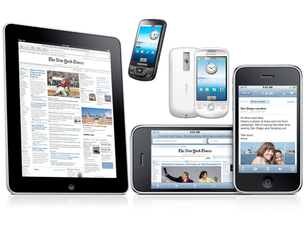
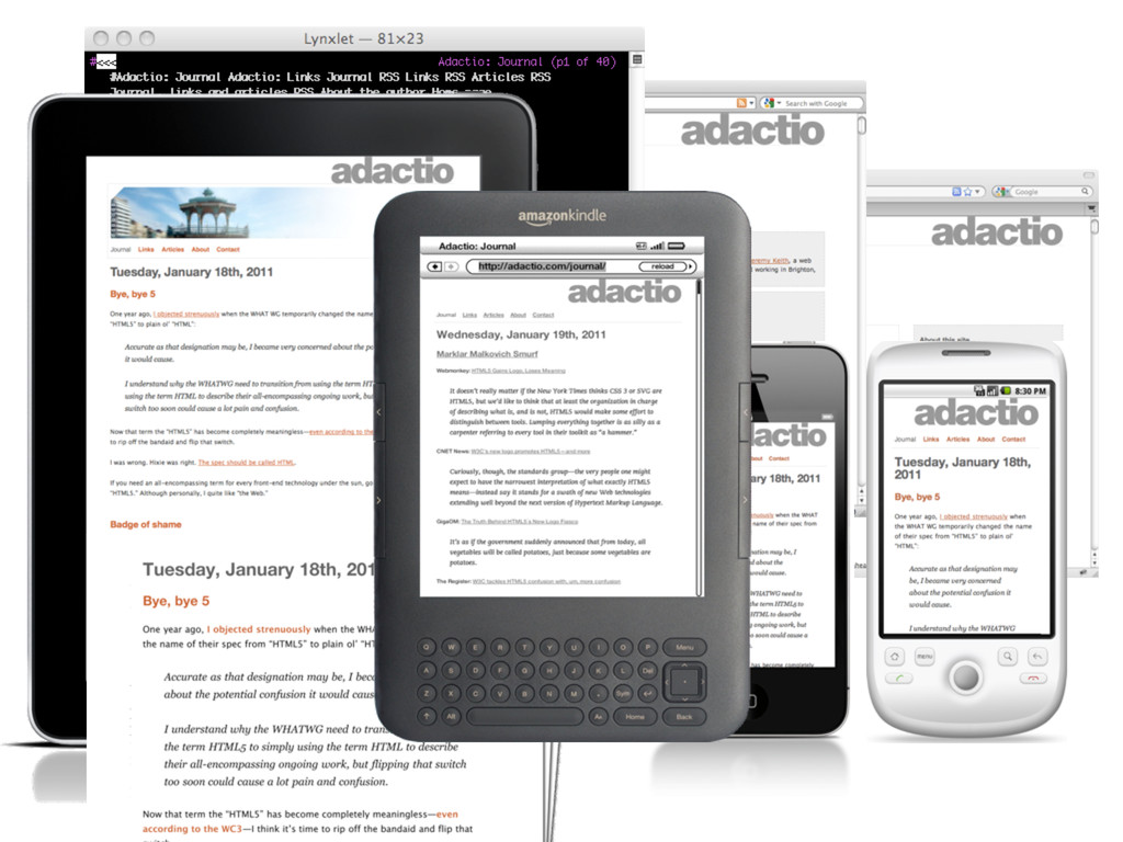
is universality. e Web should be usable by people with disabilities. It must work with any form of information, be it a document or a point of data, and information of any quality—om a silly tweet to a scholarly paper. And it should be accessible om any kind of hardware that can connect to the Internet: stationary or mobile, small screen or large. —Tim Berners-Lee Long Live the Web “ ”
 adactio
 payatsusan213
 mixi_design
 saki822
 mkasumi
 techtekt
 kaminashi
 madoka_portfolio
 spring_aki
 loglass2019
 koyaman
 takaikanako
 soysaucechin
 jonyablonski
 reverentgeek
 ks91
ks91
 jct
jct
 62gerente
 honzajavorek
 cassininazir
 brettharned
 eitanlees
 csswizardry
 sergeychernyshev