Upgrade to Pro
— share decks privately, control downloads, hide ads and more …
Speaker Deck
Features
Speaker Deck
PRO
Sign in
Sign up for free
Search
Search
Responsive Design
Search
Sponsored
·
SiteGround - Reliable hosting with speed, security, and support you can count on.
→
Andy Hume
November 13, 2011
Technology
23
1.4k
Responsive Design
Practical approaches to building responsive websites
Andy Hume
November 13, 2011
Tweet
Share
More Decks by Andy Hume
See All by Andy Hume
Architecting resilient front-ends, jQuery UK, 2015
andyhume
2
1.2k
Building for performance and resilience
andyhume
5
1.2k
Architecting resilient front ends
andyhume
3
900
Guardian Responsive Design, SmashingConf 2013
andyhume
6
690
Web Fonts as a Progressive Enhancement, Ampersand 2013
andyhume
2
810
Anatomy of a responsive page load, WhiskyWeb 2013
andyhume
10
1.9k
Breaking News & Breaking Software, SyncConf 2013
andyhume
0
320
Anatomy of a responsive page load, Responsive Day Out 2013
andyhume
23
3.3k
Responsive Guardian
andyhume
21
1.2k
Other Decks in Technology
See All in Technology
配列に見る bash と zsh の違い
kazzpapa3
3
160
22nd ACRi Webinar - NTT Kawahara-san's slide
nao_sumikawa
0
100
Introduction to Sansan for Engineers / エンジニア向け会社紹介
sansan33
PRO
6
68k
外部キー制約の知っておいて欲しいこと - RDBMSを正しく使うために必要なこと / FOREIGN KEY Night
soudai
PRO
12
5.6k
Claude_CodeでSEOを最適化する_AI_Ops_Community_Vol.2__マーケティングx_AIはここまで進化した.pdf
riku_423
2
600
Contract One Engineering Unit 紹介資料
sansan33
PRO
0
13k
小さく始めるBCP ― 多プロダクト環境で始める最初の一歩
kekke_n
1
460
プロダクト成長を支える開発基盤とスケールに伴う課題
yuu26
4
1.4k
Amazon S3 Vectorsを使って資格勉強用AIエージェントを構築してみた
usanchuu
3
450
FinTech SREのAWSサービス活用/Leveraging AWS Services in FinTech SRE
maaaato
0
130
学生・新卒・ジュニアから目指すSRE
hiroyaonoe
2
650
Oracle Cloud Observability and Management Platform - OCI 運用監視サービス概要 -
oracle4engineer
PRO
2
14k
Featured
See All Featured
Typedesign – Prime Four
hannesfritz
42
2.9k
The Myth of the Modular Monolith - Day 2 Keynote - Rails World 2024
eileencodes
26
3.3k
30 Presentation Tips
portentint
PRO
1
220
The Impact of AI in SEO - AI Overviews June 2024 Edition
aleyda
5
730
WENDY [Excerpt]
tessaabrams
9
36k
More Than Pixels: Becoming A User Experience Designer
marktimemedia
3
320
Leadership Guide Workshop - DevTernity 2021
reverentgeek
1
200
Exploring anti-patterns in Rails
aemeredith
2
250
HU Berlin: Industrial-Strength Natural Language Processing with spaCy and Prodigy
inesmontani
PRO
0
220
Agile that works and the tools we love
rasmusluckow
331
21k
Building Adaptive Systems
keathley
44
2.9k
Paper Plane
katiecoart
PRO
0
46k
Transcript
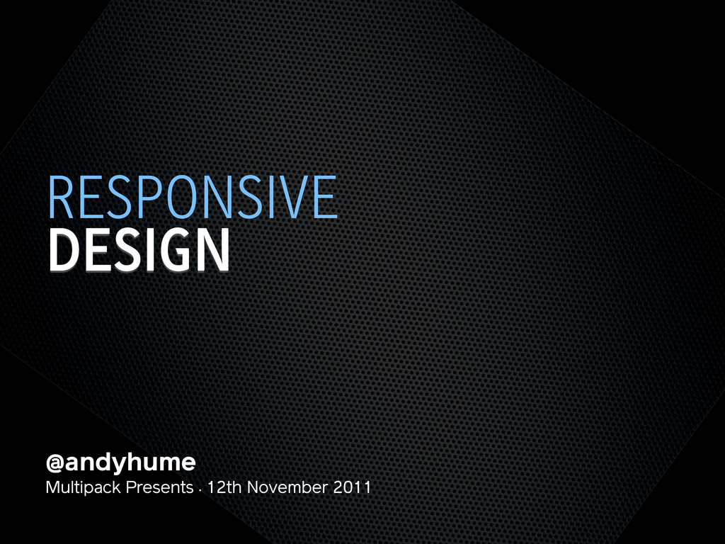
@andyhume Multipack Presents • 12th November 2011 DESIGN RESPONSIVE
@andyhume Multipack Presents • 12th November 2011 DESIGN RESPONSIVE
None
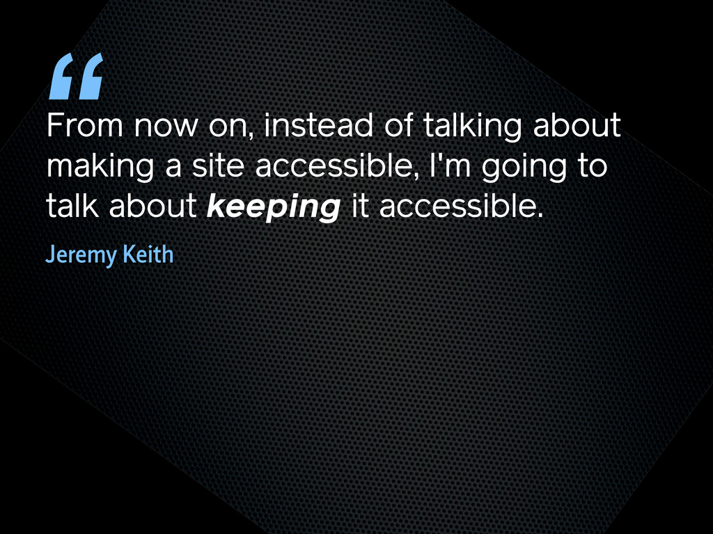
From now on, instead of talking about making a site
accessible, I'm going to talk about keeping it accessible. “ Jeremy Keith
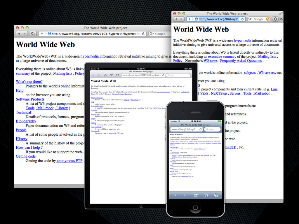
TRY NOT TO BREAK IT? THE WEB WORKS
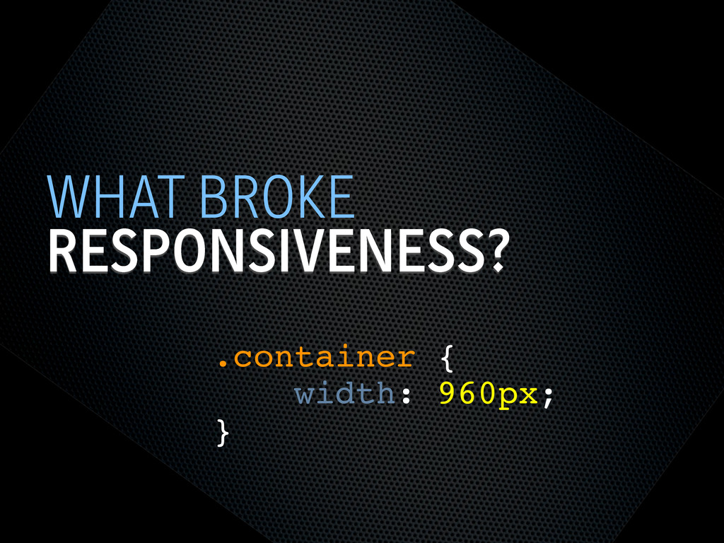
RESPONSIVENESS? WHAT BROKE .container { width: 960px; }
SEMANTIC HTML STEPS[0]
OOCSS STEPS[1] Loosely couple content styling from layout styling <link
rel="stylesheet" href="core.css">
CORE.CSS STEPS[4] .product .title { font-size: 1em; } @media screen
and (min-width: 60em) { .product .title { font-size: 1.4em; } } Keep modules together
SELECTOR QUERIES? STEPS[4] <div class="product" data-squery="min-width: 400px=wide max-width:10em=small"> <p>Content here</p>
</div> Adapt content based on container width https://github.com/ahume/selector-queries
SELECTOR QUERIES? STEPS[4] .product img { max-width: 100%; } .product.wide
img { // greater than 400px float: left; margin-right: 1em; max-width: auto; } Adapt content based on container width https://github.com/ahume/selector-queries
NAVIGATION STEPS[2]
NAVIGATION STEPS[2]
ADDING LAYOUT STEPS[3] <link rel="stylesheet" href="core.css"> <link rel="stylesheet" href="layout.css" media="screen
and (min-width:40em)"> Loosely couple content styling from layout styling
IE <9 STEPS[5] Send full ‘desktop’ layout <link rel="stylesheet" href="core.css">
<link rel="stylesheet" href="layout.css" media="screen and (min-width:40em)"> <!--[if lt IE 9]> <link rel="stylesheet" href="layout.css" media="screen"> <![endif]-->
IE <9 STEPS[5] Send full ‘desktop’ layout - but not
to mobile <link rel="stylesheet" href="core.css"> <link rel="stylesheet" href="layout.css" media="screen and (min-width:40em)"> <!--[if lt IE 9] & !(IEMobile)]> <link rel="stylesheet" href="layout.css" media="screen"> <![endif]-->
IE <9 STEPS[5] Send full ‘desktop’ layout - or not
<link rel="stylesheet" href="core.css"> <link rel="stylesheet" href="layout.css" media="screen and (min-width:40em)"> <!--[if lt IE 9] & !(IEMobile) & (gt IE6)]> <link rel="stylesheet" href="layout.css" media="screen"> <![endif]-->
IE <9 STEPS[5] Polyfill media queries <script rel="respond.js"></script> https://github.com/scottjehl/Respond
VIEWPORT STEPS[6] Set layout viewport width to the device width
<meta name="viewport" content="width=device-width, initial-scale=1.0">
VIEWPORT STEPS[6] W3C Syntax: coming soon http://dev.w3.org/csswg/css-device-adapt/ @viewport { width:
device-width; zoom: 1.0; }
IMAGES STEPS[7] Shrinking img { max-width: 100%; }
RESPONSIVE IMAGES STEPS[7] Small image by default Don’t download both
RESPONSIVE IMAGES STEPS[7] Client-side solutions https://github.com/filamentgroup/Responsive-Images https://github.com/ahume/Responsive-Images https://github.com/allmarkedup/responsive-images-alt
RESPONSIVE IMAGES STEPS[7] Here and now? src.sencha.io <img src="http://src.sencha.io/http://andyhume.net/ u.jpg">
RESPONSIVE IMAGES STEPS[7] Here and now? Image replacement <div class="logo">
<img src="logo.png" alt="Company name"> </div> .logo { background-image: url(logo-large.png); } .logo img { position: absolute; left: -9999px; }
SVG STEPS[8] Same approaches to support as responsive images
ENHANCING CONTENT STEPS[9] What’s core content?
ENHANCING CONTENT STEPS[9]
ENHANCING CONTENT STEPS[9]
ENHANCING CONTENT STEPS[9] if ($(document).width() > 640) { ! $.get('path/to/html',
function(data) { ! ! $('[role="complementary"]').append(data); ! }); } What’s core content?
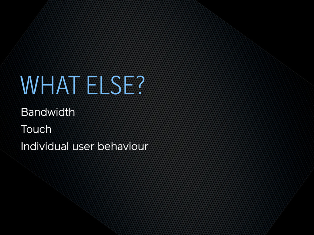
WHAT ELSE? Bandwidth Touch Individual user behaviour
THE END @andyhume Multipack Presents • 12th November 2011
 andyhume
 kazzpapa3
 nao_sumikawa
 sansan33
 soudai
 riku_423
 kekke_n
 yuu26
yuu26
 usanchuu
 maaaato
 hiroyaonoe
 oracle4engineer
 hannesfritz
 eileencodes
 portentint
 aleyda
 tessaabrams
 marktimemedia
 reverentgeek
 aemeredith
 inesmontani
 rasmusluckow
 keathley
 katiecoart
![SEMANTIC HTML STEPS[0]](https://files.speakerdeck.com/presentations/4ec011cd70a8050051006edf/slide_6.jpg)
![OOCSS STEPS[1] Loosely couple content styling from layout styling <link](https://files.speakerdeck.com/presentations/4ec011cd70a8050051006edf/slide_7.jpg)
![CORE.CSS STEPS[4] .product .title { font-size: 1em; } @media screen](https://files.speakerdeck.com/presentations/4ec011cd70a8050051006edf/slide_8.jpg)
![SELECTOR QUERIES? STEPS[4] <div class="product" data-squery="min-width: 400px=wide max-width:10em=small"> <p>Content here</p>](https://files.speakerdeck.com/presentations/4ec011cd70a8050051006edf/slide_9.jpg)
![SELECTOR QUERIES? STEPS[4] .product img { max-width: 100%; } .product.wide](https://files.speakerdeck.com/presentations/4ec011cd70a8050051006edf/slide_10.jpg)
![NAVIGATION STEPS[2]](https://files.speakerdeck.com/presentations/4ec011cd70a8050051006edf/slide_11.jpg)
![NAVIGATION STEPS[2]](https://files.speakerdeck.com/presentations/4ec011cd70a8050051006edf/slide_12.jpg)
![ADDING LAYOUT STEPS[3] <link rel="stylesheet" href="core.css"> <link rel="stylesheet" href="layout.css" media="screen](https://files.speakerdeck.com/presentations/4ec011cd70a8050051006edf/slide_13.jpg)
![IE <9 STEPS[5] Send full ‘desktop’ layout <link rel="stylesheet" href="core.css">](https://files.speakerdeck.com/presentations/4ec011cd70a8050051006edf/slide_14.jpg)
![IE <9 STEPS[5] Send full ‘desktop’ layout - but not](https://files.speakerdeck.com/presentations/4ec011cd70a8050051006edf/slide_15.jpg)
![IE <9 STEPS[5] Send full ‘desktop’ layout - or not](https://files.speakerdeck.com/presentations/4ec011cd70a8050051006edf/slide_16.jpg)
![IE <9 STEPS[5] Polyfill media queries <script rel="respond.js"></script> https://github.com/scottjehl/Respond](https://files.speakerdeck.com/presentations/4ec011cd70a8050051006edf/slide_17.jpg)
![VIEWPORT STEPS[6] Set layout viewport width to the device width](https://files.speakerdeck.com/presentations/4ec011cd70a8050051006edf/slide_18.jpg)
![VIEWPORT STEPS[6] W3C Syntax: coming soon http://dev.w3.org/csswg/css-device-adapt/ @viewport { width:](https://files.speakerdeck.com/presentations/4ec011cd70a8050051006edf/slide_19.jpg)
![IMAGES STEPS[7] Shrinking img { max-width: 100%; }](https://files.speakerdeck.com/presentations/4ec011cd70a8050051006edf/slide_20.jpg)
![RESPONSIVE IMAGES STEPS[7] Small image by default Don’t download both](https://files.speakerdeck.com/presentations/4ec011cd70a8050051006edf/slide_21.jpg)
![RESPONSIVE IMAGES STEPS[7] Client-side solutions https://github.com/filamentgroup/Responsive-Images https://github.com/ahume/Responsive-Images https://github.com/allmarkedup/responsive-images-alt](https://files.speakerdeck.com/presentations/4ec011cd70a8050051006edf/slide_22.jpg)
![RESPONSIVE IMAGES STEPS[7] Here and now? src.sencha.io <img src="http://src.sencha.io/http://andyhume.net/ u.jpg">](https://files.speakerdeck.com/presentations/4ec011cd70a8050051006edf/slide_23.jpg)
![RESPONSIVE IMAGES STEPS[7] Here and now? Image replacement <div class="logo">](https://files.speakerdeck.com/presentations/4ec011cd70a8050051006edf/slide_24.jpg)
![SVG STEPS[8] Same approaches to support as responsive images](https://files.speakerdeck.com/presentations/4ec011cd70a8050051006edf/slide_25.jpg)
![ENHANCING CONTENT STEPS[9] What’s core content?](https://files.speakerdeck.com/presentations/4ec011cd70a8050051006edf/slide_26.jpg)
![ENHANCING CONTENT STEPS[9]](https://files.speakerdeck.com/presentations/4ec011cd70a8050051006edf/slide_27.jpg)
![ENHANCING CONTENT STEPS[9]](https://files.speakerdeck.com/presentations/4ec011cd70a8050051006edf/slide_28.jpg)
![ENHANCING CONTENT STEPS[9] if ($(document).width() > 640) { ! $.get('path/to/html',](https://files.speakerdeck.com/presentations/4ec011cd70a8050051006edf/slide_29.jpg)