Upgrade to Pro — share decks privately, control downloads, hide ads and more …

Developing Mobile Solutions with Adobe CS6

Developing Mobile Solutions with Adobe CS6

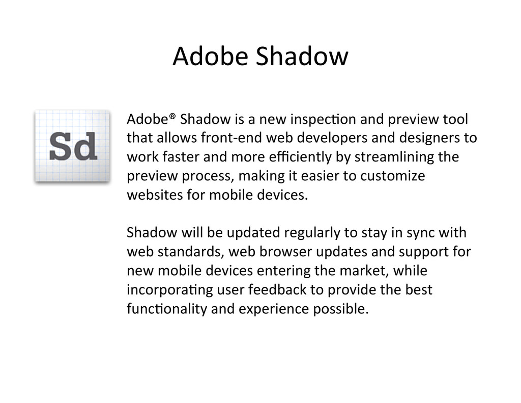
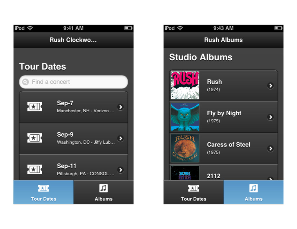
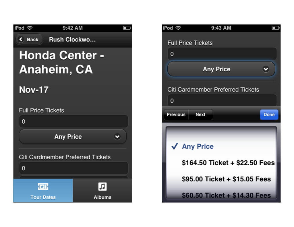
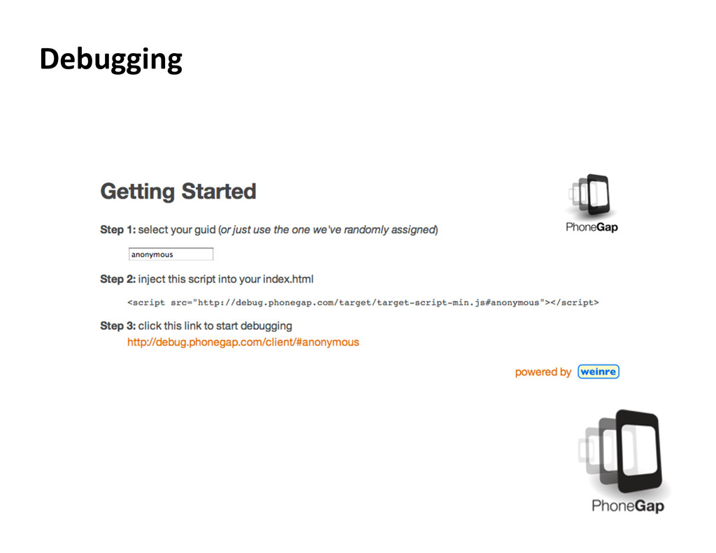
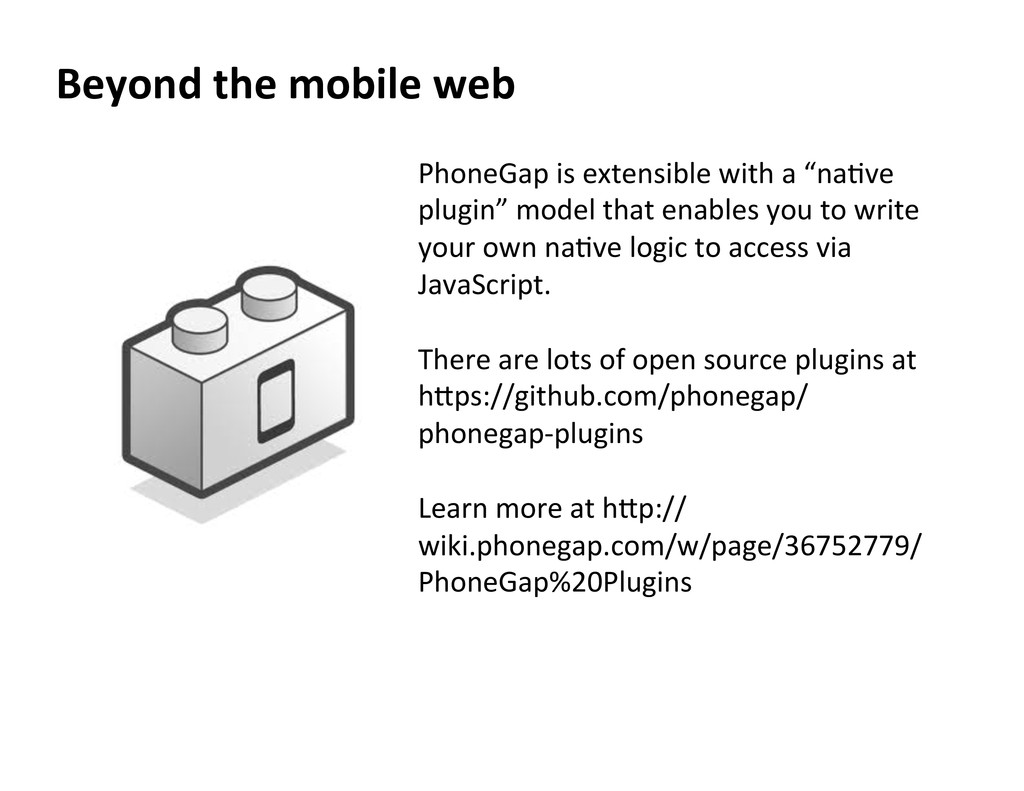
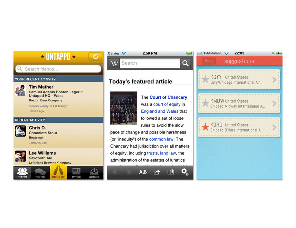
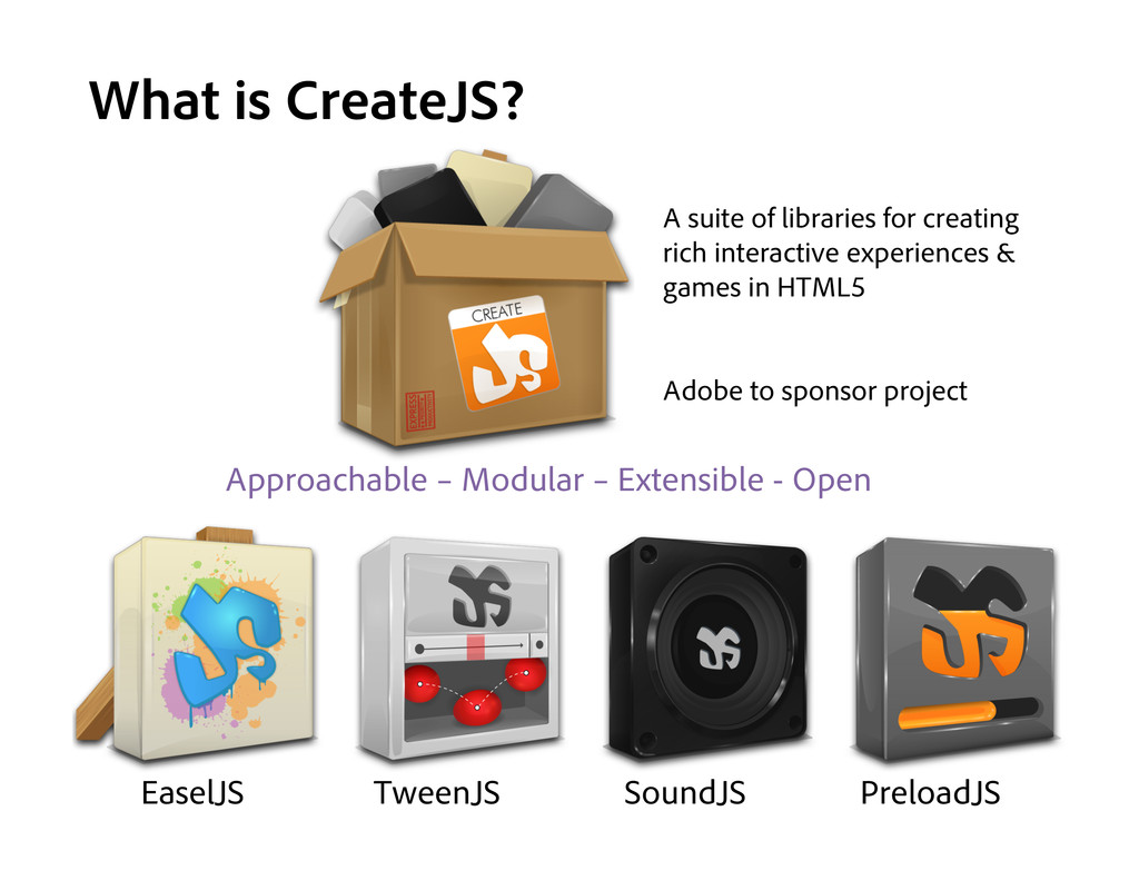
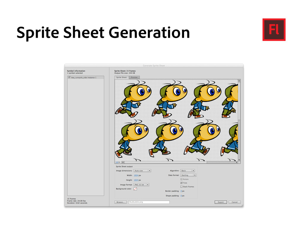
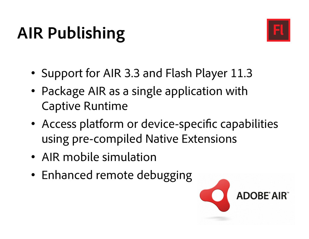
Chris Griffith will show the new tools in CS6 for getting content onto any device. He will show how to take your ideas to the mobile web and beyond with Dreamweaver, Fireworks, and PhoneGap. He will also show the tools in Flash Pro CS6 for authoring incredible experiences in Flash, and publishing for iOS and Android platforms. He will explore the new HTML5 publishing features (Create.js) and improvements in 3D and gaming. Chris will even give you a sneak peek at a new technology from Adobe, code-named "Shadow", for improving the mobile development workflow.

Chris Griffith

June 19, 2012
Tweet

More Decks by Chris Griffith

Other Decks in Technology

Transcript

  1. These  opinions  and  thoughts  are  my  own,  and   may

     or  may  not  reflect  the  opinions  of  the   company  that  I  work  for.   Disclaimer  
  2. Mobile  is  becoming  increasingly  important  to  web   designers  and

     developers  because  users  expect  a   site  to  work  on  their  phones.     6  
  3. The  web  is  becoming  increasingly  important  to  the   mobile

     world  because  it  is  the  only  way  to  deploy   an  applica/on  to  almost  any  device.   7  
  4. Mobile  Na/ve  App   Pro’s:  High  Performance     Con’s:

     Device  dependent     (e.g.  Objec/ve  C  only  apps)   A  na/ve  app  as  one  that  is  specifically  designed  to  run   on  a  device’s  opera/ng  system  and  machine  firmware,   and  typically  needs  to  be  adapted  for  different  devices.   8  
  5. Pro’s:  Broad  Reach  of  mobile  devices     Con’s:  No

     access  to  mobile  sensor  API’s   Mobile  Web  App   A  Web  app,  is  typically  coded  in  a  browser-­‐rendered   language  such  as  HTML  combined  with  JavaScript.   9  
  6. What’s  New   Fluid  Grid  Layouts   jQuery  Mobile  Support

      PhoneGap  Support   Mul=screen  Preview  
  7. What  does  jQuery  Mobile  do?   jQuery  Mobile  makes  it

     easy  to  develop     user  interfaces  for  mobile  web  apps.  
  8. What  does  jQuery  Mobile  do?   The  interface  configura=on  is

     markup-­‐driven,   which  means  you  can  pre`y  much  create  your   en/re  basic  app  interface  in  HTML,  without   needing  to  write  a  single  line  of  JavaScript.  (Of   course,  you'll  s/ll  need  to  write  JavaScript  if   your  app  is  to  do  anything  useful!)  
  9. What  does  jQuery  Mobile  do?   It  provides  a  series

     of  new  custom  events  to  let   you  detect  mobile  and  touch  specific  ac/ons  like   tap,  tap-­‐and-­‐hold,  swipe,  and  orienta=on   change  (i.e.  rota/ng  the  device).  
  10. What  does  jQuery  Mobile  do?   It  uses  themes  to

     make  it  easy  to  customize  the   look  of  your  app.  
  11. <!DOCTYPE  html>   <html>   <head>   </tle>Page  Title<//tle>  

     <link  rel="stylesheet"  href="h`p://code.jquery.com/mobile/1.0/ jquery.mobile-­‐1.0.min.css"  />    <script  src="h`p://code.jquery.com/jquery-­‐1.7.1.min.js"></script>    <script  src="h`p://code.jquery.com/mobile/1.0/ jquery.mobile-­‐1.0.min.js"></script>   </head>   <body>       </body>   </html>  
  12. <body> <div id="homePage"> <div> <h1>Page Title</h1> </div> <div> <p>My page

    content</p> </div> <div> <h4>Footer</h4> </div> </div> </body>
  13. data-­‐*   data-­‐  a`ributes  are  a  wonderful  new  feature  of

      HTML5  that  let  you  add  any  a`ributes  you  like   to  an  element.  All  you  have  to  do  is  start  your   a`ribute  name  with  the  data-­‐  prefix.  
  14. <body>   <div  id="homePage"  data-­‐role="page">    <div  data-­‐role="header">    

     <h1>Page  Title</h1>    </div>    <div  data-­‐role="content">      <p>My  page  content</p>    </div>    <div  data-­‐role="footer">      <h4>Footer</h4>    </div>   </div>   </body>  
  15. <div  data-­‐  role="header">   This  lets  you  create  a  toolbar

     at  the  top  of  the   page,  used  for  things  like  the  page  /tle  and   bu`ons.  (Typically  there  is  at  least  a  "Back"   bu`on  which  the  user  can  tap  to  return  to  the   previous  page.)  By  adding  data-­‐posi/on="fixed"   to  the  header,  you  can  make  sure  the  header   always  stays  at  the  top  of  the  screen.  
  16. <div  data-­‐  role="content">   Contains  the  main  content  of  the

     page,  such  as   text,  images,  bu`ons,  lists,  forms,  and  so  on.  
  17. <div  data-­‐  role="footer">   Creates  a  toolbar  at  the  bo`om

     of  the  page,   which  is  useful  for  things  like  main  func/on   bu`ons.  By  adding  data-­‐posi/on="fixed"  to  the   footer,  you  can  make  sure  it  always  stays  at  the   bo`om  of  the  screen.  
  18. Pages  within  pages   <body>   <div  id="homePage"  data-­‐role="page">  

     <div  data-­‐role="header">      <h1>Page  Title</h1>    </div>    <div  data-­‐role="content">      <p>My  page  content</p>      <p><a  href="#about">About  this  app</a></p>    </div>    <div  data-­‐role="footer">      <h4>Footer</h4>    </div>   </div>   <div  data-­‐role="page"  id="about">    <div  data-­‐role="header">      <h1>About  This  App</h1>    </div>    <div  data-­‐role="content">      <p>This  app  rocks!  <a  href="#homePage">Go  home</a></p>    </div>   </div>   </body>  
  19. Page  transi/ons   •  slide   •  slideup   • 

    slidedown   •  slidefade   •  pop   •  fade   •  flip   •  flow   •  turn   <p><a  href="#about"  data-­‐transi/on="flip">About  this  app</ a></p>  
  20. Bu`ons   To  turn  a  link  into  a  bu`on  in

     jQuery  Mobile,   simply  add  data-­‐role="bu`on"  to  the  a  tag:     <p><a  href="#about"  data-­‐role="bu`on">About   this  app</a></p>  
  21. Icons  &  more   An  icon  can  be  added  to

     a  bu`on  by  adding  a   data-­‐icon  a`ribute  on  the  anchor  specifying  the   icon  to  display.  For  example,  the  following   markup:   <p><a  href="#about"  data-­‐transi/on="flip"  data-­‐ role="bu`on"  data-­‐icon="info">About  this   app</a></p>  
  22. Grouped  Bu`ons   <div  data-­‐role="page"  id="about">    <div  data-­‐role="header">  

       <h1>About  This  App</h1>    </div>    <div  data-­‐role="content">      <p>Does  app  rocks?</p>      <div  data-­‐role="controlgroup"  data-­‐type="horizontal">        <a  href="#homePage"  data-­‐role="bu`on">Yes</a>        <a  href="#homePage"  data-­‐role="bu`on">No</a>        <a  href="#homePage"  data-­‐role="bu`on">Maybe</a>      </div>    </div>   </div>  
  23. Lists     Lists  are  used  for  data  display,  naviga/on,

     result   lists,  and  data  entry  so  jQuery  Mobile  includes  a   wide  range  of  list  types  and  formasng  examples   to  cover  most  common  design  pa`erns.  
  24. List  Code  -­‐  Sample   <li>    <a  href="#"><img  src="images/rush.png"

      class="ui-­‐li-­‐thumb">    <h3  class="ui-­‐li-­‐heading">Fly  by  Night</h3>    <p  class="ui-­‐li-­‐desc">(1975)</p>    </a>   </li>  
  25. Lists,  part  deux   •  Nested  lists.  If  you  nest

     another  ul  list  inside  an  li,  jQuery  automa/cally  creates  a   second  "page"  for  the  embedded  list,  linked  to  from  the  original  li.  This  is  very   handy  for  crea/ng  trees  of  menu  op/ons,  sesngs,  and  so  on.   •  Split  buJon  lists.  By  placing  2  links  inside  an  li,  you  can  create  a  list  item  with  a   ver/cal  divider  bar  on  the  right  side  of  the  item.  The  user  can  then  tap  either  the   lev  or  right  side  of  the  list  item  to  achieve  different  things  (such  as  viewing  or   purchasing).   •  Count  bubbles.  If  you  include  an  element  with  a  class  of  ui-­‐li-­‐count  in  a  list  item   then  jQuery  Mobile  creates  a  li`le  "bubble"  icon  on  the  right  side  of  the  list  item   containing  the  element's  contents.  This  is  great  for  things  like  message  counts  in   mailbox  lists.   •  Search  filtering.  If  you  add  the  a`ribute  data-­‐filter="true"  to  a  ul  or  ol  element   then  the  list  becomes  searchable.  A  "Filter  results..."  text  box  appears  above  the   list,  allowing  the  user  to  narrow  down  the  op/ons.  Perfect  for  large  lists.   •  List  dividers  for  splisng  lists  into  sec/ons.  Just  add  data-­‐role="list-­‐divider"  to  any   list  item.  
  26. Back?   <div  data-­‐role="page"  id="twenty-­‐one-­‐twelve"  data-­‐add-­‐back-­‐ btn="true">     OR

        <script  src="h`p://code.jquery.com/jquery-­‐1.7.1.min.js"></script>   <script>   $(document).bind("mobileinit",  func/on(){    $.mobile.page.prototype.op/ons.addBackBtn=true;   });   </script>   <script  src="h`p://code.jquery.com/mobile/1.0/ jquery.mobile-­‐1.0.min.js"></script>  
  27. What’s  New   CSS3  Support   CSS3  Sprites   jQuery

     Mobile   Symbols  &   Templates  
  28. <meta>   <meta  name="viewport"  content="target-­‐ densitydpi=high-­‐dpi,  width=device-­‐width,  ini/al-­‐ scale=1.0,  maximum-­‐scale=1.0,

     user-­‐ scalable=no"/>   <meta  name="apple-­‐mobile-­‐web-­‐app-­‐capable"   content="yes"  />   <meta  name="apple-­‐mobile-­‐web-­‐app-­‐status-­‐ bar-­‐style"  content="black"  />   See  h`p://www.html5rocks.com/en/mobile/mobifying/  
  29. Tabs   <div  data-­‐role="footer">        <div  data-­‐role="navbar">  

       <ul>        <li><a  href="#">One</a></li>        <li><a  href="#">Two</a></li>        <li><a  href="#">Three</a></li>      </ul>    </div><!-­‐-­‐  /navbar  -­‐-­‐>   </div><!-­‐-­‐  /footer  -­‐-­‐>  
  30. Icons  in  navbars   Icons  can  be  added  to  navbar

     items  by  adding   the  data-­‐icon  a`ribute  specifying  a  standard   mobile  icon  to  each  anchor.  By  default,  icons  are   added  above  the  text  (data-­‐iconpos="top").  The   following  examples  add  icons  to  a  navbar  in  a   footer.    
  31. Custom  Icons   18x18  pixels  saved  as  a  PNG-­‐8  with

     alpha  transparency     .ui-­‐icon-­‐myapp-­‐email  {      background-­‐image:  url("app-­‐icon-­‐email.png");   }     36x36  pixels  saved  as  a  PNG-­‐8  with  alpha  transparency     @media  only  screen  and  (-­‐webkit-­‐min-­‐device-­‐pixel-­‐ra/o:  2)  {      .ui-­‐icon-­‐myapp-­‐email  {        background-­‐image:  url("app-­‐icon-­‐email-­‐highres.png");        background-­‐size:  18px  18px;      }   }    
  32. Fixed  toolbars   In  browsers  that  support  CSS  posi/on:  fixed

     (most  desktop  browsers,  iOS5+,  Android  2.2+,  BlackBerry  6,   and  others),  toolbars  that  use  the  "fixedtoolbar"  plugin  will  be  fixed  to  the  top  or  bo`om  of  the   viewport,  while  the  page  content  scrolls  freely  in  between.  In  browsers  that  don't  support  fixed   posi/oning,  the  toolbars  will  remain  posi/oned  in  flow,  at  the  top  or  bo`om  of  the  page.     To  enable  this  behavior  on  a  header  or  footer,  add  the  data-­‐posi/on="fixed"  a`ribute  to  a  jQuery   Mobile  header  or  footer  element.     Fixed  header  markup  example:       <div  data-­‐role="header"  data-­‐posi/on="fixed">    <h1>Fixed  Header!</h1>   </div>         Fixed  footer  markup  example:       <div  data-­‐role="footer"  data-­‐posi/on="fixed">    <h1>Fixed  Footer!</h1>   </div>  
  33. Persistent  Footer  naviga/on  bar   To  tell  the  framework  to

     apply  the  persistent   behavior,  add  a  data-­‐id  a`ribute  to  the  footer  of   all  HTML  pages  in  the  naviga/on  set  to  the  same   ID.  It's  that  simple:  if  the  page  you're  naviga/ng   to  has  a  header  or  footer  with  the  same  data-­‐id,   the  toolbars  will  appear  fixed  outside  of  the   transi/on.    
  34. Persistent  Footer  naviga/on  bar   <div  data-­‐role="footer"  data-­‐id=”myTabs"  data-­‐posi/on="fixed">  

     <div  data-­‐role="navbar">      <ul>        <li><a  href="a.html">Friends</a></li>        <li><a  href="b.html">Albums</a></li>        <li><a  href="c.html">Emails</a></li>        <li><a  href="d.html"  >Info</a></li>      </ul>    </div><!-­‐-­‐  /navbar  -­‐-­‐>   </div><!-­‐-­‐  /footer  -­‐-­‐>     To  set  the  ac/ve  state  of  an  item  in  a  persistent  toolbar,  add  a  class  of  ui-­‐state-­‐persist   in  addi/on  to  ui-­‐btn-­‐ac/ve  to  the  corresponding  anchor.     <li><a  href="d.html"  class="ui-­‐btn-­‐ac/ve  ui-­‐state-­‐persist">Info</a></li>  
  35. Adobe  Shadow   Adobe®  Shadow  is  a  new  inspec/on  and

     preview  tool   that  allows  front-­‐end  web  developers  and  designers  to   work  faster  and  more  efficiently  by  streamlining  the   preview  process,  making  it  easier  to  customize   websites  for  mobile  devices.     Shadow  will  be  updated  regularly  to  stay  in  sync  with   web  standards,  web  browser  updates  and  support  for   new  mobile  devices  entering  the  market,  while   incorpora/ng  user  feedback  to  provide  the  best   func/onality  and  experience  possible.  
  36. •  The  web  is  sandboxed   •  The  web  has

     no  good  offline  story   •  The  web  cannot  par/cipate  in  app  store   distribu/on  revenue   •  The  web  cannot  access  most  device  apis   •  The  web  has  awful  tooling   Mobile  Web  is  great  but…  
  37. Applica/on  container  that  allows  you  to  build   na/vely  installed

     apps  using  HTML,  CSS  &  JavaScript       What  is  PhoneGap  
  38. What  is  PhoneGap   Your  Code   Na=ve  Web  View

      Na=ve  APIs   Na=ve  App  -­‐  .apk,  .ipa,  etc  
  39. Cau=on…   PhoneGap  uses  the  NATIVE  browser  on  the  

    device  to  render  the  HTML/CSS/JS     Keep  that  in  mind,  as  that  can  affect  the   experience  
  40. Device  Access   Accelerometer     Camera     Capture

        Compass     Connec=on     Contacts     Device  Informa=on   File     Geoloca=on     Media     No=fica=on     Storage     Out  of  the  box,  PhoneGap  provides  support  for  a  number  of  basic  device  APIs  
  41. Debugging   It’s  all  just  HTML/JS,  so  you  can  use

     your  browser!       Take  advantage  of  Chrome  Developer  tools/Firebug  to  test.  
  42. Debugging   Luckily  we  have  Weinre,  which  lets  us  debug

     and  manipulate  the   DOM  from  our  PCs.   h`p://people.apache.org/~pmuellr/weinre/  
  43. Debugging   Weinre  can  be  configured  as  a  server  (there

     is  a  Mac  applica/on)   and  uses  the  developer  tools  from  Chrome  to  provide  hooks  into   the  mobile  app.  
  44. Beyond  the  mobile  web   PhoneGap  is  extensible  with  a

     “na/ve   plugin”  model  that  enables  you  to  write   your  own  na/ve  logic  to  access  via   JavaScript.       There  are  lots  of  open  source  plugins  at   h`ps://github.com/phonegap/ phonegap-­‐plugins       Learn  more  at  h`p:// wiki.phonegap.com/w/page/36752779/   PhoneGap%20Plugins      
  45. What’s New Sprite sheet generation Wide platform and device support

    Prepackaged Adobe AIR application creation Adobe AIR mobile simulation Stage 3D targeting
  46. What is CreateJS? EaselJS TweenJS SoundJS PreloadJS A suite of

    libraries for creating rich interactive experiences & games in HTML5 Adobe to sponsor project Approachable – Modular – Extensible - Open
  47. AIR Publishing •  Support for AIR 3.3 and Flash Player

    11.3 •  Package AIR as a single application with Captive Runtime •  Access platform or device-speci c capabilities using pre-compiled Native Extensions •  AIR mobile simulation •  Enhanced remote debugging