Upgrade to Pro
— share decks privately, control downloads, hide ads and more …
Speaker Deck
Features
Speaker Deck
PRO
Sign in
Sign up for free
Search
Search
Introduction to Material Design
Search
Sponsored
·
Your Podcast. Everywhere. Effortlessly.
Share. Educate. Inspire. Entertain. You do you. We'll handle the rest.
→
Harsh Dattani
December 14, 2014
Design
3
160
Introduction to Material Design
Delivered a session on Introduction to Material Design at DevFest Ahmedabad 2014.
Harsh Dattani
December 14, 2014
Tweet
Share
More Decks by Harsh Dattani
See All by Harsh Dattani
Whats new in Android N
harshdattani
0
56
Developing Secure Android Application
harshdattani
2
370
Guard your Android
harshdattani
0
150
Other Decks in Design
See All in Design
逆向きUIの世界 〜iOSアプリのRTL言語対応〜
akatsuki174
1
510
「余白」と「欲望」を味方につける ——AI時代のデザインエンジニアリングと「越境」の作法 #KNOTS2026
koyaman
1
1.4k
【pmconf2025】PdMの頭の中を見える化する体験構造図
kamechi7222222
1
1.9k
From the Visible Crossroads: Turning Outputs into Outcomes
takaikanako
2
1.1k
CREATIVE CLASS受講課題|無印良品を題材としたブランド再構築について
happy_ferret153
0
620
デザイナーとエンジニアで 同じ山に登ろう
moco1013
0
140
hicard_credential_202601
hicard
0
160
プラットフォームに馴染むモバイルアプリデザイン / Mobile App UI Design Lunch LT
pixyzehn
0
140
Correspondence:共に生成していく過程
akiramotomura
0
190
第18回サイゼミ
lw
1
3.3k
TWCP#21 UXデザインと哲学のはなし
shinn
0
270
デザインエンジニアの延長にデザインマネージャーとしての可能性を探る
takanorip
1
900
Featured
See All Featured
The Language of Interfaces
destraynor
162
26k
Improving Core Web Vitals using Speculation Rules API
sergeychernyshev
21
1.4k
Introduction to Domain-Driven Design and Collaborative software design
baasie
1
590
How to Build an AI Search Optimization Roadmap - Criteria and Steps to Take #SEOIRL
aleyda
1
1.9k
Building an army of robots
kneath
306
46k
Have SEOs Ruined the Internet? - User Awareness of SEO in 2025
akashhashmi
0
270
A brief & incomplete history of UX Design for the World Wide Web: 1989–2019
jct
1
300
DBのスキルで生き残る技術 - AI時代におけるテーブル設計の勘所
soudai
PRO
62
50k
BBQ
matthewcrist
89
10k
The World Runs on Bad Software
bkeepers
PRO
72
12k
Producing Creativity
orderedlist
PRO
348
40k
Building a Scalable Design System with Sketch
lauravandoore
463
34k
Transcript
Introduction to Material Design Harsh Dattani
About Me M.Tech Cyber Security Gujarat Forensic Sciences University, Gandhinagar
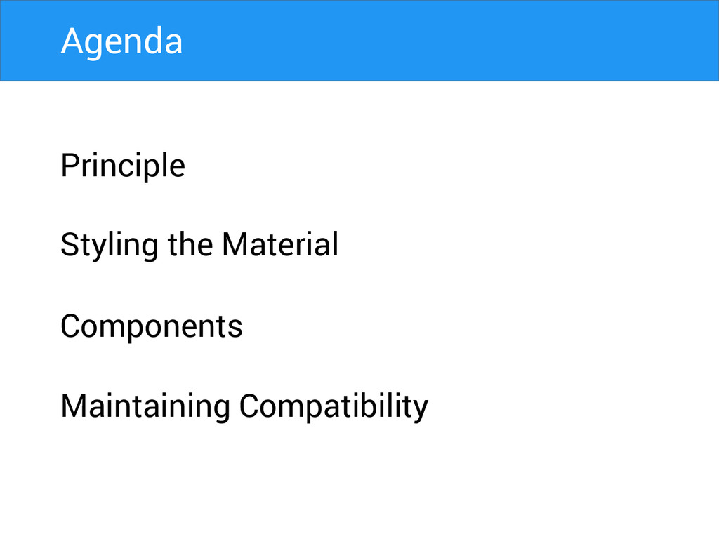
Principle Styling the Material Components Maintaining Compatibility Agenda
A great product experience starts with UX followed by UI.
Both are essential for the product’s success.
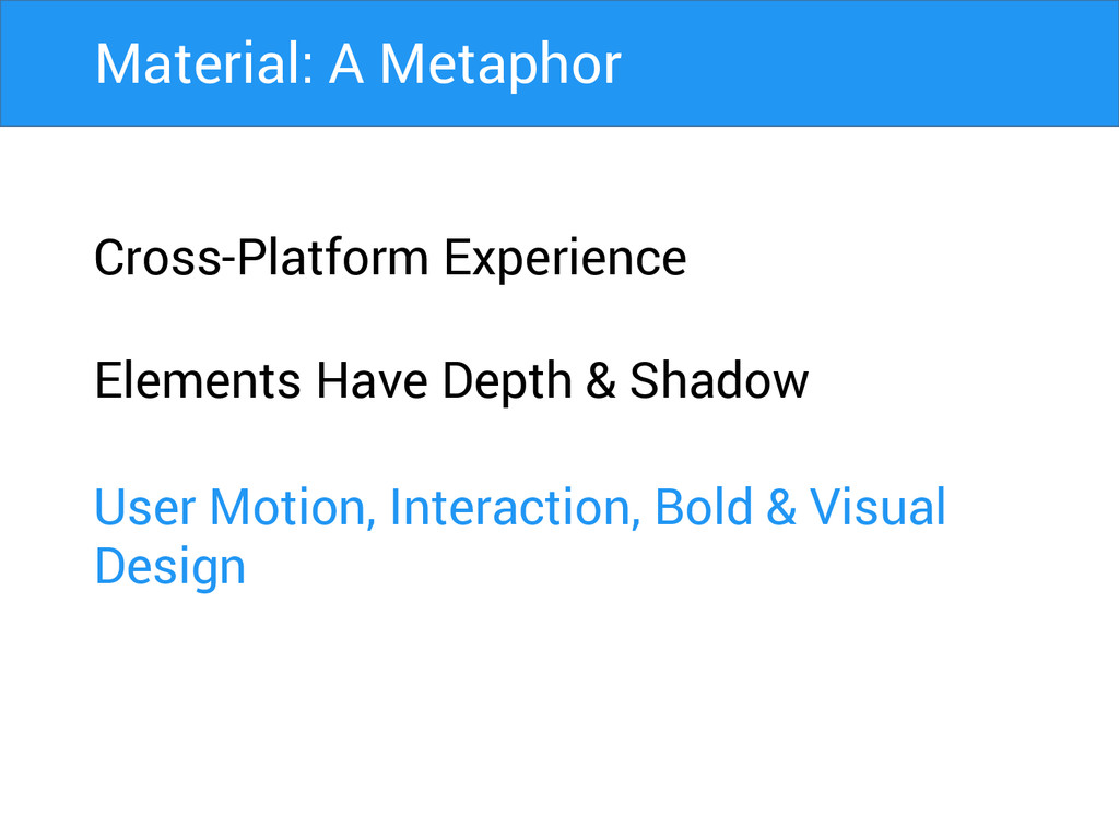
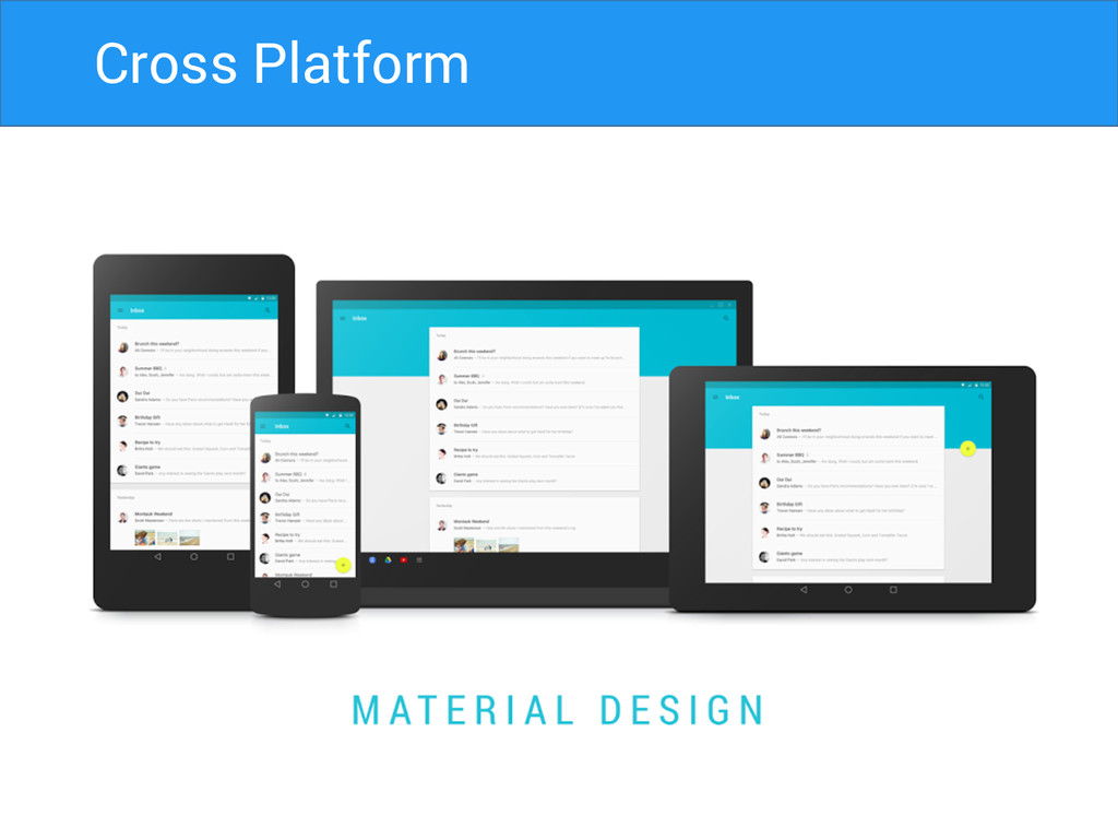
Cross-Platform Experience Material: A Metaphor
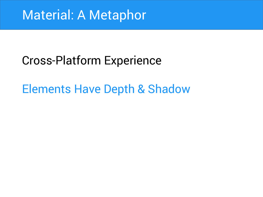
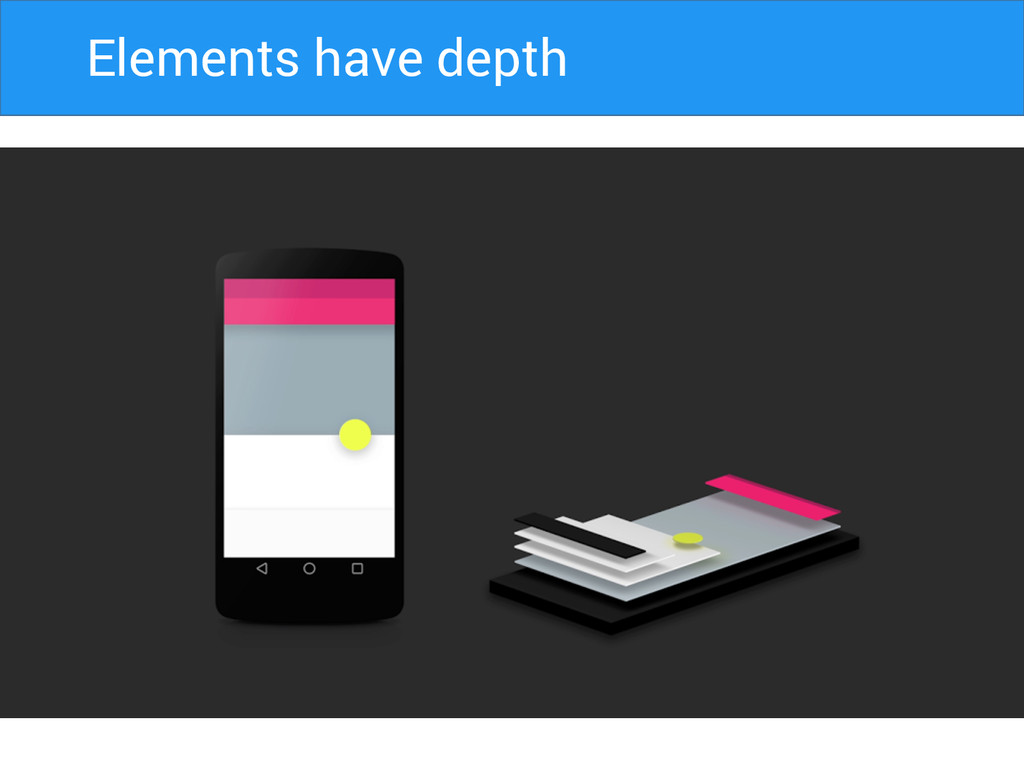
Cross-Platform Experience Elements Have Depth & Shadow Material: A Metaphor
Cross-Platform Experience Elements Have Depth & Shadow User Motion, Interaction,
Bold & Visual Design Material: A Metaphor
Cross Platform
Elements Have Depth Elements have depth
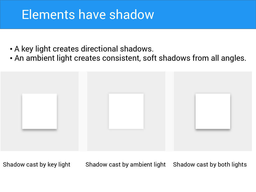
• A key light creates directional shadows. • An ambient
light creates consistent, soft shadows from all angles. Shadow cast by key light Shadow cast by ambient light Shadow cast by both lights Elements have shadow
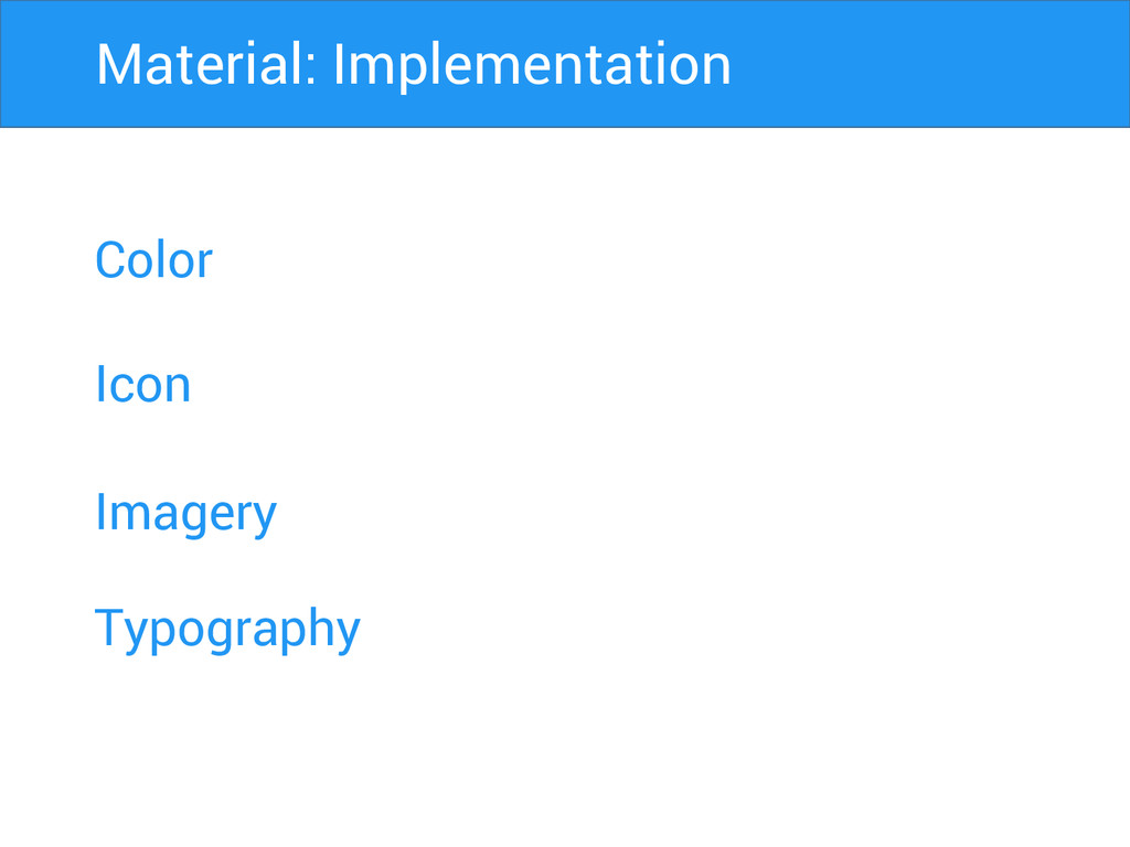
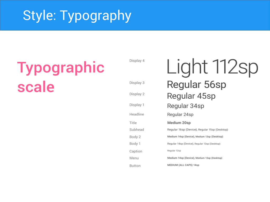
Color Icon Imagery Material: Implementation Typography
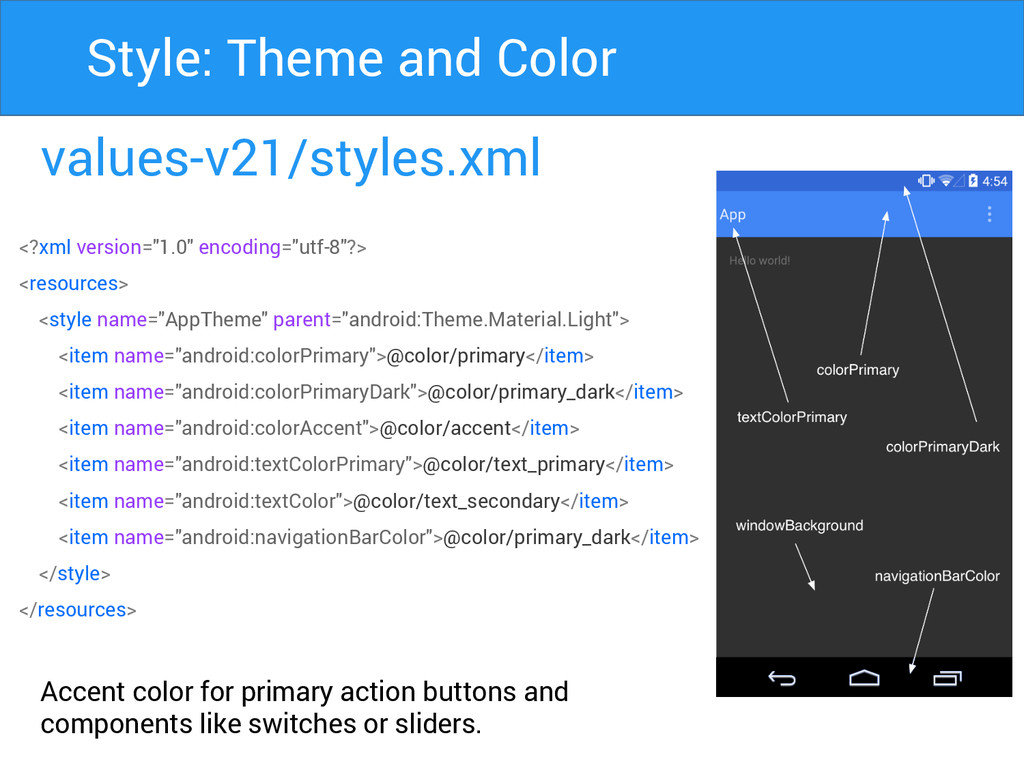
values-v21/styles.xml Accent color for primary action buttons and components like
switches or sliders. Style: Theme and Color <?xml version="1.0" encoding="utf-8"?> <resources> <style name="AppTheme" parent="android:Theme.Material.Light"> <item name="android:colorPrimary">@color/primary</item> <item name="android:colorPrimaryDark">@color/primary_dark</item> <item name="android:colorAccent">@color/accent</item> <item name="android:textColorPrimary">@color/text_primary</item> <item name="android:textColor">@color/text_secondary</item> <item name="android:navigationBarColor">@color/primary_dark</item> </style> </resources>
Primary Secondary Style: Color Palette
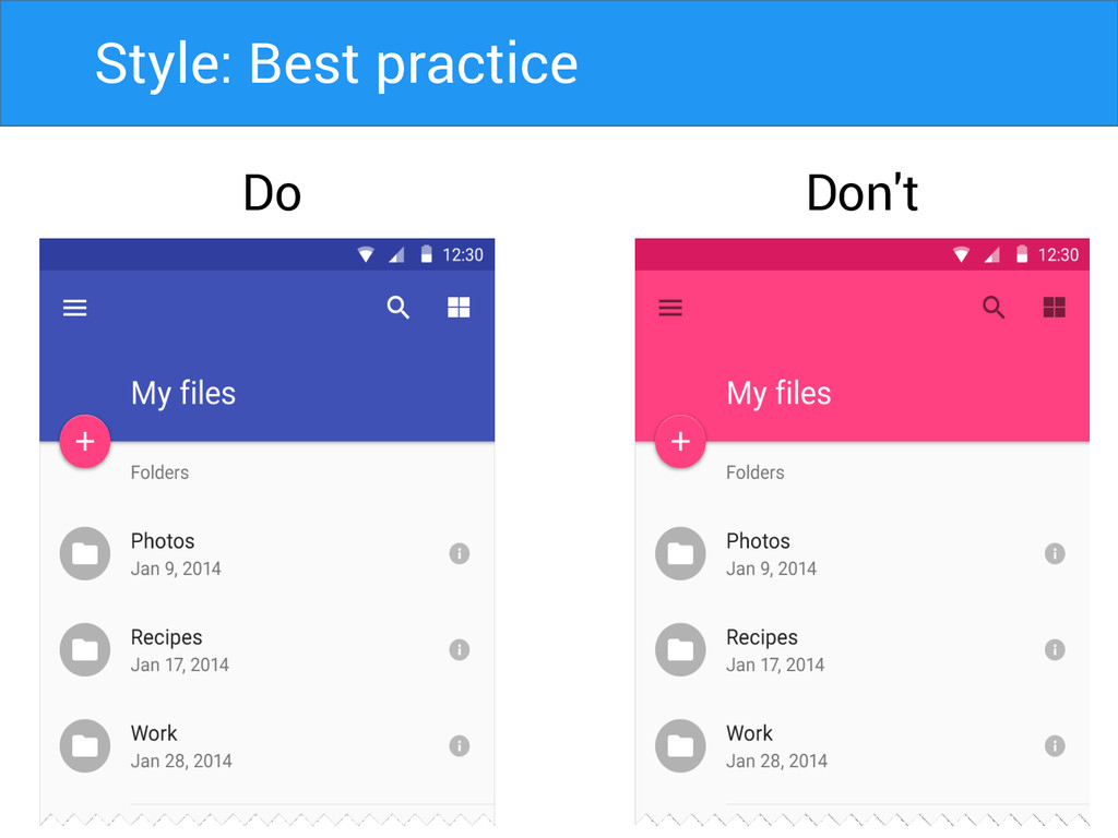
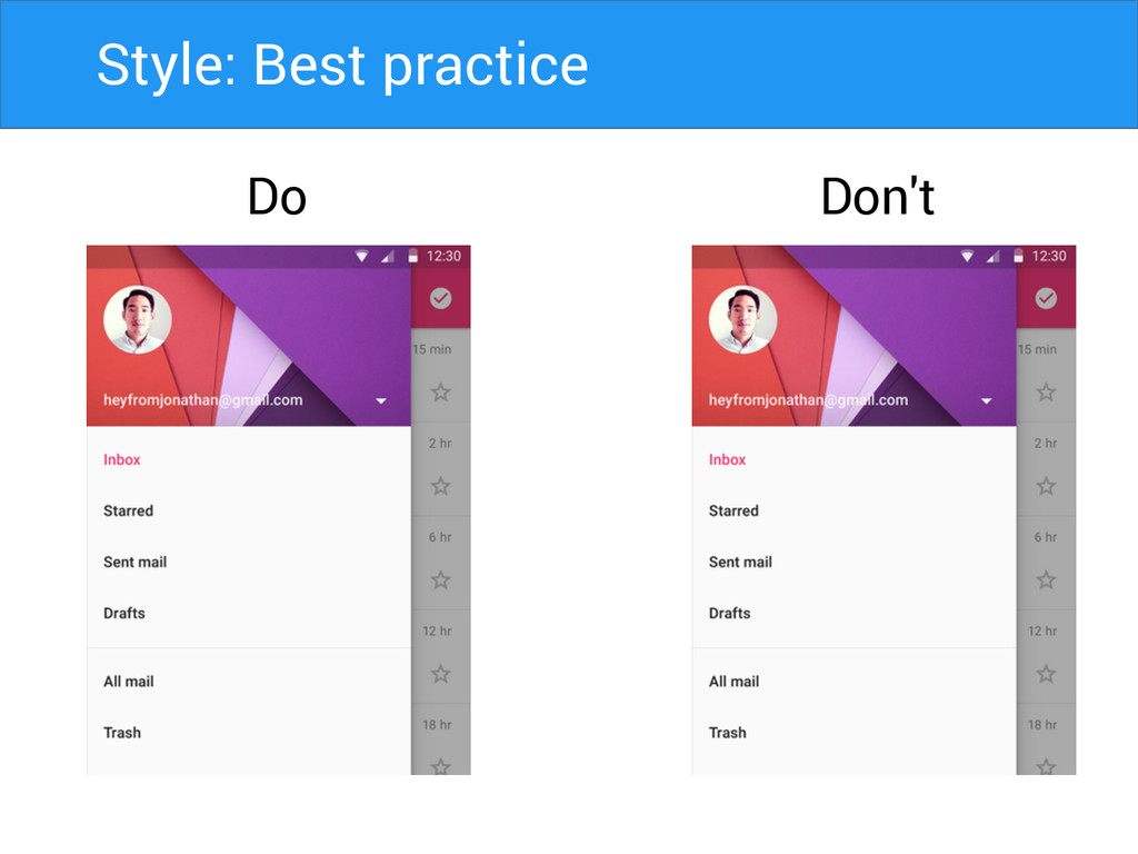
Do Don't Style: Best practice
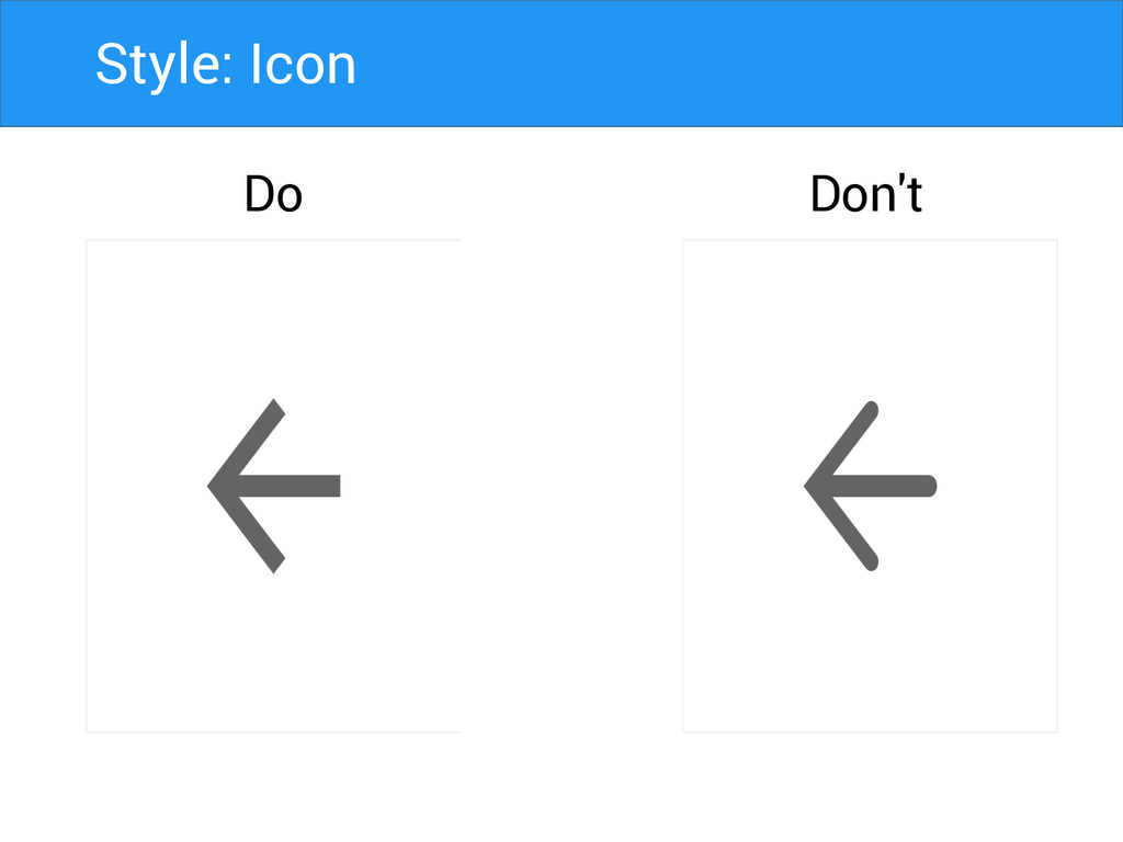
Style: Icon Do Don't
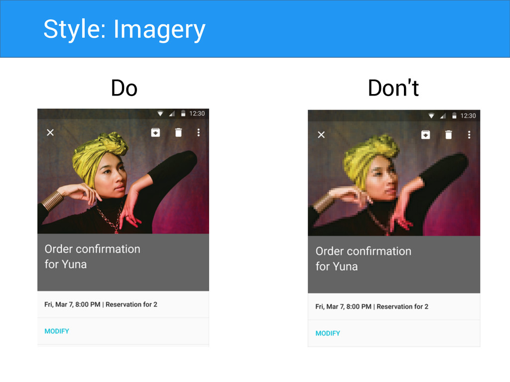
Style: Imagery Do Don't
Style: Best practice Do Don't
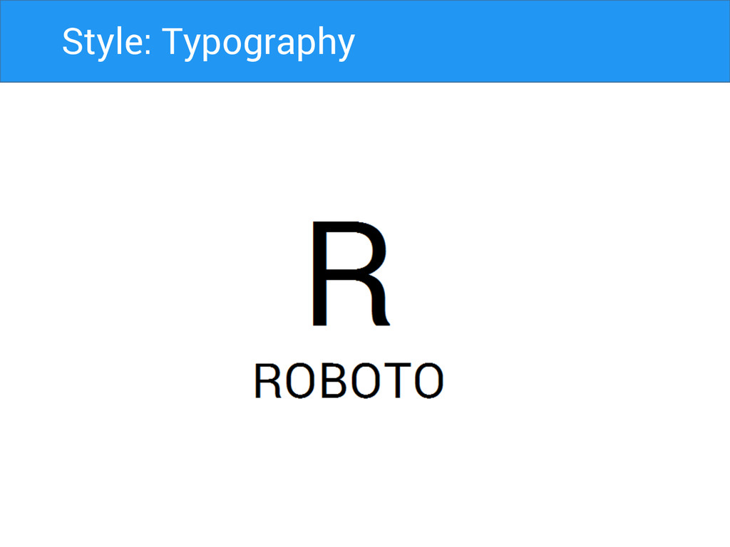
Style: Typography
Style: Typography
Style: Typography
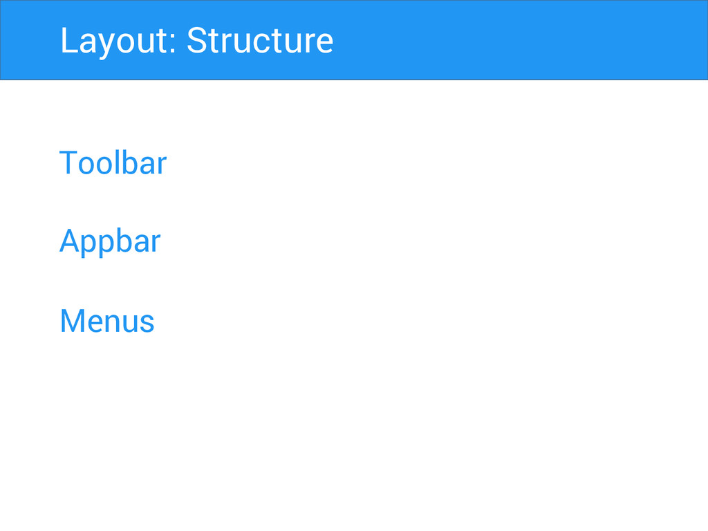
Toolbar Appbar Menus Layout: Structure
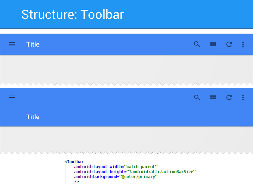
Structure: Toolbar
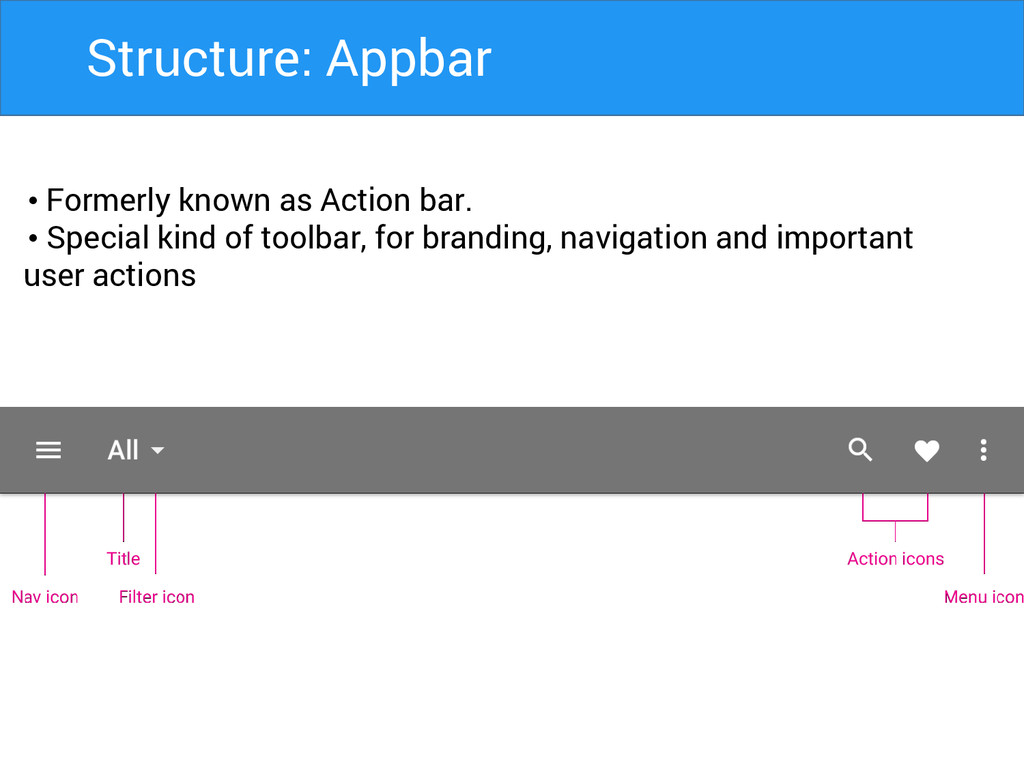
Structure: Appbar • Formerly known as Action bar. • Special
kind of toolbar, for branding, navigation and important user actions
Structure: Appbar Matrics • Mobile Landscape: 48dp • Mobile Portrait:
56dp • Tablet/Desktop: 64dp
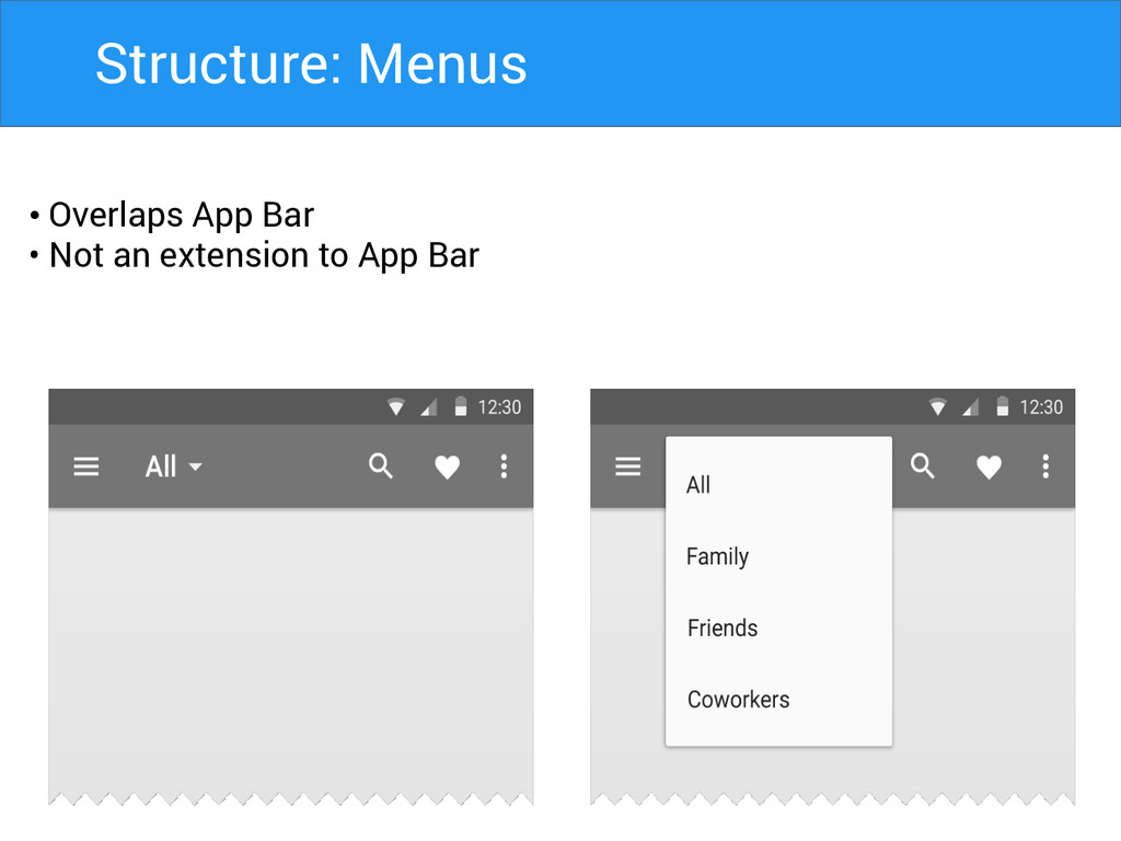
Structure: Menus • Overlaps App Bar • Not an extension
to App Bar
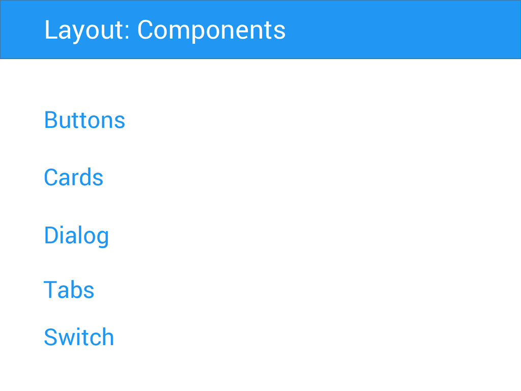
Buttons Cards Dialog Layout: Components Tabs Switch
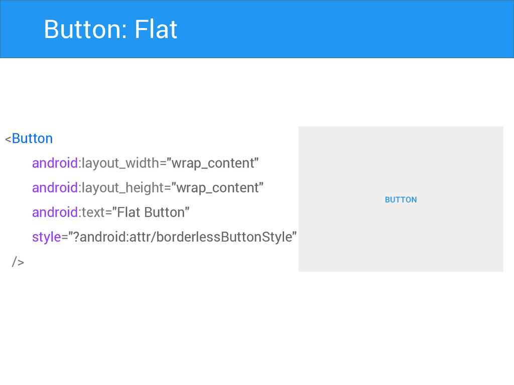
Button: Flat <Button android:layout_width="wrap_content" android:layout_height="wrap_content" android:text="Flat Button" style="?android:attr/borderlessButtonStyle" />
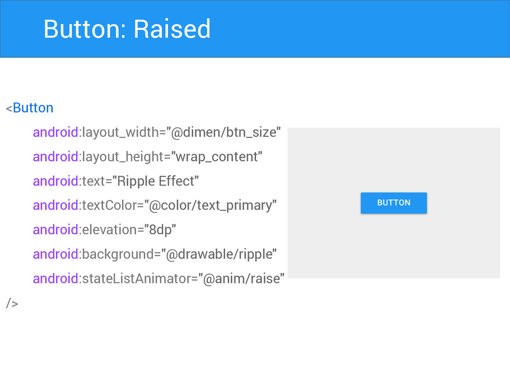
Button: Raised <Button android:layout_width="@dimen/btn_size" android:layout_height="wrap_content" android:text="Ripple Effect" android:textColor="@color/text_primary" android:elevation="8dp" android:background="@drawable/ripple"
android:stateListAnimator="@anim/raise" />
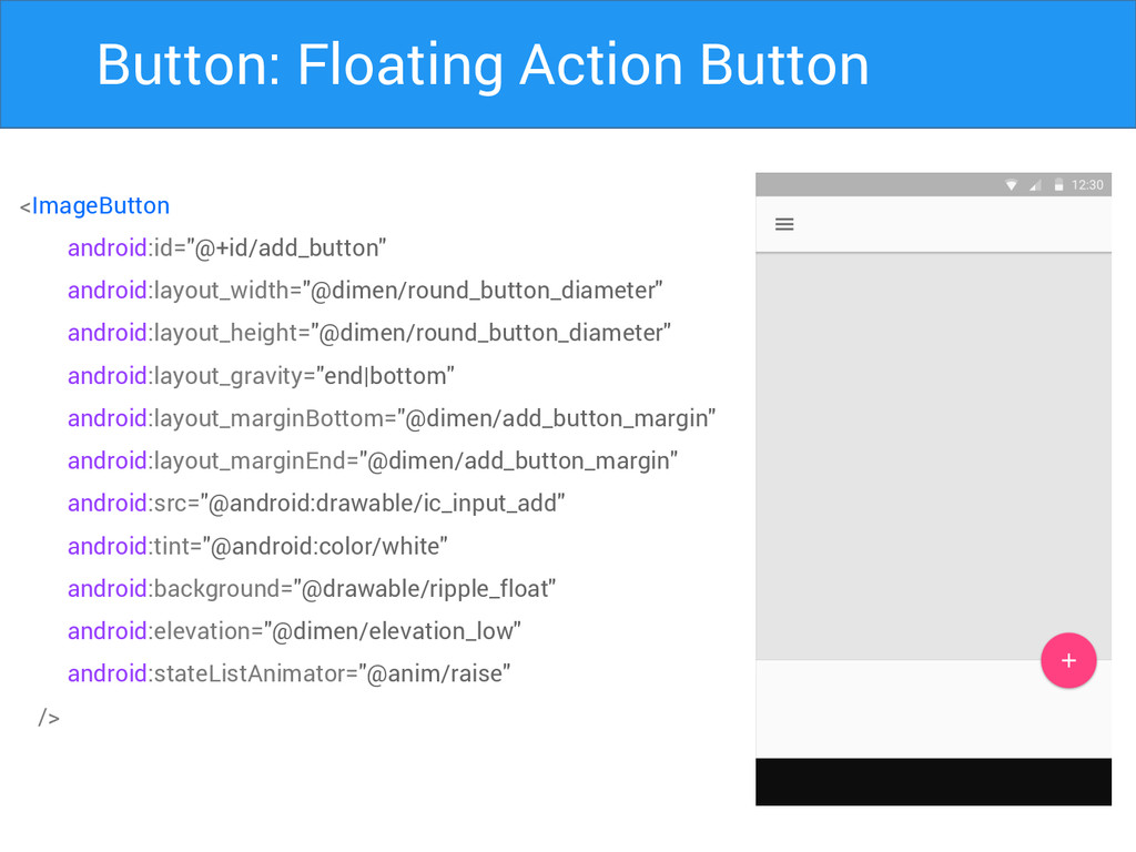
Button: Floating Action Button <ImageButton android:id="@+id/add_button" android:layout_width="@dimen/round_button_diameter" android:layout_height="@dimen/round_button_diameter" android:layout_gravity="end|bottom" android:layout_marginBottom="@dimen/add_button_margin"
android:layout_marginEnd="@dimen/add_button_margin" android:src="@android:drawable/ic_input_add" android:tint="@android:color/white" android:background="@drawable/ripple_float" android:elevation="@dimen/elevation_low" android:stateListAnimator="@anim/raise" />
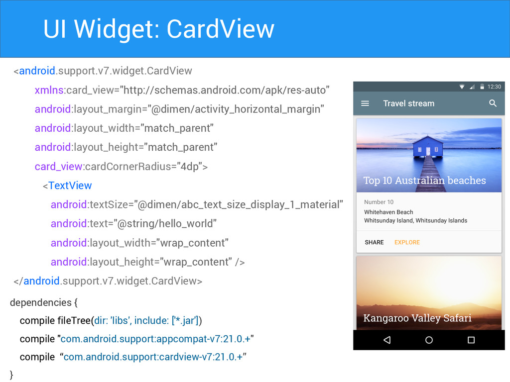
UI Widget: CardView <android.support.v7.widget.CardView xmlns:card_view="http://schemas.android.com/apk/res-auto" android:layout_margin="@dimen/activity_horizontal_margin" android:layout_width="match_parent" android:layout_height="match_parent" card_view:cardCornerRadius="4dp"> <TextView
android:textSize="@dimen/abc_text_size_display_1_material" android:text="@string/hello_world" android:layout_width="wrap_content" android:layout_height="wrap_content" /> </android.support.v7.widget.CardView> dependencies { compile fileTree(dir: 'libs', include: ['*.jar']) compile "com.android.support:appcompat-v7:21.0.+" compile “com.android.support:cardview-v7:21.0.+” }
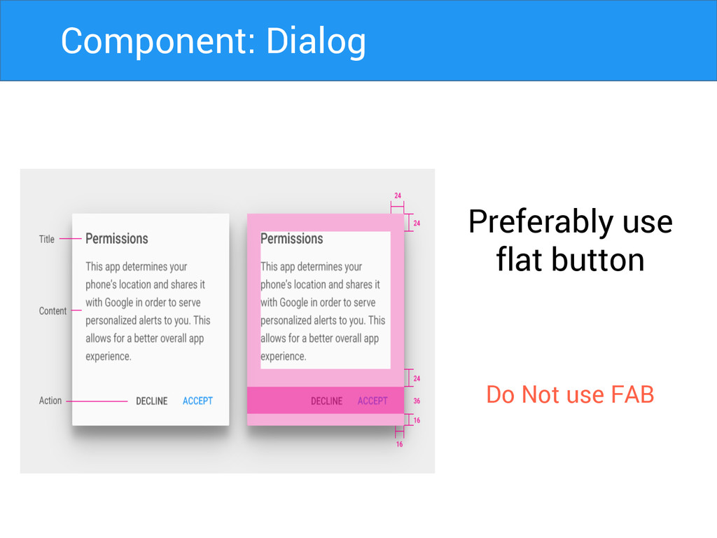
Preferably use flat button Do Not use FAB Component: Dialog
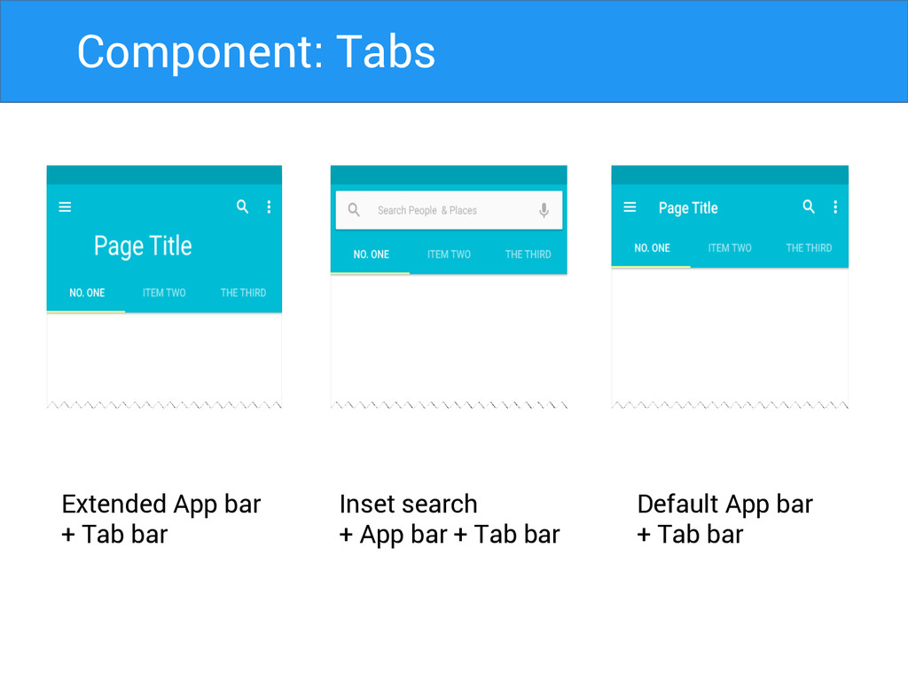
Extended App bar + Tab bar Inset search + App
bar + Tab bar Default App bar + Tab bar Component: Tabs
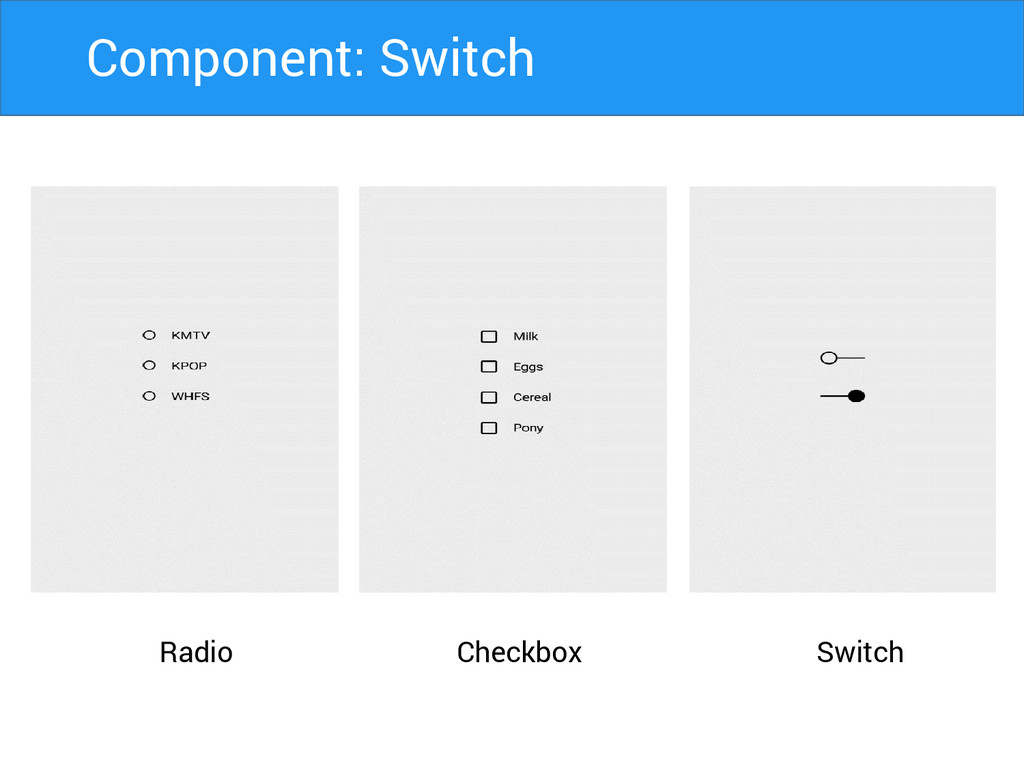
Radio Switch Checkbox Component: Switch
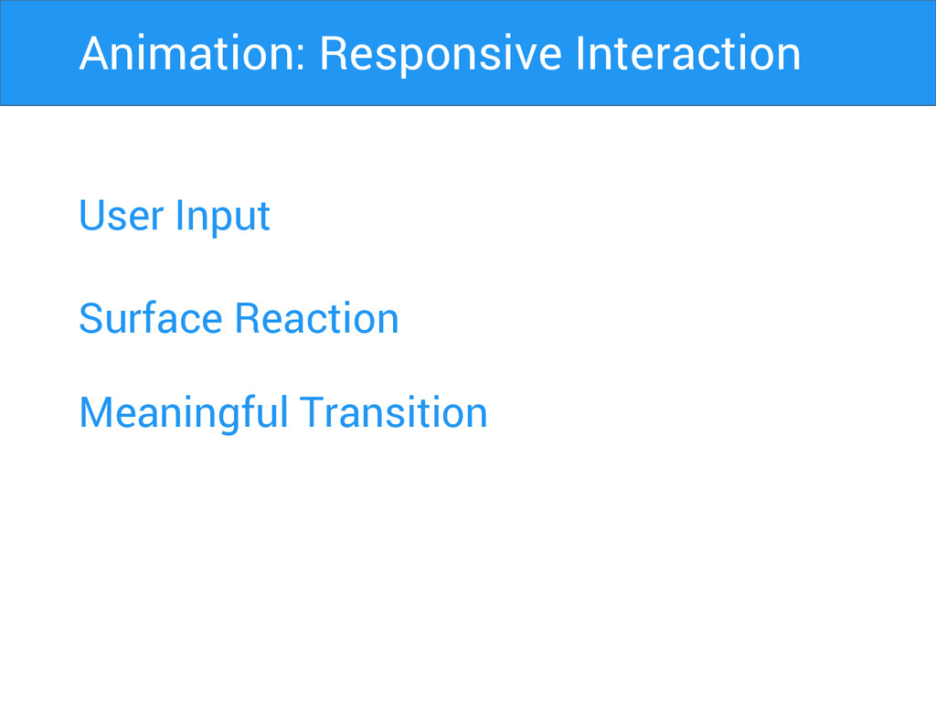
User Input Surface Reaction Animation: Responsive Interaction Meaningful Transition
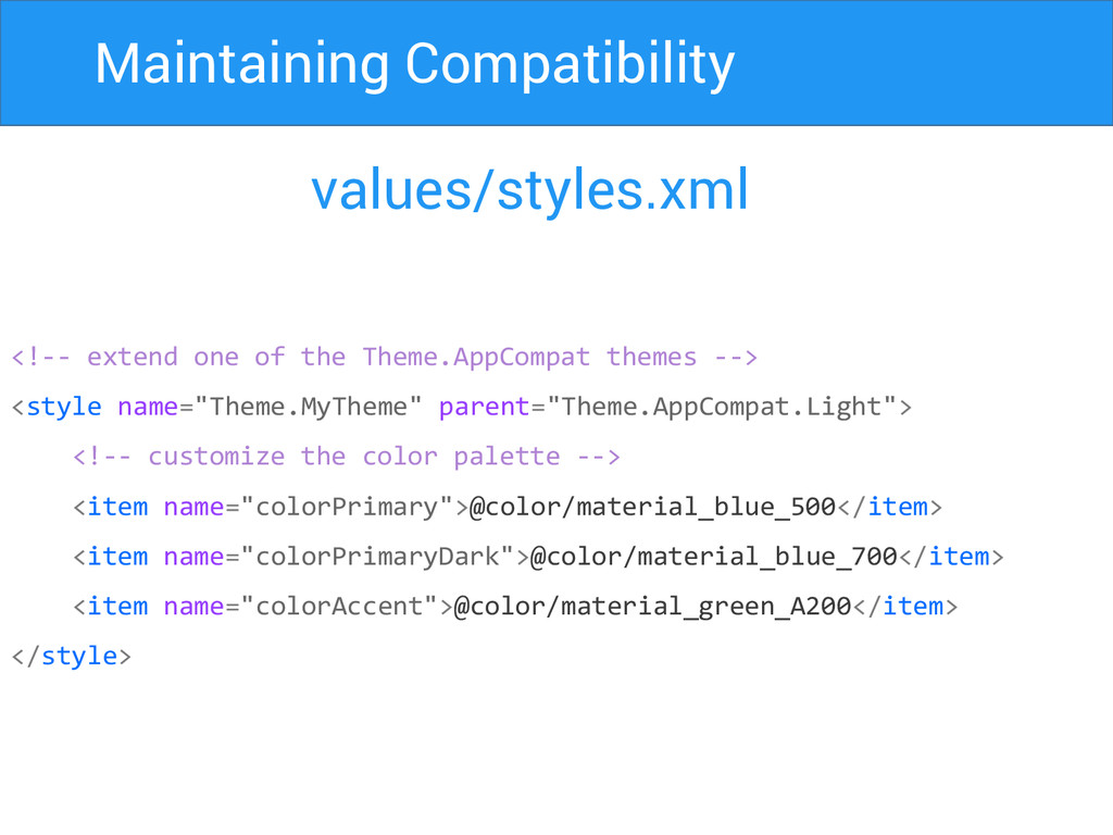
Maintaining Compatibility values/styles.xml <!-- extend one of the Theme.AppCompat themes
--> <style name="Theme.MyTheme" parent="Theme.AppCompat.Light"> <!-- customize the color palette --> <item name="colorPrimary">@color/material_blue_500</item> <item name="colorPrimaryDark">@color/material_blue_700</item> <item name="colorAccent">@color/material_green_A200</item> </style>
Maintaining Compatibility build.gradle dependencies { compile fileTree(dir: 'libs', include: ['*.jar'])
compile "com.android.support:appcompat-v7:21.0.+" compile “com.android.support:cardview-v7:21.0.+” compile “com.android.support:recyclerview-v7:21.0.+” }
Thank You Harsh Dattani @dattaniharsh Google.com/+harshdattani Github.com/harshdattani
 harshdattani
 akatsuki174
 koyaman
 kamechi7222222
 takaikanako
 happy_ferret153
 moco1013
 hicard
 pixyzehn
 akiramotomura
 lw
lw
 shinn
shinn
 takanorip
 destraynor
 sergeychernyshev
 baasie
 aleyda
 kneath
 akashhashmi
 jct
jct
 soudai
 matthewcrist
 bkeepers
 orderedlist
 lauravandoore
![Maintaining Compatibility build.gradle dependencies { compile fileTree(dir: 'libs', include: ['*.jar'])](https://files.speakerdeck.com/presentations/24f26860675101329de64646cf6f404b/slide_35.jpg)