Upgrade to Pro
— share decks privately, control downloads, hide ads and more …
Speaker Deck
Features
Speaker Deck
PRO
Sign in
Sign up for free
Search
Search
Responsive Design - Polopoly GeekNight Blixttal
Search
Henrik Ekelöf
November 23, 2011
Programming
2
410
Responsive Design - Polopoly GeekNight Blixttal
Henrik Ekelöf
November 23, 2011
Tweet
Share
Other Decks in Programming
See All in Programming
AtCoder Conference 2025
shindannin
0
1.1k
カスタマーサクセス業務を変革したヘルススコアの実現と学び
_hummer0724
0
740
Oxlint JS plugins
kazupon
1
1k
余白を設計しフロントエンド開発を 加速させる
tsukuha
7
2.1k
CSC307 Lecture 02
javiergs
PRO
1
780
AgentCoreとHuman in the Loop
har1101
5
250
AI Schema Enrichment for your Oracle AI Database
thatjeffsmith
0
330
コマンドとリード間の連携に対する脅威分析フレームワーク
pandayumi
1
470
Automatic Grammar Agreementと Markdown Extended Attributes について
kishikawakatsumi
0
200
CSC307 Lecture 08
javiergs
PRO
0
670
FOSDEM 2026: STUNMESH-go: Building P2P WireGuard Mesh Without Self-Hosted Infrastructure
tjjh89017
0
180
疑似コードによるプロンプト記述、どのくらい正確に実行される?
kokuyouwind
0
390
Featured
See All Featured
Design in an AI World
tapps
0
150
Darren the Foodie - Storyboard
khoart
PRO
2
2.4k
Building Better People: How to give real-time feedback that sticks.
wjessup
370
20k
The Success of Rails: Ensuring Growth for the Next 100 Years
eileencodes
47
7.9k
Done Done
chrislema
186
16k
Design of three-dimensional binary manipulators for pick-and-place task avoiding obstacles (IECON2024)
konakalab
0
350
SERP Conf. Vienna - Web Accessibility: Optimizing for Inclusivity and SEO
sarafernandez
1
1.3k
Digital Projects Gone Horribly Wrong (And the UX Pros Who Still Save the Day) - Dean Schuster
uxyall
0
400
技術選定の審美眼(2025年版) / Understanding the Spiral of Technologies 2025 edition
twada
PRO
117
110k
GraphQLの誤解/rethinking-graphql
sonatard
74
11k
The Power of CSS Pseudo Elements
geoffreycrofte
80
6.2k
A Guide to Academic Writing Using Generative AI - A Workshop
ks91
PRO
0
210
Transcript
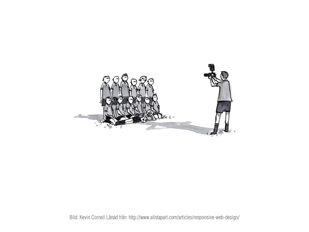
Bild: Kevin Cornell Lånad från: http://www.alistapart.com/articles/responsive-web-design/
Henrik Ekelöf Gränssnittsutvecklare på Valtech
Responsive Design
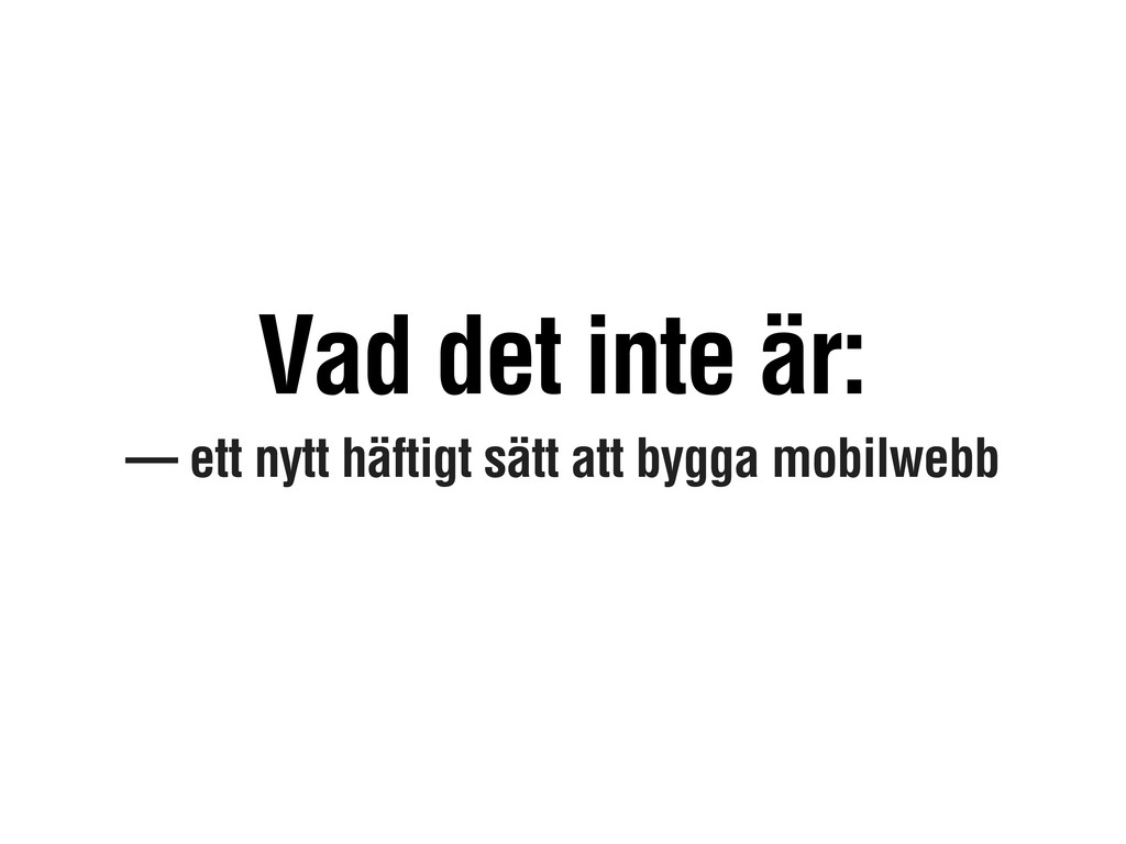
— ett nytt häftigt sätt att bygga mobilwebb Vad det
inte är:
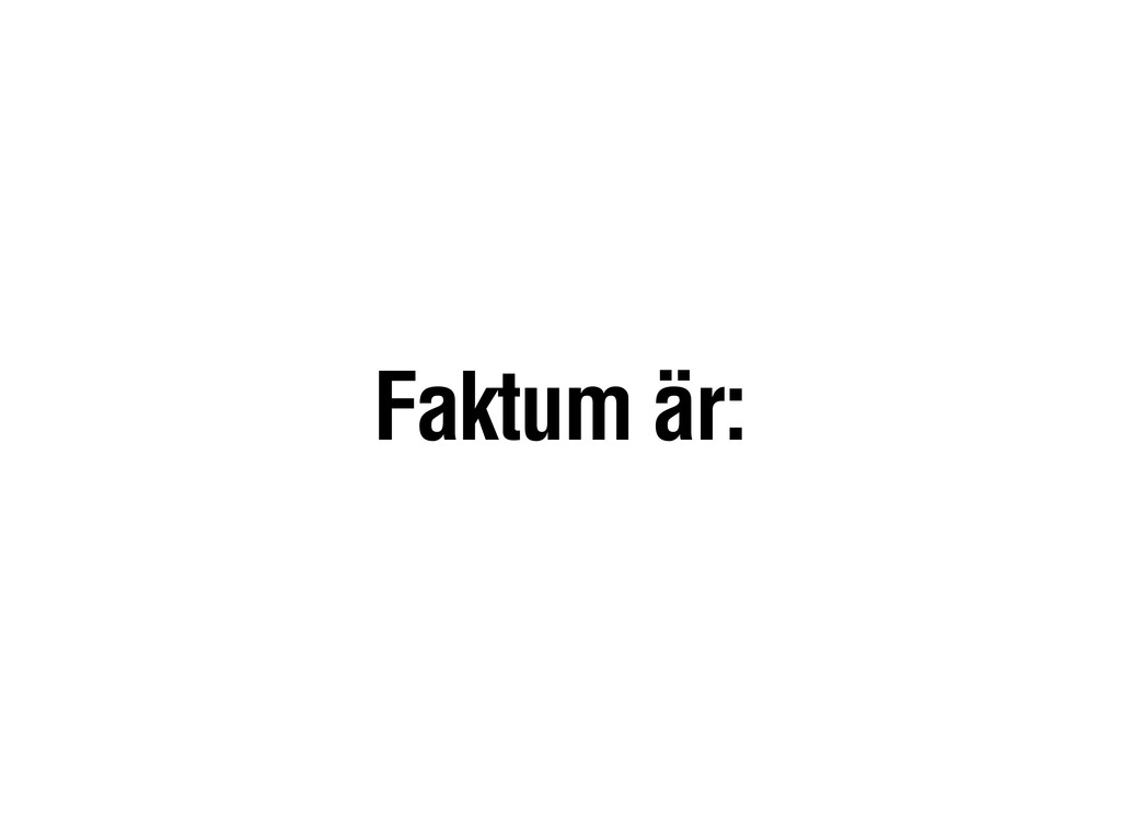
Faktum är:
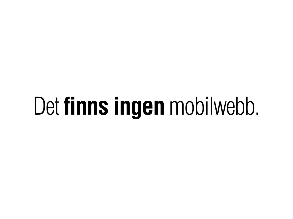
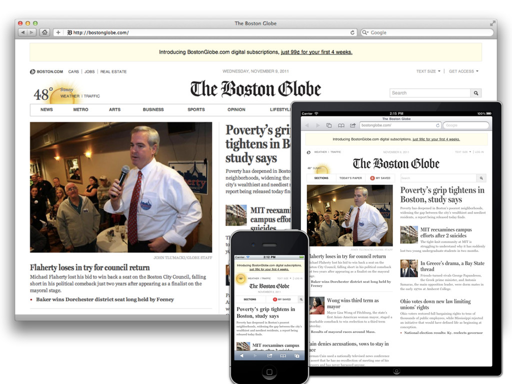
Det finns ingen mobilwebb.
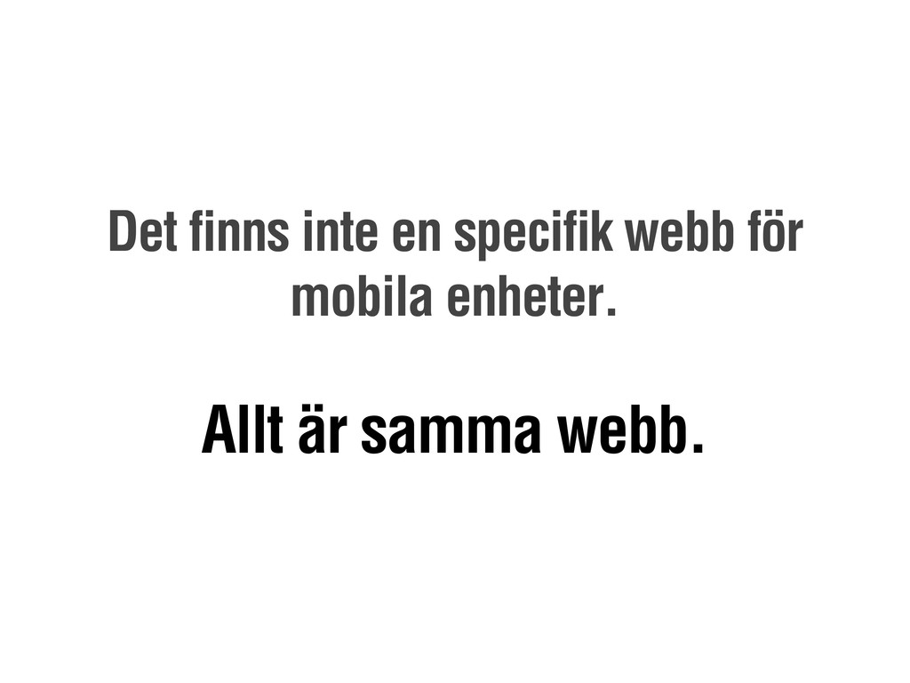
Det finns inte en specifik webb för mobila enheter. Allt
är samma webb.
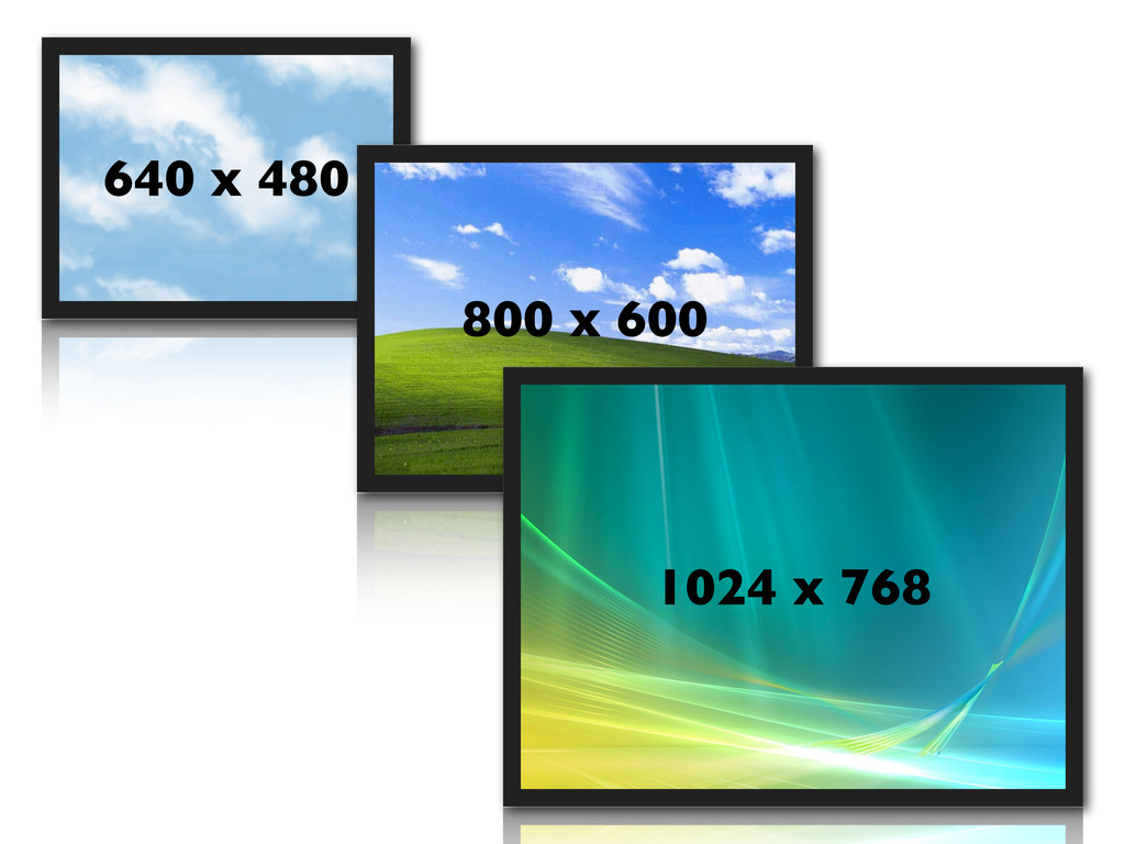
640 x 480 800 x 600 1024 x 768
None
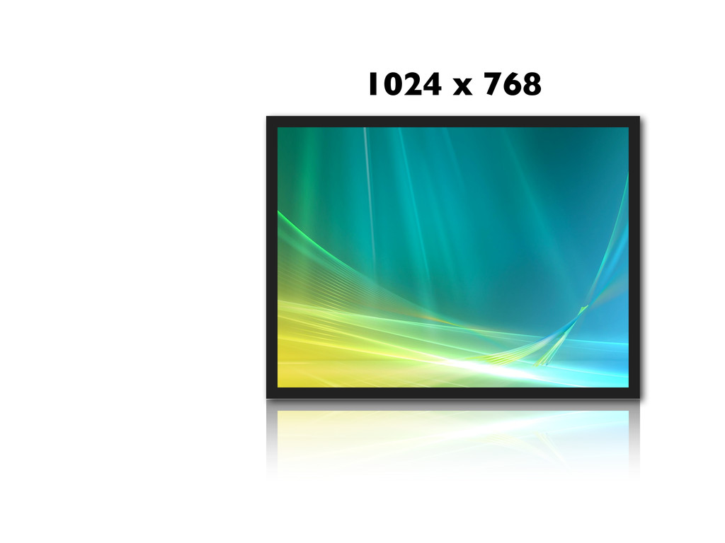
1024 x 768
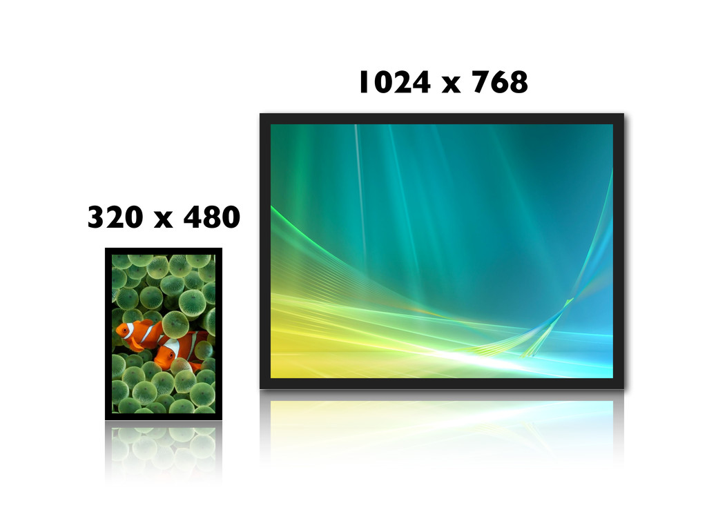
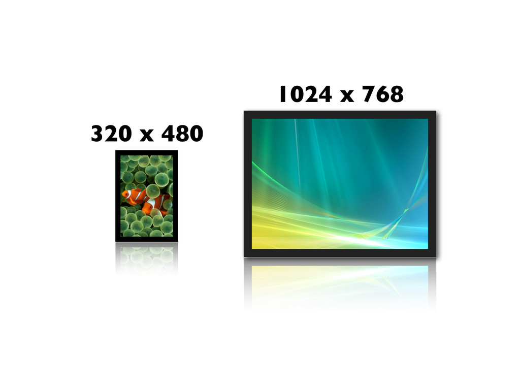
1024 x 768 320 x 480
None
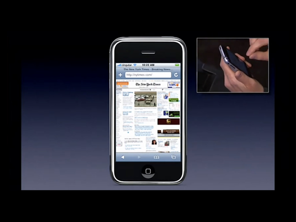
1024 x 768 320 x 480
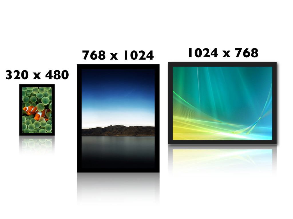
1024 x 768 320 x 480 768 x 1024
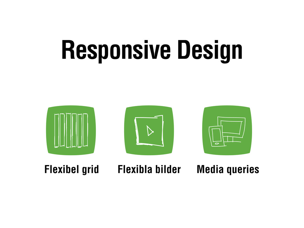
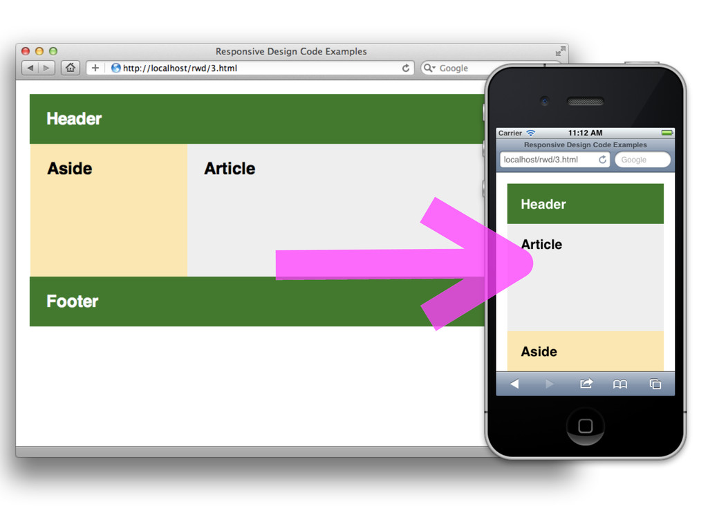
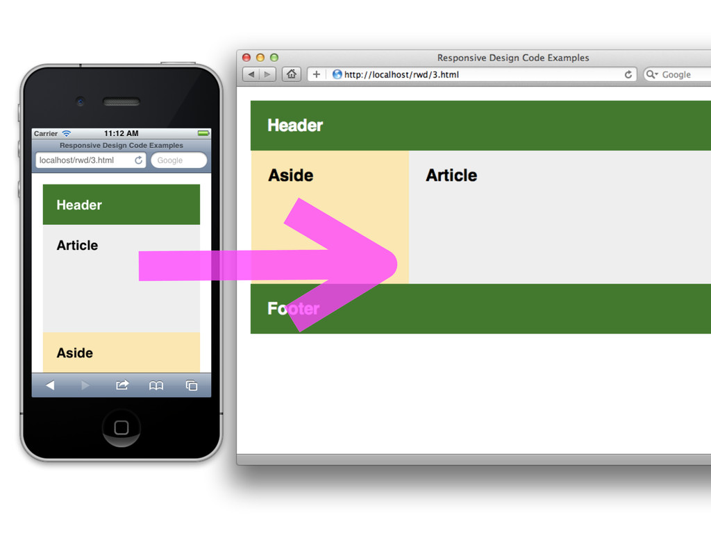
Flexibla bilder Flexibel grid Media queries Responsive Design
None
None
/* Här ovanför finns grundstyle - färger, fonter etc */
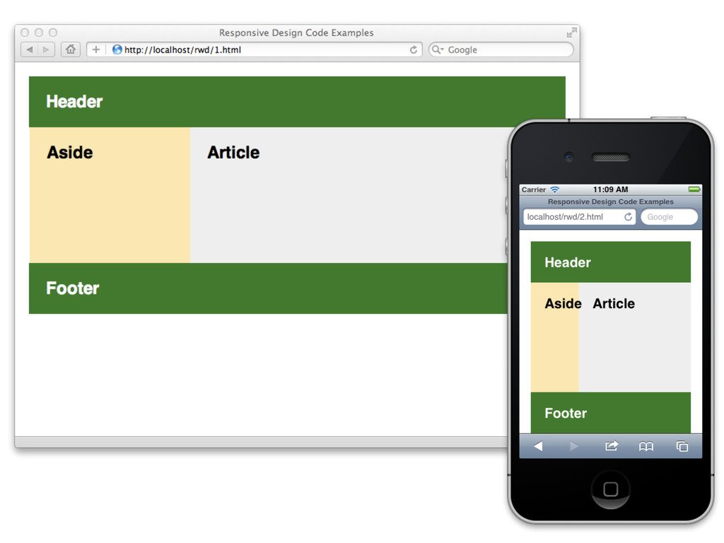
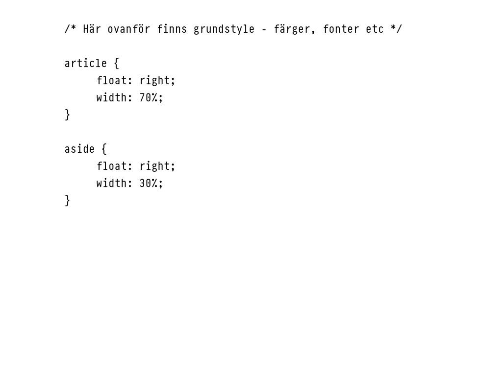
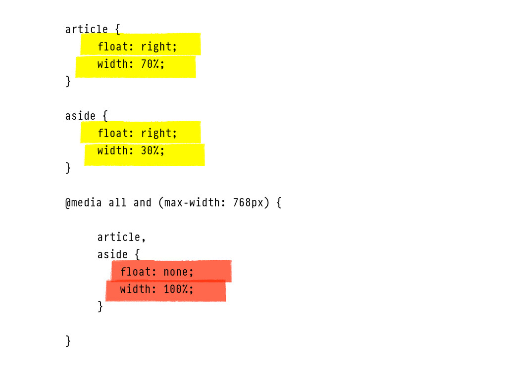
article { float: right; width: 70%; } aside { float: right; width: 30%; }
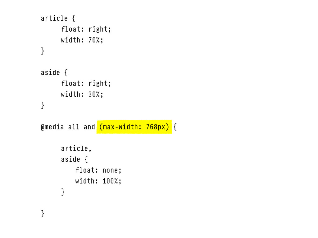
article { float: right; width: 70%; } aside { float:
right; width: 30%; } @media all and (max-width: 768px) { article, aside { float: none; width: 100%; } }
None
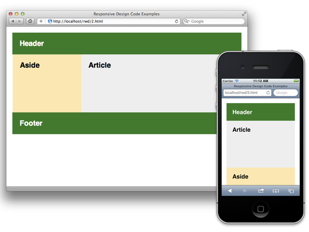
article { float: right; width: 70%; } aside { float:
right; width: 30%; } @media all and (max-width: 768px) { article, aside { float: none; width: 100%; } }
None
None
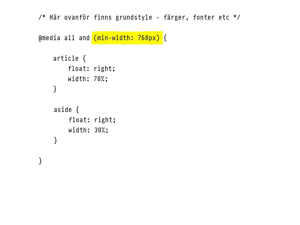
/* Här ovanför finns grundstyle - färger, fonter etc */
@media all and (min-width: 768px) { article { float: right; width: 70%; } aside { float: right; width: 30%; } }
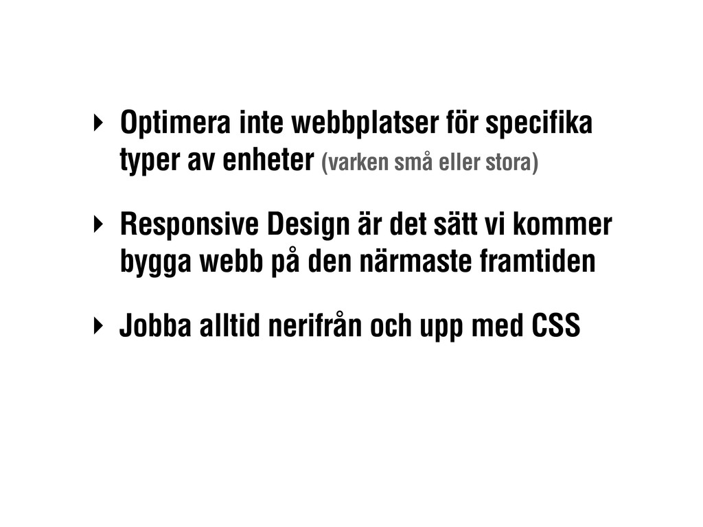
‣ Optimera inte webbplatser för specifika typer av enheter (varken
små eller stora) ‣ Responsive Design är det sätt vi kommer bygga webb på den närmaste framtiden ‣ Jobba alltid nerifrån och upp med CSS
Tack! Henrik Ekelöf, Valtech @henrikekelof
 shindannin
 _hummer0724
 kazupon
 tsukuha
 javiergs
 har1101
 thatjeffsmith
 pandayumi
 kishikawakatsumi
 tjjh89017
 kokuyouwind
 tapps
tapps
 khoart
 wjessup
 eileencodes
 chrislema
 konakalab
 sarafernandez
 uxyall
 twada
twada
 sonatard
 geoffreycrofte
 ks91
ks91