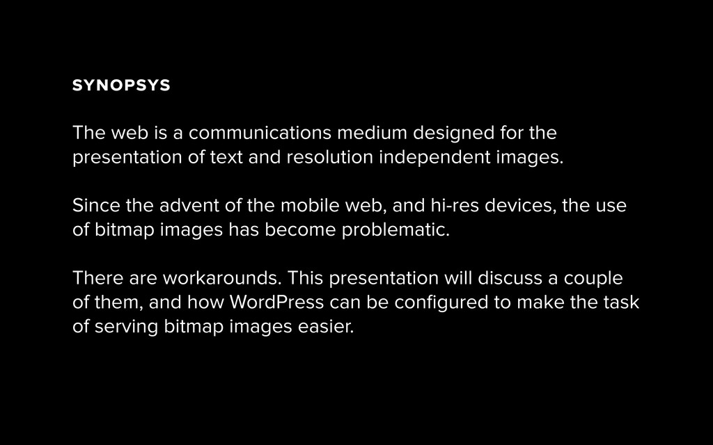
A brief presentation on options for using WordPress to produce images suitable for different screen sizes and resolutions, delivered at the Edinburgh WordPress Meetup on Wednesday 17 September.
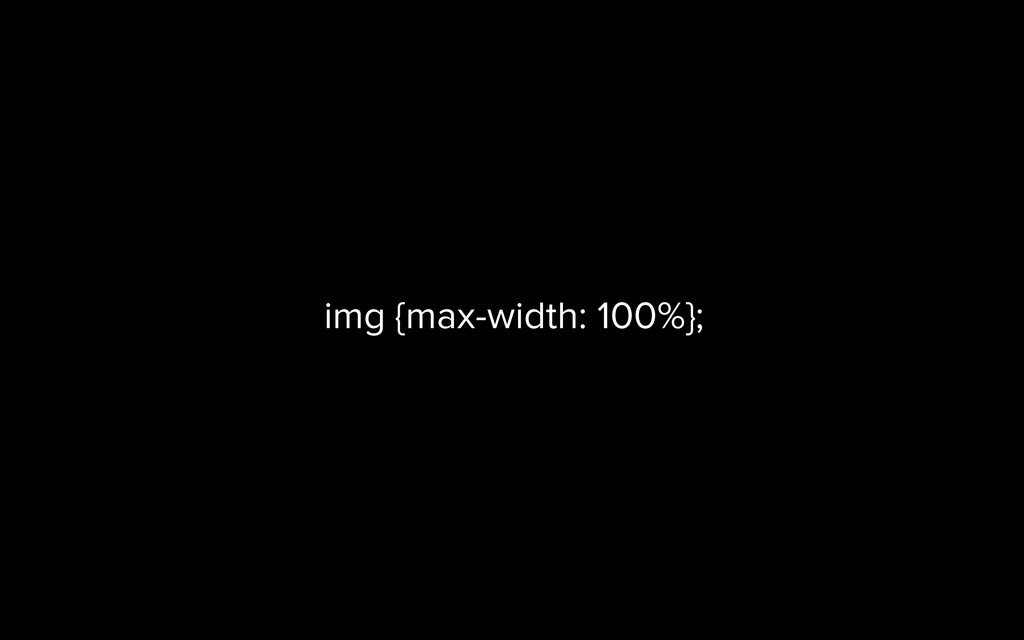
the presentation of text and resolution independent images. ! Since the advent of the mobile web, and hi-res devices, the use of bitmap images has become problematic. There are workarounds. This presentation will discuss a couple of them, and how WordPress can be configured to make the task of serving bitmap images easier.
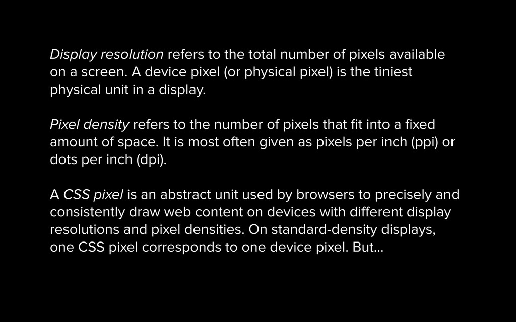
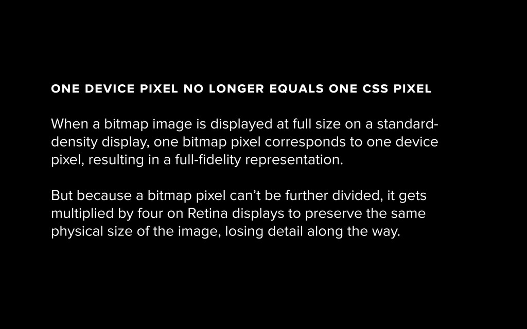
on a screen. A device pixel (or physical pixel) is the tiniest physical unit in a display. ! Pixel density refers to the number of pixels that fit into a fixed amount of space. It is most often given as pixels per inch (ppi) or dots per inch (dpi). ! A CSS pixel is an abstract unit used by browsers to precisely and consistently draw web content on devices with different display resolutions and pixel densities. On standard-density displays, one CSS pixel corresponds to one device pixel. But...
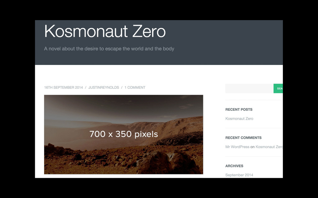
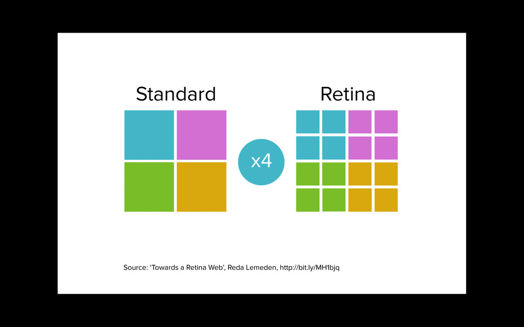
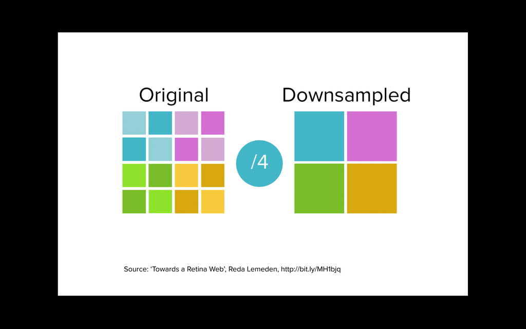
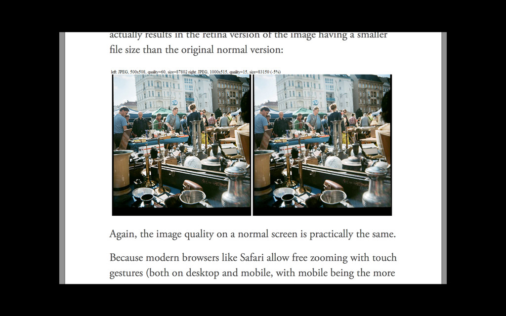
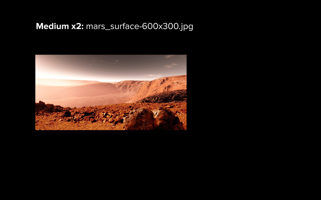
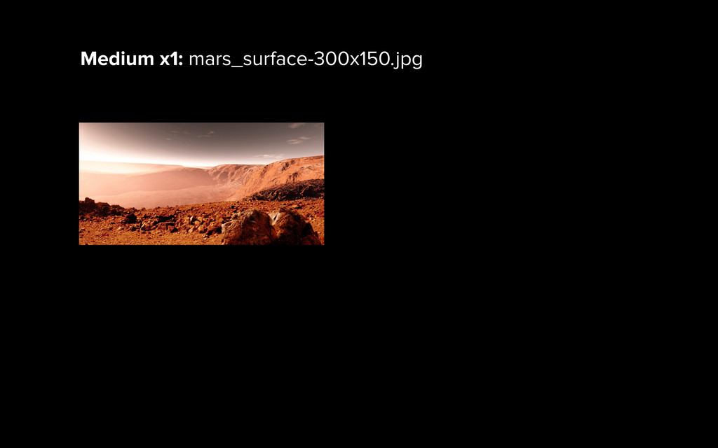
When a bitmap image is displayed at full size on a standard- density display, one bitmap pixel corresponds to one device pixel, resulting in a full-fidelity representation. ! But because a bitmap pixel can’t be further divided, it gets multiplied by four on Retina displays to preserve the same physical size of the image, losing detail along the way.
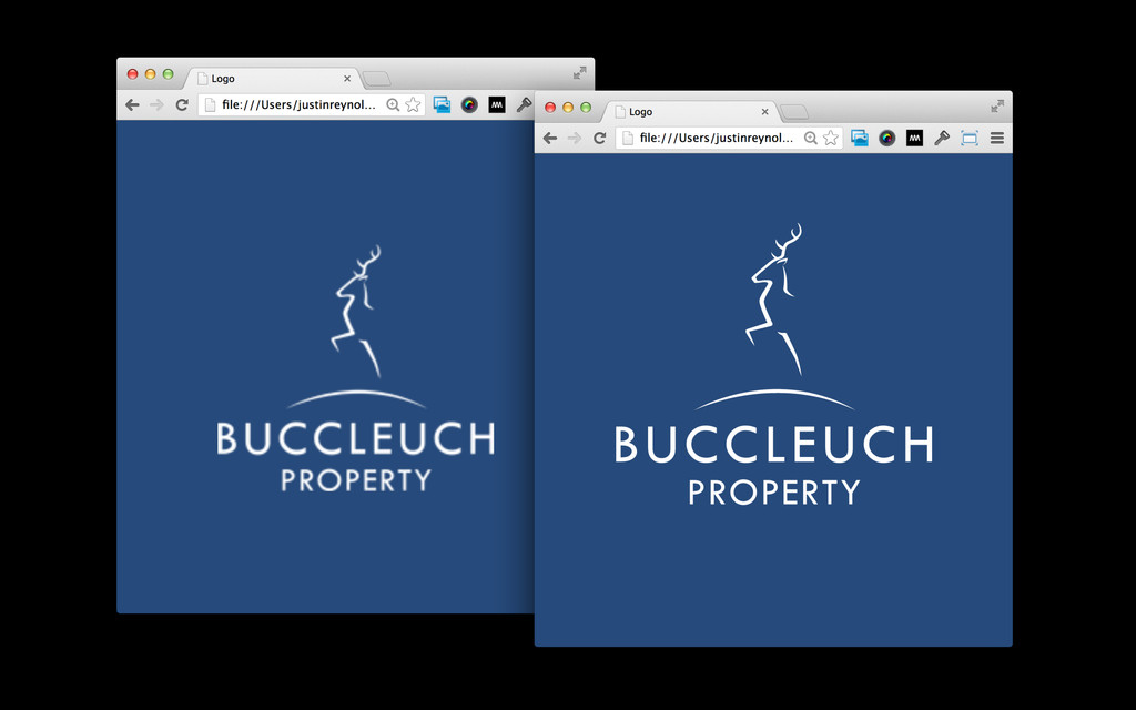
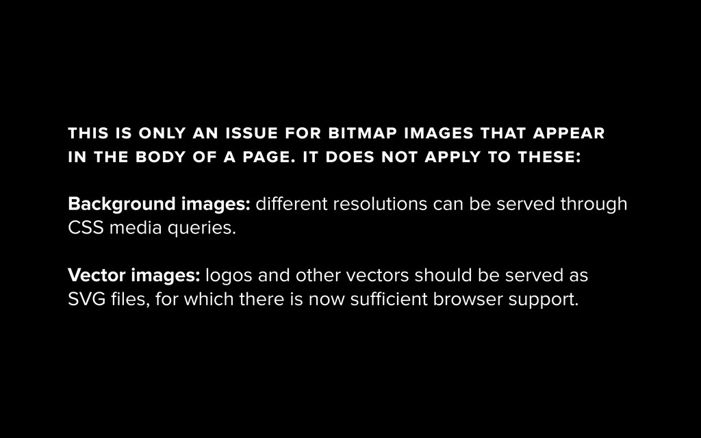
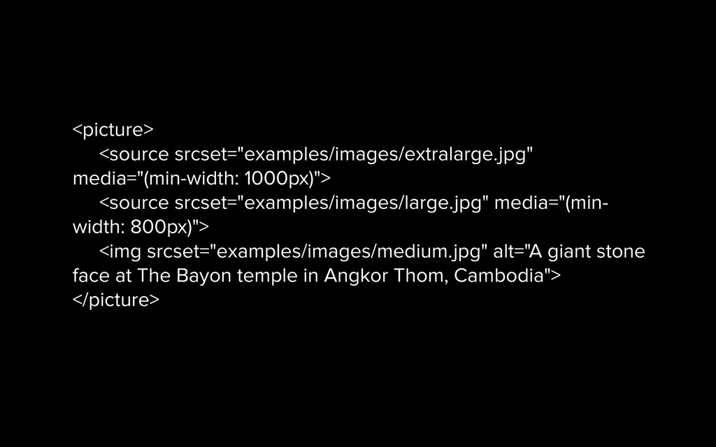
in the body of a page. it does not apply to these: ! Background images: different resolutions can be served through CSS media queries. ! Vector images: logos and other vectors should be served as SVG files, for which there is now sufficient browser support.
 justinreynolds
 hypebeans
 lynteo
 ncdc
ncdc
 saki822
 videlvequio
 chorkaichan
 tsubura
 karad
karad
 hjmkth
 securecat
.jpg) rwang05
rwang05
 mottox2
 trishagee
 inesmontani
 eileencodes
 hannesfritz
 rkaga
rkaga
 morganepeng
 sferik
 bluesmoon
 rkendrick25
 addyosmani
 tammyeverts