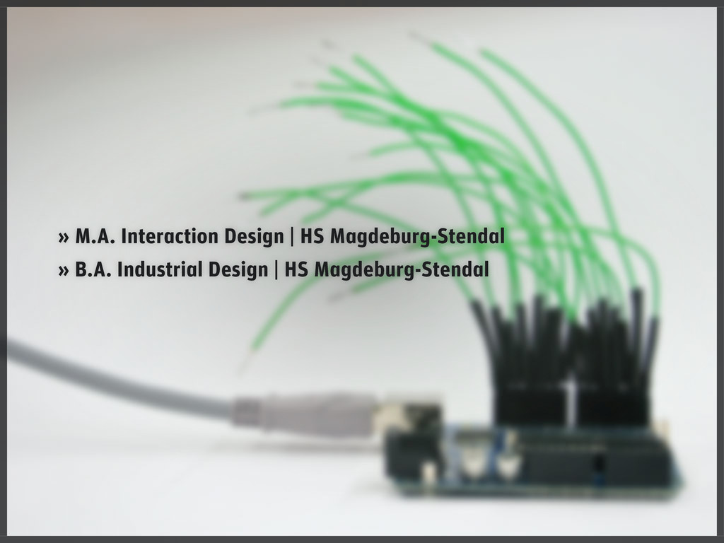
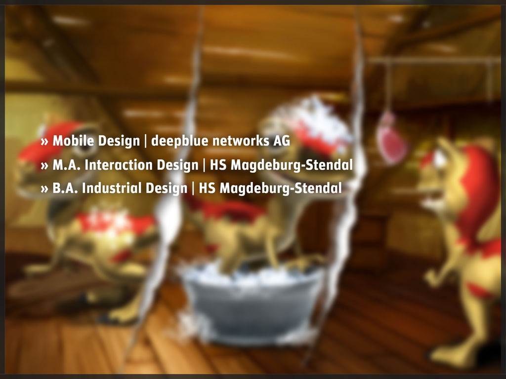
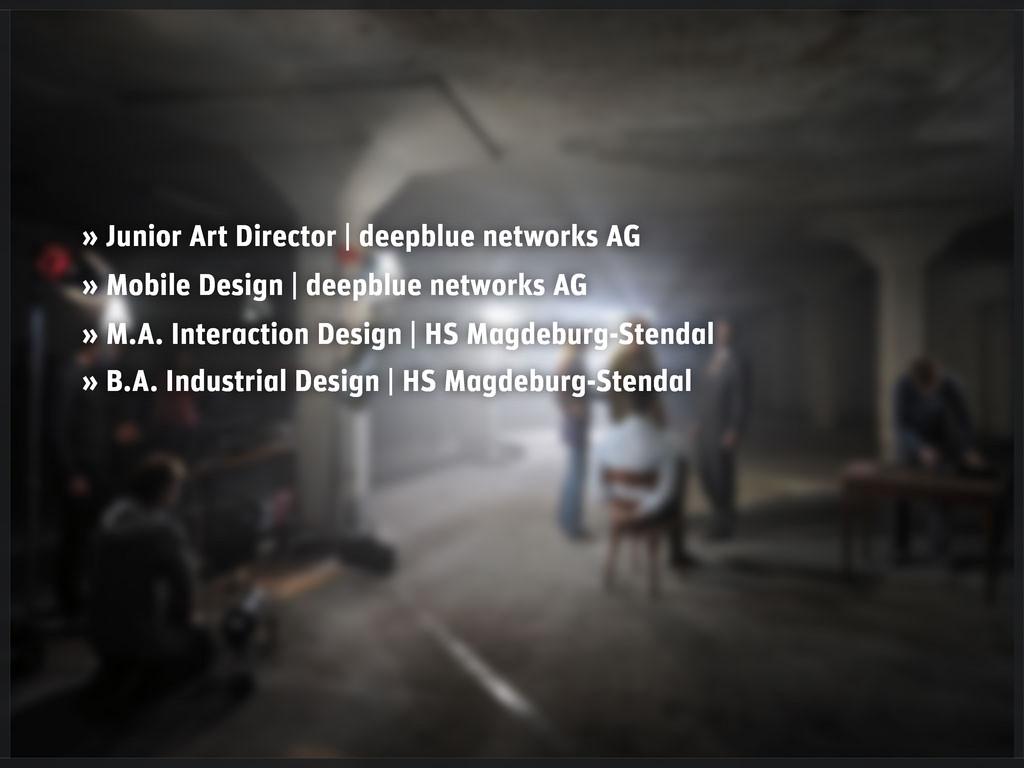
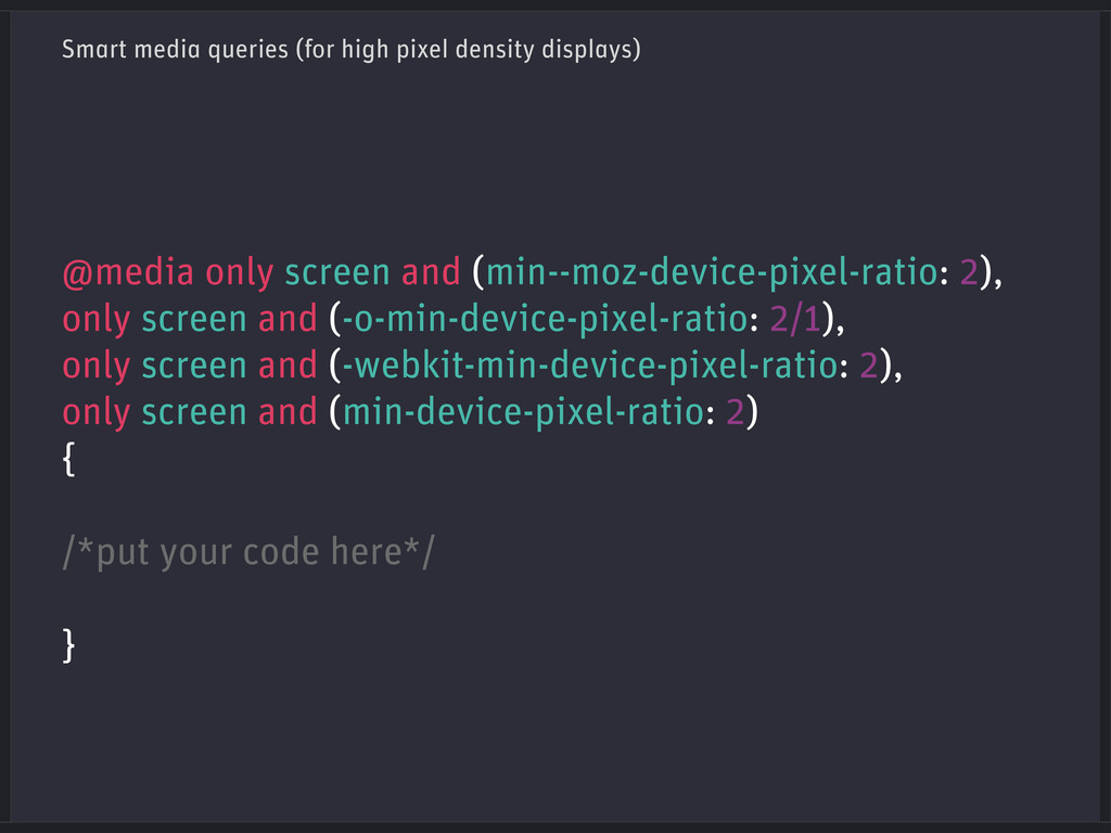
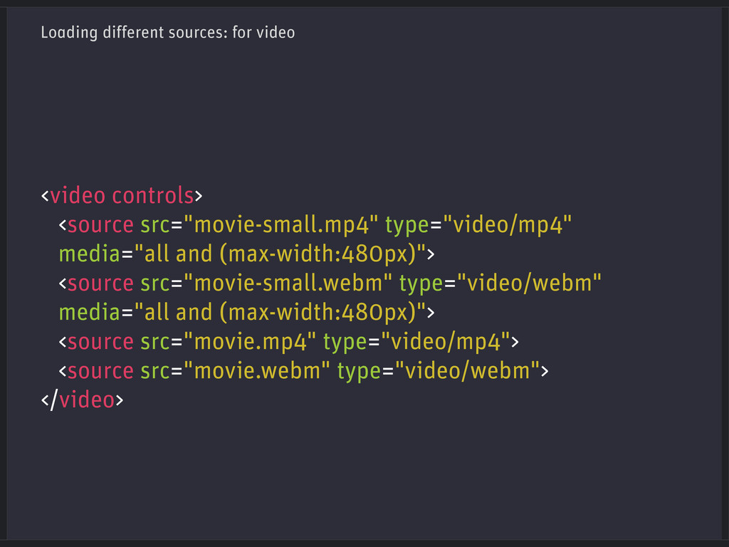
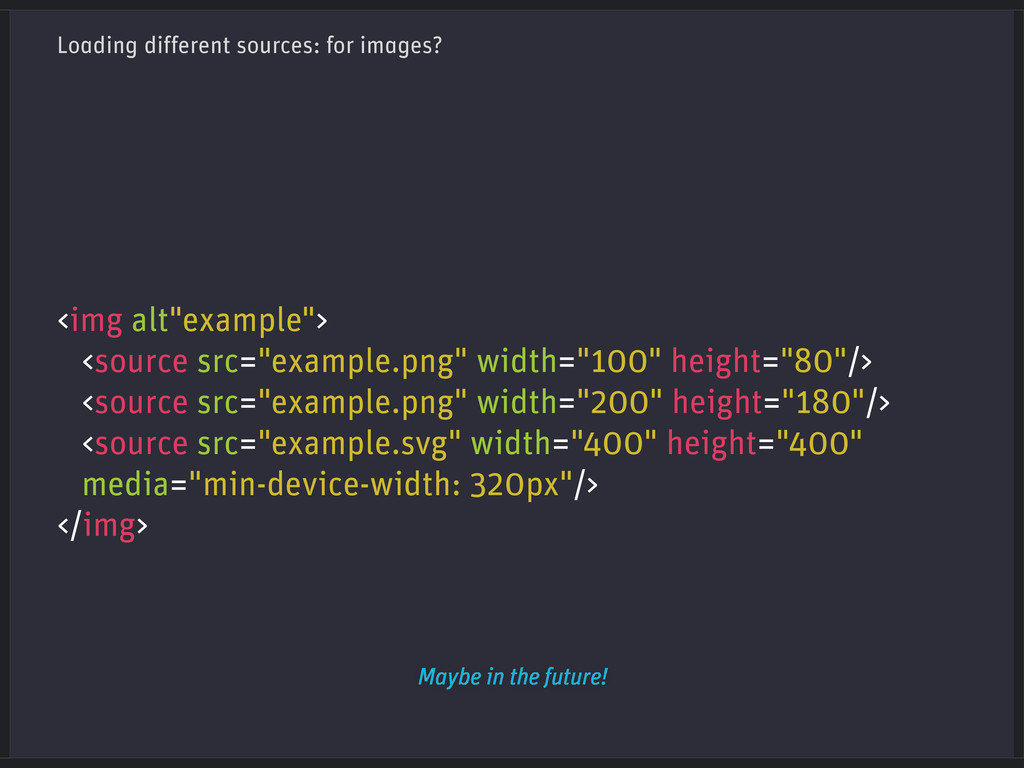
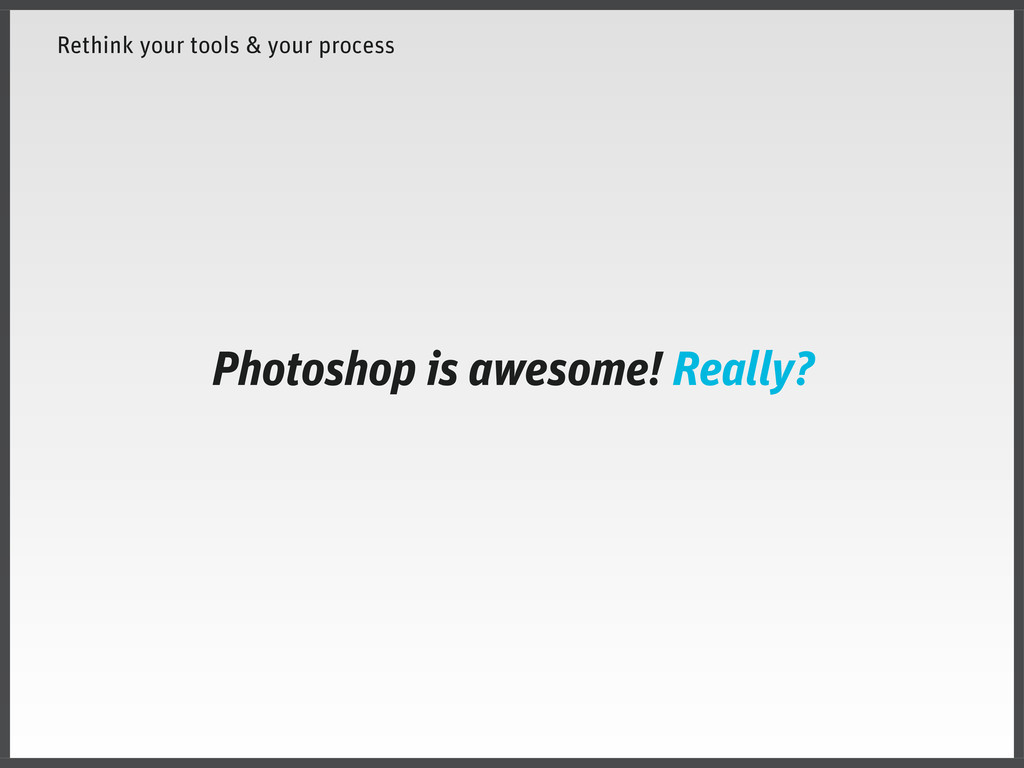
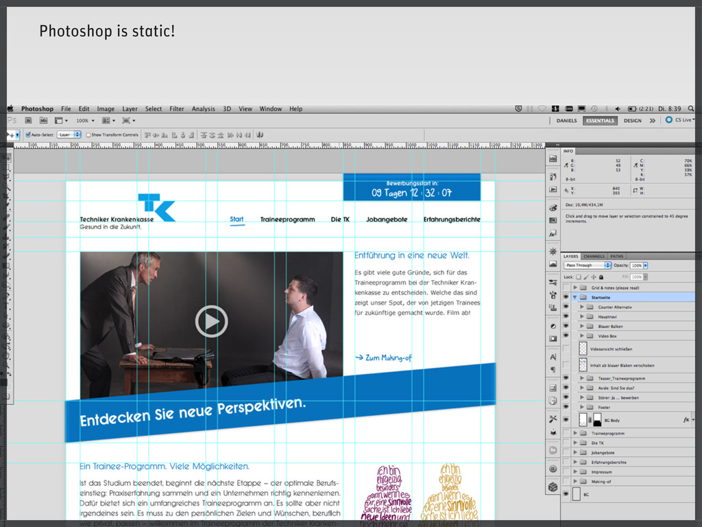
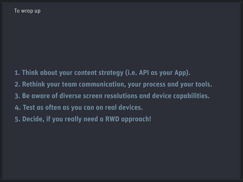
This presentation is a little introduction to Responsive Web Design. The slides dive into some basic aspects and contains some approaches, tools and techniques to start with this topic.
Originally this slides have been prepared for my talk in the Visual Interface Class at FH Potsdam on 2012/11/20.
 kraenzmann
 lynteo
 happy_ferret153
 sevendex
 nbkouhou
 littlebusters
 csswizardry
 shoko_seven11
 atsushihomma
 connecre
 calpin
 hilokifigma
 sony
sony
 akosma
 vanstee
 eileencodes
 marktimemedia
 konakalab
 greggifford
 skipperchong
 kimpetersen
 erikaheidi
 kristinabergwall1
 akashhashmi
 aleyda
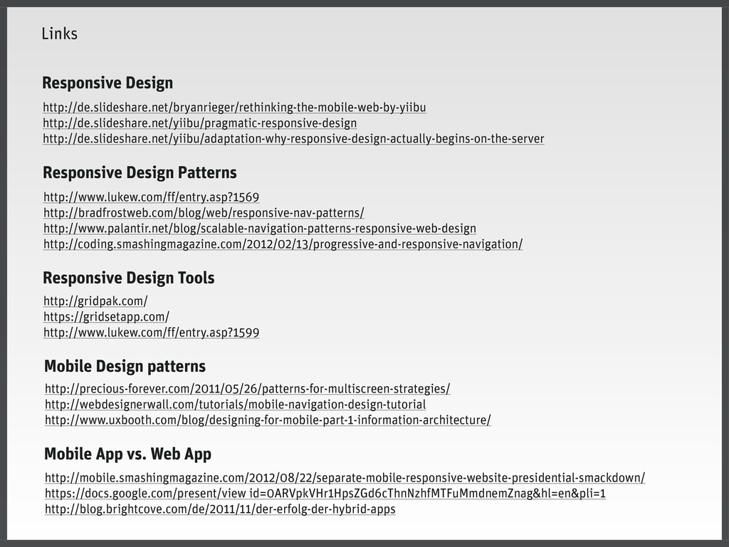
![user_timeline.json Array ( [0] => Array ( [created_at] => Fri](https://files.speakerdeck.com/presentations/a0fd42901a920130ab9412313d2a40b3/slide_72.jpg)