Upgrade to Pro — share decks privately, control downloads, hide ads and more …

Responsive Web Design in Magento (Meet Magento Poland 2013)

Meanbee
November 05, 2013

Responsive Web Design in Magento (Meet Magento Poland 2013)

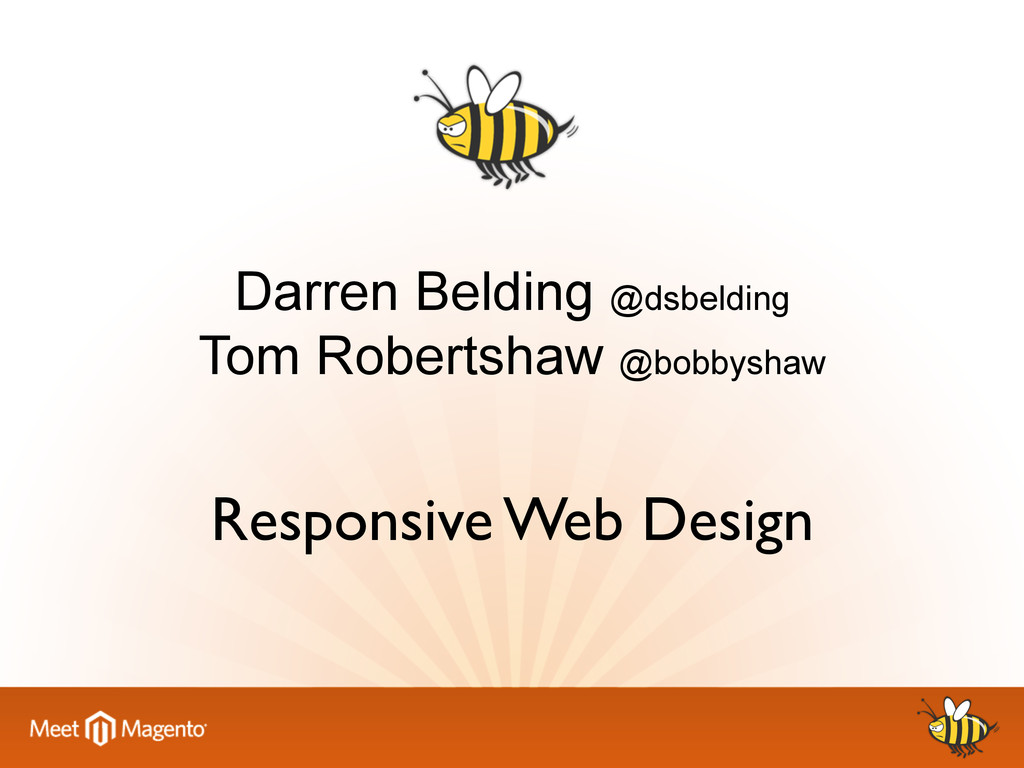
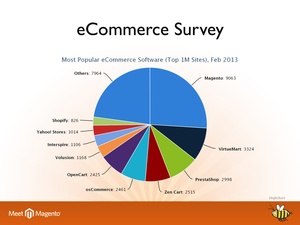
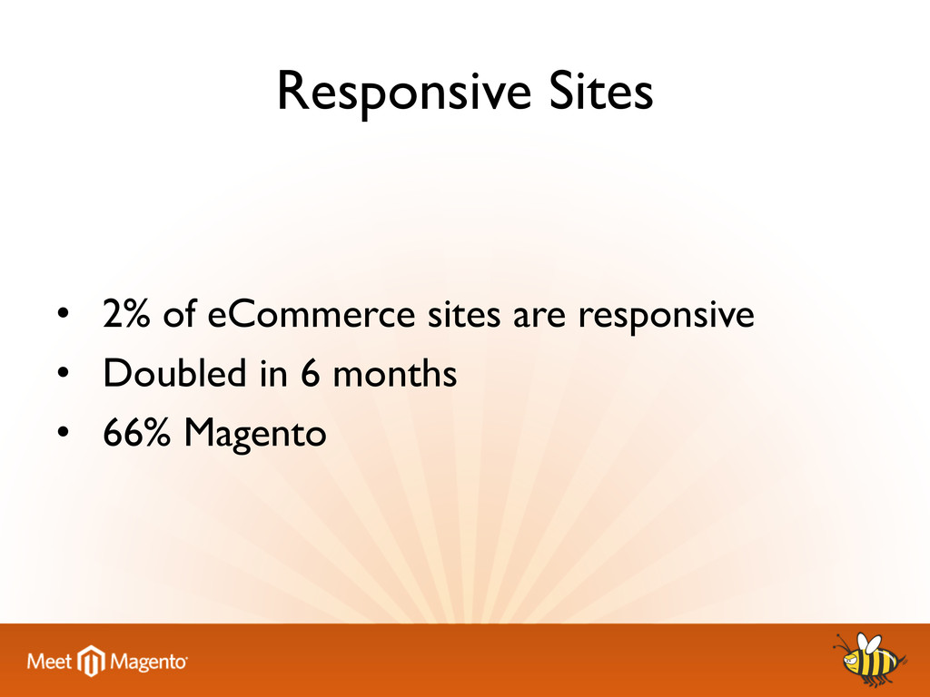
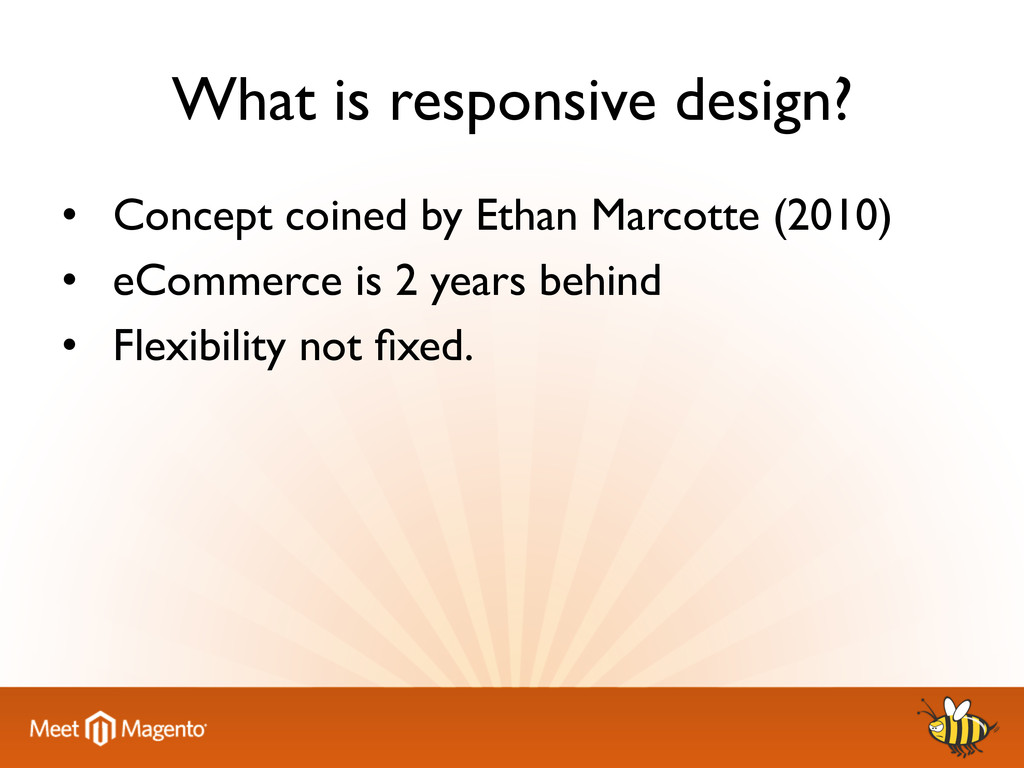
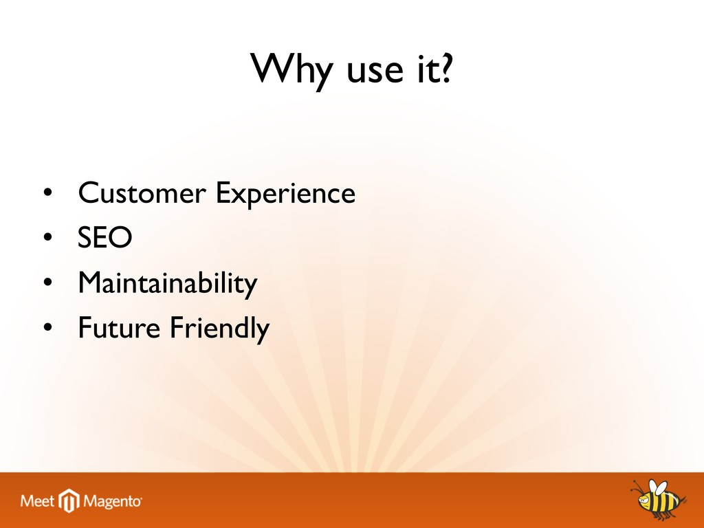
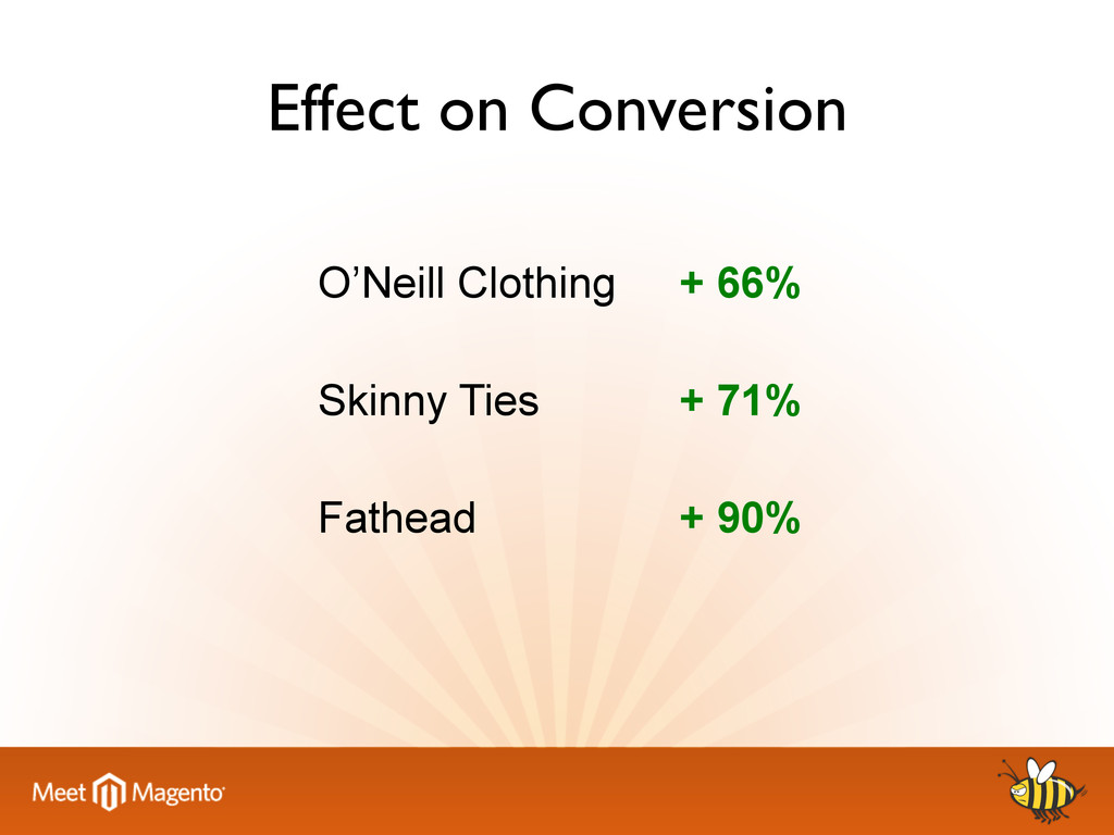
We talk about how the responsive design concept has changed our mentality for approaching the multi-device web. We share our knowledge and experiences of implementing this concept in Magento, covering the shift in developer thinking, implementation examples and solutions to common ecommerce problems.

Presented by Darren Belding and Tom Robertshaw

Meanbee

November 05, 2013
Tweet

More Decks by Meanbee

Other Decks in Design

Transcript

  1. What is responsive design? •  Concept coined by Ethan Marcotte

    (2010) •  eCommerce is 2 years behind •  Flexibility not fixed.
  2. Mobile-first or Desktop-first •  Desktop-first – Legacy systems •  Mobile First

    – Mobile optimised (load only what device needs) – But IE
  3. Legacy Browsers •  Consider ROI •  Many tools available: – respond.js

    (media query polyfill) – selectivizr (css3 selector polyfill) – html5shiv (html5 element enabling script)
  4. Design Patterns •  Make disciplined decisions •  Document Flow • 

    Consider navigation across devices •  Restrict interactions to the viewport
  5. Accessibility •  Accessibility is the foundation of a great design

    experience •  Mouse, keyboard, touch •  Bandwidth •  Web Content Accessibility Guidelines
  6. Fluid Grids •  Semantic versus Non-semantic •  CSS Pre-processors (LESS,

    SASS, Stylus) •  Retain upgradability of Magento
  7. Enhancements •  modernizr (feature detection) •  Gesture Control – Ensure JS

    and UI support it •  E.g. carousels – Add your own
  8. Responsive Video •  HTML 5 video !! !height: auto !important;

    ! !width: 100% !important;! •  For everything else there’s Fitvids.js
  9. Fluid •  Nice and easy ! ! ! !height: auto

    !important; ! ! ! !max-width: 100%;!
  10. Adaptive Size & Resolution •  Device size detection •  Resize

    images before delivery •  Reduce bandwidth, reduce page load time.
  11. Adaptive Images •  Large image is 1509 x 906 (80KB)

    •  Small image is 480 x 288 (12KB) •  85% reduction in size
  12. RESS •  Optimization at the component level to increase performance

    •  82 of top 100 Alexa site deliver different content based on user agent. •  Necessary evil to change device experience
  13. Go Forth •  Start now •  A lot of documentation

    and tools available •  You and your clients cannot afford not to.
  14. References •  “The Infinite Dial 2013: Navigating Digital Platforms” -

    Edison Research http://www.edisonresearch.com/home/archives/2013/04/the-infinite-dial-2013-navigating-digital-platforms.php •  “Half of Mobile Phone Owners Always Have Their Device Within Arm’s Length” – Marketing Charts http://www.marketingcharts.com/wp/interactive/half-of-mobile-phone-owners-always-have-their-device-within- arms-length-28367/ •  “The New Multi-Screen World Study” – Google http://www.google.com/think/research-studies/the-new-multi-screen-world-study.html •  “RESS: Responsive Design + Server Side Components” – Luke Wroblewski http://www.lukew.com/ff/entry.asp?1392 •  “Three Ways a Mobile Responsive Website Beats Using a Separate Mobile Site – Copy Blogger http://www.copyblogger.com/mobile-responsive-design-benefits/ •  “Repurposing vs optimised design” – Nielsen Norman Group http://www.nngroup.com/articles/repurposing-vs-optimized-design/ •  “Iterative Design of a Mobile Screen” – Neilsen Norman Group http://www.nngroup.com/articles/iterative-design-mobile-screen/ •  “New stats: Amazon, Apple have biggest proportion of mobile users” – Geek Wire http://www.geekwire.com/2013/multiplatform-stats-amazon-apple-biggest-proportion-mobile-users/ •  “Focal Point GitHub” – Adam Bradley https://github.com/adamdbradley/focal-point •  “Foresight GitHub” – Adam Bradley https://github.com/adamdbradley/foresight.js/ •  “Retina Revolution” – Netvlies.nl http://blog.netvlies.nl/design-interactie/retina-revolution/ •  “Data Monday: Impact of Responsive Designs” – Luke Wroblewski http://www.lukew.com/ff/entry.asp?1691 •  “Adaptive Images” – Matt Wilcox http://adaptive-images.com/ •  “Responsive Patterns” – Brad Frost http://bradfrost.github.io/this-is-responsive/patterns.html •  “Responsive Tables” – Simon Elvery http://elvery.net/demo/responsive-tables/ •  “Server-side Mobile Web Detection Used by 82% of Alexa Top 100 Sites” – CircleID http://www.circleid.com/posts/20120111_analysis_of_server_side_mobile_web_detection/ •  “Web Content Accessibility Guidelines (WCAG) 2.0” – W3C http://www.w3.org/TR/WCAG20/ •  “Responsive Images Group” - http://responsiveimages.org/