Share
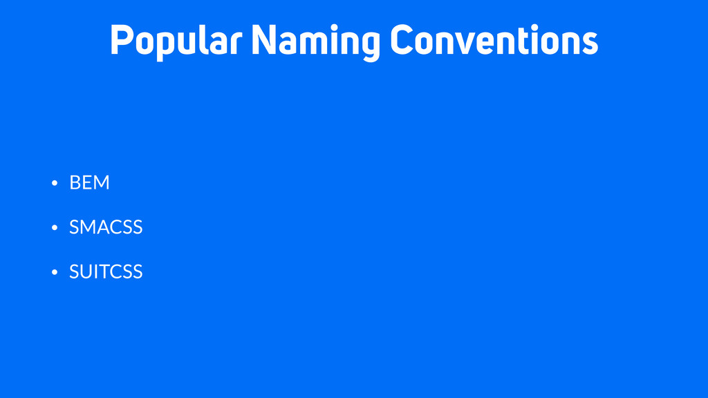
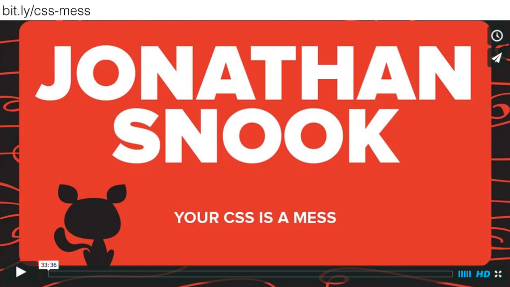
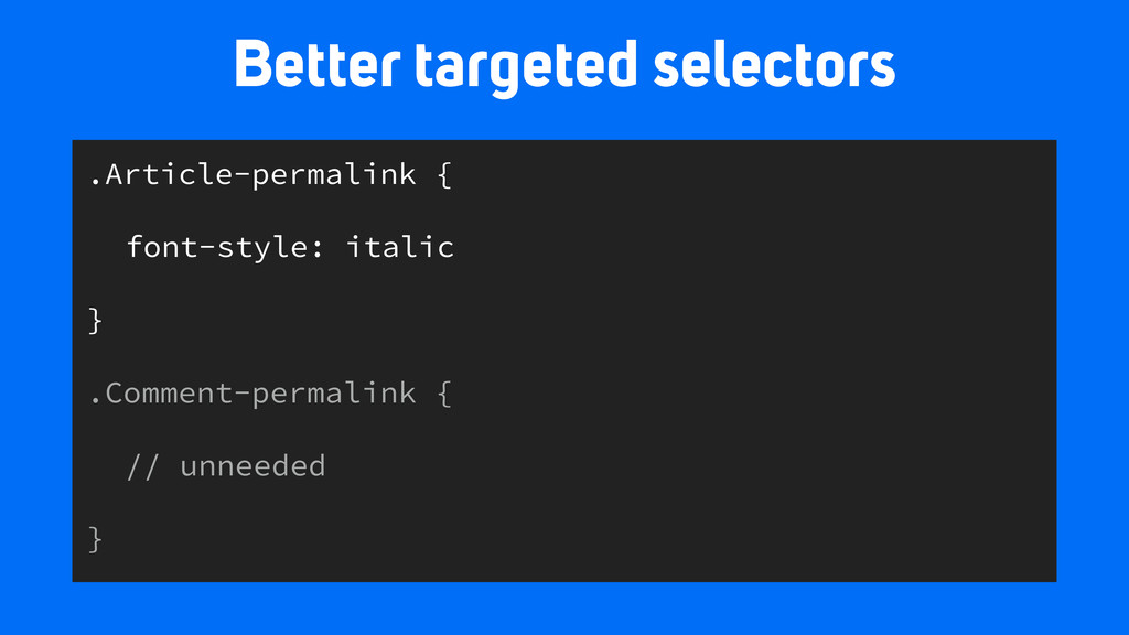
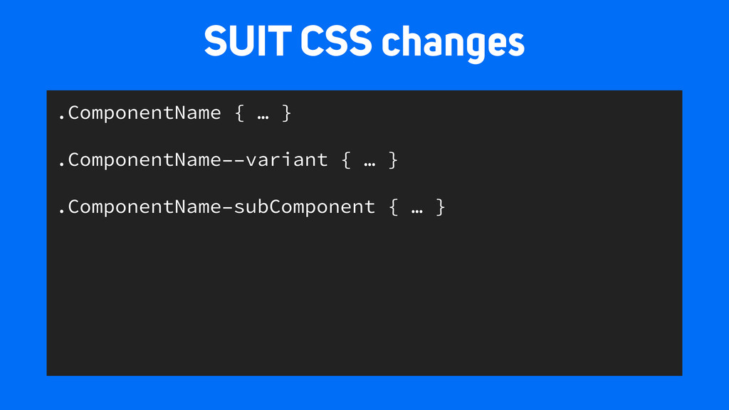
This talk compares several naming conventions and the pros and cons of each. From here, we’ll look how these benefits can be applied from the beginning of a project and assist the design process.
 peterwilsoncc
 rainerhahnekamp
 sansan33
 tomokusaba
 laysakura
 cyberagentdevelopers
 shinoharata
 element138
 mizdra
 shift_evolve
 schroneko
 reverentgeek
 portentint
 garrettdimon
 ryanjones
 mayunak
 kneath
 thekraken
 baasie
 keathley
 gr2m
gr2m
 geshan