Upgrade to Pro
— share decks privately, control downloads, hide ads and more …
Speaker Deck
Features
Speaker Deck
PRO
Sign in
Sign up for free
Search
Search
Edición de bolisillo: la web en dispositivos mó...
Search
Sponsored
·
Your Podcast. Everywhere. Effortlessly.
Share. Educate. Inspire. Entertain. You do you. We'll handle the rest.
→
Swwweet
January 25, 2012
Programming
3
210
Edición de bolisillo: la web en dispositivos móviles
Swwweet
January 25, 2012
Tweet
Share
More Decks by Swwweet
See All by Swwweet
Wonders from the Full Stack Fest website
swwweet
1
360
How to be the best web designer in the world.
swwweet
6
1.3k
Design for loading
swwweet
5
550
Mobile First: as difficult as doing things right
swwweet
225
10k
One Size Fits None
swwweet
12
890
One Size Fits None - From the Front 2013
swwweet
2
740
Responsively Responsive
swwweet
23
1.6k
La letra con píxel entra
swwweet
0
1.2k
The future of code
swwweet
4
620
Other Decks in Programming
See All in Programming
AI Schema Enrichment for your Oracle AI Database
thatjeffsmith
0
330
Python’s True Superpower
hynek
0
110
AI巻き込み型コードレビューのススメ
nealle
2
1.4k
フロントエンド開発の勘所 -複数事業を経験して見えた判断軸の違い-
heimusu
7
2.8k
AtCoder Conference 2025
shindannin
0
1.1k
責任感のあるCloudWatchアラームを設計しよう
akihisaikeda
3
180
Oxlint JS plugins
kazupon
1
1k
MDN Web Docs に日本語翻訳でコントリビュート
ohmori_yusuke
0
660
コマンドとリード間の連携に対する脅威分析フレームワーク
pandayumi
1
470
AWS re:Invent 2025参加 直前 Seattle-Tacoma Airport(SEA)におけるハードウェア紛失インシデントLT
tetutetu214
2
120
AgentCoreとHuman in the Loop
har1101
5
250
CSC307 Lecture 06
javiergs
PRO
0
690
Featured
See All Featured
Stewardship and Sustainability of Urban and Community Forests
pwiseman
0
110
Test your architecture with Archunit
thirion
1
2.2k
Breaking role norms: Why Content Design is so much more than writing copy - Taylor Woolridge
uxyall
0
170
Navigating Team Friction
lara
192
16k
How To Stay Up To Date on Web Technology
chriscoyier
791
250k
SEO Brein meetup: CTRL+C is not how to scale international SEO
lindahogenes
0
2.4k
Heart Work Chapter 1 - Part 1
lfama
PRO
5
35k
It's Worth the Effort
3n
188
29k
ラッコキーワード サービス紹介資料
rakko
1
2.3M
Max Prin - Stacking Signals: How International SEO Comes Together (And Falls Apart)
techseoconnect
PRO
0
89
Organizational Design Perspectives: An Ontology of Organizational Design Elements
kimpetersen
PRO
1
470
How to train your dragon (web standard)
notwaldorf
97
6.5k
Transcript
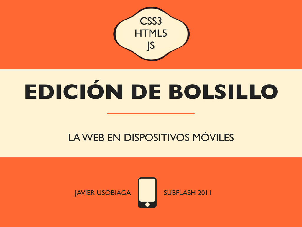
EDICIÓN DE BOLSILLO LA WEB EN DISPOSITIVOS MÓVILES CSS3 HTML5
JS JAVIER USOBIAGA SUBFLASH 2011
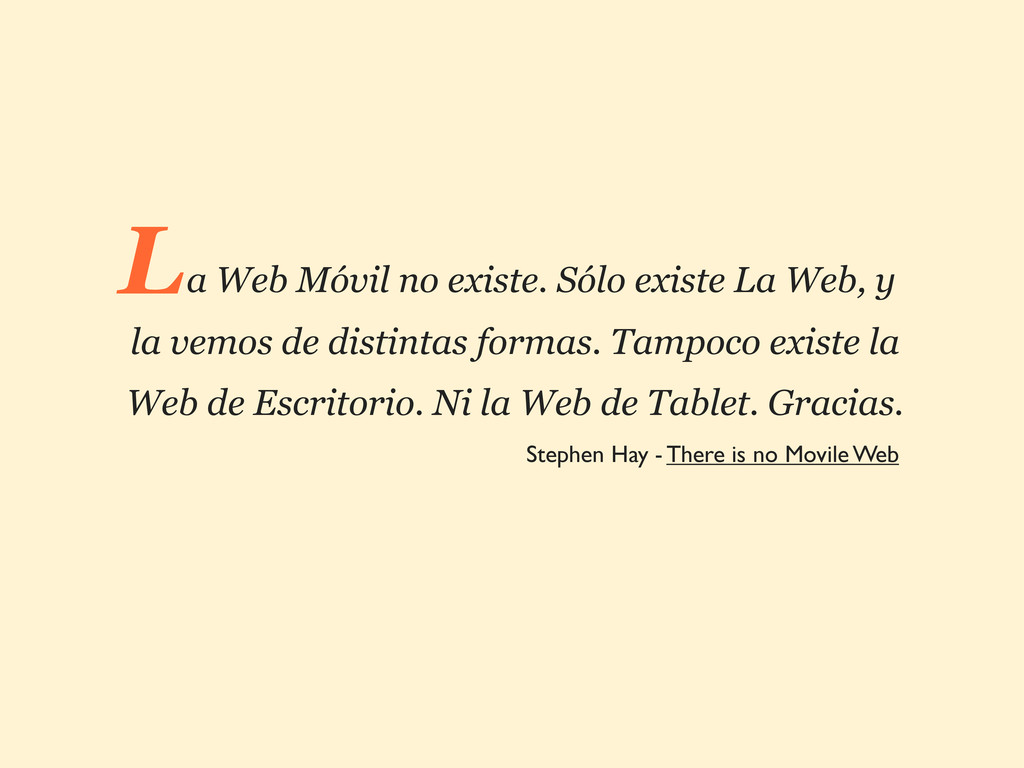
a Web Móvil no existe. Sólo existe La Web, y
la vemos de distintas formas. Tampoco existe la Web de Escritorio. Ni la Web de Tablet. Gracias. L Stephen Hay - There is no Movile Web
La web móvil no va de pantallas pequeñas.
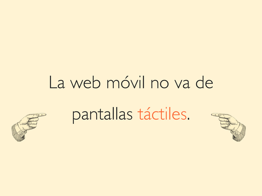
La web móvil no va de pantallas táctiles.
La web móvil no va de conexiones lentas.
La web móvil no va de aplicaciones para SO.
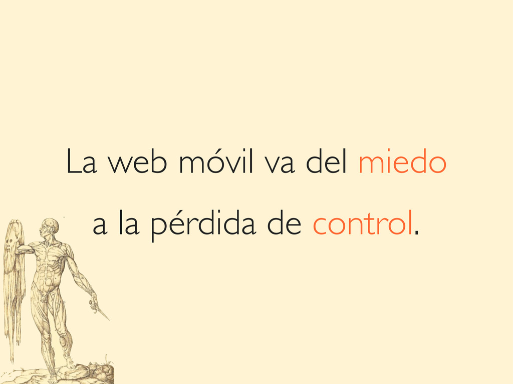
La web móvil va del miedo a la pérdida de
control.
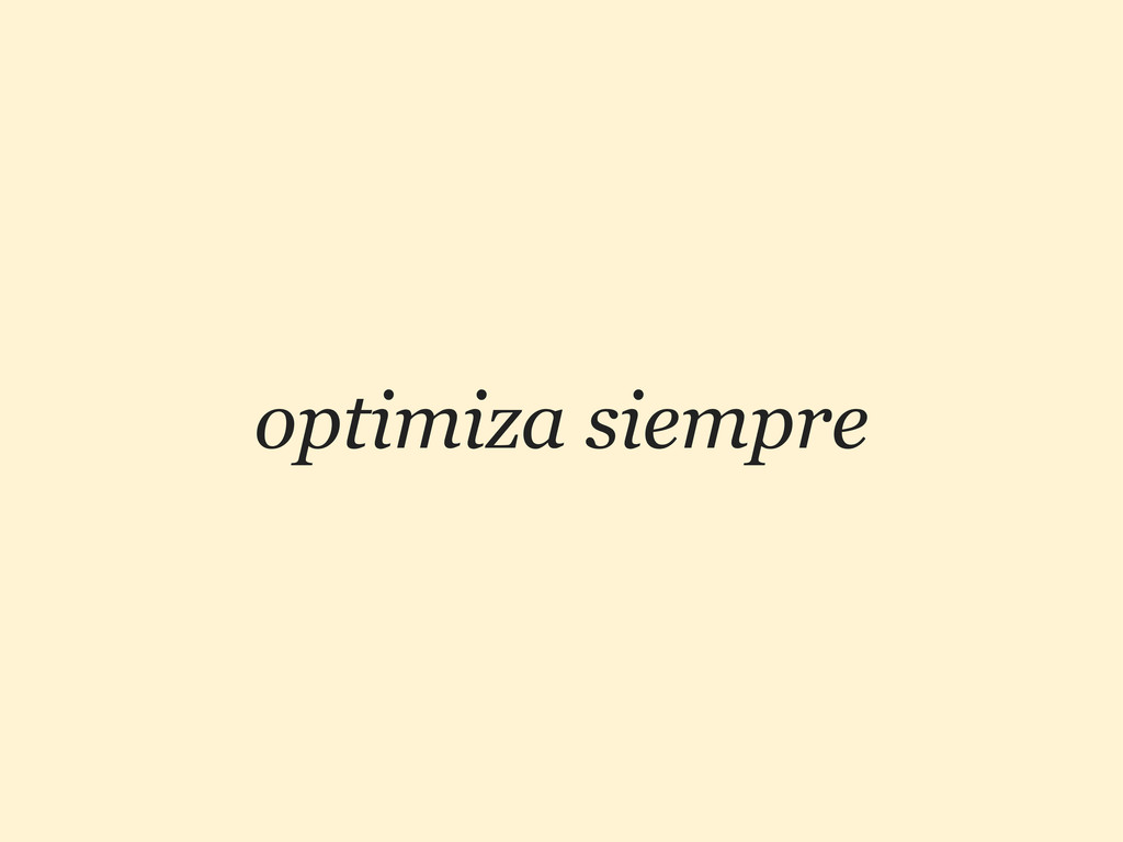
optimiza siempre
None
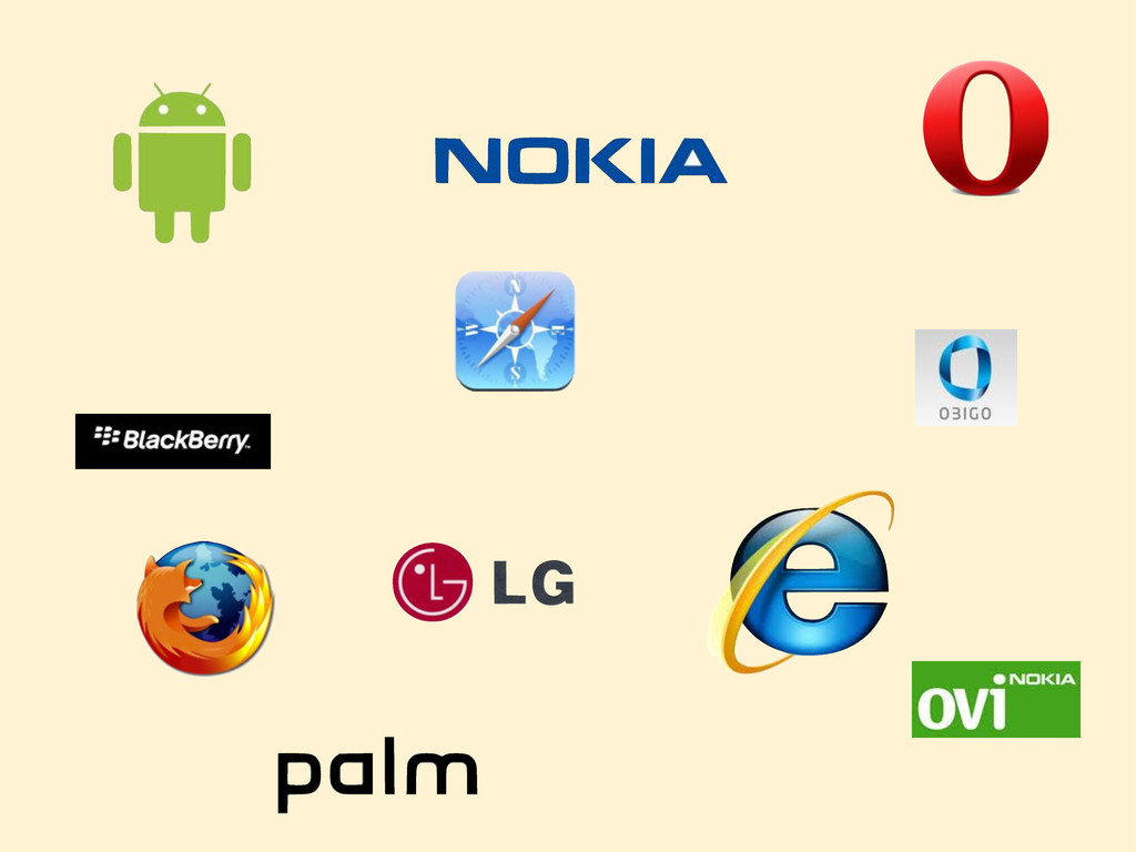
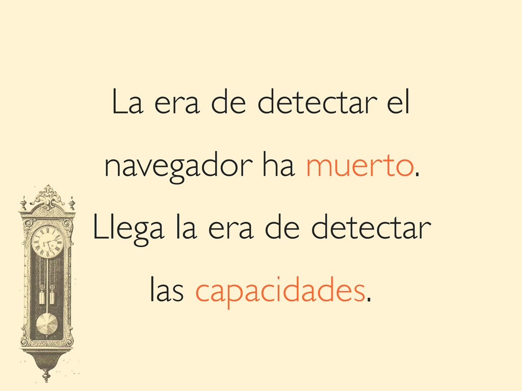
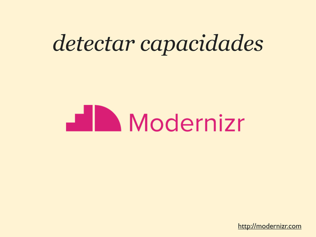
La era de detectar el navegador ha muerto. Llega la
era de detectar las capacidades.
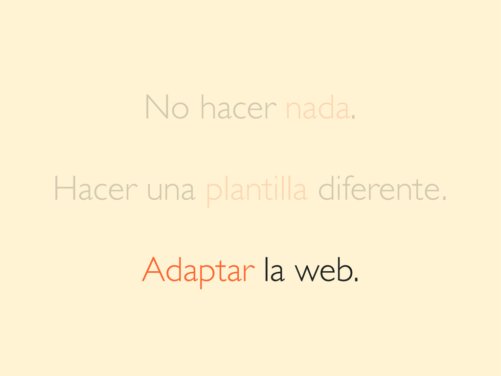
ESTRATEGIAS 1 3 SOLUCIONES A UN MISMO RETO
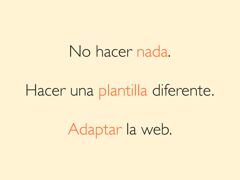
No hacer nada.
No hacer nada. Hacer una plantilla diferente.
No hacer nada. Hacer una plantilla diferente. Adaptar la web.
No hacer nada. Hacer una plantilla diferente. Adaptar la web.
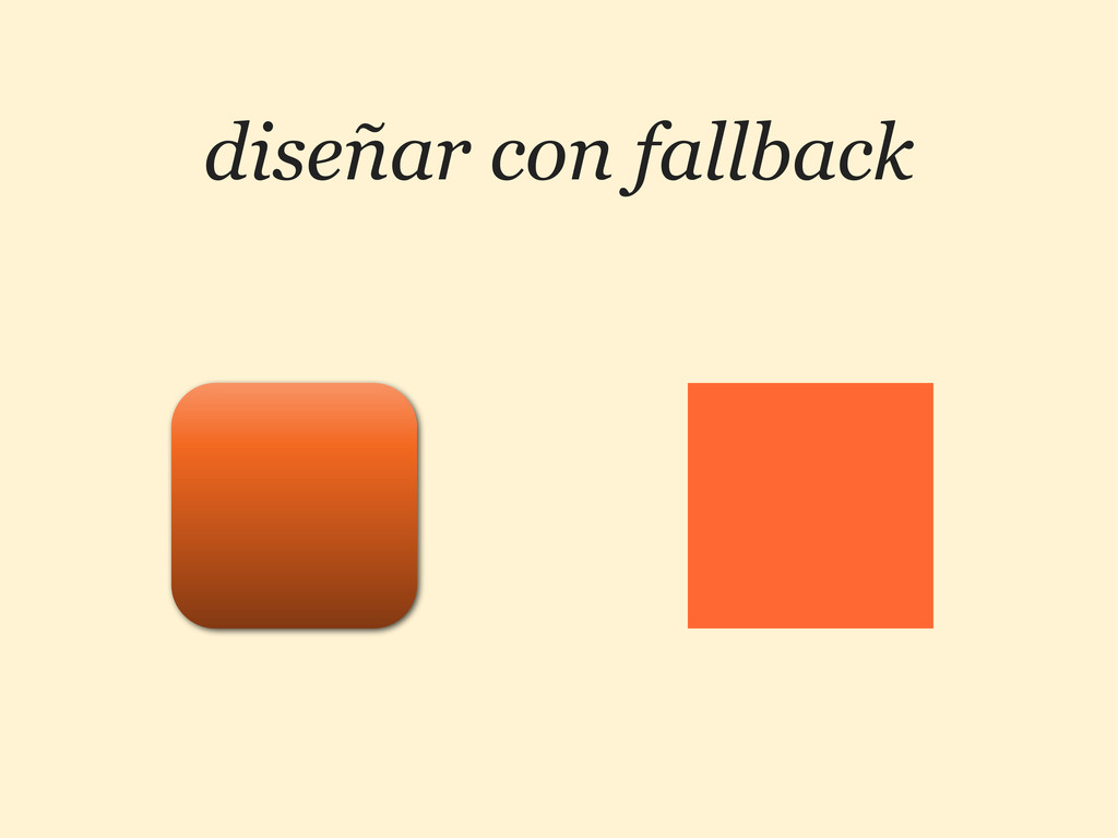
diseñar con fallback
detectar capacidades http://modernizr.com
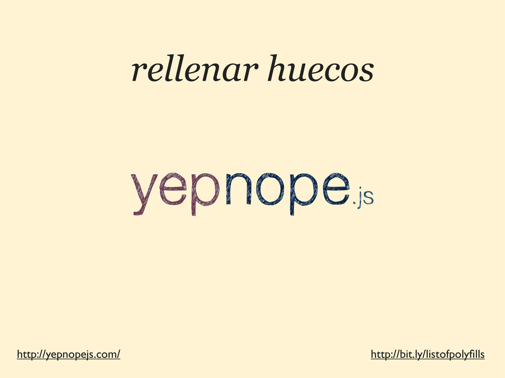
rellenar huecos http://yepnopejs.com/ http://bit.ly/listofpolyfills
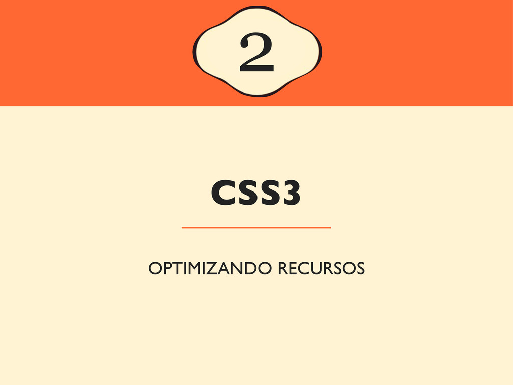
CSS3 2 OPTIMIZANDO RECURSOS
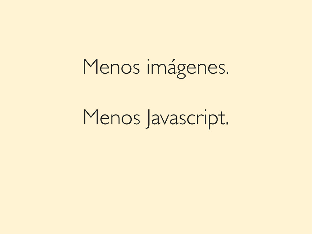
Menos imágenes.
Menos imágenes. Menos Javascript.
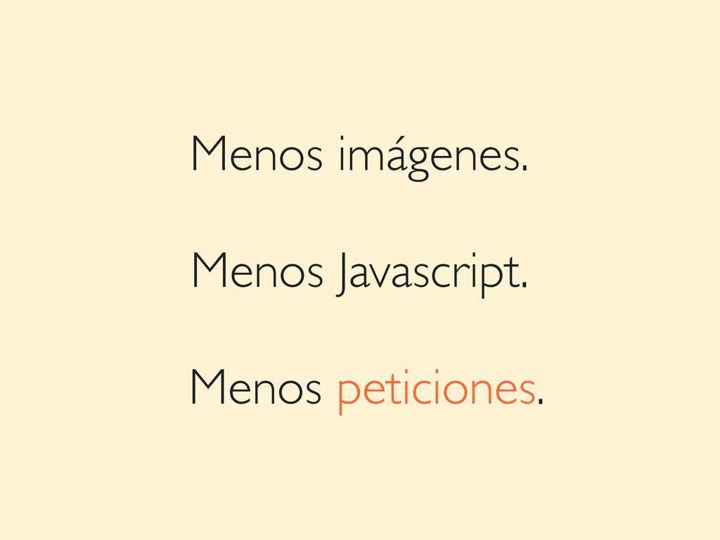
Menos imágenes. Menos Javascript. Menos peticiones.
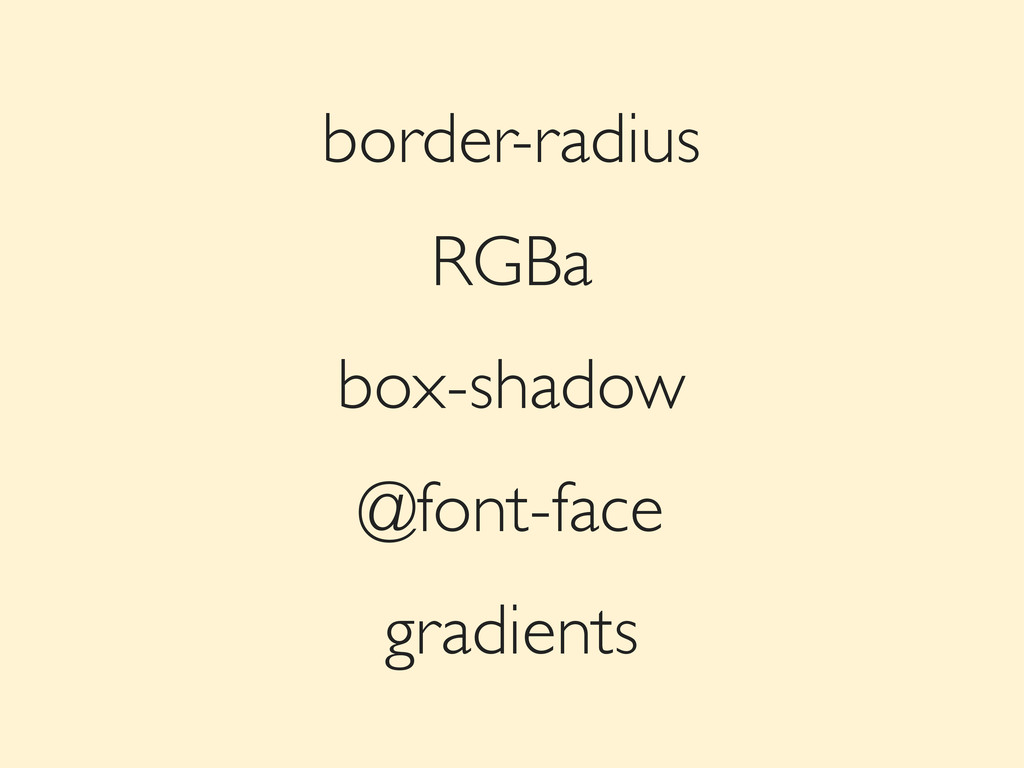
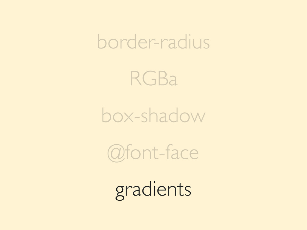
gradients border-radius RGBa box-shadow @font-face
gradients border-radius RGBa box-shadow @font-face
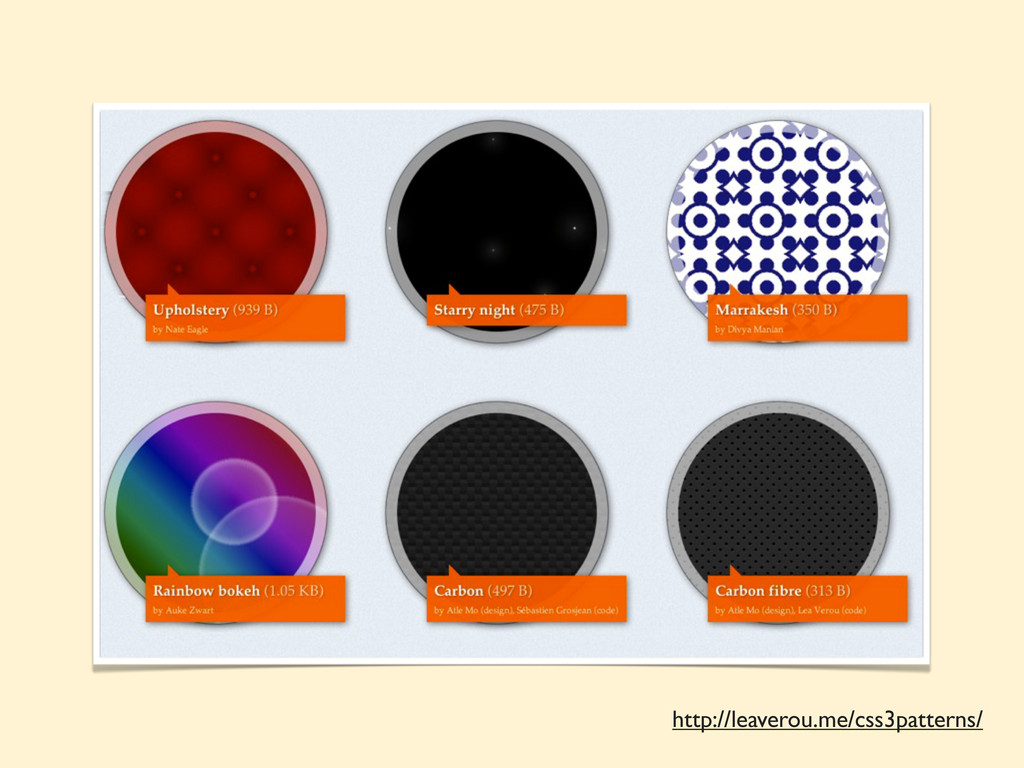
http://leaverou.me/css3patterns/
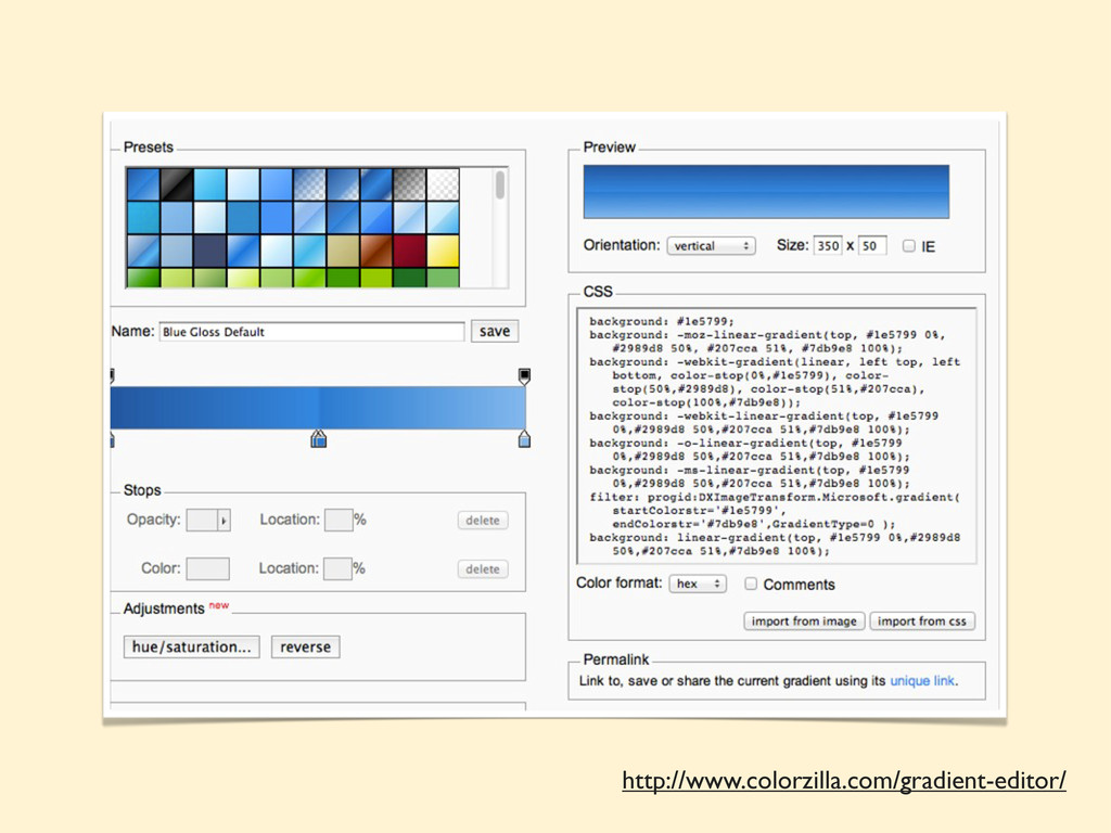
http://www.colorzilla.com/gradient-editor/
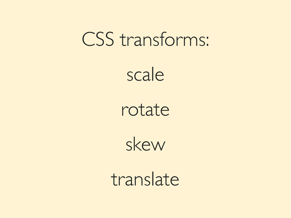
CSS transforms: scale rotate skew translate
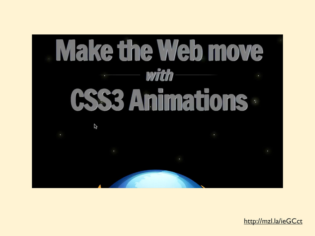
Transitions & Animations
http://mzl.la/ieGCct
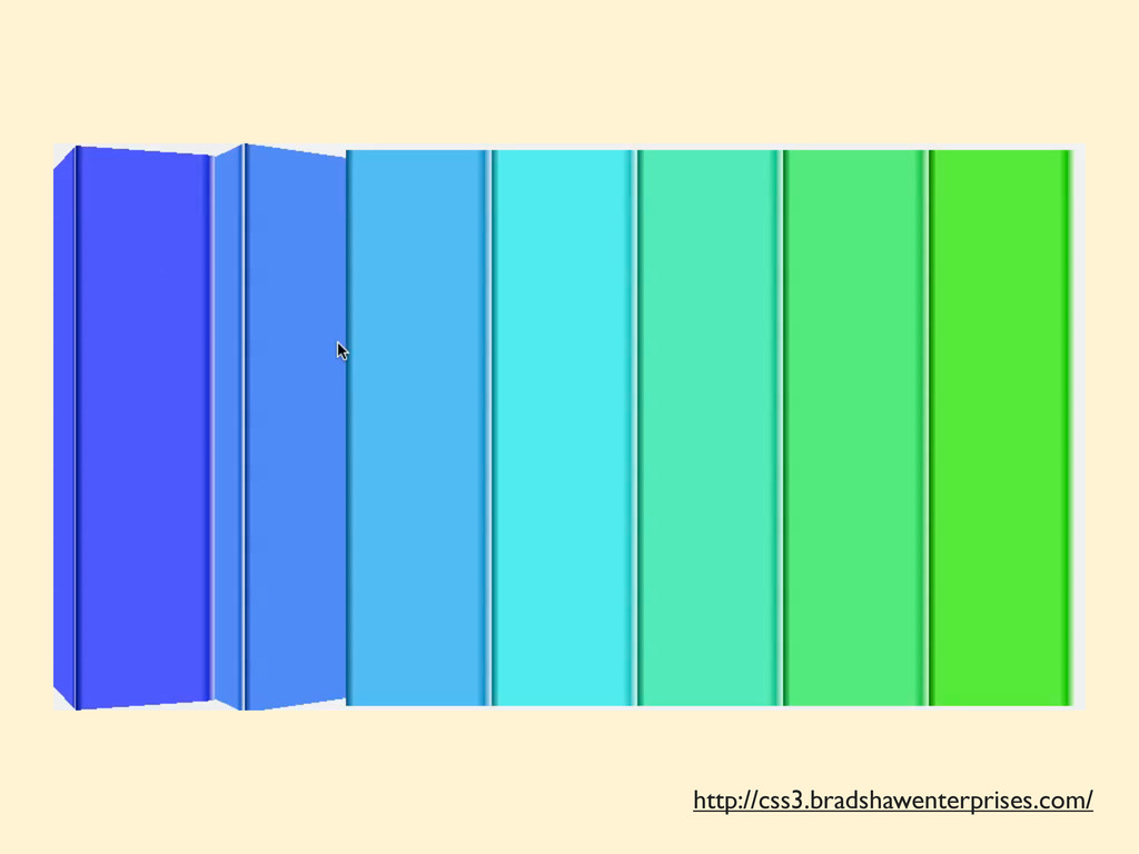
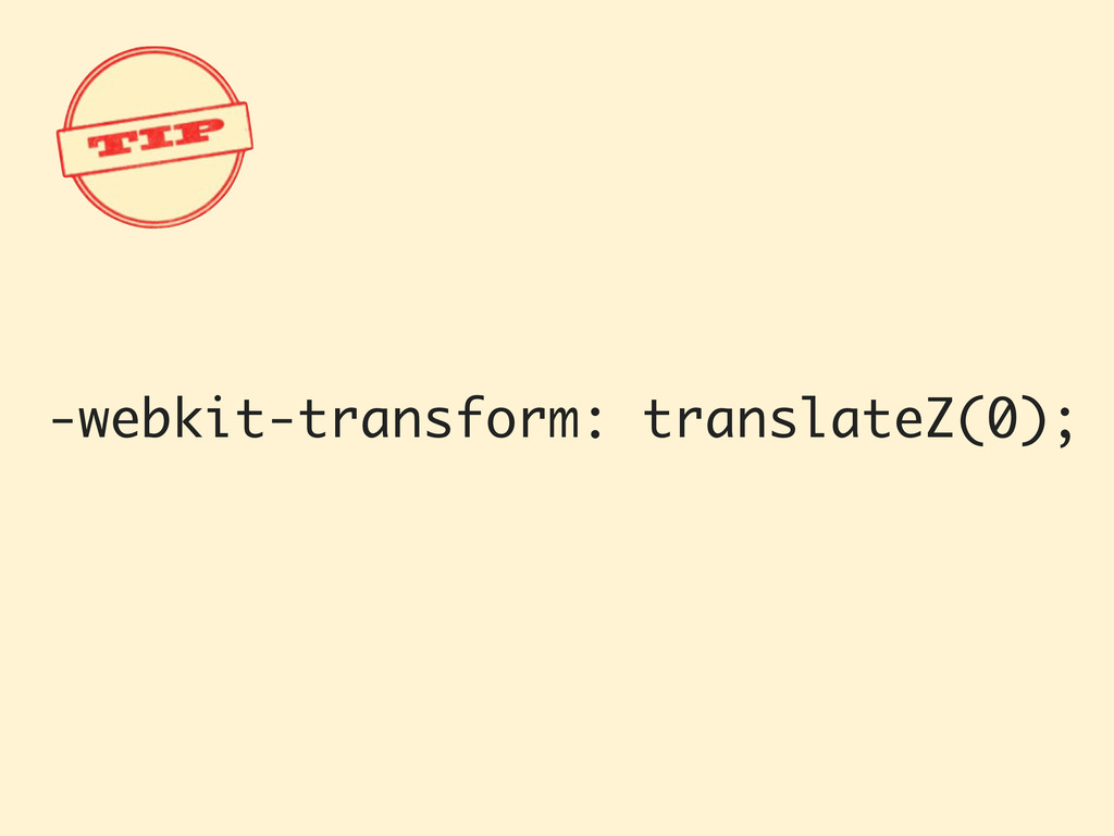
3D transforms
http://css3.bradshawenterprises.com/
-webkit-transform: translateZ(0);
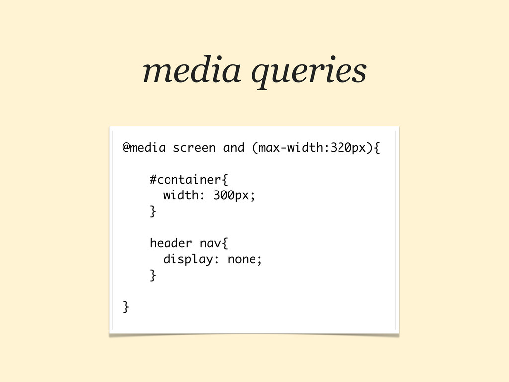
media queries @media screen and (max-width:320px){ #container{ width: 300px; }
header nav{ display: none; } }
http://mediaqueri.es
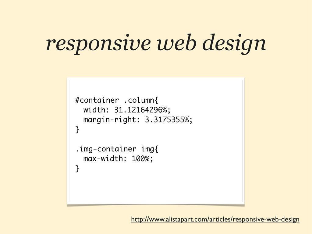
responsive web design #container .column{ width: 31.12164296%; margin-right: 3.3175355%; }
.img-container img{ max-width: 100%; } http://www.alistapart.com/articles/responsive-web-design
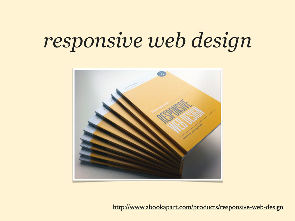
responsive web design http://www.abookapart.com/products/responsive-web-design
HTML5 3 EL NAVEGADOR RECUPERA EL CONTROL
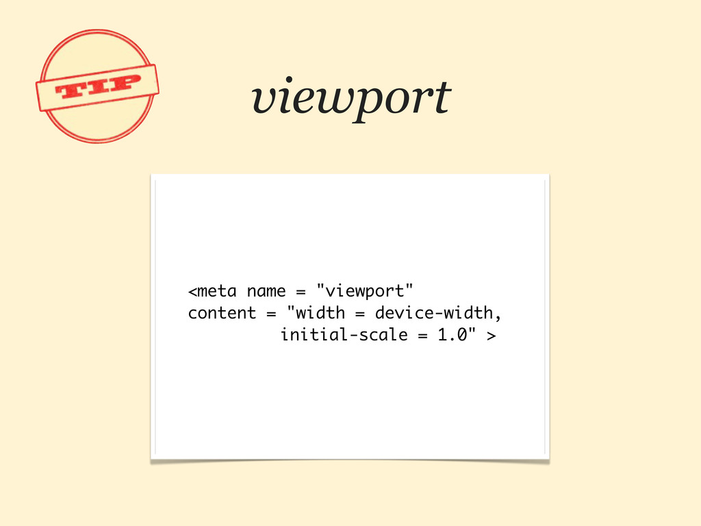
viewport <meta name = "viewport" content = "width = device-width,
initial-scale = 1.0" >
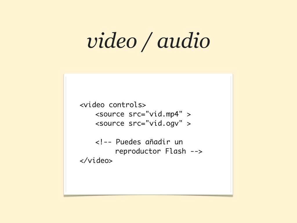
video / audio <video controls> <source src="vid.mp4" > <source src="vid.ogv"
> <!-- Puedes añadir un reproductor Flash --> </video>
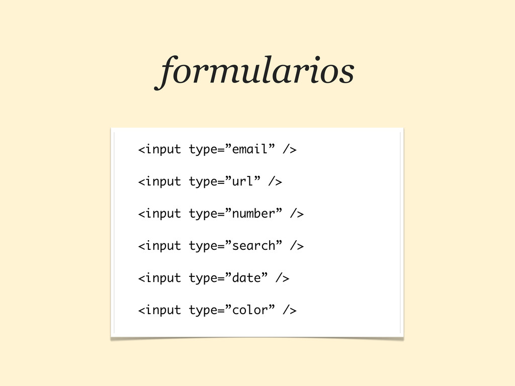
formularios <input type=”email” /> <input type=”url” /> <input type=”number” />
<input type=”search” /> <input type=”date” /> <input type=”color” />
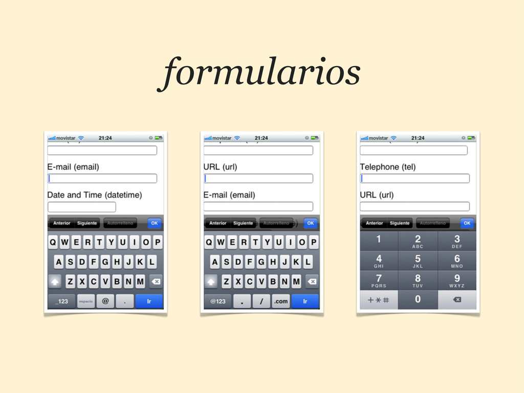
formularios
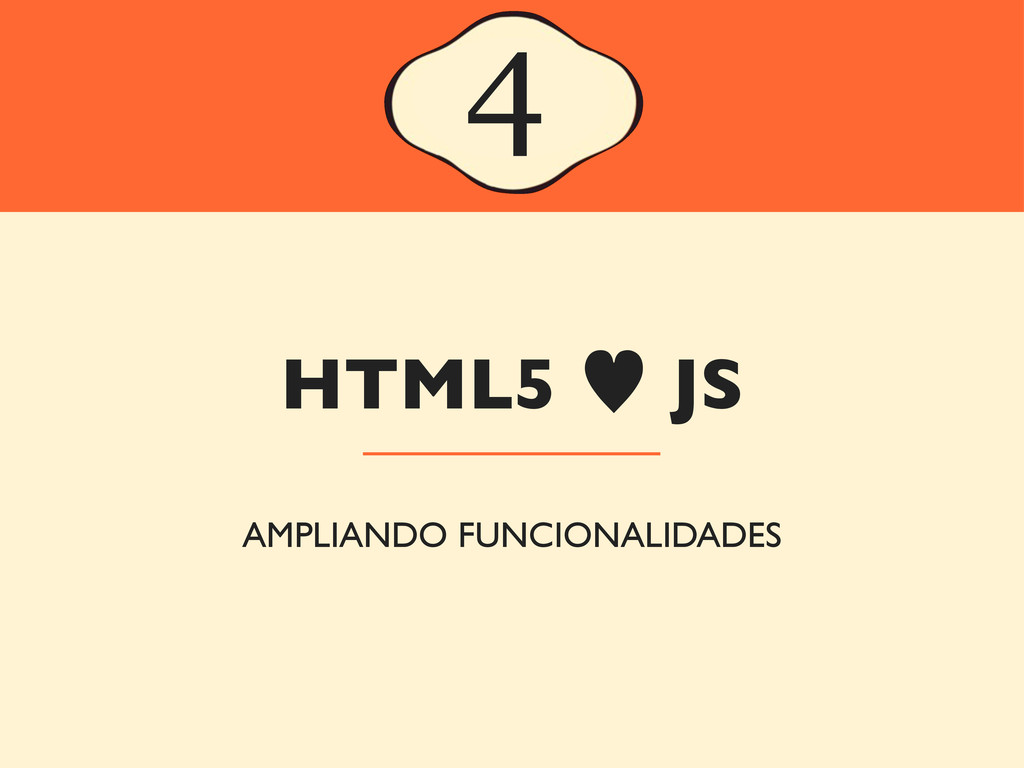
HTML5 — JS 4 AMPLIANDO FUNCIONALIDADES
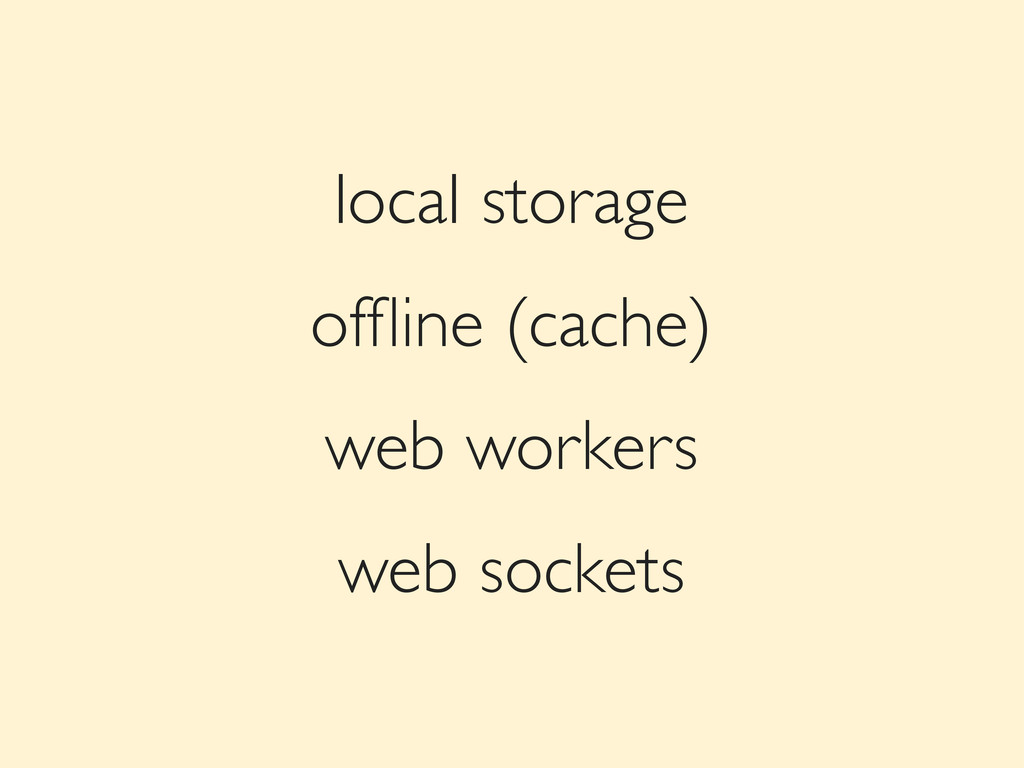
local storage offline (cache) web workers web sockets
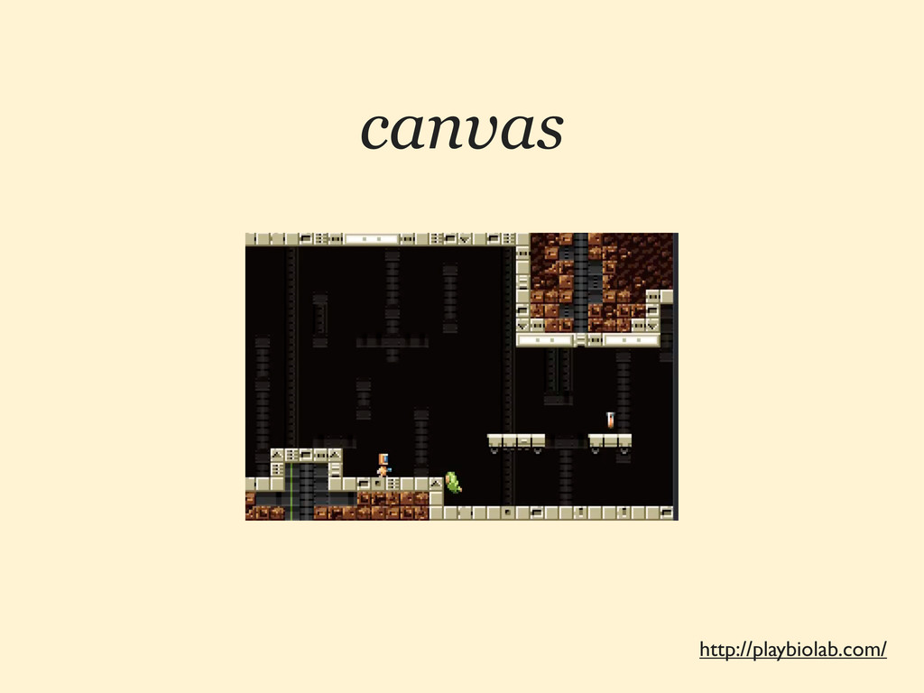
canvas http://playbiolab.com/
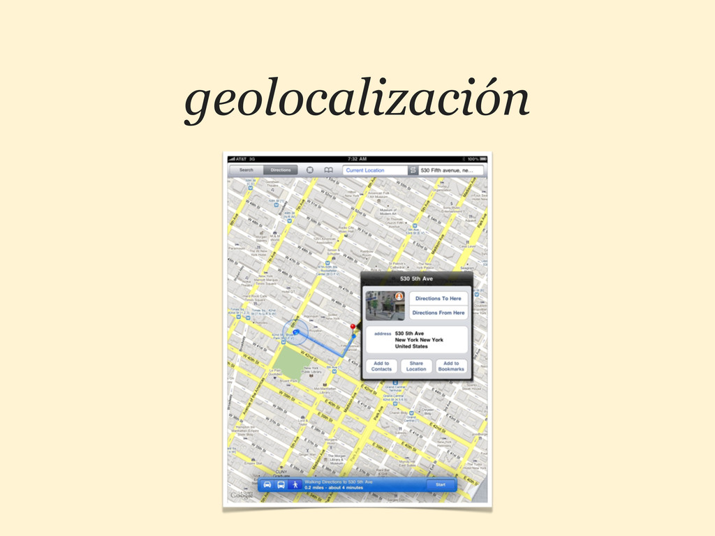
geolocalización
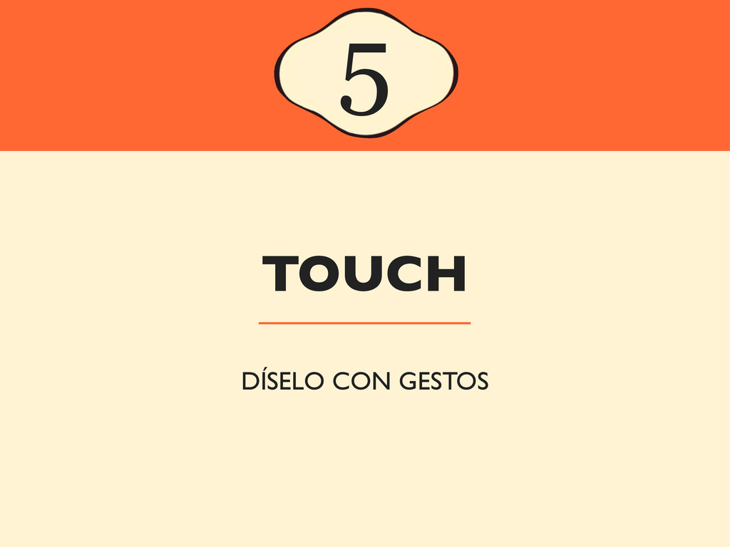
TOUCH 5 DÍSELO CON GESTOS
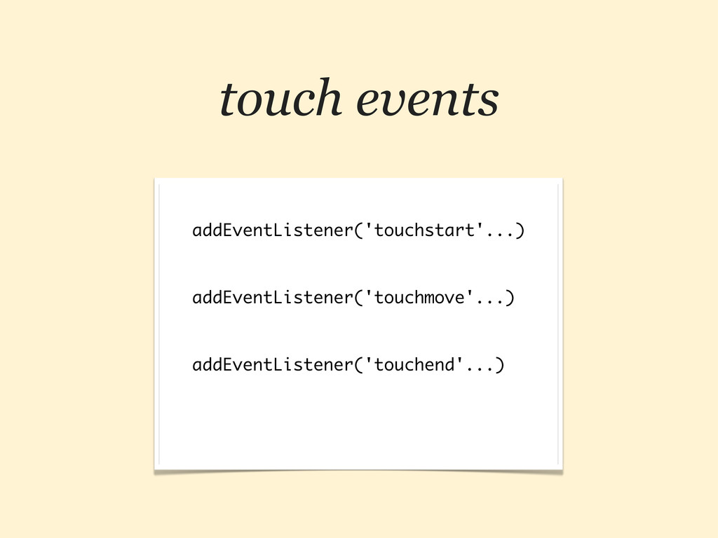
touch events addEventListener('touchstart'...) addEventListener('touchmove'...) addEventListener('touchend'...)
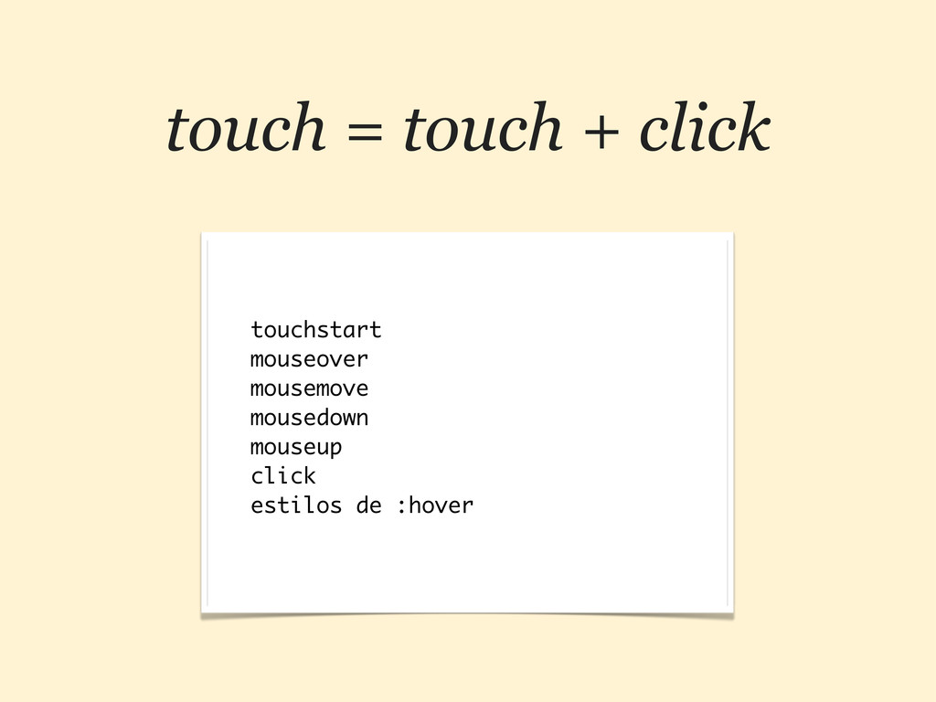
touch = touch + click touchstart mouseover mousemove mousedown mouseup
click estilos de :hover
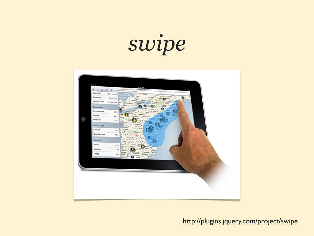
http://plugins.jquery.com/project/swipe swipe
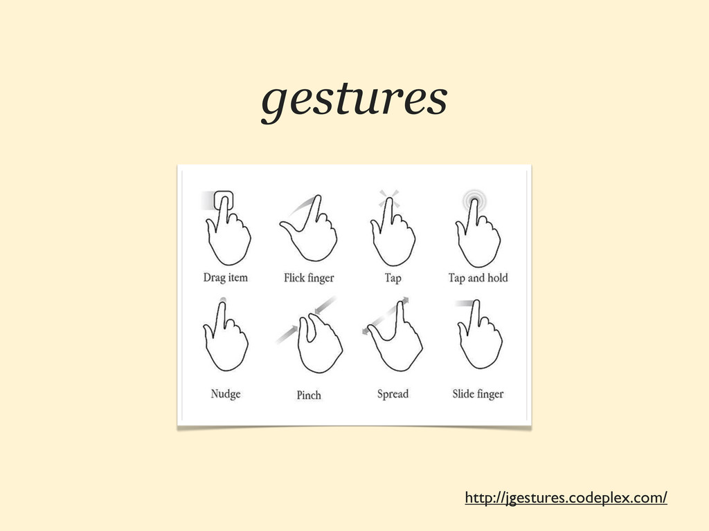
http://jgestures.codeplex.com/ gestures
FRAMEWORKS JS 6 ¿SON NECESARIOS?
http://jqtouch.com http://jquerymobile.com http://www.sencha.com/products/touch http://zeptojs.com
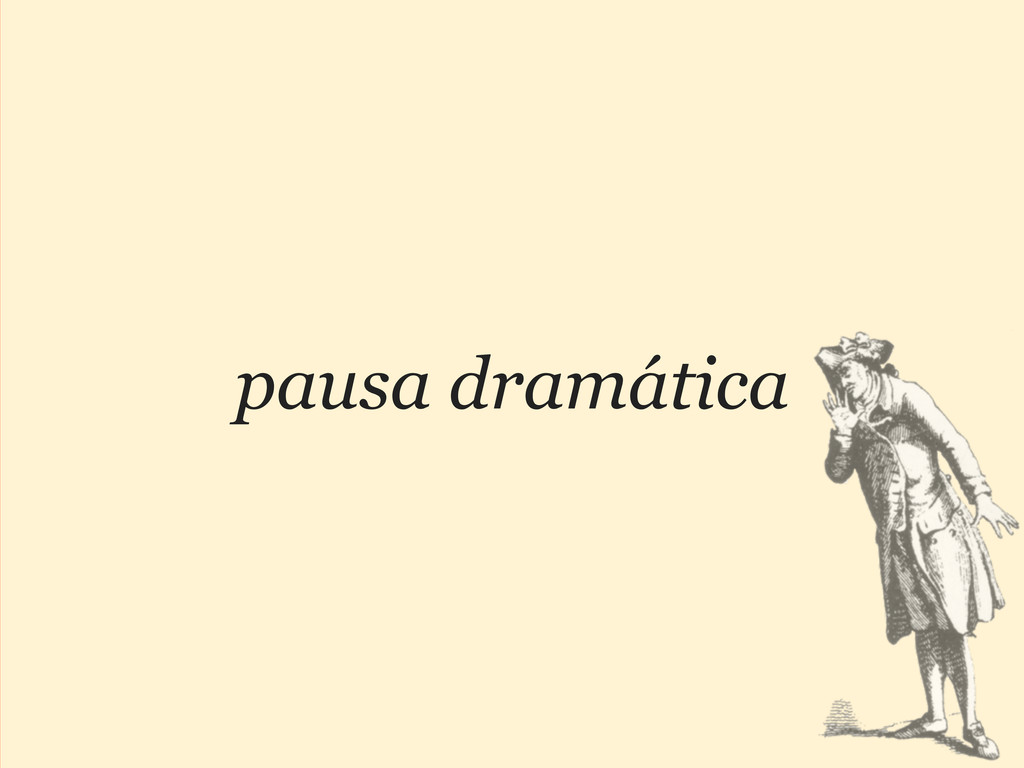
pausa dramática
¡GRACIAS! ¿PREGUNTAS? :-) @HTMLBOY SWWWEET.COM
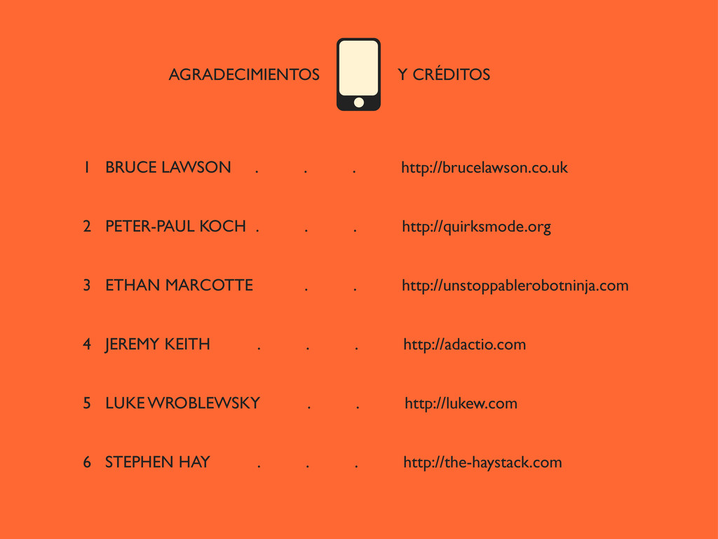
AGRADECIMIENTOS Y CRÉDITOS 1 BRUCE LAWSON . . . http://brucelawson.co.uk
2 PETER-PAUL KOCH . . . http://quirksmode.org 3 ETHAN MARCOTTE . . http://unstoppablerobotninja.com 4 JEREMY KEITH . . . http://adactio.com 5 LUKE WROBLEWSKY . . http://lukew.com 6 STEPHEN HAY . . . http://the-haystack.com
 swwweet
 thatjeffsmith
 hynek
hynek
 nealle
 heimusu
 shindannin
 akihisaikeda
 kazupon
 ohmori_yusuke
 pandayumi
 tetutetu214
 har1101
 javiergs
 pwiseman
 thirion
 uxyall
 lara
lara
 chriscoyier
 lindahogenes
 lfama
lfama
 3n
3n
 rakko
rakko
 techseoconnect
 kimpetersen
 notwaldorf