Upgrade to Pro
— share decks privately, control downloads, hide ads and more …
Speaker Deck
Features
Speaker Deck
PRO
Sign in
Sign up for free
Search
Search
Responsive Web Design: Everything has Changed
Search
Swwweet
June 17, 2012
Technology
6
730
Responsive Web Design: Everything has Changed
Presentation by @htmlboy at Drupal Developers Day Barcelona 2012.
Swwweet
June 17, 2012
Tweet
Share
More Decks by Swwweet
See All by Swwweet
Wonders from the Full Stack Fest website
swwweet
1
360
How to be the best web designer in the world.
swwweet
6
1.3k
Design for loading
swwweet
5
550
Mobile First: as difficult as doing things right
swwweet
225
10k
One Size Fits None
swwweet
12
890
One Size Fits None - From the Front 2013
swwweet
2
740
Responsively Responsive
swwweet
23
1.6k
La letra con píxel entra
swwweet
0
1.2k
The future of code
swwweet
4
620
Other Decks in Technology
See All in Technology
Claude_CodeでSEOを最適化する_AI_Ops_Community_Vol.2__マーケティングx_AIはここまで進化した.pdf
riku_423
2
610
SREじゃなかった僕らがenablingを通じて「SRE実践者」になるまでのリアル / SRE Kaigi 2026
aeonpeople
6
2.5k
Agent Skils
dip_tech
PRO
0
120
OCI Database Management サービス詳細
oracle4engineer
PRO
1
7.4k
量子クラウドサービスの裏側 〜Deep Dive into OQTOPUS〜
oqtopus
0
140
~Everything as Codeを諦めない~ 後からCDK
mu7889yoon
3
470
Embedded SREの終わりを設計する 「なんとなく」から計画的な自立支援へ
sansantech
PRO
3
2.6k
Greatest Disaster Hits in Web Performance
guaca
0
280
コミュニティが変えるキャリアの地平線:コロナ禍新卒入社のエンジニアがAWSコミュニティで見つけた成長の羅針盤
kentosuzuki
0
130
usermode linux without MMU - fosdem2026 kernel devroom
thehajime
0
240
データの整合性を保ちたいだけなんだ
shoheimitani
8
3.2k
外部キー制約の知っておいて欲しいこと - RDBMSを正しく使うために必要なこと / FOREIGN KEY Night
soudai
PRO
12
5.6k
Featured
See All Featured
30 Presentation Tips
portentint
PRO
1
220
Jess Joyce - The Pitfalls of Following Frameworks
techseoconnect
PRO
1
67
Side Projects
sachag
455
43k
AI Search: Where Are We & What Can We Do About It?
aleyda
0
7k
Facilitating Awesome Meetings
lara
57
6.8k
The SEO identity crisis: Don't let AI make you average
varn
0
330
Building Experiences: Design Systems, User Experience, and Full Site Editing
marktimemedia
0
410
Fight the Zombie Pattern Library - RWD Summit 2016
marcelosomers
234
17k
Abbi's Birthday
coloredviolet
1
4.8k
Speed Design
sergeychernyshev
33
1.5k
Kristin Tynski - Automating Marketing Tasks With AI
techseoconnect
PRO
0
150
Dealing with People You Can't Stand - Big Design 2015
cassininazir
367
27k
Transcript
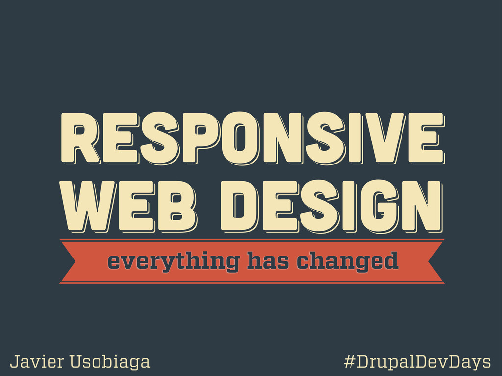
RESPoNSIVE WEB DESIGN RESPoNSIVE WEB DESIGN RESPoNSIVE WEB DESIGN everything
has changed Javier Usobiaga #DrupalDevDays
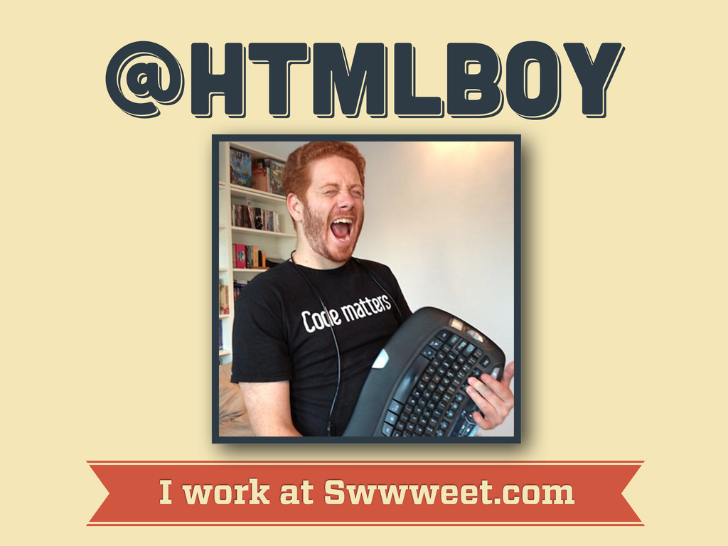
@htmlboy @htmlboy @htmlboy I work at Swwweet.com
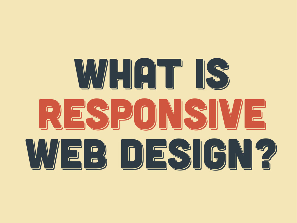
WHAT IS responsive web design? WHAT IS responsive web design?
WHAT IS respoNsive web design?
WHAT IS THE web? WHAT IS THE web? WHAT IS
THE web?
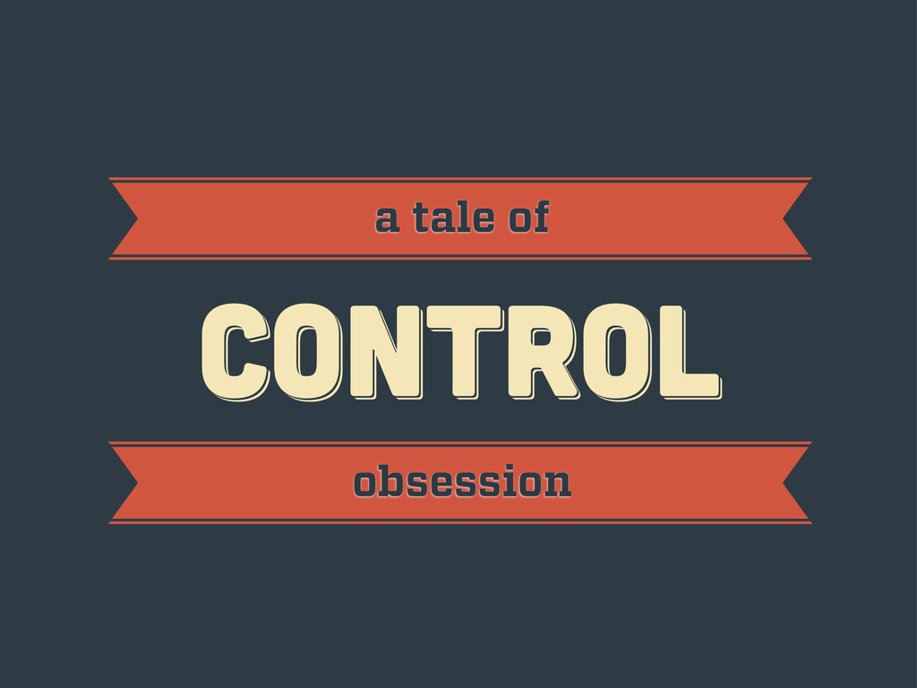
CONTROL CONTROL CONTROL a tale of obsession
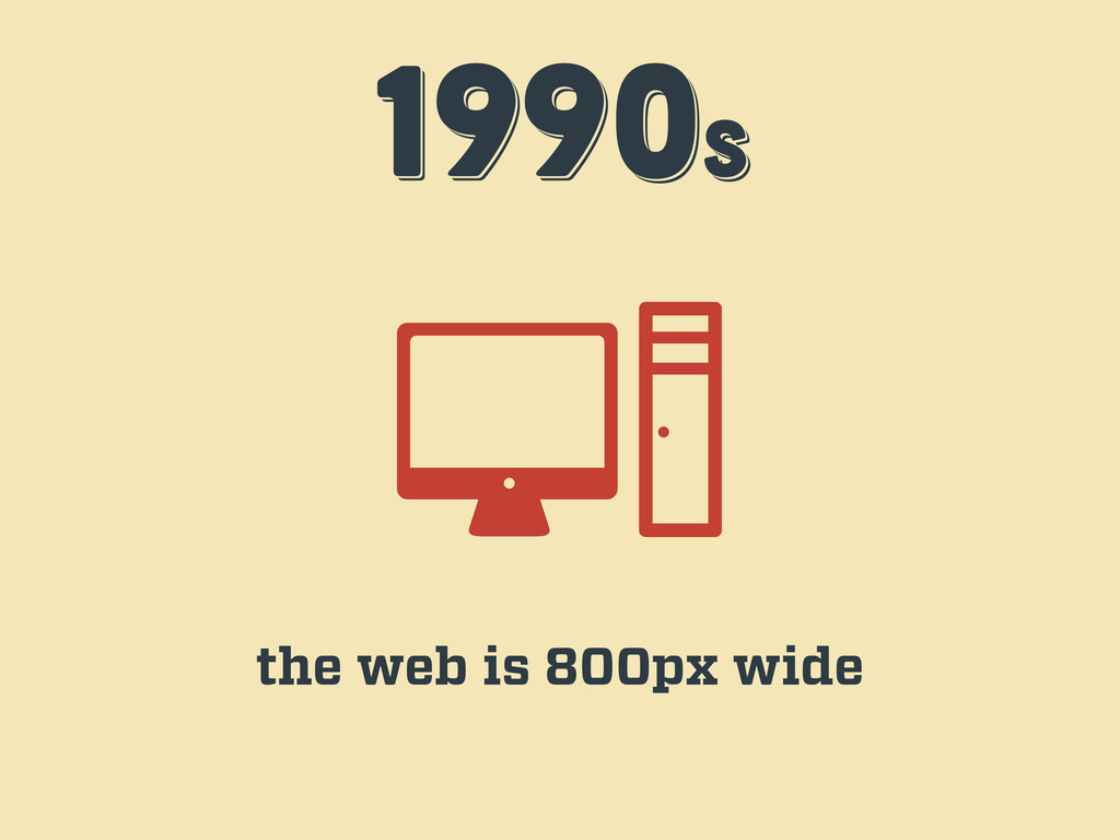
1990s 1990s 1990s the web is 800px wide
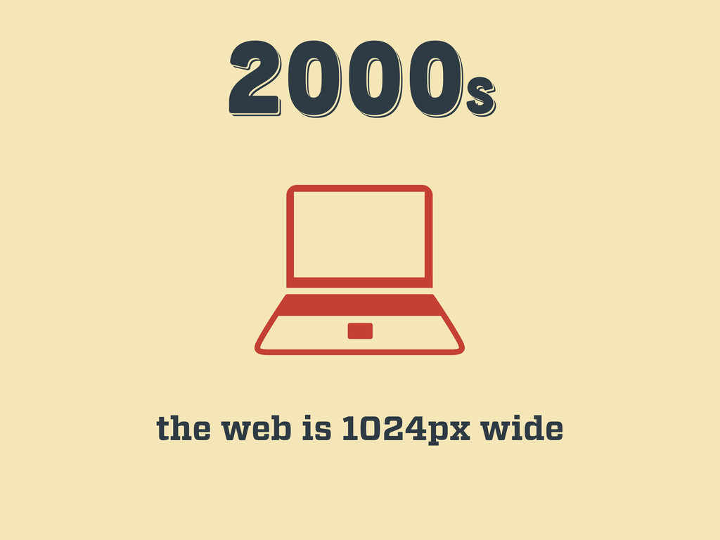
2000s 2000s 2000s the web is 1024px wide
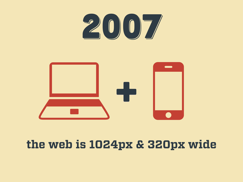
2007 2007 2007 + the web is 1024px & 320px
wide
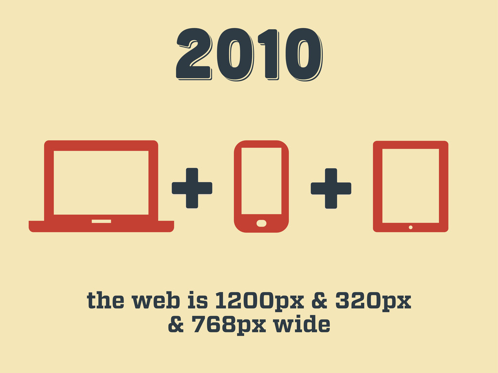
2010 2010 2010 + + the web is 1200px &
320px & 768px wide
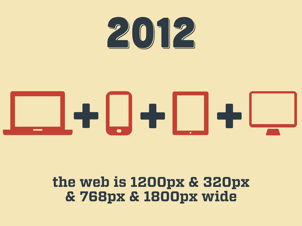
2012 2012 2012 + + the web is 1200px &
320px & 768px & 1800px wide +
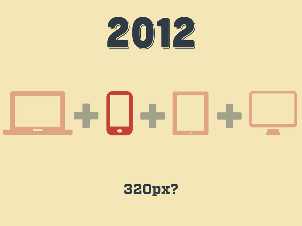
2012 2012 2012 + + 320px? +
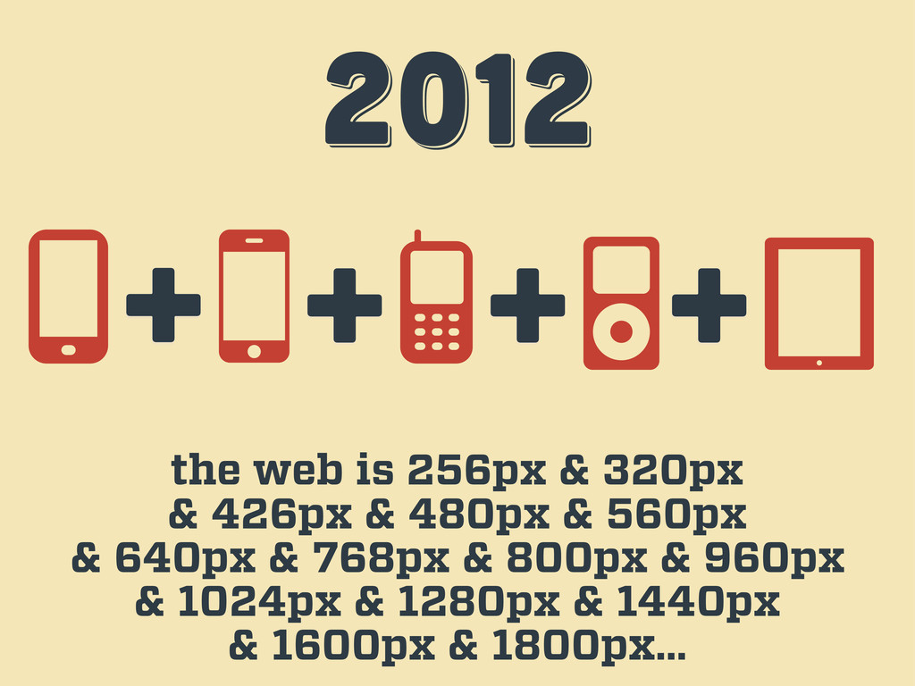
2012 2012 2012 the web is 256px & 320px &
426px & 480px & 560px & 640px & 768px & 800px & 960px & 1024px & 1280px & 1440px & 1600px & 1800px… + + + +
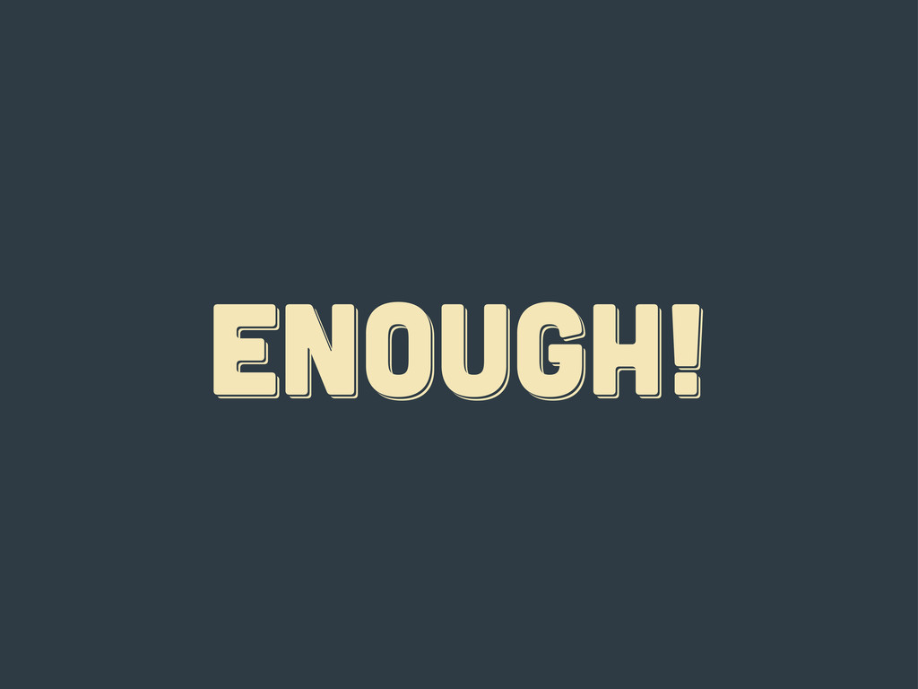
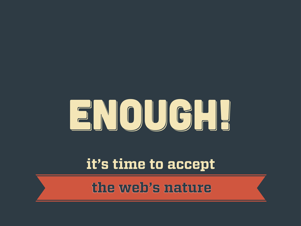
ENOUGH! ENOUGH! ENOUGH!
ENOUGH! ENOUGH! ENOUGH! it’s time to accept the web’s nature
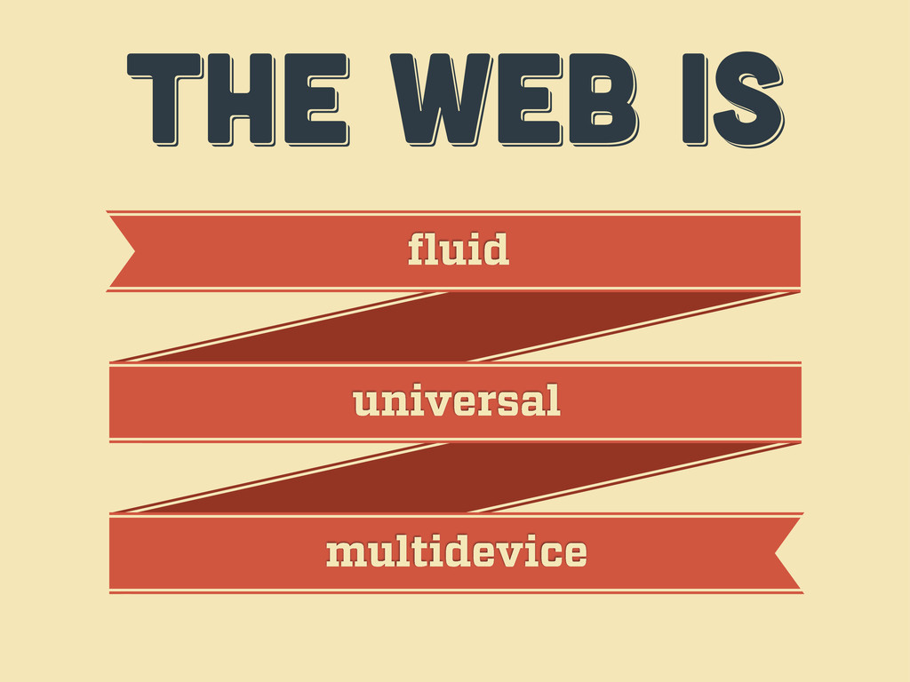
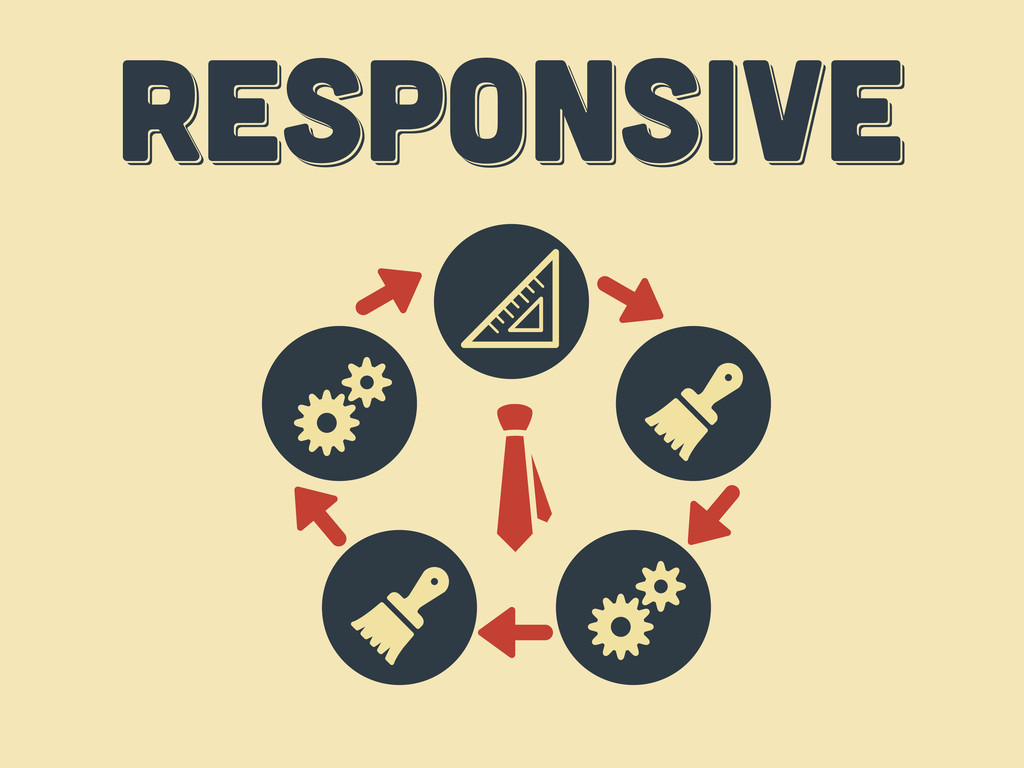
THE WEB IS THE WEB IS THE WEB IS fluid
universal multidevice
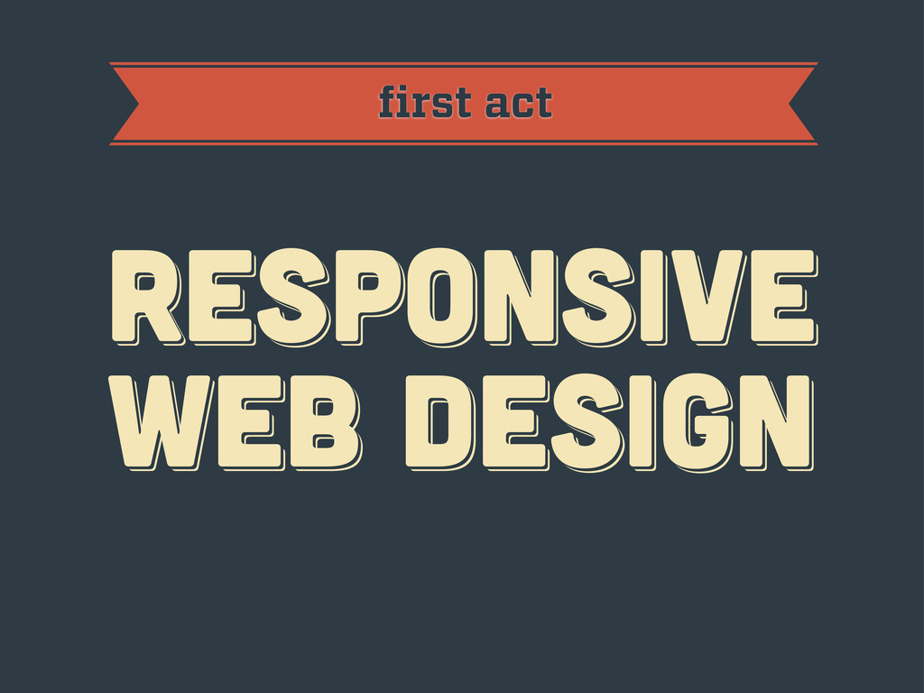
first act RESPoNSIVE WEB DESIGN RESPoNSIVE WEB DESIGN RESPoNSIVE WEB
DESIGN
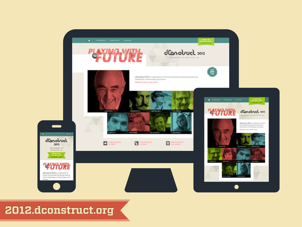
2012.dconstruct.org
mediaqueri.es
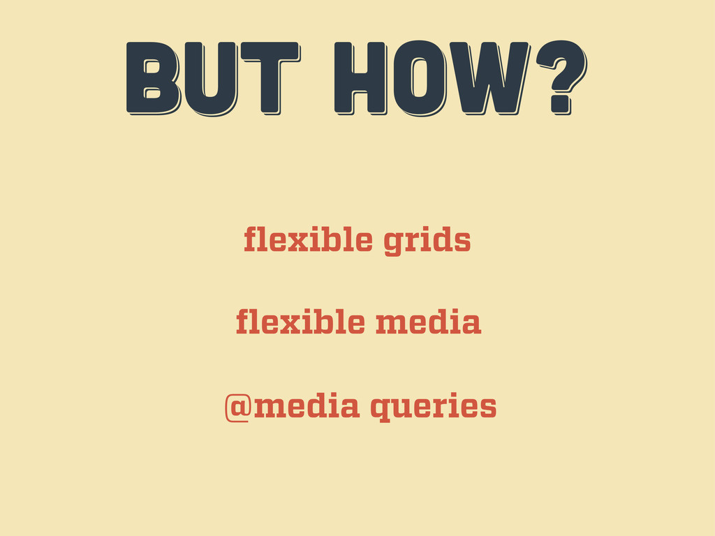
BUT HOW? BUT HOW? BUT HOW? flexible grids flexible media
@media queries
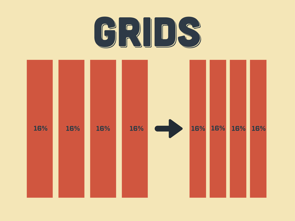
GRIDS GRIDS GRIDS 16% 16% 16% 16% 16% 16% 16%
16%
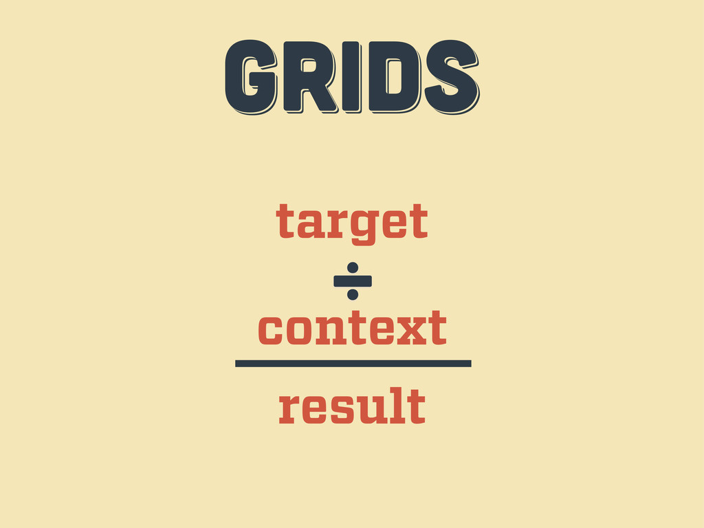
target context ÷ result GRIDS GRIDS GRIDS
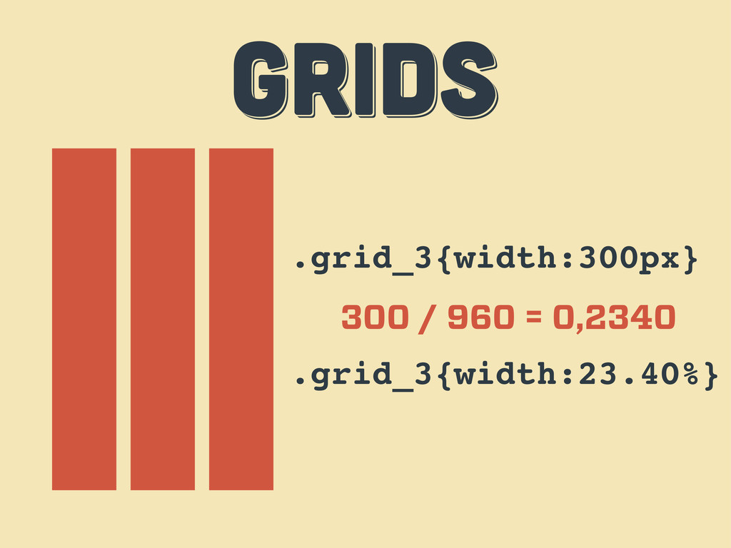
.grid_3{width:300px} 300 / 960 = 0,2340 .grid_3{width:23.40%} GRIDS GRIDS GRIDS
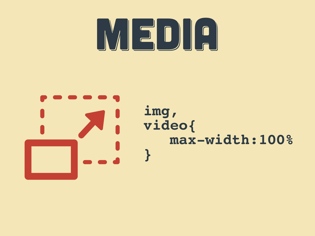
MEDIA MEDIA MEDIA img, video{ max-width:100% }
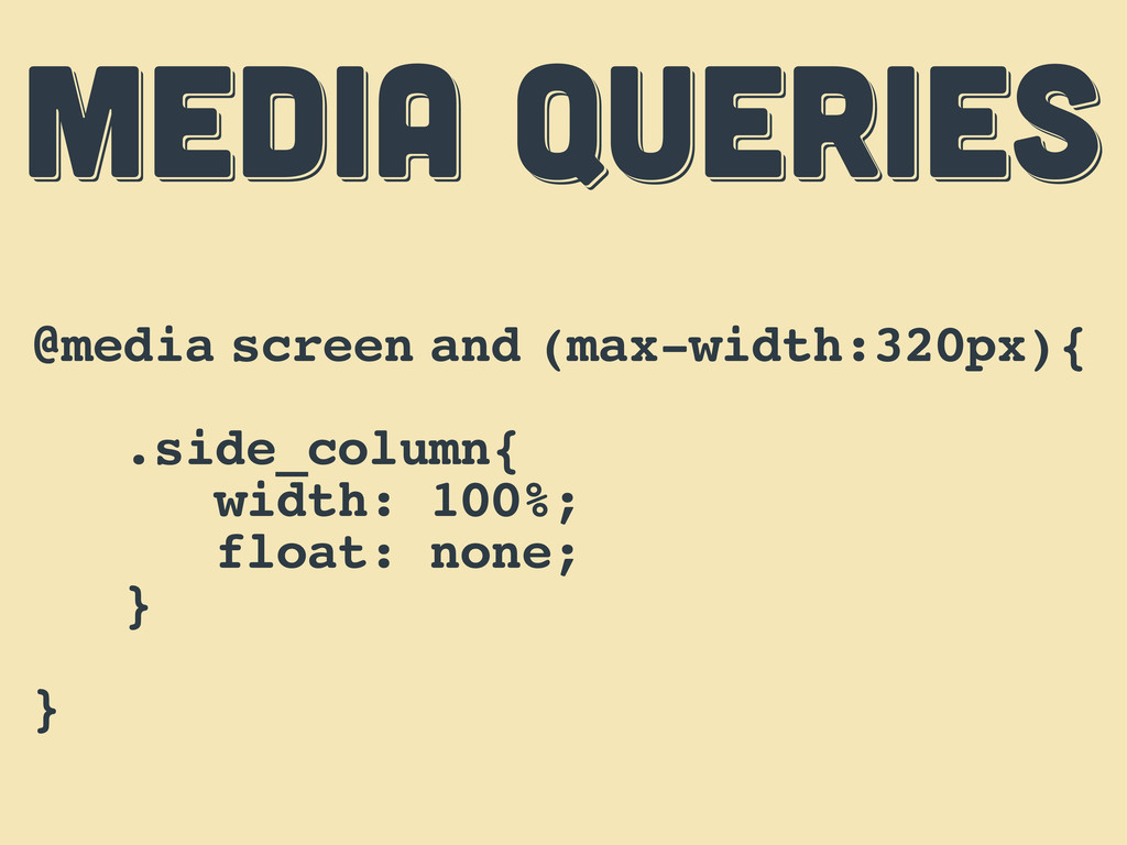
MEDIA QUERIES MEDIA QUERIES MEDIA QUERIES @media screen and (max-width:320px){
.side_column{ width: 100%; float: none; } }
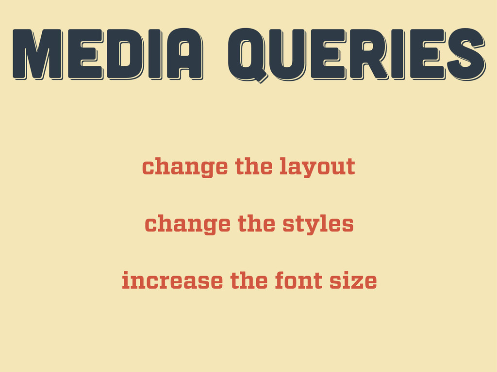
MEDIA QUERIES MEDIA QUERIES MEDIA QUERIES change the layout change
the styles increase the font size
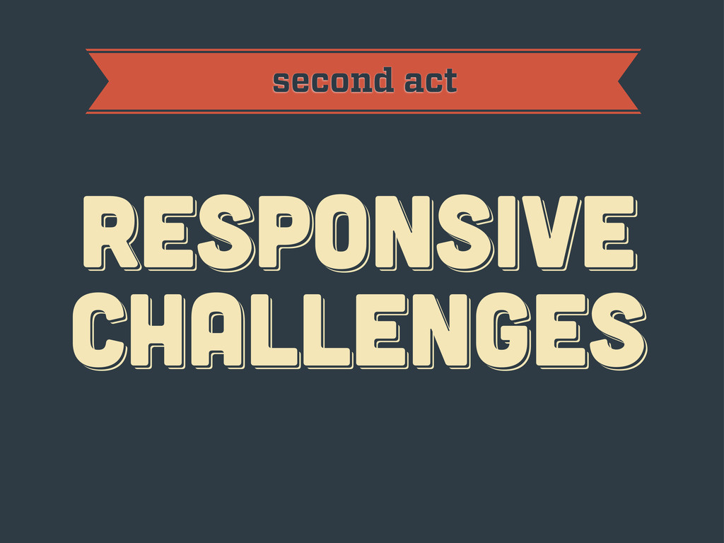
RESPoNSIVE challenges RESPoNSIVE challenges Responsive challenges second act
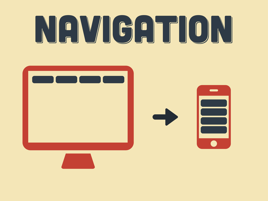
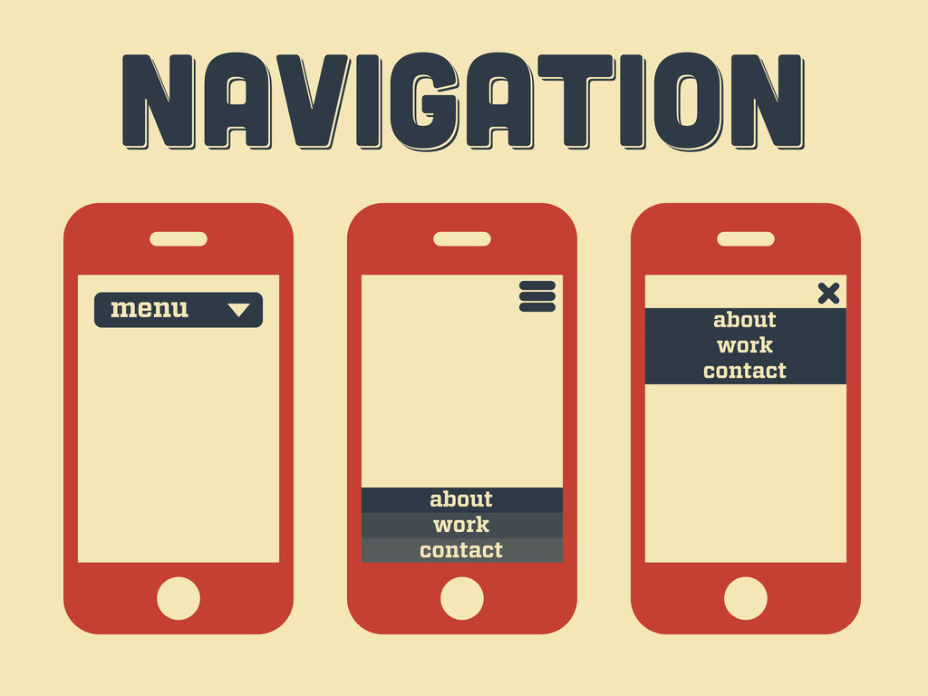
Navigation Navigation Navigation
Navigation Navigation Navigation menu contact work about contact work about
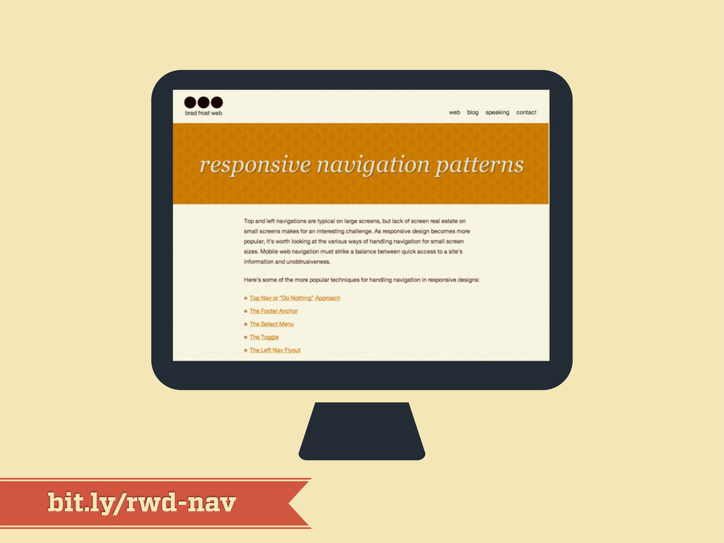
bit.ly/rwd-nav
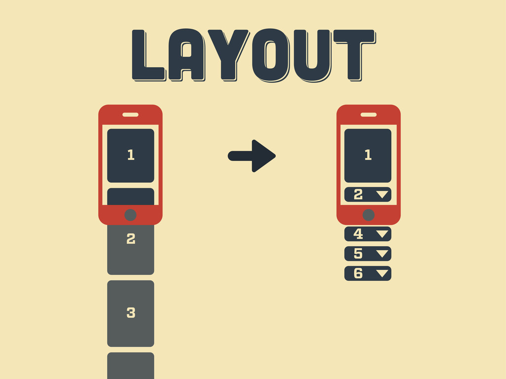
LAYOUT LAYOUT layout 1 2 3 4 6 5
3 2 LAYOUT LAYOUT layout 1 3 1 2 4
5 6
LAYOUT LAYOUT layout
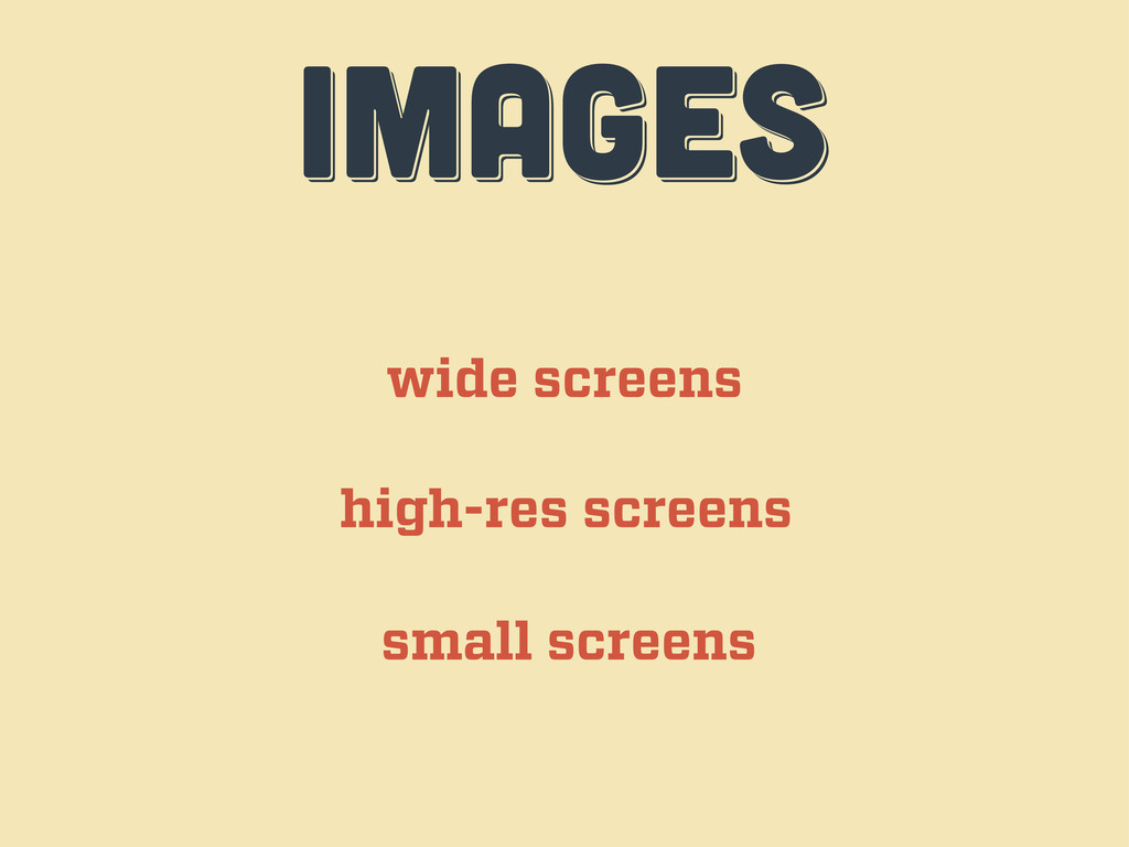
IMAGES IMAGES images wide screens high-res screens small screens
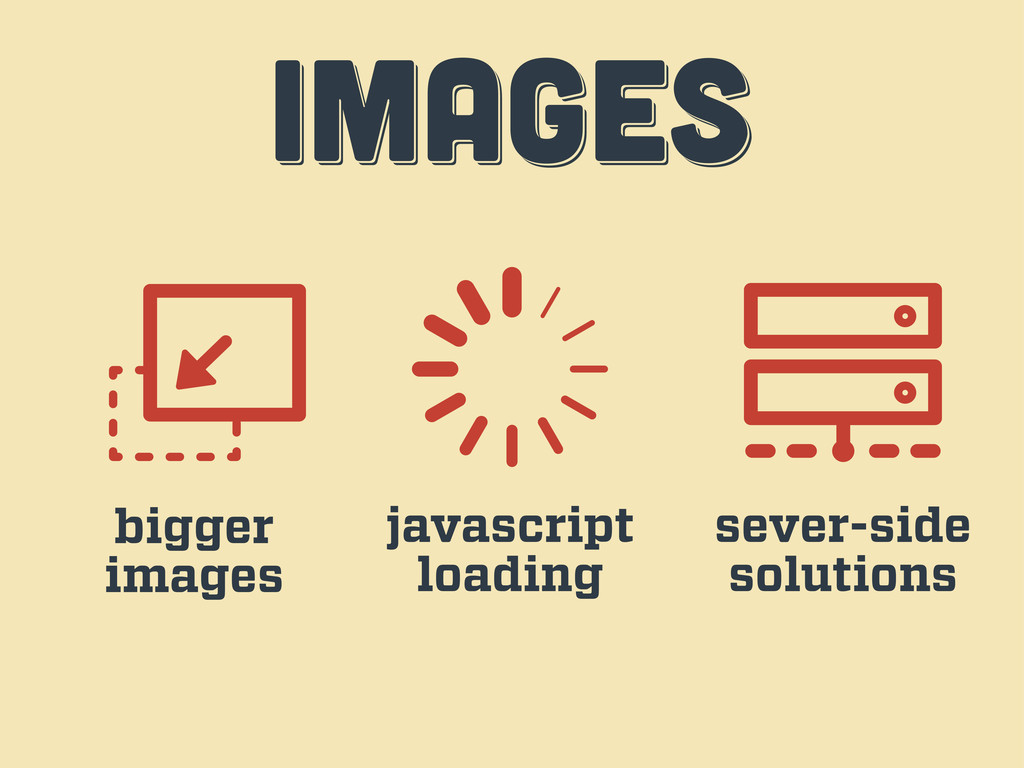
IMAGES IMAGES images bigger images javascript loading sever-side solutions
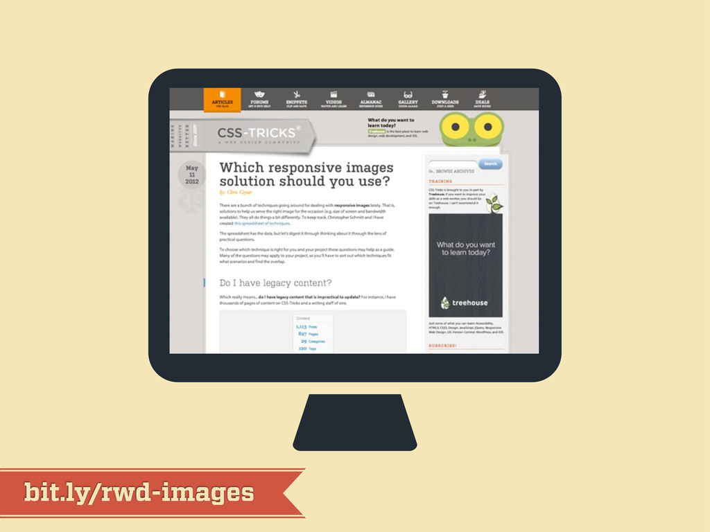
bit.ly/rwd-images
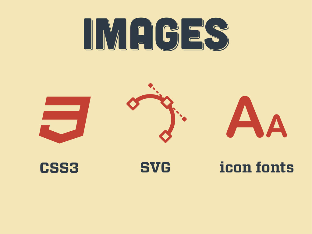
IMAGES IMAGES images CSS3 SVG icon fonts
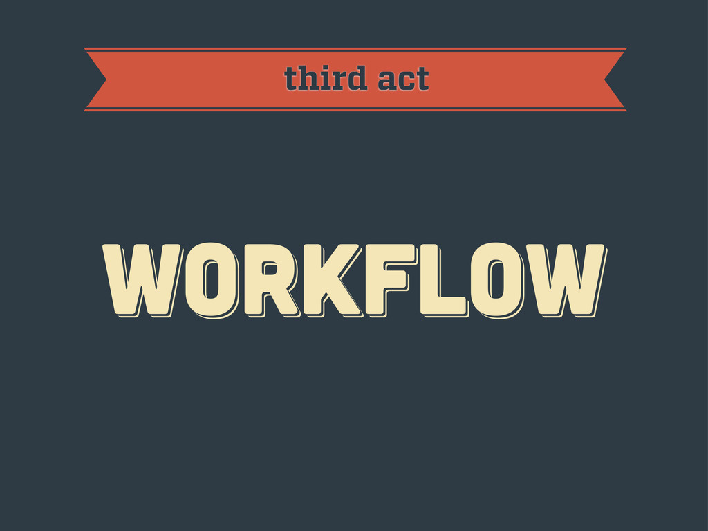
workflow workflow workflow third act
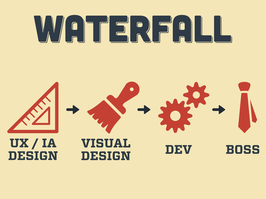
WATERFALL WATERFALL WATERFALL UX / IA DESIGN VISUAL DESIGN DEV
BOSS
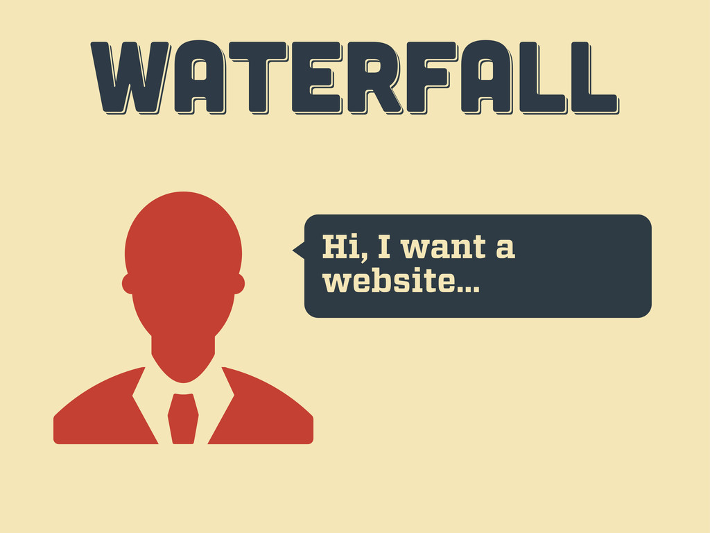
Hi, I want a website… WATERFALL WATERFALL WATERFALL
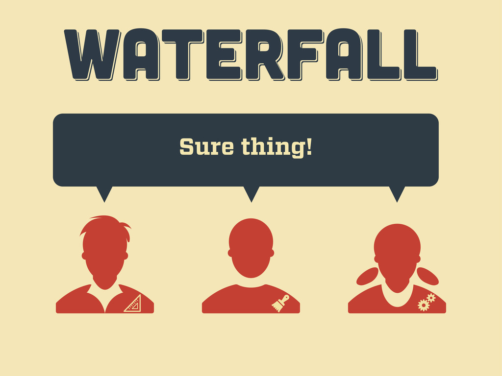
Sure thing! WATERFALL WATERFALL WATERFALL
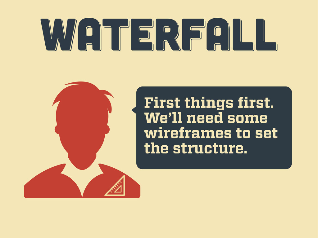
First things first. We’ll need some wireframes to set the
structure. WATERFALL WATERFALL WATERFALL
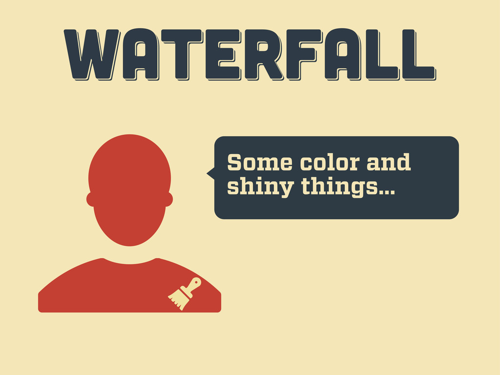
Some color and shiny things… WATERFALL WATERFALL WATERFALL
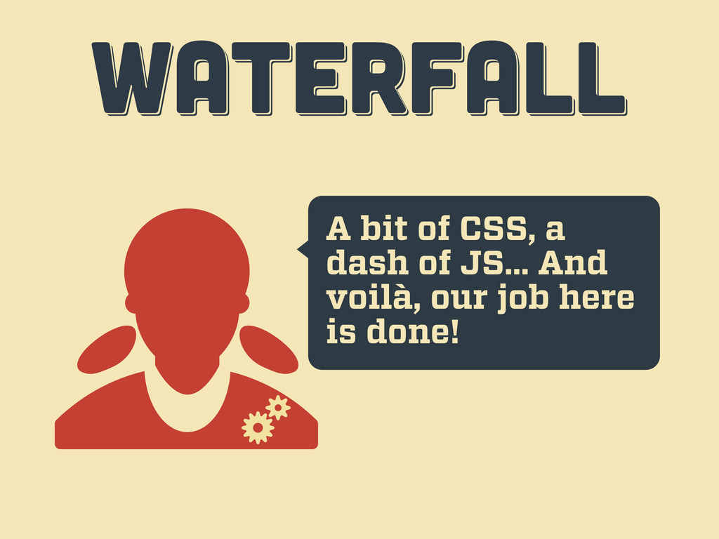
A bit of CSS, a dash of JS... And voilà,
our job here is done! WATERFALL WATERFALL WATERFALL
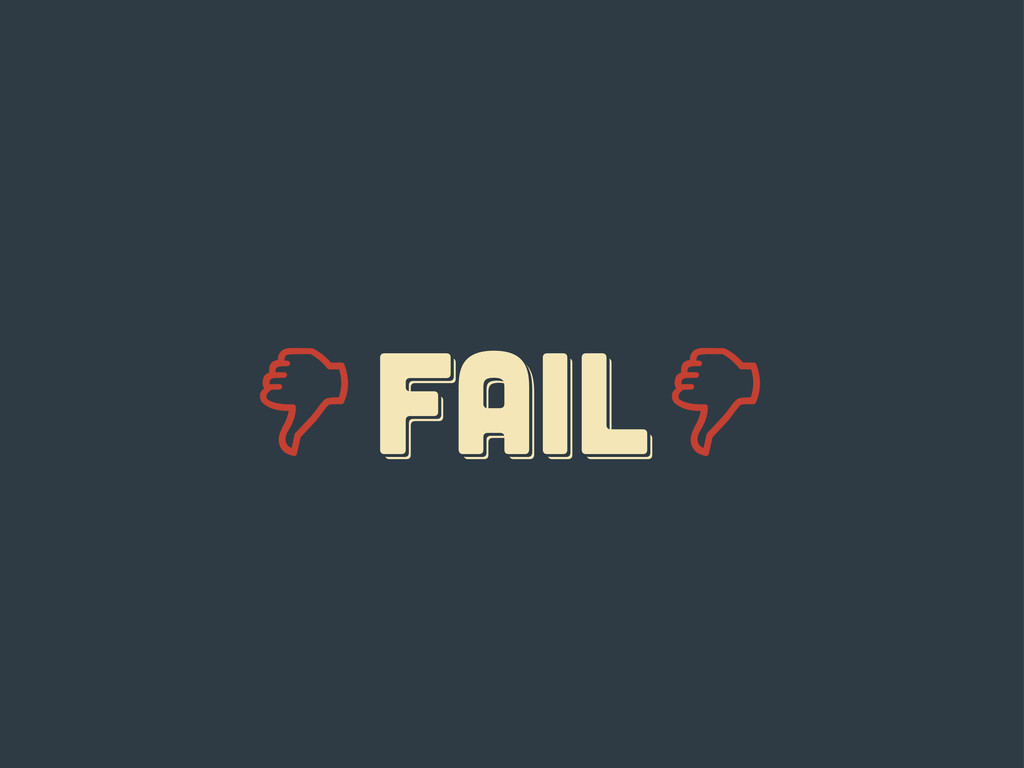
Er... guys... WATERFALL WATERFALL WATERFALL
FAIL fail Fail
responsive responsive Responsive
ten tips ten tips ten tips fourth act
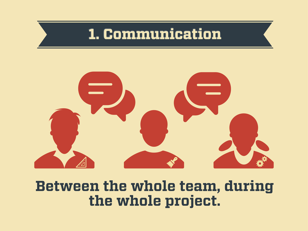
1. Communication Between the whole team, during the whole project.
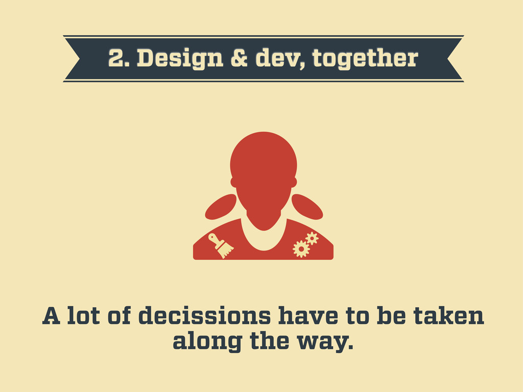
2. Design & dev, together A lot of decissions have
to be taken along the way.
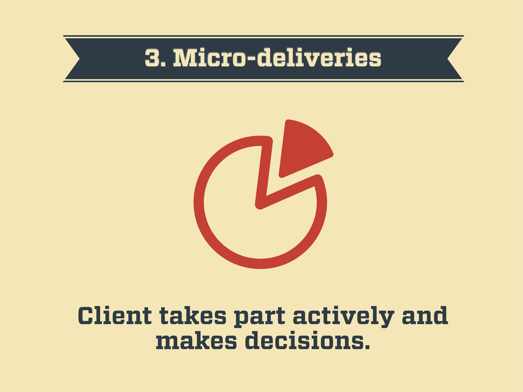
3. Micro-deliveries Client takes part actively and makes decisions.
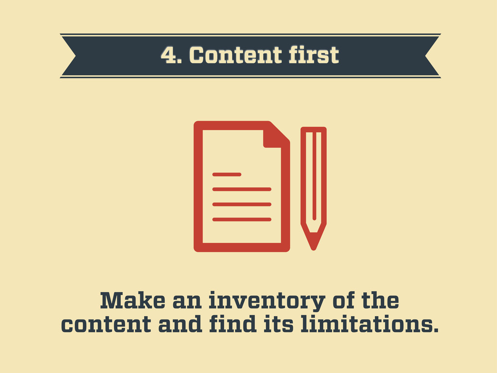
4. Content first Make an inventory of the content and
find its limitations.
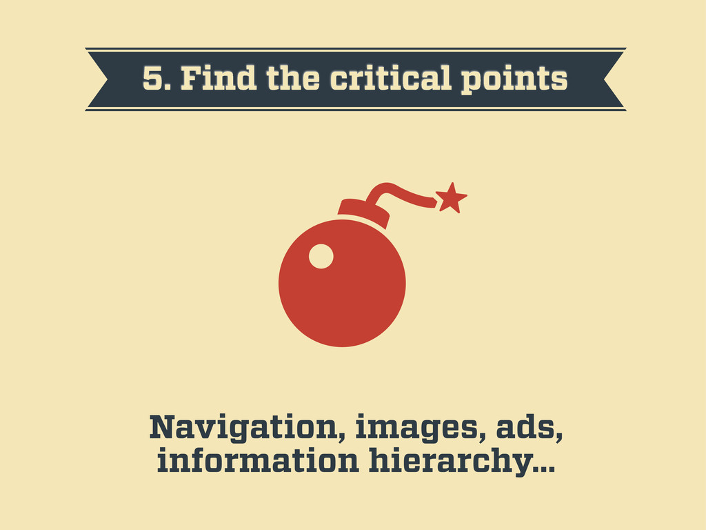
5. Find the critical points Navigation, images, ads, information hierarchy…
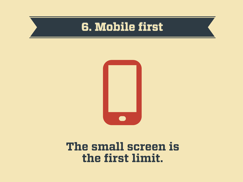
6. Mobile first The small screen is the first limit.
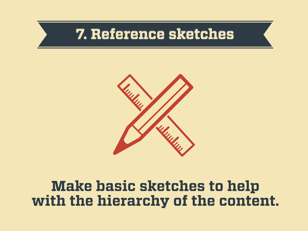
7. Reference sketches Make basic sketches to help with the
hierarchy of the content.
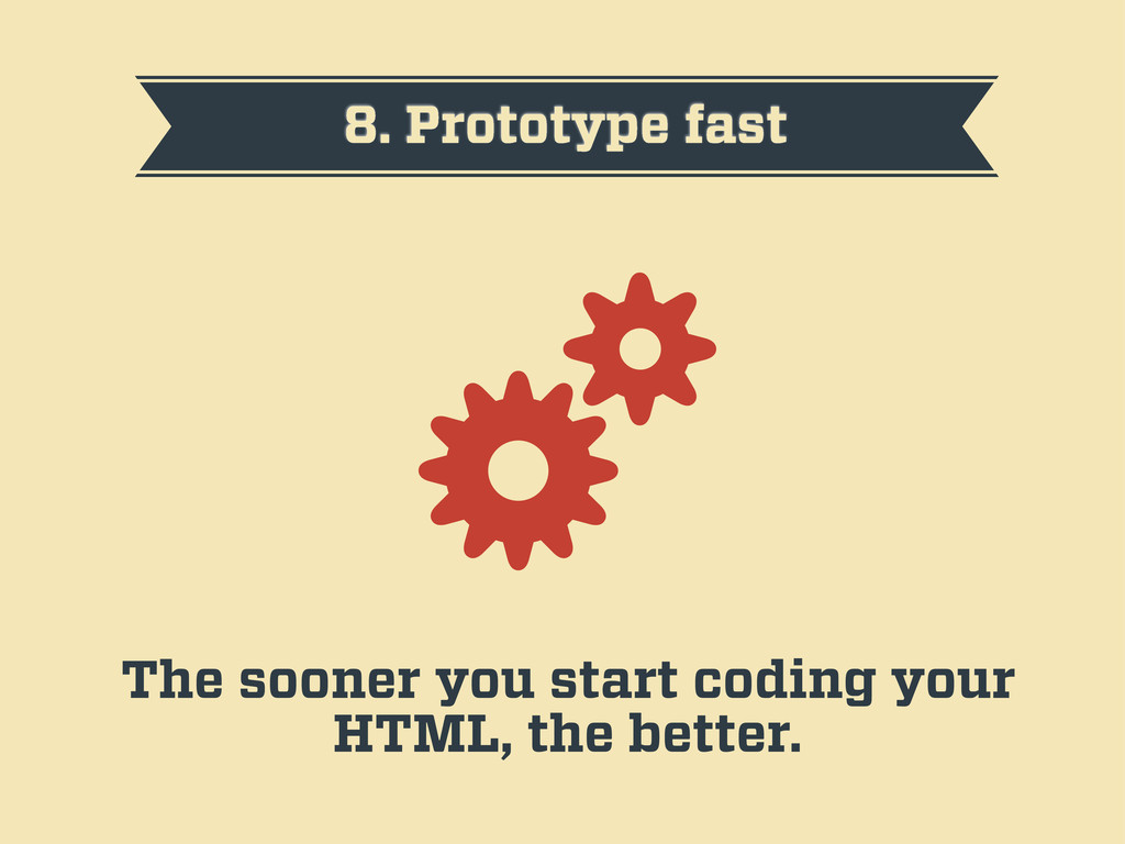
8. Prototype fast The sooner you start coding your HTML,
the better.
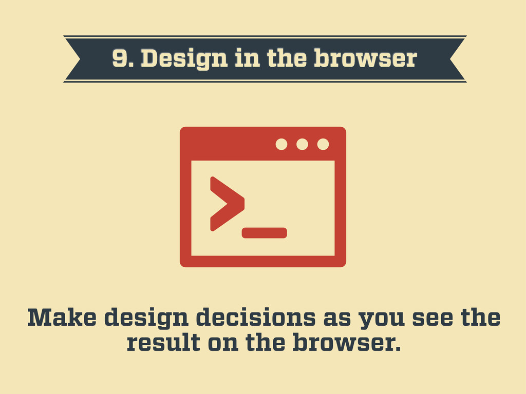
9. Design in the browser Make design decisions as you
see the result on the browser.
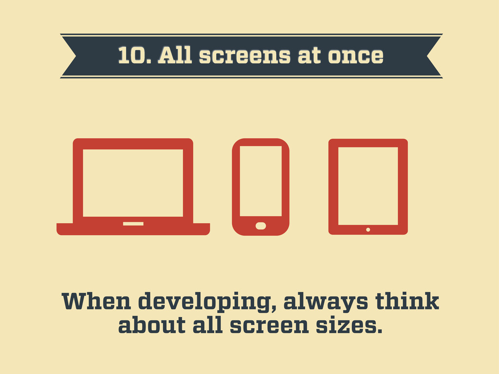
10. All screens at once When developing, always think about
all screen sizes.
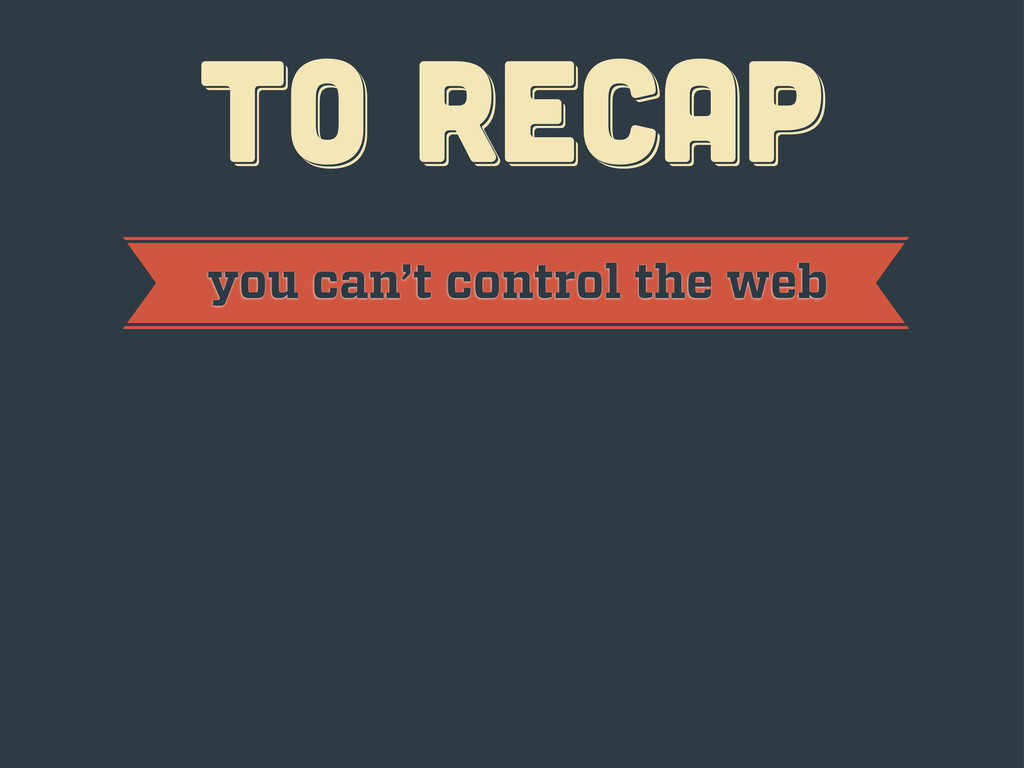
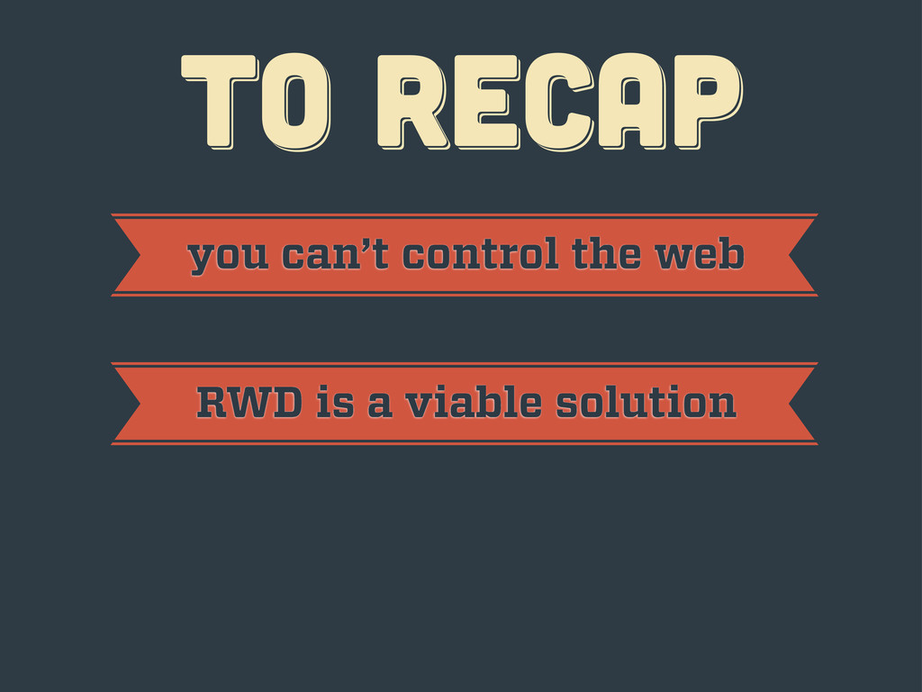
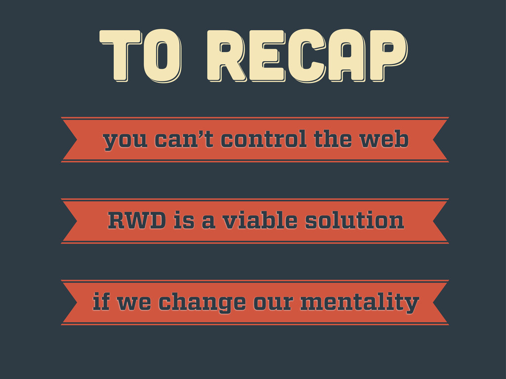
TO RECAP TO RECAP TO RECAP
TO RECAP TO RECAP TO RECAP you can’t control the
web
TO RECAP TO RECAP TO RECAP you can’t control the
web RWD is a viable solution
TO RECAP TO RECAP TO RECAP you can’t control the
web RWD is a viable solution if we change our mentality
thanks! thanks! thanks! Javier Usobiaga · http://Swwweet.com · @htmlboy
 swwweet
 riku_423
 aeonpeople
 dip_tech
 oracle4engineer
 oqtopus
 mu7889yoon
 sansantech
 guaca
guaca
 kentosuzuki
 thehajime
 shoheimitani
 soudai
 portentint
 techseoconnect
 sachag
 aleyda
 lara
lara
 varn
varn
 marktimemedia
 marcelosomers
 coloredviolet
 sergeychernyshev
 cassininazir