Upgrade to Pro
— share decks privately, control downloads, hide ads and more …
Speaker Deck
Features
Speaker Deck
PRO
Sign in
Sign up for free
Search
Search
Responsive Design
Search
Sponsored
·
Ship Features Fearlessly
Turn features on and off without deploys. Used by thousands of Ruby developers.
→
Andy Hume
November 13, 2011
Technology
1.4k
23
Share
Responsive Design
Practical approaches to building responsive websites
Andy Hume
November 13, 2011
More Decks by Andy Hume
See All by Andy Hume
Architecting resilient front-ends, jQuery UK, 2015
andyhume
2
1.2k
Building for performance and resilience
andyhume
5
1.3k
Architecting resilient front ends
andyhume
3
920
Guardian Responsive Design, SmashingConf 2013
andyhume
6
710
Web Fonts as a Progressive Enhancement, Ampersand 2013
andyhume
2
830
Anatomy of a responsive page load, WhiskyWeb 2013
andyhume
10
2k
Breaking News & Breaking Software, SyncConf 2013
andyhume
0
340
Anatomy of a responsive page load, Responsive Day Out 2013
andyhume
23
3.4k
Responsive Guardian
andyhume
21
1.2k
Other Decks in Technology
See All in Technology
Databricks における 生成AIガバナンスの実践
taka_aki
1
120
個人の発見を、組織の知恵に 〜生成AI活用を"探索"から"組織の仕組み"へ〜
kintotechdev
2
460
Oracle AI Database@AWS:サービス概要のご紹介
oracle4engineer
PRO
4
2.8k
AI Adaptable なテストを整える工夫 / Ways to Make Your Tests AI-Adaptable
bitkey
PRO
2
190
Kiro CLI v2.0.0がやってきた!
kentapapa
0
250
OpenID Connectによるサービス間連携
takesection
0
150
「気づいたら仕事が終わっている」バクラクAIエージェント本番運用の裏側 / layerx-bakuraku-aie2026
yuya4
6
2.6k
コードレビューを制するチームがソフトウェアデリバリーのフローを制す / Beyond Code Review: Distributing Its Responsibilities Across the SDLC
mtx2s
3
580
チームで実践する AI-DLC 思考の軌跡を残すチェックポイント設計
belongadmin
0
660
Terraformモジュールは、なぜ「魔境」化するのか
hayama17
1
140
さきさん文庫の書籍ができるまで
sakiengineer
0
330
OpenClawとHermesAgentでAI新入社員を作った話
takanoriyanada
0
150
Featured
See All Featured
Evolving SEO for Evolving Search Engines
ryanjones
0
210
[SF Ruby Conf 2025] Rails X
palkan
2
1.1k
No one is an island. Learnings from fostering a developers community.
thoeni
21
3.7k
エンジニアに許された特別な時間の終わり
watany
107
240k
It's Worth the Effort
3n
188
29k
How to Create Impact in a Changing Tech Landscape [PerfNow 2023]
tammyeverts
55
3.4k
GraphQLとの向き合い方2022年版
quramy
50
15k
Building Better People: How to give real-time feedback that sticks.
wjessup
370
20k
ラッコキーワード サービス紹介資料
rakko
1
3.5M
Navigating Team Friction
lara
192
16k
Visualizing Your Data: Incorporating Mongo into Loggly Infrastructure
mongodb
49
10k
Primal Persuasion: How to Engage the Brain for Learning That Lasts
tmiket
0
350
Transcript
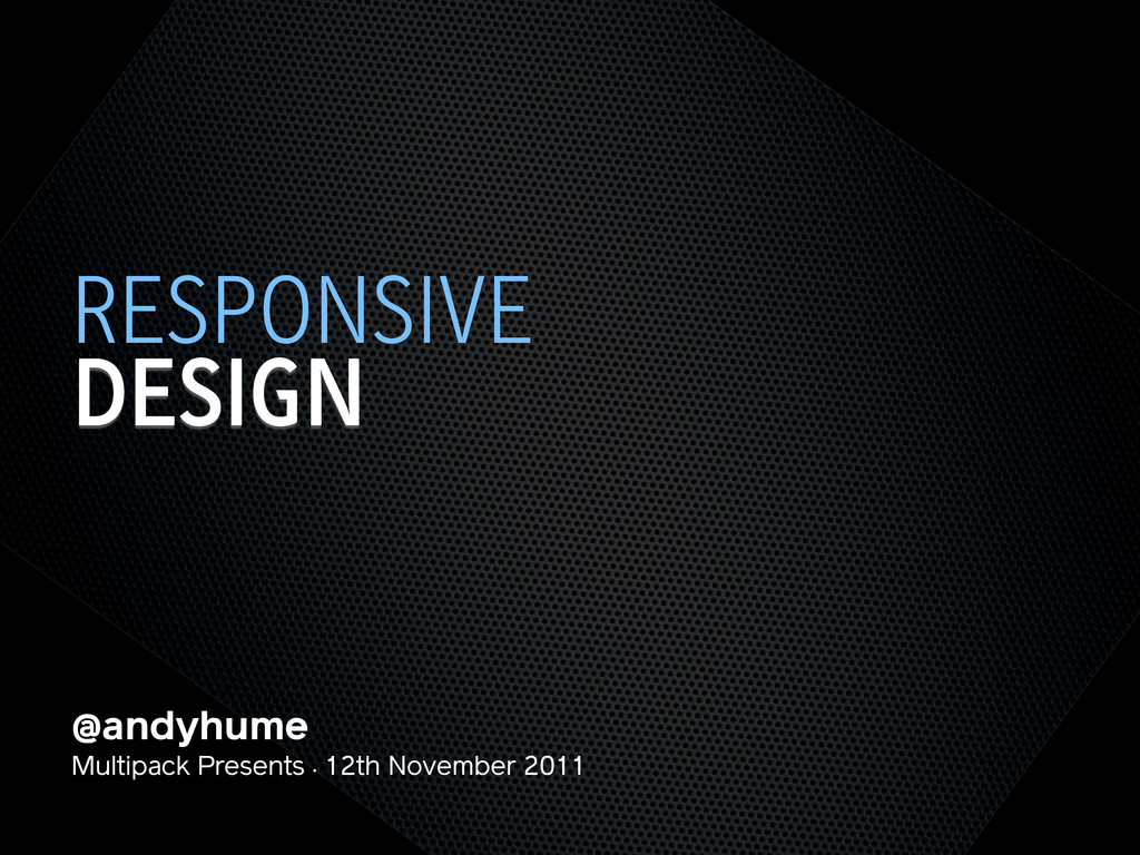
@andyhume Multipack Presents • 12th November 2011 DESIGN RESPONSIVE
@andyhume Multipack Presents • 12th November 2011 DESIGN RESPONSIVE
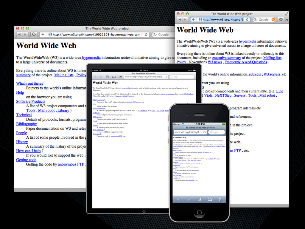
None
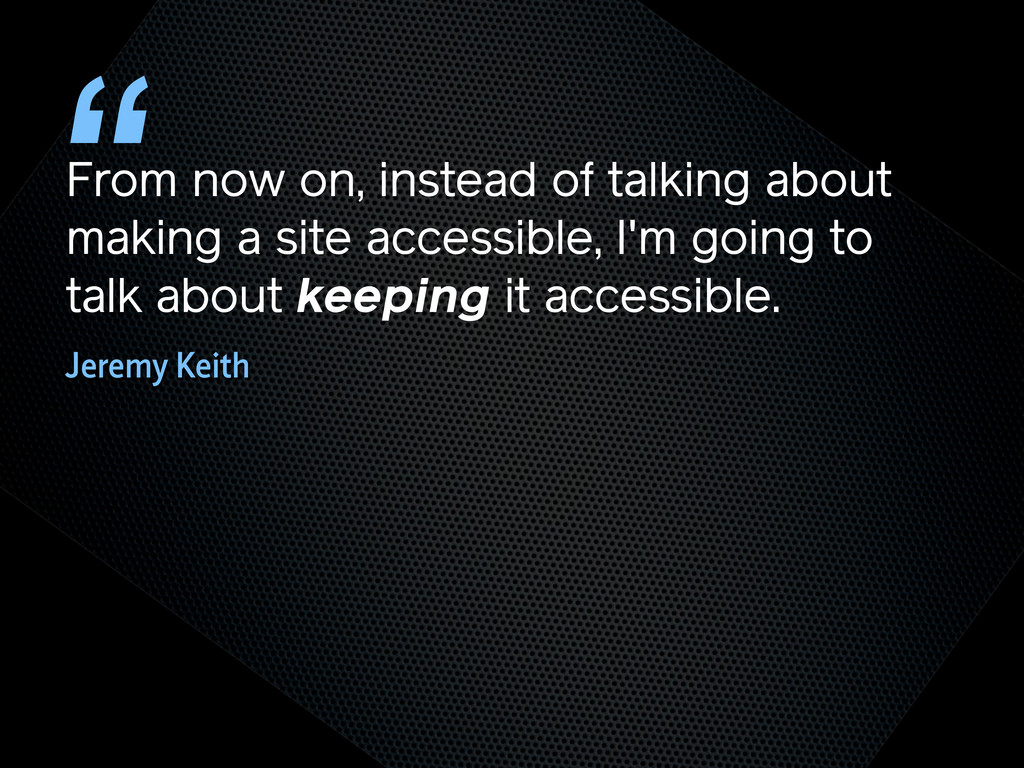
From now on, instead of talking about making a site
accessible, I'm going to talk about keeping it accessible. “ Jeremy Keith
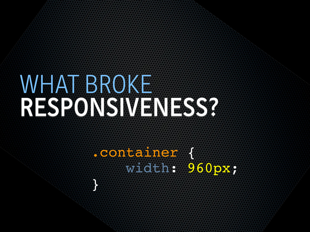
TRY NOT TO BREAK IT? THE WEB WORKS
RESPONSIVENESS? WHAT BROKE .container { width: 960px; }
SEMANTIC HTML STEPS[0]
OOCSS STEPS[1] Loosely couple content styling from layout styling <link
rel="stylesheet" href="core.css">
CORE.CSS STEPS[4] .product .title { font-size: 1em; } @media screen
and (min-width: 60em) { .product .title { font-size: 1.4em; } } Keep modules together
SELECTOR QUERIES? STEPS[4] <div class="product" data-squery="min-width: 400px=wide max-width:10em=small"> <p>Content here</p>
</div> Adapt content based on container width https://github.com/ahume/selector-queries
SELECTOR QUERIES? STEPS[4] .product img { max-width: 100%; } .product.wide
img { // greater than 400px float: left; margin-right: 1em; max-width: auto; } Adapt content based on container width https://github.com/ahume/selector-queries
NAVIGATION STEPS[2]
NAVIGATION STEPS[2]
ADDING LAYOUT STEPS[3] <link rel="stylesheet" href="core.css"> <link rel="stylesheet" href="layout.css" media="screen
and (min-width:40em)"> Loosely couple content styling from layout styling
IE <9 STEPS[5] Send full ‘desktop’ layout <link rel="stylesheet" href="core.css">
<link rel="stylesheet" href="layout.css" media="screen and (min-width:40em)"> <!--[if lt IE 9]> <link rel="stylesheet" href="layout.css" media="screen"> <![endif]-->
IE <9 STEPS[5] Send full ‘desktop’ layout - but not
to mobile <link rel="stylesheet" href="core.css"> <link rel="stylesheet" href="layout.css" media="screen and (min-width:40em)"> <!--[if lt IE 9] & !(IEMobile)]> <link rel="stylesheet" href="layout.css" media="screen"> <![endif]-->
IE <9 STEPS[5] Send full ‘desktop’ layout - or not
<link rel="stylesheet" href="core.css"> <link rel="stylesheet" href="layout.css" media="screen and (min-width:40em)"> <!--[if lt IE 9] & !(IEMobile) & (gt IE6)]> <link rel="stylesheet" href="layout.css" media="screen"> <![endif]-->
IE <9 STEPS[5] Polyfill media queries <script rel="respond.js"></script> https://github.com/scottjehl/Respond
VIEWPORT STEPS[6] Set layout viewport width to the device width
<meta name="viewport" content="width=device-width, initial-scale=1.0">
VIEWPORT STEPS[6] W3C Syntax: coming soon http://dev.w3.org/csswg/css-device-adapt/ @viewport { width:
device-width; zoom: 1.0; }
IMAGES STEPS[7] Shrinking img { max-width: 100%; }
RESPONSIVE IMAGES STEPS[7] Small image by default Don’t download both
RESPONSIVE IMAGES STEPS[7] Client-side solutions https://github.com/filamentgroup/Responsive-Images https://github.com/ahume/Responsive-Images https://github.com/allmarkedup/responsive-images-alt
RESPONSIVE IMAGES STEPS[7] Here and now? src.sencha.io <img src="http://src.sencha.io/http://andyhume.net/ u.jpg">
RESPONSIVE IMAGES STEPS[7] Here and now? Image replacement <div class="logo">
<img src="logo.png" alt="Company name"> </div> .logo { background-image: url(logo-large.png); } .logo img { position: absolute; left: -9999px; }
SVG STEPS[8] Same approaches to support as responsive images
ENHANCING CONTENT STEPS[9] What’s core content?
ENHANCING CONTENT STEPS[9]
ENHANCING CONTENT STEPS[9]
ENHANCING CONTENT STEPS[9] if ($(document).width() > 640) { ! $.get('path/to/html',
function(data) { ! ! $('[role="complementary"]').append(data); ! }); } What’s core content?
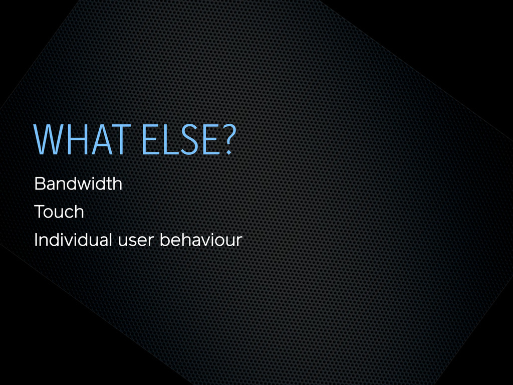
WHAT ELSE? Bandwidth Touch Individual user behaviour
THE END @andyhume Multipack Presents • 12th November 2011
 andyhume
 taka_aki
 kintotechdev
 oracle4engineer
 bitkey
 kentapapa
 takesection
 yuya4
yuya4
 mtx2s
mtx2s
 belongadmin
 hayama17
 sakiengineer
 takanoriyanada
 ryanjones
 palkan
 thoeni
 watany
 3n
3n
 tammyeverts
 quramy
 wjessup
 rakko
rakko
 lara
lara
 mongodb
 tmiket
![SEMANTIC HTML STEPS[0]](https://files.speakerdeck.com/presentations/4ec011cd70a8050051006edf/slide_6.jpg)
![OOCSS STEPS[1] Loosely couple content styling from layout styling <link](https://files.speakerdeck.com/presentations/4ec011cd70a8050051006edf/slide_7.jpg)
![CORE.CSS STEPS[4] .product .title { font-size: 1em; } @media screen](https://files.speakerdeck.com/presentations/4ec011cd70a8050051006edf/slide_8.jpg)
![SELECTOR QUERIES? STEPS[4] <div class="product" data-squery="min-width: 400px=wide max-width:10em=small"> <p>Content here</p>](https://files.speakerdeck.com/presentations/4ec011cd70a8050051006edf/slide_9.jpg)
![SELECTOR QUERIES? STEPS[4] .product img { max-width: 100%; } .product.wide](https://files.speakerdeck.com/presentations/4ec011cd70a8050051006edf/slide_10.jpg)
![NAVIGATION STEPS[2]](https://files.speakerdeck.com/presentations/4ec011cd70a8050051006edf/slide_11.jpg)
![NAVIGATION STEPS[2]](https://files.speakerdeck.com/presentations/4ec011cd70a8050051006edf/slide_12.jpg)
![ADDING LAYOUT STEPS[3] <link rel="stylesheet" href="core.css"> <link rel="stylesheet" href="layout.css" media="screen](https://files.speakerdeck.com/presentations/4ec011cd70a8050051006edf/slide_13.jpg)
![IE <9 STEPS[5] Send full ‘desktop’ layout <link rel="stylesheet" href="core.css">](https://files.speakerdeck.com/presentations/4ec011cd70a8050051006edf/slide_14.jpg)
![IE <9 STEPS[5] Send full ‘desktop’ layout - but not](https://files.speakerdeck.com/presentations/4ec011cd70a8050051006edf/slide_15.jpg)
![IE <9 STEPS[5] Send full ‘desktop’ layout - or not](https://files.speakerdeck.com/presentations/4ec011cd70a8050051006edf/slide_16.jpg)
![IE <9 STEPS[5] Polyfill media queries <script rel="respond.js"></script> https://github.com/scottjehl/Respond](https://files.speakerdeck.com/presentations/4ec011cd70a8050051006edf/slide_17.jpg)
![VIEWPORT STEPS[6] Set layout viewport width to the device width](https://files.speakerdeck.com/presentations/4ec011cd70a8050051006edf/slide_18.jpg)
![VIEWPORT STEPS[6] W3C Syntax: coming soon http://dev.w3.org/csswg/css-device-adapt/ @viewport { width:](https://files.speakerdeck.com/presentations/4ec011cd70a8050051006edf/slide_19.jpg)
![IMAGES STEPS[7] Shrinking img { max-width: 100%; }](https://files.speakerdeck.com/presentations/4ec011cd70a8050051006edf/slide_20.jpg)
![RESPONSIVE IMAGES STEPS[7] Small image by default Don’t download both](https://files.speakerdeck.com/presentations/4ec011cd70a8050051006edf/slide_21.jpg)
![RESPONSIVE IMAGES STEPS[7] Client-side solutions https://github.com/filamentgroup/Responsive-Images https://github.com/ahume/Responsive-Images https://github.com/allmarkedup/responsive-images-alt](https://files.speakerdeck.com/presentations/4ec011cd70a8050051006edf/slide_22.jpg)
![RESPONSIVE IMAGES STEPS[7] Here and now? src.sencha.io <img src="http://src.sencha.io/http://andyhume.net/ u.jpg">](https://files.speakerdeck.com/presentations/4ec011cd70a8050051006edf/slide_23.jpg)
![RESPONSIVE IMAGES STEPS[7] Here and now? Image replacement <div class="logo">](https://files.speakerdeck.com/presentations/4ec011cd70a8050051006edf/slide_24.jpg)
![SVG STEPS[8] Same approaches to support as responsive images](https://files.speakerdeck.com/presentations/4ec011cd70a8050051006edf/slide_25.jpg)
![ENHANCING CONTENT STEPS[9] What’s core content?](https://files.speakerdeck.com/presentations/4ec011cd70a8050051006edf/slide_26.jpg)
![ENHANCING CONTENT STEPS[9]](https://files.speakerdeck.com/presentations/4ec011cd70a8050051006edf/slide_27.jpg)
![ENHANCING CONTENT STEPS[9]](https://files.speakerdeck.com/presentations/4ec011cd70a8050051006edf/slide_28.jpg)
![ENHANCING CONTENT STEPS[9] if ($(document).width() > 640) { ! $.get('path/to/html',](https://files.speakerdeck.com/presentations/4ec011cd70a8050051006edf/slide_29.jpg)