Upgrade to Pro
— share decks privately, control downloads, hide ads and more …
Speaker Deck
Features
Speaker Deck
PRO
Sign in
Sign up for free
Search
Search
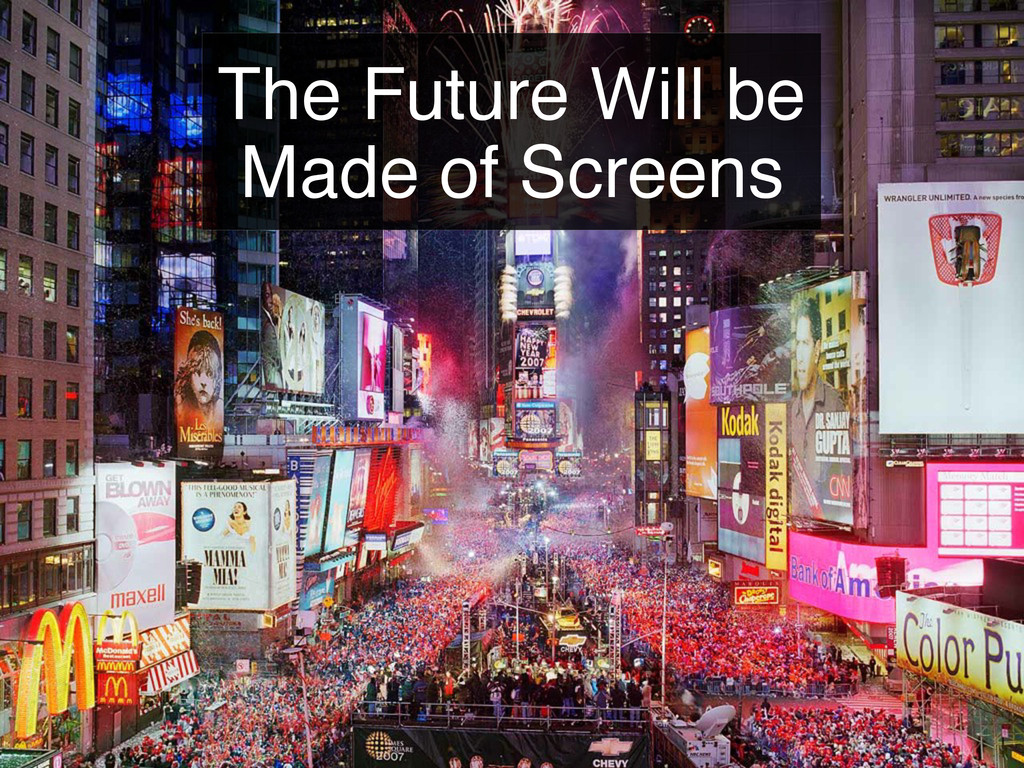
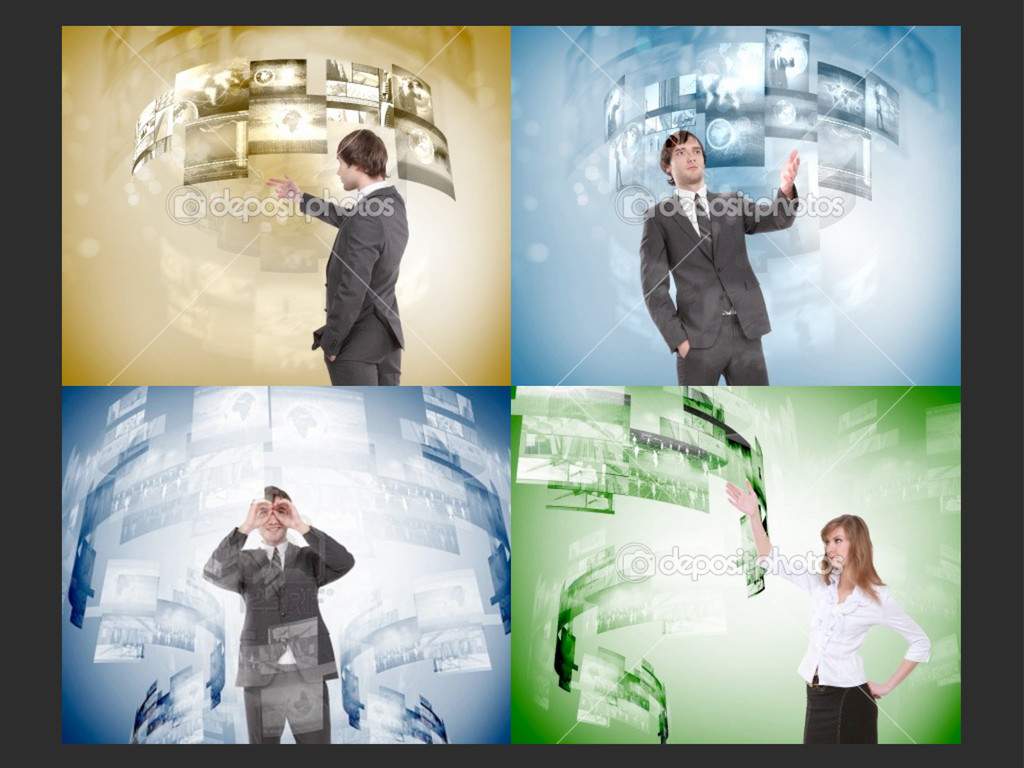
The Future Will be Made of Screens
Search
Sponsored
·
Your Podcast. Everywhere. Effortlessly.
Share. Educate. Inspire. Entertain. You do you. We'll handle the rest.
→
binx
February 24, 2012
320
3
Share
The Future Will be Made of Screens
Presented at the February 2012 Designers & Geeks Meeup
binx
February 24, 2012
More Decks by binx
See All by binx
On the Importance of Iteration
binx
0
130
Designing for Spacecraft Operations
binx
2
640
Place and Space
binx
0
540
Error: Success
binx
0
550
Peak Visualization?
binx
1
620
The Data Visualization Hustle
binx
2
480
People, Not Users
binx
2
270
Data Collection and Memory
binx
1
250
The Road To Code
binx
1
410
Featured
See All Featured
HU Berlin: Industrial-Strength Natural Language Processing with spaCy and Prodigy
inesmontani
PRO
0
390
"I'm Feeling Lucky" - Building Great Search Experiences for Today's Users (#IAC19)
danielanewman
231
23k
Rails Girls Zürich Keynote
gr2m
96
14k
16th Malabo Montpellier Forum Presentation
akademiya2063
PRO
0
140
Building the Perfect Custom Keyboard
takai
2
780
The State of eCommerce SEO: How to Win in Today's Products SERPs - #SEOweek
aleyda
2
11k
The Limits of Empathy - UXLibs8
cassininazir
1
340
Speed Design
sergeychernyshev
33
1.8k
End of SEO as We Know It (SMX Advanced Version)
ipullrank
3
4.2k
Marketing Yourself as an Engineer | Alaka | Gurzu
gurzu
0
210
Imperfection Machines: The Place of Print at Facebook
scottboms
270
14k
Helping Users Find Their Own Way: Creating Modern Search Experiences
danielanewman
31
3.2k
Transcript
The Future Will be Made of Screens
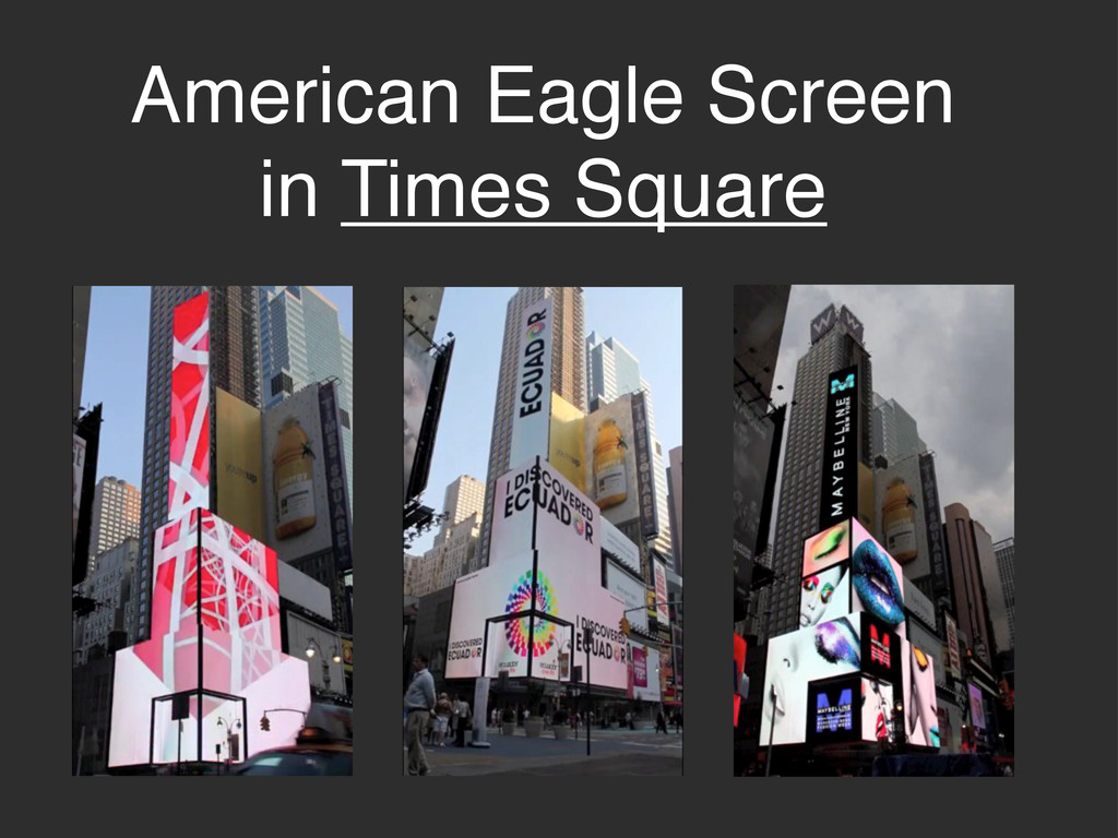
American Eagle Screen in Times Square
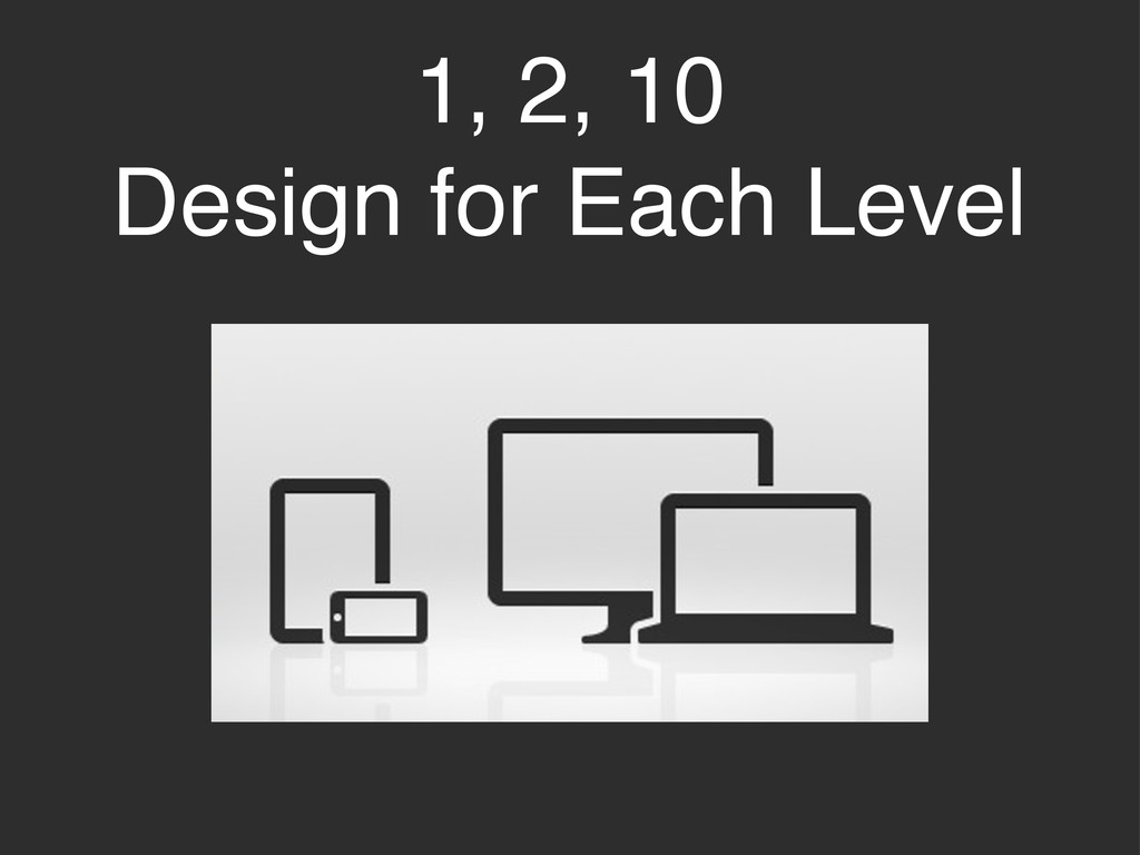
1, 2, 10 Design for Each Level
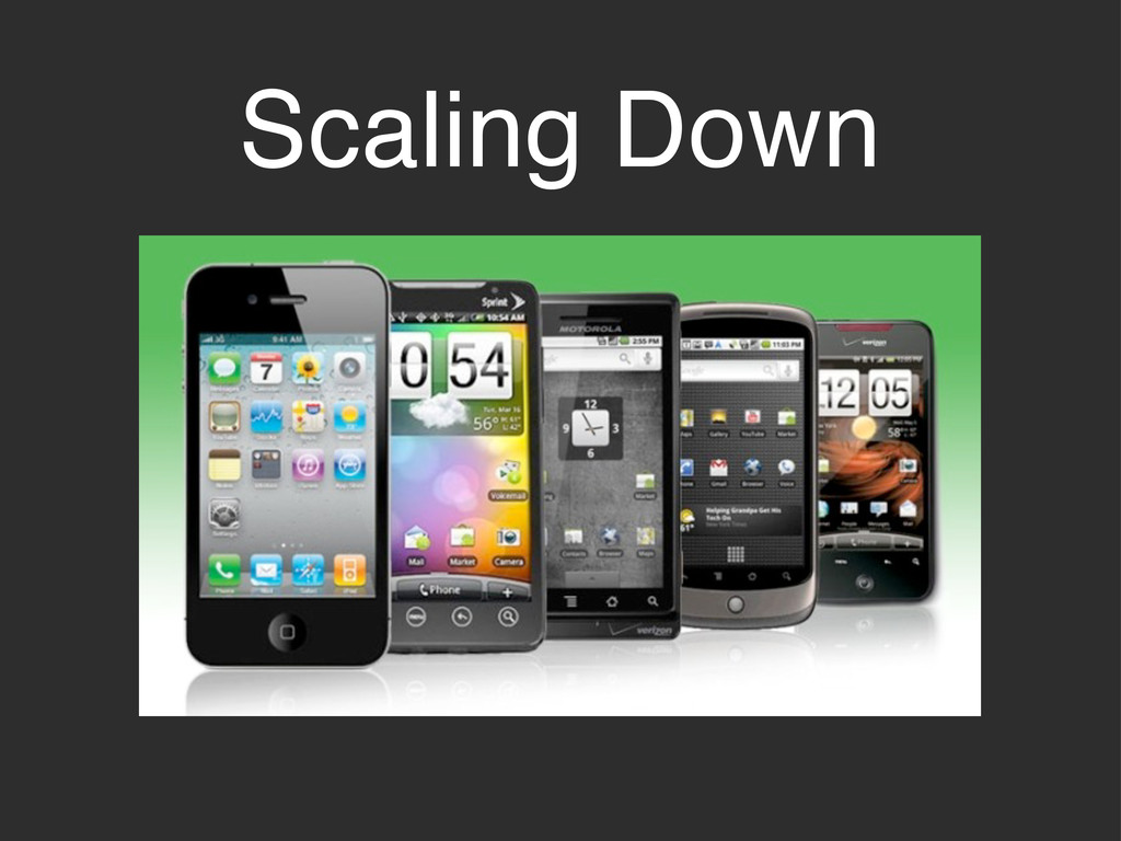
Scaling Down
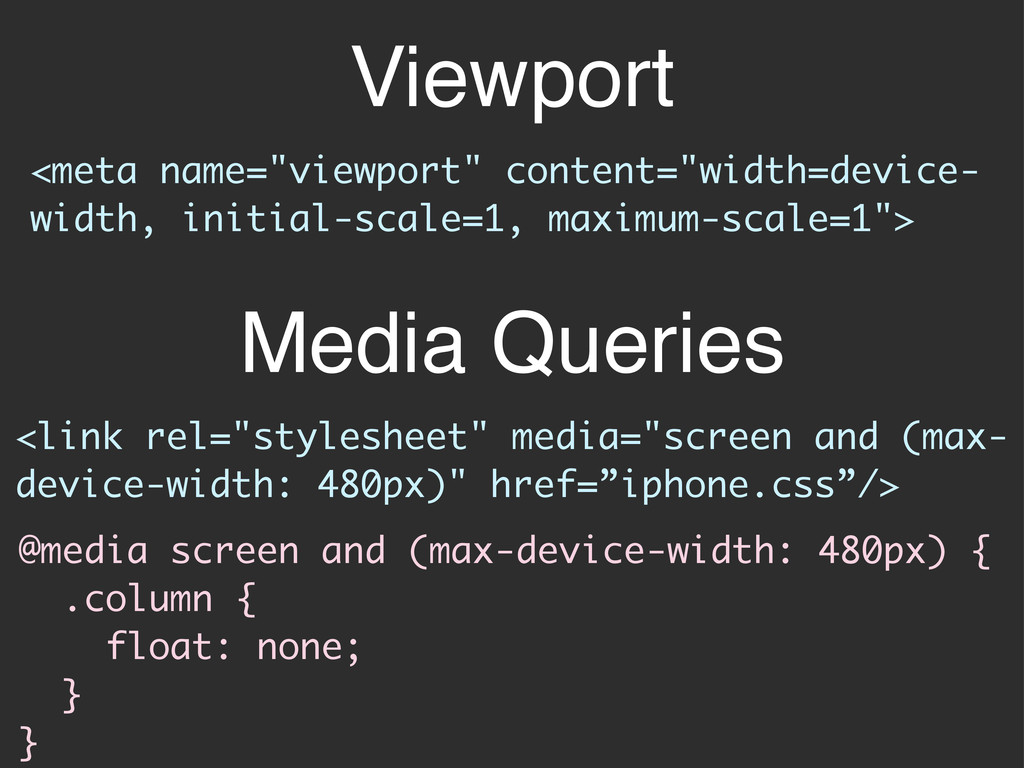
Viewport <link rel="stylesheet" media="screen and (max- device-width: 480px)" href=”iphone.css”/> <meta
name="viewport" content="width=device- width, initial-scale=1, maximum-scale=1"> @media screen and (max-device-width: 480px) { .column { float: none; } } Media Queries
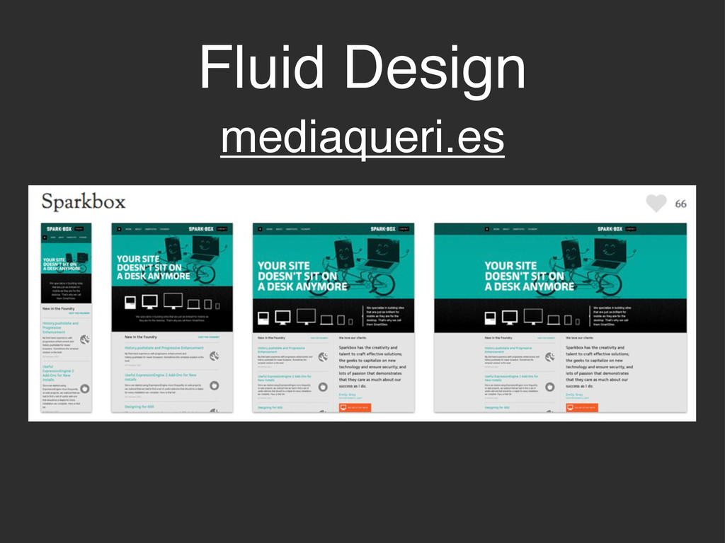
Fluid Design mediaqueri.es
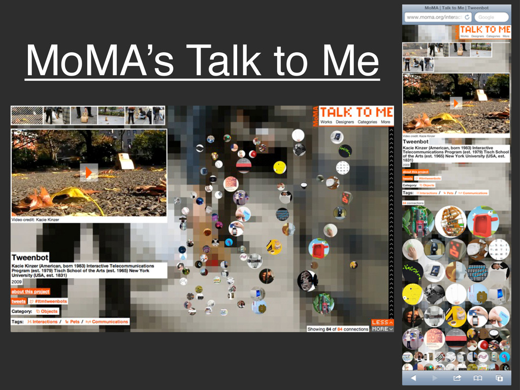
MoMA’s Talk to Me
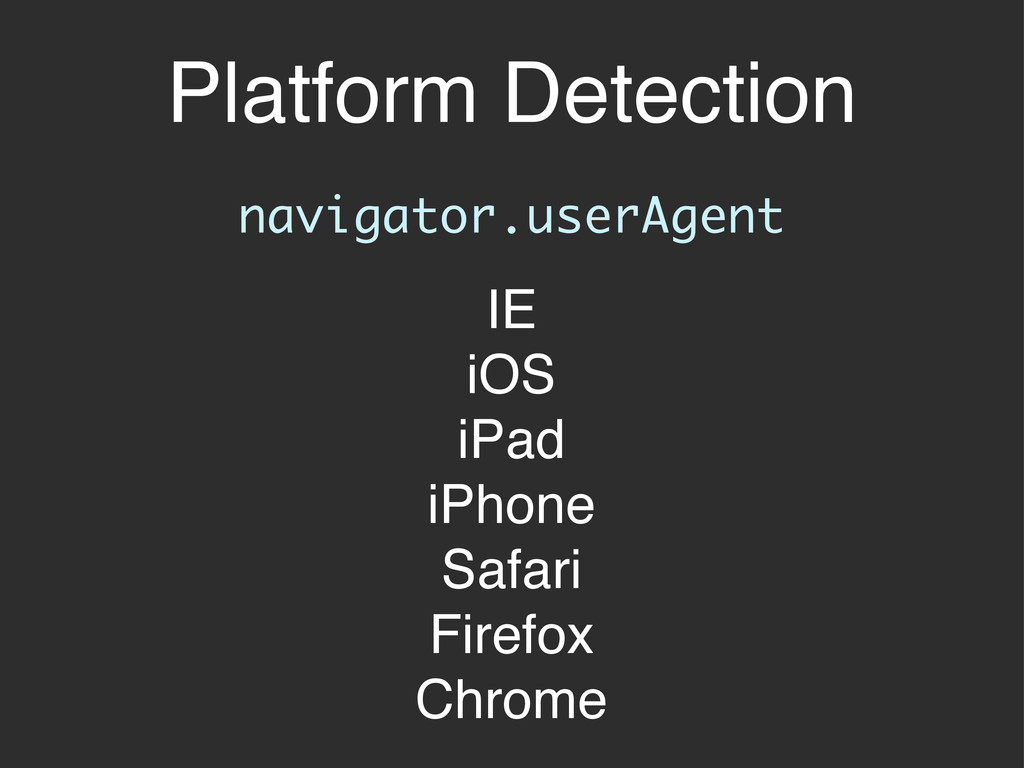
Platform Detection navigator.userAgent IE iOS iPad iPhone Safari Firefox Chrome
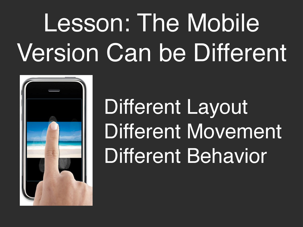
Lesson: The Mobile Version Can be Different Different Layout Different
Movement Different Behavior
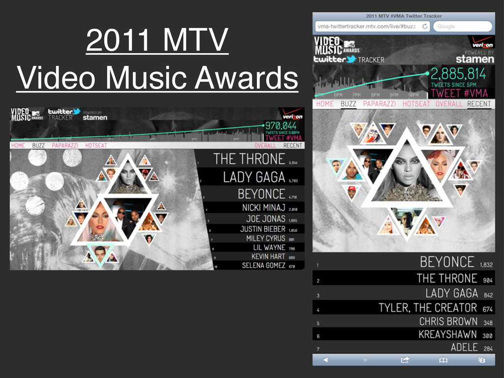
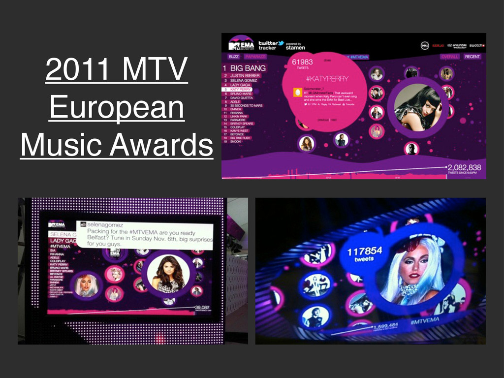
2011 MTV Video Music Awards
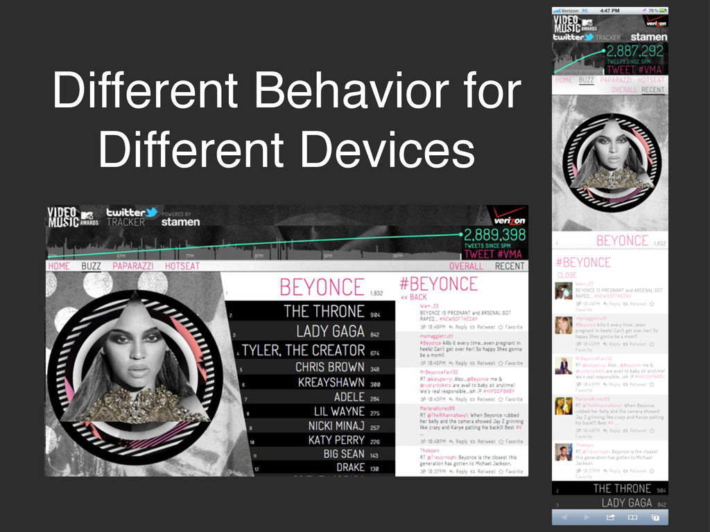
Different Behavior for Different Devices
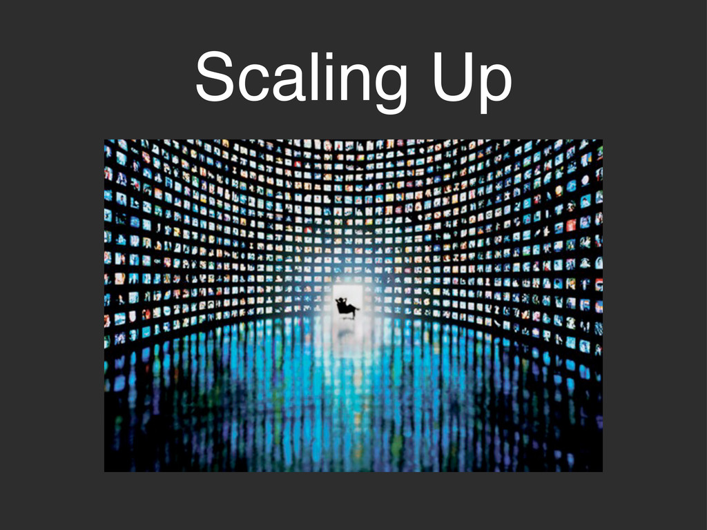
Scaling Up
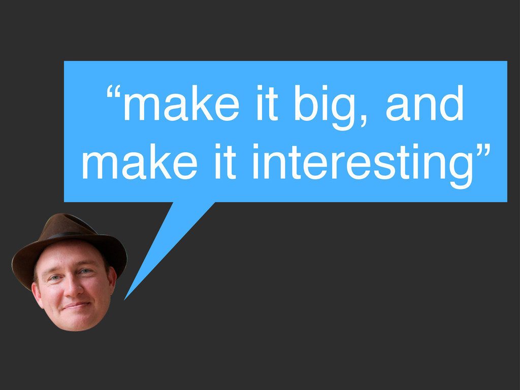
“make it big, and make it interesting”
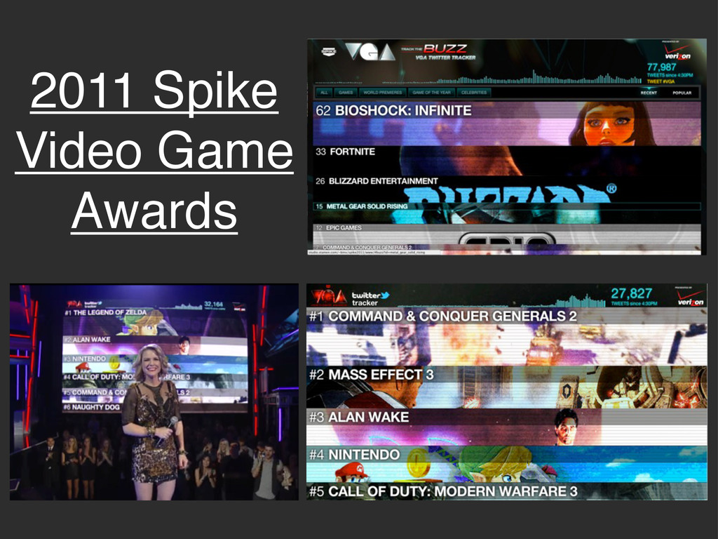
2011 Spike Video Game Awards
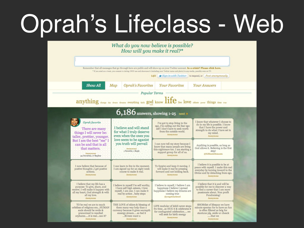
Oprah’s Lifeclass - Web
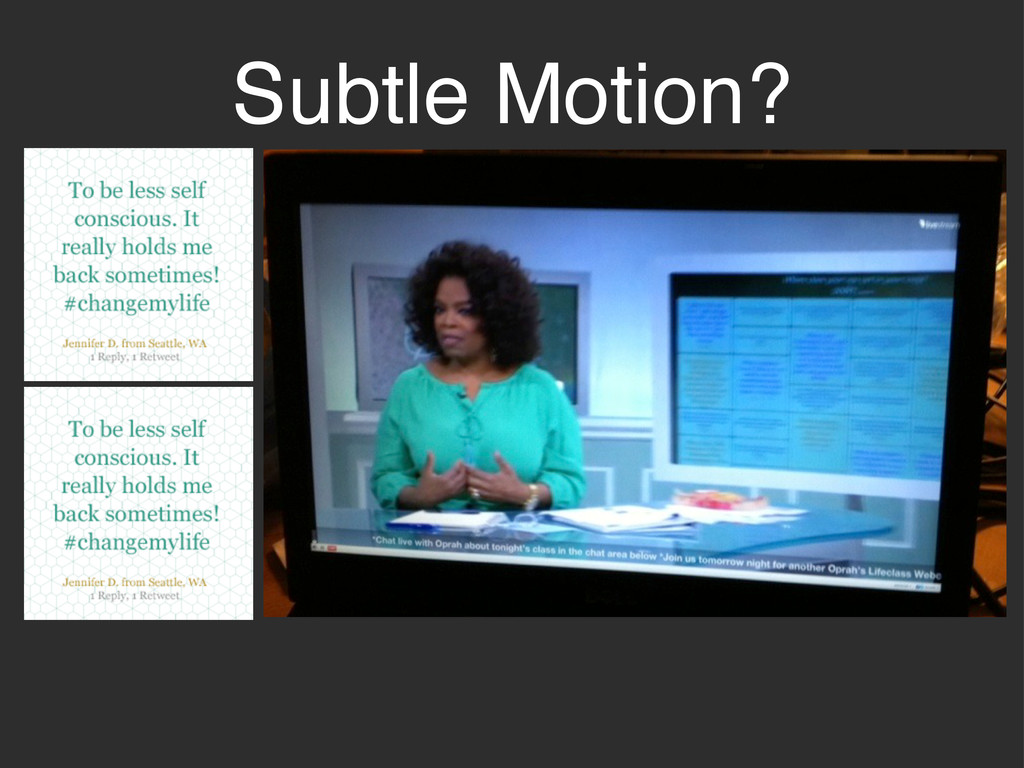
Subtle Motion?
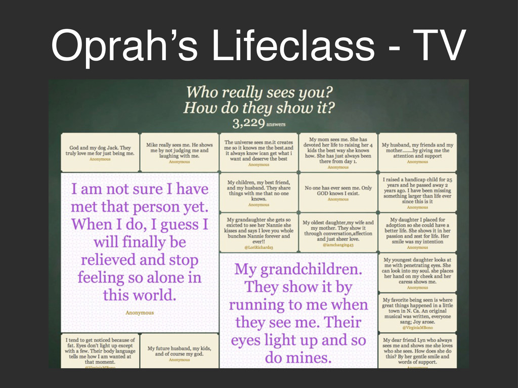
Oprah’s Lifeclass - TV
2011 MTV European Music Awards
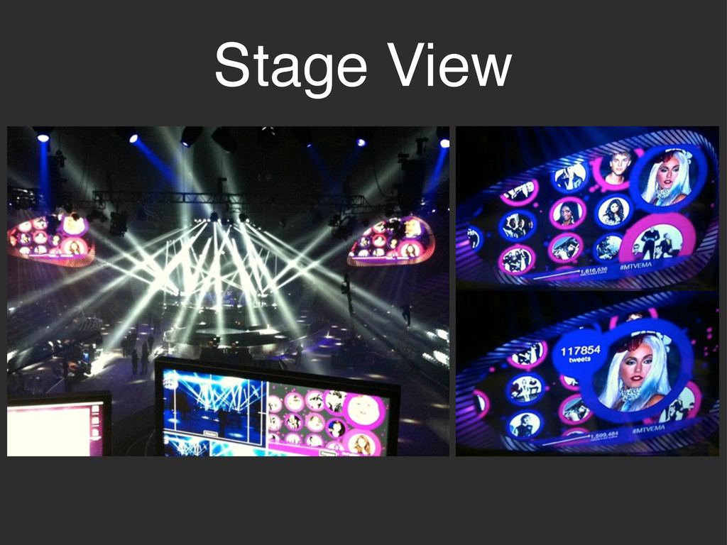
Stage View
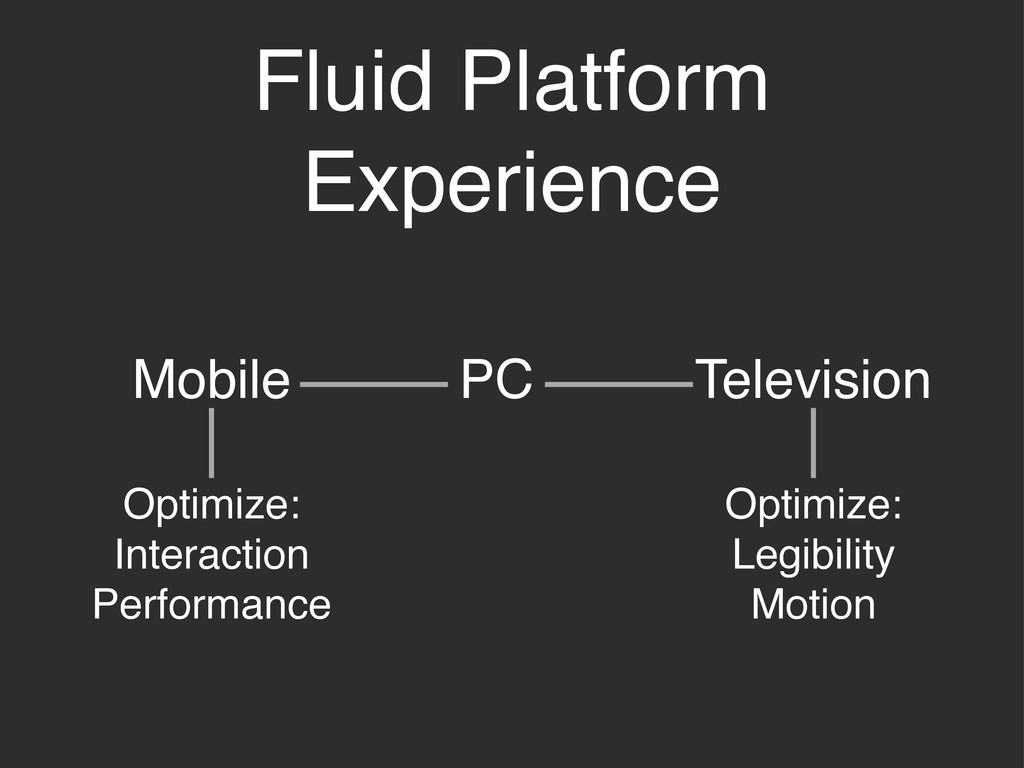
Fluid Platform Experience PC Mobile Television Optimize: Interaction Performance Optimize:
Legibility Motion
None
Thanks!
[email protected]
@rachelbinx
 Your Podcast. Everywhere. Effortlessly.
 binx
binx
 inesmontani
 danielanewman
 gr2m
gr2m
 akademiya2063
 takai
takai
 aleyda
 cassininazir
 sergeychernyshev
 ipullrank
 gurzu
gurzu
 scottboms
![Thanks! [email protected] @rachelbinx](https://files.speakerdeck.com/presentations/4f47ebb408476d00220014a6/slide_21.jpg)