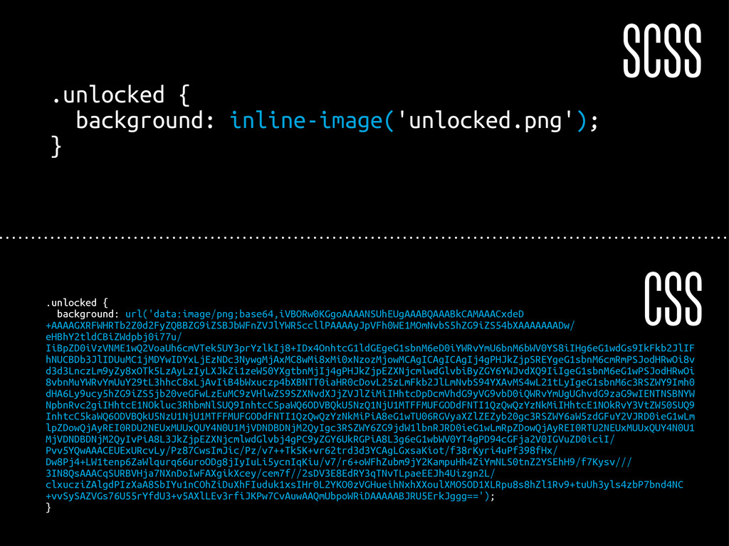
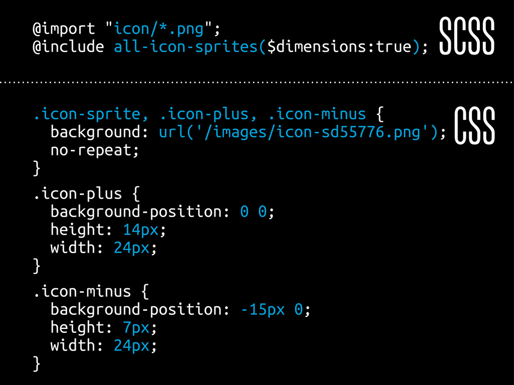
#block-system-main.block { font-weight: bold; } #page-wrapper #page #main-wrapper #main #content h2.active, #page-wrapper #page #main-wrapper #main #content h2, #page-wrapper #page #main-wrapper #main #content .visuallyhidden, #page-wrapper #main .column#content h2.active, #page-wrapper #main .column#content h2, #page-wrapper #main .column#content .visuallyhidden, .section .region #block-system-main.block h2.active, .section .region #block-system-main.block h2, .section .region #block-system-main.block .visuallyhidden { color: #fff; } #page-wrapper #page #main-wrapper #main #content h2.active a:link, #page-wrapper #page #main-wrapper #main #content h2.active a:visited, #page-wrapper #page #main-wrapper #main #content h2.active .button:link, #page-wrapper #page #main-wrapper #main #content h2.active .button:visited, #page-wrapper #page #main-wrapper #main #content h2 a:link, #page-wrapper #page #main-wrapper #main #content h2 a:visited, #page-wrapper #page #main-wrapper #main #content h2 .button:link, #page-wrapper #page #main-wrapper #main #content h2 .button:visited, #page-wrapper #page #main-wrapper #main #content .visuallyhidden a:link, #page-wrapper #page #main-wrapper #main #content .visuallyhidden a:visited, #page-wrapper #page #main-wrapper #main #content .visuallyhidden .button:link, #page-wrapper #page #main-wrapper #main #content .visuallyhidden .button:visited, #page-wrapper #main .column#content h2.active a:link, #page-wrapper #main .column#content h2.active a:visited, #page-wrapper #main .column#content h2.active .button:link, #page-wrapper #main .column#content h2.active .button:visited, #page-wrapper #main .column#content h2 a:link, #page-wrapper #main .column#content h2 a:visited, #page-wrapper #main .column#content h2 .button:link, #page-wrapper #main .column#content h2 .button:visited, #page-wrapper #main .column#content .visuallyhidden a:link, #page-wrapper #main .column#content .visuallyhidden a:visited, #page-wrapper #main .column#content .visuallyhidden .button:link, #page-wrapper #main .column#content .visuallyhidden .button:visited, .section .region #block-system-main.block h2.active a:link, .section .region #block-system-main.block h2.active a:visited, .section .region #block-system-main.block h2.active .button:link, .section .region #block-system-main.block h2.active .button:visited, .section .region #block-system-main.block h2 a:link, .section .region #block-system-main.block h2 a:visited, .section .region #block-system-main.block h2 .button:link, .section .region #block-system-main.block h2 .button:visited, .section .region #block-system-main.block .visuallyhidden a:link, .section .region #block-system-main.block .visuallyhidden a:visited, .section .region #block-system-main.block .visuallyhidden .button:link, .section .region #block-system-main.block .visuallyhidden .button:visited { background-color: #f00; } #page-wrapper #page #main-wrapper #main #content h2.active a:hover, #page-wrapper #page #main-wrapper #main #content h2.active a focus, #page-wrapper #page #main-wrapper #main #content h2.active .button:hover, #page-wrapper #page #main-wrapper #main #content h2.active .button focus, #page-wrapper #page #main-wrapper #main #content h2 a:hover, #page-wrapper #page #main-wrapper #main #content h2 a focus, #page-wrapper #page #main-wrapper #main #content h2 .button:hover, #page-wrapper #page #main-wrapper #main #content h2 .button focus, #page-wrapper #page #main-wrapper #main #content .visuallyhidden a:hover, #page-wrapper #page #main-wrapper #main #content .visuallyhidden a focus, #page-wrapper #page #main-wrapper #main #content .visuallyhidden .button:hover, #page-wrapper #page #main-wrapper #main #content .visuallyhidden .button focus, #page-wrapper #main .column#content h2.active a:hover, #page-wrapper #main .column#content h2.active a focus, #page-wrapper #main .column#content h2.active .button:hover, #page-wrapper #main .column#content h2.active .button focus, #page-wrapper #main .column#content h2 a:hover, #page-wrapper #main .column#content h2 a focus, #page-wrapper #main .column#content h2 .button:hover, #page-wrapper #main .column#content h2 .button focus, #page-wrapper #main .column#content .visuallyhidden a:hover, #page-wrapper #main .column#content .visuallyhidden a focus, #page-wrapper #main .column#content .visuallyhidden .button:hover, #page-wrapper #main .column#content .visuallyhidden .button focus, .section .region #block-system-main.block h2.active a:hover, .section .region #block-system-main.block h2.active a focus, .section .region #block-system-main.block h2.active .button:hover, .section .region #block-system-main.block h2.active .button focus, .section .region #block-system-main.block h2 a:hover, .section .region #block-system-main.block h2 a focus, .section .region #block-system-main.block h2 .button:hover, .section .region #block-system-main.block h2 .button focus, .section .region #block-system-main.block .visuallyhidden a:hover, .section .region #block-system-main.block .visuallyhidden a focus, .section .region #block-system-main.block .visuallyhidden .button:hover, .section .region #block-system-main.block .visuallyhidden .button focus { #background-color: #f0f; } CSS
 dantz
dantz
 geekplus_tech
 tatsuhiro
 niftycorp
 kotaminato
 manfredsteyer
 mizchi
 mototakatsu
 makicamel
 hyshu
hyshu
 kotetuco
 kuranuki
 addyosmani
 schroneko
 eileencodes
 orderedlist
 tonyrice
 kneath
 marcelosomers
 tammyeverts
 techseoconnect
 jct
jct
 signer
![Andreas Dantz 0 @dantz — [email protected]](https://files.speakerdeck.com/presentations/4f9800fda8accb001f010581/slide_1.jpg)
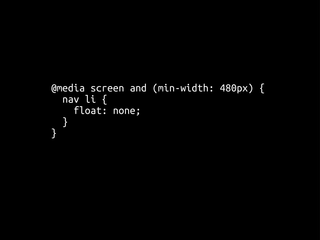
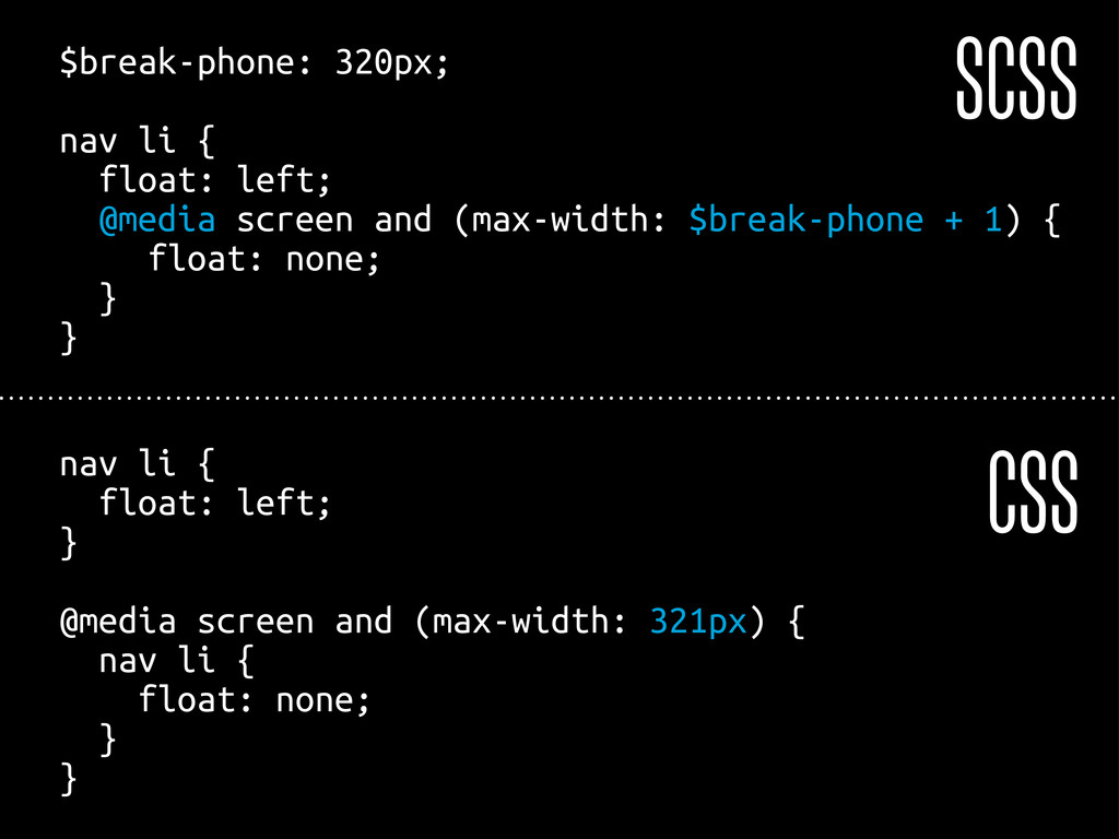
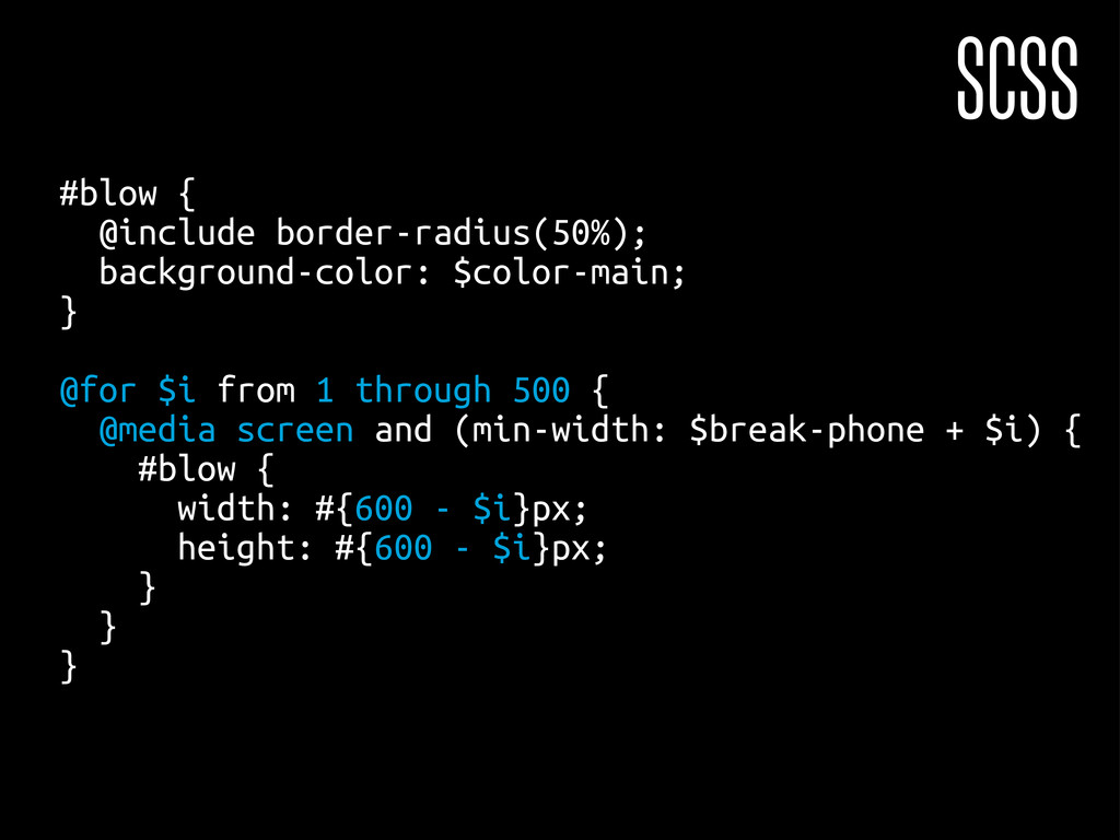
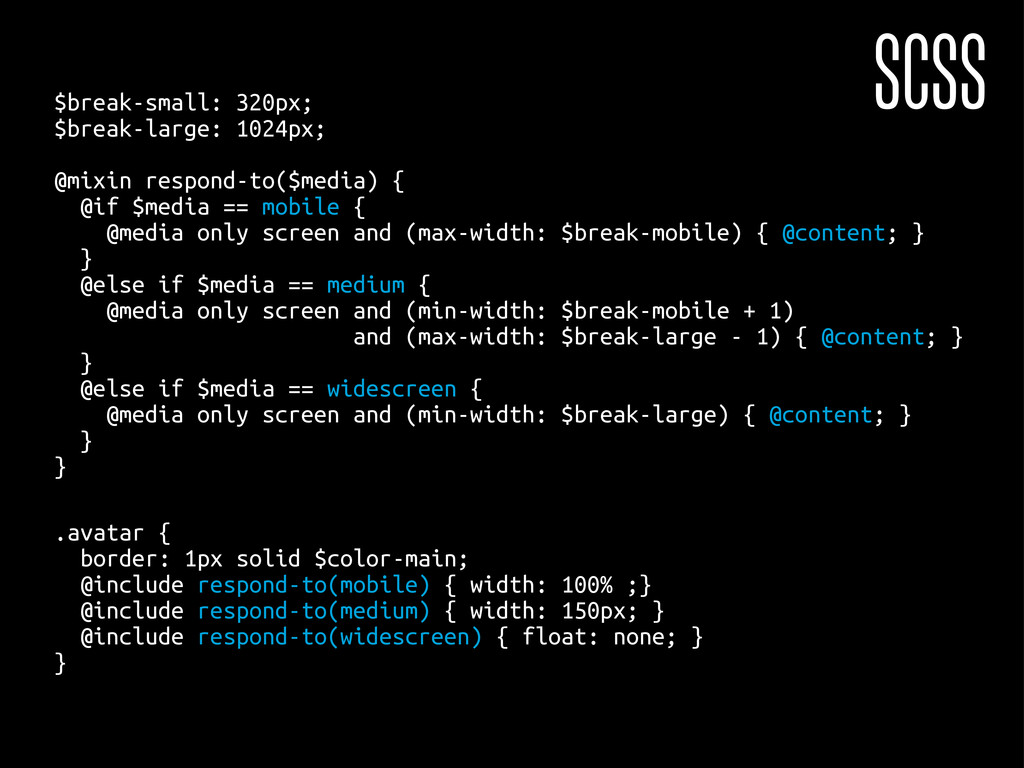
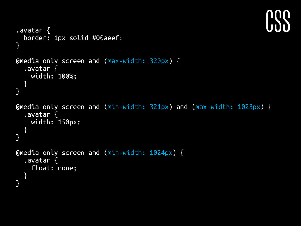
![[…] @media screen and (min-width: 335px) { #blow { width:](https://files.speakerdeck.com/presentations/4f9800fda8accb001f010581/slide_55.jpg)