Upgrade to Pro — share decks privately, control downloads, hide ads and more …

7 Step To Make Drupal 7 Rock Mobile

Andrew Berry
November 13, 2011

7 Step To Make Drupal 7 Rock Mobile

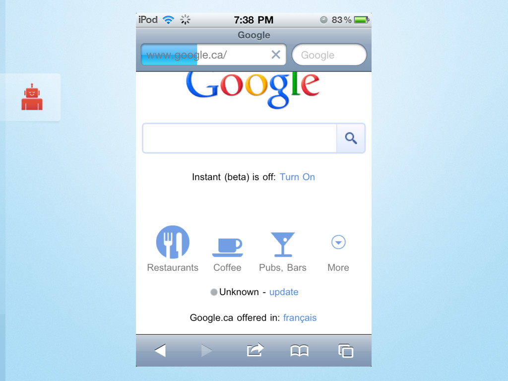
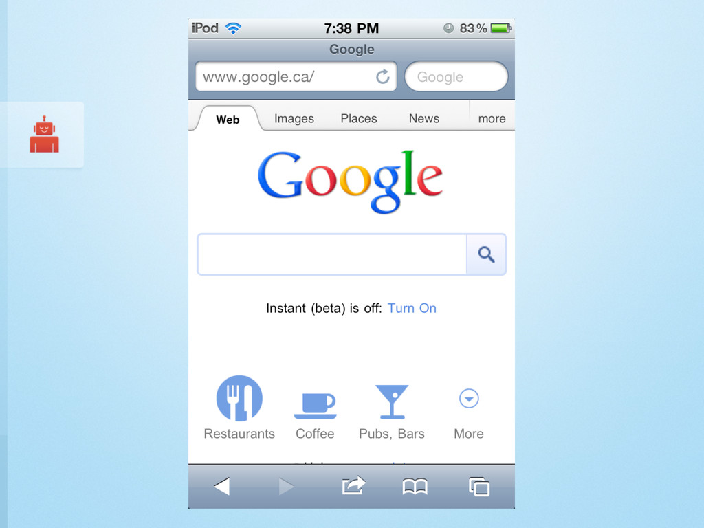
How can site builders and developers improve the user experience on mobile of sites they build in Drupal 7? This session will cover seven (or even more!) steps to help ensure a consistent and friendly mobile experience for visitors of your Drupal 7 sites.

Andrew Berry

November 13, 2011
Tweet

More Decks by Andrew Berry

Other Decks in Programming

Transcript

  1. ANDREW BERRY * @deviantintegral * DRUPALCAMP TORONTO, NOVEMBER 12 2011

    7 Steps To Make Drupal 7 Rock Mobile 2 Minutes to Mobile
  2. Get instant access to an unrivalled library of Drupal training

    from top-tier experts streaming to your computer, tablet, smart phone, & tv. DCTORONTO11 $20 off, until November 20
  3. ‣ By default, mobile browsers will show the address bar

    on loaded pages ‣ Could be losing as much as 36% of the available screen height ‣ google.com and cbc.ca
  4. 1 (function ($) { 2 3 /** 4 * This

    behavior hides the address bar in iOS. 5 */ 6 Drupal.behaviors.hideAddressBar = { 7 attach: function (context, settings) { 8 $('body:not(.hide-address-bar- processed)').addClass('hide-address-bar- processed').each(function() { 9 $(window).load(function() { 10 setTimeout(function() { 11 window.scrollTo(0, 1); 12 }); 13 }); 14 }); 15 } 16 }; 17 18 }(jQuery)); 19
  5. ‣ Enable CSS Aggregation ‣ Enable JavaScript Aggregation ‣ Don’t

    include carousels and extra images ‣ display: none; isn’t invited to the mobile party ‣ Watch for scripts that execute after page load The Basics
  6. ‣ Enable gzip compression ‣ Use CSS sprites and data

    urls for small images ‣ IE 8+ ‣ gzip helps negate base64 encoding increasing the size by ~1/3 ‣ http://dataurl.net/
  7. URL Setup ‣ A subdomain or URL path ‣ Can

    always use URL rewriting to make it match any technical requirements ‣ Don’t try and change anything in the URL resource ‣ Use Mobile Tools to set up your URLs
  8. When Building on a New Site... ‣ Edge cases are

    always hard to find and fix ‣ Provide an easy way to change between mobile / desktop ‣ It’s a workaround, but an easy one to implement
  9. A Few Reasons To Care ‣ CSS3 is a set

    of modules, each with their own status ‣ Browsers offering early support with vendor prefixes ‣ Easy! (at least compared to JavaScript) ‣ Faster! (usually)
  10. More powerful selectors ‣ :checked ‣ You can now change

    display attributes without JavaScript ‣ :not ‣ Many of the selectors we’re used to in jQuery
  11. <style type="text/css" media="all and (min-width: 740px) and (min-device-width: 740px), (max-device-

    width: 800px) and (min-width: 740px) and (orientation:landscape)"> @import url("default.css"); @import url("narrow.css"); </style>
  12. 5 <p style="-moz-column-width: 15em;">Lorem ipsum dolor sit amet, consectetur adipisicing

    elit, ... 15 qui officia deserunt mollit anim id est laborum</p>
  13. ‣ Supported by all major mobile browsers! ‣ localStorage, sessionStorage

    ‣ Use web storage to save on HTTP requests and page size, at the expense of local CPU resources HTML5 Storage
  14. Apps? Web? Webapps? Appwebs? ‣ An “App” is typically something

    that is distributed through a store ‣ A website loads in a browser such as Mobile Safari ‣ Some apps use web technologies (HTML, JavaScript, CSS) while some websites can be installed as Apps!
  15. 1. An name and icon for the home screen or

    launcher 2. An indication that the application should run in full-screen mode (iOS only) 3. The size of the viewport 4. A startup image (iOS only as well) 5. A list of the files needed for offline use (but only for pure JS apps)