Upgrade to Pro — share decks privately, control downloads, hide ads and more …

Meet the New Web Typography: Same as the Old Web Typography

Erik Vorhes
October 07, 2011

Meet the New Web Typography: Same as the Old Web Typography

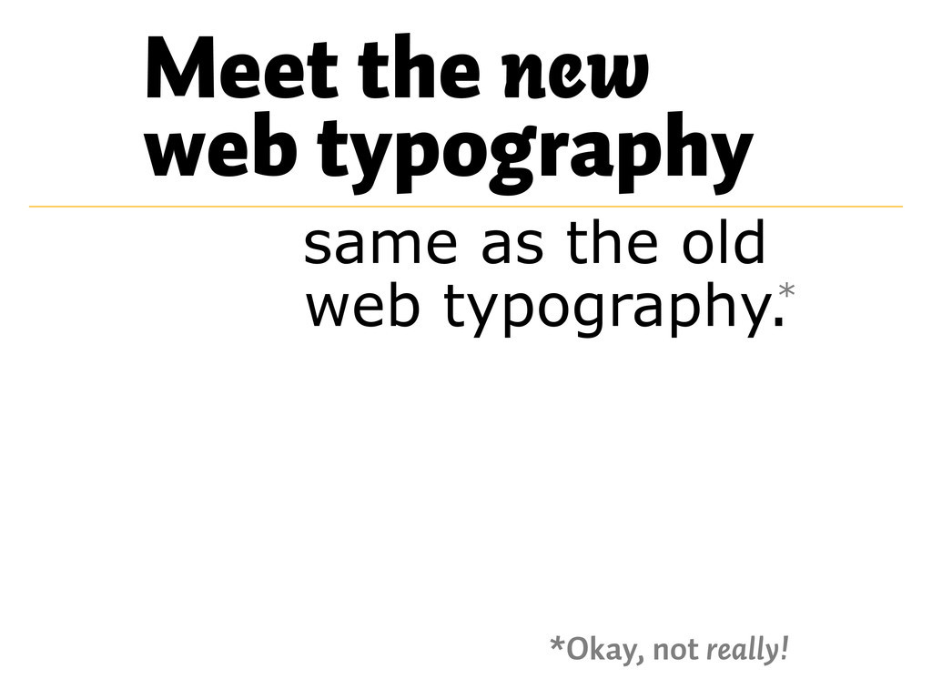
My brief-ish talk for the AIGA Chicago event on October 6, 2011, “The New Web Typography.”

A little context:

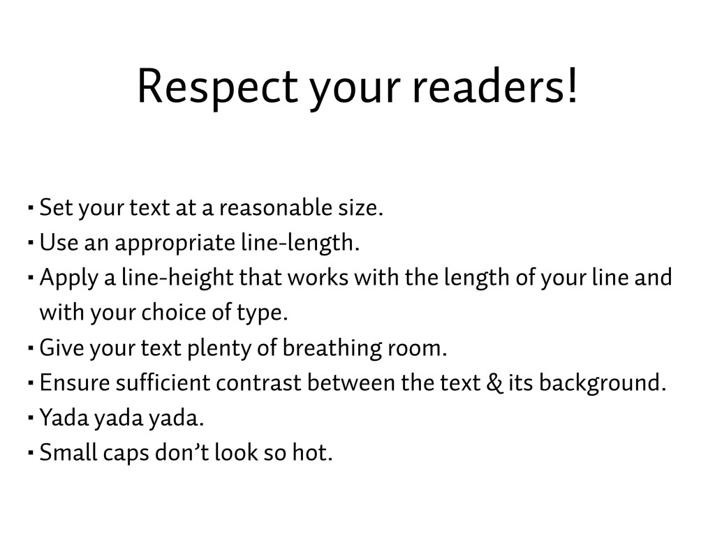
1. The same typographic “rules” that held for type on the web before webfonts are still in effect.

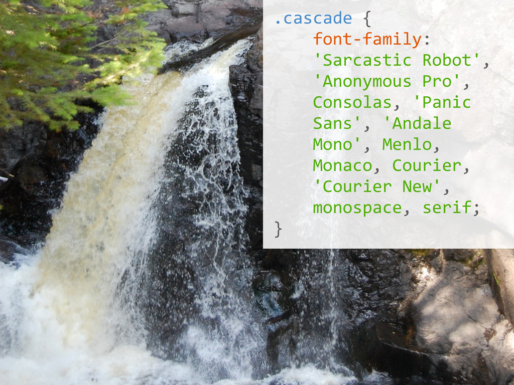
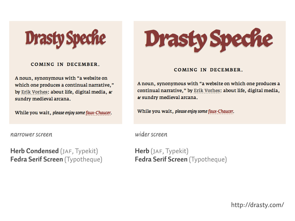
2. “Font stacks” were a pain, but tracking down which webfonts are available where can be just as difficult.

3. Webfonts let us do fun things that we couldn’t do when we couldn’t know that a visitor had the same installed fonts.

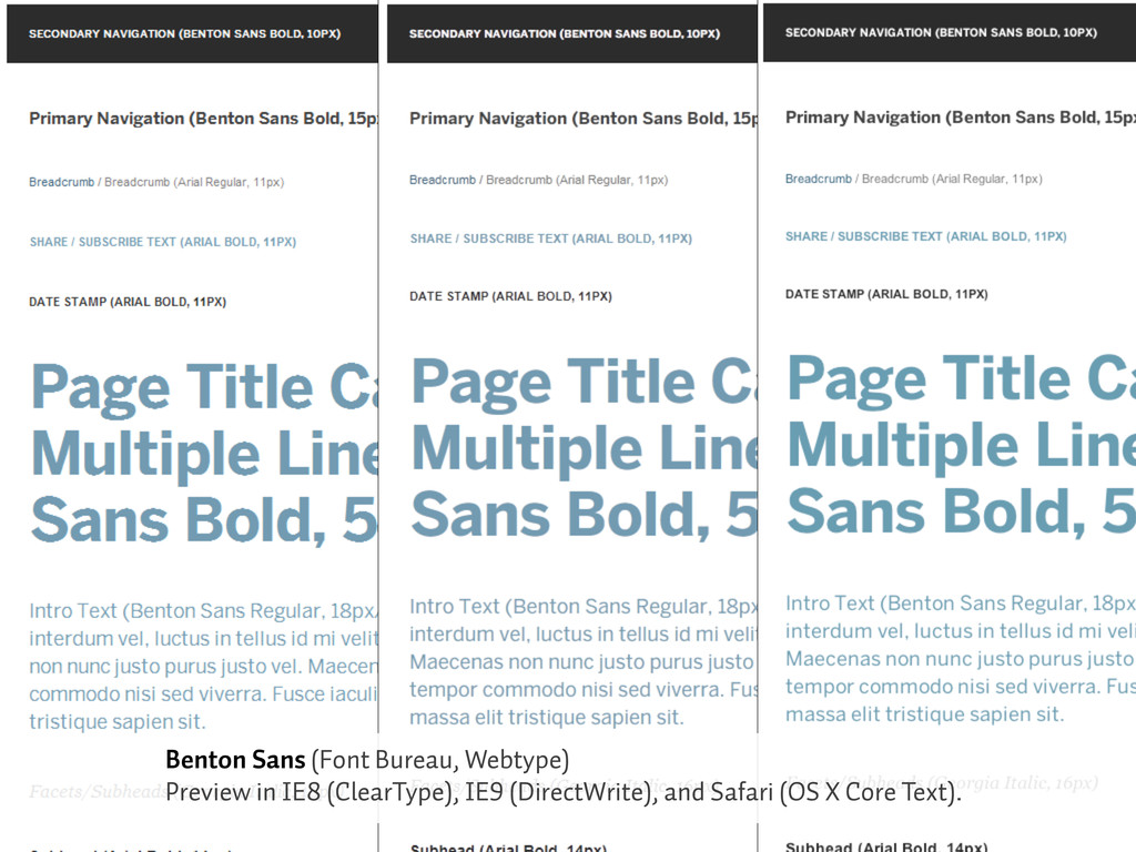
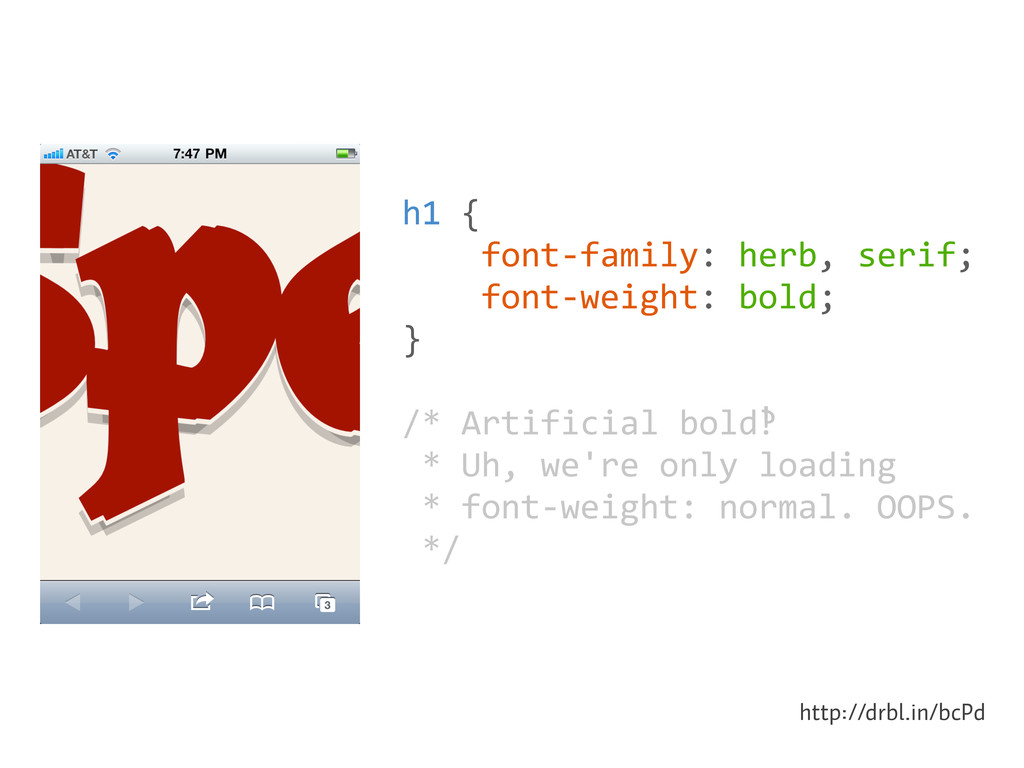
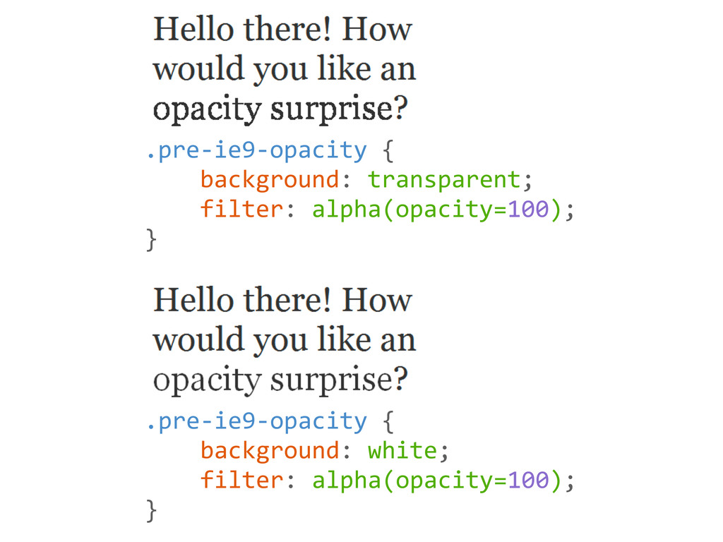
4. At VSA we test type in as many browsers and operating systems as we can — including dealing with the suckage of how IE8 and earlier mishandle opacity.

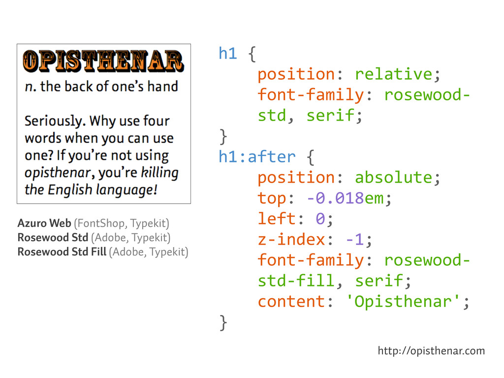
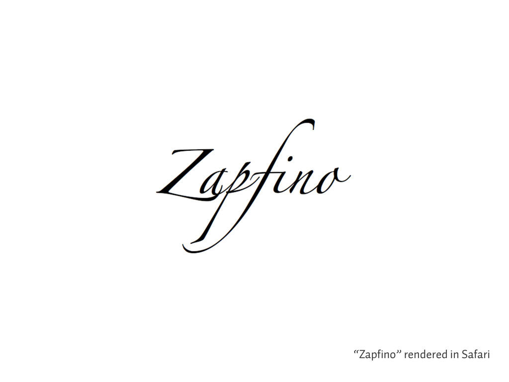
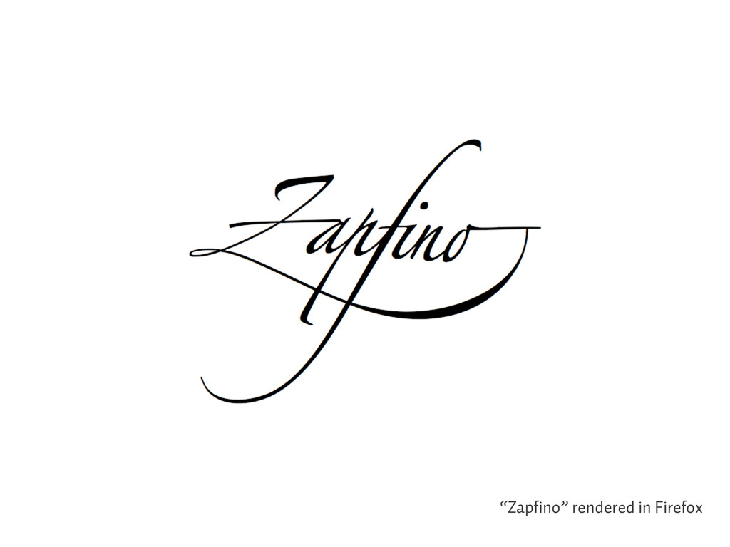
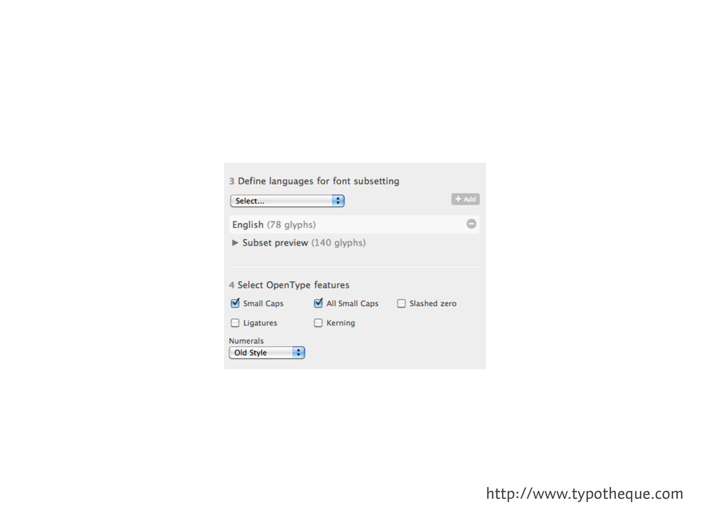
5. Opentype support in browsers promises the ability to use real type to create logos and word marks.

6. For now, we need to settle for tools that help us achieve some of those effects (when we need them).

7. But webfonts are still in their infancy (as is the web itself). We have a long way to go — and need to keep pushing.

Erik Vorhes

October 07, 2011
Tweet

More Decks by Erik Vorhes

Other Decks in Design

Transcript

  1. Meet the new web typography same as the old. web

    typography. * *Okay, not really!
  2. There are a lot of rules. Or rather, guiding principles.

    Set your text at a reasonable size. Use an appropriate line-length. Apply a line-height that works with the length of your line and with your choice of type. Give your text plenty of breathing room. Ensure sufficient contrast between the text and its background. Yada yada yada. Small caps don’t look so hot. (In other words, ignore how this paragraph is set. ;)
  3. •Set your text at a reasonable size. •Use an appropriate

    line-length. •Apply a line-height that works with the length of your line and with your choice of type. •Give your text plenty of breathing room. •Ensure sufficient contrast between the text & its background. •Yada yada yada. •Small caps don’t look so hot. Respect your readers!
  4. .cascade  {        font-­‐family:        'Sarcastic

     Robot',        'Anonymous  Pro',        Consolas,  'Panic        Sans',  'Andale        Mono',  Menlo,        Monaco,  Courier,        'Courier  New',        monospace,  serif; }
  5. Azuro Web (FontShop, Typekit) Rosewood Std (Adobe, Typekit) Rosewood Std

    Fill (Adobe, Typekit) http://opisthenar.com h1  {        position:  relative;        font-­‐family:  rosewood-­‐        std,  serif; } h1:after  {        position:  absolute;        top:  -­‐0.018em;        left:  0;        z-­‐index:  -­‐1;        font-­‐family:  rosewood-­‐        std-­‐fill,  serif;        content:  'Opisthenar'; }
  6. http://drasty.com/ wider screen Herb (JAF, Typekit) Fedra Serif Screen (Typotheque)

    narrower screen Herb Condensed (JAF, Typekit) Fedra Serif Screen (Typotheque)
  7. Benton Sans (Font Bureau, Webtype) Preview in IE8 (ClearType), IE9

    (DirectWrite), and Safari (OS X Core Text).
  8. h1  {        font-­‐family:  herb,  serif;    

       font-­‐weight:  bold; } /*  Artificial  bold‽  *  Uh,  we're  only  loading  *  font-­‐weight:  normal.  OOPS.  */ http://drbl.in/bcPd
  9. .pre-­‐ie9-­‐opacity  {        background:  white;      

     filter:  alpha(opacity=100); } .pre-­‐ie9-­‐opacity  {        background:  transparent;        filter:  alpha(opacity=100); }