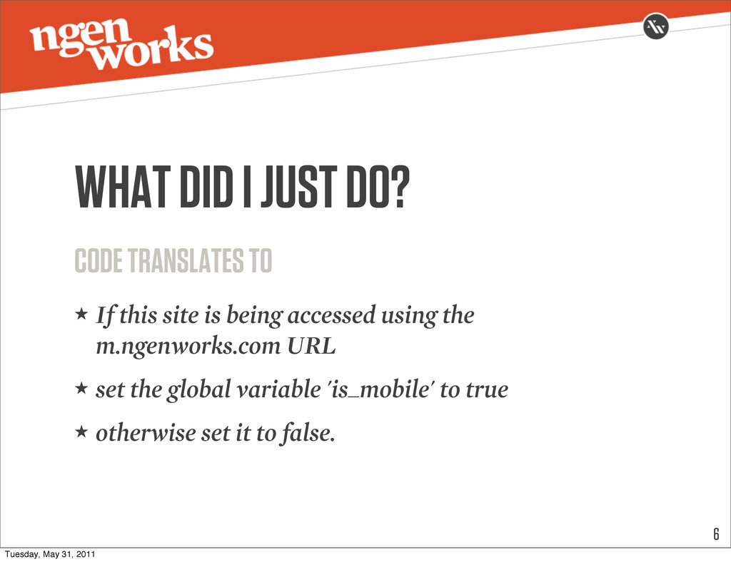
else { $assign_to_config['global_vars'] = array('is_mobile' => false); } THE MAGIC 5 ★ Place the following in your index.php file Tuesday, May 31, 2011
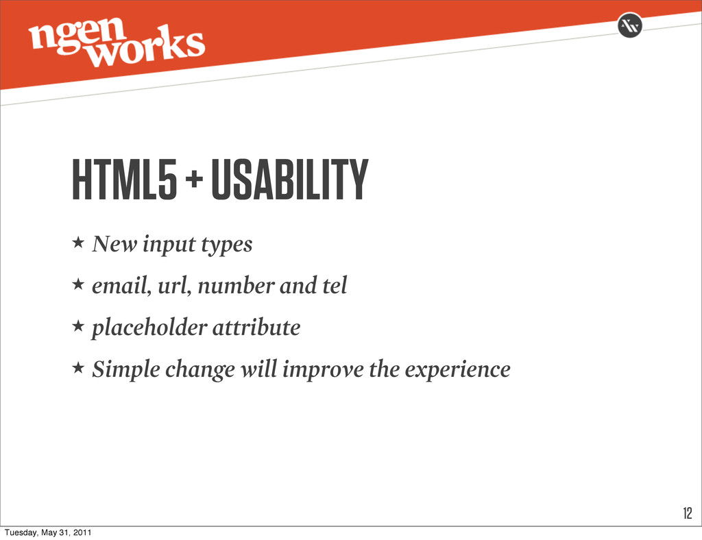
this site is being accessed using the m.ngenworks.com URL ★ set the global variable 'is_mobile' to true ★ otherwise set it to false. 6 Tuesday, May 31, 2011
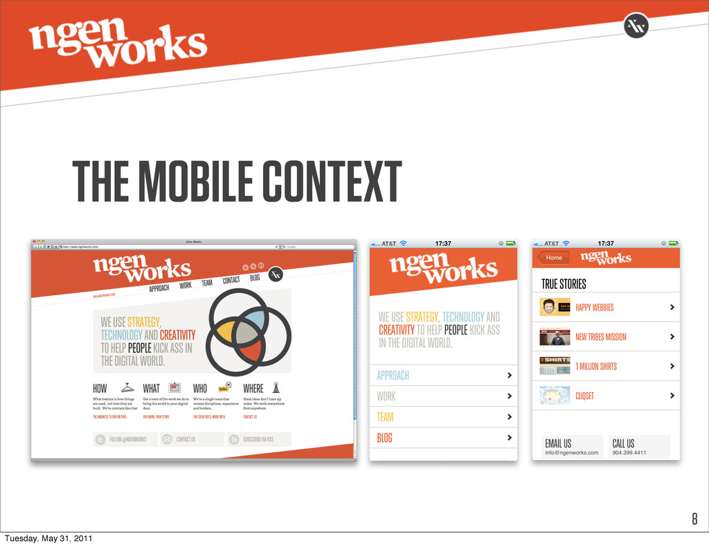
all content from your “full” site is needed ★ Define what the focus of your mobile site is ★ What content is most important in the mobile context? Tuesday, May 31, 2011
your content ★ Prioritize your different content elements ★ What type of site is this? ★ If an event site, upcoming events are priority ★ If a product site, finding products and details 10 Tuesday, May 31, 2011
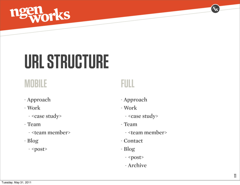
- Team - <team member> - Blog - <post> 11 FULL - Approach - Work - <case study> - Team - <team member> - Contact - Blog - <post> - Archive Tuesday, May 31, 2011
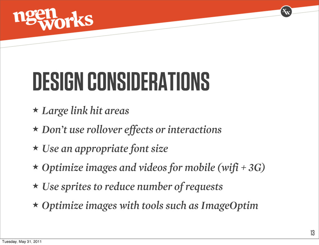
rollover effects or interactions ★ Use an appropriate font size ★ Optimize images and videos for mobile (wifi + 3G) ★ Use sprites to reduce number of requests ★ Optimize images with tools such as ImageOptim 13 Tuesday, May 31, 2011
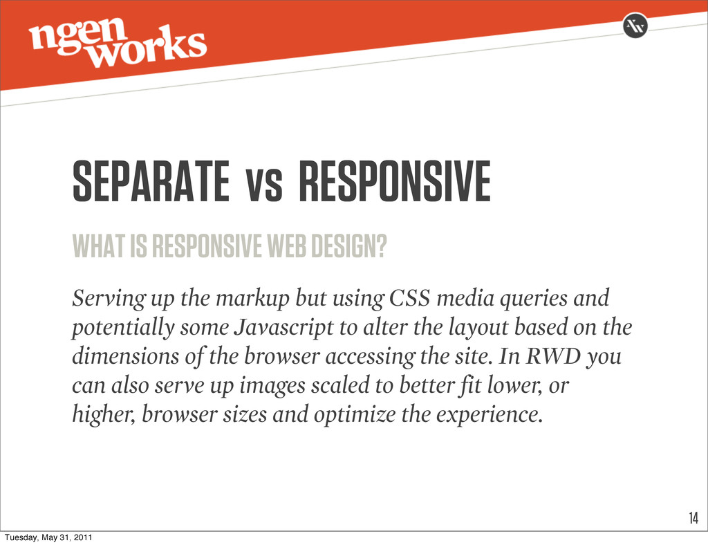
the markup but using CSS media queries and potentially some Javascript to alter the layout based on the dimensions of the browser accessing the site. In RWD you can also serve up images scaled to better fit lower, or higher, browser sizes and optimize the experience. 14 Tuesday, May 31, 2011
 fredboyle
 ssssota
 kuranuki
 susisu
 fadis
fadis
 o0h
o0h
 mnch
mnch
 ukin0k0
 contour_gara
 kyoko_nr_nr
 seosoft
 arkw
arkw
 kkamegawa
 quramy
 rabernat
 sabderemane
 rkaga
rkaga
 palkan
 bethany
 codingconduct
 tonyrice
 ryanjones
 rasmusluckow
 shpigford
 csswizardry
![if($_SERVER['SERVER_NAME'] == 'm.ngenworks.com') { $assign_to_config['global_vars'] = array('is_mobile' => true); }](https://files.speakerdeck.com/presentations/4e9b5675f01b830051010f93/slide_2.jpg)