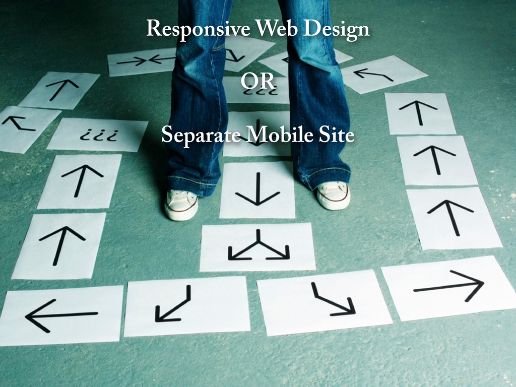
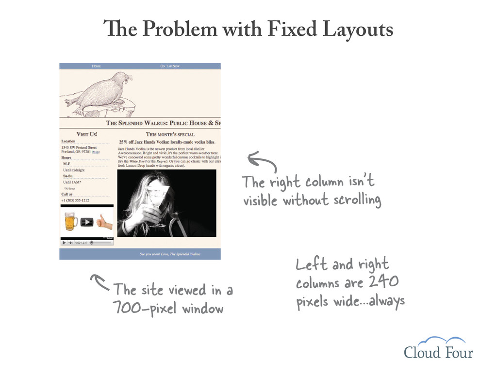
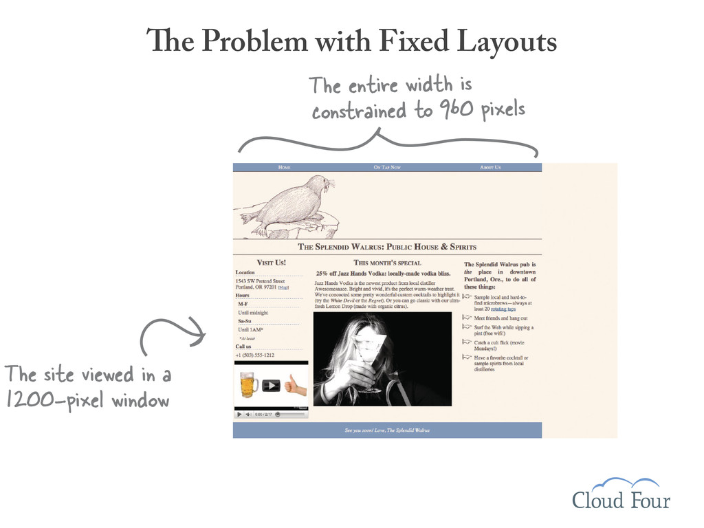
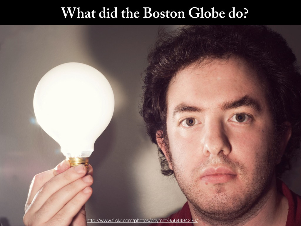
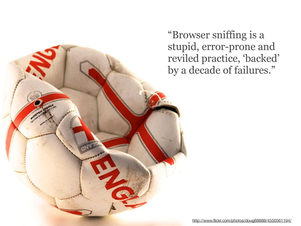
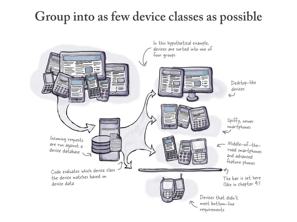
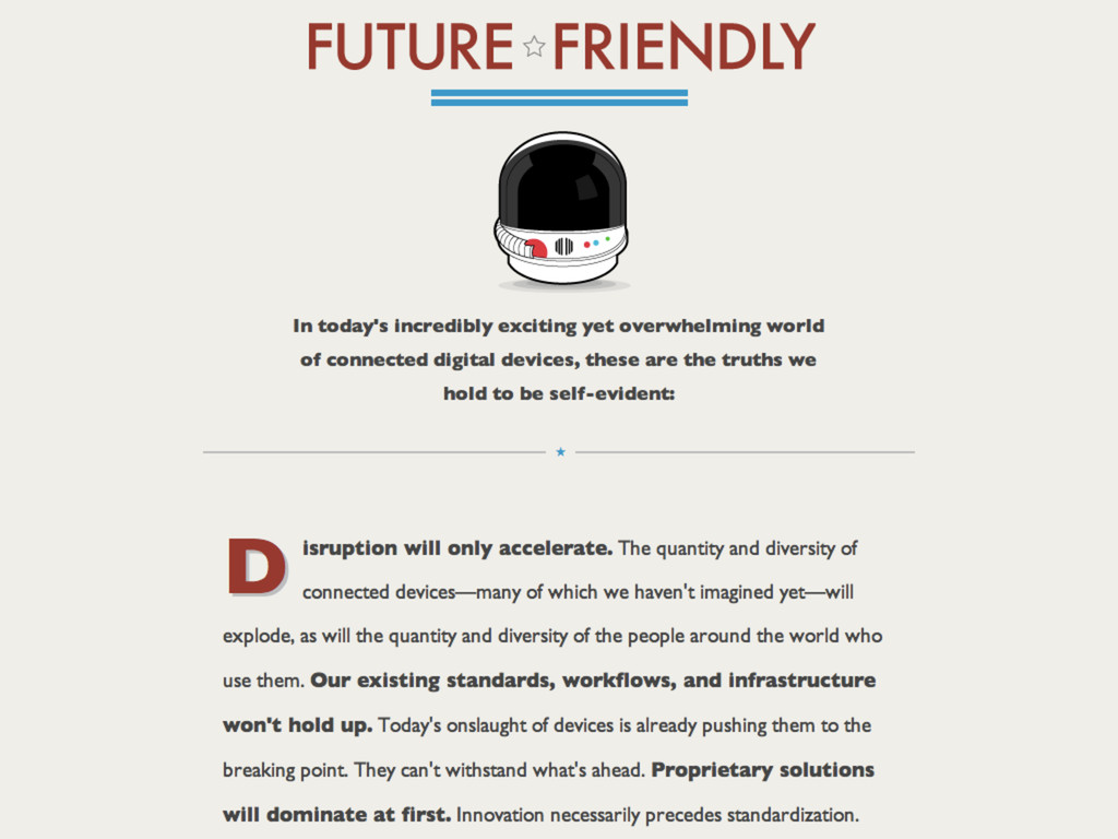
Mobile has been described as the wild west of the web. It is untamed. Pitfalls abound. And there are plenty of bad characters ready step between you and your customer to “help” them have a better mobile experience.
Choosing the right path can be daunting, but just like the wild west of old, there’s gold in them there hills.
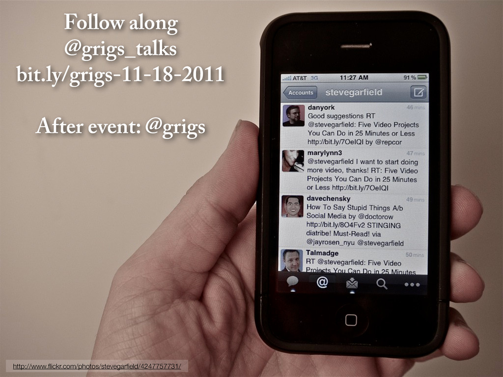
 grigs
grigs
 koheiyoshikawa
 i35_267
 flatt_security
 hinac0
 shift_evolve
 ynisqa1988
 oracle4engineer
 news_it_enj
 mhrtech
 kitano_yuichi
 kintotechdev
 mochico50
 orderedlist
 hannesfritz
 andyhume
 tamaranovitovic
 keavy
keavy
 davidcarrasco
 eileencodes
 427marketing
 rabernat
 destraynor
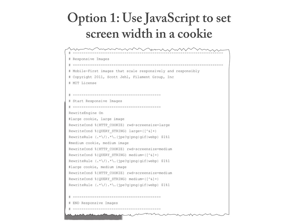
![[THEMATIC_CONSISTENCY] Ensure that content provided by accessing a URI yields](https://files.speakerdeck.com/presentations/4ec64e7af60270005100402b/slide_96.jpg)