Upgrade to Pro — share decks privately, control downloads, hide ads and more …

The Mobile Omnivore: A Taste Test of Mobile Website Development

The Mobile Omnivore: A Taste Test of Mobile Website Development

Slides from O’Reilly Webcast
http://oreillynet.com/pub/e/2201

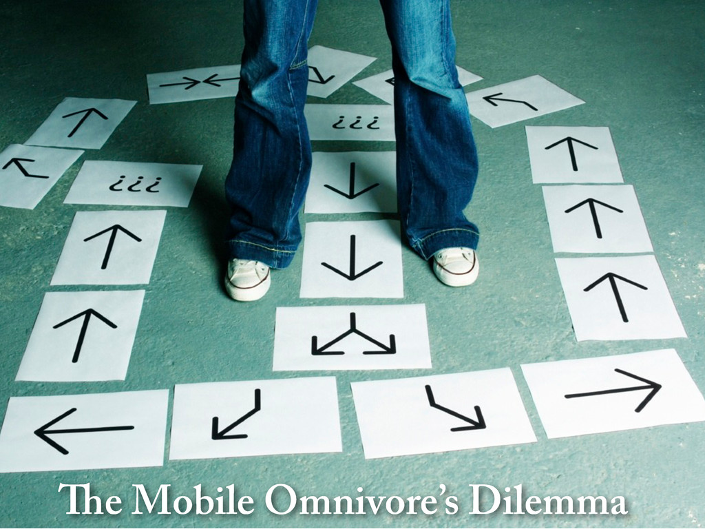
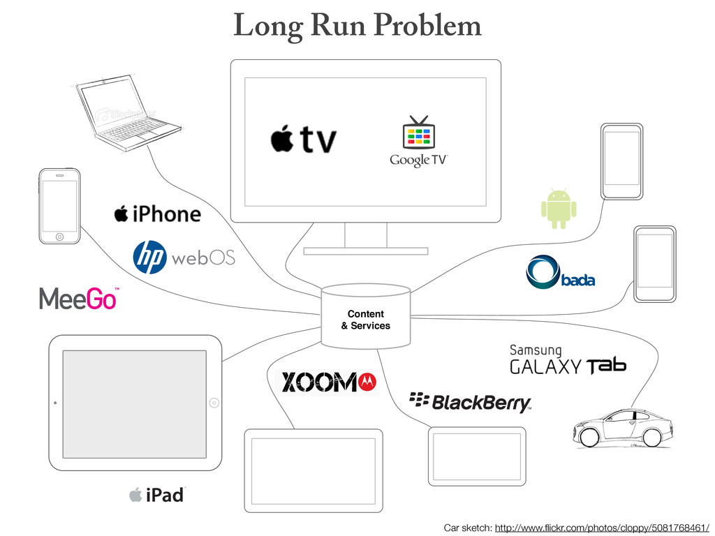
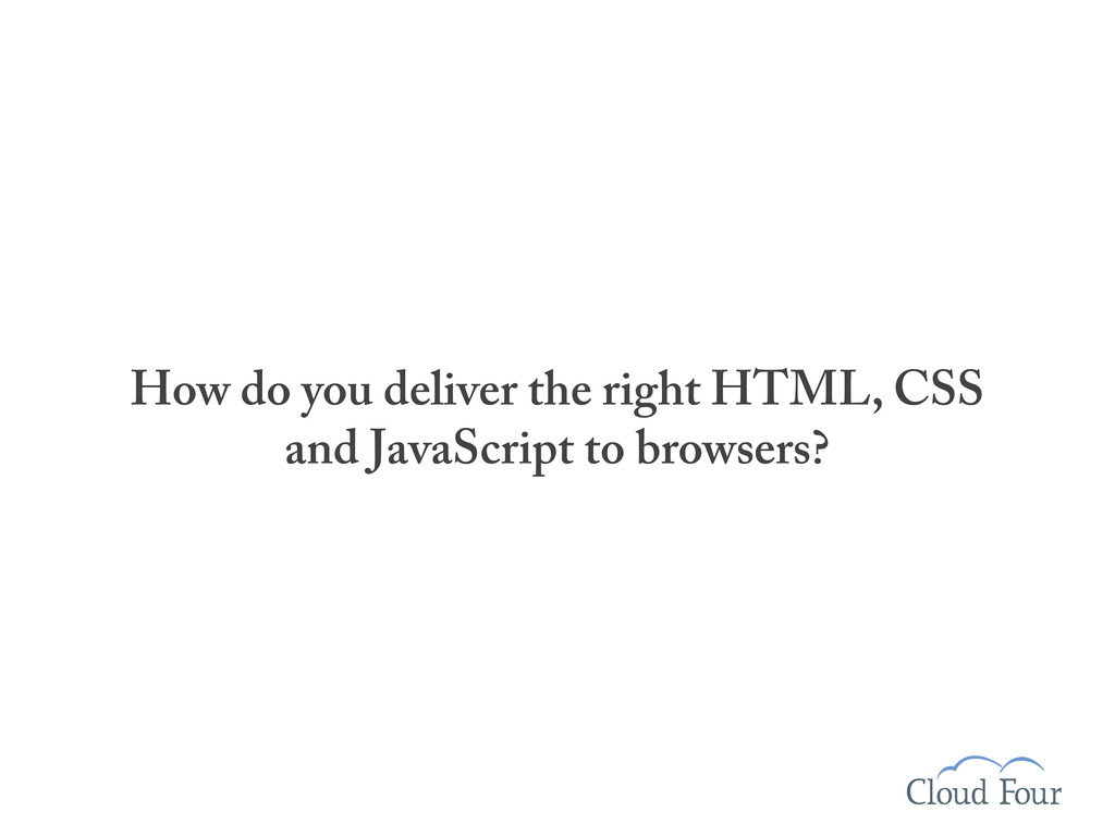
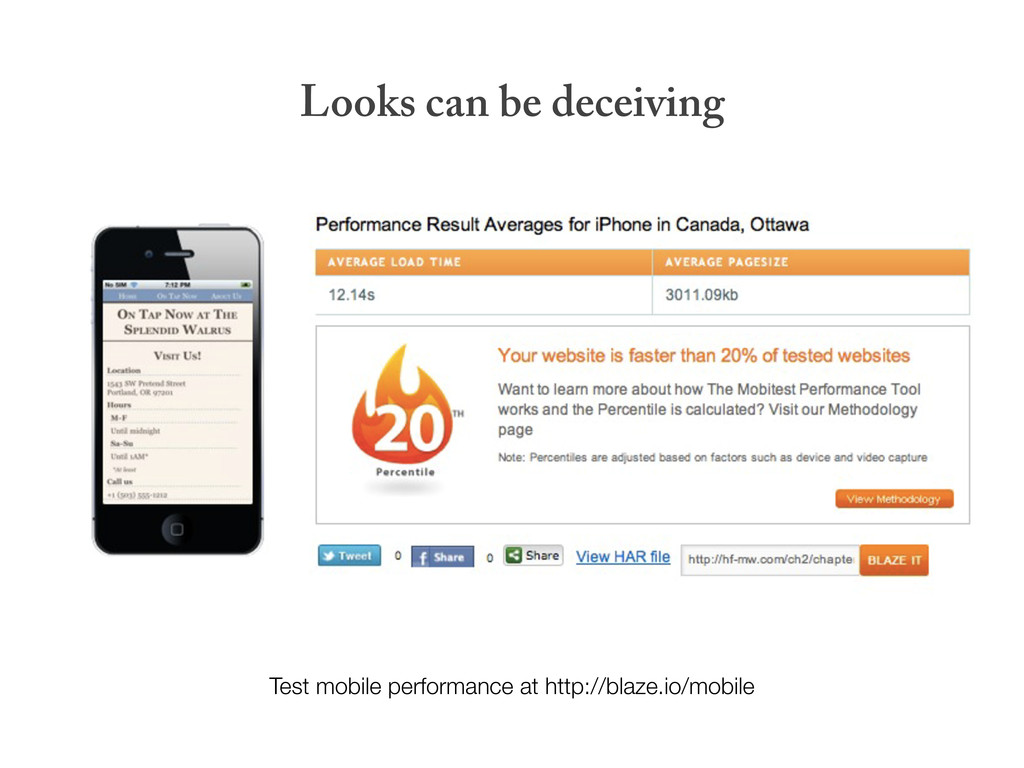
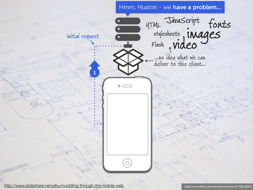
The mobile web is a complex place. There are lots of ways to build a mobile website—how do you choose the right tool for the job?

In this webcast presentation, we touch on a series of technologies and techniques including:

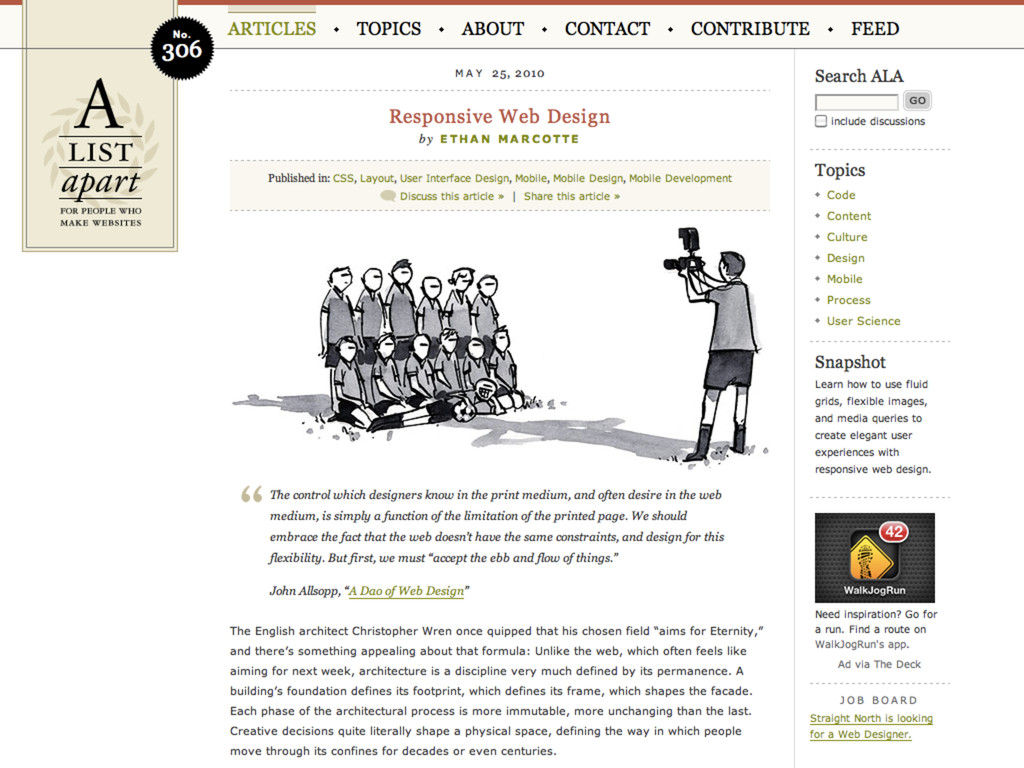
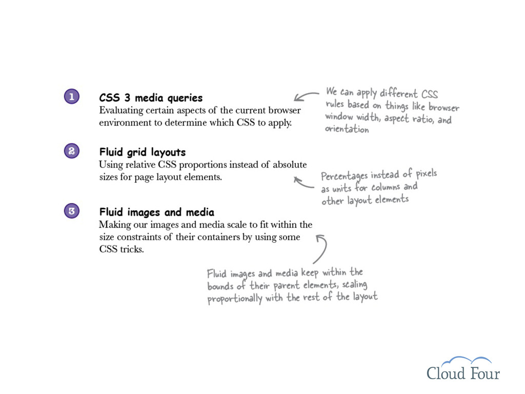
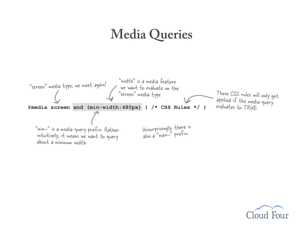
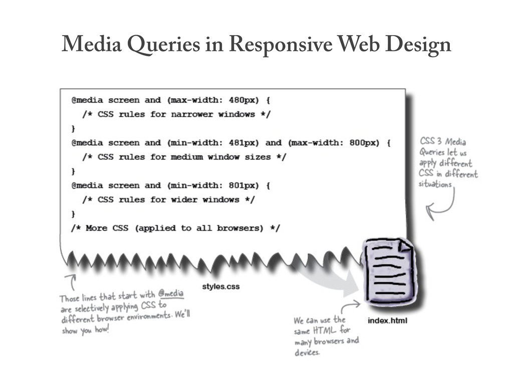
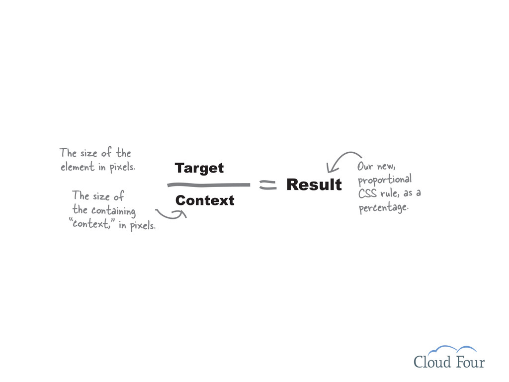
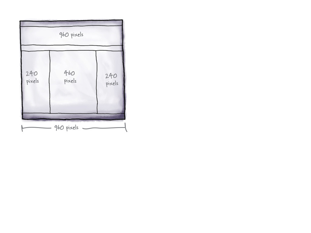
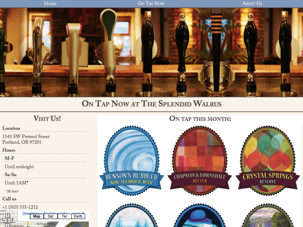
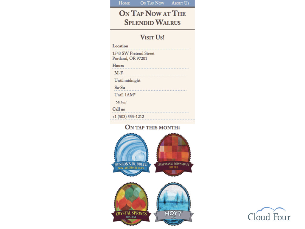
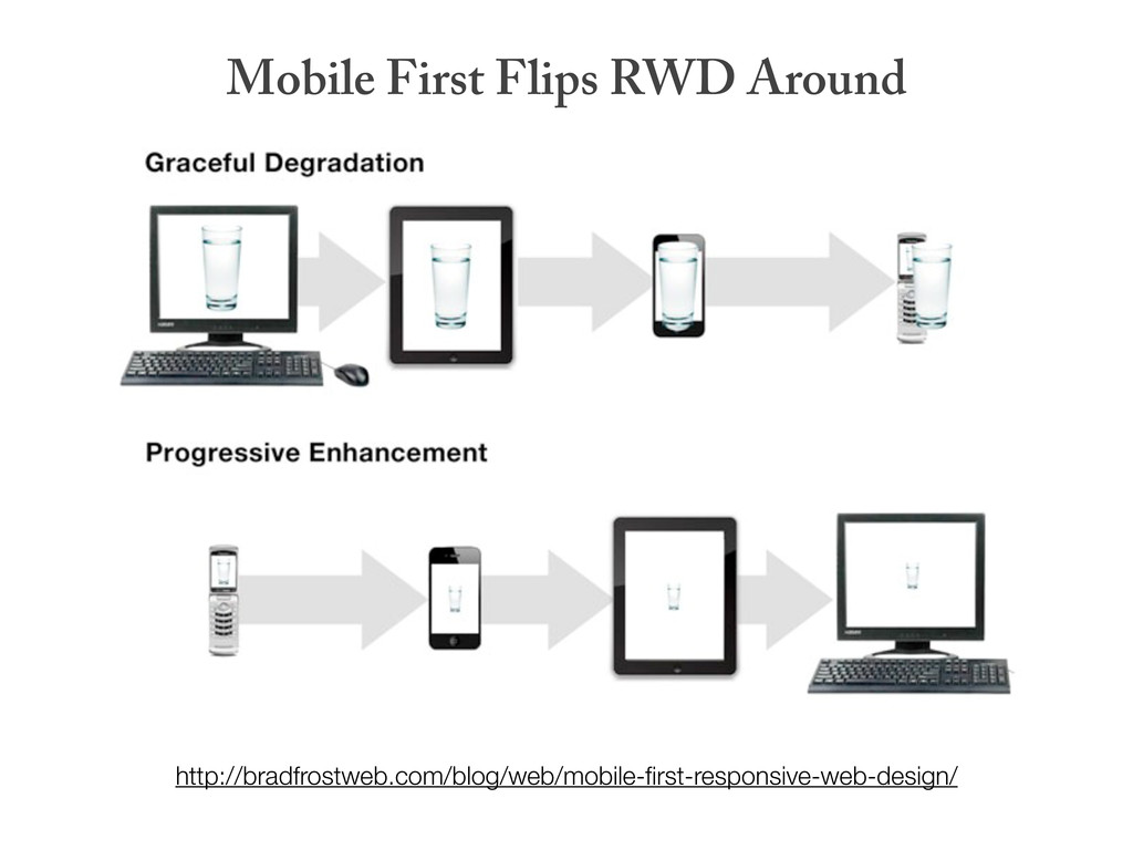
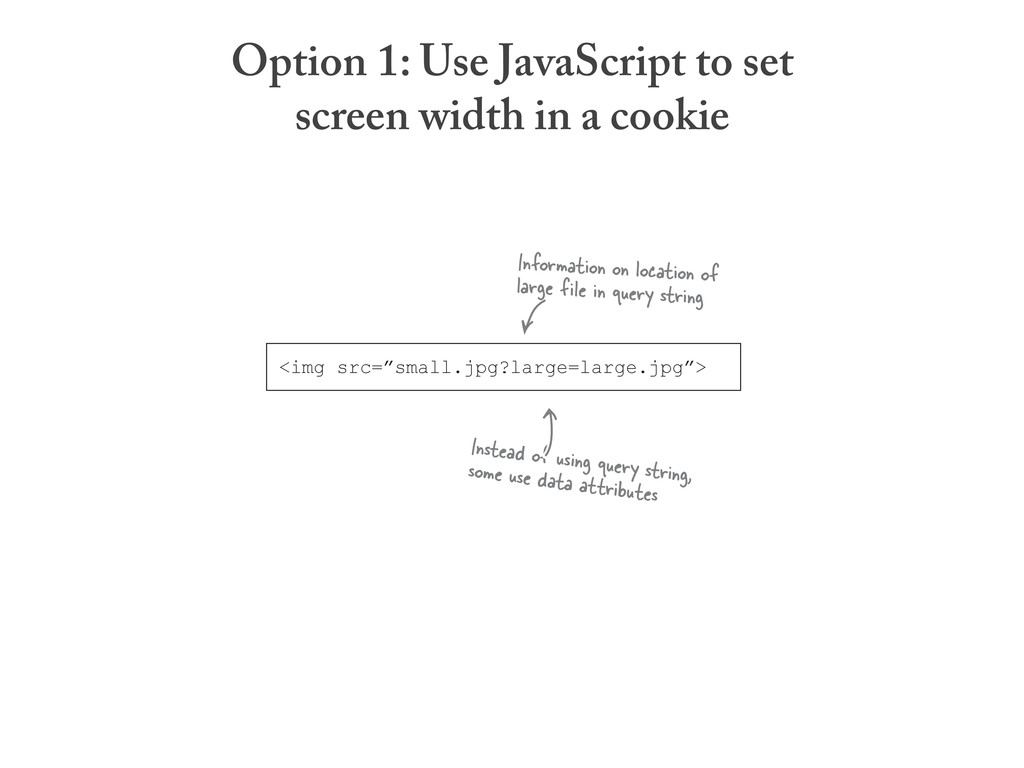
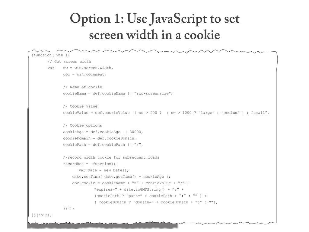
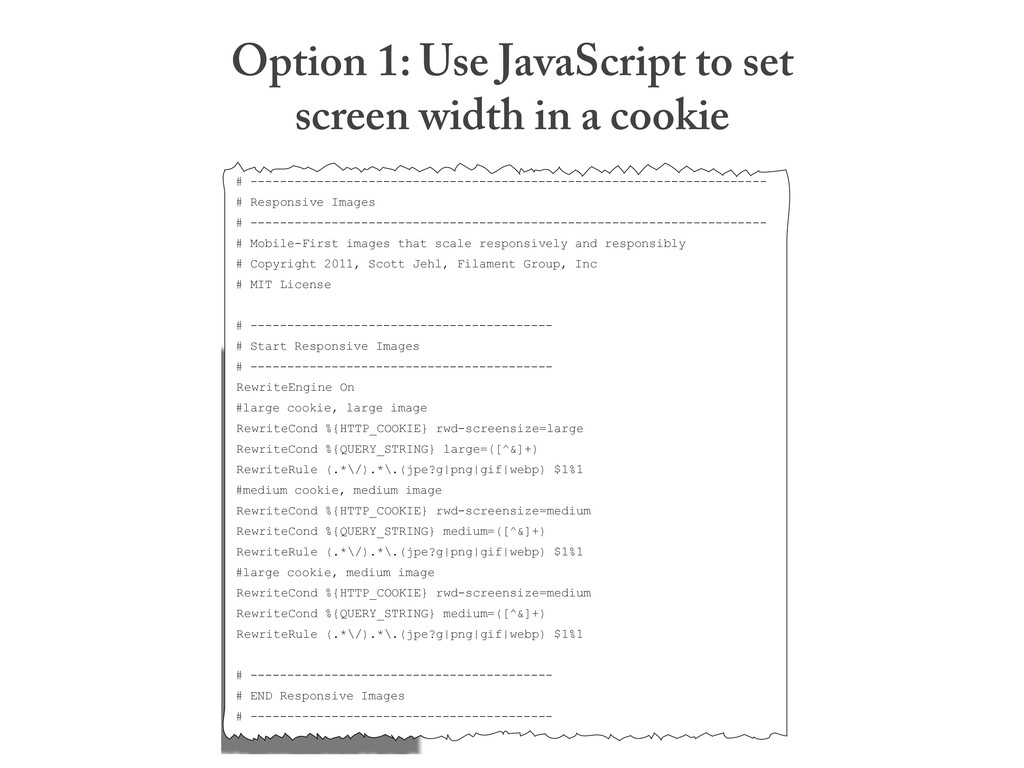
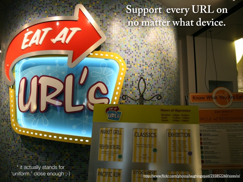
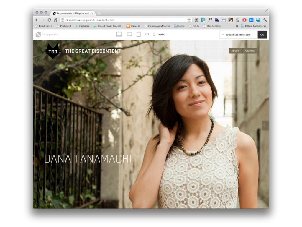
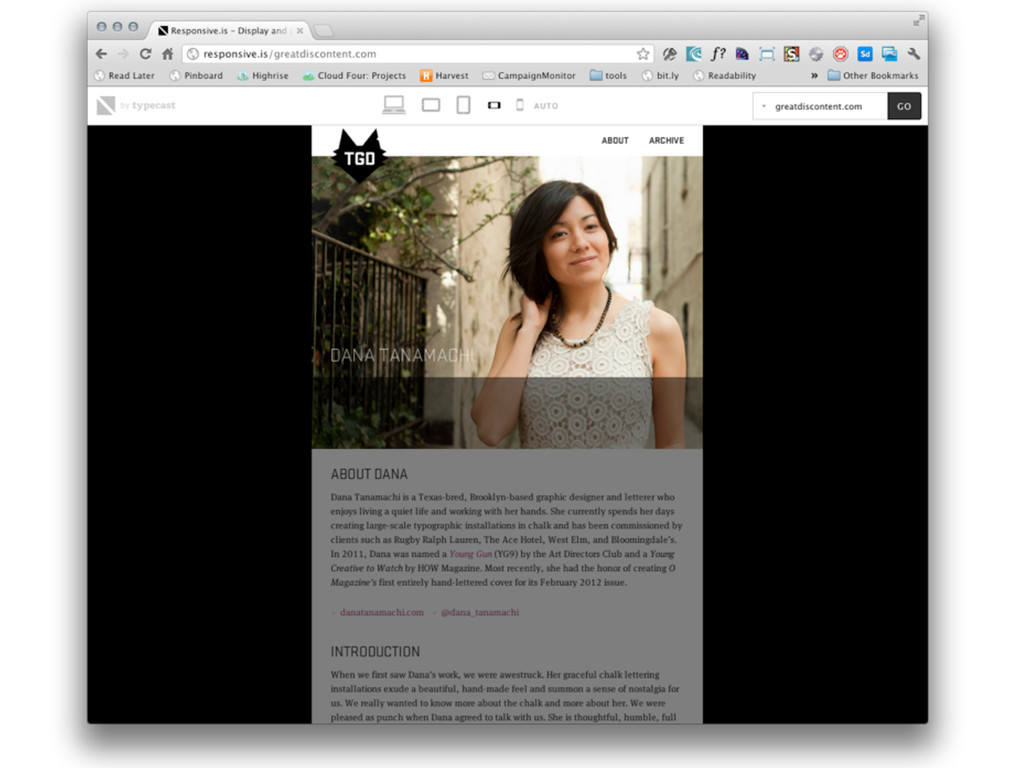
Responsive Web Design (RWD)
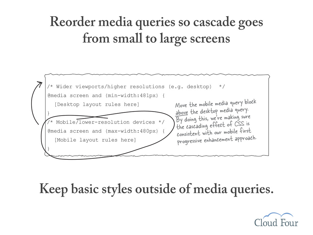
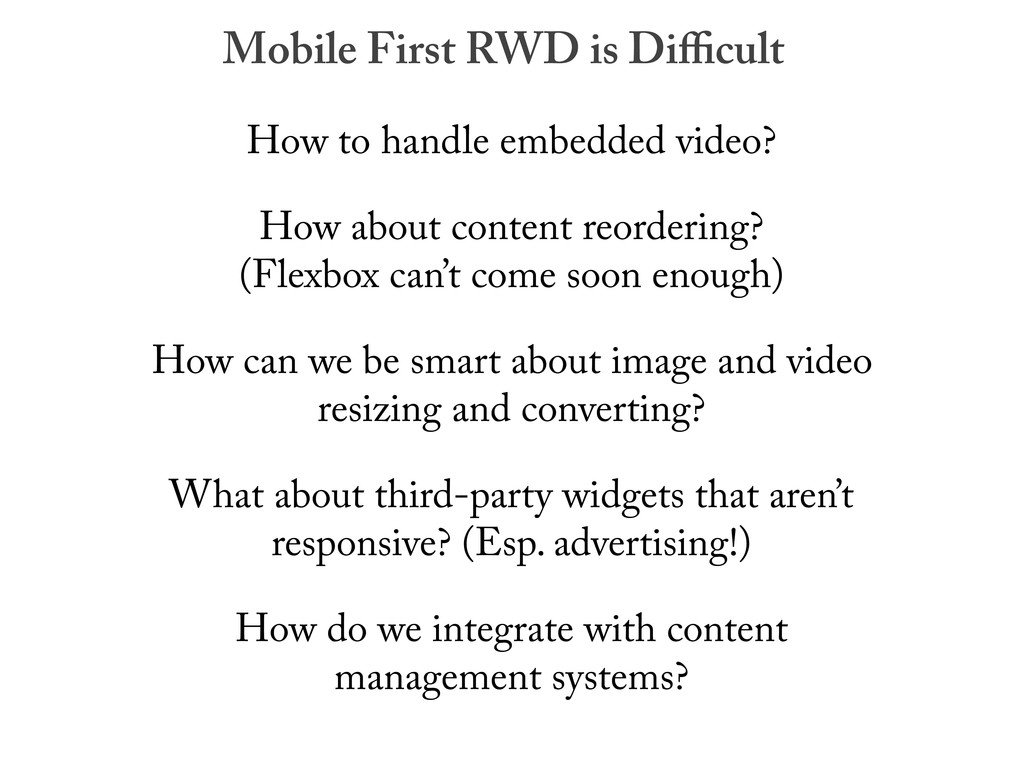
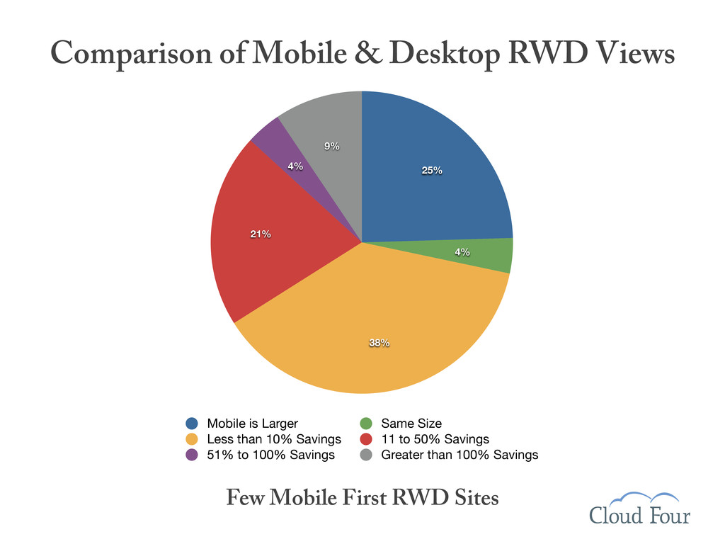
Mobile-first RWD
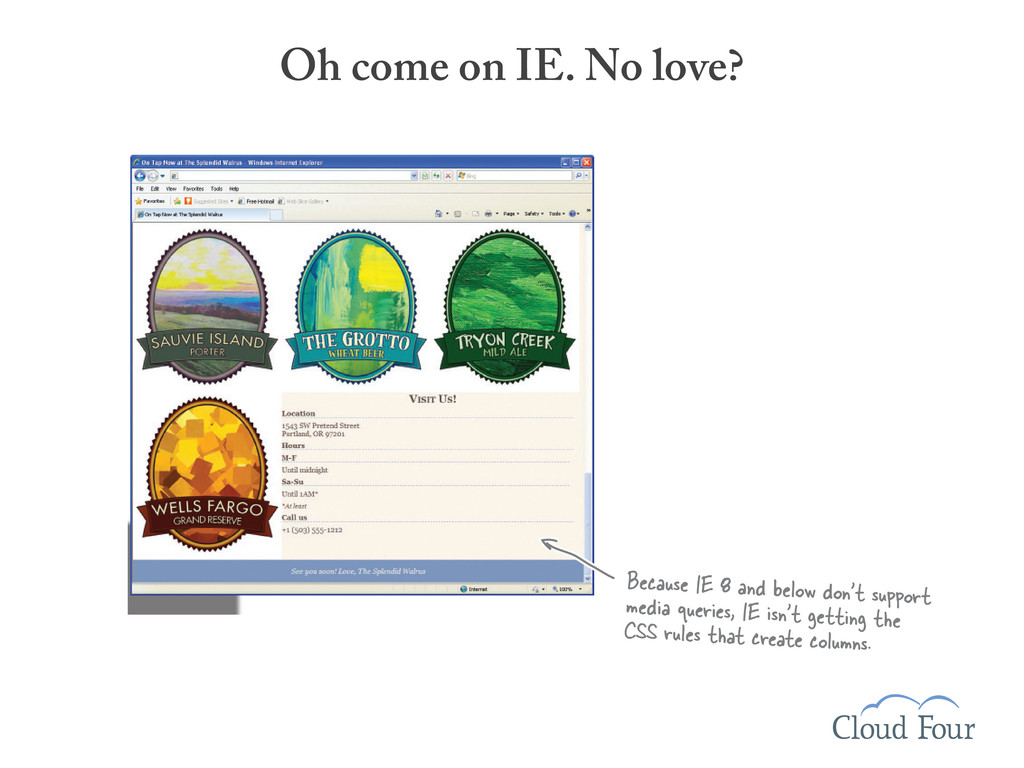
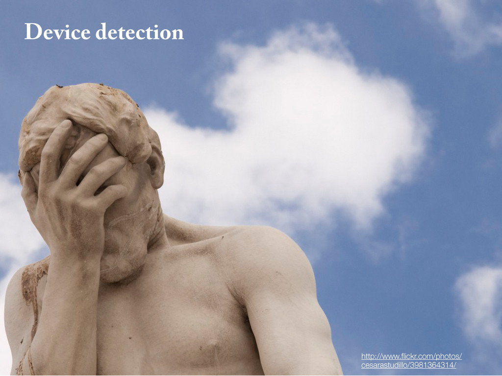
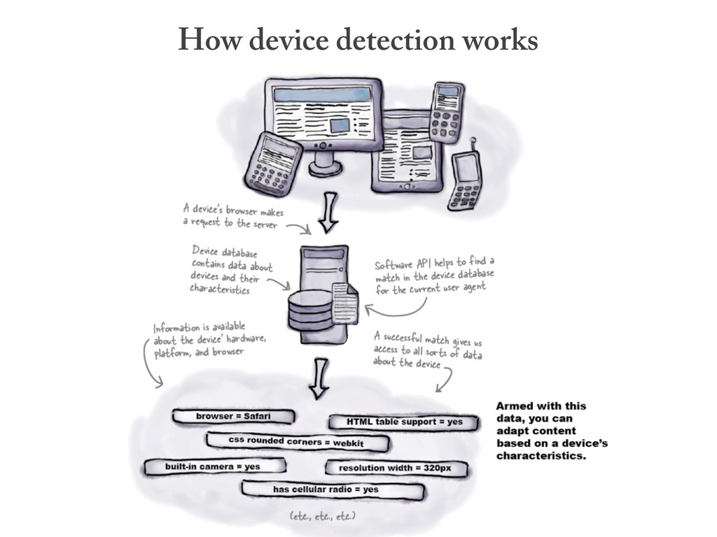
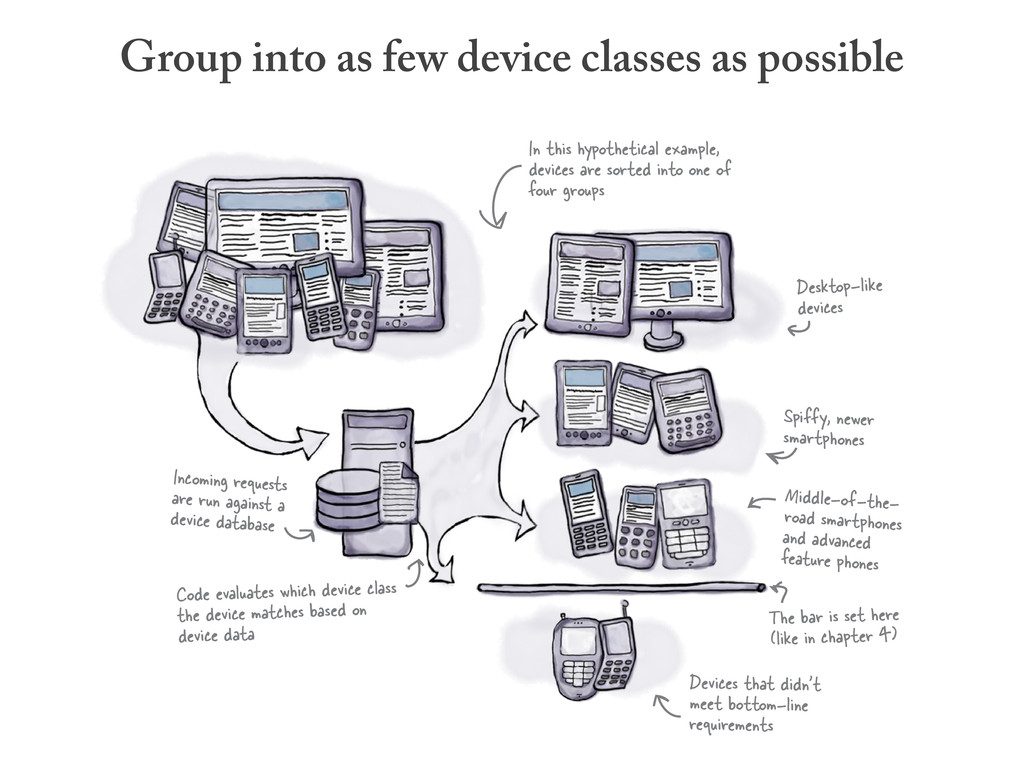
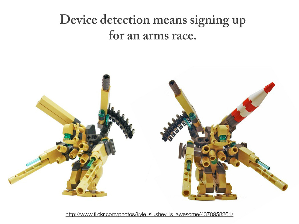
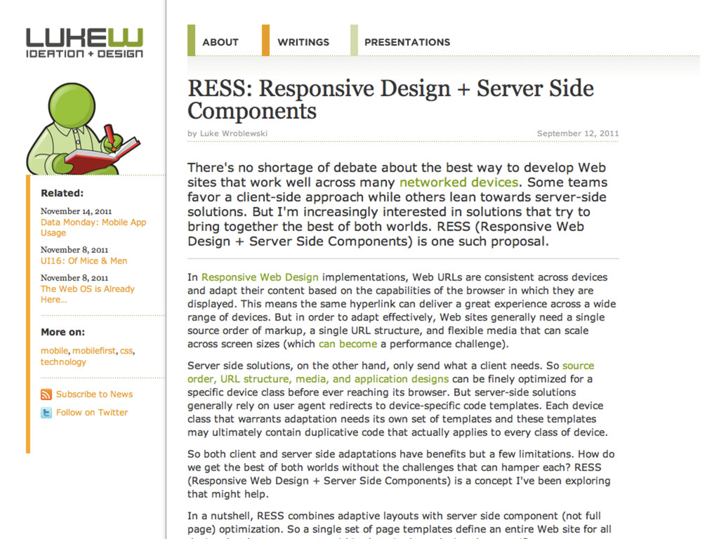
Server-side device detection
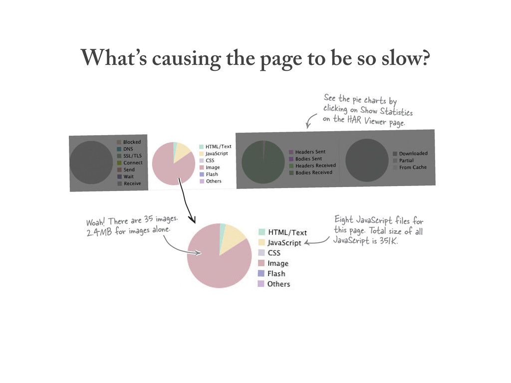
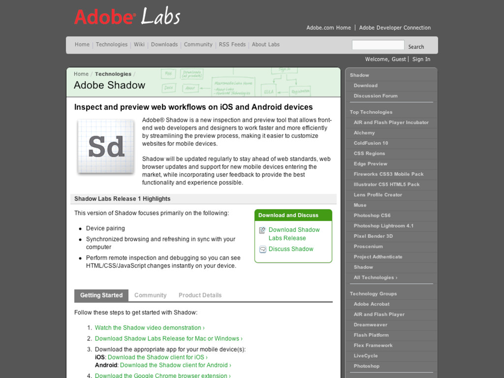
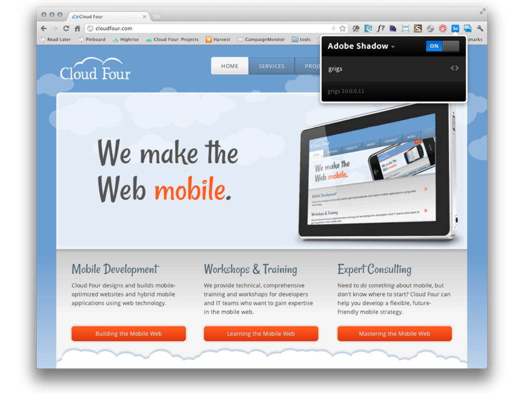
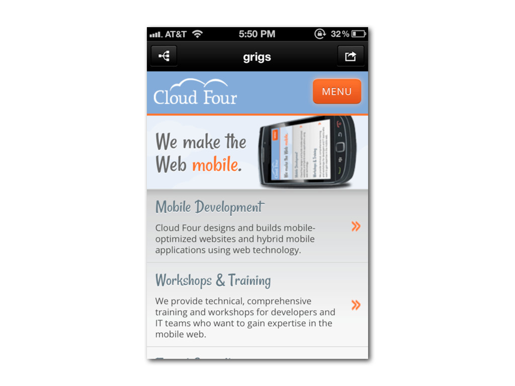
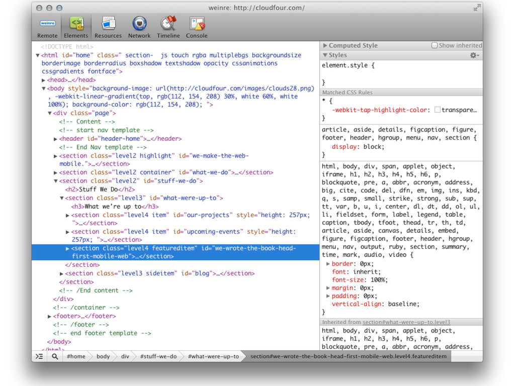
HTML5 and CSS3 on mobile
Device idiosyncrasies
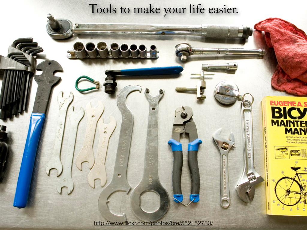
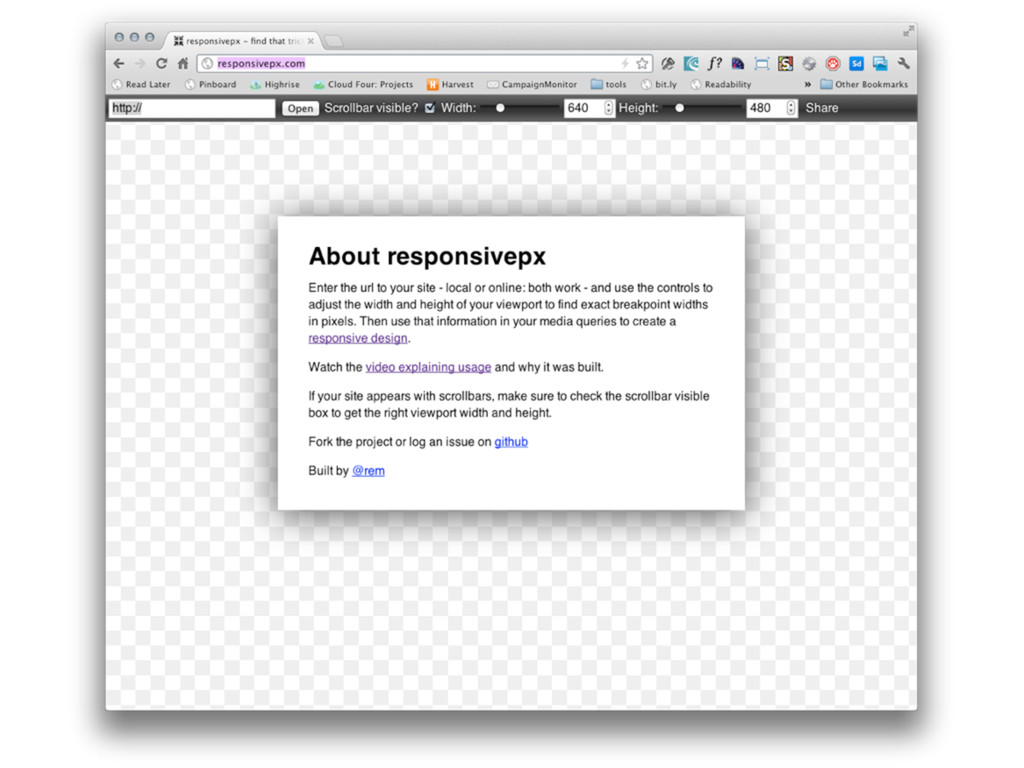
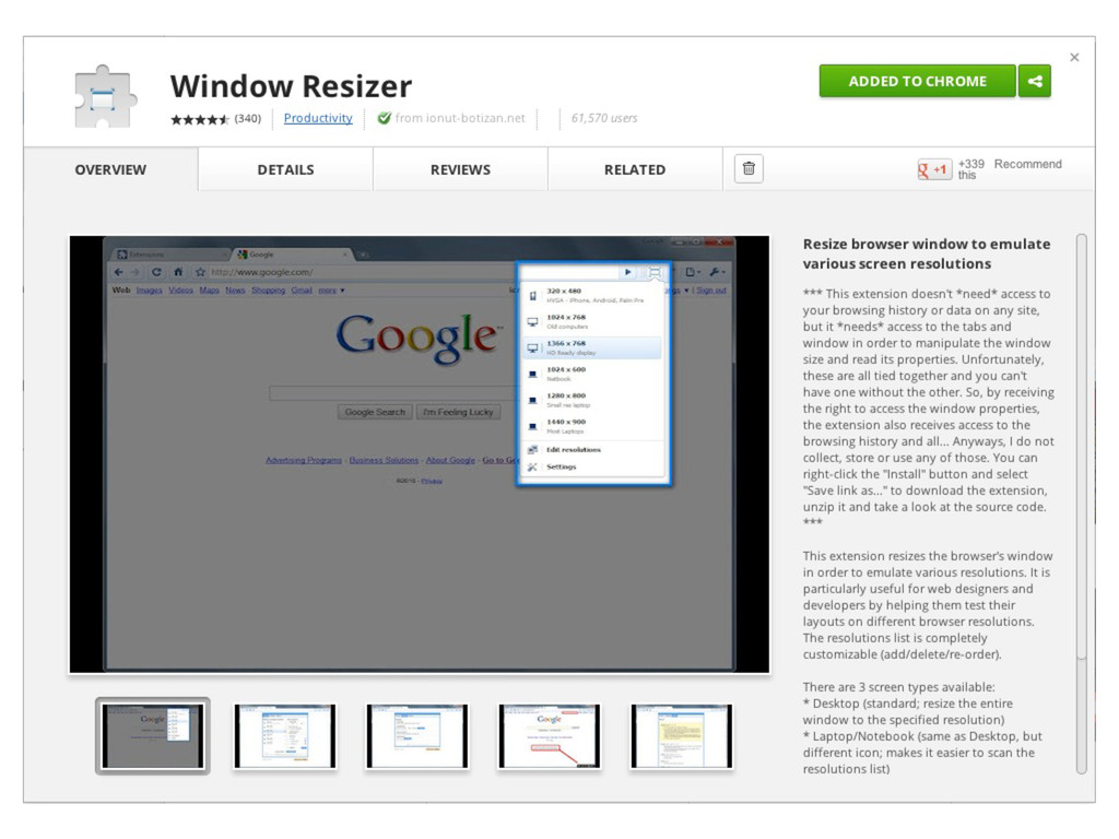
Some of our favorite tools and tips for mobile development
Who is this webcast for?

If you already have web development chops but want to go mobile, this is the talk for you! Familiarity with HTML and CSS is a must; comfort with some JavaScript is helpful.

Jason Grigsby

April 03, 2012
Tweet

More Decks by Jason Grigsby

Other Decks in Technology

Transcript

  1. @media screen and (min-width:480px) { /* CSS Rules */ }

    “screen” media type, we meet again! “min-” is a media query prefix. Rather intuitively, it means we want to query about a minimum width. “width” is a media feature we want to evaluate on the “screen” media type Unsurprisingly, there is also a “max-” prefix. These CSS rules will only get applied if the media query evaluates to TRUE Media Queries
  2. Target Context Result The size of the element in pixels.

    The size of the containing “context,” in pixels. Our new, proportional CSS rule, as a percentage.
  3. 960 pixels 240 pixels 240 pixels 460 pixels 960 pixels

    240 pixels 960 pixels 25% The columns span a quarter of the page width. So this feels pretty intuitive, right?
  4. 960 pixels 240 pixels 240 pixels 460 pixels 960 pixels

    240 pixels 960 pixels 25% The columns span a quarter of the page width. So this feels pretty intuitive, right? 260 pixels 960 pixels 27.0833333% #main { margin: 10px 260px 0 250px; } 250 pixels 960 pixels 26.0416667% Our current CSS rule
  5. 960 pixels 240 pixels 240 pixels 460 pixels 960 pixels

    240 pixels 960 pixels 25% The columns span a quarter of the page width. So this feels pretty intuitive, right? 260 pixels 960 pixels 27.0833333% #main { margin: 10px 260px 0 250px; } 250 pixels 960 pixels 26.0416667% Our current CSS rule #main { margin: 10px 27.0833333% 0 26.0416667%; }
  6. Em-based media queries solve zooming Pixel-based media queries when you

    zoom Em-based media queries when you zoom (you may have to reload to see change)
  7. Eight JavaScript files for this page. Total size of all

    JavaScript is 351K. Woah! There are 35 images. 2.4MB for images alone. See the pie charts by clicking on Show Statistics on the HAR Viewer page. What’s causing the page to be so slow?
  8. <iframe id="map" width="300" height="300" frameborder="0" scrolling="no" marginheight="0" marginwidth="0" src="http://maps.google.com..."></iframe> Extremely

    long URL abbreviated This single iframe causes 47 files to be downloaded! Look inside ontap.html to find this code. Did you notice the map?
  9. <iframe id="map" width="300" height="300" frameborder="0" scrolling="no" marginheight="0" marginwidth="0" src="http://maps.google.com..."></iframe> Extremely

    long URL abbreviated This single iframe causes 47 files to be downloaded! Look inside ontap.html to find this code. @media screen and (max-width:480px) { . . . #map {display:none;} } taps.css There are many more rules in the css file. The iframe has an id of map. This rule hides the Google Maps iframe by setting the display to none. Did you notice the map?
  10. The taps.jpg file is 440.7K making it the largest file

    on the page. @media screen and (max-width:480px) { [Other CSS rules are here] .header {display:none;} } Same display:none issue with images
  11. Original Resized K Saved % Saved Holmes 34.7K 8.1K 26.6K

    76.6% Watson 39.0K 8.4K 30.6K 78.4% Mycroft 30.5K 6.7K 23.8K 78.0% Moriarty 43.4K 8.2K 35.2K 81.1% Adler 26.0K 6.6K 19.4K 74.6% Winter 34.7K 7.8K 26.9K 77.5% Total 208.3K 45.8K 162.5K 78.0% Flexible images are unnecessarily large images
  12. /* Wider viewports/higher resolutions (e.g. desktop) */ @media screen and

    (min-width:481px) { [Desktop layout rules here] } /* Mobile/lower-resolution devices */ @media screen and (max-width:480px) { [Mobile layout rules here] } Move the mobile media query block above the desktop media query. By doing this, we’re making sure the cascading effect of CSS is consistent with our mobile first progressive enhancement approach. Reorder media queries so cascade goes from small to large screens Keep basic styles outside of media queries.
  13. e absence of support for media queries is in fact

    the rst media query. —Bryan Rieger, Yiibu
  14. Oh come on IE. No love? Because IE 8 and

    below don’t support media queries, IE isn’t getting the CSS rules that create columns.
  15. <link rel="stylesheet" type="text/css" href="taps.css" /> <link rel="stylesheet" type="text/css" href="layout.css" media="all

    and (min-width: 481px)"> <!--[if (lt IE 9)&(!IEMobile)]> <link rel="stylesheet" type="text/css" href="layout.css" media="all" /> <![endif]--> The conditional comment repeats the line above it ensuring desktop IE sees our layout.css file. IE conditional comments
  16. <link rel="stylesheet" type="text/css" href="taps.css" /> <link rel="stylesheet" type="text/css" href="layout.css" media="all

    and (min-width: 481px)"> <!--[if (lt IE 9)&(!IEMobile)]> <link rel="stylesheet" type="text/css" href="layout.css" media="all" /> <![endif]--> The conditional comment repeats the line above it ensuring desktop IE sees our layout.css file. IE conditional comments or use Respond.js (a media query poly ll for IE)
  17. Put CSS images inside media queries to prevent extra downloads

    @media screen and (min-width:481px){ .header { background:URL('images/taps.jpg') repeat-x; height: 300px; } } Doesn’t work in all browsers. Duplicate downloads are unavoidable if the browser downloads assets if they are inside a media query that doesn’t apply.
  18. What to do about the map? <iframe id="map" width="300" height="300"

    frameborder="0" scrolling="no" marginheight="0" marginwidth="0" src="http://maps.google.com..."></iframe> Extremely long URL abbreviated This single iframe causes 47 files to be downloaded! Look inside ontap.html to find this code.
  19. What to do about the map? <script type="text/JavaScript"> var breakpoint

    = 481, id = 'mapcontainer', viewportWidth = window.innerWidth; if (viewportWidth > breakpoint) { var mapElement = document.createElement('iframe'); mapElement.id = 'map'; mapElement.src = 'http://maps.google.com/maps?f=q&s ource=s_q&hl=en&geocode=&q=334+NW+11th+Ave,+Portland,+ OR+97209&aq=&sll=37.0625,-95.677068&sspn=58.164117,80. 332031&vpsrc=0&ie=UTF8&hq=&hnear=334+NW+11th+Ave,+Port land,+Oregon+97209&t=m&ll=45.525472,-122.68218&spn=0.0 1804,0.025749&z=14&output=embed'; document.getElementById(id).insertBefore(mapElement, maplink); } </script>
  20. One SRC to rule all images <img src="brews_images/bensons_bubbler.jpg" alt="Bensons Bubbler">

    There are 16 beer labels on the On Tap Now page that use an img tag like this one for the Bensons Bubbler. Despite the need for multiple versions of this image depending on the screen size, HTML only allows one value for the src.
  21. http://www.flickr.com/photos/wscullin/3770015203 initial request 1 Hmm, Huston - we have a

    problem... ...no idea what we can deliver to this client... HTML JavaScript stylesheets images Flash video fonts http://www.slideshare.net/yiibu/muddling-through-the-mobile-web
  22. Option 1: Use JavaScript to set screen width in a

    cookie <img src=”small.jpg?large=large.jpg”> Information on location of large file in query string Instead of using query string, some use data attributes
  23. Option 1: Use JavaScript to set screen width in a

    cookie (function( win ){ // Get screen width var sw = win.screen.width, doc = win.document, // Name of cookie cookieName = def.cookieName || “rwd-screensize”, // Cookie value cookieValue = def.cookieValue || sw > 500 ? ( sw > 1000 ? “large” : “medium” ) : “small”, // Cookie options cookieAge = def.cookieAge || 30000, cookieDomain = def.cookieDomain, cookiePath = def.cookiePath || “/”, //record width cookie for subsequent loads recordRes = (function(){ var date = new Date(); date.setTime( date.getTime() + cookieAge ); doc.cookie = cookieName + “=” + cookieValue + “;” + “expires=” + date.toGMTString() + “;” + (cookiePath ? “path=” + cookiePath + “;” : “” ) + ( cookieDomain ? “domain=” + cookieDomain + “;” : “”); })(); })(this);
  24. Option 1: Use JavaScript to set screen width in a

    cookie # ---------------------------------------------------------------------- # Responsive Images # ---------------------------------------------------------------------- # Mobile-First images that scale responsively and responsibly # Copyright 2011, Scott Jehl, Filament Group, Inc # MIT License # ----------------------------------------- # Start Responsive Images # ----------------------------------------- RewriteEngine On #large cookie, large image RewriteCond %{HTTP_COOKIE} rwd-screensize=large RewriteCond %{QUERY_STRING} large=([^&]+) RewriteRule (.*\/).*\.(jpe?g|png|gif|webp) $1%1 #medium cookie, medium image RewriteCond %{HTTP_COOKIE} rwd-screensize=medium RewriteCond %{QUERY_STRING} medium=([^&]+) RewriteRule (.*\/).*\.(jpe?g|png|gif|webp) $1%1 #large cookie, medium image RewriteCond %{HTTP_COOKIE} rwd-screensize=medium RewriteCond %{QUERY_STRING} medium=([^&]+) RewriteRule (.*\/).*\.(jpe?g|png|gif|webp) $1%1 # ----------------------------------------- # END Responsive Images # -----------------------------------------
  25. Option 1: Use JavaScript to set screen width in a

    cookie http://blog.yoav.ws/2011/09/Preloaders-cookies-and-race-conditions
  26. Option 1: Use JavaScript to set screen width in a

    cookie Ugh, unreliable. May not work in future. http://blog.yoav.ws/2011/09/Preloaders-cookies-and-race-conditions
  27. Option 2: Use noscript to prevent image from loading <noscript

    data-large=”Koala.jpg” data-small=”Koala-small.jpg” data-alt=”Koala”> <img src=”Koala.jpg” alt=”Koala” /> </noscript> File doesn’t download because anything inside noscript tags is not is the DOM if the JavaScript is enabled. $(‘noscript[data-large][data-small]’).each(function(){ var src = screen.width >= 500 ? $(this).data(‘large’) : $(this).data(‘small’); $(‘<img src=”’ + src + ‘” alt=”’ + $(this).data(‘alt’) + ‘” />’). insertAfter($(this)); }); Script assumes jQuery is loaded.
  28. Option 2: Use noscript to prevent image from loading <noscript

    data-large=”Koala.jpg” data-small=”Koala-small.jpg” data-alt=”Koala”> <img src=”Koala.jpg” alt=”Koala” /> </noscript> File doesn’t download because anything inside noscript tags is not is the DOM if the JavaScript is enabled.
  29. Option 2: Use noscript to prevent image from loading <noscript

    data-large=”Koala.jpg” data-small=”Koala-small.jpg” data-alt=”Koala”> <img src=”Koala.jpg” alt=”Koala” /> </noscript> File doesn’t download because anything inside noscript tags is not is the DOM if the JavaScript is enabled. Ugh, markup is no longer semantic. We’ve changed HTML to t one and only one solution.
  30. Option 3: Use Sencha.io SRC or similar solution to resize

    images Set the first part of the src to http://src.sencha.io/ After the slash add the full URL of the image you want to have resized. Sencha.io SRC will resize the image to fit the size of the device screen. For example, if an iPhone visits the site, the image will be constrained to its screen size of 320 by 480 pixels. <img src="http://src.sencha.io/http://[DOMAIN]/[PATH]/brews_images/bensons_ bubbler.jpg" alt="Bensons Bubbler"> Replace with your domain and path to the images.
  31. Option 3: Use Sencha.io SRC or similar solution to resize

    images Set the first part of the src to http://src.sencha.io/ After the slash add the full URL of the image you want to have resized. Sencha.io SRC will resize the image to fit the size of the device screen. For example, if an iPhone visits the site, the image will be constrained to its screen size of 320 by 480 pixels. <img src="http://src.sencha.io/http://[DOMAIN]/[PATH]/brews_images/bensons_ bubbler.jpg" alt="Bensons Bubbler"> Replace with your domain and path to the images.
  32. Option 3: Use Sencha.io SRC or similar solution to resize

    images Set the first part of the src to http://src.sencha.io/ After the slash add the full URL of the image you want to have resized. Sencha.io SRC will resize the image to fit the size of the device screen. For example, if an iPhone visits the site, the image will be constrained to its screen size of 320 by 480 pixels. <img src="http://src.sencha.io/http://[DOMAIN]/[PATH]/brews_images/bensons_ bubbler.jpg" alt="Bensons Bubbler"> Replace with your domain and path to the images. Ugh, we’re routing everything through a third party. And how does Sencha.io know what size image to send anyways?
  33. Only real solution is a new element <picture alt="Giraffe"> <source

    src="giraffe-sml.jpg" media="(max-width:480px)"> <source src="giraffe-lrg.jpg" media="(min-width:481px)"> <img src="giraffe-sml.jpg" alt="Giraffe" /> <p>Long description</p> </picture> W3C Responsive Images Community Group http://www.w3.org/community/respimg/
  34. How to handle embedded video? How about content reordering? (Flexbox

    can’t come soon enough) How can we be smart about image and video resizing and converting? What about third-party widgets that aren’t responsive? (Esp. advertising!) How do we integrate with content management systems? Mobile First RWD is Difficult
  35. 9% 4% 21% 38% 4% 25% Mobile is Larger Same

    Size Less than 10% Savings 11 to 50% Savings 51% to 100% Savings Greater than 100% Savings Comparison of Mobile & Desktop RWD Views Few Mobile First RWD Sites
  36. User agent strings are the third rail of web development

    http://www.flickr.com/photos/flashflood/5183622956/
  37. “User agent sniffing must die. Nice job advocating this bad

    practice.” http://www.flickr.com/photos/kayepants/391645870/
  38. 25 of 30 sites in Alexa Top 30 use device

    detection Other ve don’t offer mobile sites!
  39. Incoming requests are run against a device database Code evaluates

    which device class the device matches based on device data In this hypothetical example, devices are sorted into one of four groups Desktop-like devices Spiffy, newer smartphones Middle-of-the- road smartphones and advanced feature phones Devices that didn’t meet bottom-line requirements The bar is set here (like in chapter 4) Group into as few device classes as possible
  40. Get 40% off of the print and 50% off of

    ebook version using code AUTHD at oreilly.com. OR Amazon link (no code): http://bit.ly/hf-mw ank you. You’ve been awesome!