Upgrade to Pro
— share decks privately, control downloads, hide ads and more …
Speaker Deck
Features
Speaker Deck
PRO
Sign in
Sign up for free
Search
Search
Responsive Design - Polopoly GeekNight Blixttal
Search
Henrik Ekelöf
November 23, 2011
Programming
2
410
Responsive Design - Polopoly GeekNight Blixttal
Henrik Ekelöf
November 23, 2011
Tweet
Share
Other Decks in Programming
See All in Programming
ロボットのための工場に灯りは要らない
watany
10
2.8k
TipKitTips
ktcryomm
0
170
Fundamentals of Software Engineering In the Age of AI
therealdanvega
1
250
コードレビューをしない選択 #でぃーぷらすトウキョウ
kajitack
3
940
AIに任せる範囲を安全に広げるためにやっていること
fukucheee
0
130
The Ralph Wiggum Loop: First Principles of Autonomous Development
sembayui
0
3.7k
Unity6.3 AudioUpdate
cova8bitdots
0
130
AWS Infrastructure as Code の新機能 2025 総まとめ 〜SA 4人による怒涛のデモ祭り〜
konokenj
10
3.4k
コーディングルールの鮮度を保ちたい / keep-fresh-go-internal-conventions
handlename
0
200
モジュラモノリスにおける境界をGoのinternalパッケージで守る
magavel
0
3.5k
New in Go 1.26 Implementing go fix in product development
sunecosuri
0
430
ベクトル検索のフィルタを用いた機械学習モデルとの統合 / python-meetup-fukuoka-06-vector-attr
monochromegane
2
420
Featured
See All Featured
Large-scale JavaScript Application Architecture
addyosmani
515
110k
Mozcon NYC 2025: Stop Losing SEO Traffic
samtorres
0
180
Abbi's Birthday
coloredviolet
2
5.3k
Writing Fast Ruby
sferik
630
63k
Lessons Learnt from Crawling 1000+ Websites
charlesmeaden
PRO
1
1.1k
Keith and Marios Guide to Fast Websites
keithpitt
413
23k
Efficient Content Optimization with Google Search Console & Apps Script
katarinadahlin
PRO
1
400
Avoiding the “Bad Training, Faster” Trap in the Age of AI
tmiket
0
100
Testing 201, or: Great Expectations
jmmastey
46
8.1k
HU Berlin: Industrial-Strength Natural Language Processing with spaCy and Prodigy
inesmontani
PRO
0
260
Building Applications with DynamoDB
mza
96
7k
Joys of Absence: A Defence of Solitary Play
codingconduct
1
310
Transcript
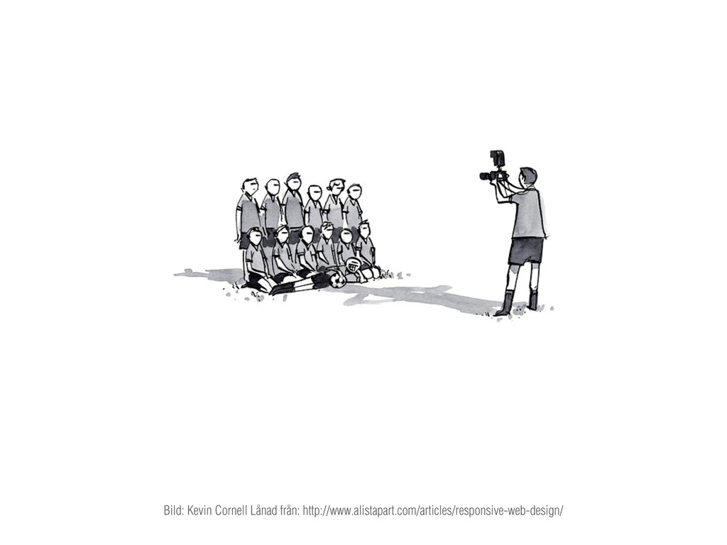
Bild: Kevin Cornell Lånad från: http://www.alistapart.com/articles/responsive-web-design/
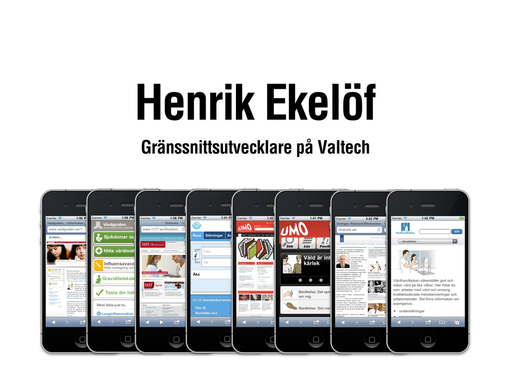
Henrik Ekelöf Gränssnittsutvecklare på Valtech
Responsive Design
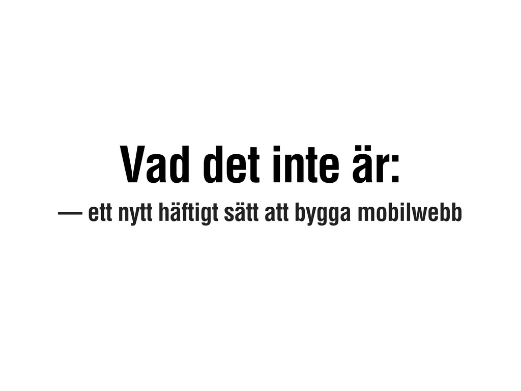
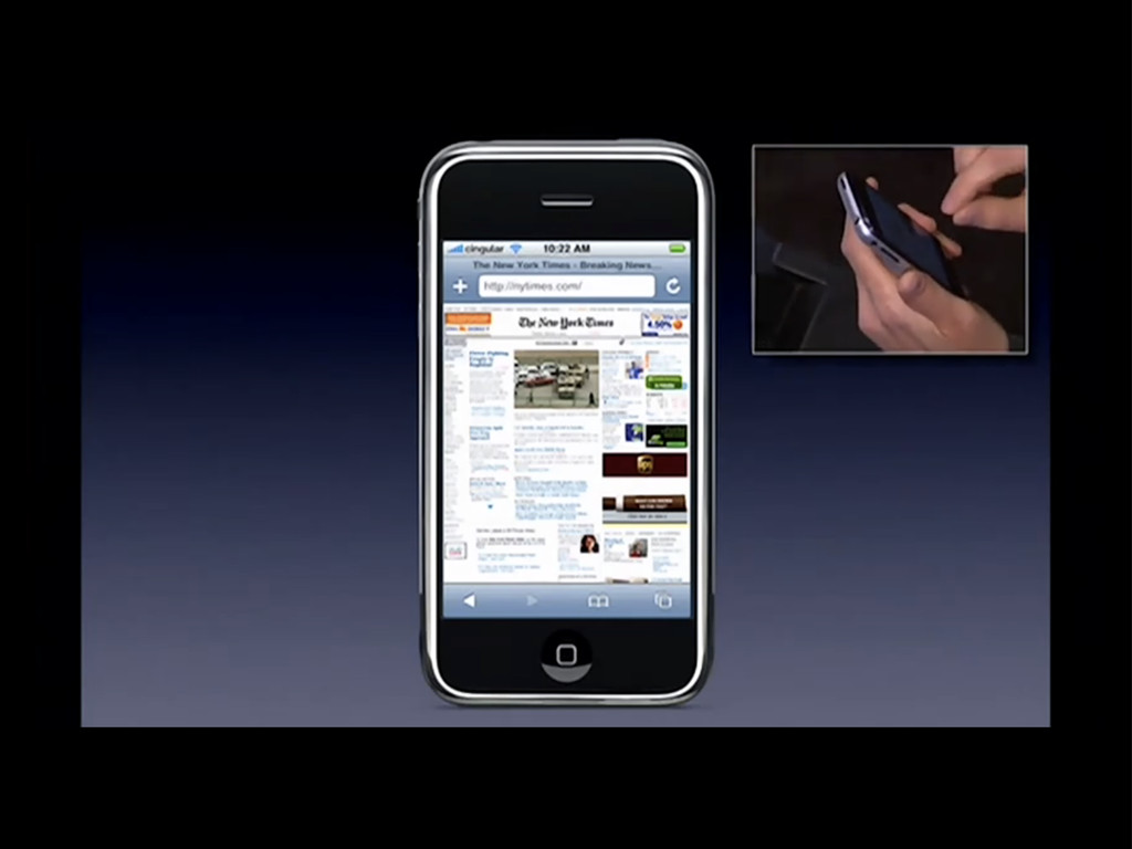
— ett nytt häftigt sätt att bygga mobilwebb Vad det
inte är:
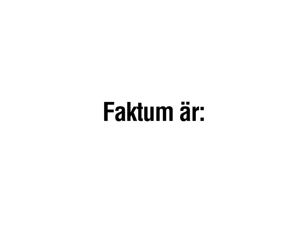
Faktum är:
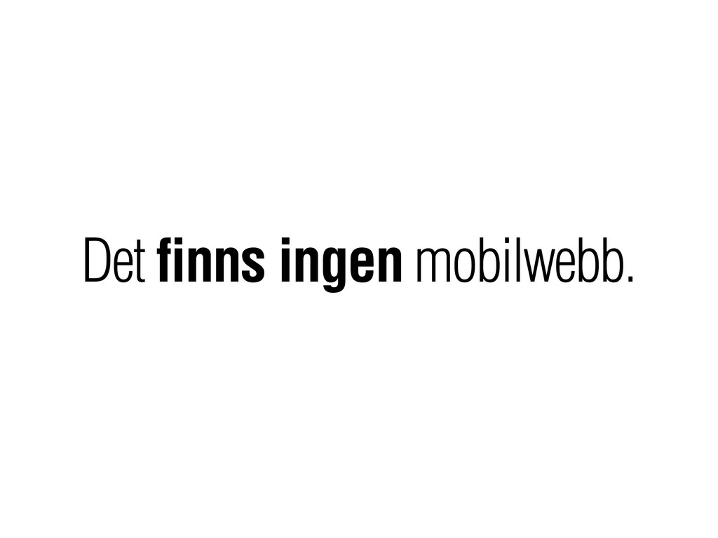
Det finns ingen mobilwebb.
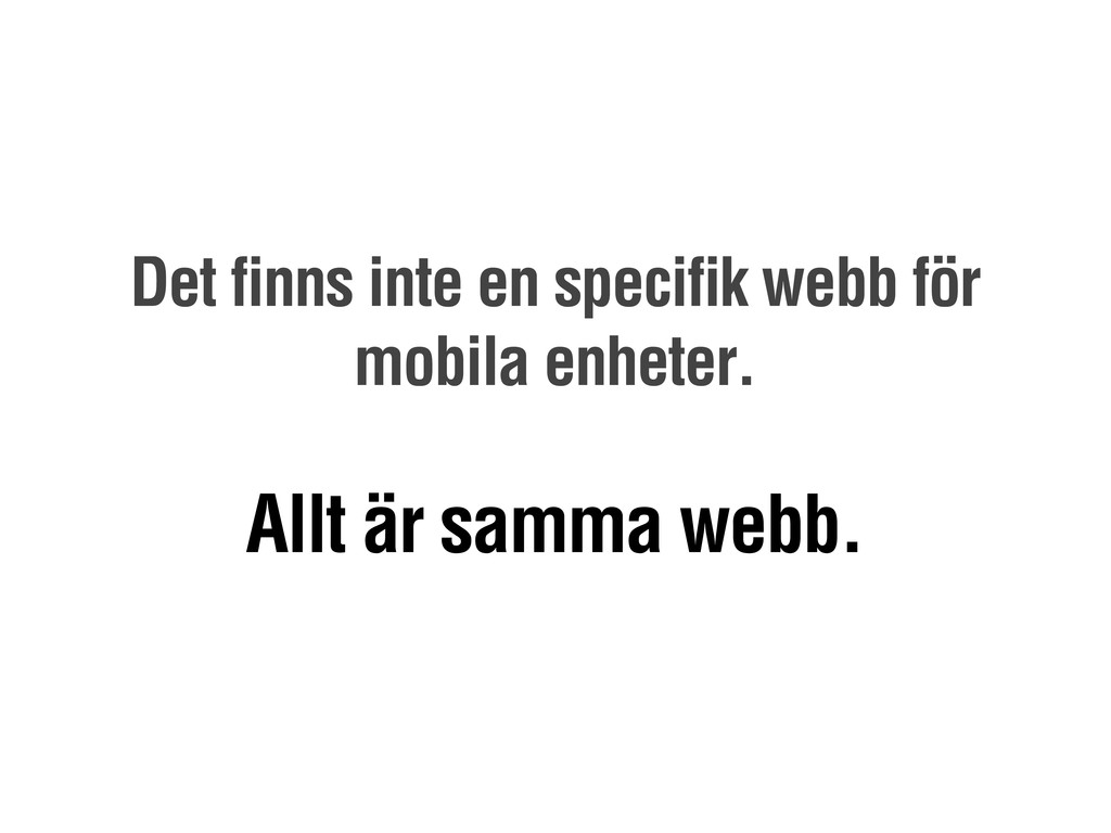
Det finns inte en specifik webb för mobila enheter. Allt
är samma webb.
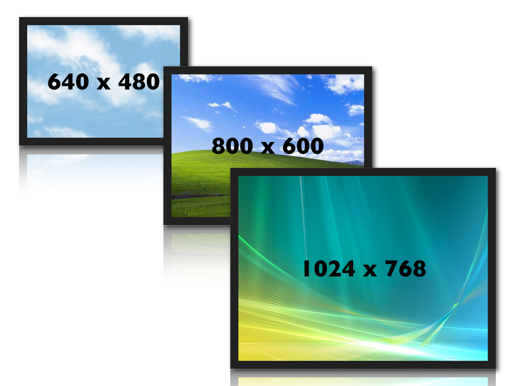
640 x 480 800 x 600 1024 x 768
None
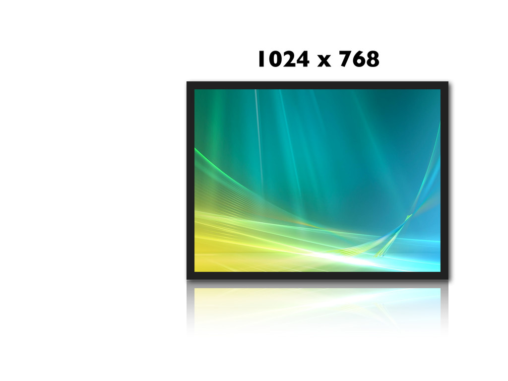
1024 x 768
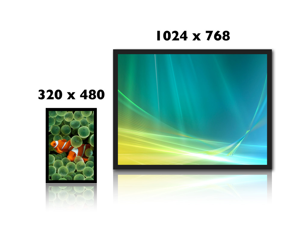
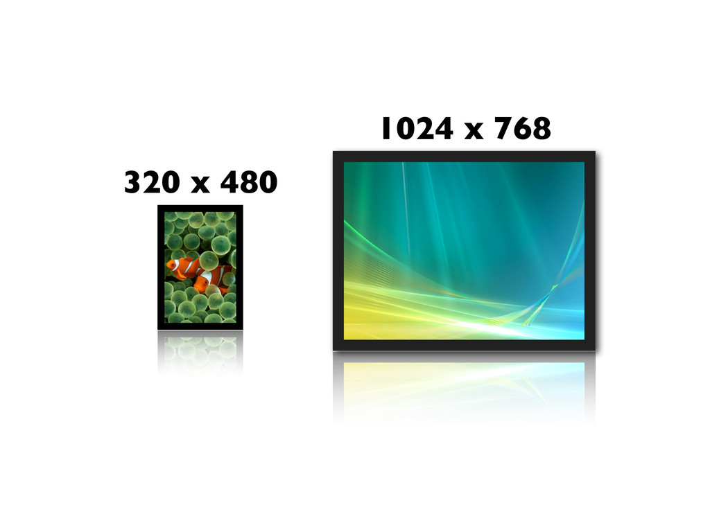
1024 x 768 320 x 480
None
1024 x 768 320 x 480
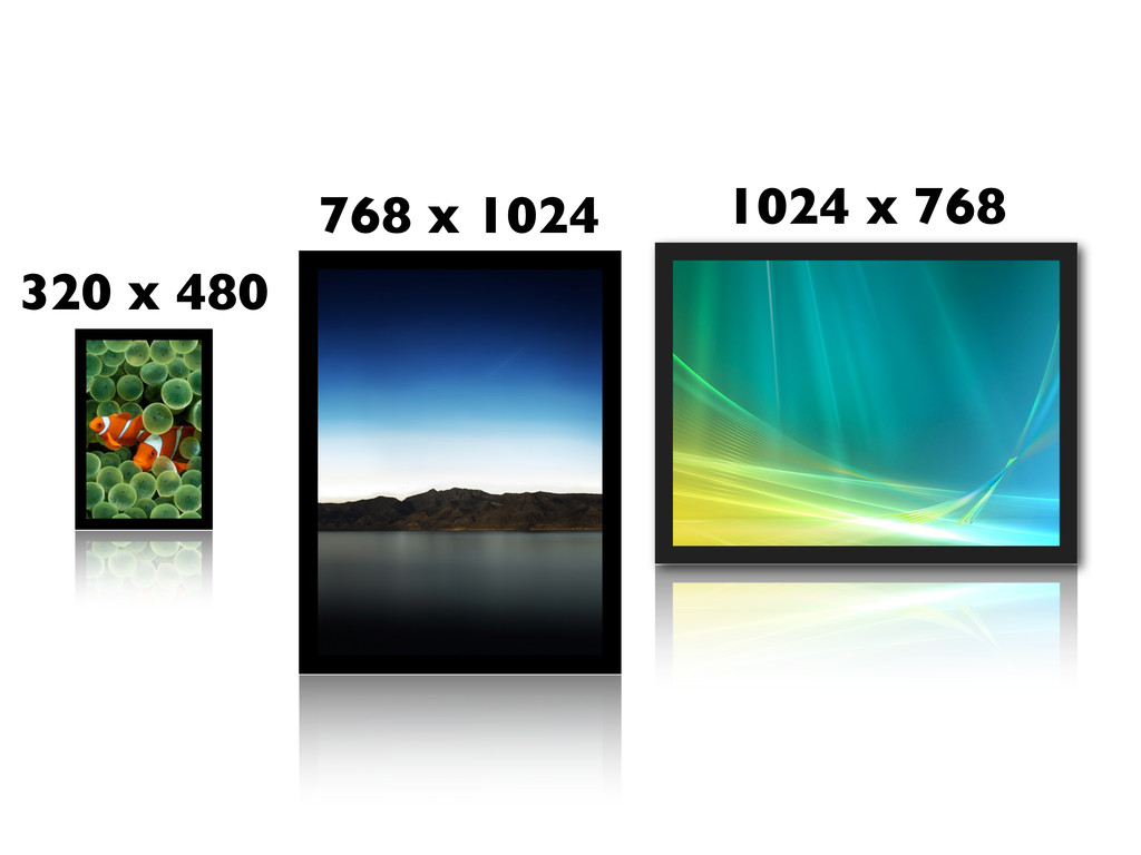
1024 x 768 320 x 480 768 x 1024
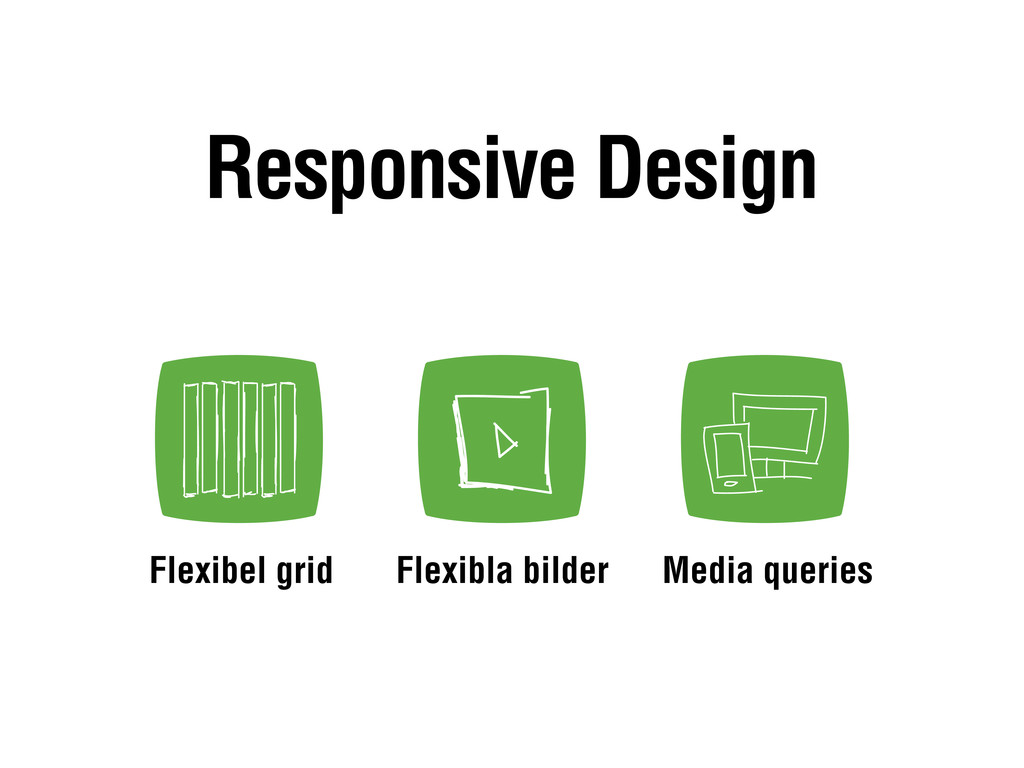
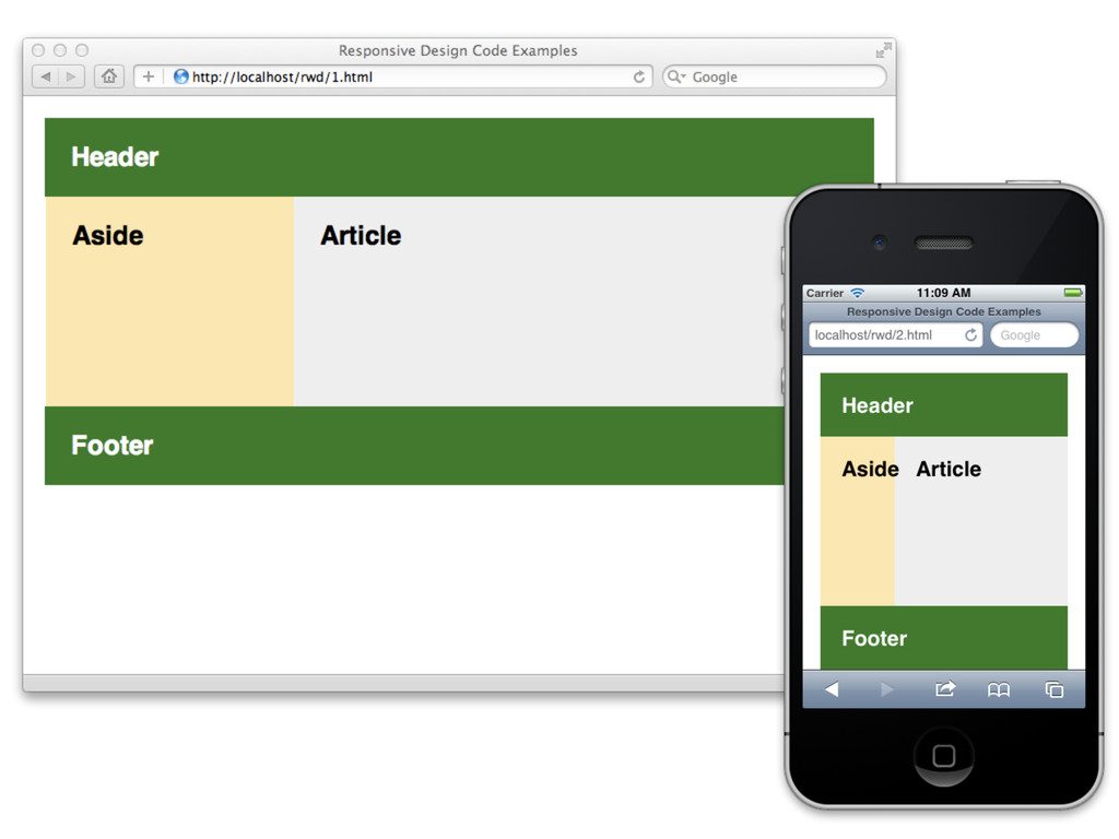
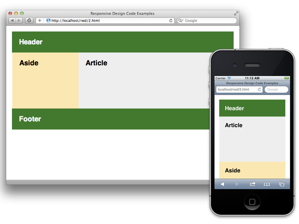
Flexibla bilder Flexibel grid Media queries Responsive Design
None
None
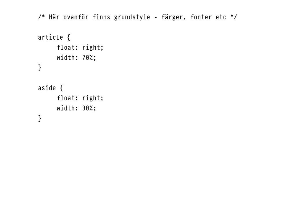
/* Här ovanför finns grundstyle - färger, fonter etc */
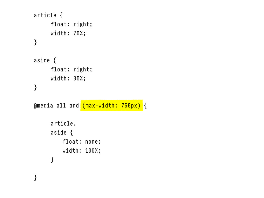
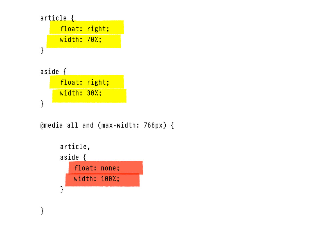
article { float: right; width: 70%; } aside { float: right; width: 30%; }
article { float: right; width: 70%; } aside { float:
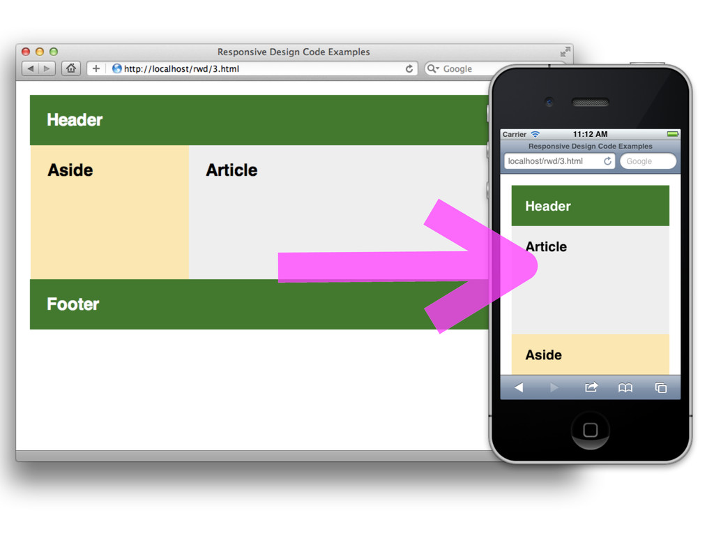
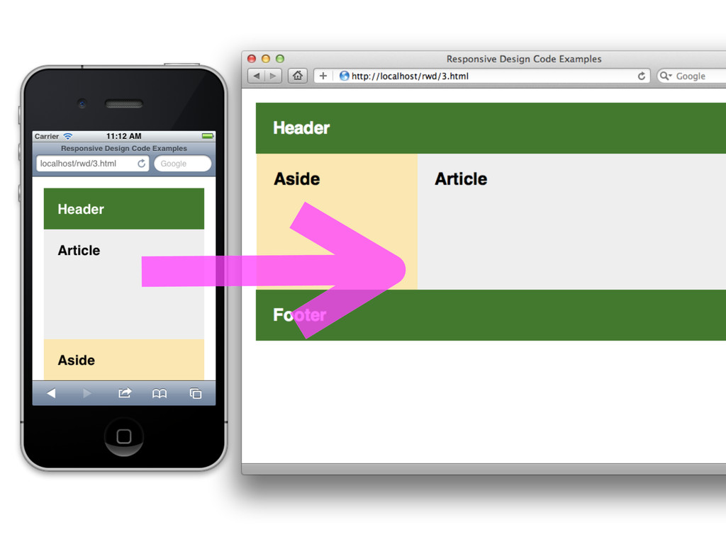
right; width: 30%; } @media all and (max-width: 768px) { article, aside { float: none; width: 100%; } }
None
article { float: right; width: 70%; } aside { float:
right; width: 30%; } @media all and (max-width: 768px) { article, aside { float: none; width: 100%; } }
None
None
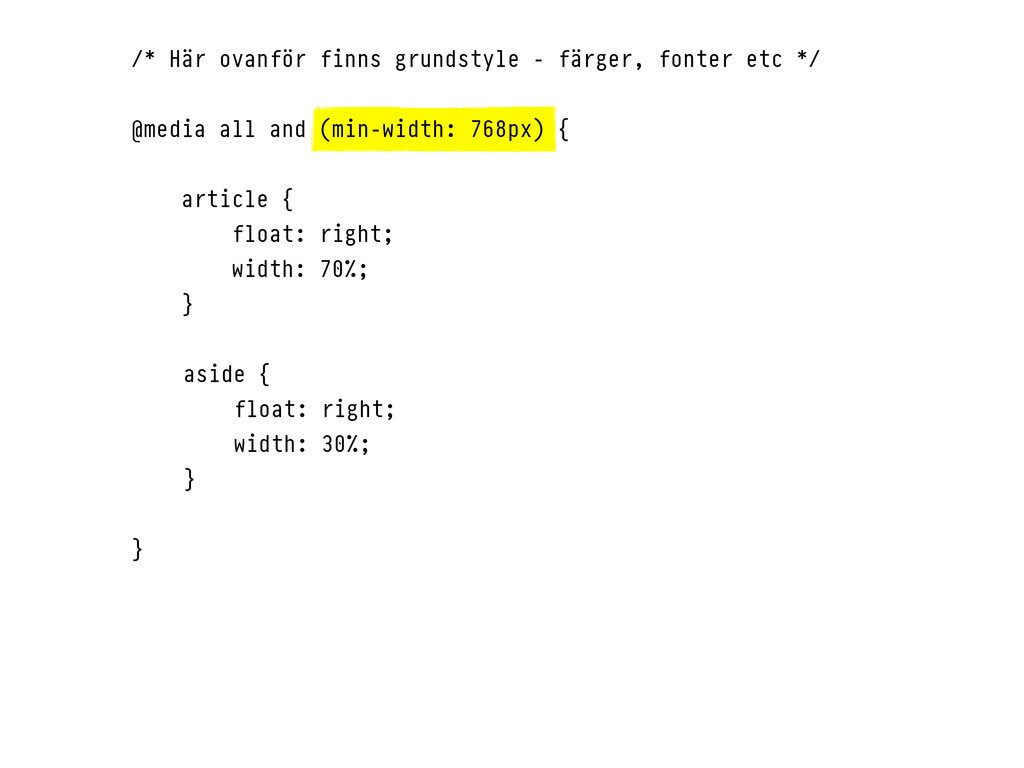
/* Här ovanför finns grundstyle - färger, fonter etc */
@media all and (min-width: 768px) { article { float: right; width: 70%; } aside { float: right; width: 30%; } }
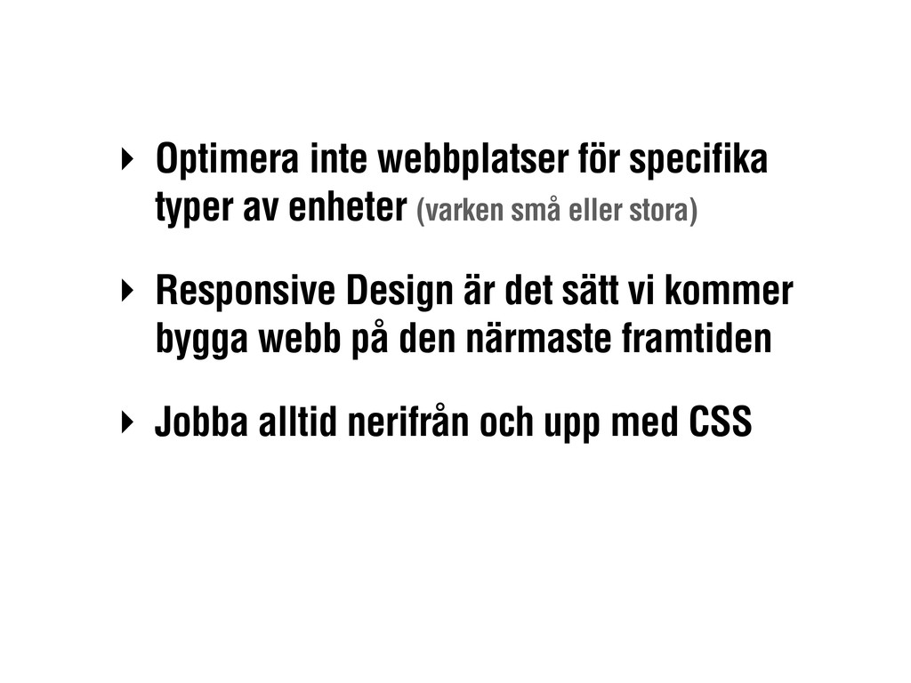
‣ Optimera inte webbplatser för specifika typer av enheter (varken
små eller stora) ‣ Responsive Design är det sätt vi kommer bygga webb på den närmaste framtiden ‣ Jobba alltid nerifrån och upp med CSS
Tack! Henrik Ekelöf, Valtech @henrikekelof
 watany
 ktcryomm
 therealdanvega
 kajitack
 fukucheee
 sembayui
 cova8bitdots
 konokenj
 handlename
 magavel
 sunecosuri
 monochromegane
 addyosmani
 samtorres
 coloredviolet
 sferik
 charlesmeaden
 keithpitt
 katarinadahlin
 tmiket
 jmmastey
 inesmontani
 mza
mza
 codingconduct