Share
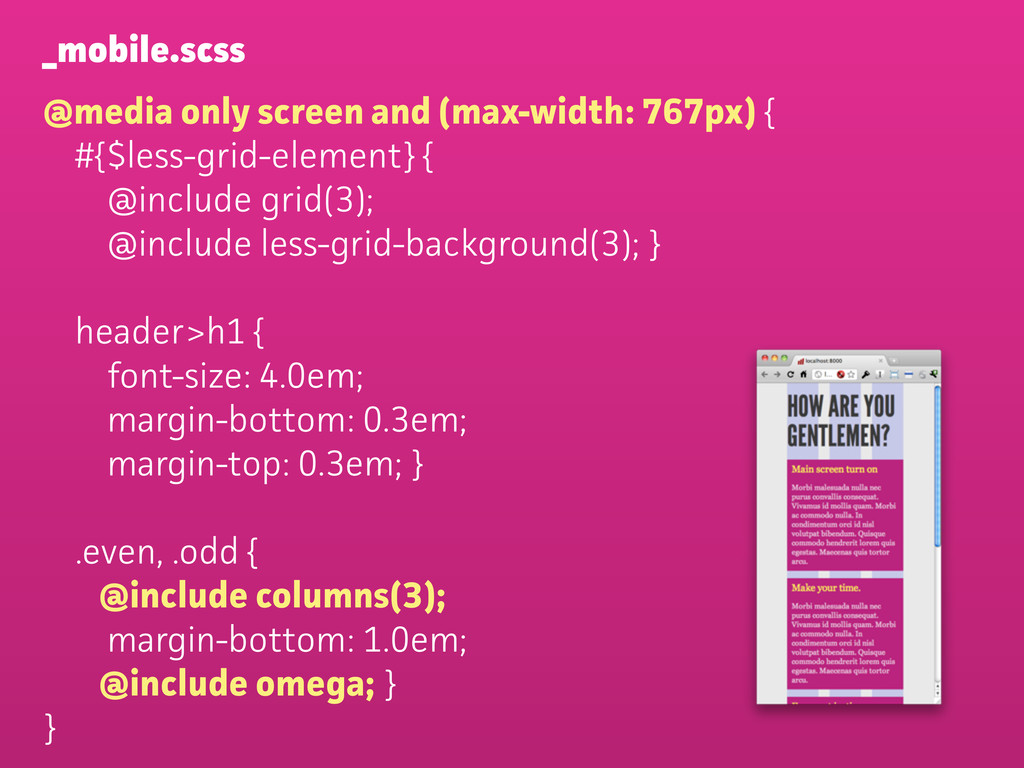
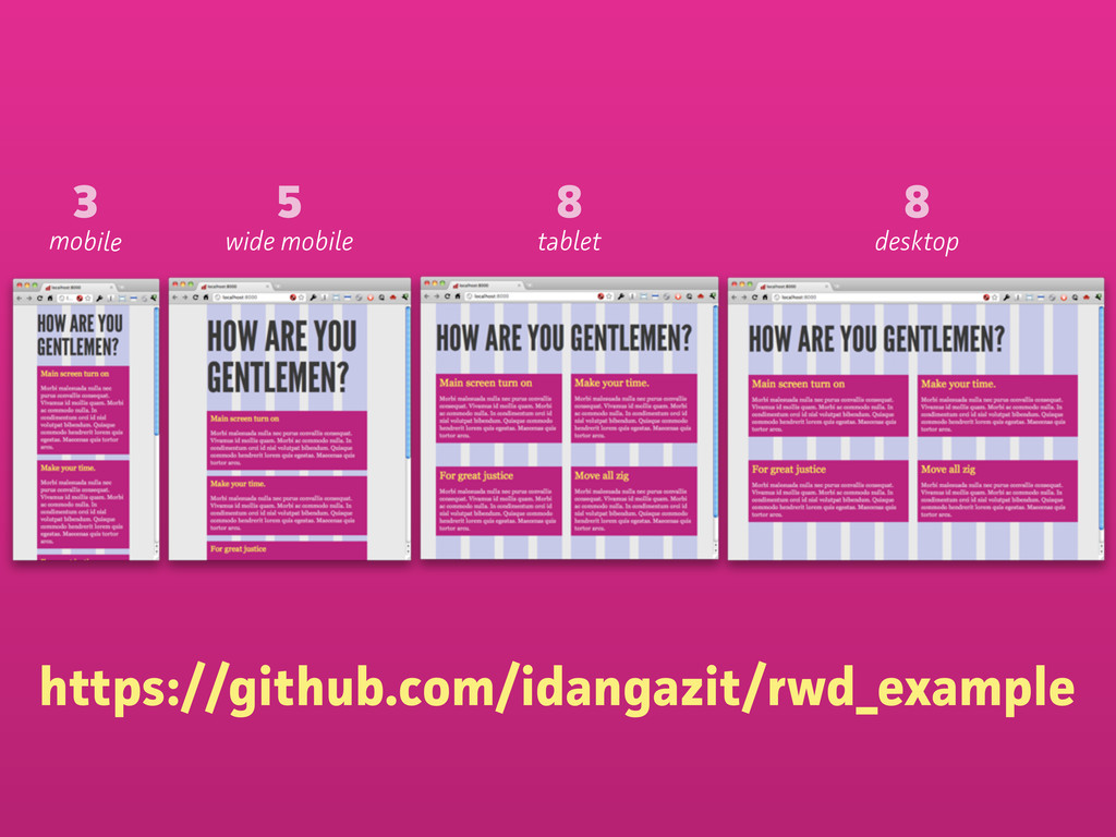
Slides from my talk at DjangoCon Europe 2011. Video and other coverage online at http://lanyrd.com/2011/djangocon-europe/sfmzd/#link-dgmx
 idangazit
 shotamatsuo
.jpg) rwang05
rwang05
 ajstarks
 nbkouhou
 garyuten
 payatsusan213
 koyaman
 madoka_portfolio
 lynteo
 shosira
 kaminashi
 greggifford
 aki_iinuma
 seathinner
 jonoalderson
 emna__ayadi
 cromwellryan
 sonatard
 soysaucechin
 apolaine
 kimpetersen
 shlominoach
 destraynor