website, NPR’s API and NPR’s mobile applica<ons. Recently we have also entered the Connected Cars space with the launch of Ford Sync support in NPR mobile apps, announced at CES. 2011 has been an incredible year for the web in general and for online publishing, in par<cular. A lot of new, interes<ng technologies have emerged and/or reached the state of maturity at which they can be used on live websites. Today I would like to share with you some insights about the most interes<ng web technologies and how they relate to news and media publishing, plus what we see as the trends in 2012. 1
distribu<ng content. Content is the king, the queen and a herd of unruly heirs running around, making a mess. It’s the alpha and omega of our business. When we discuss technology, we mostly care about the part of the technology that makes produc<on and distribu<on of content easier or more effec<ve. 2
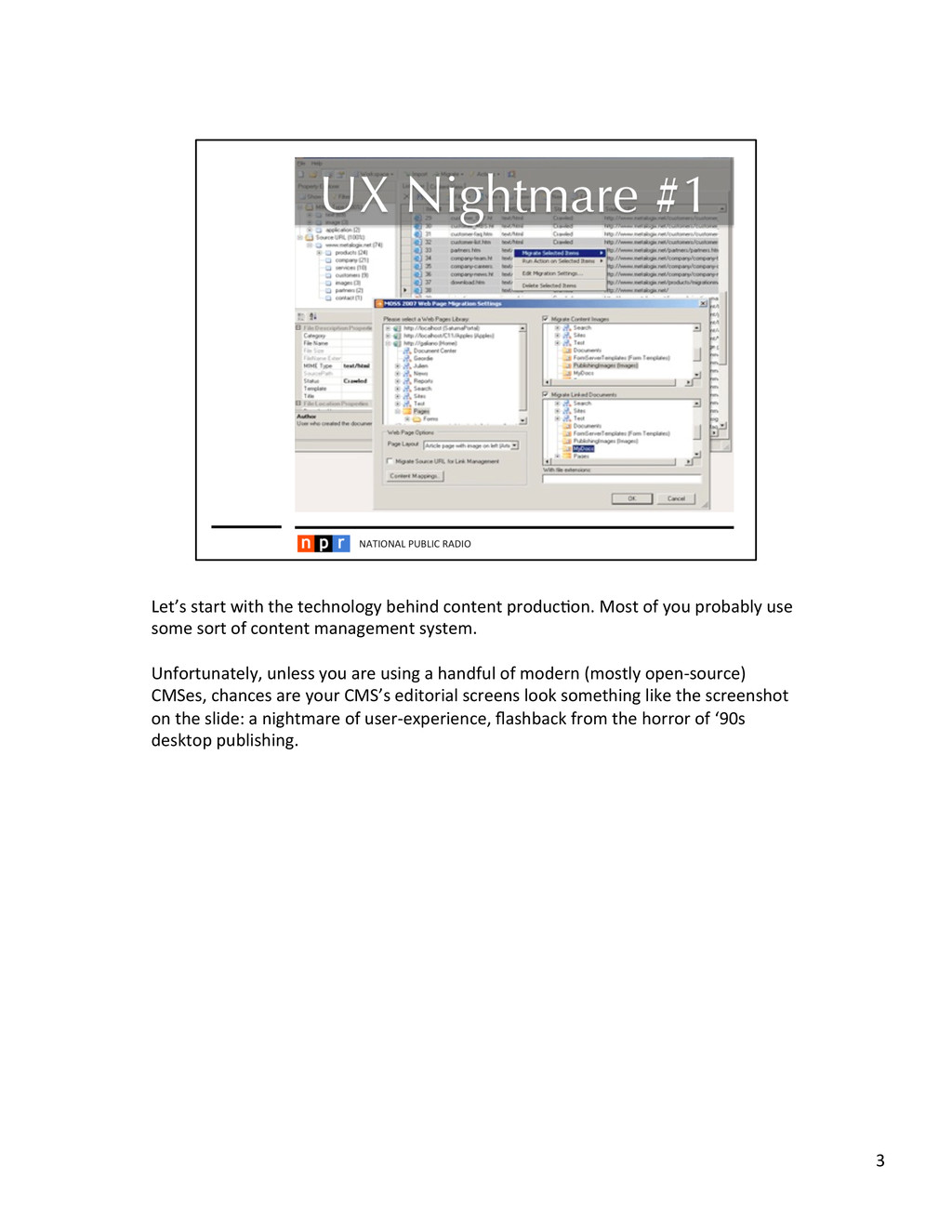
you probably use some sort of content management system. Unfortunately, unless you are using a handful of modern (mostly open-‐source) CMSes, chances are your CMS’s editorial screens look something like the screenshot on the slide: a nightmare of user-‐experience, flashback from the horror of ‘90s desktop publishing. 3
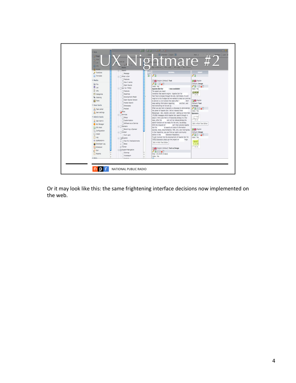
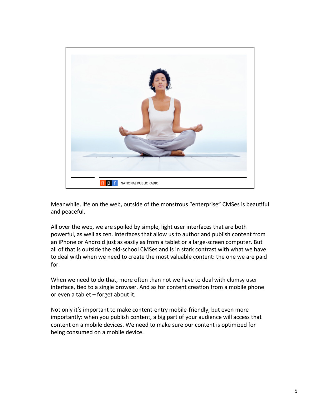
CMSes is beau<ful and peaceful. All over the web, we are spoiled by simple, light user interfaces that are both powerful, as well as zen. Interfaces that allow us to author and publish content from an iPhone or Android just as easily as from a tablet or a large-‐screen computer. But all of that is outside the old-‐school CMSes and is in stark contrast with what we have to deal with when we need to create the most valuable content: the one we are paid for. When we need to do that, more oaen than not we have to deal with clumsy user interface, <ed to a single browser. And as for content crea<on from a mobile phone or even a tablet – forget about it. Not only it’s important to make content-‐entry mobile-‐friendly, but even more importantly: when you publish content, a big part of your audience will access that content on a mobile devices. We need to make sure our content is op<mized for being consumed on a mobile device. 5
of an average computer screen width are GONE! Ever since Steve Jobs got on that stage and unveiled iPhone to the world, mobile web traffic has been experiencing explosive growth. If you look at sta<s<cal data from Cisco and other companies who make such data available, you will see that the trend of mobile growth will only con<nue. Some of the challenges with mobile content publishing are that a) mobile devices (smartphones as well as tablets) have limited screen size which your conven<onal website looks prehy horrible on b) modern mobile phones employ touch interfaces to interact with the user, which your conven<onal website is probably not op<mized for. c) There is huge market fragmenta<on in the mobile space. Mobile devices come in all kinds of shapes, sizes and capabili<es making it hard to target individual ones. We are not even talking yet about various kinds of connected devices like: cars, TVs, entertainment boxes and other digital equipment that will all become content delivery vehicles if they are not already. Revenue sources for publishers follow the mobile trend, as well. Mashable has declared 2012 the year of Mobile Adver<sing (hhp://mashable.com/2012/01/20/ mobile-‐marke<ng-‐2012/) and I think they are onto something there. 6
has long employed a concept we call COPE – Create Once, Publish Everywhere. It was coined, number of years ago, by Dan Jacobson, my predecessor at NPR, now the director of API at Neklix. The basic idea behind COPE is that content should be authored in a re-‐usable manner and then delivered in a uniform way to all target devices/plakorms. 7
technological advancement on the web, since web’s crea<on. What you know as “HTML5” is actually a collec<on of various new technologies that modern browsers implemented per the W3C specifica<ons. One such important technology is called CSS3 Media Queries. Media Queries allow websites to customize the look-‐and-‐feel, using style-‐sheets, depending on the capabili<es of the device that the site is displayed on. 9
something called Responsive Web Design. RWD is a novel design methodology to create web user interfaces that adapt themselves depending on the device they are displayed on and work equally well on all screen sizes and devices, from your iPhone to your iPad to your laptop. 10
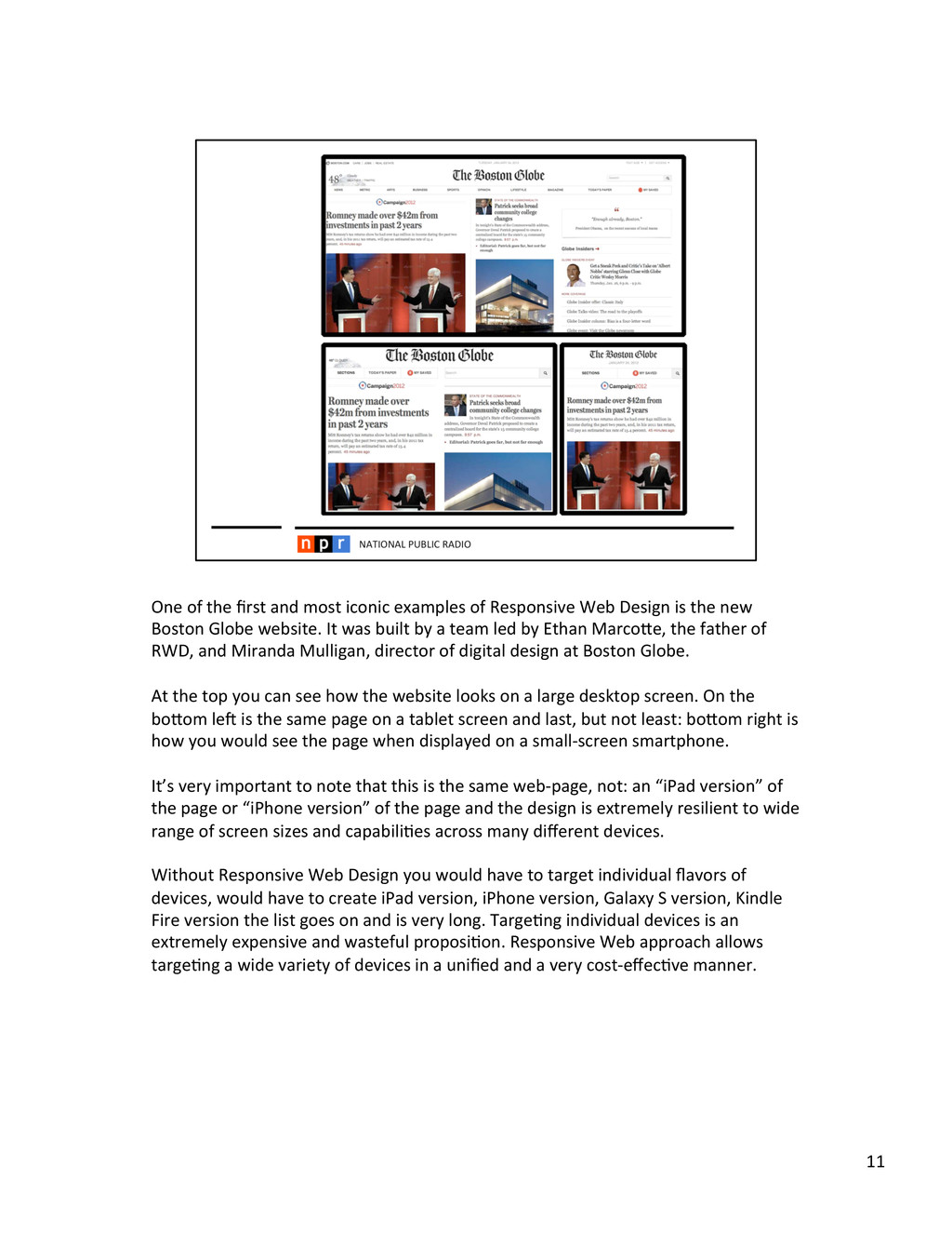
Web Design is the new Boston Globe website. It was built by a team led by Ethan Marcohe, the father of RWD, and Miranda Mulligan, director of digital design at Boston Globe. At the top you can see how the website looks on a large desktop screen. On the bohom lea is the same page on a tablet screen and last, but not least: bohom right is how you would see the page when displayed on a small-‐screen smartphone. It’s very important to note that this is the same web-‐page, not: an “iPad version” of the page or “iPhone version” of the page and the design is extremely resilient to wide range of screen sizes and capabili<es across many different devices. Without Responsive Web Design you would have to target individual flavors of devices, would have to create iPad version, iPhone version, Galaxy S version, Kindle Fire version the list goes on and is very long. Targe<ng individual devices is an extremely expensive and wasteful proposi<on. Responsive Web approach allows targe<ng a wide variety of devices in a unified and a very cost-‐effec<ve manner. 11
your needs, can solve from 70-‐100% of your needs in reaching various plakorms and devices with your content. However, it does have some limita<ons. Firstly, RWD is a web methodology that strongly depends on underlying technologies behind HTML5. While HTML5 is definitely on the curve of becoming Lingua Franca of the Internet, there are s<ll some devices that require na<ve applica<ons (e.g. car computer systems, entertainment boxes, TVs etc.). Furthermore, some of the advanced features of even the devices that do support HTML5 are not yet fully available to web applica<ons. These include: full support of device capabili<es like: camera, voice and so on. If you are building an advanced app for a device that does not support HTML5 or if you need to tap into advanced capabili<es of a device, you may need to build a na<ve applica<on for that device. This is where content APIs come into the play. 12
communicate on the web. Content APIs are a way for electronic devices to exchange content in a standard way. Following the Create Once, Publish Everywhere principle, you want to create content once in a re-‐usable, digital format and disseminate it to all your target devices, through the web. Similarly, when suppor<ng things like ci<zen journalism, you want to be able to collect and aggregate content in a unified way via any available device. All of these is made possible with the use of content APIs. Some<mes people make a mistake of thinking of an API as a way to “give away your content”. As a communica<on tool between computer systems, APIs definitely enables this use-‐case, but that’s not necessarily the only purpose. NPR’s API is one of the most used APIs on the web. While we make tons of content available through our API, for free, you may be surprised to learns that the majority of NPR API usage comes from NPR itself. We use API to reach the wide variety of devices and plakorms where we publish our content and to exchange content with many local NPR sta<ons. Publishing content through APIs is the main technological tool with which we enable the Create Once, Publish Everywhere principle. 13
NPR, much like probably most of you in the audience, has limited resources and dispropor<onally larger mo<va<on to deliver the best possible content experience to its audiences. At NPR we call it: constantly punching above our weight. Cost reduc<ons are very important in this effort. Even more important is: being able to leverage the technological space that provides the most innova<on; being at the forefront of the technology curve. In many cases the pursuit of innova<on has lead us to open source soaware. 14
somewhat contradictory) defini<ons of Open Source. At the basic level it’s a collabora<ve way to create soaware. On a philosophical level, open-‐source follows scien<fic method of knowledge crea<on: through sharing. The thing is: knowledge is not like material goods. If I have one apple and I give it to you, I don’t have an apple, anymore. But if I know something and I tell all of you about it – now all of us know it, we have increased the amount of knowledge! This is what open-‐source tries to leverage and how it approaches tackling hard programming problems – through collabora<on! On a prac<cal level, open-‐source is a number of soaware licenses that enable and encourage collabora<on. In a typical, successful open-‐source project, a large amount of soaware developers, from all around the world, join forces online on developing a complex system. The key to open collabora<on is a soaware license that allows free modifica<ons to the soaware and free distribu<on, that’s where the name “open source” comes from. 15
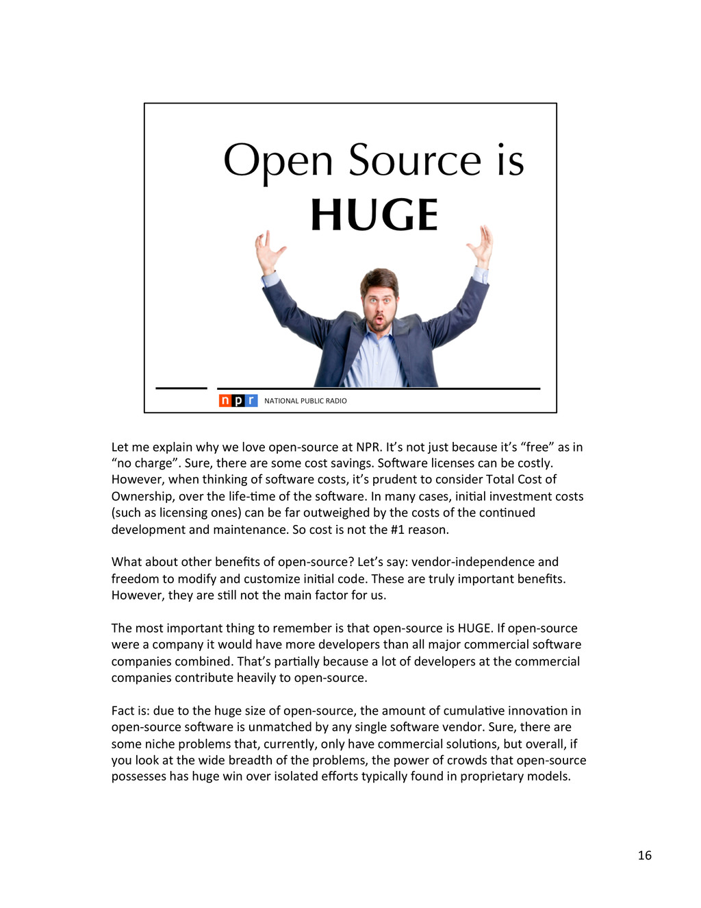
not just because it’s “free” as in “no charge”. Sure, there are some cost savings. Soaware licenses can be costly. However, when thinking of soaware costs, it’s prudent to consider Total Cost of Ownership, over the life-‐<me of the soaware. In many cases, ini<al investment costs (such as licensing ones) can be far outweighed by the costs of the con<nued development and maintenance. So cost is not the #1 reason. What about other benefits of open-‐source? Let’s say: vendor-‐independence and freedom to modify and customize ini<al code. These are truly important benefits. However, they are s<ll not the main factor for us. The most important thing to remember is that open-‐source is HUGE. If open-‐source were a company it would have more developers than all major commercial soaware companies combined. That’s par<ally because a lot of developers at the commercial companies contribute heavily to open-‐source. Fact is: due to the huge size of open-‐source, the amount of cumula<ve innova<on in open-‐source soaware is unmatched by any single soaware vendor. Sure, there are some niche problems that, currently, only have commercial solu<ons, but overall, if you look at the wide breadth of the problems, the power of crowds that open-‐source possesses has huge win over isolated efforts typically found in proprietary models. 16
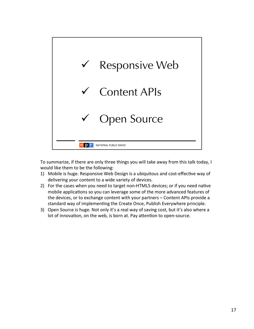
take away from this talk today, I would like them to be the following: 1) Mobile is huge. Responsive Web Design is a ubiquitous and cost-‐effec<ve way of delivering your content to a wide variety of devices. 2) For the cases when you need to target non-‐HTML5 devices; or if you need na<ve mobile applica<ons so you can leverage some of the more advanced features of the devices, or to exchange content with your partners – Content APIs provide a standard way of implemen<ng the Create Once, Publish Everywhere principle. 3) Open Source is huge. Not only it’s a real way of saving cost, but it’s also where a lot of innova<on, on the web, is born at. Pay ahen<on to open-‐source. 17
 irakli
 hayama17
 tabatad
 tkyowa
 ytaka23
 sakiengineer
 taketo957
 takesection
 hamadakoji
 yuyamiyamoto
 joker1007
 doradora09
 taigamikami
 codingconduct
 dougneiner
 smashingmag
 katarinadahlin
 lindahogenes
 tmiket
 tapps
tapps
 szymonslowik
 baasie
 mayatellez
 asonas