 SiteGround - Reliable hosting with speed, security, and support you can count on.
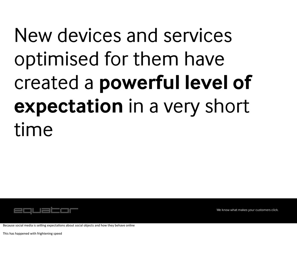
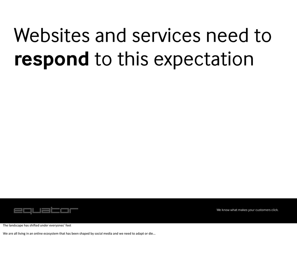
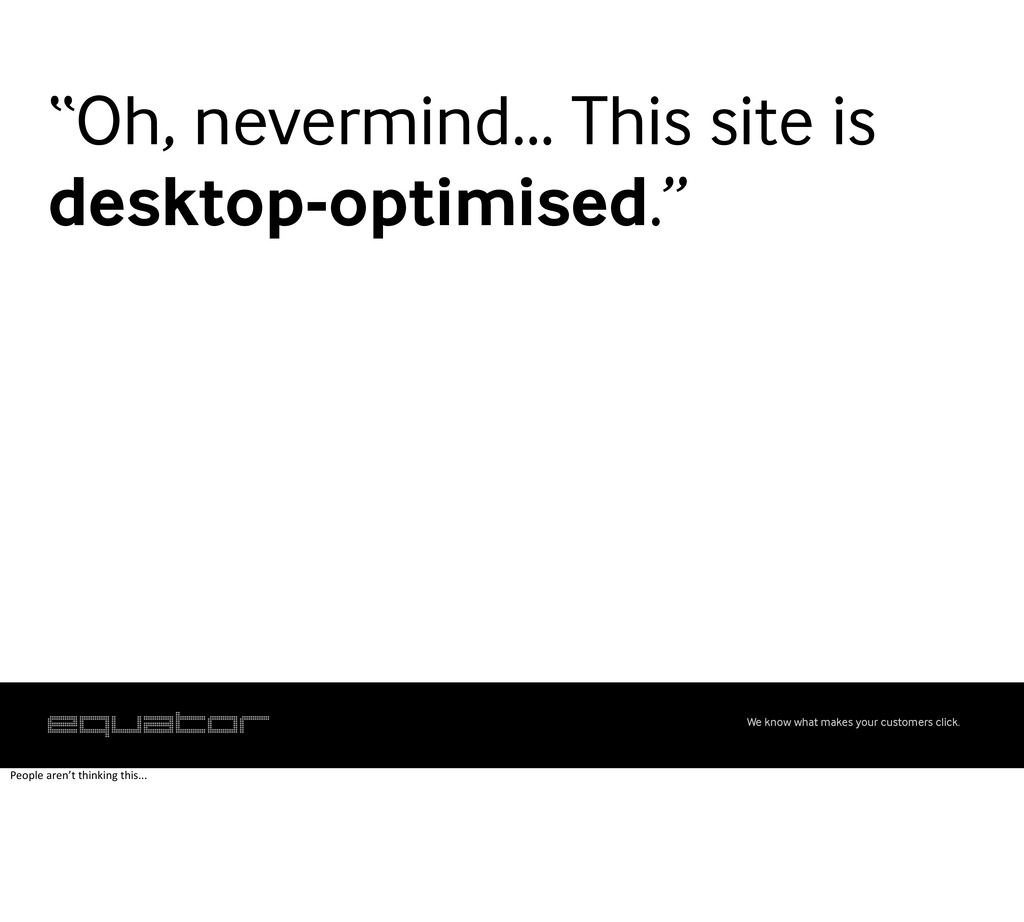
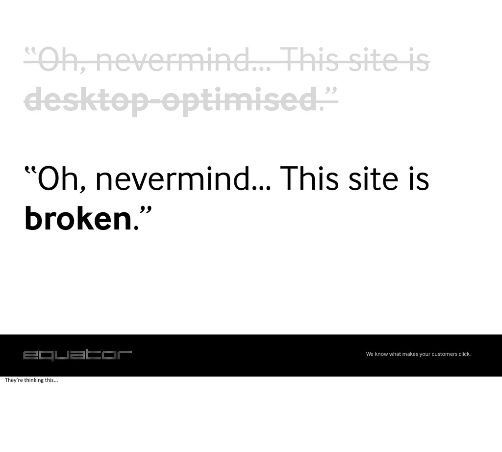
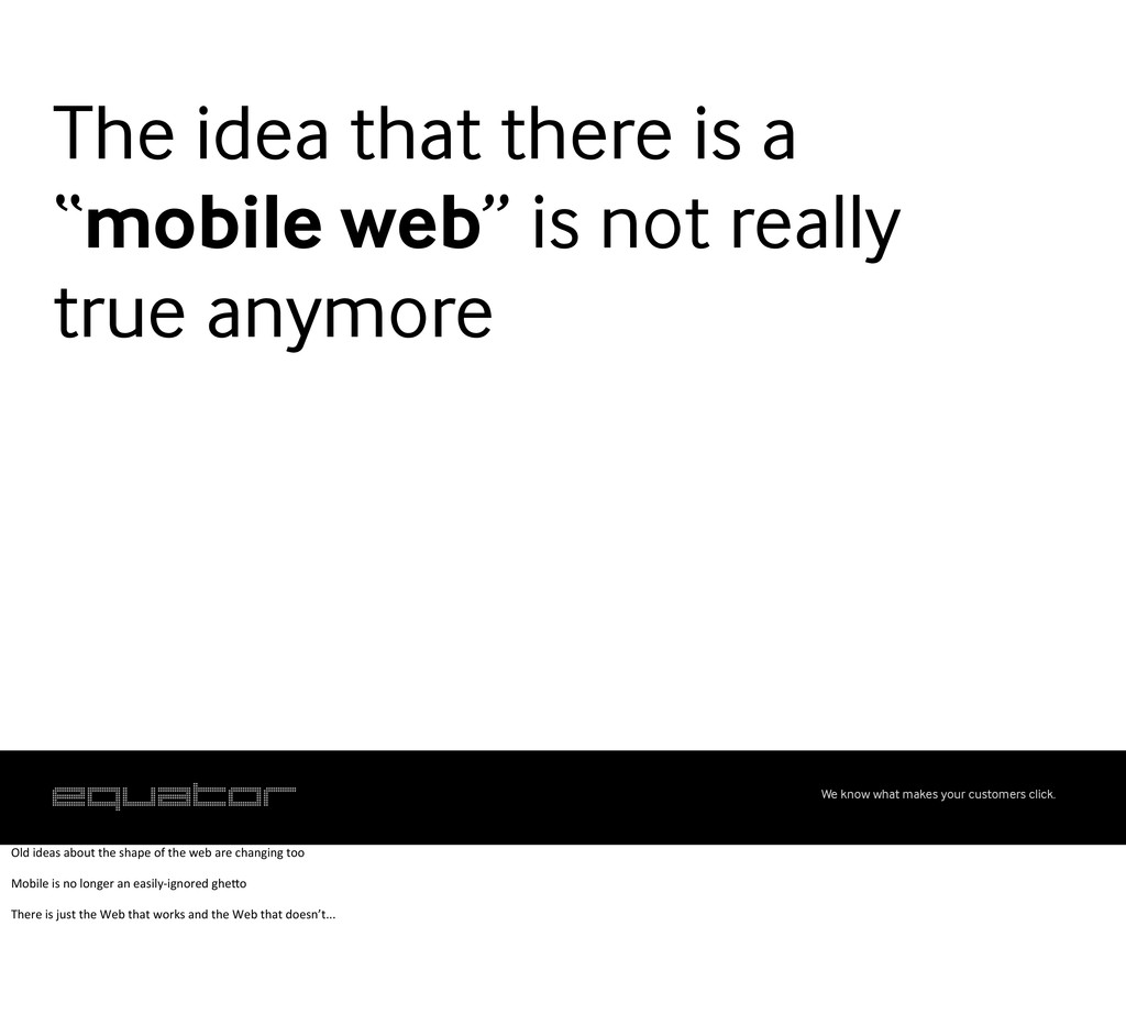
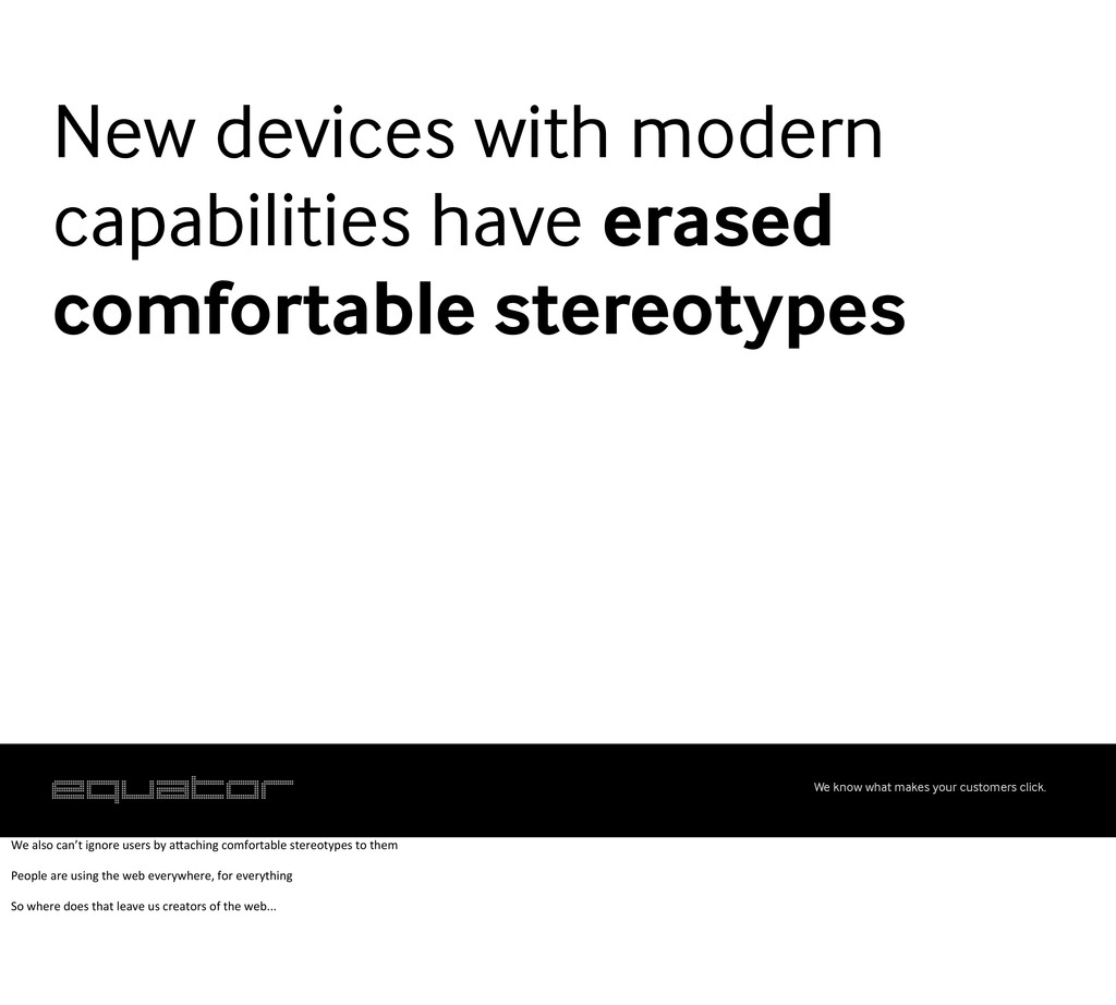
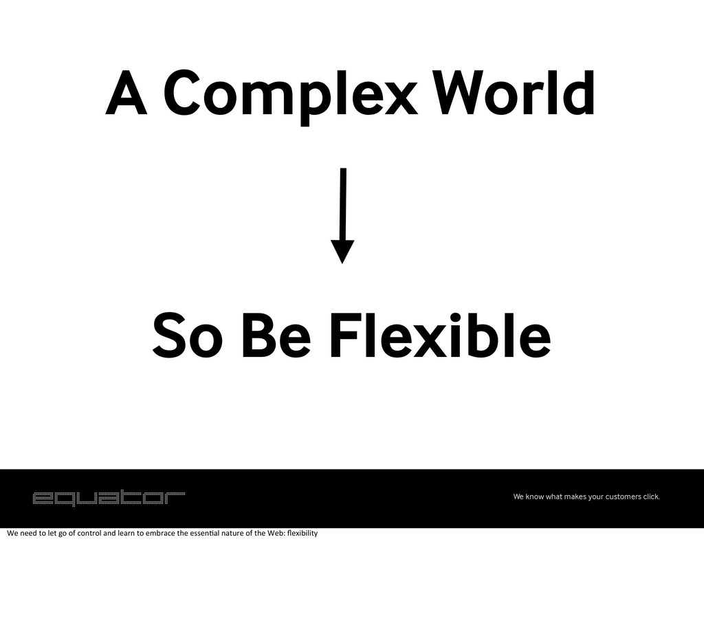
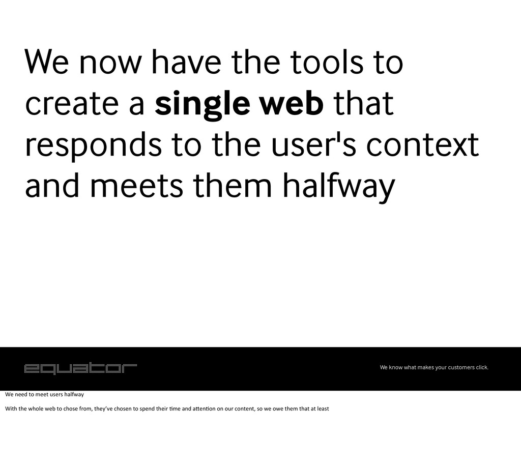
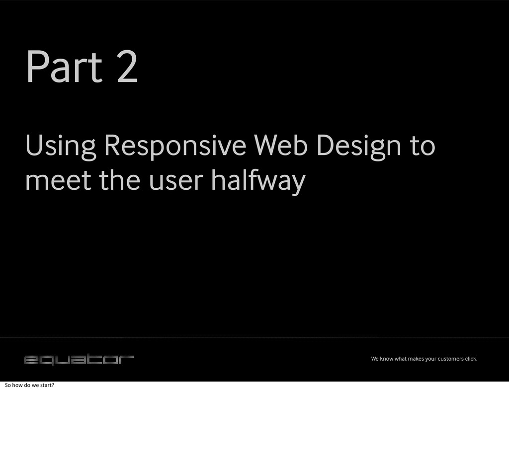
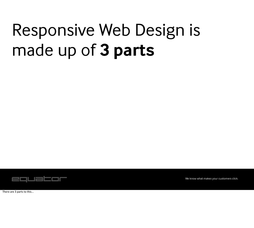
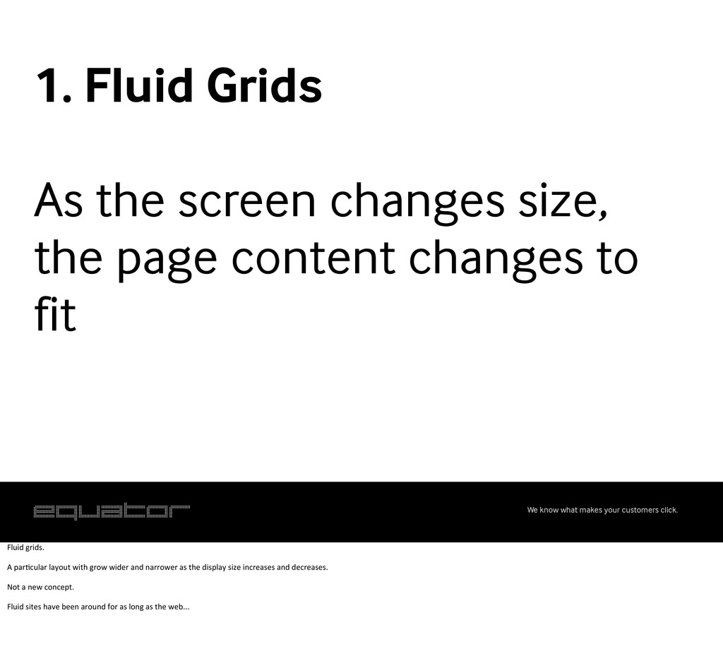
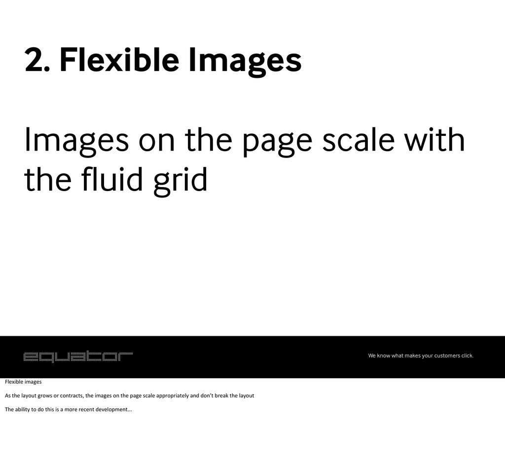
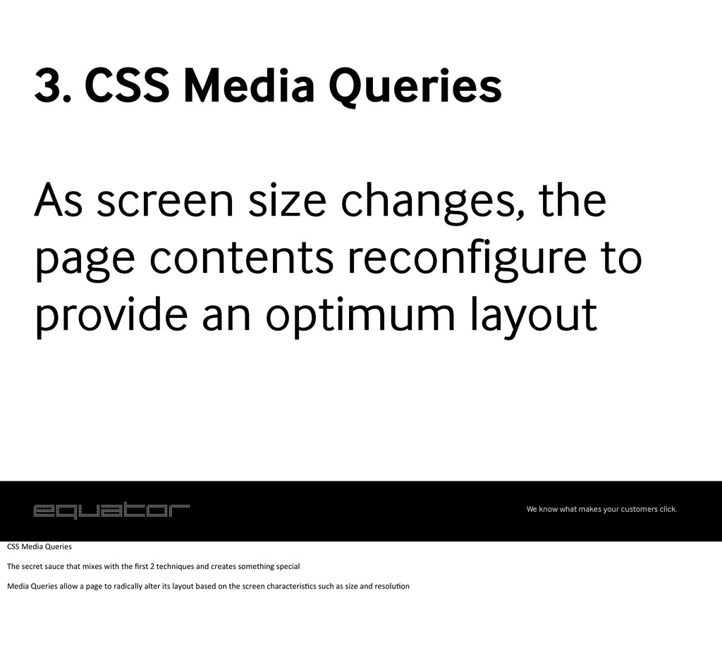
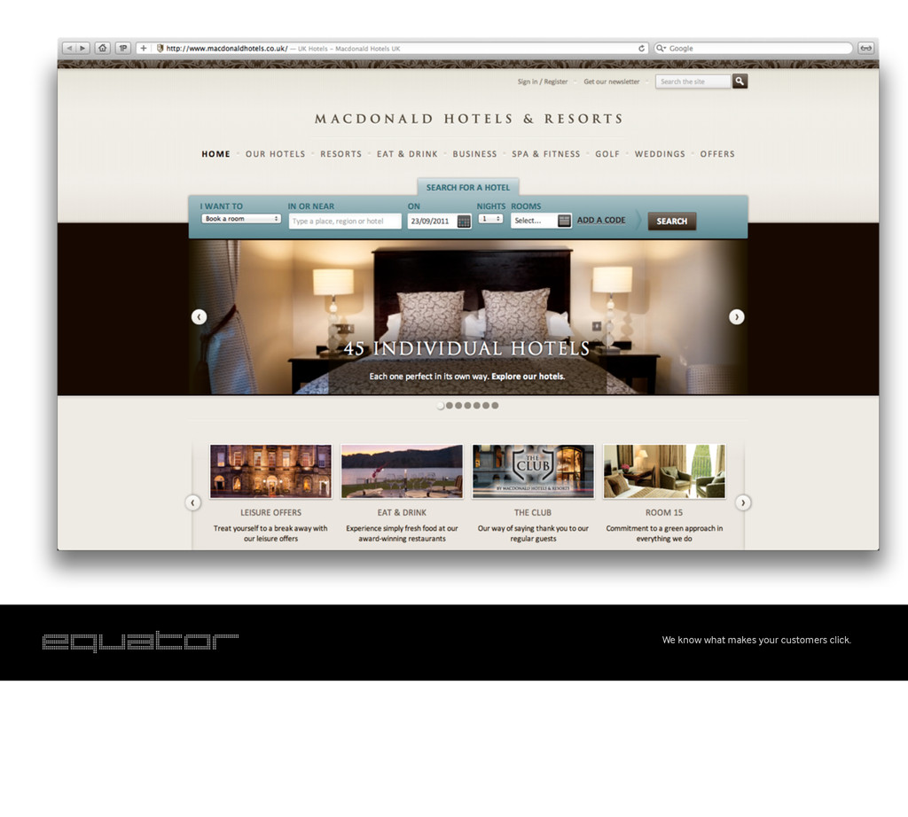
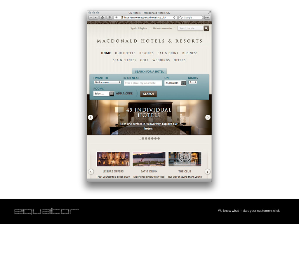
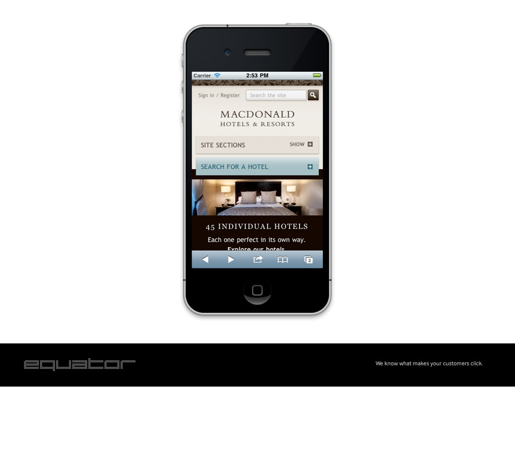
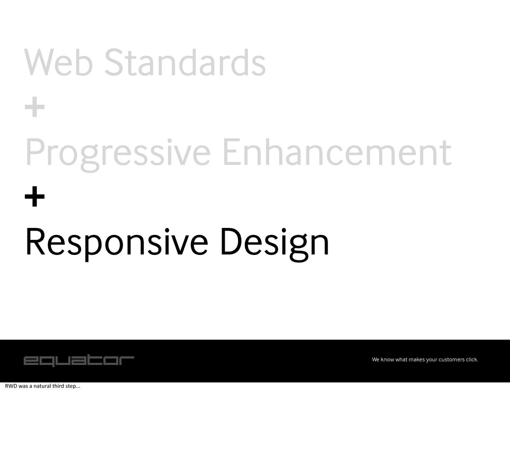
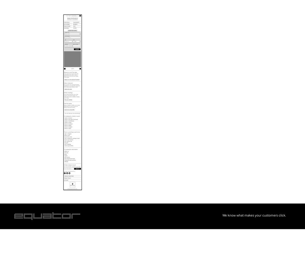
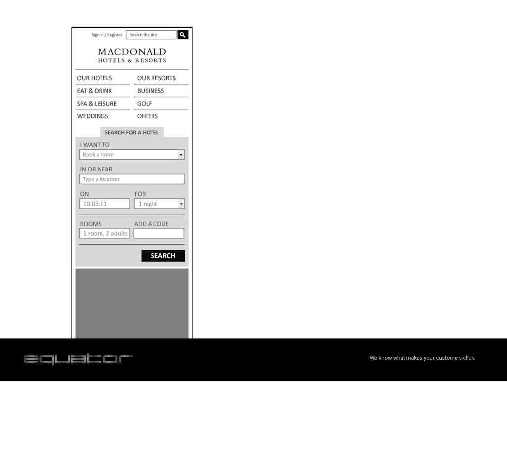
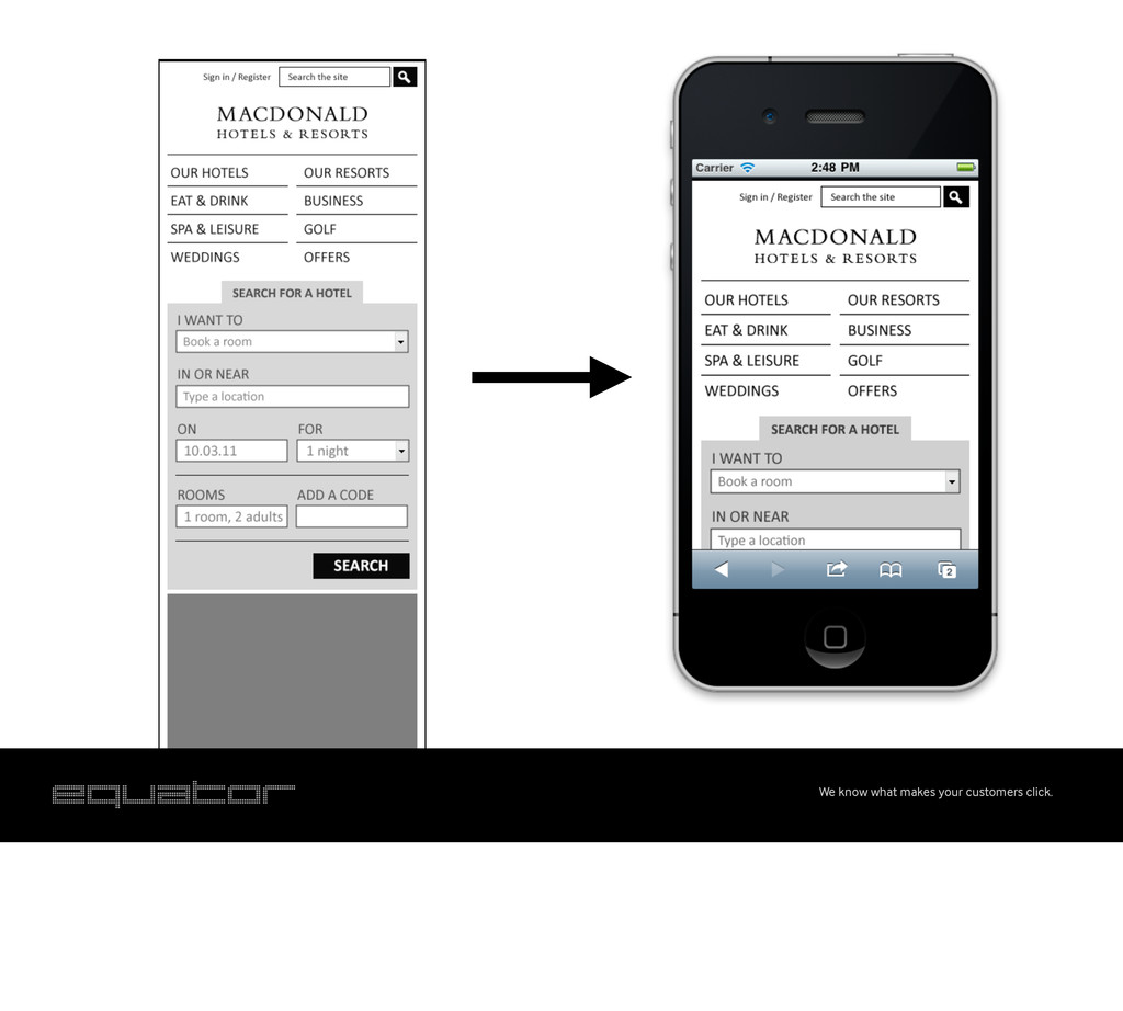
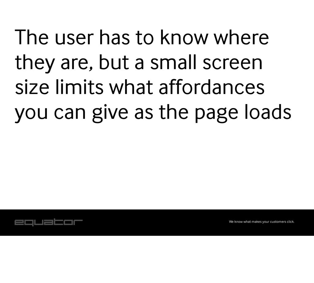
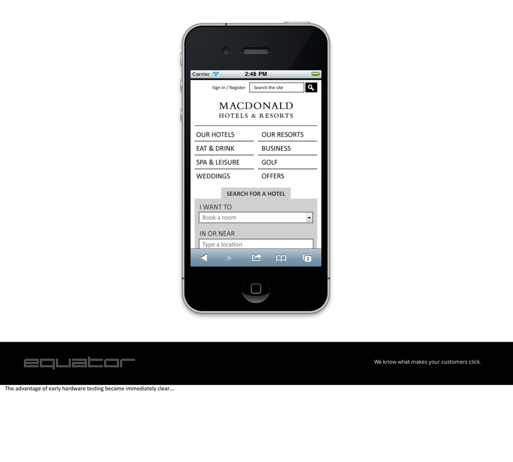
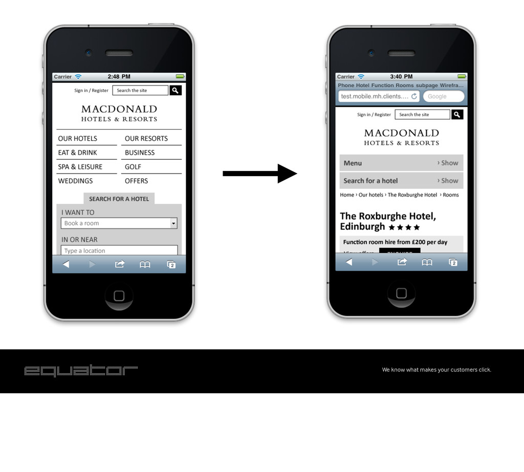
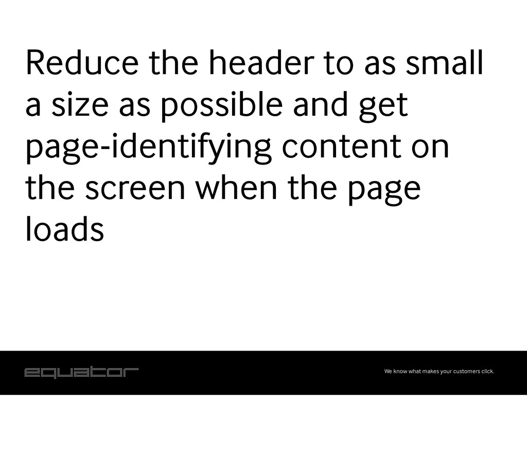
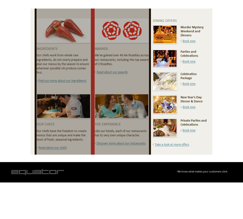
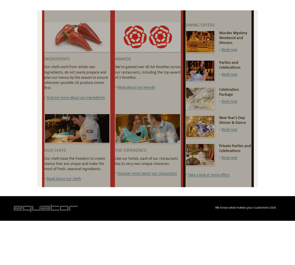
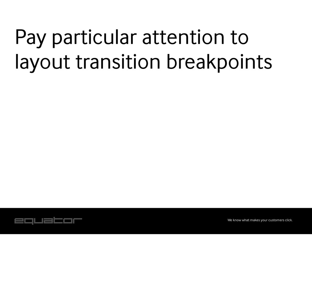
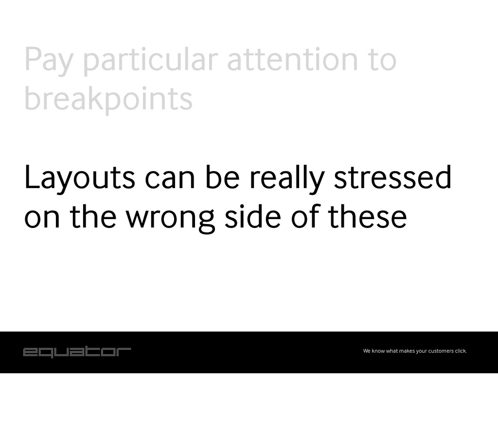
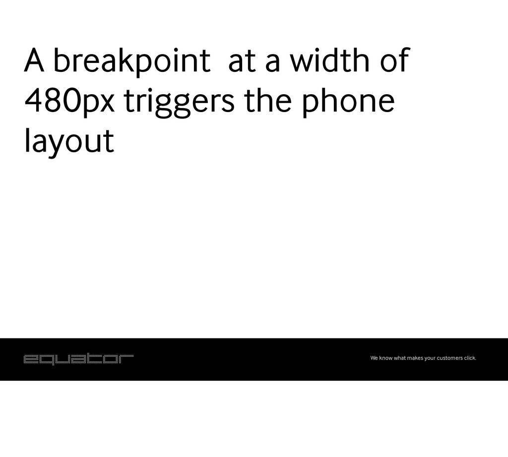
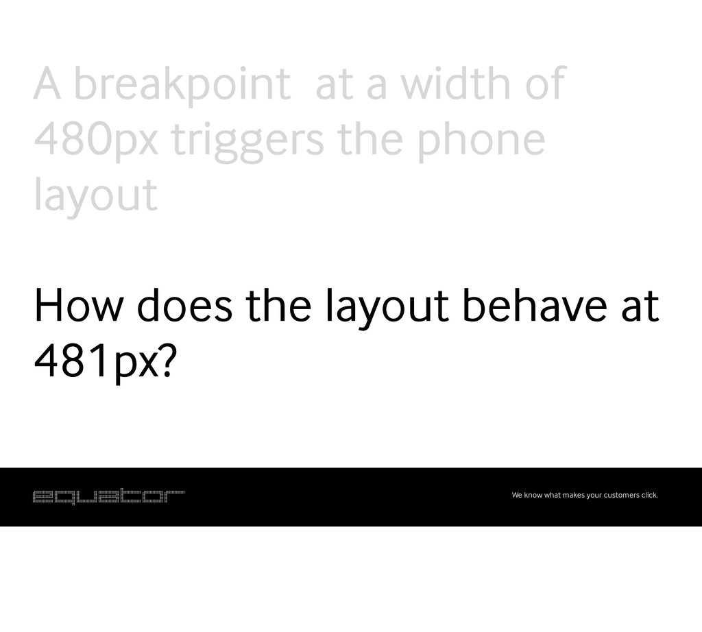
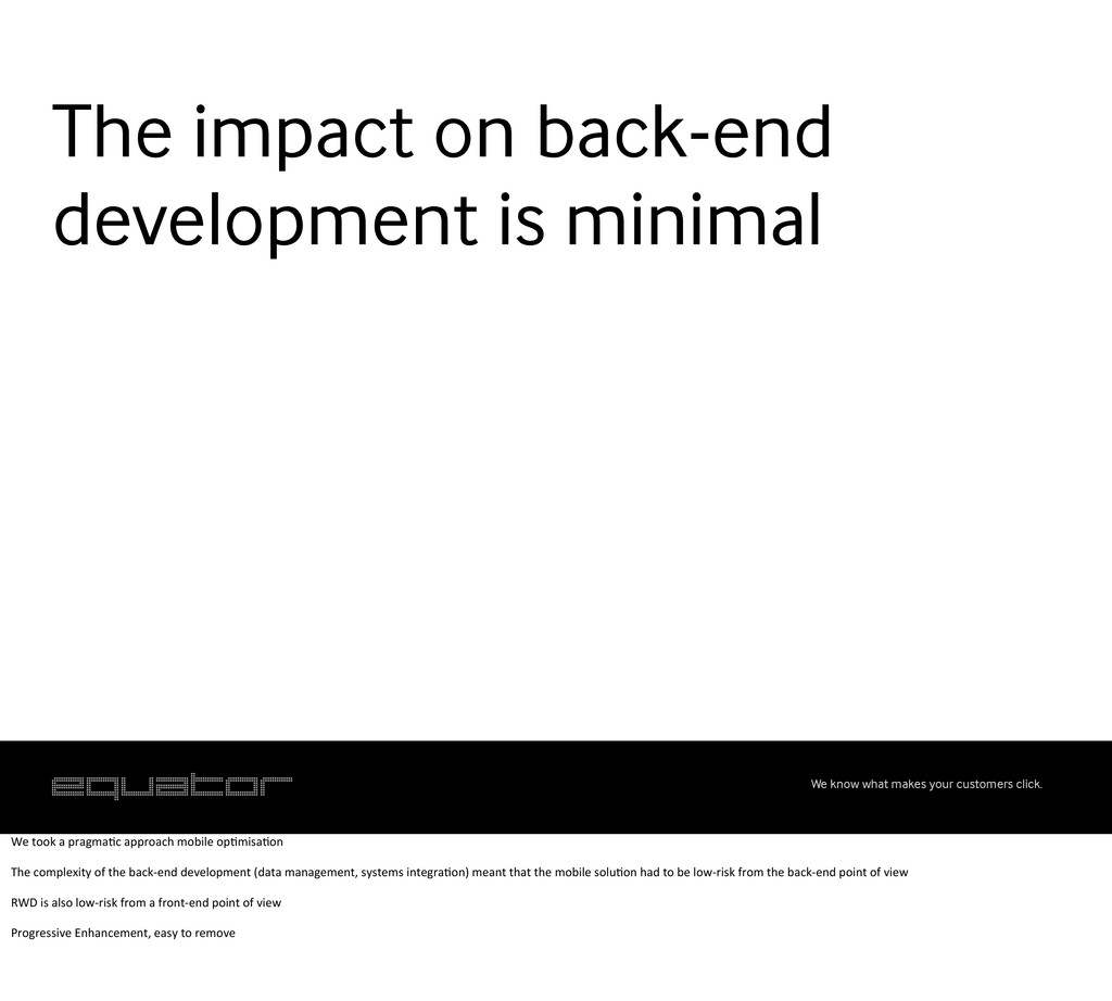
A presentation I gave at Social Media Week Glasgow 2011. In it I talked about social media, online content and recent client work my company did using responsive web design as a solution to optimise content for different devices.
 jamboid
.png) genax
genax
 joker1007
 minorun365
 muehara
 takatama
 tagomoris
 belongadmin
 kmiya84377
 amacbee
 taigamikami
 kintotechdev
 phaya72
 codingconduct
 tammielis
 tenderlove
 retrage
 minecr
 thekraken
 bcantrill
 deanohume
 pauljervisheath
 moore
moore
 afnizarnur
 marcduiker