This presentation examines the philosophy of "Responsive Web Design". It's suitable for newcomers to the term and experienced developers and designers who are already deeply involved in creating responsive sites.
Past
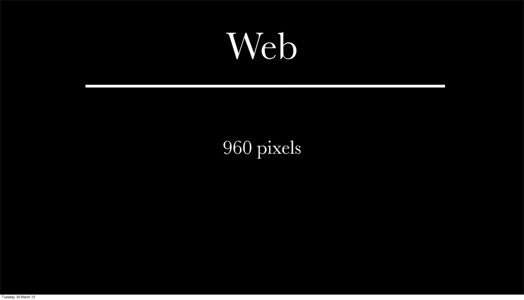
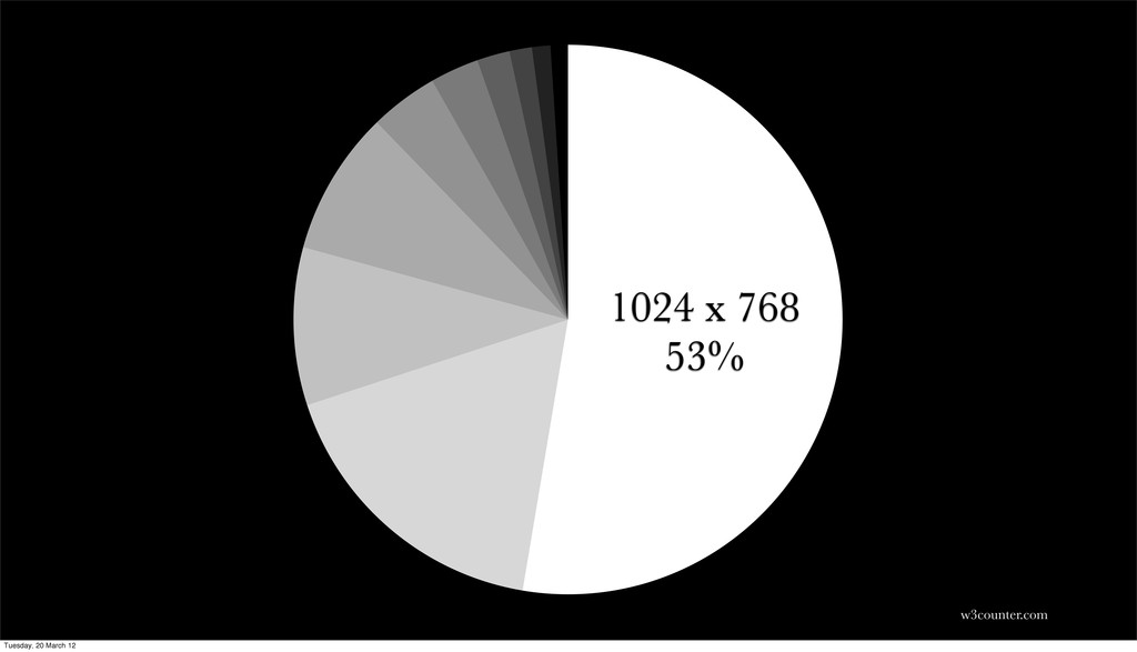
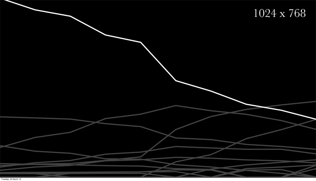
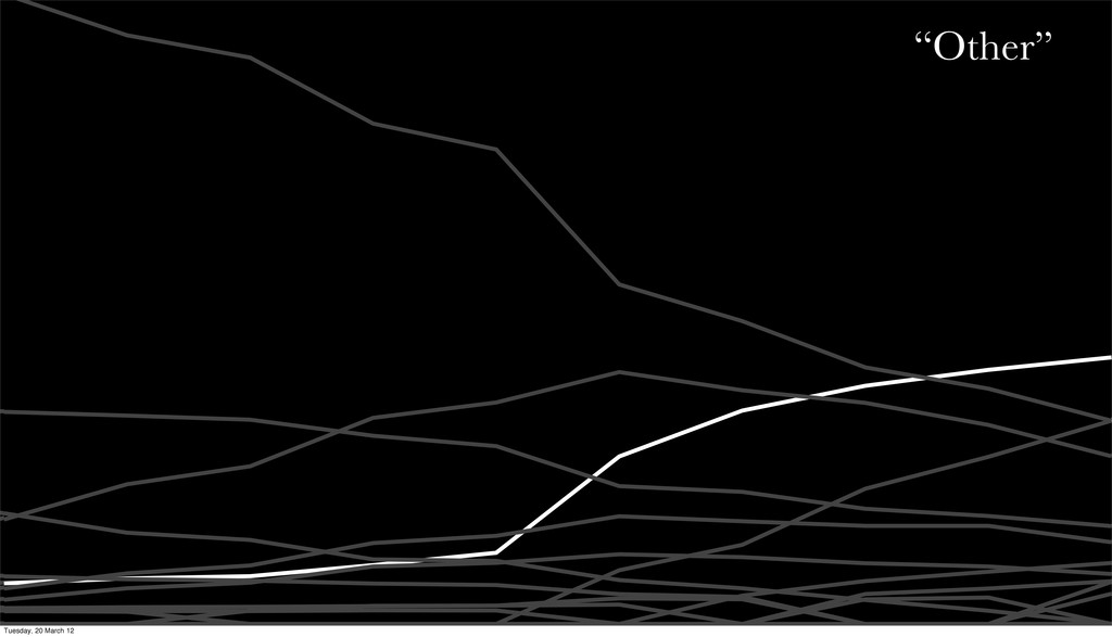
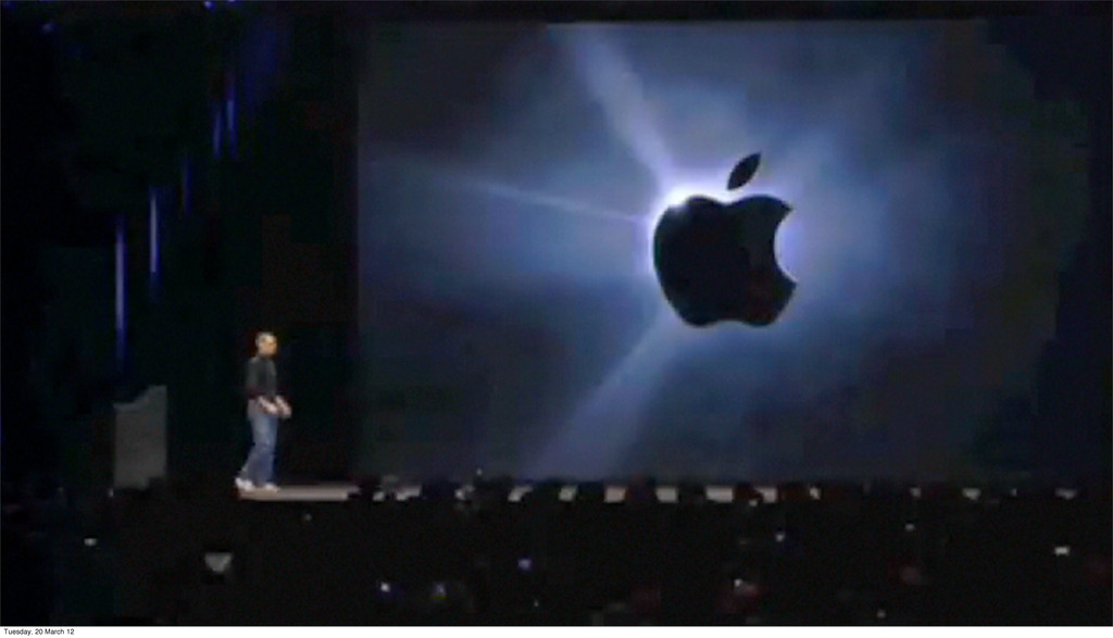
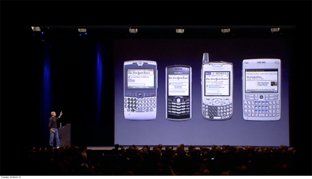
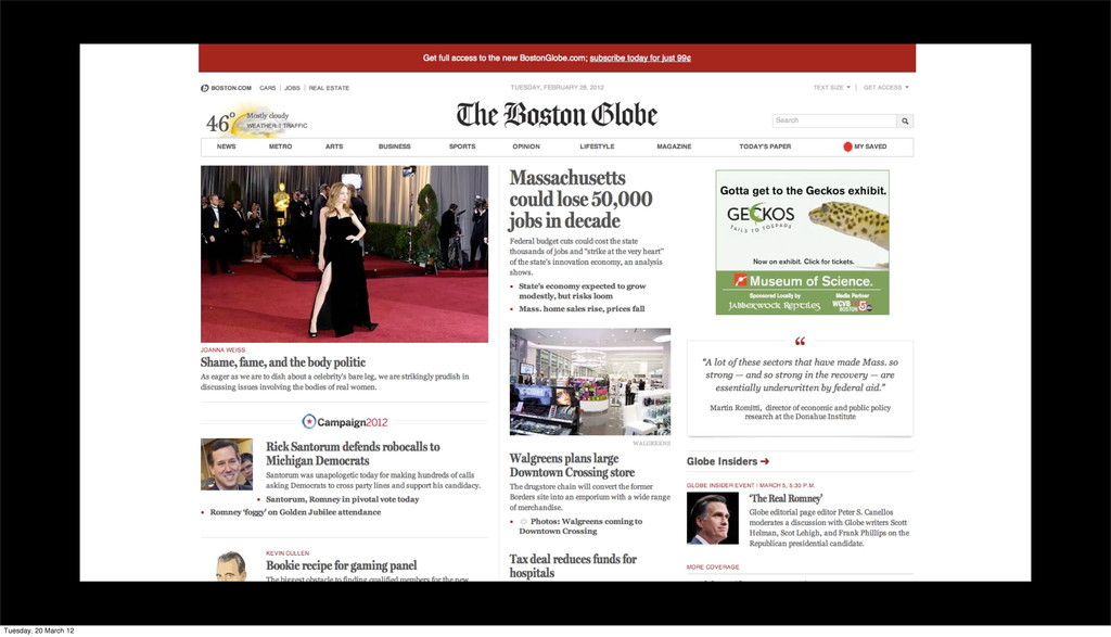
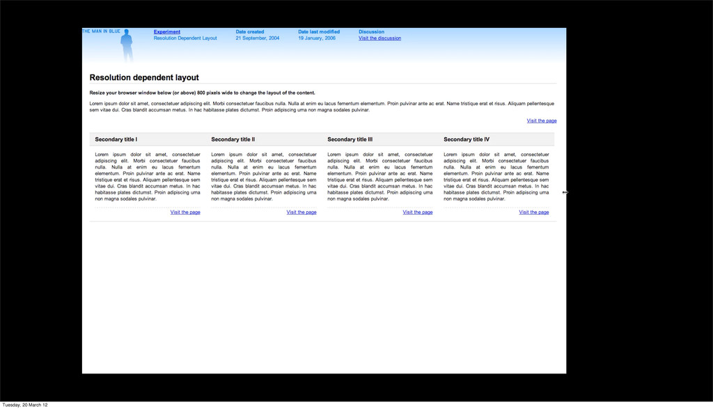
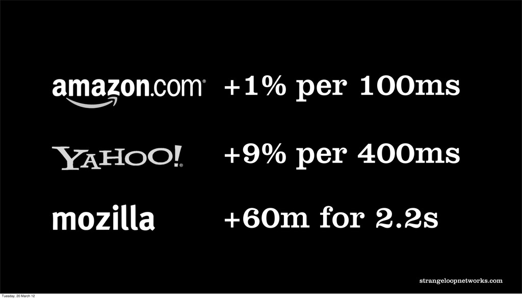
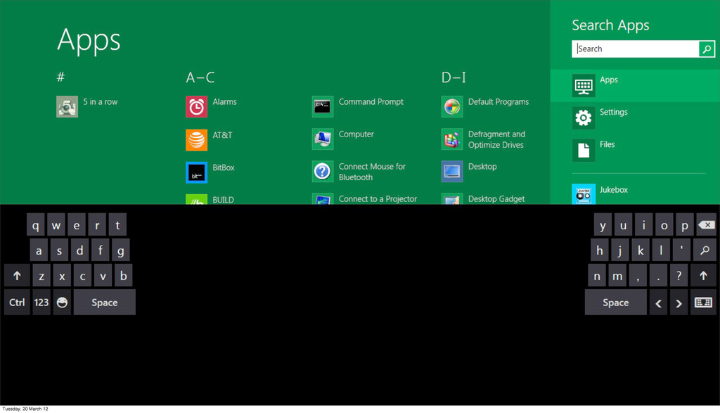
The web was stuck inside a lie we had created for ourselves called 960px. Designing sites for the lowest common denomination of screen size. Screens were getting bigger and more varied and we didn’t take advantage of them because it was hard.
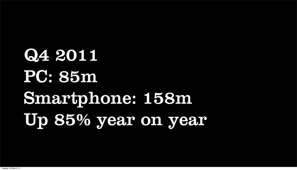
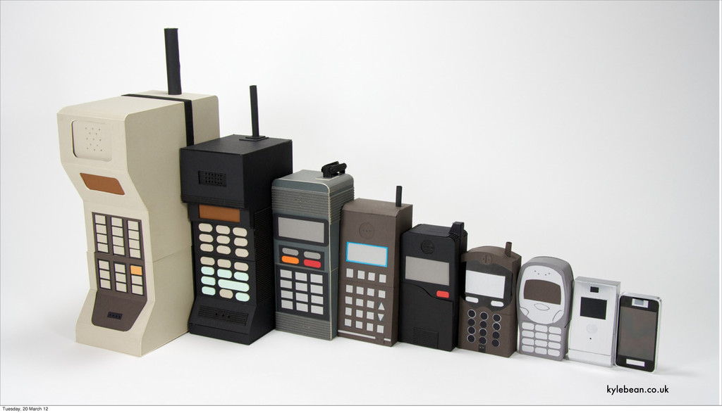
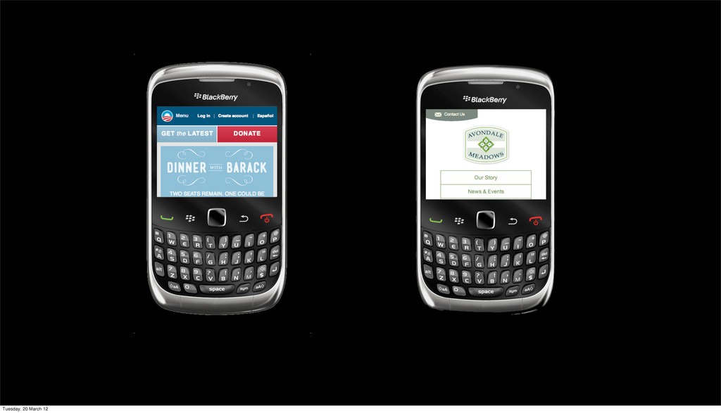
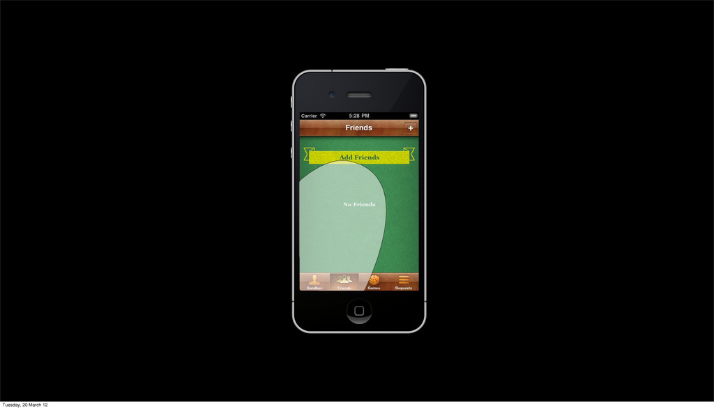
Mobile web browsing came of age. Screen sizes suddenly got a lot smaller and forced us to stop looking at the web through the 960px view port and start thinking about how users were experiencing our site on different devices.
Present
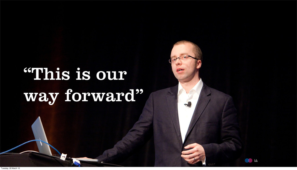
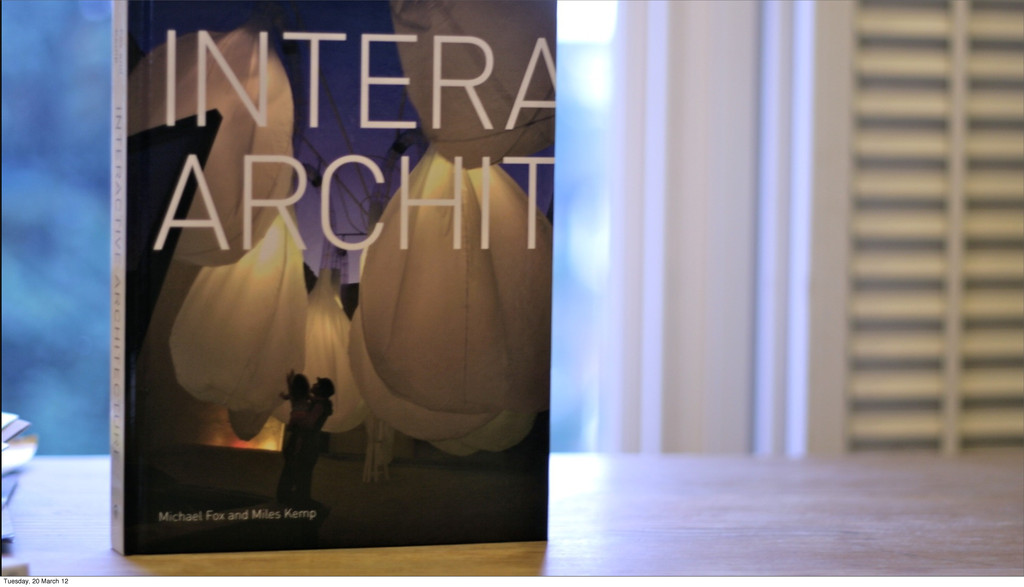
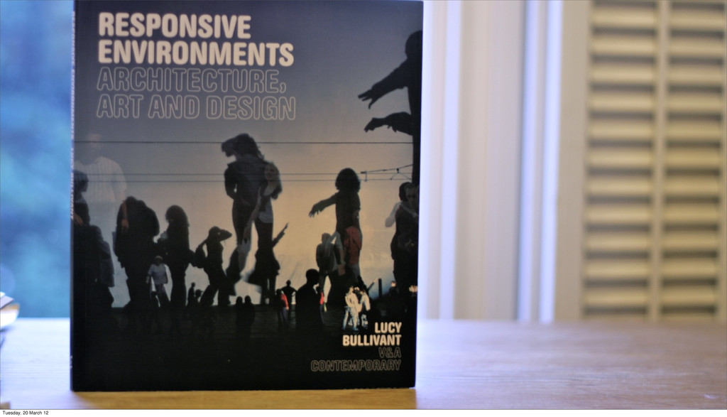
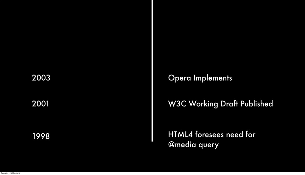
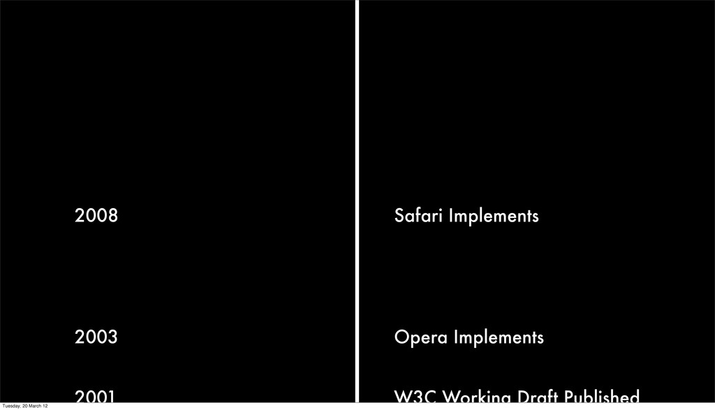
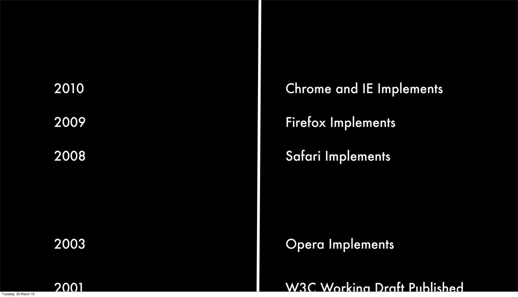
Ethan Marcotte introduced a philosophy called 'Responsive Web Design'. It embraces the fact that devices are different and adapts to different contexts. Let's explore the roots of the philosophy and how it gave meaning to techniques people were already using.
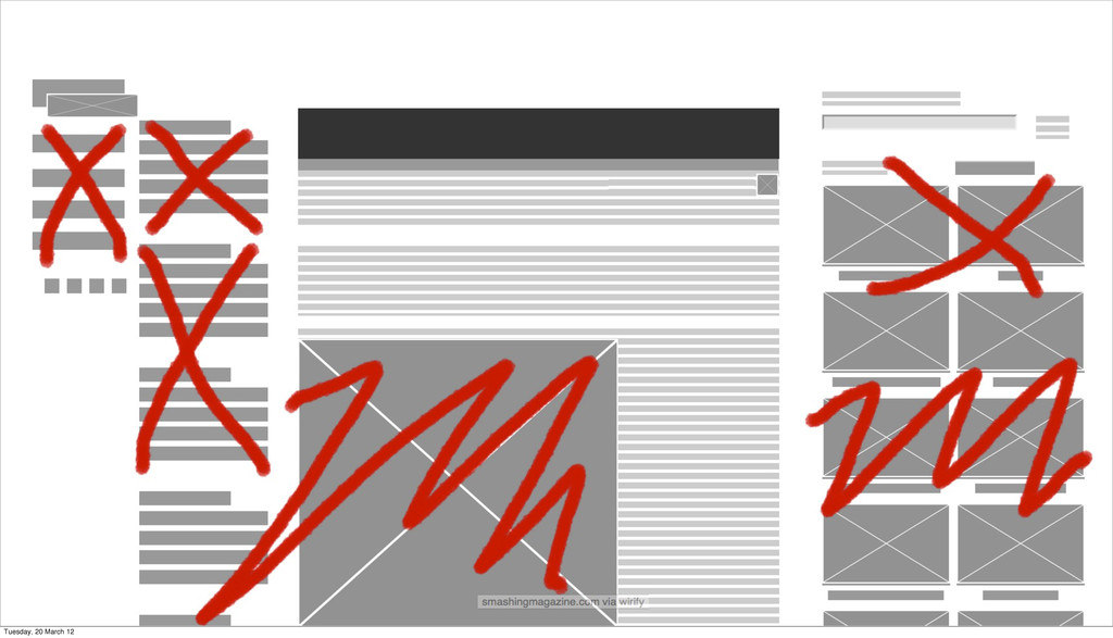
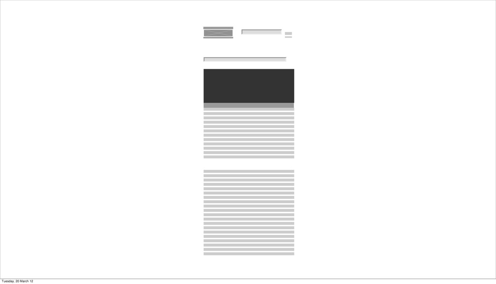
Since the introduction of the term the web community has embraced it and expanded upon the original concepts. Mobile first responsive design is progressive enhancement taken a step further. Conditional loading introduces the concept of economical enhancement. Don't load what won't be used.
Future
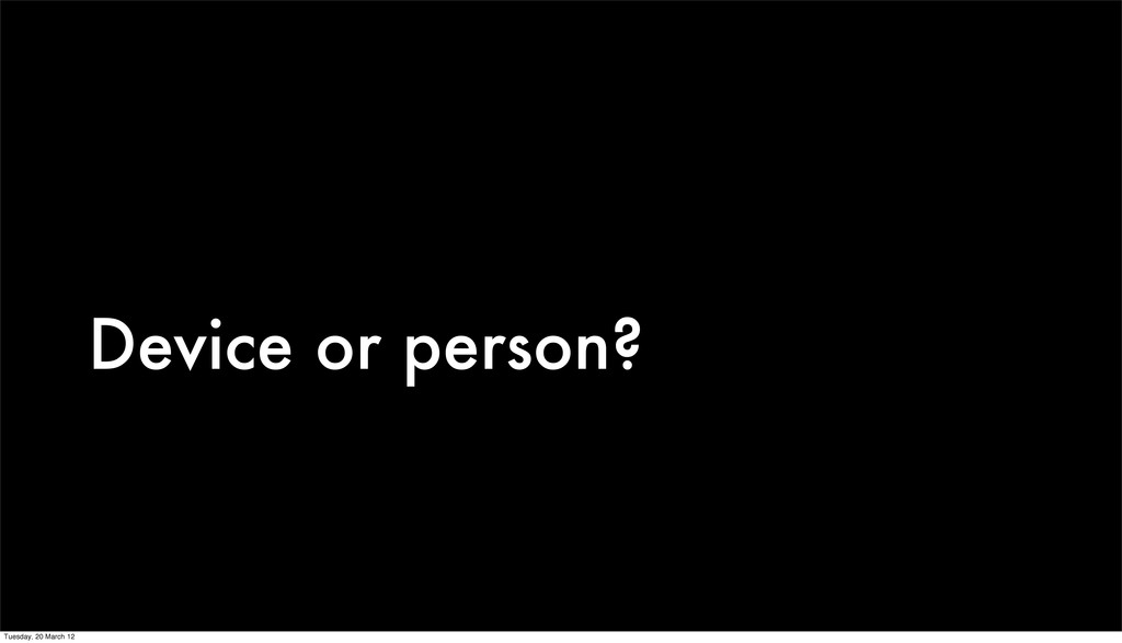
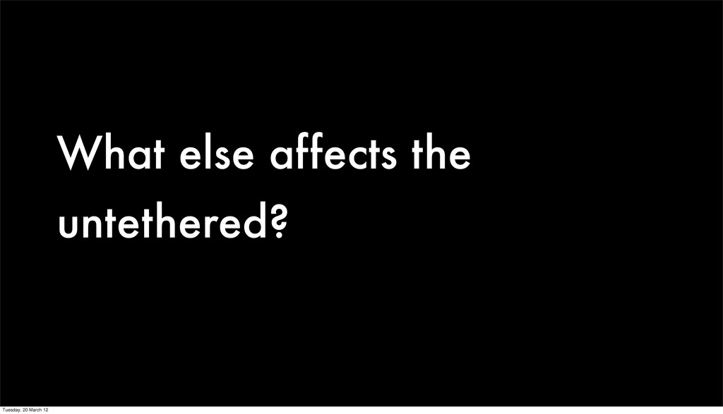
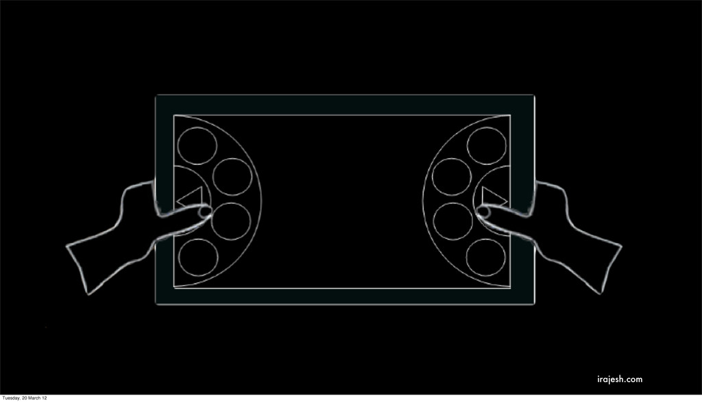
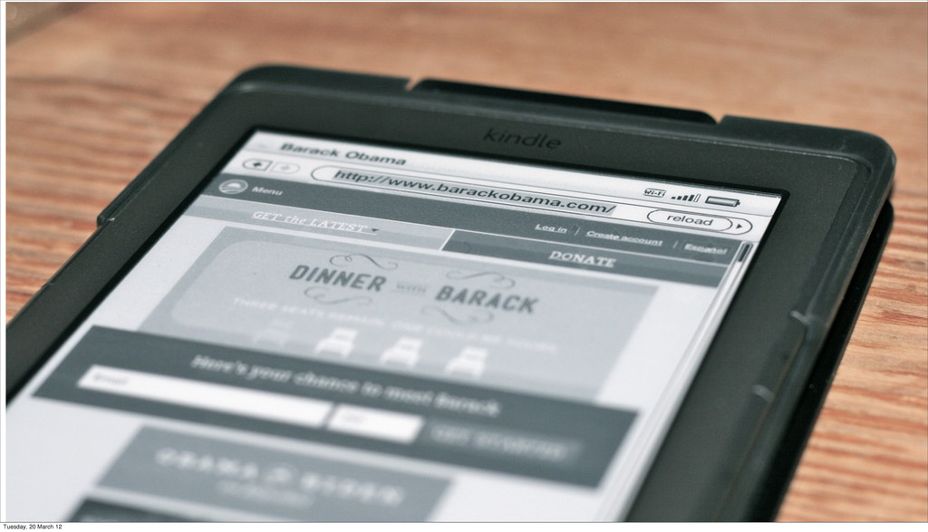
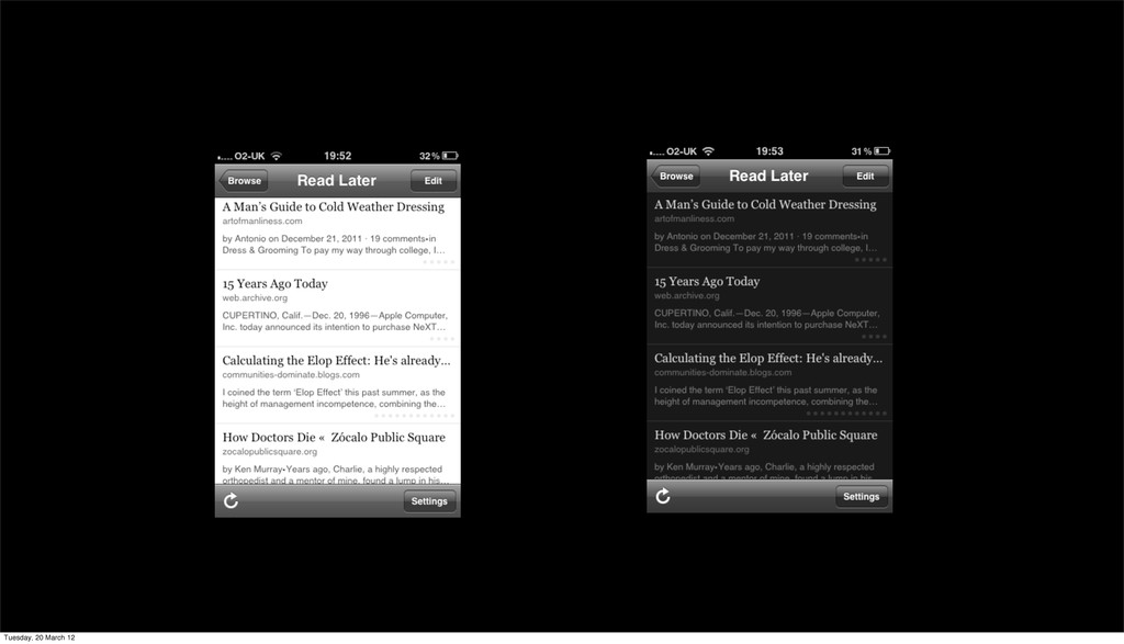
There’s a lot more to a mobile device than a small screen. If a larger screen size is considered a device capability then what other capabilities do devices have we can take advantage of to create a better experience.
 lewisnyman
 kenichiota0711
 lw
lw
 takanorip
 garyuten
 godlingkogami
 a2k
a2k
 kamechi7222222
 hikarutakase
 webnaut
 yuri_ohashi
 bebe
bebe
 moco1013
 portentint
 michielstock
 paigeccino
 aki_iinuma
.jpg) cargoodrich
cargoodrich
 nikkihalliwell
 mojombo
 nwiizo
 keavy
keavy
 maggiecrowley
 codingconduct
 aleyda