Upgrade to Pro — share decks privately, control downloads, hide ads and more …

Responsive Design and Progressive Enhancements for the Web (workshop)

Luca Salvini
October 02, 2011

Responsive Design and Progressive Enhancements for the Web (workshop)

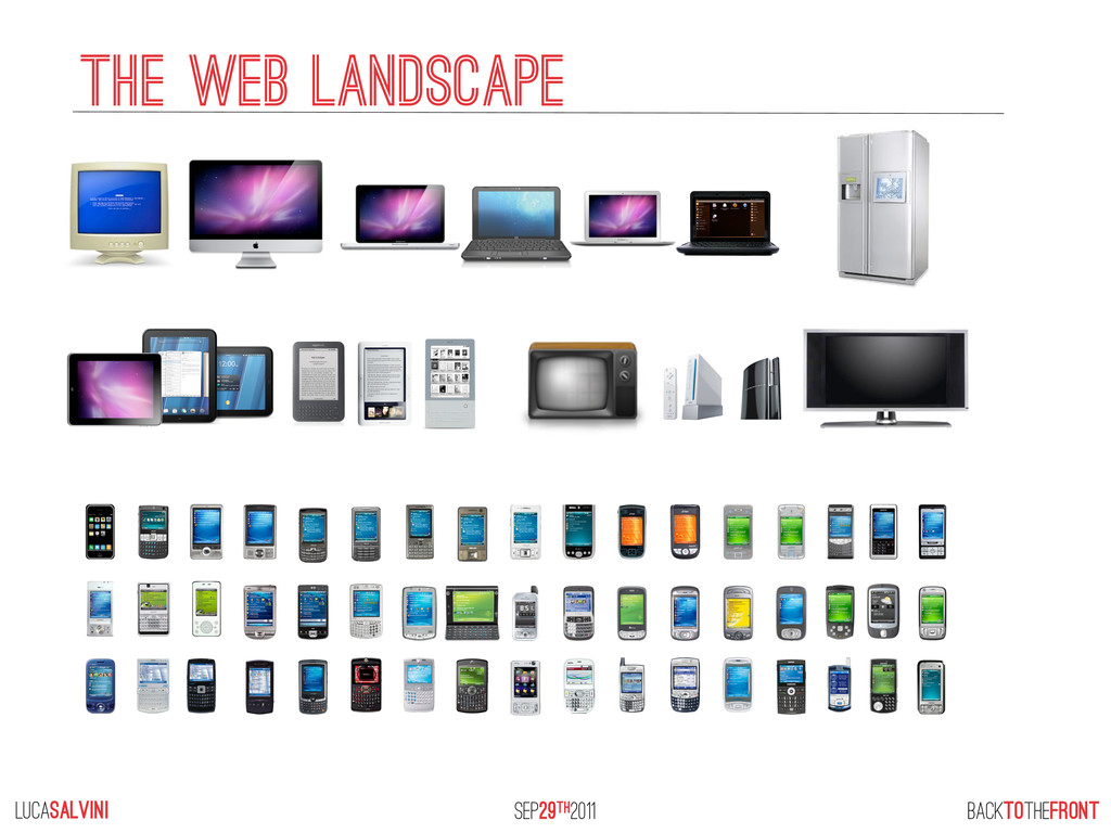
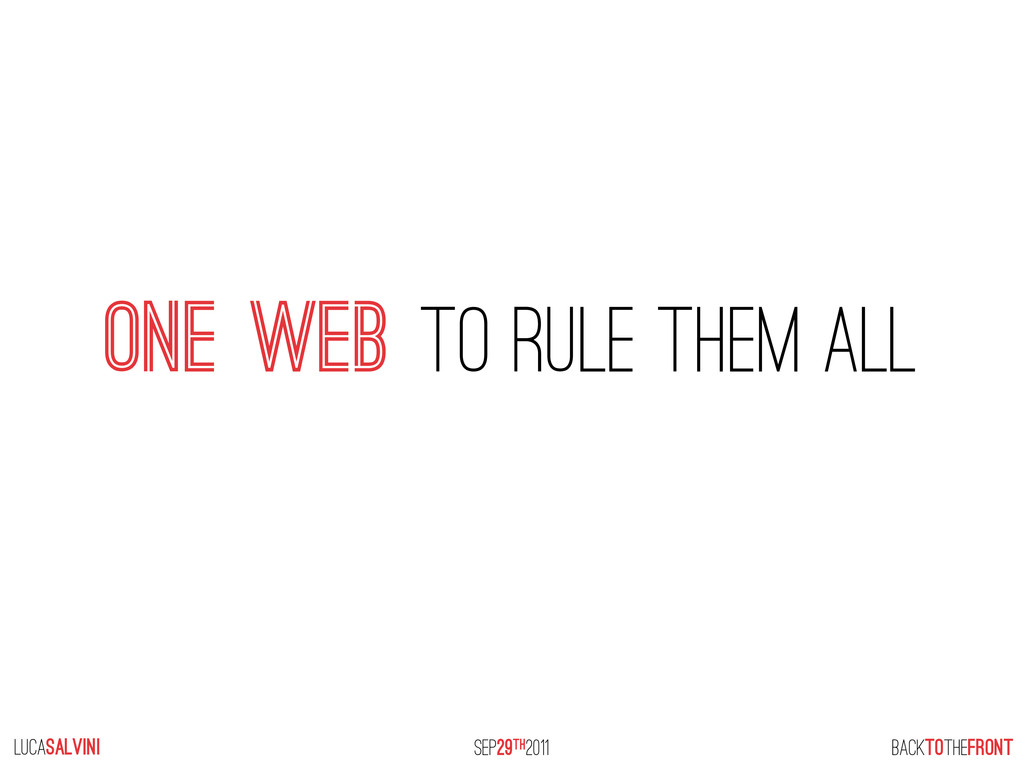
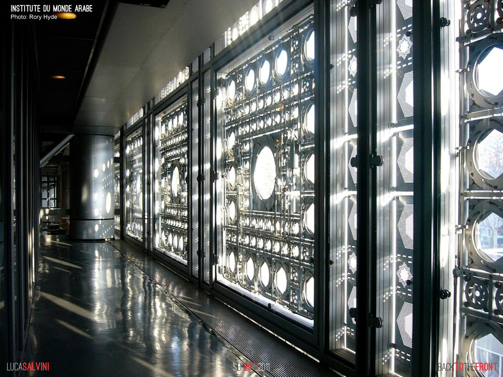
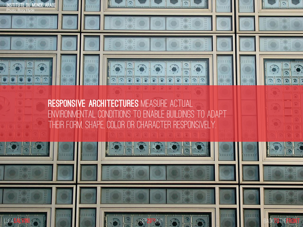
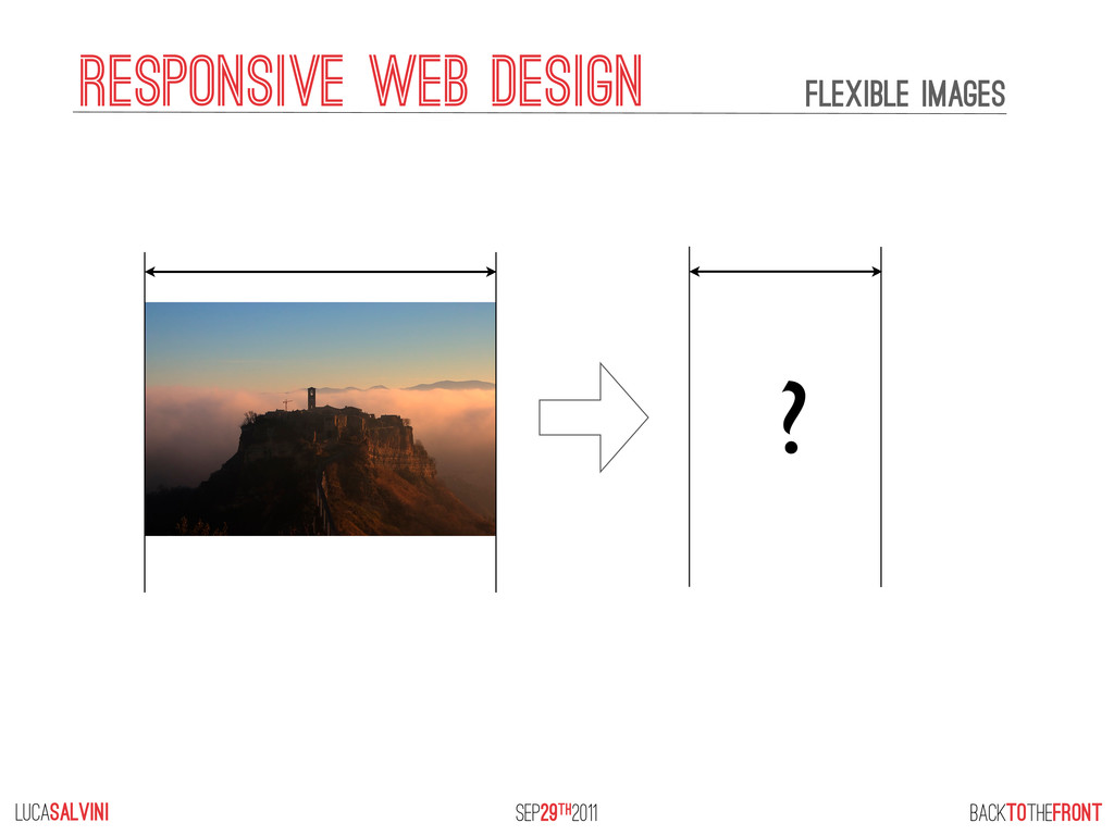
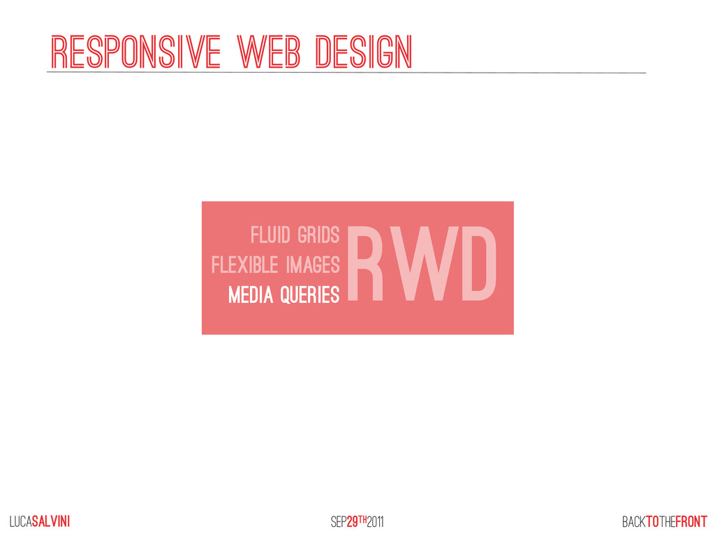
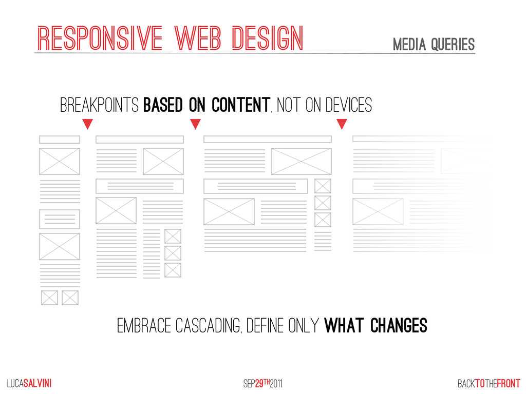
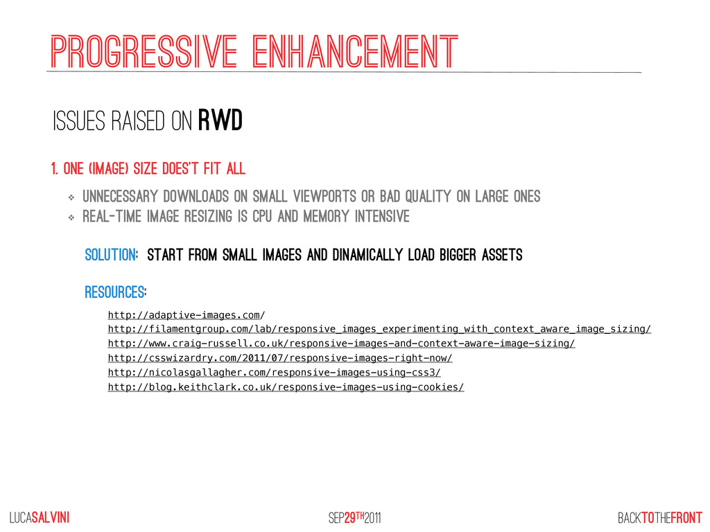
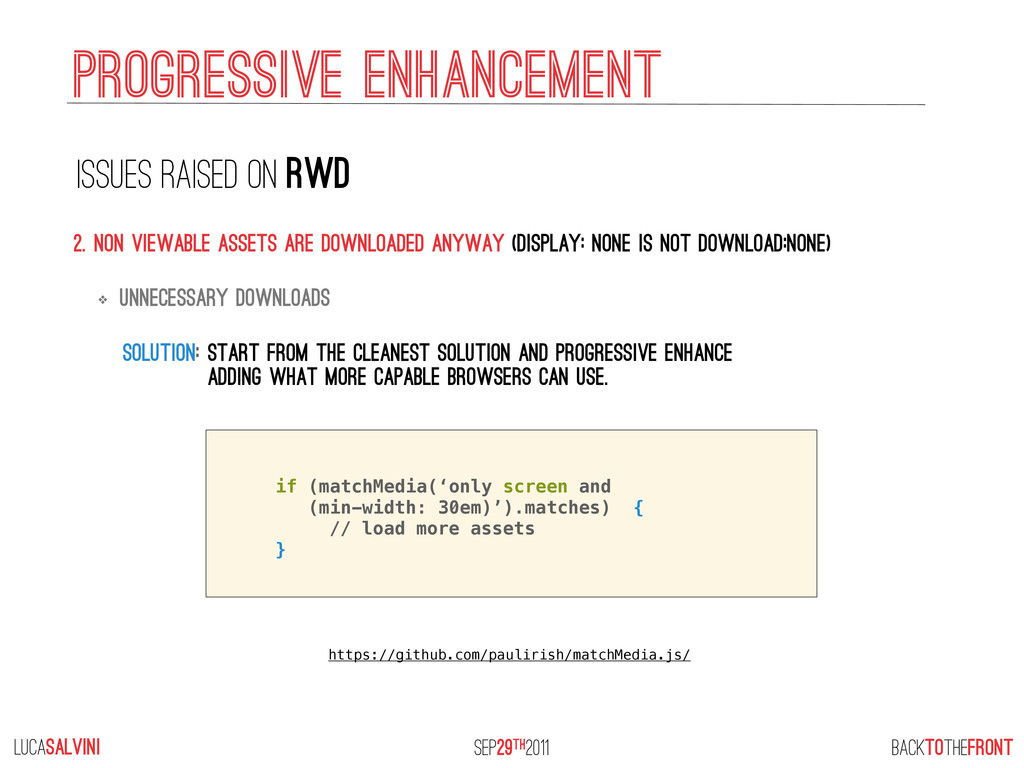
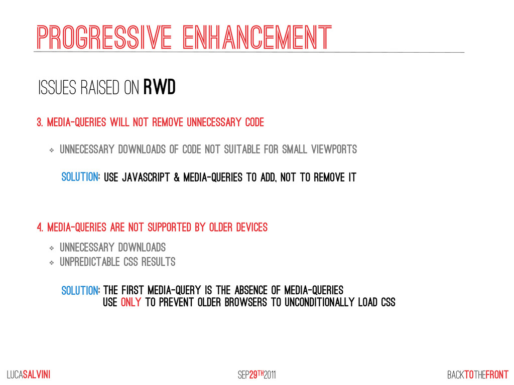
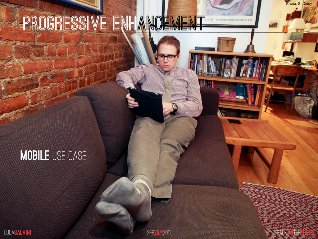
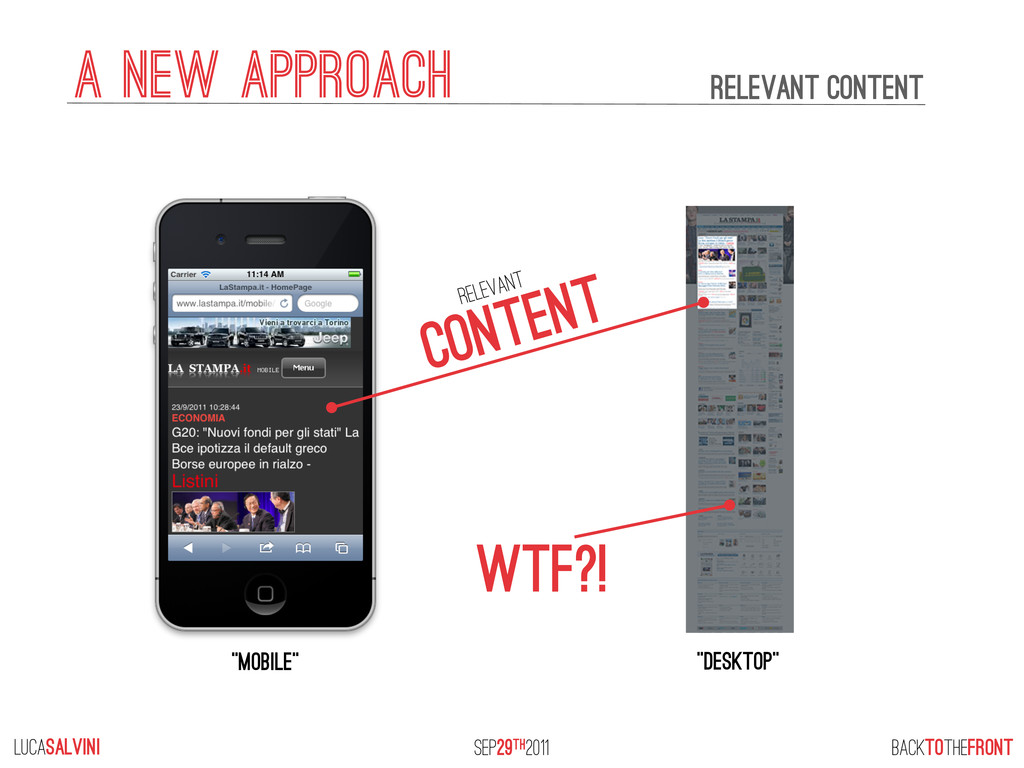
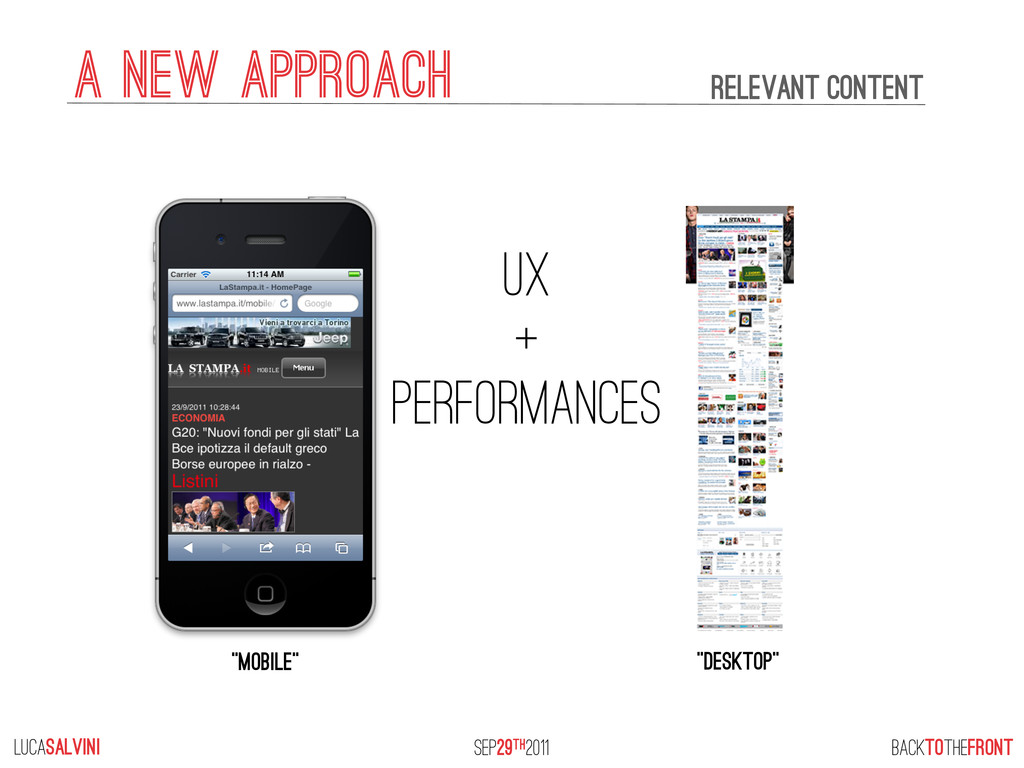
Smartphones, tablets, gaming consoles, ebook readers and internet fridges are becoming our main tools to browse the web and yet websites are strictly made for a desktop consumption.
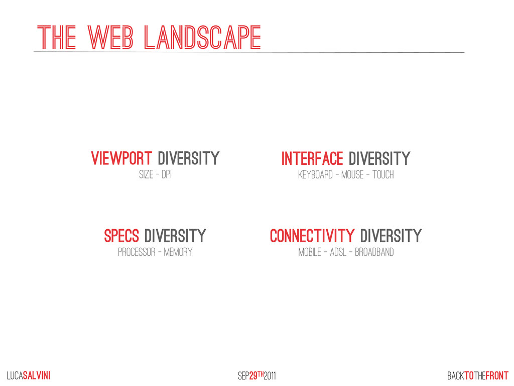
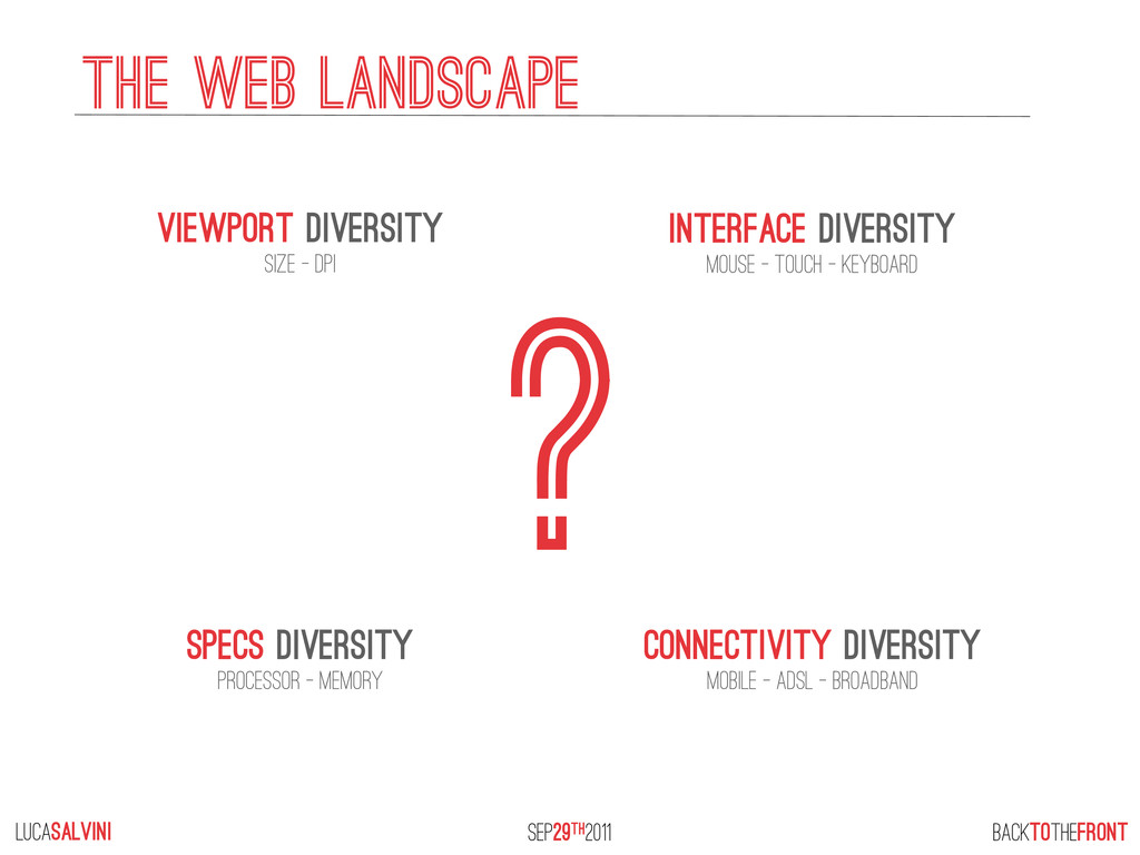
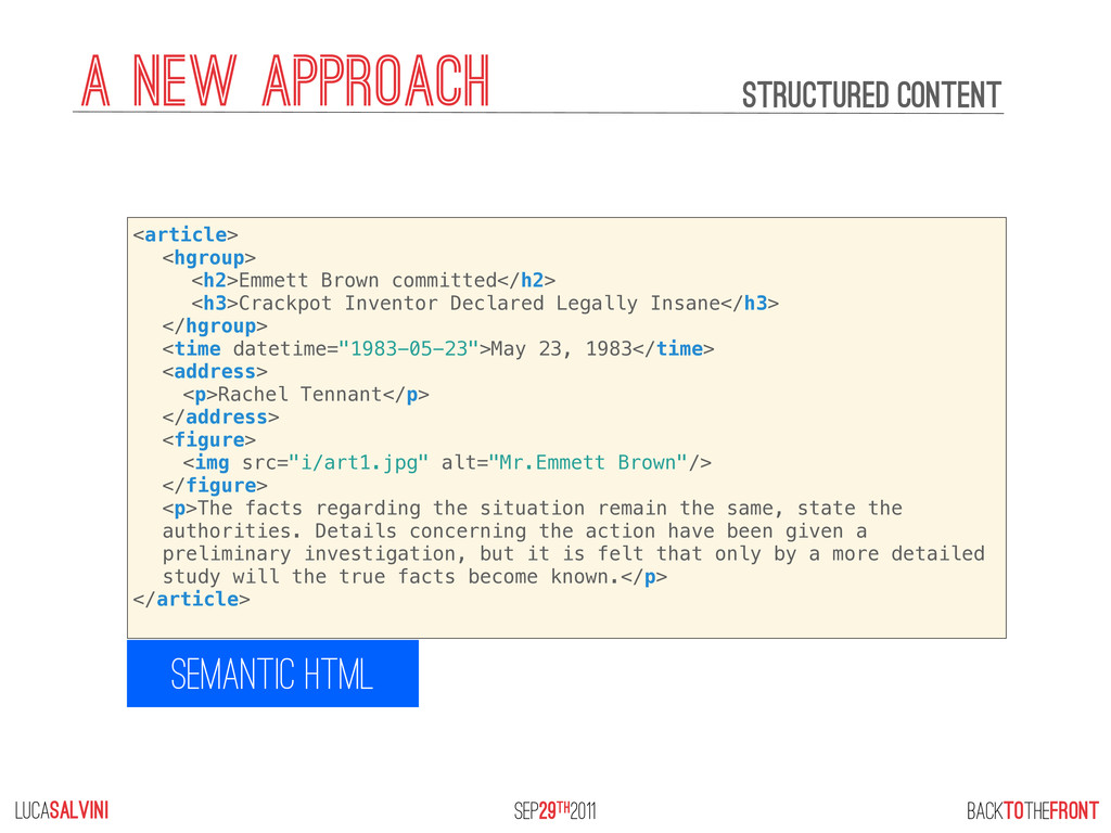
We need to develop a device agnostic approach and fully embrace the flexibility of the web with semantic coding and progressive enhancements.

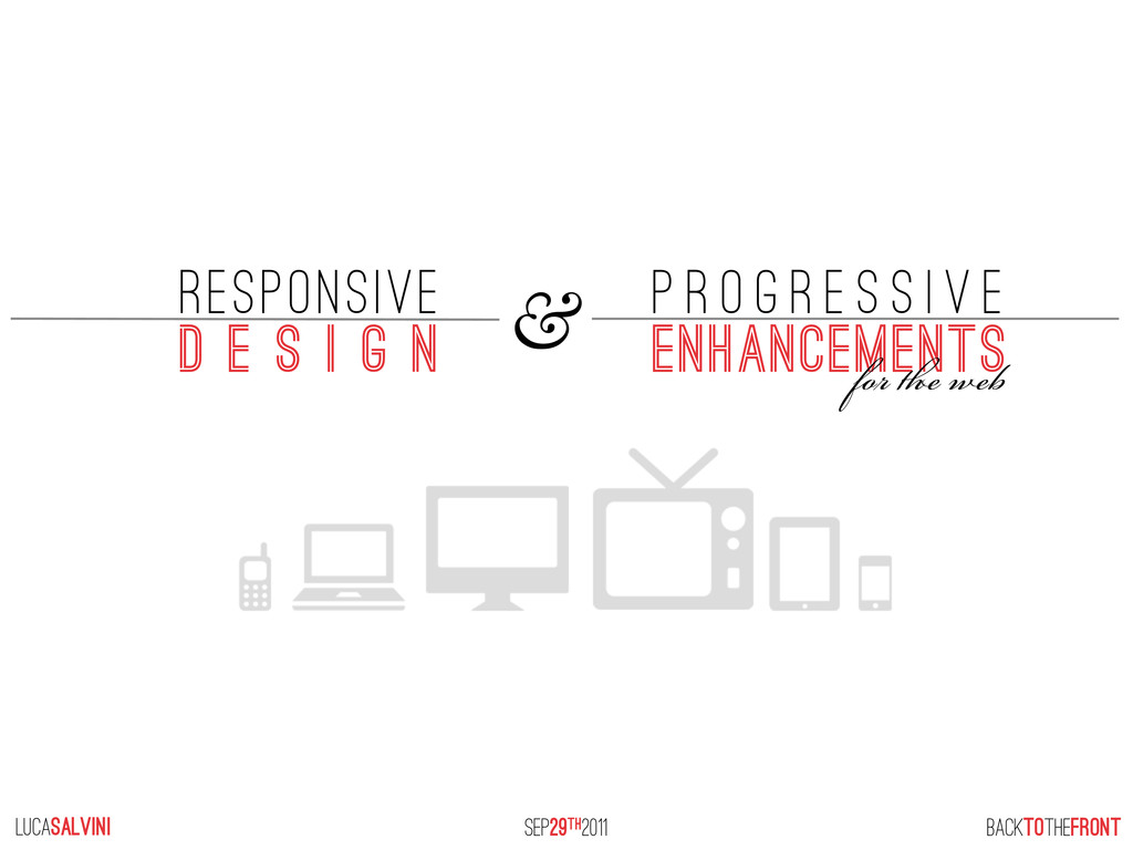
From The Front, Back To The Front (Cesena, Sept 29th, 2011)
@lucasalvini

Luca Salvini

October 02, 2011
Tweet

Other Decks in Design

Transcript

  1. lucaSALVINI BACKTOTHEFRONT SEP29th2011 & RESPONSIVE d e s i g

    n p r o g r e s s i v e enhancements f  
  2. lucaSALVINI BACKTOTHEFRONT SEP29th2011 Viewport diversity SIZE - DPI INterface diversity

    Keyboard - mouse - touch SPECS diversity processor - memory CONNECtivity diversity mobile - adsl - broadband THE WEB LANDSCAPE
  3. lucaSALVINI BACKTOTHEFRONT SEP29th2011 ? Viewport diversity SIZE - DPI INterface

    diversity mouse - touch - keyboard SPECS diversity processor - memory CONNECtivity diversity mobile - adsl - broadband THE WEB LANDSCAPE
  4. lucaSALVINI BACKTOTHEFRONT SEP29th2011 a new approach We have no canvas

    there’s no such thing as pixel perfect we know nothing* *assumption is the mother of all fuckups
  5. lucaSALVINI BACKTOTHEFRONT SEP29th2011 a new approach structured CONTENT SEMANTIC HTML

    <article> <hgroup> <h2>Emmett Brown committed</h2> <h3>Crackpot Inventor Declared Legally Insane</h3> </hgroup> <time datetime="1983-05-23">May 23, 1983</time> <address> ! <p>Rachel Tennant</p> </address>! ! <figure> ! <img src="i/art1.jpg" alt="Mr.Emmett Brown"/> </figure> <p>The facts regarding the situation remain the same, state the authorities. Details concerning the action have been given a preliminary investigation, but it is felt that only by a more detailed study will the true facts become known.</p> </article>
  6. lucaSALVINI BACKTOTHEFRONT SEP29th2011 a new approach structured CONTENT SEMANTIC HTML

    WAI-ARIA ROLES <article role=”article”> <hgroup> <h2>Emmett Brown committed</h2> <h3>Crackpot Inventor Declared Legally Insane</h3> </hgroup> <time datetime="1983-05-23">May 23, 1983</time> <address> ! <p>Rachel Tennant</p> </address>! ! <figure> ! <img src="i/art1.jpg" alt="Mr.Emmett Brown"/> </figure> <p>The facts regarding the situation remain the same, state the authorities. Details concerning the action have been given a preliminary investigation, but it is felt that only by a more detailed study will the true facts become known.</p> </article> <article role=”article”> <hgroup> <h2>Emmett Brown committed</h2> <h3>Crackpot Inventor Declared Legally Insane</h3> </hgroup> <time datetime="1983-05-23">May 23, 1983</time> <address> ! <p>Rachel Tennant</p> </address>! ! <figure> ! <img src="i/art1.jpg" alt="Mr.Emmett Brown"/> </figure> <p>The facts regarding the situation remain the same, state the authorities. Details concerning the action have been given a preliminary investigation, but it is felt that only by a more detailed study will the true facts become known.</p> </article>
  7. lucaSALVINI BACKTOTHEFRONT SEP29th2011 a new approach structured CONTENT SEMANTIC HTML

    WAI-ARIA ROLES <article role=”article” class=”hentry”> <hgroup> <h2 class=”entry-title”>Emmett Brown committed</h2> <h3>Crackpot Inventor Declared Legally Insane</h3> </hgroup> <time class=”updated” datetime="1983-05-23">May 23, 1983</time> <address class=”vcard”> ! <p class=”fn”>Rachel Tennant</p> </address>! ! <figure> ! <img src="i/art1.jpg" alt="Mr.Emmett Brown"/> </figure> <p class=”entry-content”>The facts regarding the situation remain the same, state the authorities. Details concerning the action have been given a preliminary investigation, but it is felt that only by a more detailed study will the true facts become known.</p> </article>
  8. lucaSALVINI BACKTOTHEFRONT SEP29th2011 a new approach prioritized CONTENT the order

    of information is the simplest possible layout The foundation Ok, but what next?
  9. responsive architectures measure actual environmental conditions to enable buildings to

    adapt their form, shape, color or character responsively. lucaSALVINI BACKTOTHEFRONT SEP29th2011 institute du monde arabe Photo: Rory Hyde
  10. “Fluid grids, flexible images, and media queries are the three

    technical ingredients for responsive web design” ETHAN MARCOTTE FLUID GRIDS Flexible images media queries lucaSALVINI BACKTOTHEFRONT SEP29th2011 institute du monde arabe Photo: Rory Hyde RWD
  11. institute du monde arabe Photo: Rory Hyde RWD FLUID GRIDS

    Flexible images media queries lucaSALVINI BACKTOTHEFRONT SEP29th2011
  12. institute du monde arabe Photo: Rory Hyde RWD FLUID GRIDS

    Flexible images media queries lucaSALVINI BACKTOTHEFRONT SEP29th2011
  13. lucaSALVINI BACKTOTHEFRONT SEP29th2011 a new approach Every module of information

    can be moved and resized as needed REMEMBER OUR foundation layout? FLUID GRIDS
  14. lucaSALVINI BACKTOTHEFRONT SEP29th2011 a new approach Every module of information

    can be moved and resized as needed REMEMBER OUR foundation layout? FLUID GRIDS The GRID IS our guide
  15. FLUID grid relative units lucaSALVINI BACKTOTHEFRONT SEP29th2011 responsive web design

    FLUID GRIDS fixed WIDTH grid 1000px 250px 250px 250px 250px 25% 25% 25% 25% any width absolute units MATH is SIMPLE CONTENT CONTAINER = %
  16. institute du monde arabe Photo: Rory Hyde RWD FLUID GRIDS

    Flexible images media queries lucaSALVINI BACKTOTHEFRONT SEP29th2011 responsive web design
  17. lucaSALVINI BACKTOTHEFRONT SEP29th2011 responsive web design FLEXIBLE IMAGES THE “SCALING”

    solution img { width:100%; } + imgSizer.js <!--[if lte IE 6]>
  18. institute du monde arabe Photo: Rory Hyde RWD FLUID GRIDS

    Flexible images media queries lucaSALVINI BACKTOTHEFRONT SEP29th2011 responsive web design
  19. lucaSALVINI BACKTOTHEFRONT SEP29th2011 responsive web design MEDIA QUERIES media types

    @media screen @media print @media handheld {...} {...} {...}
  20. lucaSALVINI BACKTOTHEFRONT SEP29th2011 responsive web design MEDIA QUERIES + logics

    media types @media screen @media print @media handheld {...} {...} {...} and (exp) and (exp) and (exp) =media queries
  21. lucaSALVINI BACKTOTHEFRONT SEP29th2011 responsive web design MEDIA QUERIES + logics

    media types @media screen @media print @media handheld {...} {...} {...} and (exp) and (exp) and (exp) =media queries @media screen and (min-width: 500px) {...} they work as feature detection (if viewport width is at least 500 pixels...)
  22. lucaSALVINI BACKTOTHEFRONT SEP29th2011 responsive web design MEDIA QUERIES WHAT features

    can we detect? WIDTH HEIGHT DEVICE-WIDTH DEVICE-HEIGHT ASPECT-RATIO DEVICE-ASPECT-RATIO COLOR COLOR-INDEX MONOCHROME RESOLUTION ORIENTATION SCAN GRID [min/max] [min/max] [min/max] [min/max] [min/max] [min/max] [min/max] [min/max] [min/max]
  23. lucaSALVINI BACKTOTHEFRONT SEP29th2011 responsive web design MEDIA QUERIES WHAT features

    can we detect? WIDTH HEIGHT DEVICE-WIDTH DEVICE-HEIGHT ASPECT-RATIO DEVICE-ASPECT-RATIO COLOR COLOR-INDEX MONOCHROME RESOLUTION ORIENTATION SCAN GRID [min/max] [min/max] [min/max] [min/max] [min/max] [min/max] [min/max] [min/max] [min/max]
  24. lucaSALVINI BACKTOTHEFRONT SEP29th2011 responsive web design MEDIA QUERIES WHAT features

    can we detect? WIDTH HEIGHT DEVICE-WIDTH DEVICE-HEIGHT ASPECT-RATIO DEVICE-ASPECT-RATIO COLOR COLOR-INDEX MONOCHROME RESOLUTION ORIENTATION SCAN GRID [min/max] [min/max] [min/max] [min/max] [min/max] [min/max] [min/max] [min/max] [min/max] DEVICE-PIXEL-RATIO DEVICE-PIXEL-RATIO DEVICE-PIXEL-RATIO DEVICE-PIXEL-RATIO TOUCH-ENABLED --moz- -moz- [min/max] [min/max] [min/max] -webkit- -o-
  25. lucaSALVINI BACKTOTHEFRONT SEP29th2011 responsive web design MEDIA QUERIES @media [not|only]

    type [and] (condition) {...} dissection of media queries operators and @media screen and (min-width: 500px) and (max-width: 800px) {...}
  26. lucaSALVINI BACKTOTHEFRONT SEP29th2011 responsive web design MEDIA QUERIES @media [not|only]

    type [and] (condition) {...} dissection of media queries operators and @media screen and (min-width: 500px) and (max-width: 800px) {...} OR @media screen and (min-width: 500px), screen and (orientation: landscape) {...}
  27. lucaSALVINI BACKTOTHEFRONT SEP29th2011 responsive web design MEDIA QUERIES @media [not|only]

    type [and] (condition) {...} dissection of media queries operators and @media screen and (min-width: 500px) and (max-width: 800px) {...} OR @media screen and (min-width: 500px), screen and (orientation: landscape) {...} NOT @media not screen and (min-width: 500px) {...} !!
  28. lucaSALVINI BACKTOTHEFRONT SEP29th2011 responsive web design MEDIA QUERIES BE CAREFUL,

    NOT negates the entire media querY @media not screen and (min-width: 500px) {...}
  29. lucaSALVINI BACKTOTHEFRONT SEP29th2011 responsive web design MEDIA QUERIES BE CAREFUL,

    NOT negates the entire media querY @media not screen and (min-width: 500px) {...} So, it doesn’t evaluate like this @media (not screen) and (min-width: 500px) {...} X
  30. lucaSALVINI BACKTOTHEFRONT SEP29th2011 responsive web design MEDIA QUERIES BE CAREFUL,

    NOT negates the entire media querY @media not screen and (min-width: 500px) {...} So, it doesn’t evaluate like this @media (not screen) and (min-width: 500px) {...} X But IT evaluates like this @media (not (screen and (min-width: 500px))) {...} ✓
  31. lucaSALVINI BACKTOTHEFRONT SEP29th2011 responsive web design MEDIA QUERIES @media [not|only]

    type [and] (condition) {...} dissection of media queries ONLY AND NOT Hide the media query from OLDER BROWSERS preventing them to uncontitionally apply styles PRO TIP:
  32. lucaSALVINI BACKTOTHEFRONT SEP29th2011 responsive web design MEDIA QUERIES THE VIEWPORT

    ISSUE @media only screen and (max-device-width: 20em) { #test {width:50%} } VIEWPORT width device-width
  33. lucaSALVINI BACKTOTHEFRONT SEP29th2011 responsive web design MEDIA QUERIES THE VIEWPORT

    ISSUE @media only screen and (max-device-width: 20em) { #test {width:50%} } device-width VIEWPORT width
  34. lucaSALVINI BACKTOTHEFRONT SEP29th2011 responsive web design MEDIA QUERIES THE VIEWPORT

    ISSUE @media only screen and (max-width: 20em) { #test {width:50%} } <meta name=”viewport” content=”width=device-width, initial-scale=1” /> device-width VIEWPORT width
  35. lucaSALVINI BACKTOTHEFRONT SEP29th2011 responsive web design MEDIA QUERIES THE ABSENCE

    of a media query is in fact, the first media query Bryan Rieger, Rethinking the Mobile Web
  36. lucaSALVINI BACKTOTHEFRONT SEP29th2011 responsive web design EVEN MORE SPACE makes

    room for LARGER images and deeper asides MEDIA QUERIES
  37. lucaSALVINI BACKTOTHEFRONT SEP29th2011 BREAKPOINTS BASED on cONTENT, not on devices

    embrace CASCADING, define only WHAT CHANGES responsive web design MEDIA QUERIES
  38. lucaSALVINI BACKTOTHEFRONT SEP29th2011 responsive web design ISSUES RAISED on RWD

    1. one (image) size doesn’t fit all ❖ unnecessary downloads on small viewports or bad quality on large ones ❖ real-time image resizing is cpu and memory intensive 2. non viewable assets are downloaded anyway (display: none is not download:none) ❖ unnecessary downloads 3. media-queries will not remove unnecessary code ❖ unnecessary downloads of code not suitable for “mobile” 4. media-queries are not supported by older devices ❖ unnecessary downloads ❖ unpredictable css results 5. context of “mobile” ≠ context of “desktop” ❖ RWD doesn’t respect contextual usage patterns
  39. BACKTOTHEFRONT progressive enhancement lucaSALVINI SEP29th2011 An escalator can never break;

    it can only become stairs. Mitch hedberg Photo: Niall & Elizabeth Dawson
  40. lucaSALVINI BACKTOTHEFRONT SEP29th2011 progressive enhancement STRUCTURED CONTENT with linear layout

    CSS: color and typography SMALL inline IMAGES big inline images STATIC MAPS JS DRIVEN MAP SMALL CSS IMAGES big CSS IMAGES PLUGIns, AUDIO & VIDEO with FALLBACKS RESPOND.js CSS3 selectivizr.js responsive layout MODERNIZR.js media queries available Javascript available
  41. lucaSALVINI BACKTOTHEFRONT SEP29th2011 1. one (image) size does’t fit all

    ❖ unnecessary downloads on small viewports or bad quality on large ones ❖ real-time image resizing is cpu and memory intensive start from small images and dinamically load bigger assets http://adaptive-images.com/ http://filamentgroup.com/lab/responsive_images_experimenting_with_context_aware_image_sizing/ http://www.craig-russell.co.uk/responsive-images-and-context-aware-image-sizing/ http://csswizardry.com/2011/07/responsive-images-right-now/ http://nicolasgallagher.com/responsive-images-using-css3/ http://blog.keithclark.co.uk/responsive-images-using-cookies/ progressive enhancement SOLUTION: resources: ISSUES RAISED on RWD
  42. lucaSALVINI BACKTOTHEFRONT SEP29th2011 ISSUES RAISED on RWD 2. non viewable

    assets are downloaded anyway (display: none is not download:none) ❖ unnecessary downloads SOLUTION: start from the cleanest solution and progressive enhance adding what MORE capable browsers can use. progressive enhancement if (matchMedia(‘only screen and (min-width: 30em)’).matches) { // load more assets } https://github.com/paulirish/matchMedia.js/
  43. lucaSALVINI BACKTOTHEFRONT SEP29th2011 3. media-queries will not remove unnecessary code

    ❖ unnecessary downloads of code not suitable for SMALL VIEWPORTS progressive enhancement SOLUTION: use javascript & media-queries to add, not to remove it 4. media-queries are not supported by older devices ❖ unnecessary downloads ❖ unpredictable css results the first media-query is the absence of media-queries use ONLY to prevent older browsers to unconditionally load css SOLUTION: ISSUES RAISED on RWD
  44. lucaSALVINI BACKTOTHEFRONT SEP29th2011 5. context of “mobile” ≠ context of

    “desktop” ❖ doesn’t respect tipical usage based on context progressive enhancement ISSUES RAISED on RWD
  45. lucaSALVINI BACKTOTHEFRONT SEP29th2011 5. context of “mobile” ≠ context of

    “desktop” ❖ don’t respect usage patterns IF YOU REALLY need to, progressive enhance reacting to location, not screen width, and adapt content based to proximity progressive enhancement SOLUTION: ISSUES RAISED on RWD
  46. lucaSALVINI BACKTOTHEFRONT SEP29th2011 RWD + progressive enhancement Maybe people resize

    windows, maybe they don’t. The point is a responsive site means they no longer NEED to. Scott Jehl, Filament Group Photo: David Calhoun
  47. lucaSALVINI BACKTOTHEFRONT SEP29th2011 TESTING DESKTOP test on every possible browser

    you can install USe offsite browser testing services1 use “responsiveness” testing services2 MOBILE Nothing is like the real thing Android simulator ios simulator opera mini simulator 1 CrossBrowserTesting (http://crossbrowsertesting.com/), Browsershots (http://browsershots.org/), Litmus (http://litmus.com/), Browsercam (http://www.browsercam.com/), etc... 2 Resize My Browser (http://resizemybrowser.com/), ResponsivePx (http://responsivepx.com/), ScreenFly (http:// quirktools.com/screenfly/), Responsive Design Testing (http://mattkersley.com/responsive/)
  48. lucaSALVINI BACKTOTHEFRONT SEP29th2011 a new approach “MOBILE” “DESKTOP” UX +

    performances number of requests 8 208 relevant CONTENT
  49. lucaSALVINI BACKTOTHEFRONT SEP29th2011 a new approach UX + performances “MOBILE”

    “DESKTOP” number of requests 8 208 total page size 30,2KB 1.28Mb relevant CONTENT
  50. lucaSALVINI BACKTOTHEFRONT SEP29th2011 a new approach UX + performances “MOBILE”

    “DESKTOP” number of requests 8 208 total page size 30,2KB 1.28Mb PAGE LOAD TIME (seconds) 1.82 7.95 relevant CONTENT