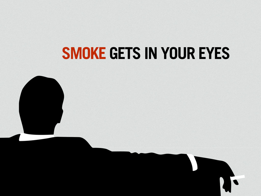
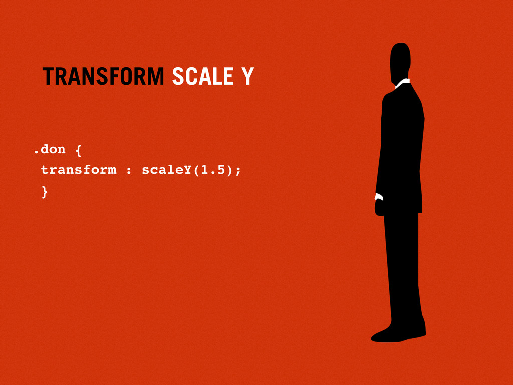
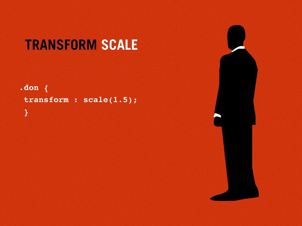
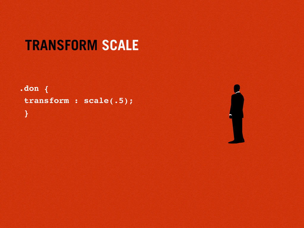
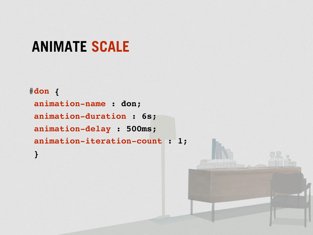
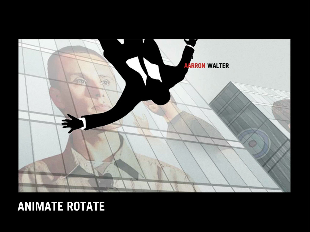
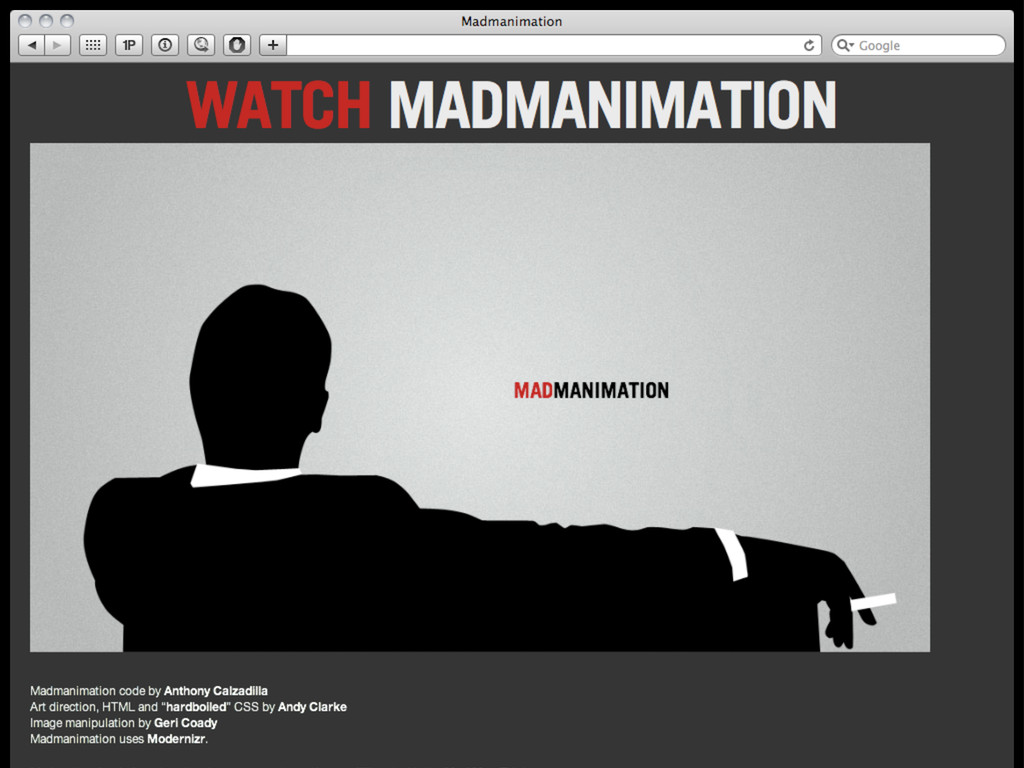
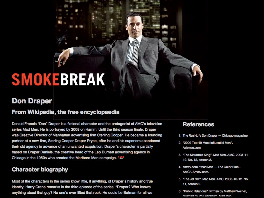
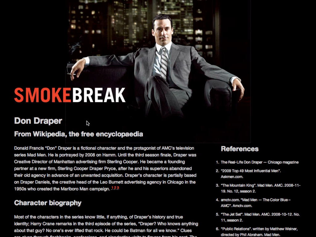
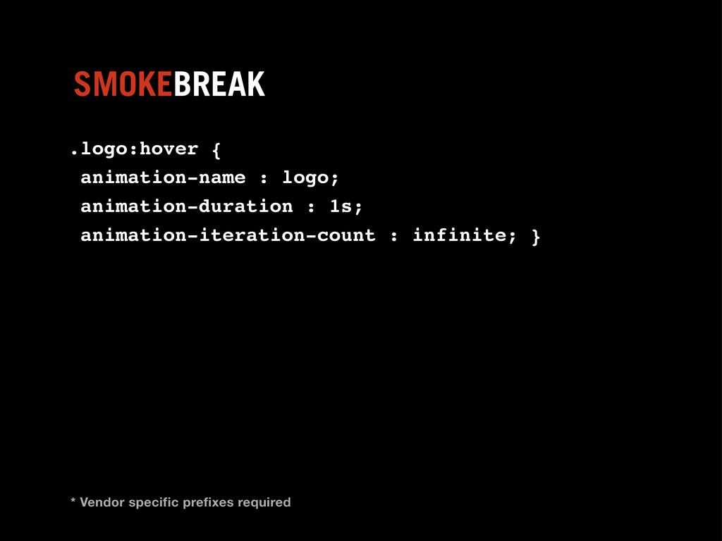
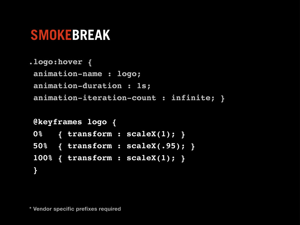
Animation on the web has traditionally been low-fidelity and shares much common ground with the work of early animators. Web animations have always been the domain of Flash because equivalents couldn’t easily be created using open standards. That is until now, with ever increasing support for CSS3 Animations. Learn about the latest CSS animation techniques and how to create effective, accessible fallbacks for all browsers, including those with limited capabilities.
 malarkey
 oracle4engineer
 peintangos
 moongift
 shogogg
 sakiengineer
 techtekt
 kmiya84377
 yoshimi0227
 yama3133
 tanimuyk
 hayama17
 phantomjuju
 lara
lara
 speakerdeck
 marcoroth
 aleyda
 kneath
 chriscoyier
 rkendrick25
 mfonobong
 eileencodes
 watany
![.lamp { animation-iteration-count : 1; } ANIMATION ITERATIONS Hint: [number]](https://files.speakerdeck.com/presentations/4ee7e2c4bc1ba9004900222d/slide_40.jpg)
![.lamp { animation-timing-function : linear; } ANIMATION TIMING Hint: [ease]](https://files.speakerdeck.com/presentations/4ee7e2c4bc1ba9004900222d/slide_41.jpg)
![.lamp { animation-direction : normal; } ANIMATION DIRECTION Hint: [normal]](https://files.speakerdeck.com/presentations/4ee7e2c4bc1ba9004900222d/slide_42.jpg)
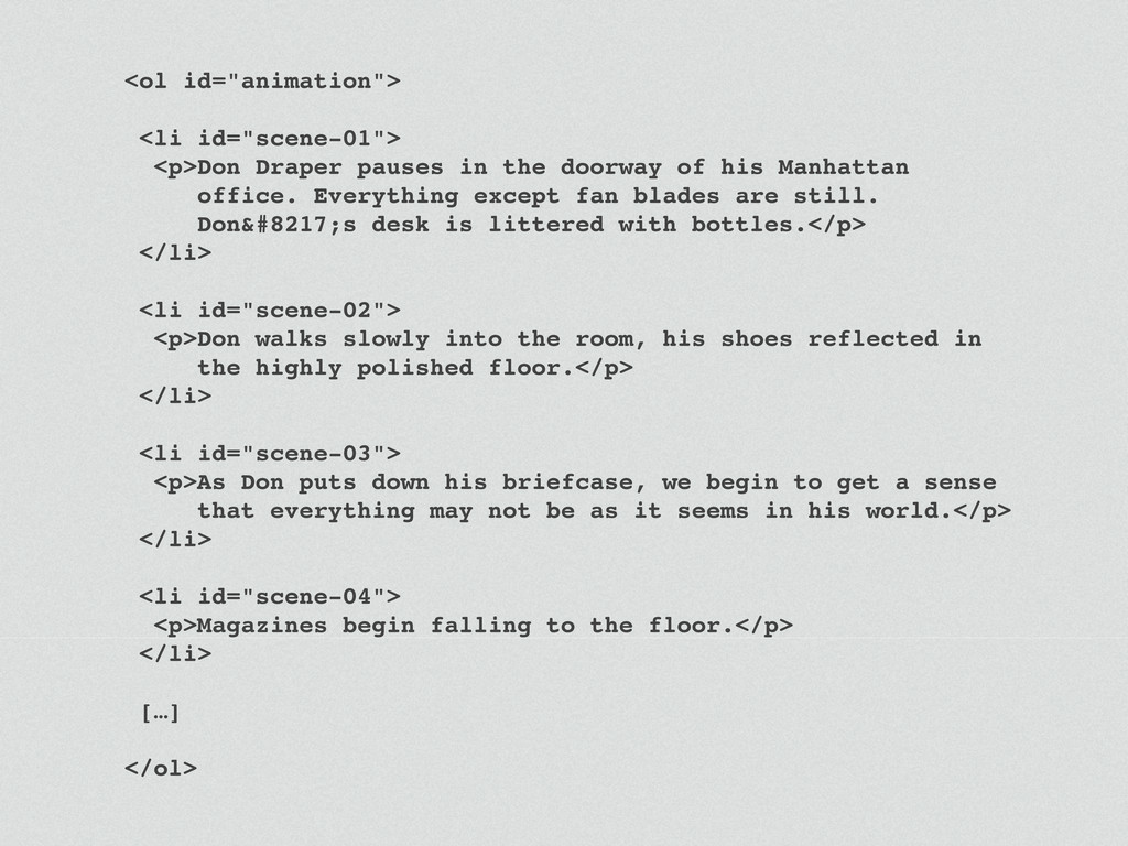
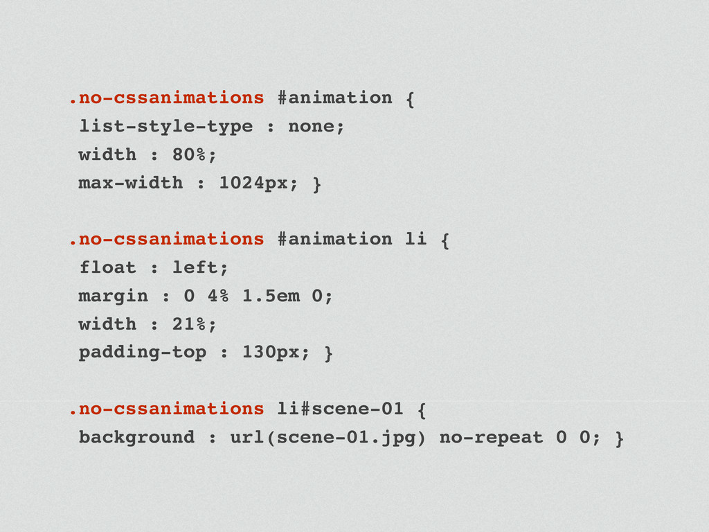
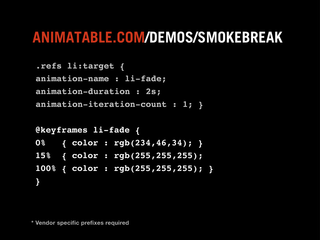
![<ol id="animation"> <li id="scene-01">[…]</li> <li id="scene-02">[…]</li> <li id="scene-03">[…]</li> <li id="scene-04">[…]</li>](https://files.speakerdeck.com/presentations/4ee7e2c4bc1ba9004900222d/slide_100.jpg)