Share
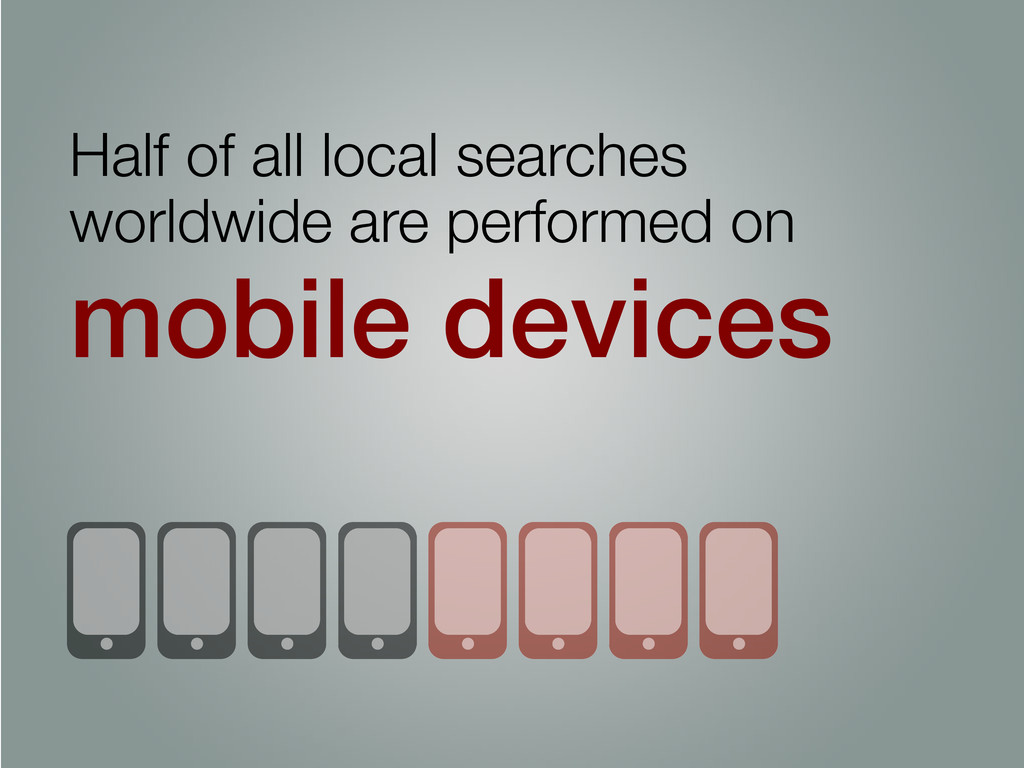
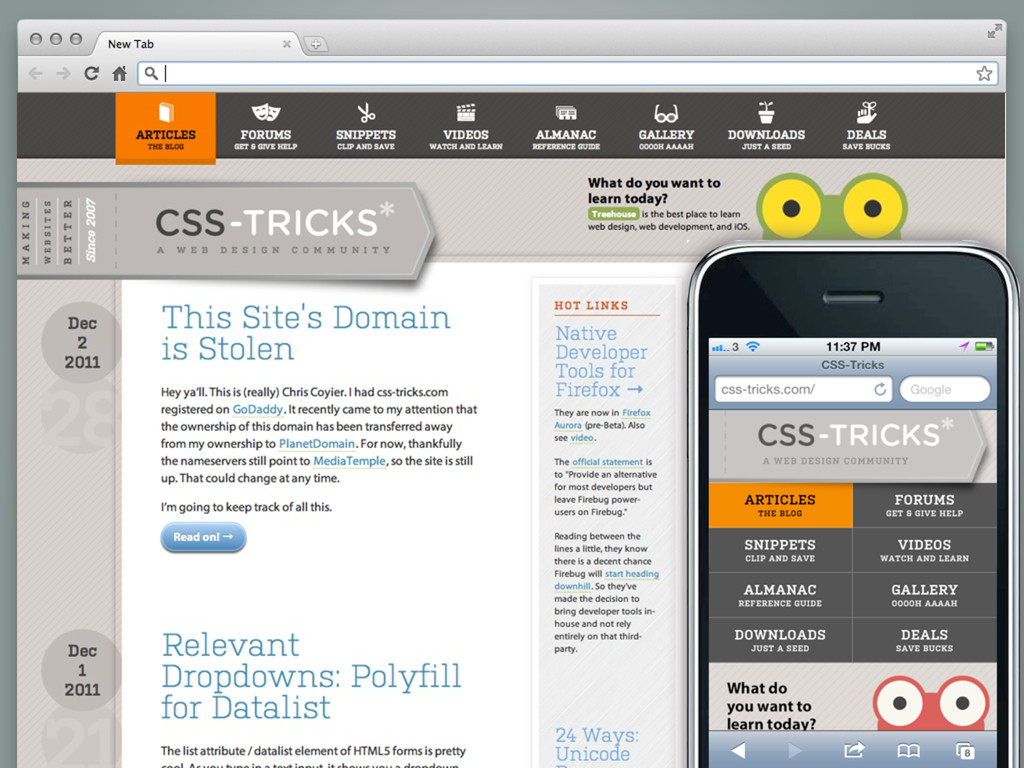
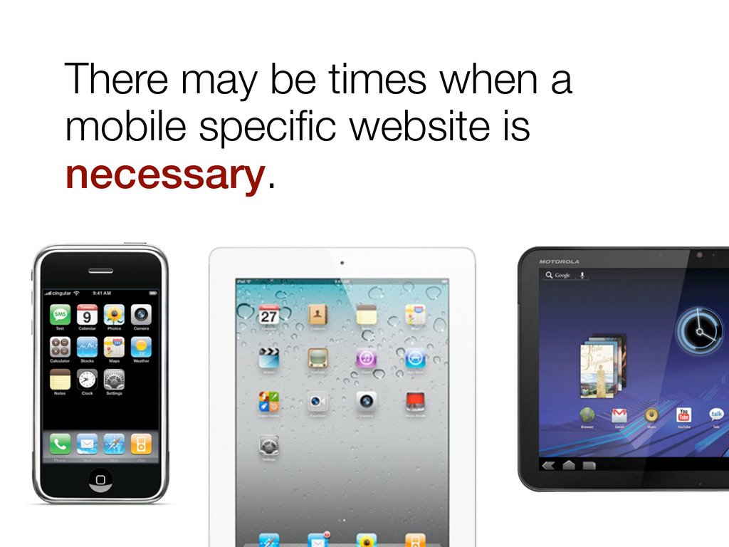
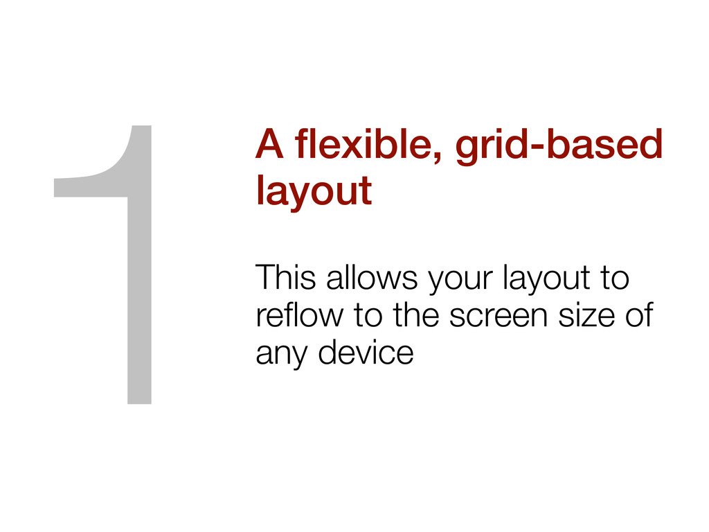
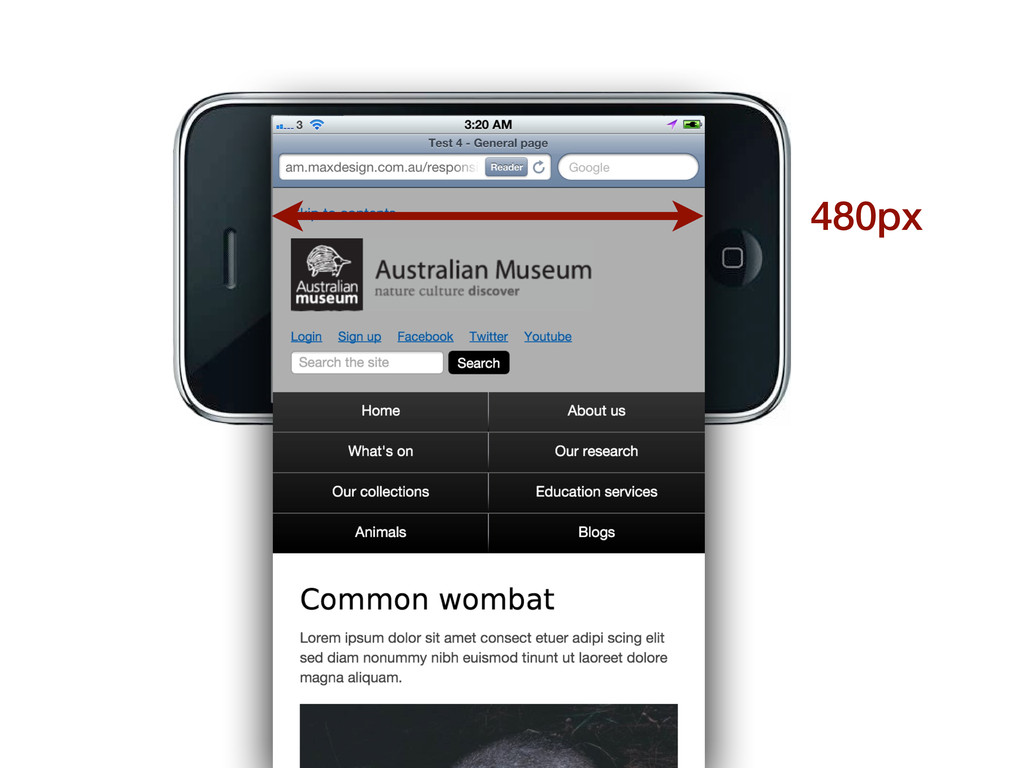
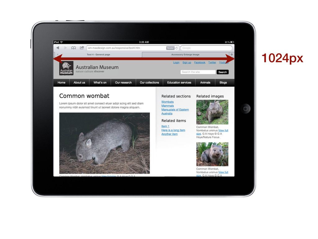
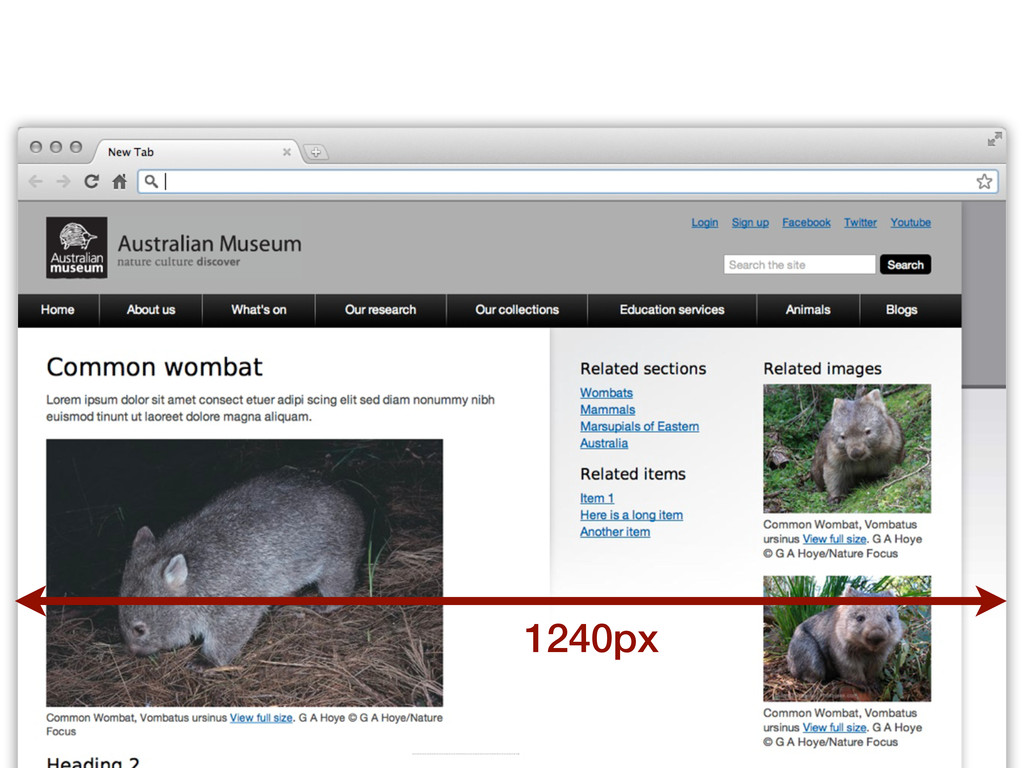
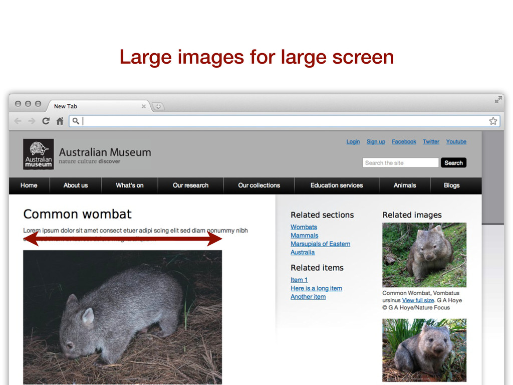
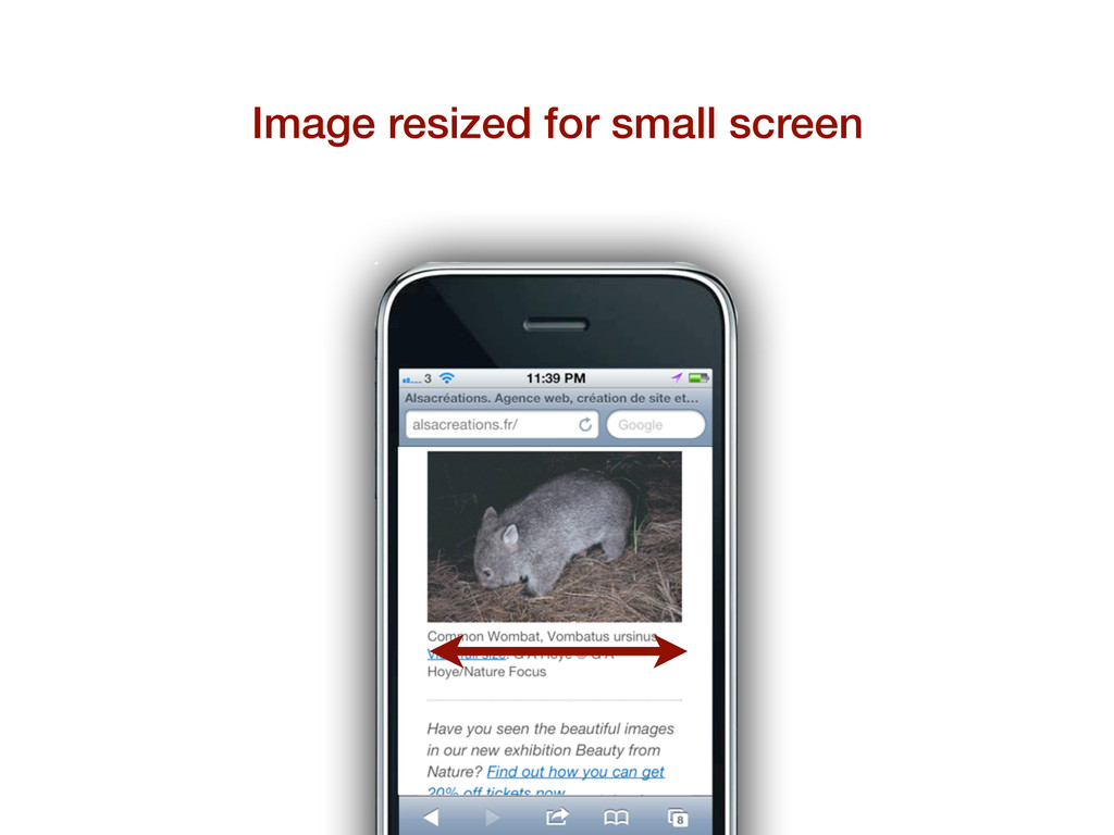
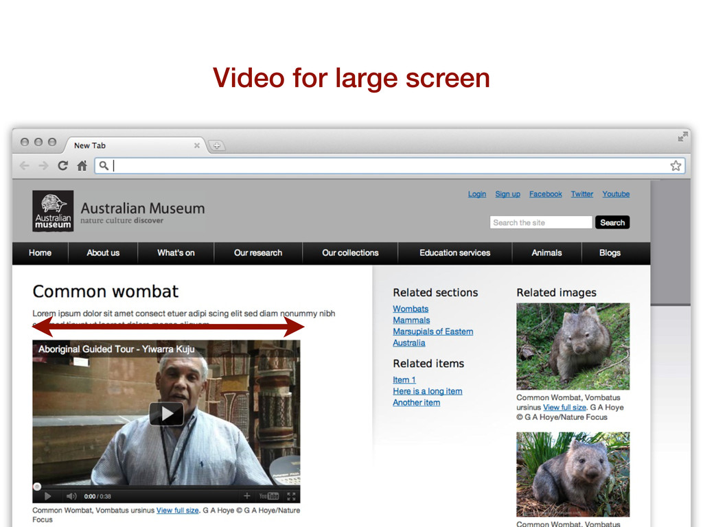
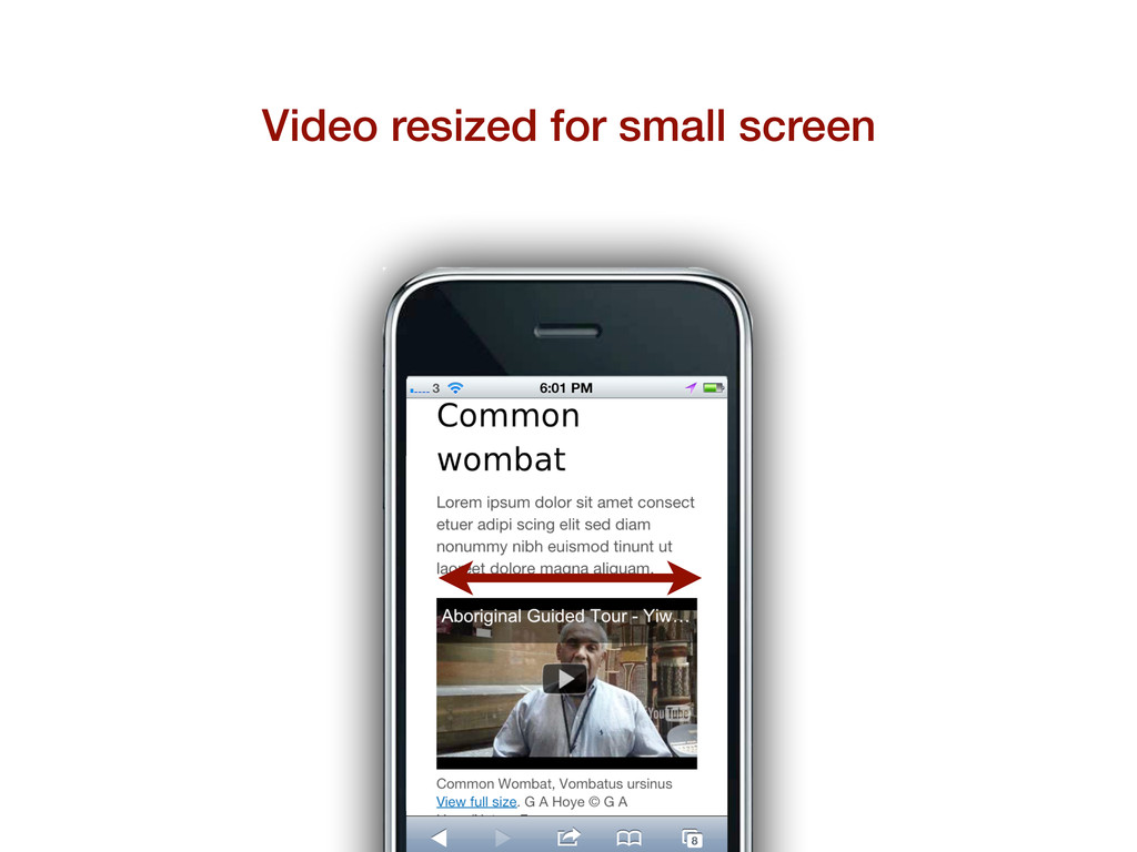
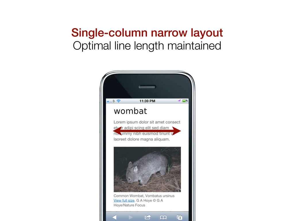
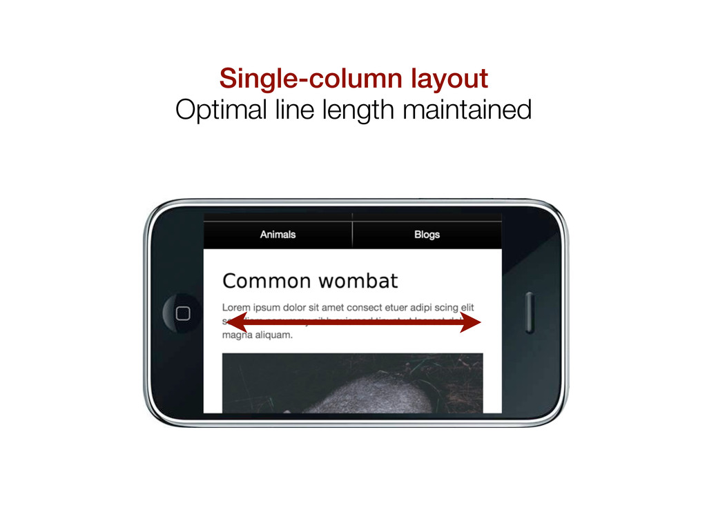
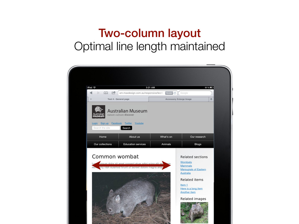
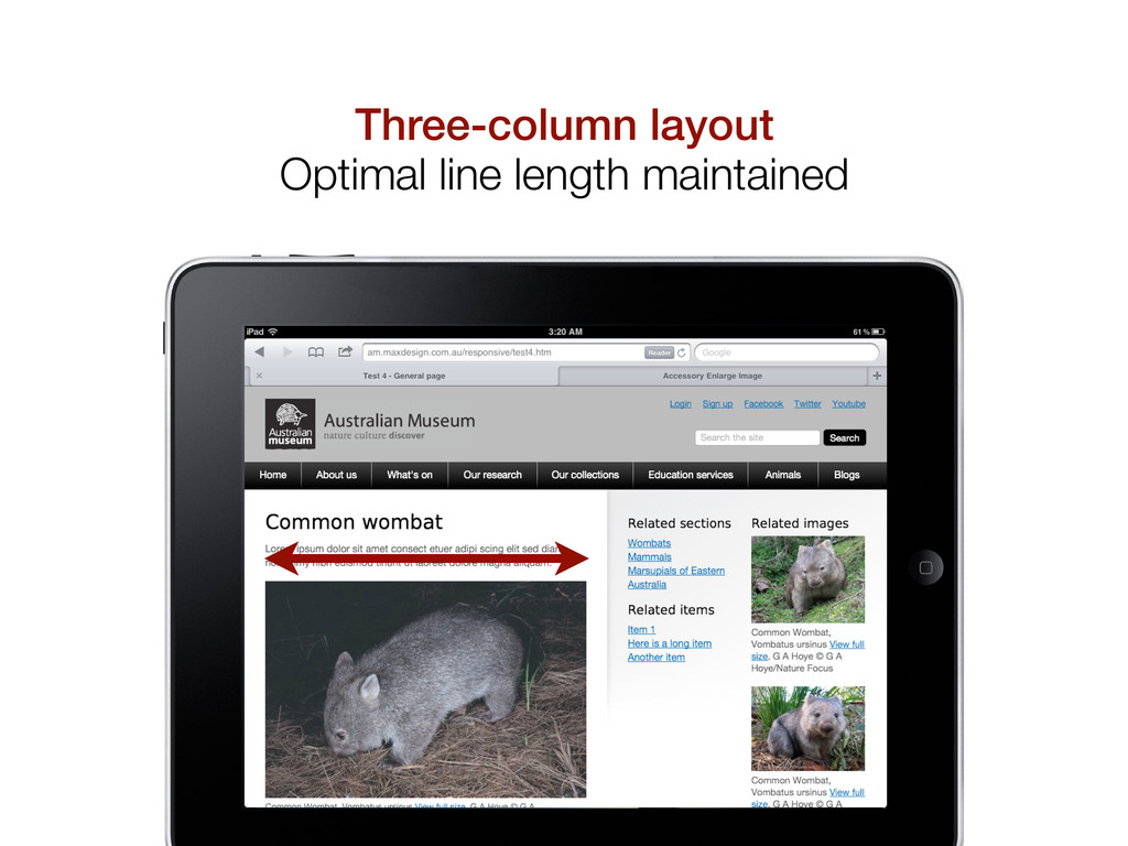
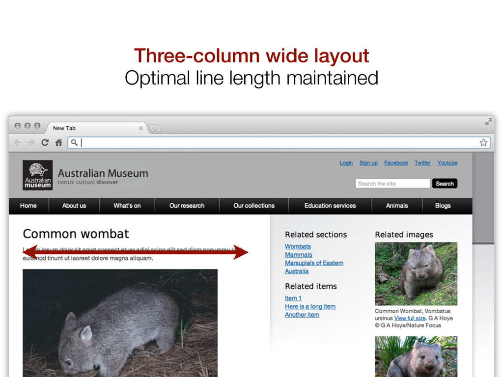
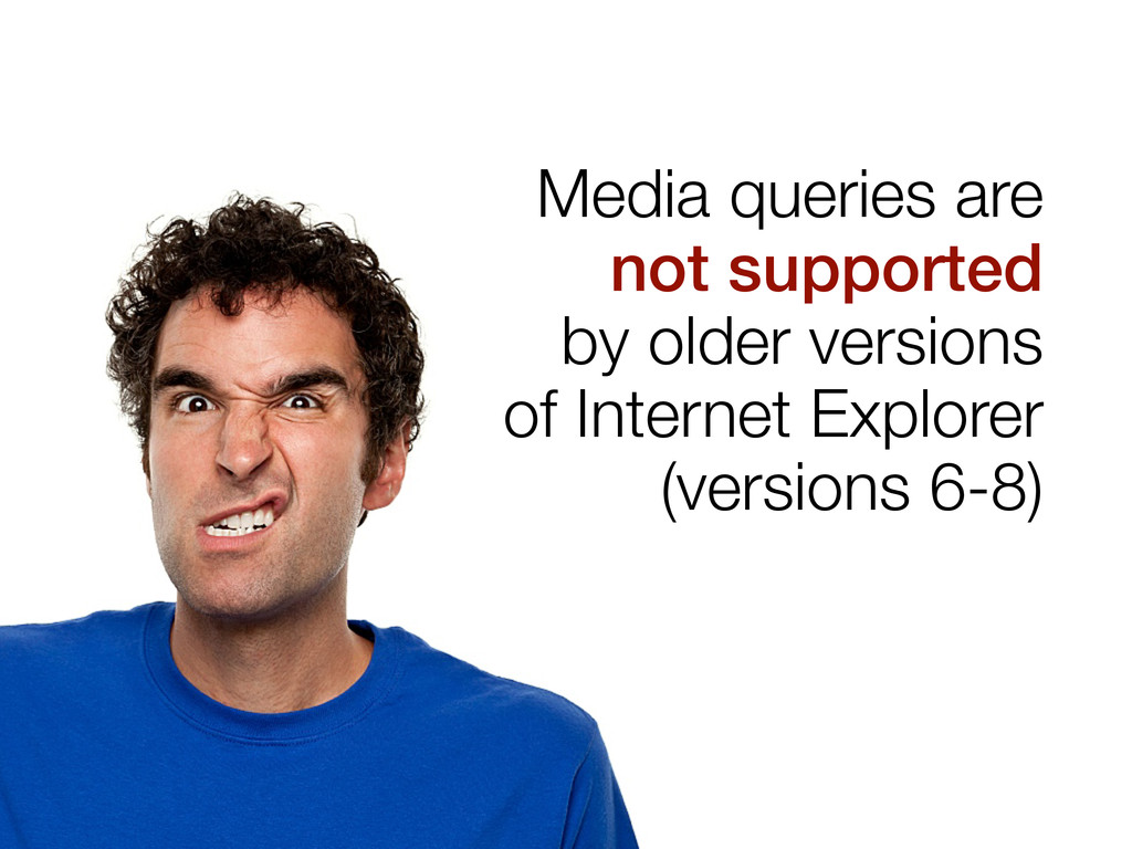
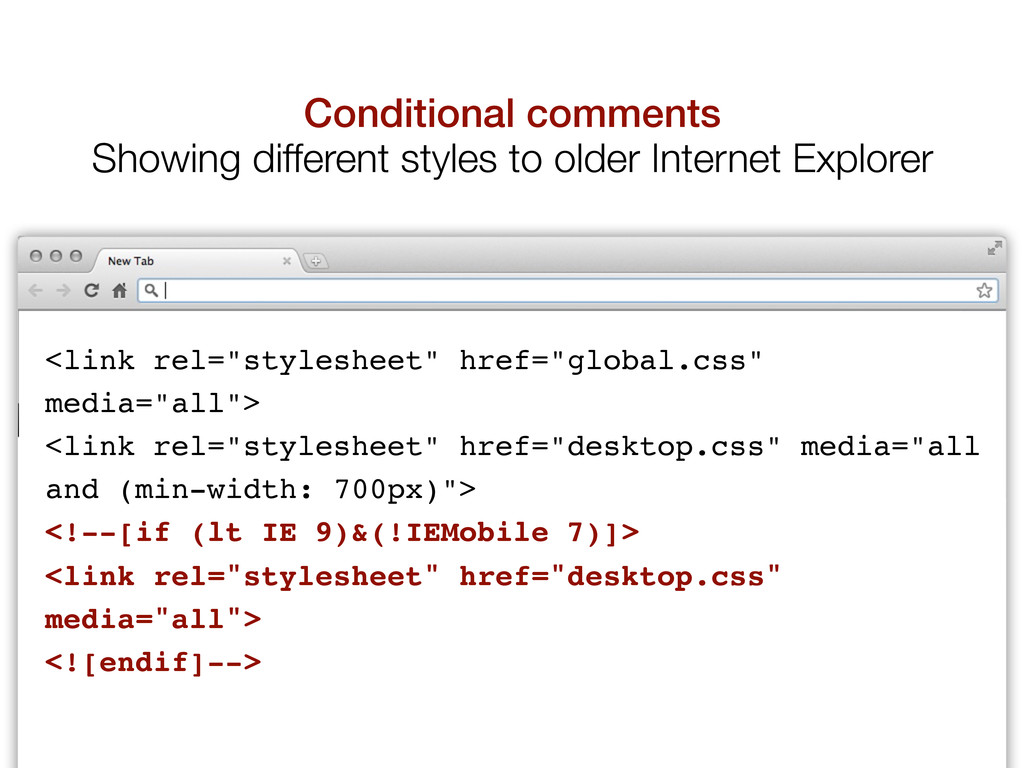
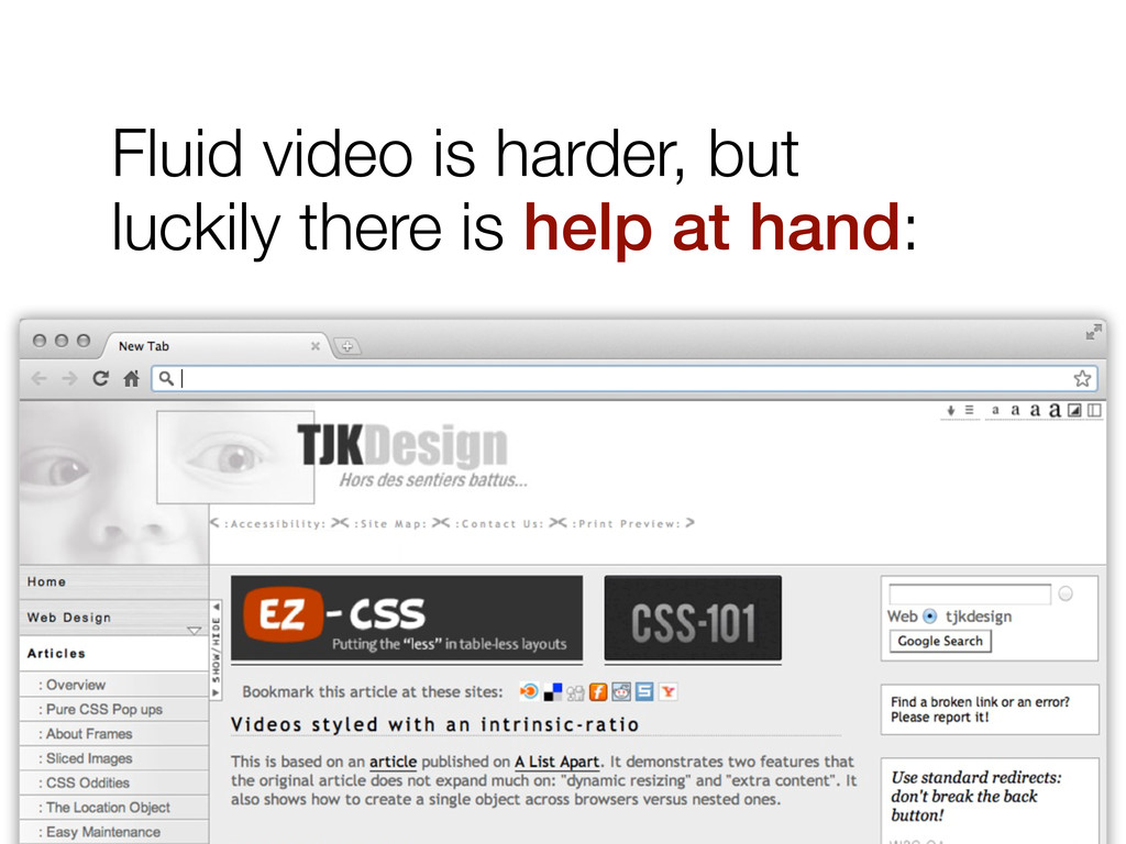
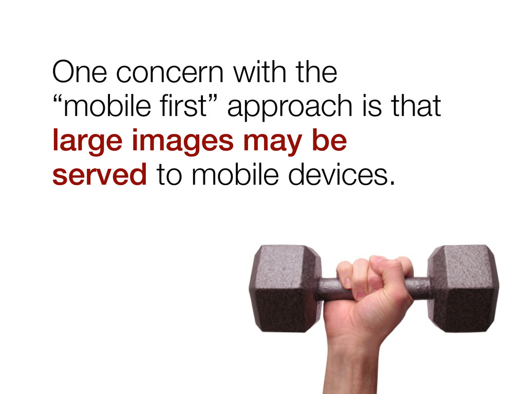
Responsive web design is an important part of web development today. These slides from a resent presentation explain what it is and how it can be achieved.
 y150saya
 shin1988
 yud0uhu
 ysknsid25
 nwiizo
 tamaiyutaro
 kanny
kanny
 muziyoshiz
 minorun365
 vtryo
vtryo
 pict3
pict3
 nomizone
 chriscoyier
 jeffersonlam
 akosma
 tmiket
 codingconduct
 tamaranovitovic
 axbom
axbom
 leimatthew05
 sergeychernyshev
 lindahogenes
 kimpetersen
 uxyall