Upgrade to Pro
— share decks privately, control downloads, hide ads and more …
Speaker Deck
Features
Speaker Deck
PRO
Sign in
Sign up for free
Search
Search
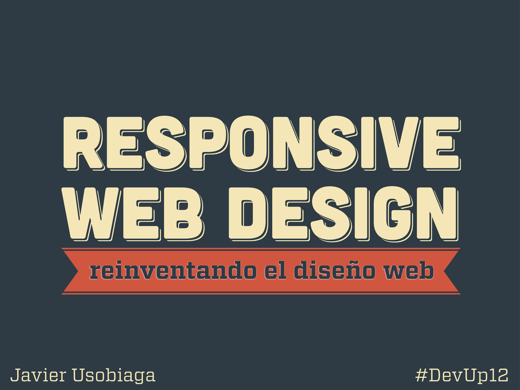
Responsive Web Design - Reinventando la web
Search
Swwweet
April 27, 2012
Technology
4.7k
15
Share
Responsive Web Design - Reinventando la web
Presentación de Javier Usobiaga en el Ideateca HTML5 DevUp 2012.
Swwweet
April 27, 2012
More Decks by Swwweet
See All by Swwweet
Wonders from the Full Stack Fest website
swwweet
1
390
How to be the best web designer in the world.
swwweet
6
1.3k
Design for loading
swwweet
5
590
Mobile First: as difficult as doing things right
swwweet
225
10k
One Size Fits None
swwweet
12
920
One Size Fits None - From the Front 2013
swwweet
2
760
Responsively Responsive
swwweet
23
1.7k
La letra con píxel entra
swwweet
0
1.2k
The future of code
swwweet
4
660
Other Decks in Technology
See All in Technology
ITエンジニアを取り巻く環境とキャリアパス / A career path for Japanese IT engineers
takatama
4
1.8k
「気づいたら仕事が終わっている」バクラクAIエージェント本番運用の裏側 / layerx-bakuraku-aie2026
yuya4
6
3.1k
AI フレンドリーなエラー監視を TypeScript で実現する
shinyaigeek
2
200
AI時代の私の技術インプットとアウトプット術
tonkotsuboy_com
15
8.1k
React、まだ楽しくて草
uhyo
7
3.7k
Generative UI × A2UI で AI エージェントを作った話 AI-DLC も使ってみた!
kmiya84377
1
300
Claude Codeですべての日常業務を爆速化しよう!
minorun365
PRO
17
16k
組織の中で自分を経営する技術
shoota
0
230
もりもり新機能を一挙紹介! AgentCoreに入門して、AWS上にAIエージェントを構築しよう
minorun365
PRO
6
610
大学生が本気でDatabricksを活用してDiscordサークルをデータ駆動させてみた
phantomjuju
1
310
サプライチェーンセキュリティの空白地帯 - 信頼できる”依存性”の未来を考える
rung
PRO
2
610
関西に縁あるMicrosoft MVPsが語るCopilotの未来
kasada
0
950
Featured
See All Featured
Amusing Abliteration
ianozsvald
1
190
Redefining SEO in the New Era of Traffic Generation
szymonslowik
1
320
Bootstrapping a Software Product
garrettdimon
PRO
307
120k
The Illustrated Guide to Node.js - THAT Conference 2024
reverentgeek
1
370
XXLCSS - How to scale CSS and keep your sanity
sugarenia
250
1.3M
Ruling the World: When Life Gets Gamed
codingconduct
0
240
Ecommerce SEO: The Keys for Success Now & Beyond - #SERPConf2024
aleyda
1
2k
We Are The Robots
honzajavorek
0
240
Dominate Local Search Results - an insider guide to GBP, reviews, and Local SEO
greggifford
PRO
0
180
Building AI with AI
inesmontani
PRO
1
1k
Optimising Largest Contentful Paint
csswizardry
37
3.7k
The Impact of AI in SEO - AI Overviews June 2024 Edition
aleyda
5
1.1k
Transcript
RESPoNSIVE WEB DESIGN RESPoNSIVE WEB DESIGN RESPoNSIVE WEB DESIGN reinventando
el diseño web Javier Usobiaga #DevUp12
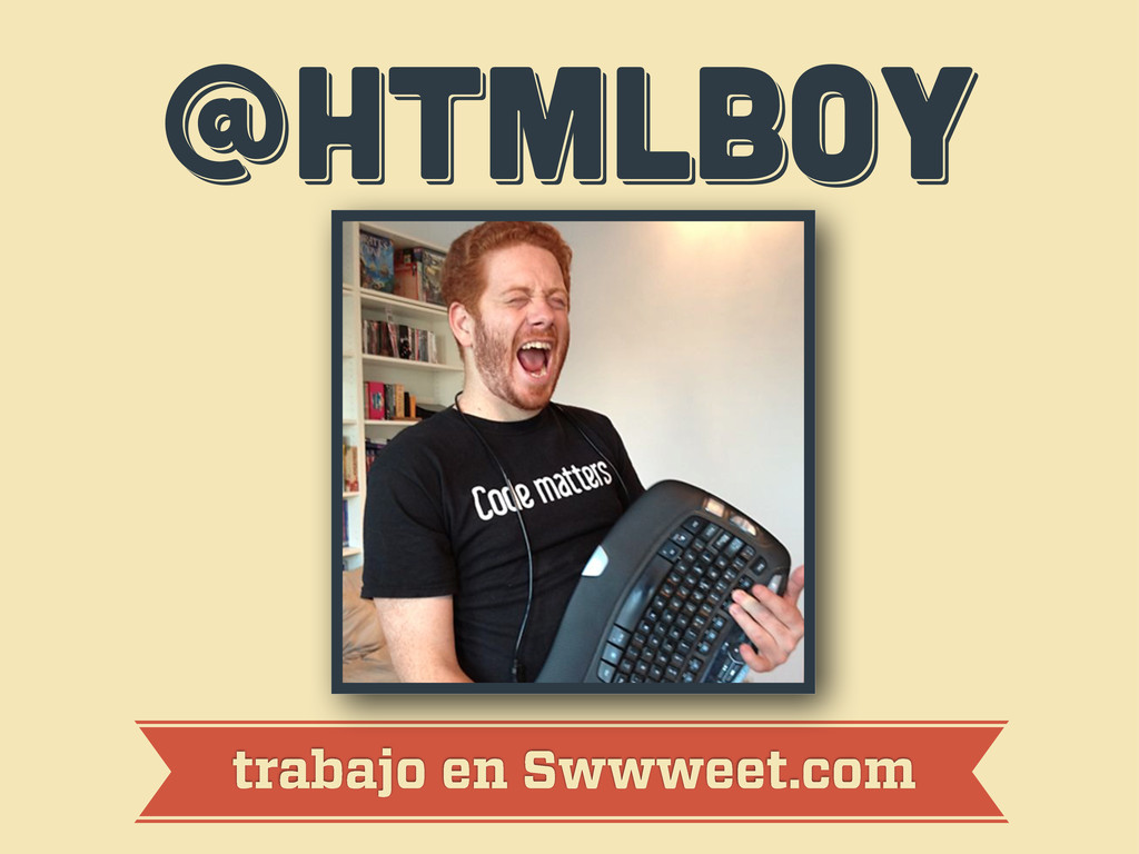
@htmlboy @htmlboy @htmlboy trabajo en Swwweet.com
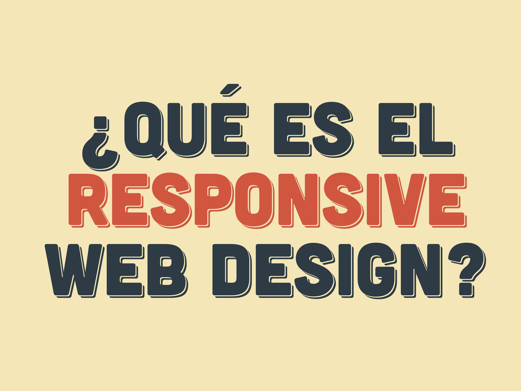
¿Qué es el responsive web design? ¿Qué es el responsive
web design? ¿Qué es el respoNsive web design?
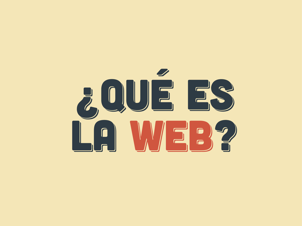
¿Qué es LA web? ¿Qué es LA web? ¿Qué es
LA web?
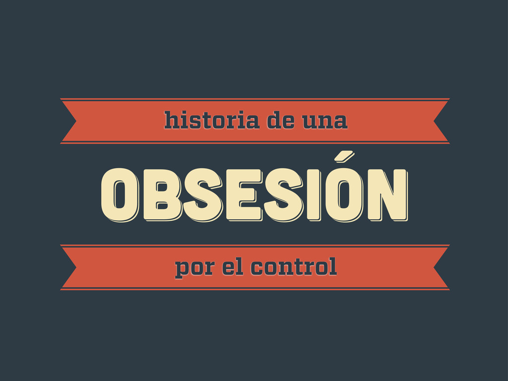
obsesión obsesión historia de una obsesión por el control
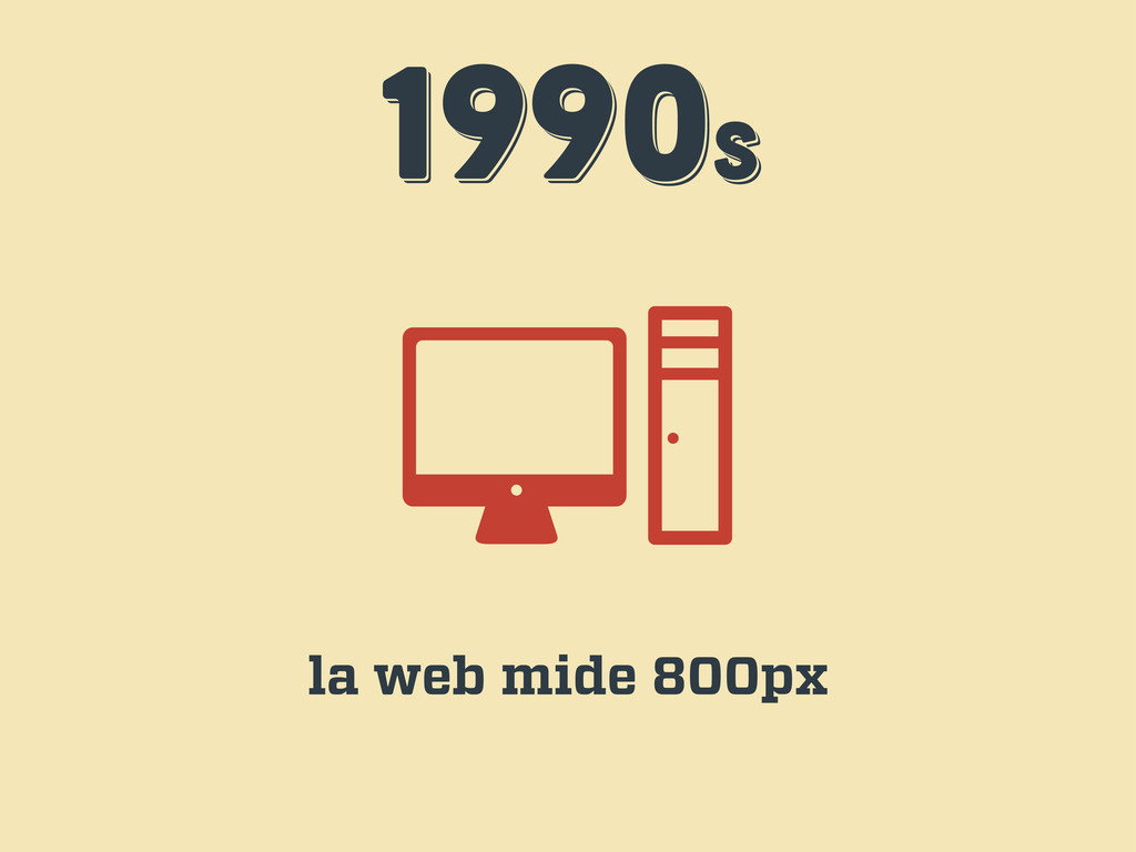
1990s 1990s 1990s la web mide 800px
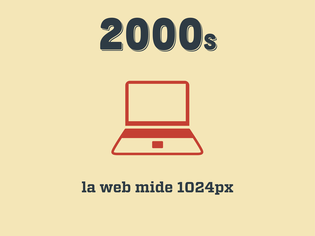
2000s 2000s 2000s la web mide 1024px
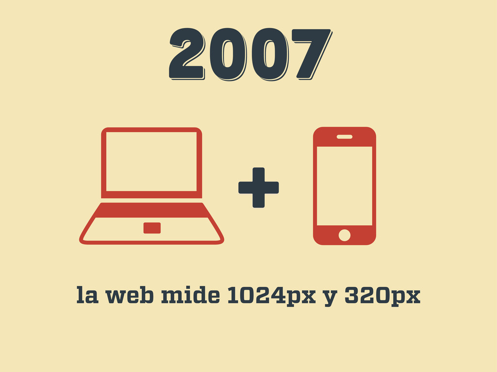
2007 2007 2007 + la web mide 1024px y 320px
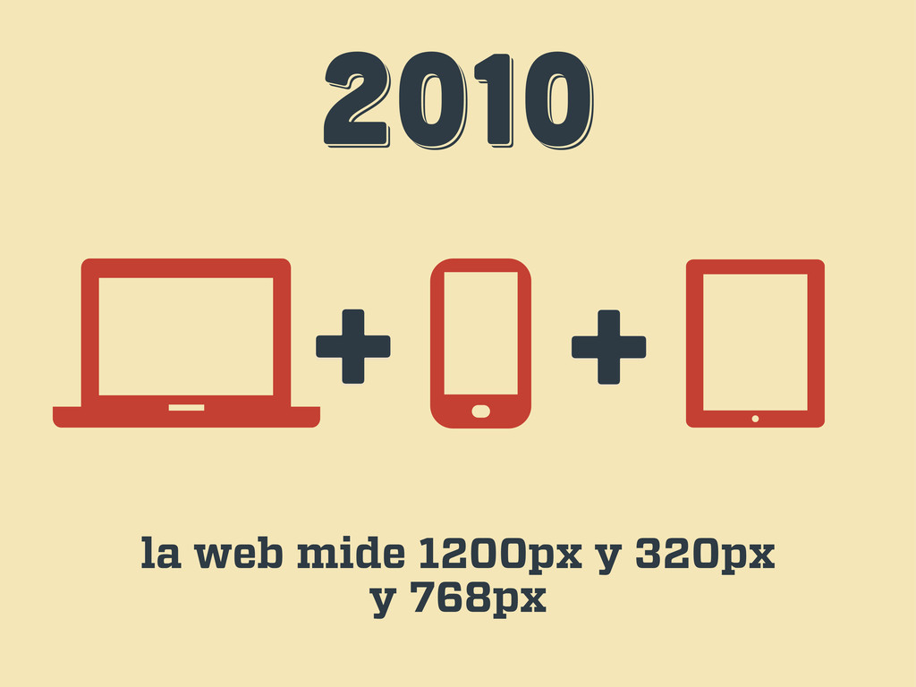
2010 2010 2010 + + la web mide 1200px y
320px y 768px
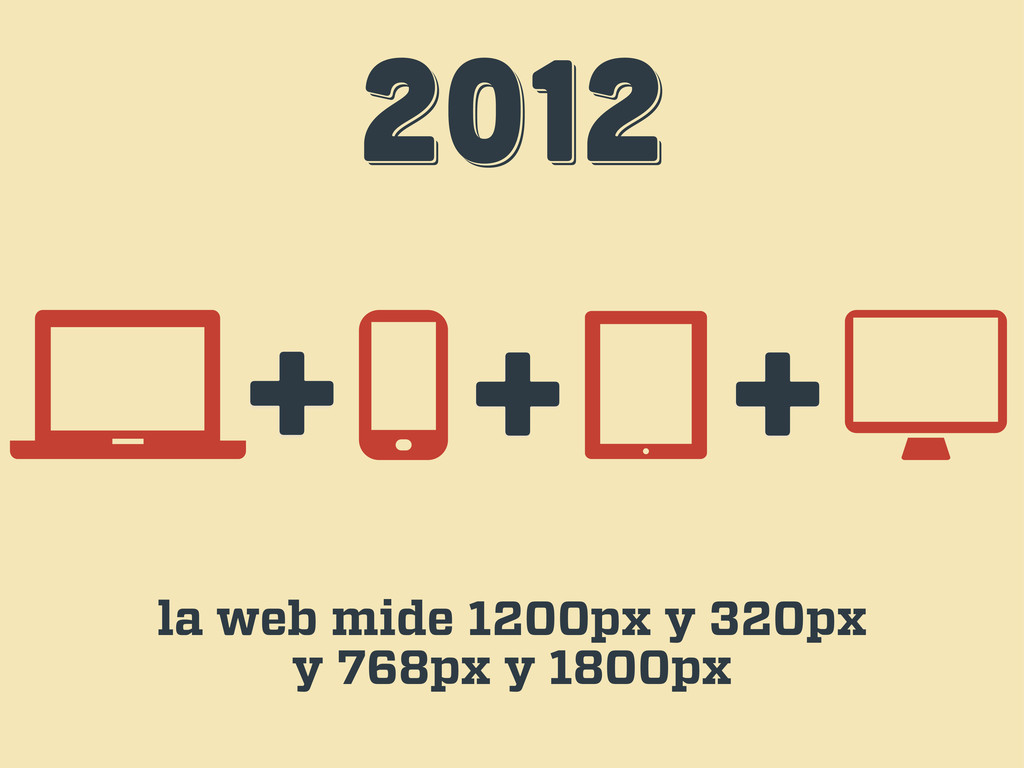
2012 2012 2012 + + la web mide 1200px y
320px y 768px y 1800px +
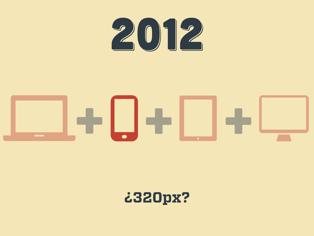
2012 2012 2012 + + ¿320px? +
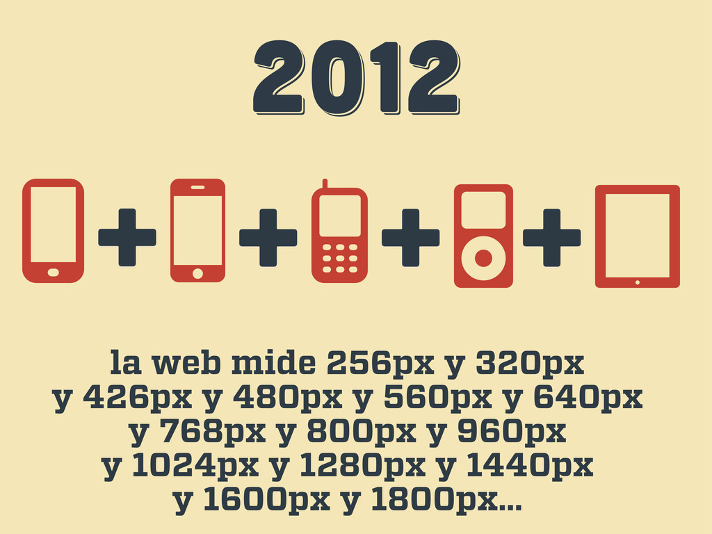
2012 2012 2012 la web mide 256px y 320px y
426px y 480px y 560px y 640px y 768px y 800px y 960px y 1024px y 1280px y 1440px y 1600px y 1800px… + + + +
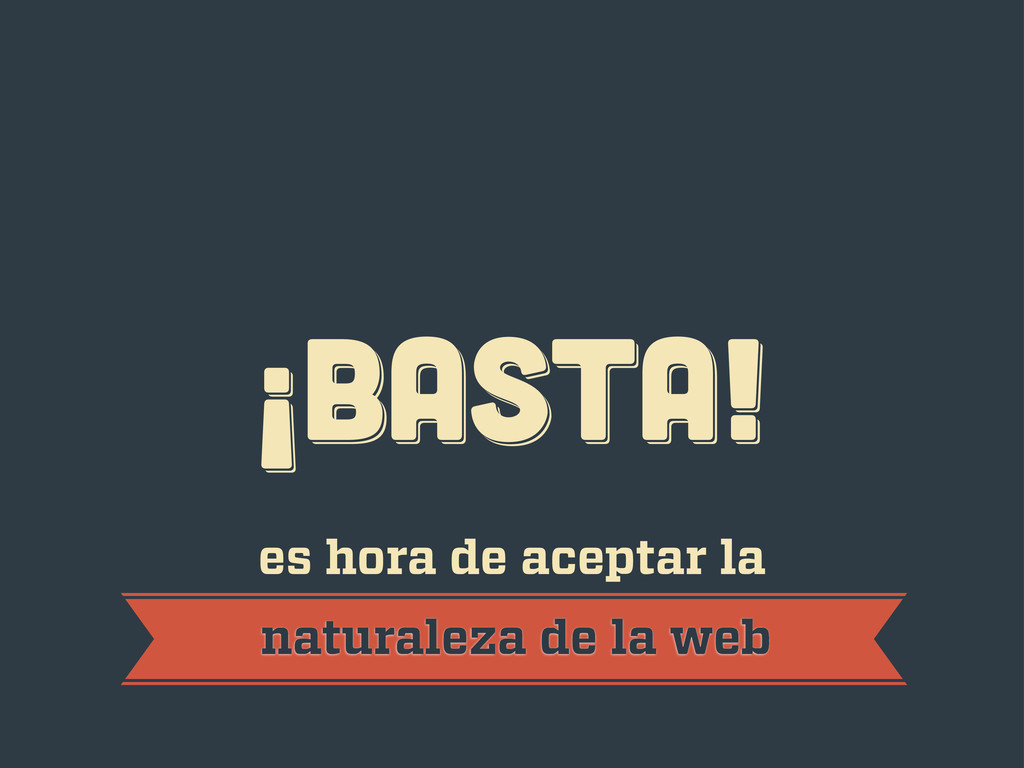
¡BASTA! ¡BASTA! ¡BASTA! es hora de aceptar la naturaleza de
la web
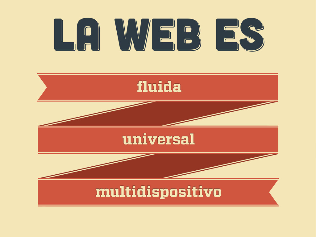
LA WEB ES LA WEB ES LA WEB ES fluida
universal multidispositivo
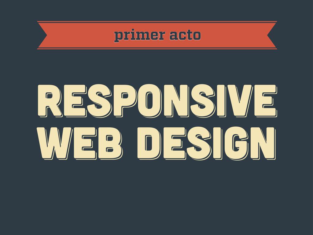
primer acto RESPoNSIVE WEB DESIGN RESPoNSIVE WEB DESIGN RESPoNSIVE WEB
DESIGN
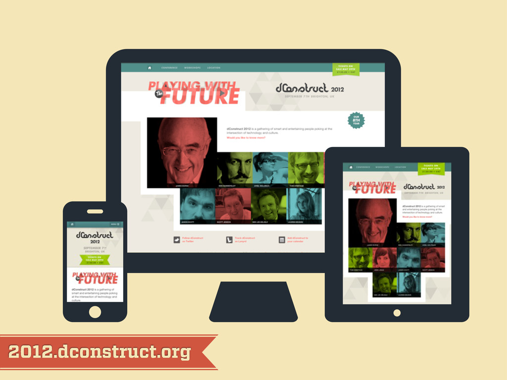
2012.dconstruct.org
mediaqueri.es
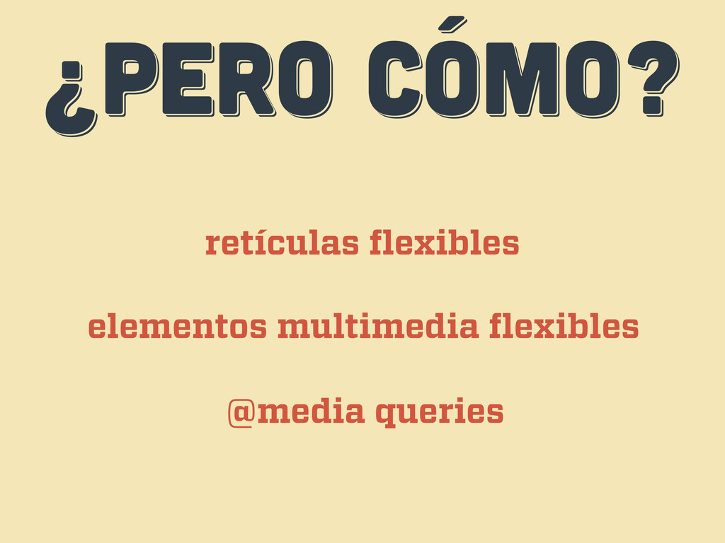
¿PERO CÓMO? ¿PERO CÓMO? ¿PERO CÓMO? retículas flexibles elementos multimedia
flexibles @media queries
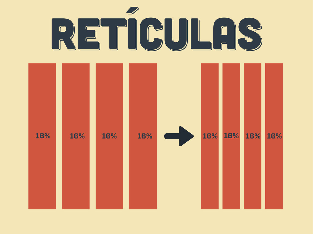
RETÍCULAS RETÍCULAS RETÍCULAS 16% 16% 16% 16% 16% 16% 16%
16%
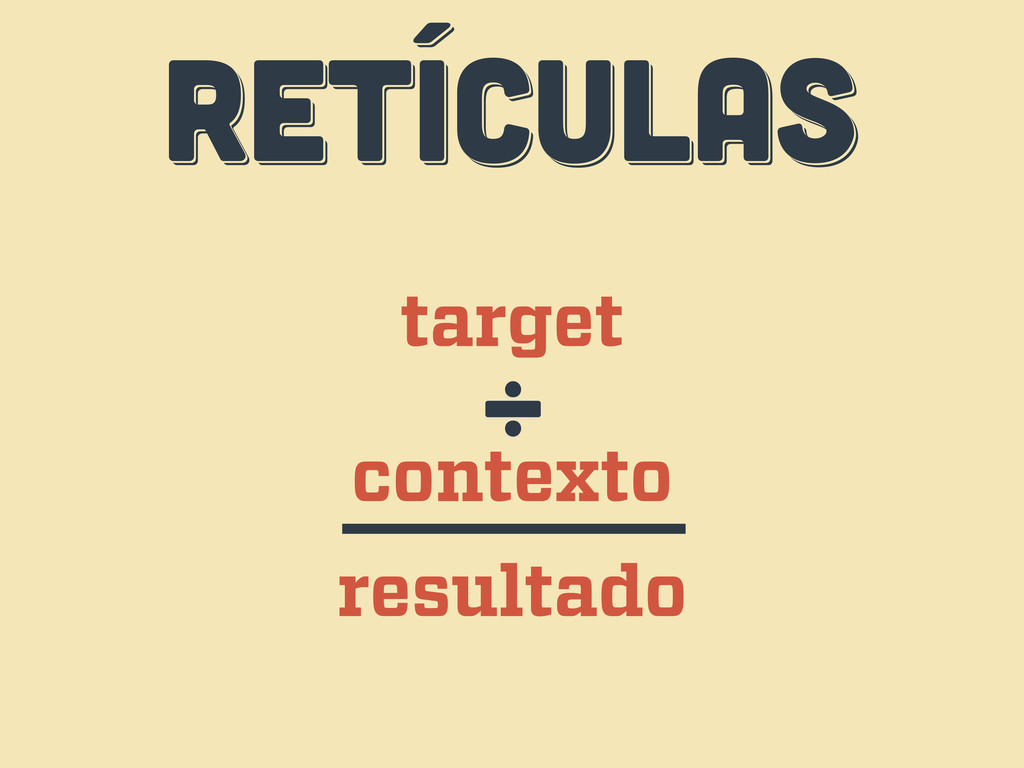
RETÍCULAS RETÍCULAS RETÍCULAS target contexto ÷ resultado
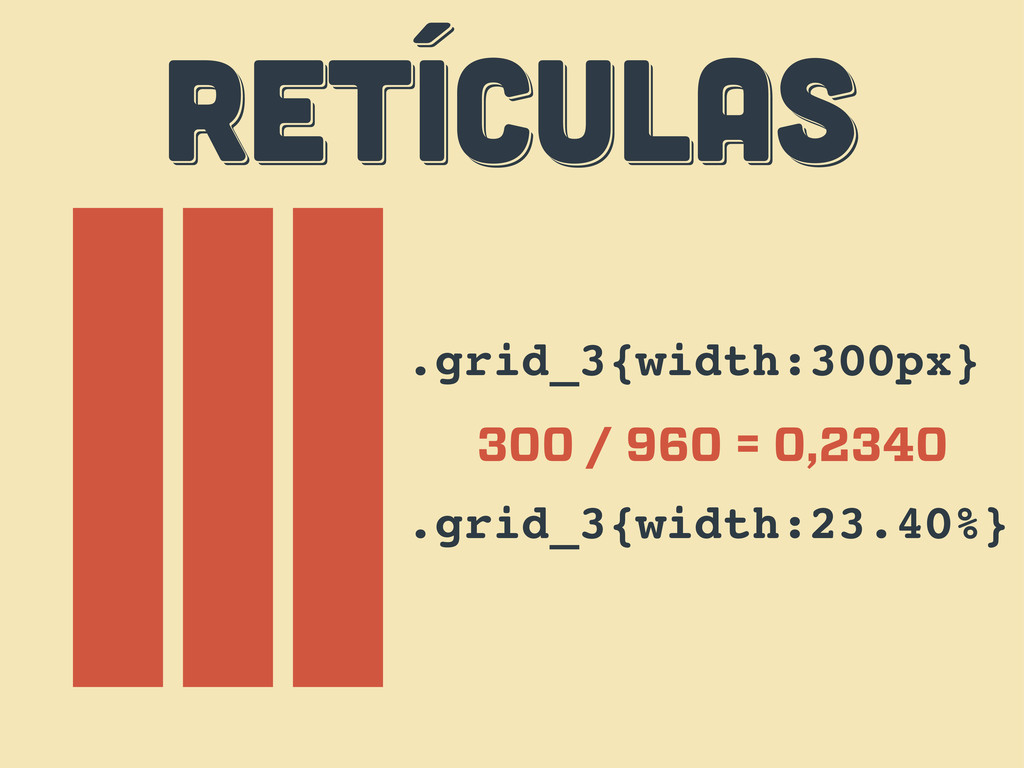
RETÍCULAS RETÍCULAS RETÍCULAS .grid_3{width:300px} 300 / 960 = 0,2340 .grid_3{width:23.40%}
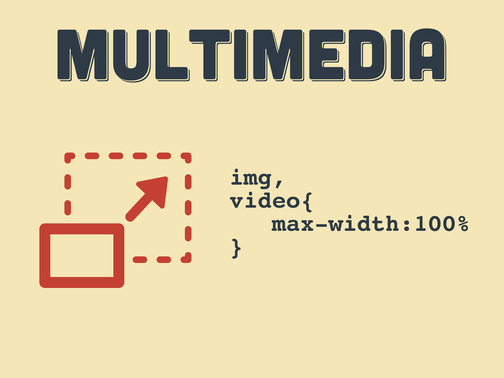
MULTIMEDIA MULTIMEDIA MULTIMEDIA img, video{ max-width:100% }
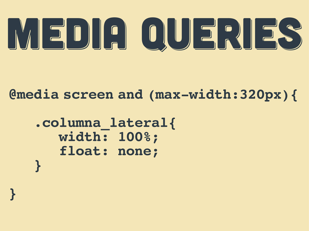
MEDIA QUERIES MEDIA QUERIES MEDIA QUERIES @media screen and (max-width:320px){
.columna_lateral{ width: 100%; float: none; } }
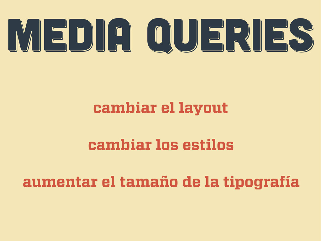
MEDIA QUERIES MEDIA QUERIES MEDIA QUERIES cambiar el layout cambiar
los estilos aumentar el tamaño de la tipografía
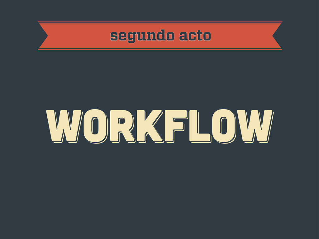
workflow workflow workflow segundo acto
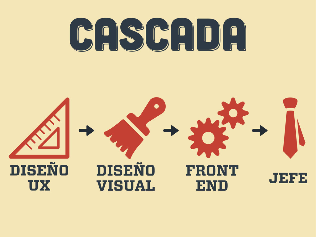
CASCADA CASCADA CASCADA DISEÑO UX DISEÑO VISUAL FRONT END JEFE
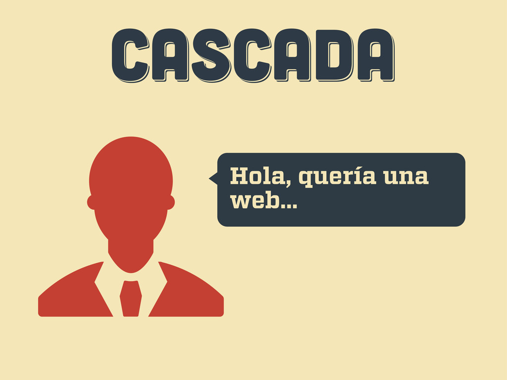
CASCADA CASCADA CASCADA Hola, quería una web...
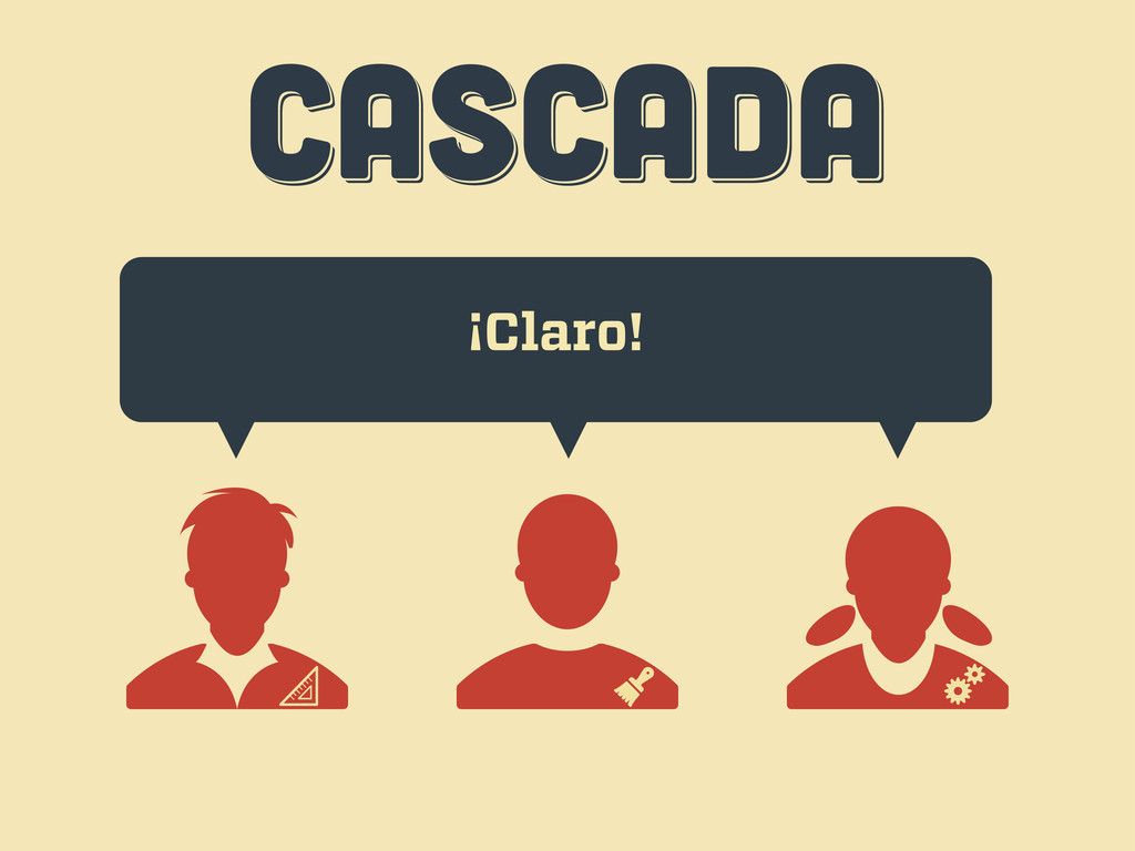
CASCADA CASCADA CASCADA ¡Claro!
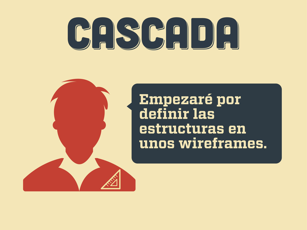
CASCADA CASCADA CASCADA Empezaré por definir las estructuras en unos
wireframes.
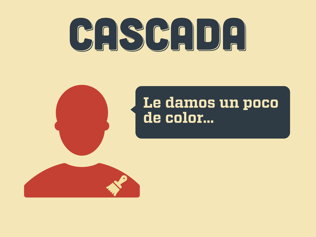
CASCADA CASCADA CASCADA Le damos un poco de color...
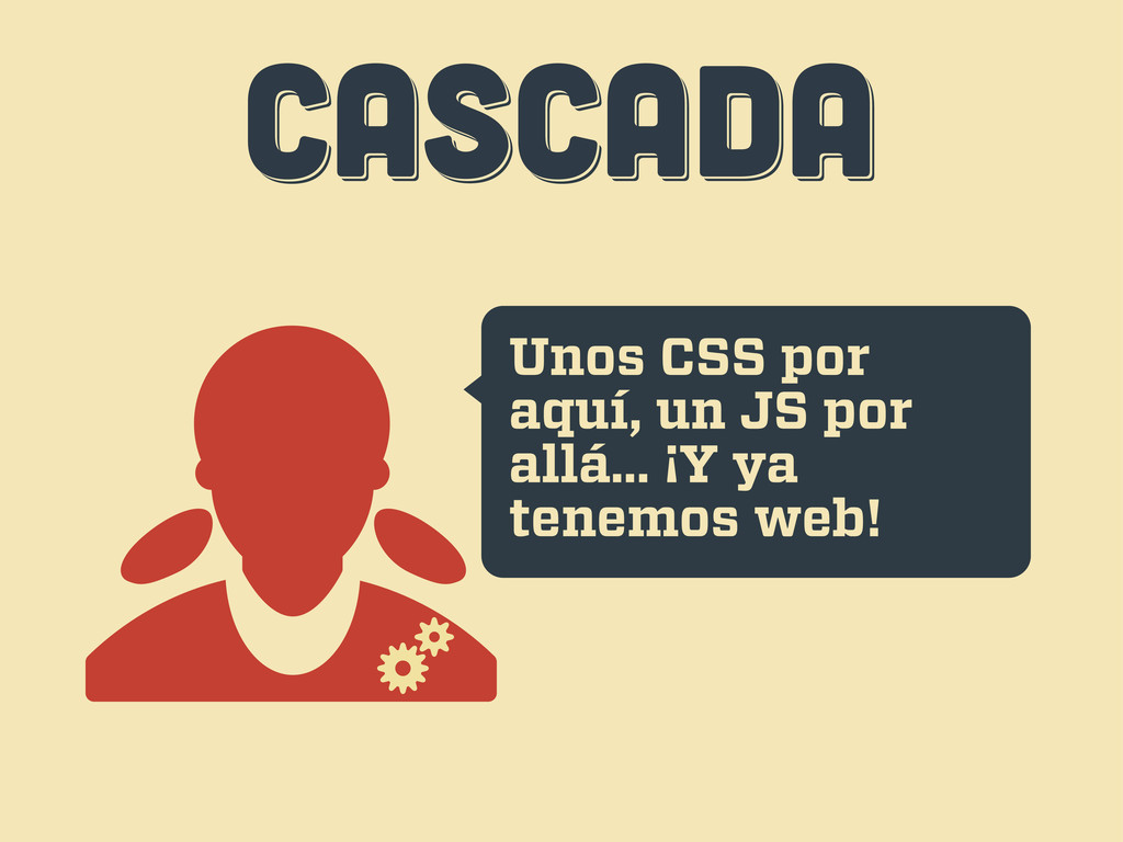
CASCADA CASCADA CASCADA Unos CSS por aquí, un JS por
allá... ¡Y ya tenemos web!
CASCADA CASCADA CASCADA Uh... esto...
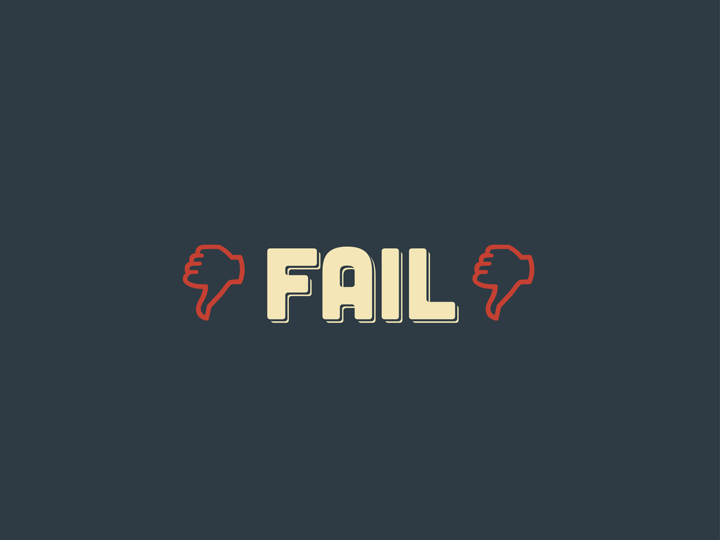
FAIL fail Fail
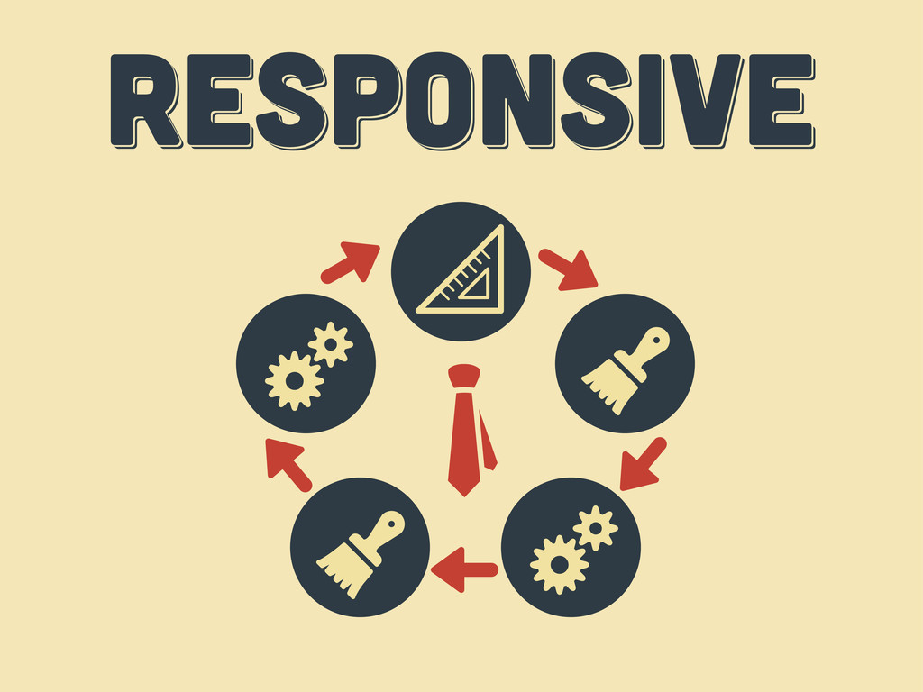
responsive responsive Responsive
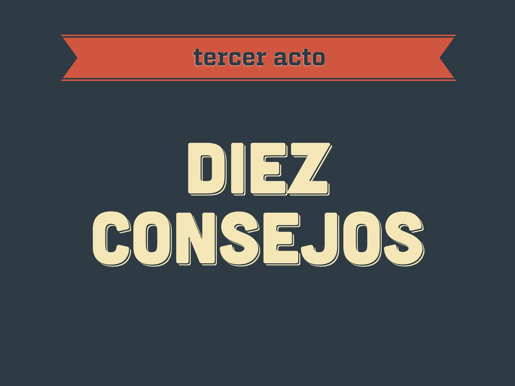
diez consejos diez consejos diez consejos tercer acto
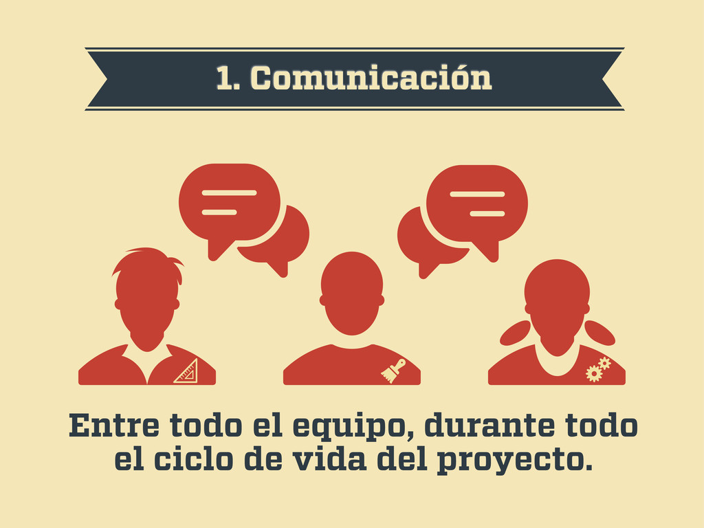
1. Comunicación Entre todo el equipo, durante todo el ciclo
de vida del proyecto.
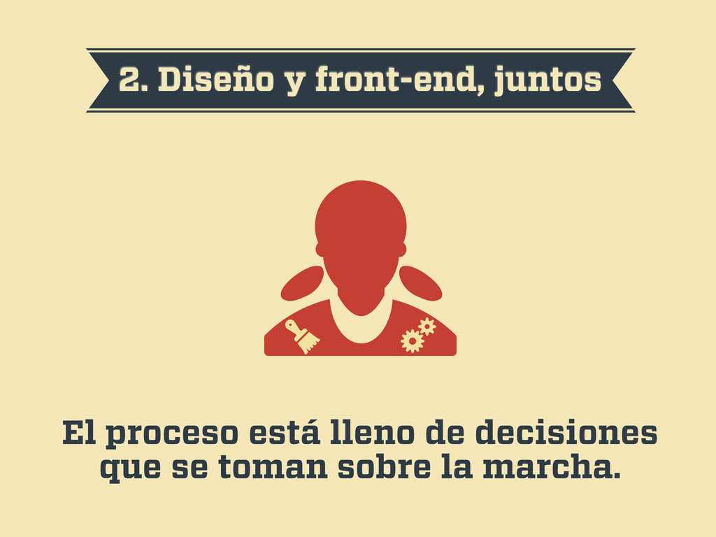
2. Diseño y front-end, juntos El proceso está lleno de
decisiones que se toman sobre la marcha.
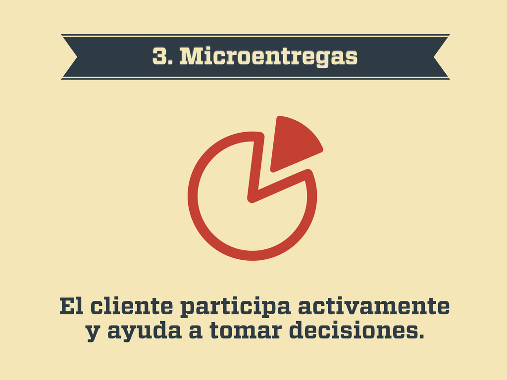
3. Microentregas El cliente participa activamente y ayuda a tomar
decisiones.
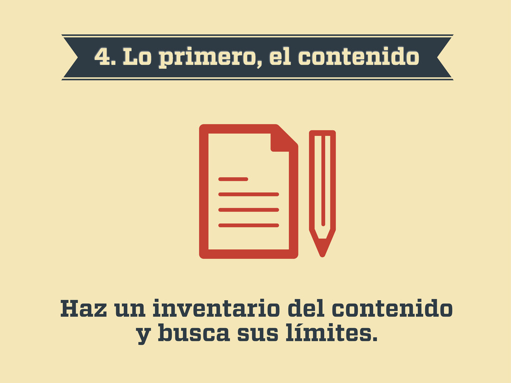
4. Lo primero, el contenido Haz un inventario del contenido
y busca sus límites.
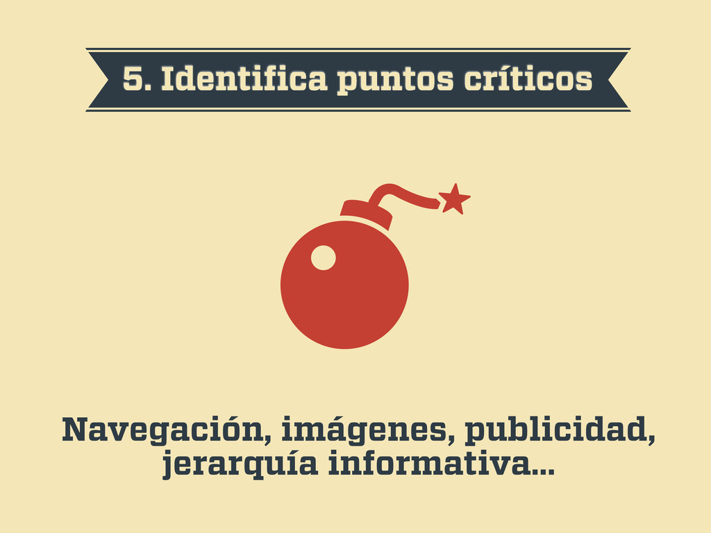
5. Identifica puntos críticos Navegación, imágenes, publicidad, jerarquía informativa…
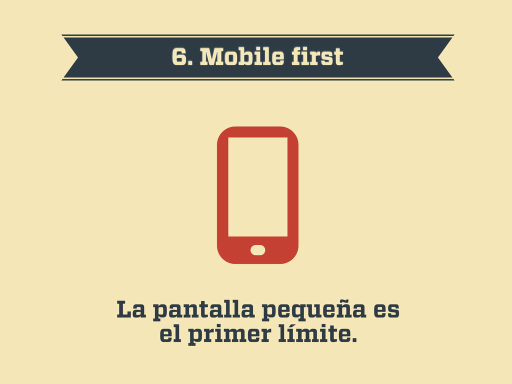
6. Mobile first La pantalla pequeña es el primer límite.
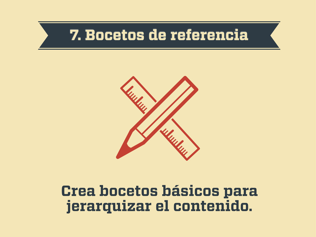
7. Bocetos de referencia Crea bocetos básicos para jerarquizar el
contenido.
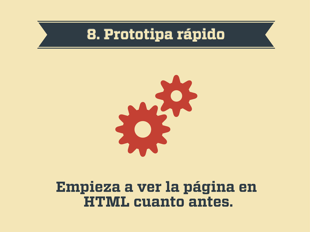
8. Prototipa rápido Empieza a ver la página en HTML
cuanto antes.
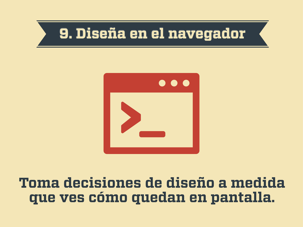
9. Diseña en el navegador Toma decisiones de diseño a
medida que ves cómo quedan en pantalla.
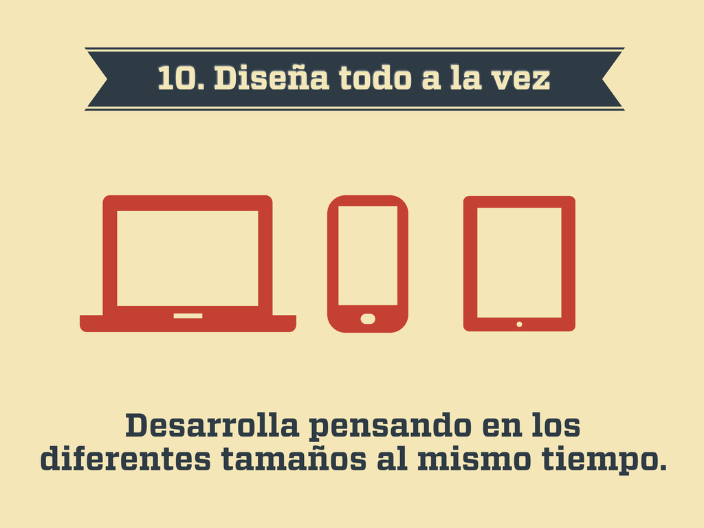
10. Diseña todo a la vez Desarrolla pensando en los
diferentes tamaños al mismo tiempo.
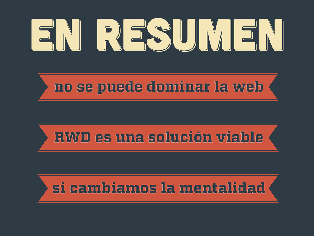
EN RESUMEN EN RESUMEN EN RESUMEN no se puede dominar
la web RWD es una solución viable si cambiamos la mentalidad
¡gracias! ¡gracias! ¡gracias! Javier Usobiaga · http://Swwweet.com · @htmlboy
 swwweet
 takatama
 yuya4
yuya4
 shinyaigeek
 tonkotsuboy_com
 uhyo
uhyo
 kmiya84377
 minorun365
 shoota
 phantomjuju
 rung
rung
 kasada
 ianozsvald
 szymonslowik
 garrettdimon
 reverentgeek
 sugarenia
 codingconduct
 aleyda
 honzajavorek
 greggifford
 inesmontani
 csswizardry