Upgrade to Pro
— share decks privately, control downloads, hide ads and more …
Speaker Deck
Features
Speaker Deck
PRO
Sign in
Sign up for free
Search
Search
Can Media Queries Save Us All?
Search
Sponsored
·
Your Podcast. Everywhere. Effortlessly.
Share. Educate. Inspire. Entertain. You do you. We'll handle the rest.
→
Tim Kadlec
September 22, 2011
Programming
360
2
Share
Embed
Copy iframe code
Copy JS code
Copy link
Start on current slide
Can Media Queries Save Us All?
Presented May 27, 2011 at WebVisions in Portland, OR.
Tim Kadlec
September 22, 2011
More Decks by Tim Kadlec
See All by Tim Kadlec
The State of Node.js Security, at Node.js Interactive 2017
tkadlec
1
500
JavaScript Exposed at Midwest JS
tkadlec
3
330
Focusing On What Matters, at Fluent, 2017
tkadlec
0
180
Once More, With Feeling at Code 2016 in Sydney
tkadlec
1
730
Once More, With Feeling
tkadlec
9
1.8k
Mobile Image Processing at London Web Perf Meetup, 2016
tkadlec
1
250
Better By Proxy at Velocity NY 2015
tkadlec
3
720
Getting Started with Performance Budgets at HighEdWeb Technical Academy, 2015
tkadlec
9
1.3k
Reaching Everyone, Fast at From the Front, 2015
tkadlec
8
7.5k
Other Decks in Programming
See All in Programming
どこまでゆるくて許されるのか
tk3fftk
0
460
例外の正しい扱い方 そのエラー try-catchして大丈夫?
jinwatanabe
0
350
PHPだって関数型したい 〜できること、できないこと〜 / fp-in-php
jsoizo
0
170
これからAgentCoreを触る方へ トレンドはGatewayです
har1101
6
480
Language Server 使ってる? 〜VSCode と Zed の場合〜 / Are you using a Language Server? ~For VS Code and Zed~
handlename
0
840
TypeScript+Orvalで実現する型安全かつ堅牢でスケーラブルなマルチチャネル通知基盤 / TSKaigi Night talks ~after conference~
d0riven
0
390
Embedded SREと共に達成した会員管理システムのAWS移行 - SRE NEXT 2026 ランチスポンサーセッション
niftycorp
PRO
0
2.1k
The Bowling Game - From Imperative to Functional Programming - Part 1
philipschwarz
PRO
0
300
1B+ /day規模のログを管理する技術
broadleaf
0
130
Generative UI & AI-Assistants for Your Angular Solutions
manfredsteyer
PRO
0
150
ローカルLLMでどこまでコードが書けるか -拡張版 / How much code can be written on a local LLM Extended
kishida
12
4.7k
LaravelLive Japan の裏方のすべて — 第188回 PHP勉強会@東京 (2026-06-24)
suguruooki
2
150
Featured
See All Featured
How to Build an AI Search Optimization Roadmap - Criteria and Steps to Take #SEOIRL
aleyda
1
2.1k
Crafting Experiences
bethany
1
210
Marketing Yourself as an Engineer | Alaka | Gurzu
gurzu
0
260
Designing for humans not robots
tammielis
254
26k
The Myth of the Modular Monolith - Day 2 Keynote - Rails World 2024
eileencodes
28
3.5k
Paper Plane
katiecoart
PRO
1
52k
From Legacy to Launchpad: Building Startup-Ready Communities
dugsong
0
260
Technical Leadership for Architectural Decision Making
baasie
3
440
The Art of Delivering Value - GDevCon NA Keynote
reverentgeek
16
2k
The Director’s Chair: Orchestrating AI for Truly Effective Learning
tmiket
1
210
Jess Joyce - The Pitfalls of Following Frameworks
techseoconnect
PRO
1
190
30 Presentation Tips
portentint
PRO
1
340
Transcript
http://flic.kr/p/6iMxyT Can Media Queries Save Us All? Presented by Tim
Kadlec - @tkadlec Friday, May 27, 2011
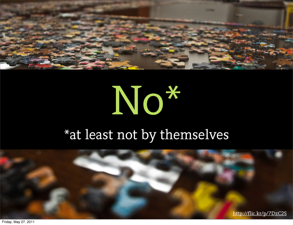
http://flic.kr/p/7DzC2S No* *at least not by themselves Friday, May 27,
2011
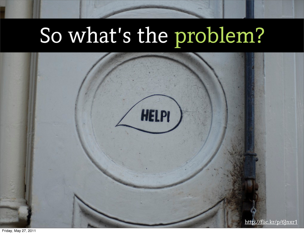
http://flic.kr/p/6Jnxr1 So what’s the problem? Friday, May 27, 2011
http://flic.kr/p/7c8Nkq She is. Friday, May 27, 2011
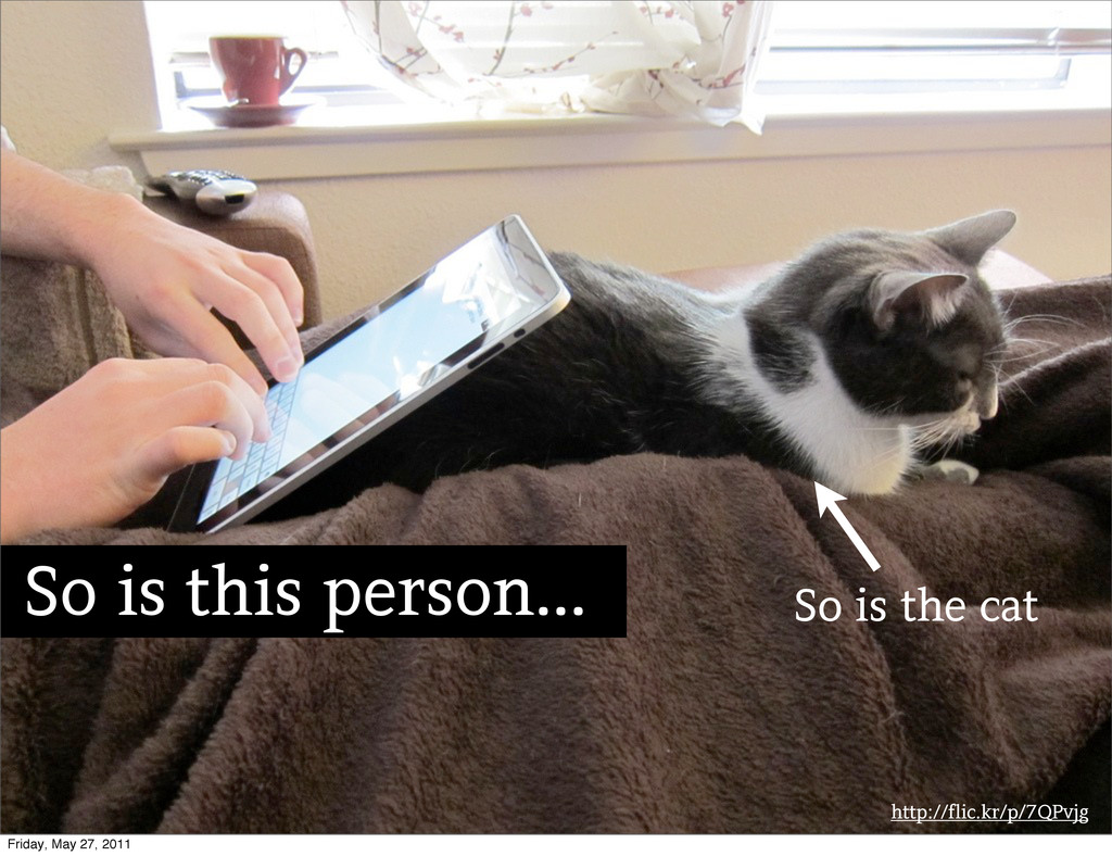
http://flic.kr/p/7QPvjg So is this person... So is the cat Friday,
May 27, 2011
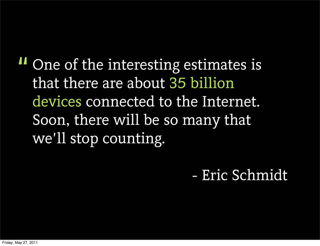
One of the interesting estimates is that there are about
35 billion devices connected to the Internet. Soon, there will be so many that we’ll stop counting. - Eric Schmidt “ Friday, May 27, 2011
http://flic.kr/p/8PGKvr Friday, May 27, 2011
http://flic.kr/p/coTdy Option #1: Ignore Friday, May 27, 2011
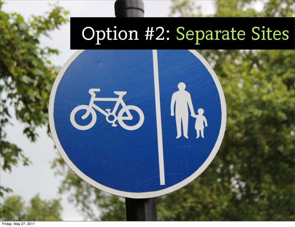
http://flic.kr/p/8rWoUd Option #2: Separate Sites Friday, May 27, 2011
http://flic.kr/p/9i3TMD Slight Detour... Friday, May 27, 2011
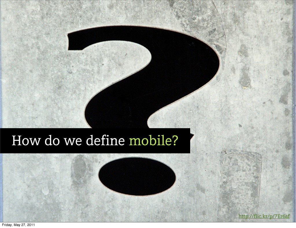
http://flic.kr/p/7Er6af How do we define mobile? Friday, May 27, 2011
Text Friday, May 27, 2011
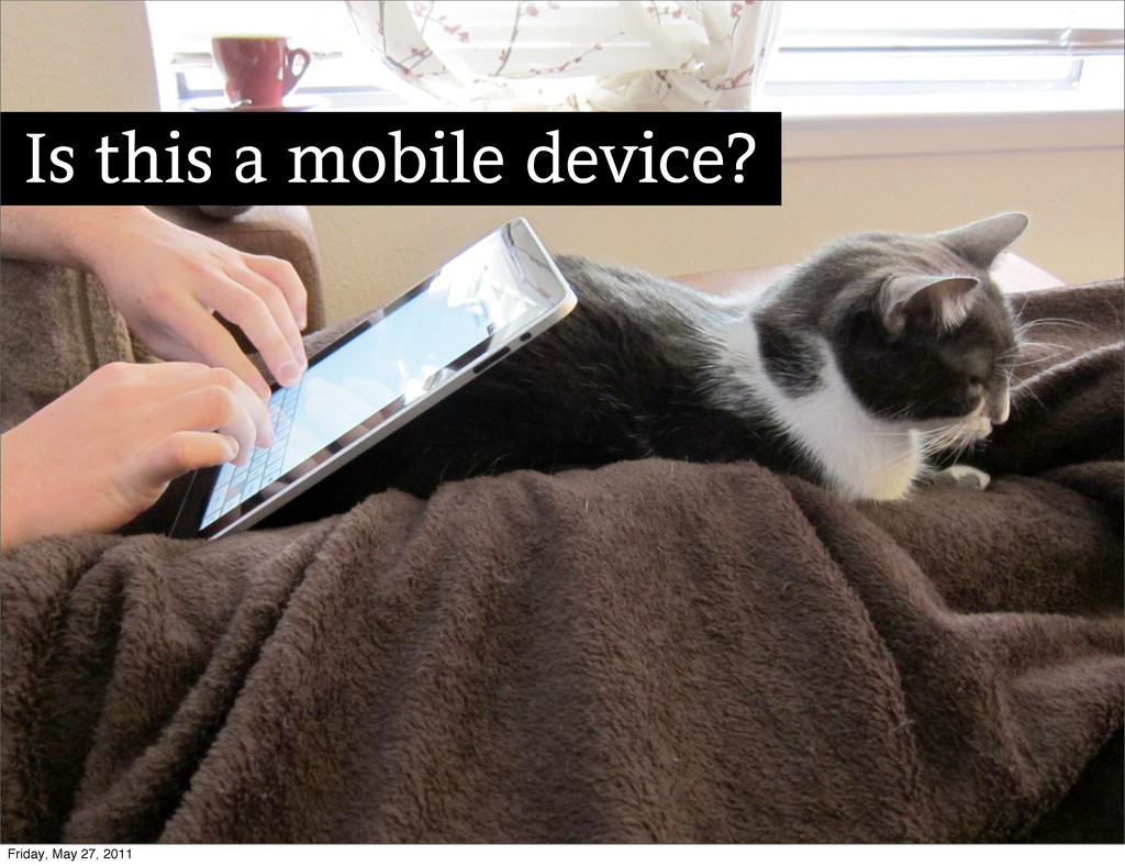
Is this a mobile device? Friday, May 27, 2011
Is this mobile use? Friday, May 27, 2011
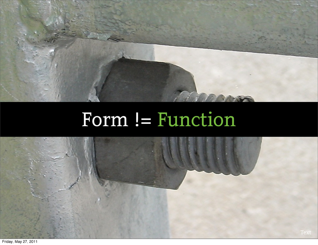
Text Form != Function Friday, May 27, 2011
Option #2: Separate Sites Friday, May 27, 2011
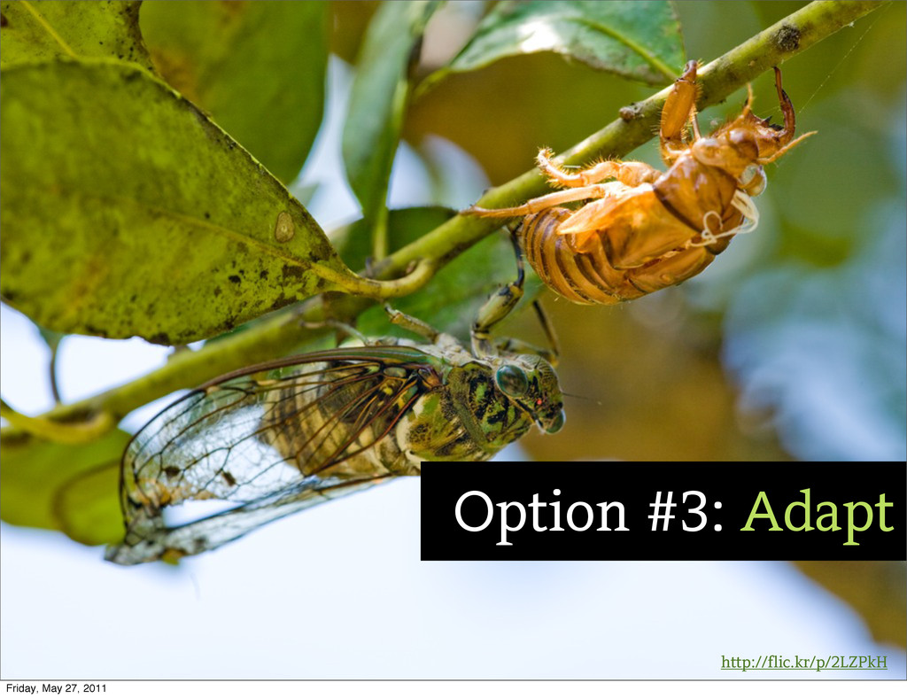
http://flic.kr/p/2LZPkH Option #3: Adapt Friday, May 27, 2011
Text http://www.alistapart.com/articles/responsive-web-design/ Friday, May 27, 2011
Friday, May 27, 2011
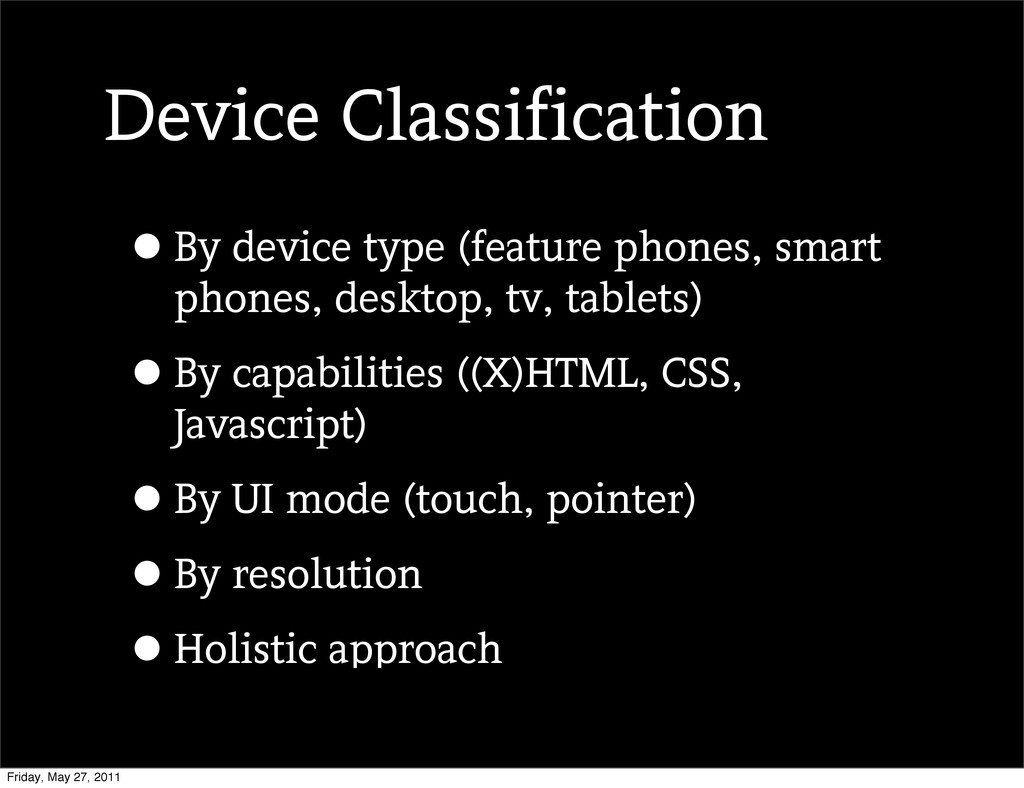
Device Classification •By device type (feature phones, smart phones, desktop,
tv, tablets) •By capabilities ((X)HTML, CSS, Javascript) •By UI mode (touch, pointer) •By resolution •Holistic approach Friday, May 27, 2011
http://flic.kr/p/99UEu4 Don’t Get Too Granular Friday, May 27, 2011
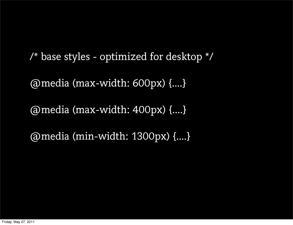
/* base styles - optimized for desktop */ @media (max-width:
600px) {....} @media (max-width: 400px) {....} @media (min-width: 1300px) {....} Friday, May 27, 2011
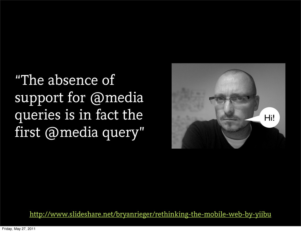
“The absence of support for @media queries is in fact
the first @media query” http://www.slideshare.net/bryanrieger/rethinking-the-mobile-web-by-yiibu Hi! Friday, May 27, 2011
Start with this Friday, May 27, 2011
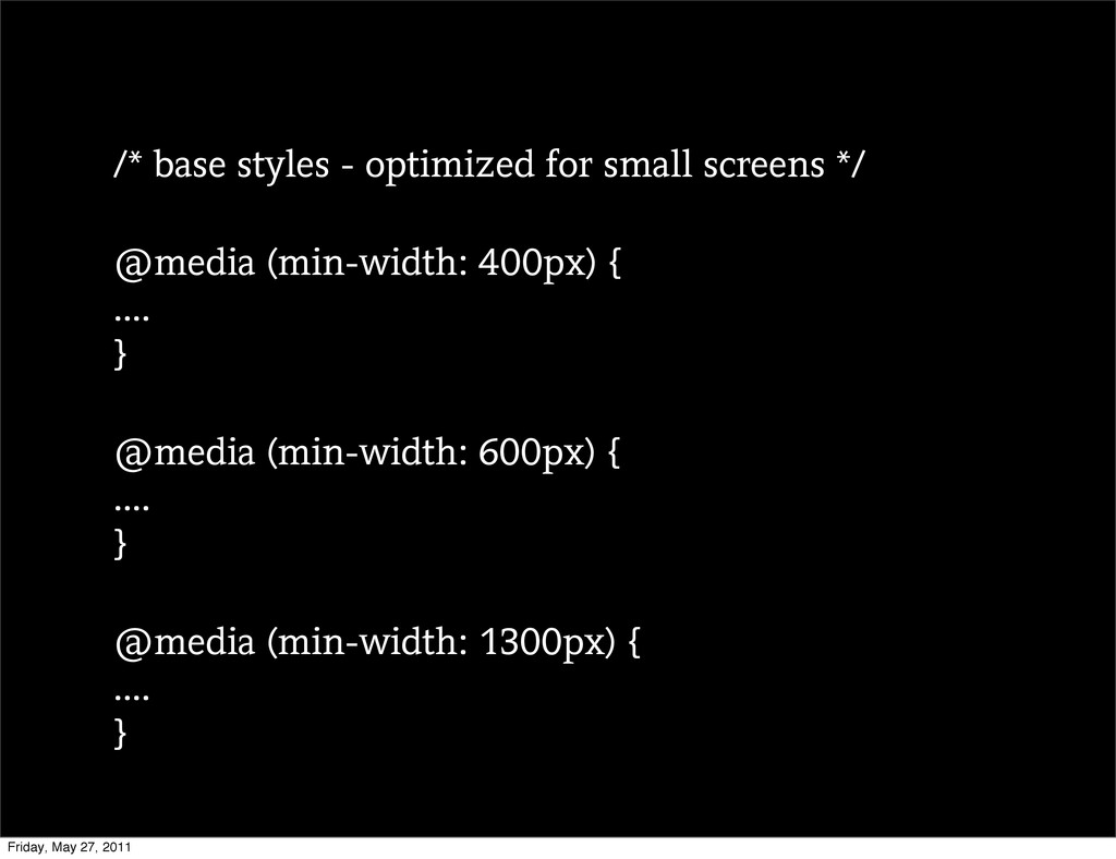
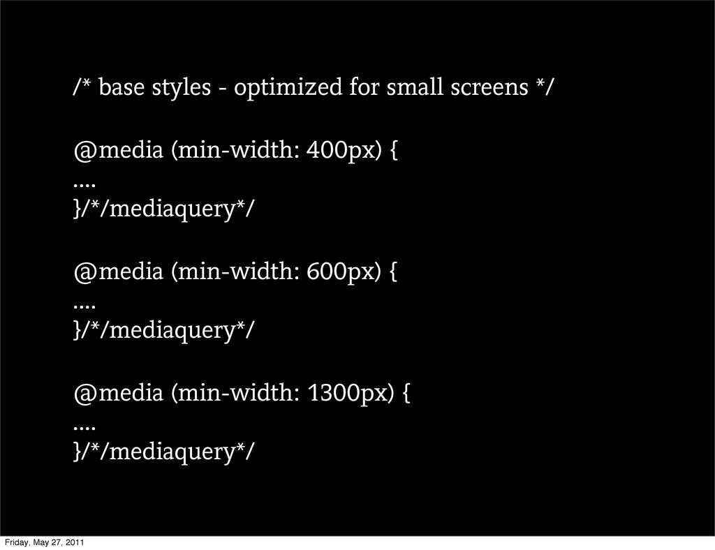
/* base styles - optimized for small screens */ @media
(min-width: 400px) { .... } @media (min-width: 600px) { .... } @media (min-width: 1300px) { .... } Friday, May 27, 2011
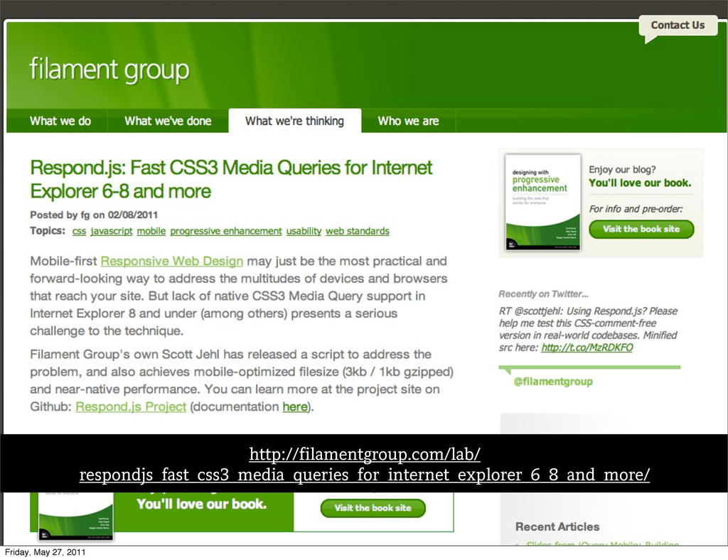
Text http://filamentgroup.com/lab/ respondjs_fast_css3_media_queries_for_internet_explorer_6_8_and_more/ Friday, May 27, 2011
/* base styles - optimized for small screens */ @media
(min-width: 400px) { .... }/*/mediaquery*/ @media (min-width: 600px) { .... }/*/mediaquery*/ @media (min-width: 1300px) { .... }/*/mediaquery*/ Friday, May 27, 2011
http://flic.kr/p/713QR9 Performance Friday, May 27, 2011
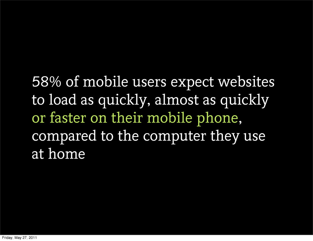
58% of mobile users expect websites to load as quickly,
almost as quickly or faster on their mobile phone, compared to the computer they use at home Friday, May 27, 2011
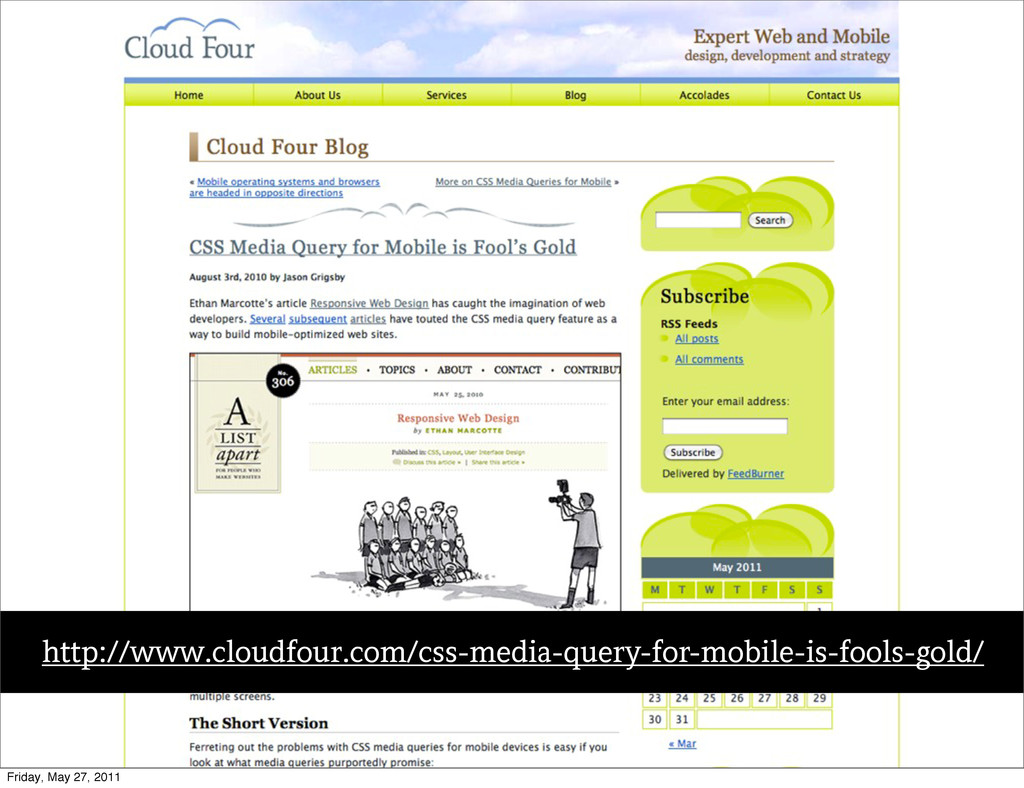
Text http://www.cloudfour.com/css-media-query-for-mobile-is-fools-gold/ Friday, May 27, 2011
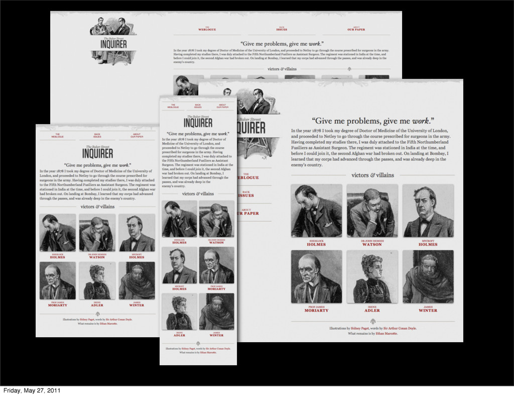
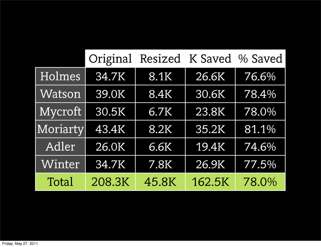
Original Resized K Saved % Saved Holmes Watson Mycroft Moriarty
Adler Winter 34.7K 8.1K 26.6K 76.6% 39.0K 8.4K 30.6K 78.4% 30.5K 6.7K 23.8K 78.0% 43.4K 8.2K 35.2K 81.1% 26.0K 6.6K 19.4K 74.6% 34.7K 7.8K 26.9K 77.5% Total 208.3K 45.8K 162.5K 78.0% Friday, May 27, 2011
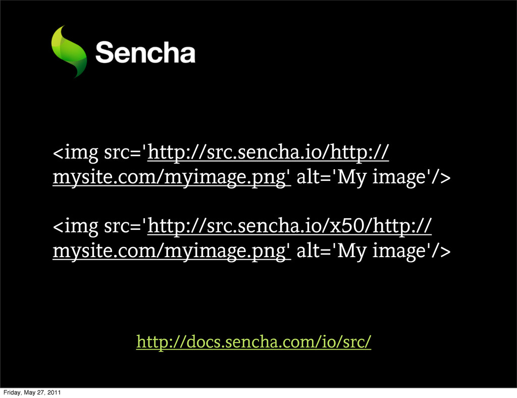
Responsive Images Friday, May 27, 2011
<img src='http://src.sencha.io/http:// mysite.com/myimage.png' alt='My image'/> <img src='http://src.sencha.io/x50/http:// mysite.com/myimage.png' alt='My image'/>
http://docs.sencha.com/io/src/ Friday, May 27, 2011
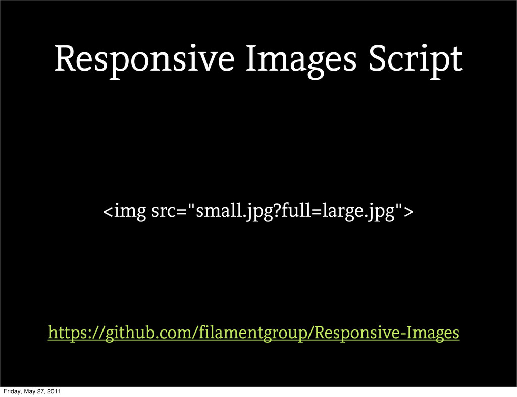
<img src="small.jpg?full=large.jpg"> https://github.com/filamentgroup/Responsive-Images Responsive Images Script Friday, May 27, 2011
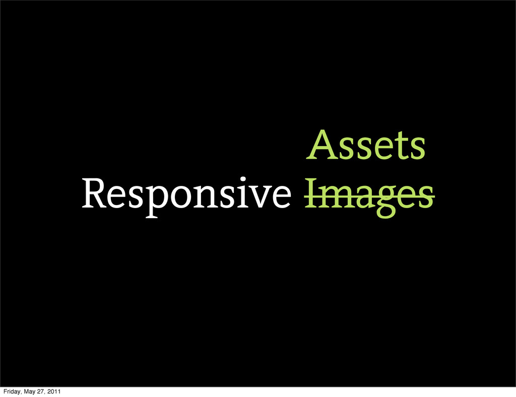
Responsive Images Assets Friday, May 27, 2011
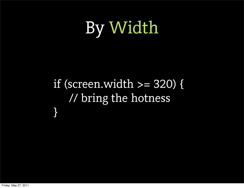
if (screen.width >= 320) { // bring the hotness }
By Width Friday, May 27, 2011
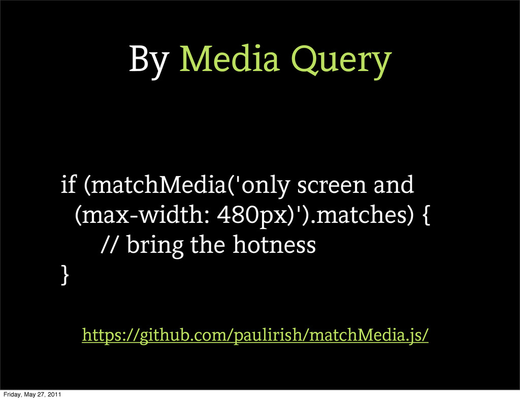
if (matchMedia('only screen and (max-width: 480px)').matches) { // bring the
hotness } https://github.com/paulirish/matchMedia.js/ By Media Query Friday, May 27, 2011
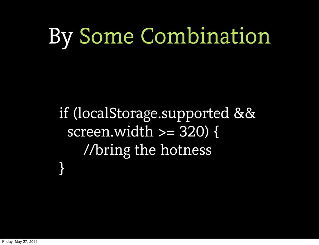
if (localStorage.supported && screen.width >= 320) { //bring the hotness
} By Some Combination Friday, May 27, 2011
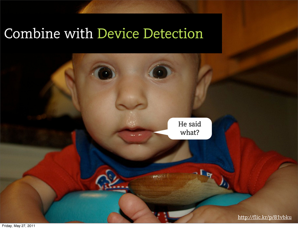
http://flic.kr/p/81vbku Combine with Device Detection He said what? Friday, May
27, 2011
http://flic.kr/p/3HMbN Friday, May 27, 2011
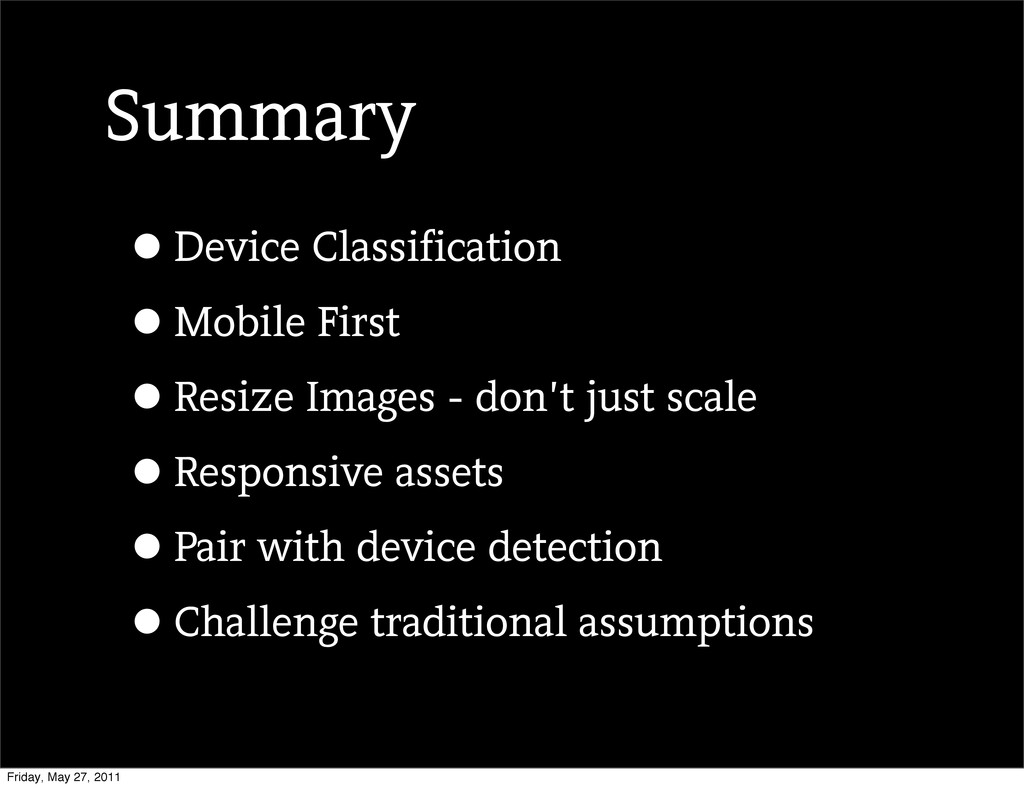
Summary •Device Classification •Mobile First •Resize Images - don’t just
scale •Responsive assets •Pair with device detection •Challenge traditional assumptions Friday, May 27, 2011
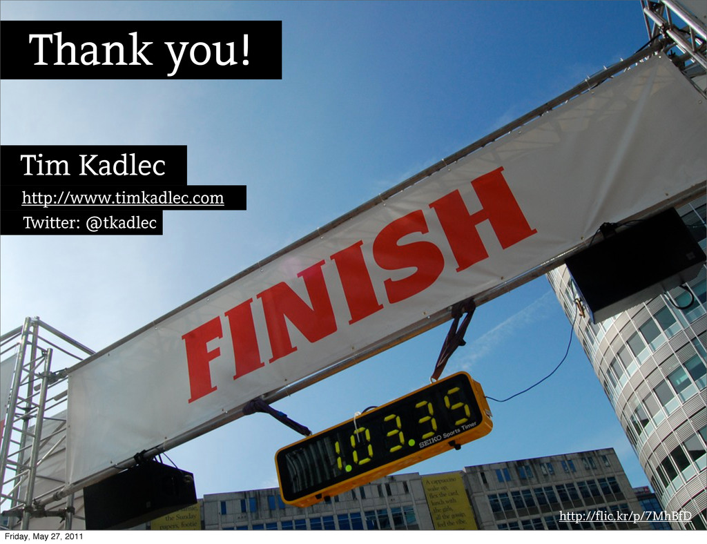
http://flic.kr/p/7MhBfD Thank you! Tim Kadlec http://www.timkadlec.com Twitter: @tkadlec Friday, May
27, 2011
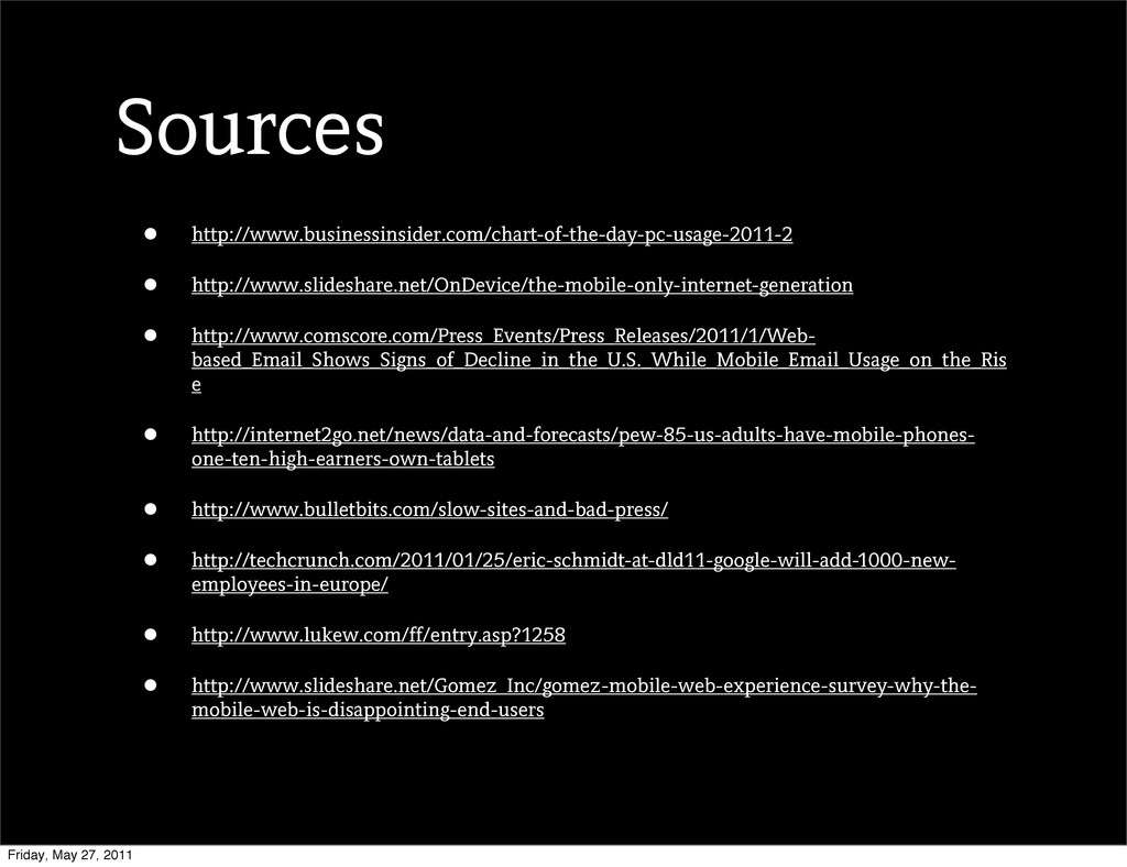
• http://www.businessinsider.com/chart-of-the-day-pc-usage-2011-2 • http://www.slideshare.net/OnDevice/the-mobile-only-internet-generation • http://www.comscore.com/Press_Events/Press_Releases/2011/1/Web- based_Email_Shows_Signs_of_Decline_in_the_U.S._While_Mobile_Email_Usage_on_the_Ris e • http://internet2go.net/news/data-and-forecasts/pew-85-us-adults-have-mobile-phones-
one-ten-high-earners-own-tablets • http://www.bulletbits.com/slow-sites-and-bad-press/ • http://techcrunch.com/2011/01/25/eric-schmidt-at-dld11-google-will-add-1000-new- employees-in-europe/ • http://www.lukew.com/ff/entry.asp?1258 • http://www.slideshare.net/Gomez_Inc/gomez-mobile-web-experience-survey-why-the- mobile-web-is-disappointing-end-users Sources Friday, May 27, 2011
 tkadlec
 tk3fftk
 jinwatanabe
 jsoizo
 har1101
 handlename
 d0riven
 niftycorp
 philipschwarz
 broadleaf
 manfredsteyer
 kishida
 suguruooki
 aleyda
 bethany
 gurzu
gurzu
 tammielis
 eileencodes
 katiecoart
 dugsong
 baasie
 reverentgeek
 tmiket
 techseoconnect
 portentint