Upgrade to Pro — share decks privately, control downloads, hide ads and more …

Greg Rewis - Move it! CSS3 Transitions and Animations

Web Directions
November 05, 2011

Greg Rewis - Move it! CSS3 Transitions and Animations

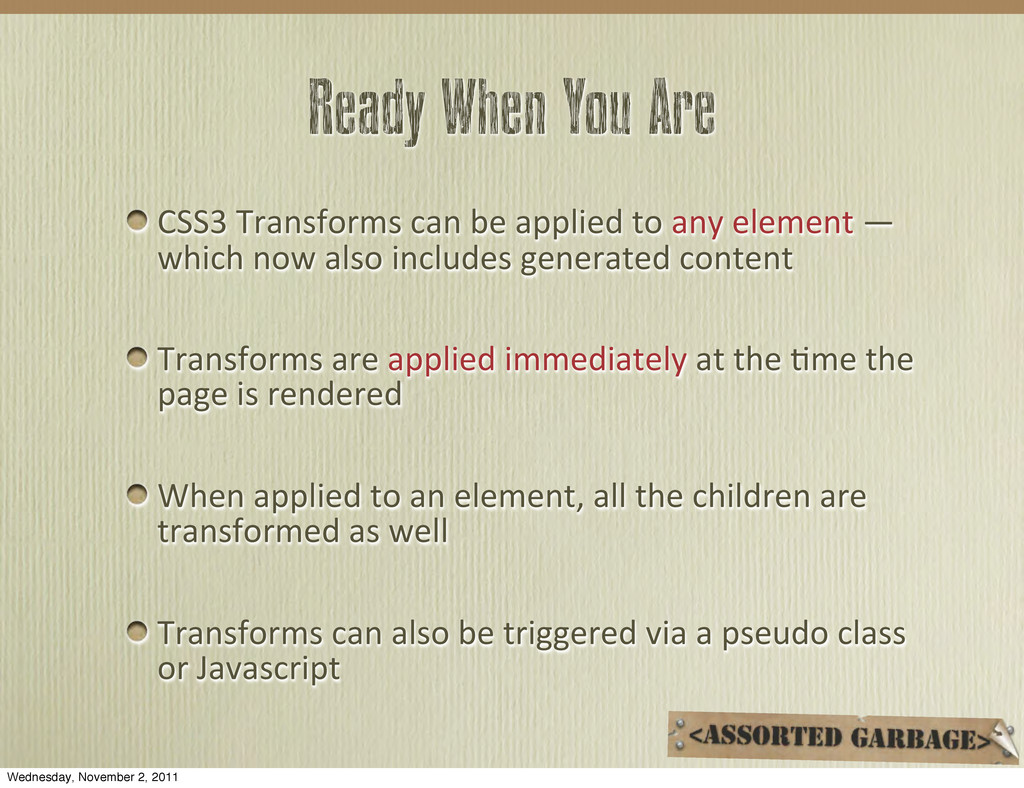
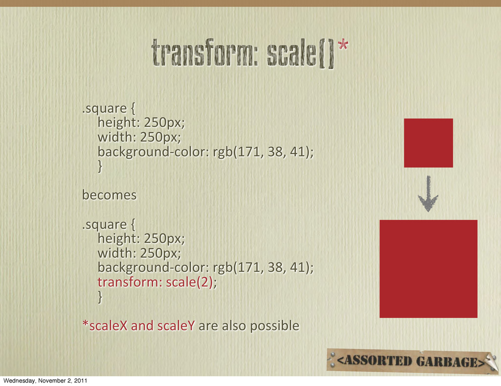
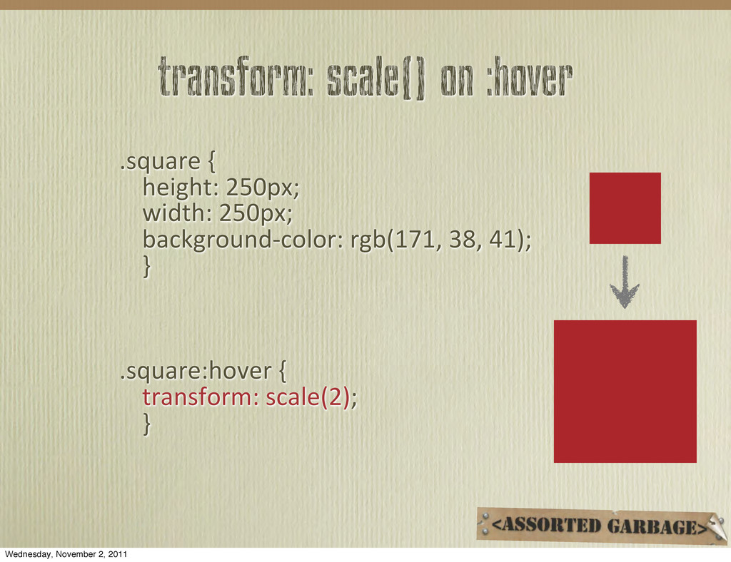
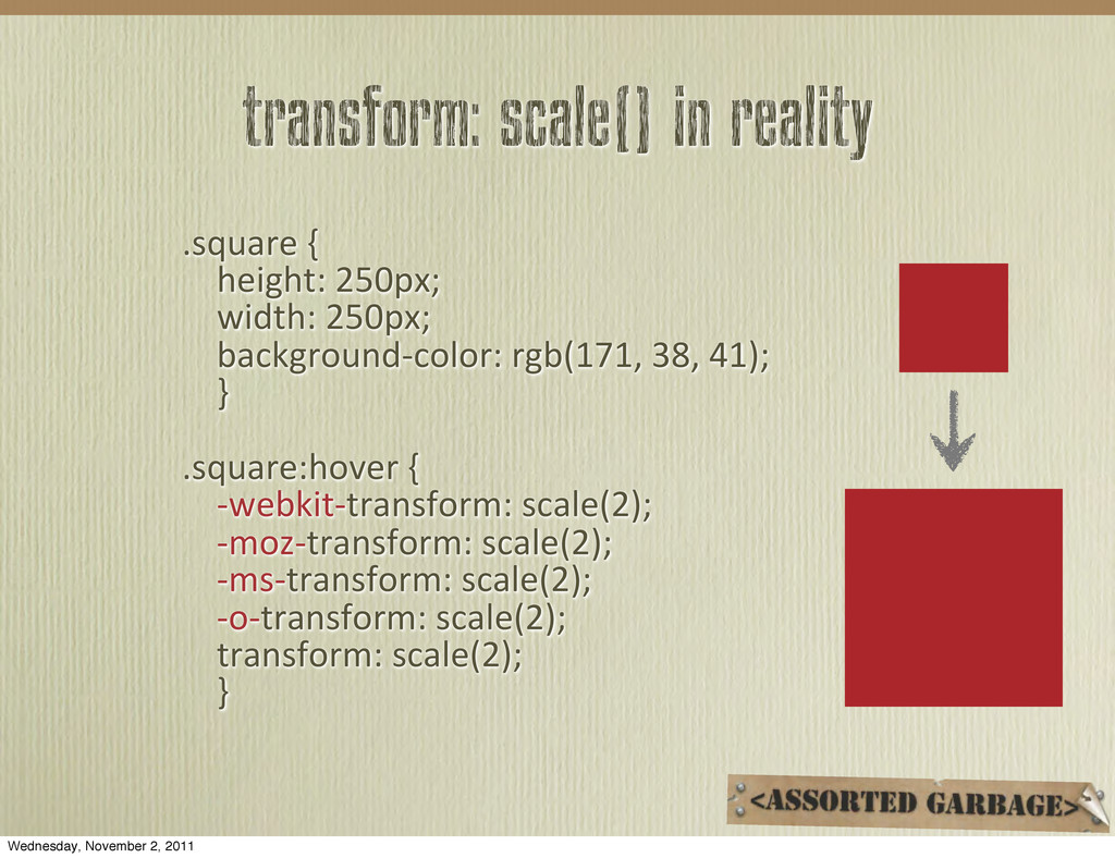
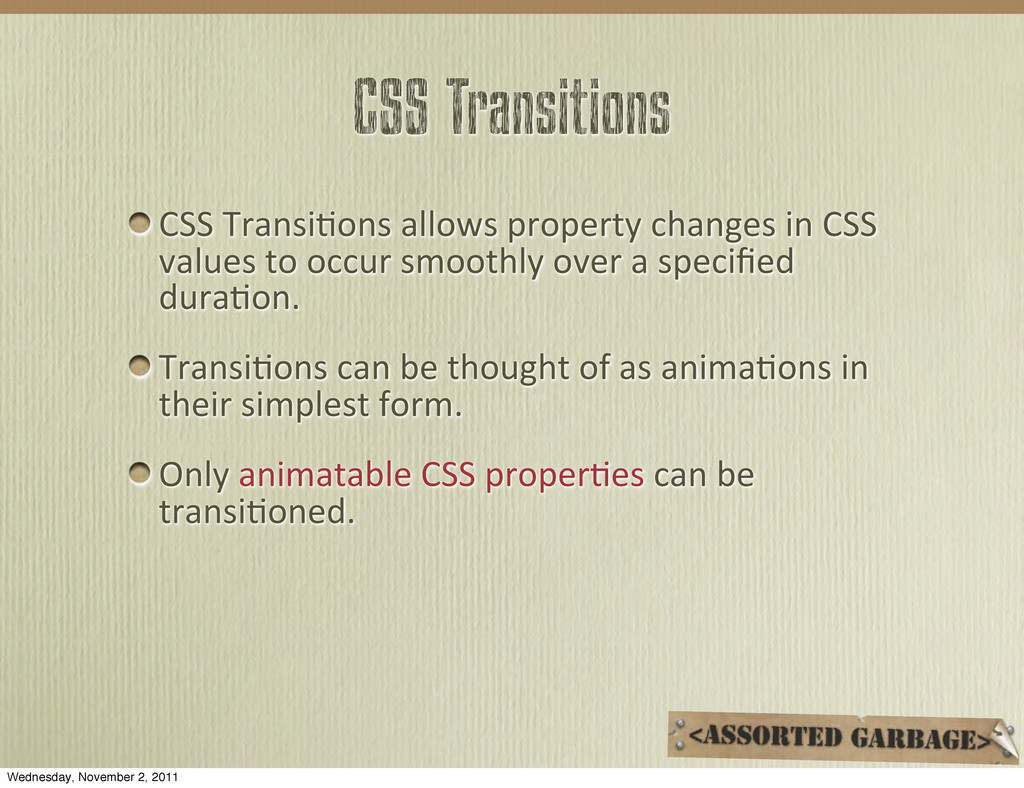
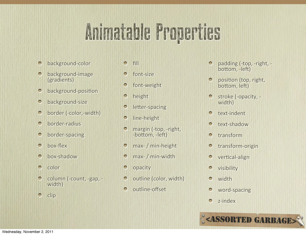
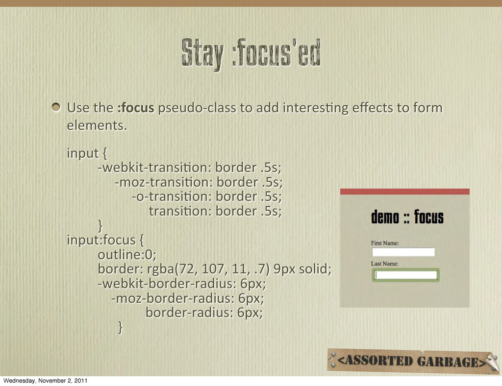
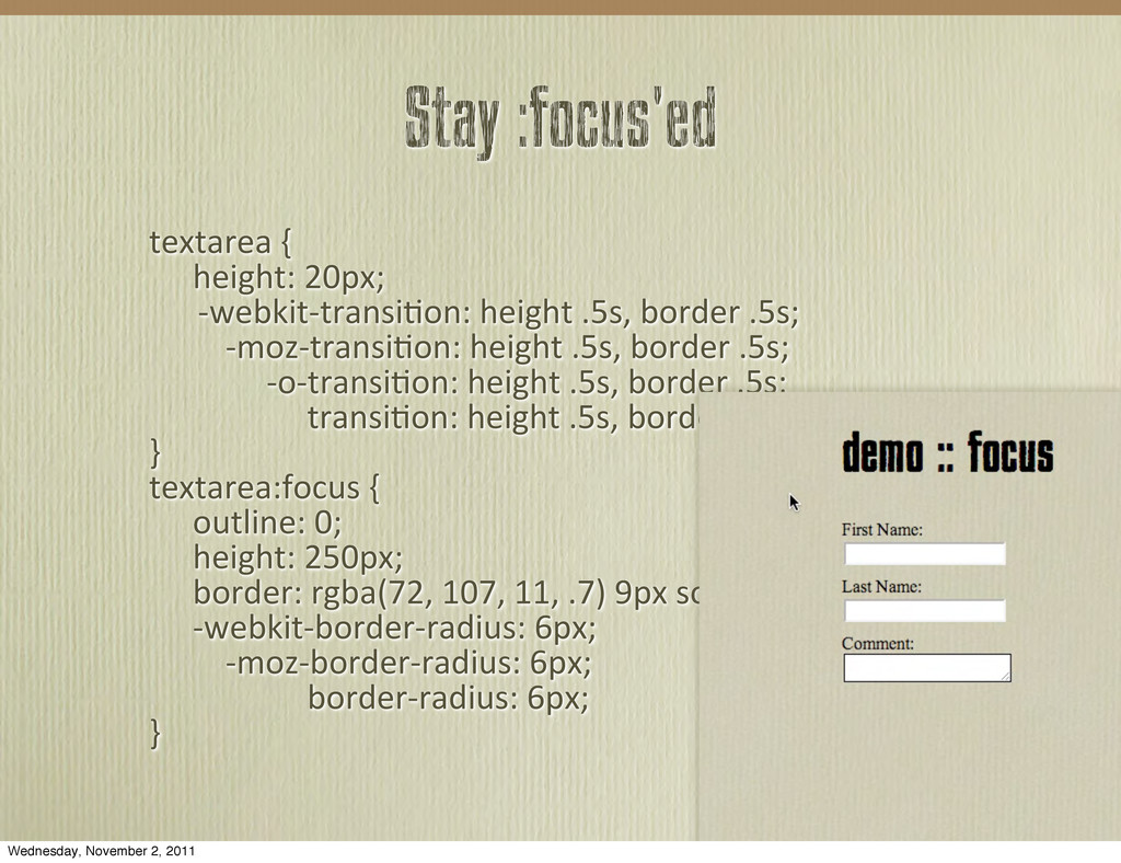
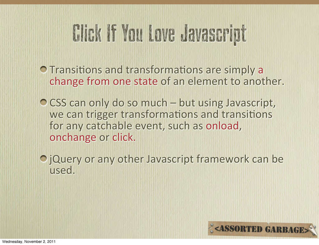
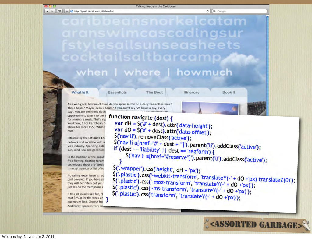
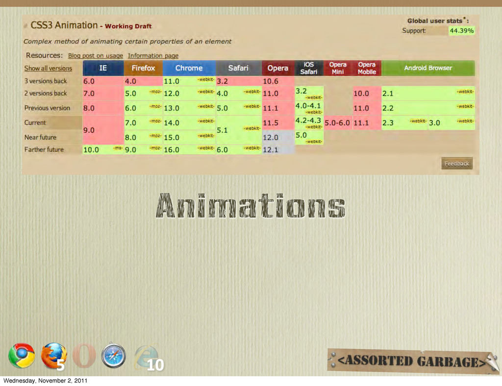
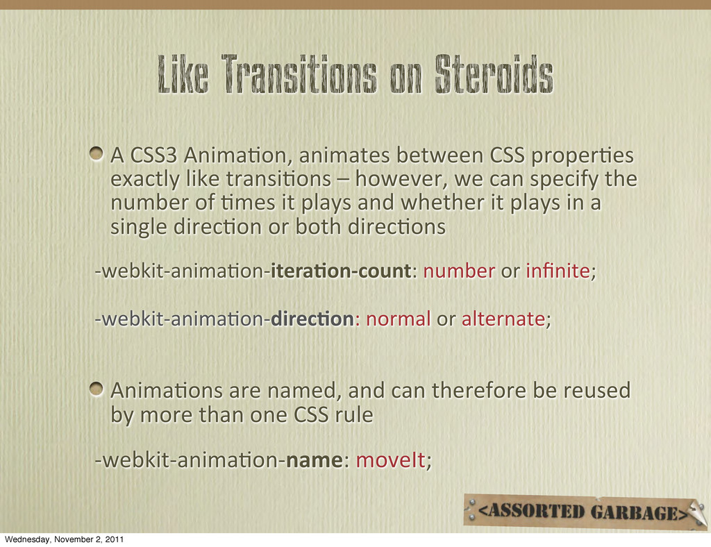
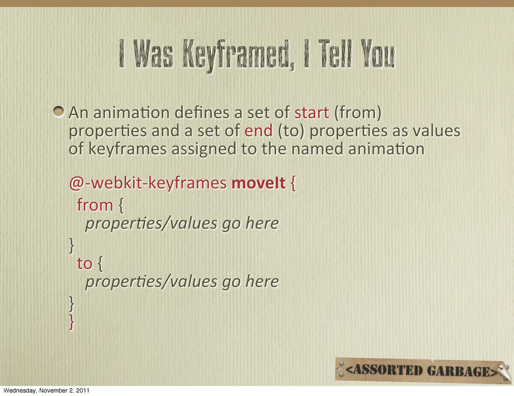
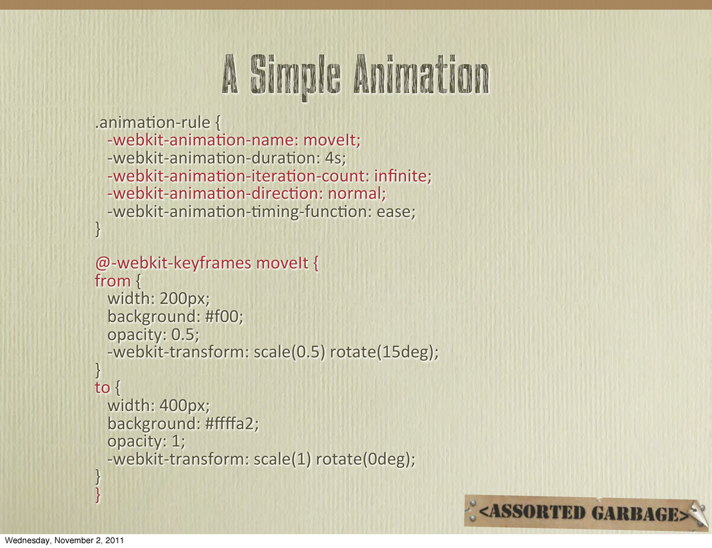
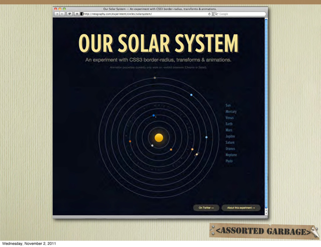
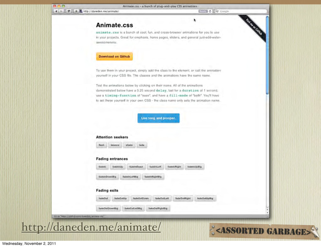
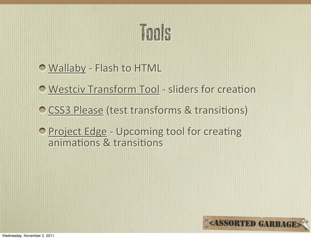
Since the early days of the web, the only reliable way to get movement on your site was through Flash, or more recently, Javascript. But now, with WebKit and Mozilla leading the way, transformations and transitions can be done with pure CSS, even on mobile devices. And for those in need of even more movement, CSS3 provides for keyframe-based animations. In this session, we’ll take a look at all of the possibilities and explore what works and where — from the simplest effects, to creative usability enhancements including the combination of CSS with mobile Javascript frameworks.

Web Directions

November 05, 2011
Tweet

More Decks by Web Directions

Other Decks in Technology

Transcript

  1. CSS Transforms “The  2D  Transforma/ons  Module  defines  a  property  

    that  applies  rota/ons,  transla/ons  and  other  affine   transforma/ons  to  a  box.” In  the  2D  space,  think  of  the  transform  controls  in  your   favorite  graphics  program Scale Rotate Skew Translate   Wednesday, November 2, 2011
  2. Ready When You Are CSS3  Transforms  can  be  applied  to

     any  element  — which  now  also  includes  generated  content Transforms  are  applied  immediately  at  the  ;me  the   page  is  rendered   When  applied  to  an  element,  all  the  children  are   transformed  as  well Transforms  can  also  be  triggered  via  a  pseudo  class   or  Javascript Wednesday, November 2, 2011
  3. transform: scale()* .square  { height:  250px; width:  250px; background-­‐color:  rgb(171,

     38,  41); } becomes .square  { height:  250px; width:  250px; background-­‐color:  rgb(171,  38,  41); transform:  scale(2); } *scaleX  and  scaleY  are  also  possible Wednesday, November 2, 2011
  4. transform: scale() on :hover .square  { height:  250px; width:  250px;

    background-­‐color:  rgb(171,  38,  41); } .square:hover  { transform:  scale(2); } Wednesday, November 2, 2011
  5. If only it were that simple... As  individual  browsers  add

     support  for   transforms  (and  transi%ons),  they  use  vendor-­‐ specific  prefixes. You  should  list  the  vendor  specific   implementa%ons  first.  The  actual  CSS  property   (without  a  browser  prefix)  should  always  be  last. If  you  aren’t  confident  coding  the  vendor-­‐specific   prefixes  yourself,  you  can  use  CSSPrefixer. Wednesday, November 2, 2011
  6. transform: scale() in reality .square  { height:  250px; width:  250px;

    background-­‐color:  rgb(171,  38,  41); } .square:hover  { -­‐webkit-­‐transform:  scale(2); -­‐moz-­‐transform:  scale(2);   -­‐ms-­‐transform:  scale(2); -­‐o-­‐transform:  scale(2); transform:  scale(2); } Wednesday, November 2, 2011
  7. transform: rotate() & transform: skew()* .square  { height:  250px; width:

     250px; background-­‐color:  rgb(171,  38,  41); transform:  rotate(45deg); } .square  { height:  250px; width:  250px; background-­‐color:  rgb(171,  38,  41); transform:  skew(45deg); } *skewX  and  skewY  are  also  possible [browser  specific  varia;ons  inten;onally  omiXed] Wednesday, November 2, 2011
  8. transform: translate() .square  { height:  250px; width:  250px; background-­‐color:  rgb(171,

     38,  41); } .square:hover  { transform:  translate(50px,  50px); } *translateX  and  translateY  are  also  possible [browser  specific  varia;ons  inten;onally  omiXed] Wednesday, November 2, 2011
  9. multiple transforms* .square  { height:  250px; width:  250px; background-­‐color:  rgb(171,

     38,  41); } .square:hover  { transform:  scale(2)  rotate(45deg); } *all  proper;es  are  applied  simultaneously [browser  specific  varia;ons  inten;onally  omiXed] Wednesday, November 2, 2011
  10. Transform-origin By  default,  all  transforms  occur  “around”  the   center

     of  the  object  (x=50%,  y=50%) .square:hover  { transform:  rotate(45deg); } origin Wednesday, November 2, 2011
  11. Transform-origin .square:hover  { transform:  rotate(45deg); transform-­‐origin:  right  top; } leZ,

     center,  right  and  top,  center,  boXom .square:hover  { transform:  rotate(45deg); transform-­‐origin:  100%  100%; } the  point  of  origin  can  even  be   outside  of  the  object  itself [browser  specific  varia;ons  inten;onally  omiXed] origin origin Wednesday, November 2, 2011
  12. I Didn’t See That Coming! Much  like  absolute  posi%oning,  the

     CSS3   Transform  property  does  not  affect  the  box   model Wednesday, November 2, 2011
  13. Modernizr - Feature Detection Link  to  the  script  &  add

     <html  class=”no-­‐js”> Modernizr  changes  the  no-­‐js  class  to  a  long  string   of  classes  that  you  can  use  to  serve  different  CSS   or  JS  to  a  browser  depending  on  its  lack  of   capabili%es.  ie: <html  class=”  js  canvas  canvastext  geoloca/on   crosswindowmessaging  no-­‐websqldatabase  no-­‐indexeddb   hashchange  no-­‐historymanagement  draganddrop  no-­‐websockets   rgba  hsla  mul/plebgs  backgroundsize  borderimage  borderradius   boxshadow  opacity  no-­‐cssanima/ons  csscolumns  cssgradients  no-­‐ cssreflec9ons  csstransforms  no-­‐csstransforms3d  no-­‐csstransi9ons   video  audio  localstorage  sessionstorage  webworkers   applica/oncache  svg  no-­‐smilsvgclippaths   fonLace”> Wednesday, November 2, 2011
  14. Transforms – based on abilities .no-­‐csstransforms  #foo  #soo  {  

         display:block; } Or  write  CSS  so  it’s  only  shown  to  capable   browsers: .csstransforms  #foo  {      transform:  rotate(10deg); } Wednesday, November 2, 2011
  15. :hover - before CSS3 nav  li  a  { background-­‐color:  rgb(0,0,0);

    } nav  li  a:hover  { background-­‐color:  rgb(86,  125,33); } Wednesday, November 2, 2011
  16. CSS Transitions CSS  Transi%ons  allows  property  changes  in  CSS  

    values  to  occur  smoothly  over  a  specified   dura%on. Transi%ons  can  be  thought  of  as  anima%ons  in   their  simplest  form. Only  animatable  CSS  proper%es  can  be   transi%oned. Wednesday, November 2, 2011
  17. Animatable Properties background-­‐color background-­‐image   (gradients) background-­‐posi;on background-­‐size border  (-­‐color,-­‐width)

    border-­‐radius border-­‐spacing box-­‐flex box-­‐shadow color column  (-­‐count,  -­‐gap,  -­‐ width) clip fill font-­‐size font-­‐weight height leXer-­‐spacing line-­‐height margin  (-­‐top,  -­‐right, -­‐boXom,  -­‐leZ) max-­‐  /  min-­‐height max-­‐  /  min-­‐width opacity outline  (color,  width) outline-­‐offset padding  (-­‐top,  -­‐right,  -­‐ boXom,  -­‐leZ) posi;on  (top,  right,   boXom,  leZ) stroke  (-­‐opacity,  -­‐ width) text-­‐indent text-­‐shadow transform transform-­‐origin ver;cal-­‐align visibility width word-­‐spacing z-­‐index Wednesday, November 2, 2011
  18. Basic Anatomy of a Transition Basic  styling  of  the  element

     in  rule  1 It  may  contain  proper;es  that  won’t  be  modified The  proper;es  to  be  “animated”  are  iden;fied   with  the  transi;on  property Rule  2  contains  the  modifica;ons  to  the  element  &   uses  a  pseudo-­‐class  (:hover,  :focus,  :target)  to   trigger  the  transi;on OR  Javascript  can  also  be  used  to  trigger  a   transi;on Wednesday, November 2, 2011
  19. :hover - with CSS3 transitions nav  li  a  { background-­‐color:

     rgb(0,0,0); transi%on-­‐property:  background-­‐color; transi%on-­‐dura%on:  1s; } nav  li  a:hover  { background-­‐color:  rgb(86,  125,33); } Wednesday, November 2, 2011
  20. Property Listings In  the  previous  example,  only  a  single  property

     was   transi;oned: transi;on-­‐property:  background-­‐color; Mul;ple  proper;es  can  be  defined  at  one  ;me: transi;on-­‐property:  background-­‐color,   padding,  font-­‐size,  color; or transi;on-­‐property:  all; Wednesday, November 2, 2011
  21. Time it Right! The  dura%on  of  the  transi%on  is  determined

     by   the  transi%on-­‐dura%on  property. Time  can  be  designated  in  seconds  or   milliseconds transi%on-­‐dura%on:  2s; transi%on-­‐dura%on:  500ms; Time  is  not  precise  and  can  vary  slightly  between   browsers Wednesday, November 2, 2011
  22. Transition Speed By  default,  transi%ons  play  at  a  constant  rate

      (called  linear).   The  transi%on-­‐%ming-­‐func%on  allows  you  to   specify  a  variable  rate  of  speed  for  the  transi%on transi%on-­‐%ming-­‐func%on:  ease; linear ease ease-­‐in ease-­‐out ease-­‐in-­‐out cubic-­‐bezier(0,.33,1,.75) Wednesday, November 2, 2011
  23. Wait a Second! By  default,  a  transi%on  will  play  immediately

     when   triggered The  transi%on-­‐delay  property  allows  you  to  specify   a  period  of  %me  to  wait  before  performing  the   transi%on As  with  the  transi%on-­‐dura%on  property,  %me  can   be  specified  in  either  seconds  or  milliseconds transi%on-­‐delay:  3s; transi%on-­‐delay:  250ms; Wednesday, November 2, 2011
  24. Putting It All Together nav  li  a  { background-­‐color:  rgb(0,0,0);

    padding:  9px  5px; transi;on-­‐property:  background-­‐color,  padding,  transform; transi;on-­‐dura;on:  1s; transi;on-­‐delay:  100ms; transi;on-­‐;ming-­‐func;on:  ease; } nav  li  a:hover  { background-­‐color:  rgb(86,  125,33); padding:  12px  5px; transform:  rotate(-­‐5deg); } Wednesday, November 2, 2011
  25. Well, Actually... nav  li  a  { background-­‐color:  rgb(0,0,0); padding:  9px

     5px; -­‐webkit-­‐transi;on-­‐property:  background-­‐color,  padding,  transform;            -­‐moz-­‐transi;on-­‐property:  background-­‐color,  padding,  transform;                    -­‐o-­‐transi;on-­‐property:  background-­‐color,  padding,  transform;                              transi;on-­‐property:  background-­‐color,  padding,  transform; -­‐webkit-­‐transi;on-­‐dura;on:  1s;          -­‐moz-­‐transi;on-­‐dura;on:  1s;                    -­‐o-­‐transi;on-­‐dura;on:  1s;                              transi;on-­‐dura;on:  1s; -­‐webkit-­‐transi;on-­‐delay:  100ms;          -­‐moz-­‐transi;on-­‐delay:  100ms;                    -­‐o-­‐transi;on-­‐delay:  100ms;                              transi;on-­‐delay:  100ms; -­‐webkit-­‐transi;on-­‐;ming-­‐func;on:  ease;          -­‐moz-­‐transi;on-­‐;ming-­‐func;on:  ease;                    -­‐o-­‐transi;on-­‐;ming-­‐func;on:  ease;                              transi;on-­‐;ming-­‐func;on:  ease; } nav  li  a:hover  { background-­‐color:  rgb(86,  125,33); padding:  12px  5px; -­‐webkit-­‐transform:  rotate(-­‐5deg);          -­‐moz-­‐transform:  rotate(-­‐5deg);              -­‐ms-­‐transform:  rotate(-­‐5deg);                    -­‐o-­‐transform:  rotate(-­‐5deg);                              transform:  rotate(-­‐5deg); } Wednesday, November 2, 2011
  26. Let’s Mix It Up You  can  target  mul%ple  proper%es  and

     assign   differing  speeds  —  all  within  the  same  rule  using   comma-­‐separated  values. nav  li  a  { transi%on-­‐property:  background-­‐color,  padding,   transform; transi%on-­‐dura%on:  1s,  2s,  500ms; transi%on-­‐delay:  100ms,  0,  2s; transi%on-­‐%ming-­‐func%on:  ease,  linear,  ease-­‐in; } Wednesday, November 2, 2011
  27. Transition Shorthand Using  shorthand,  we  can  combine  all  four  of

     the   transi;on  proper;es  into  a  single  property Order  is  important  due  to  the  existence  of  2  ;ming   proper;es  —  the  first  !me  value  will  be  assigned  to   transi;on-­‐dura;on  and  the  last  to  the  delay Values  are  separated  by  a  space  (not  comma) property dura%on %ming-­‐func%on delay transi%on:  all  1s  ease  100ms Wednesday, November 2, 2011
  28. That’s Better nav  li  a  { background-­‐color:  rgb(0,0,0); padding:  9px

     5px; -­‐webkit-­‐transi;on:  all  1s  ease  100ms;        -­‐moz-­‐transi;on:  all  1s  ease  100ms;                    -­‐o-­‐transi;on:  all  1s  ease  100ms;                              transi;on:  all  1s  ease  100ms; } nav  li  a:hover  { background-­‐color:  rgb(86,  125,33); padding:  12px  5px; -­‐webkit-­‐transform:  rotate(-­‐5deg);          -­‐moz-­‐transform:  rotate(-­‐5deg);              -­‐ms-­‐transform:  rotate(-­‐5deg);                    -­‐o-­‐transform:  rotate(-­‐5deg);                              transform:  rotate(-­‐5deg); } Wednesday, November 2, 2011
  29. Let’s Mix It Up It’s  also  possible  to  shorthand  the

     mul%ple   proper%es  with  differing  speeds (use  a  comma  between  the  groupings) nav  li  a  { transi%on:            background-­‐color  1s  ease  100ms,            padding  2s  linear  0,            transform  500ms  ease-­‐in  2s; } [placed  on  separate  lines  for  readability] Wednesday, November 2, 2011
  30. UI Enhancements Transi%ons  and  transforms  can  be  added  to  

    pseudo-­‐elements  (::before  and  ::ajer). The  :focus  pseudo-­‐class  can  add  interes%ng  effects   to  form  elements  by  highligh%ng  the  element  with   focus. :focus  is  also  good  to  use  in  combina%on   with  :hover  —  keyboard  navigators  have  a  visual   cue  of  their  focus  on  the  page. Wednesday, November 2, 2011
  31. Stay :focus’ed Use  the  :focus  pseudo-­‐class  to  add  interes;ng  effects

     to  form   elements. input  { -­‐webkit-­‐transi;on:  border  .5s;          -­‐moz-­‐transi;on:  border  .5s;                    -­‐o-­‐transi;on:  border  .5s;                              transi;on:  border  .5s; } input:focus  { outline:0; border:  rgba(72,  107,  11,  .7)  9px  solid; -­‐webkit-­‐border-­‐radius:  6px;        -­‐moz-­‐border-­‐radius:  6px;                            border-­‐radius:  6px; } Wednesday, November 2, 2011
  32. Stay :focus’ed textarea  {   height:  20px;      

         -­‐webkit-­‐transi;on:  height  .5s,  border  .5s;          -­‐moz-­‐transi;on:  height  .5s,  border  .5s;                    -­‐o-­‐transi;on:  height  .5s,  border  .5s;                              transi;on:  height  .5s,  border  .5s; } textarea:focus  {   outline:  0;   height:  250px;   border:  rgba(72,  107,  11,  .7)  9px  solid;   -­‐webkit-­‐border-­‐radius:  6px;          -­‐moz-­‐border-­‐radius:  6px;                              border-­‐radius:  6px;   } Wednesday, November 2, 2011
  33. Click If You Love Javascript Transi%ons  and  transforma%ons  are  simply

     a   change  from  one  state  of  an  element  to  another.   CSS  can  only  do  so  much  –  but  using  Javascript,   we  can  trigger  transforma%ons  and  transi%ons   for  any  catchable  event,  such  as  onload,   onchange  or  click. jQuery  or  any  other  Javascript  framework  can  be   used. Wednesday, November 2, 2011
  34. Like Transitions on Steroids A  CSS3  Anima;on,  animates  between  CSS

     proper;es   exactly  like  transi;ons  –  however,  we  can  specify  the   number  of  ;mes  it  plays  and  whether  it  plays  in  a   single  direc;on  or  both  direc;ons -­‐webkit-­‐anima;on-­‐itera9on-­‐count:  number  or  infinite; -­‐webkit-­‐anima;on-­‐direc9on:  normal  or  alternate; Anima;ons  are  named,  and  can  therefore  be  reused   by  more  than  one  CSS  rule -­‐webkit-­‐anima;on-­‐name:  moveIt; Wednesday, November 2, 2011
  35. I Was Keyframed, I Tell You An  anima;on  defines  a

     set  of  start  (from)   proper;es  and  a  set  of  end  (to)  proper;es  as  values   of  keyframes  assigned  to  the  named  anima;on @-­‐webkit-­‐keyframes  moveIt  {    from  {        proper!es/values  go  here }    to  {        proper!es/values  go  here } } Wednesday, November 2, 2011
  36. A Simple Animation .anima;on-­‐rule  {      -­‐webkit-­‐anima;on-­‐name:  moveIt;  

       -­‐webkit-­‐anima;on-­‐dura;on:  4s;      -­‐webkit-­‐anima;on-­‐itera;on-­‐count:  infinite;      -­‐webkit-­‐anima;on-­‐direc;on:  normal;      -­‐webkit-­‐anima;on-­‐;ming-­‐func;on:  ease; } @-­‐webkit-­‐keyframes  moveIt  { from  {      width:  200px;      background:  #f00;      opacity:  0.5;      -­‐webkit-­‐transform:  scale(0.5)  rotate(15deg); } to  {      width:  400px;      background:  #ffffa2;      opacity:  1;      -­‐webkit-­‐transform:  scale(1)  rotate(0deg); } } Wednesday, November 2, 2011
  37. Smoothing out the bumps As  with  transi%ons,  the  anima%on-­‐%ming-­‐ func%on

     can  use  linear,  ease,  ease-­‐in,  ease-­‐out,   ease-­‐in-­‐out For  more  control  over  the  look  of  the  anima%on,   addi%onal  keyframes  allow  you  to  specify  the   values  for  proper%es  at  a  certain  percentage  of   the  anima%on Anima%ons  can  also  be  wrimen  as  shorthand -­‐webkit-­‐anima;on:  name  dura;on  ;ming  itera;ons  direc;on; Wednesday, November 2, 2011
  38. A Simple Animation .anima;on-­‐rule  {      height:  60px;  

       padding:  10px;      -­‐webkit-­‐anima;on:  ‘moveIt’  4s  ease  3  normal; } @-­‐webkit-­‐keyframes  ‘moveIt’  { 0%  {      width:  200px;      background:  #A74240;      opacity:  0.5;      -­‐webkit-­‐transform:  scale(0.5)  rotate(15deg); } 40%  {      width:  300px;      background:  #A74240;      opacity:  1;      -­‐webkit-­‐transform:  scale(1.3)  rotate(15deg); } 100%  {      width:  400px;      background:  #ffffa2;      opacity:  0.5;      -­‐webkit-­‐transform:  scale(1)  rotate(0deg); }  } Wednesday, November 2, 2011
  39. Animation Values anima;on-­‐name:  'yourName';   anima;on-­‐dura;on:  !me;   anima;on-­‐;ming-­‐func;on:  

                 linear  |  ease  |  ease-­‐in  |  ease-­‐out  |                ease-­‐in-­‐out  |  cubic-­‐bezier(); anima;on-­‐itera;on-­‐count:  number  or  infinite; anima;on-­‐direc;on:  normal  |  alternate; anima;on-­‐delay:  !me; anima9on-­‐fill-­‐mode:                                    backwards|forwards|none|both; -­‐webkit-­‐anima9on:  'disappear'  0.6s    linear  0.5s  alternate  5  forwards; Wednesday, November 2, 2011
  40. Accelerate! -­‐webkit-­‐transform:  translateZ(0); -­‐webkit-­‐transform:  translate3d(0,0,0) Both  these  tricks  will  make

     your  webkit  browser   believe  it  needs  to  use  the  GPU,  rather  than  the   CPU,  which  can  increase  performance. As  always,  test  to  be  sure  performance  is   increased—and  that  you’re  not  simply  decreasing   bamery  life  for  your  user. Wednesday, November 2, 2011
  41. Putting it in Perspective “The  3D  Transforma%ons  Module  extends  the

     2D   transforma%ons  with  a  perspec%ve   transforma%on.” Actually,  it’s  really  more  about  2.5D  —  think   postcards  in  space X,  Y  &  Z  axis  rota%on Perspec%ve Applied  via  the  same  transform  property  as  2D   tranforms  (our  examples  will  use  -­‐webkit-­‐) Wednesday, November 2, 2011
  42. Translate in 3d Several  new  transform  func;ons.  Remember: transform:  translate(50px,

     50px); transform:  translateX(50px); We  now  add: -­‐webkit-­‐transform:  translate3d(x,  y,  z); -­‐webkit-­‐transform:  translateZ(z); For  the  z  axis,  a  posi;ve  number  represents  a  move   toward  the  viewer. *  The  z  value  cannot  be  a  percentage. Wednesday, November 2, 2011
  43. 3d Scale & Rotation In  addi/on  to  movement  (translate),  objects

     can  be   scaled  and  rotated scale3d(sx,  sy,  sz) scaleZ(sz) rotateX(angle) rotateY(angle),   rotate3d(x,  y,  z,  angle) When  rota/ng,  the  first  two  examples  rotate  an   element  around  a  horizontal  or  ver/cal  axis  defined   using  degrees  (deg),  radians  (rad)  or  gradians  (grad).   The  last  example  rotates  an  element  around  a  defined   vector  in  3D  space. Wednesday, November 2, 2011
  44. Animations You  can  use  these  in  anima%ons  as  well: @-­‐webkit-­‐keyframes

     x-­‐spin  {    0%  {  -­‐webkit-­‐transform:  rotateX(0deg);  }    50%  {  -­‐webkit-­‐transform:  rotateX(180deg);  }    100%  {  -­‐webkit-­‐transform:  rotateX(360deg);  } } Wednesday, November 2, 2011
  45. I See Where You’re Coming From Perspec%ve  can  be  applied

     to  a  single  element   using  the  perspec%ve(p)  func%on  or  applied  to  all   the  children  of  an  element  using  the  -­‐webkit-­‐ perspec%ve  property -­‐webkit-­‐transform:  rotateY(45deg)  perspec%ve (400px); -­‐webkit-­‐perspec%ve:  800px; Smaller  numbers  indicate  that  the  perspec%ve   begins  closer  to  the  viewer Wednesday, November 2, 2011
  46. Stay Away From Me By  default  the  children  of  a

     transformed  element   are  flamened  into  the  parent  element Using  -­‐webkit-­‐transform-­‐style  allows  you  to   specify  whether  the  elements  should  follow  their   default  behavior  (flat)  or  “live”  in  the  3D  world   with  their  own  transforma%ons  (preserves-­‐3d) Wednesday, November 2, 2011
  47. Tools Wallaby  -­‐  Flash  to  HTML Westciv  Transform  Tool  -­‐

     sliders  for  crea%on CSS3  Please  (test  transforms  &  transi%ons) Project  Edge  -­‐  Upcoming  tool  for  crea%ng   anima%ons  &  transi%ons Wednesday, November 2, 2011