Upgrade to Pro
— share decks privately, control downloads, hide ads and more …
Speaker Deck
Features
Speaker Deck
PRO
Sign in
Sign up for free
Search
Search
Responsive Web Design - Reinventando la web
Search
Swwweet
April 27, 2012
Technology
15
4.6k
Responsive Web Design - Reinventando la web
Presentación de Javier Usobiaga en el Ideateca HTML5 DevUp 2012.
Swwweet
April 27, 2012
Tweet
Share
More Decks by Swwweet
See All by Swwweet
Wonders from the Full Stack Fest website
swwweet
1
250
How to be the best web designer in the world.
swwweet
6
1k
Design for loading
swwweet
5
420
Mobile First: as difficult as doing things right
swwweet
218
8.7k
One Size Fits None
swwweet
12
770
One Size Fits None - From the Front 2013
swwweet
2
630
Responsively Responsive
swwweet
23
1.5k
La letra con píxel entra
swwweet
0
1k
The future of code
swwweet
4
460
Other Decks in Technology
See All in Technology
やらない事を決めるプロダクト設計
rukiadia
4
3.2k
生成AI向け機械学習クラスタ 構築のレシピ 北海道石狩編
pfn
PRO
3
550
Autify Company Deck
autifyhq
1
33k
良い開発のためにまず組織を設計せい
ichimichi
6
3k
データ分析力を高めるSQL研修『SQL Everyone』のご紹介【SQL勉強会 #3】
hikarut
1
180
Adopting ZGC in HBase for LINE Messaging
lycorptech_jp
PRO
2
190
Developing image pull secrets provisioner / Kubernetes Meetup Tokyo #65
pfn
PRO
2
290
Spring Bootで作成したAPIテストのコスパを高めよう!
gorou_178
1
190
NAB Show 2024 動画技術関連レポート/ NAB Show 2024 Report
cyberagentdevelopers
PRO
3
240
自動テストは何の役に立つのか そして役に立たないのか
undefined_name
3
1.2k
Gemini in AppSheet_吉積情報株式会社 石見
comucal
PRO
0
2.2k
10分で完全に理解するGuardDutyのS3マルウェア保護
cmusudakeisuke
0
1.2k
Featured
See All Featured
Designing for humans not robots
tammielis
247
25k
Building Flexible Design Systems
yeseniaperezcruz
321
37k
The Straight Up "How To Draw Better" Workshop
denniskardys
228
130k
Practical Orchestrator
shlominoach
184
9.8k
The Pragmatic Product Professional
lauravandoore
28
6k
StorybookのUI Testing Handbookを読んだ
zakiyama
14
4.8k
No one is an island. Learnings from fostering a developers community.
thoeni
16
2.2k
The Psychology of Web Performance [Beyond Tellerrand 2023]
tammyeverts
19
1.7k
A Philosophy of Restraint
colly
198
16k
個人開発の失敗を避けるイケてる考え方 / tips for indie hackers
panda_program
71
15k
The Language of Interfaces
destraynor
151
23k
Bootstrapping a Software Product
garrettdimon
PRO
302
110k
Transcript
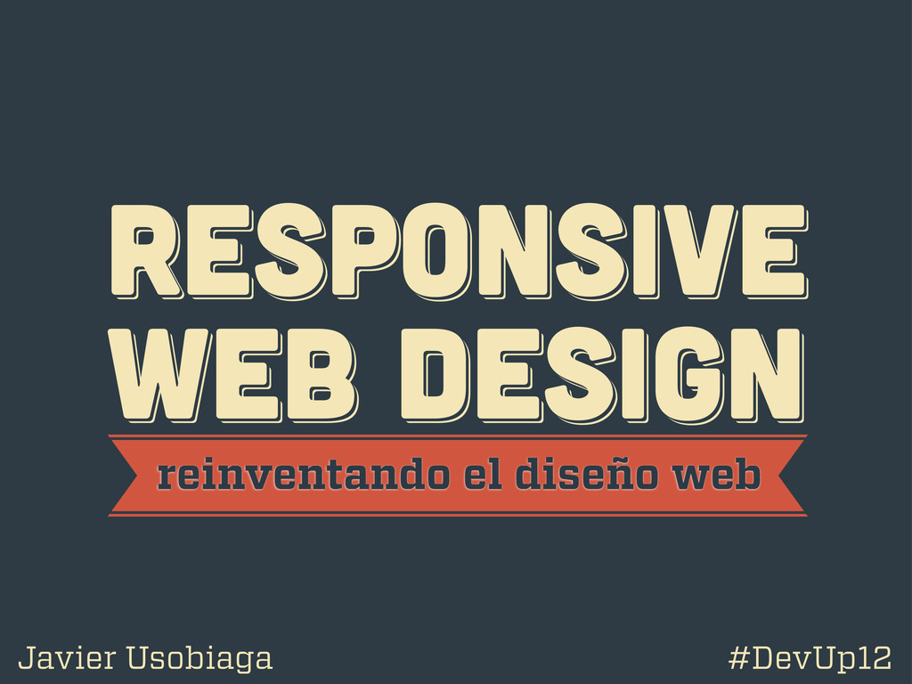
RESPoNSIVE WEB DESIGN RESPoNSIVE WEB DESIGN RESPoNSIVE WEB DESIGN reinventando
el diseño web Javier Usobiaga #DevUp12
@htmlboy @htmlboy @htmlboy trabajo en Swwweet.com
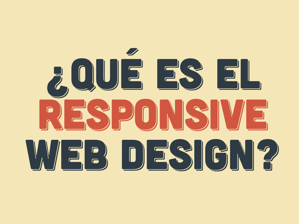
¿Qué es el responsive web design? ¿Qué es el responsive
web design? ¿Qué es el respoNsive web design?
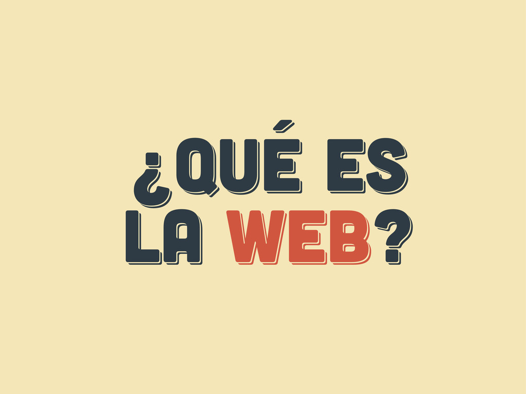
¿Qué es LA web? ¿Qué es LA web? ¿Qué es
LA web?
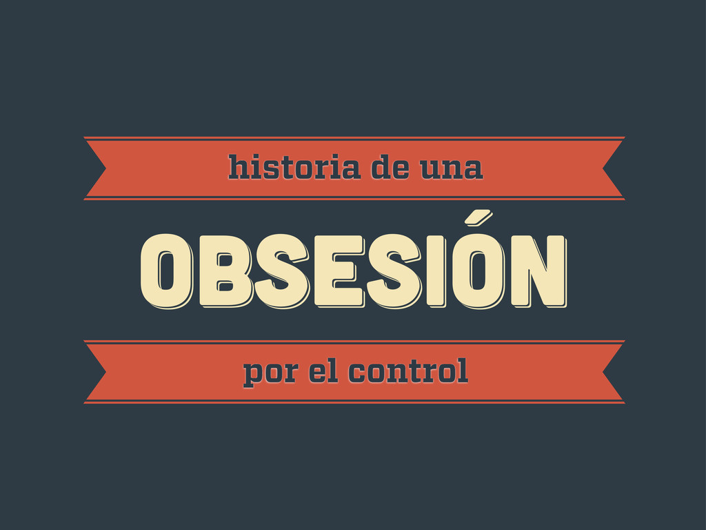
obsesión obsesión historia de una obsesión por el control
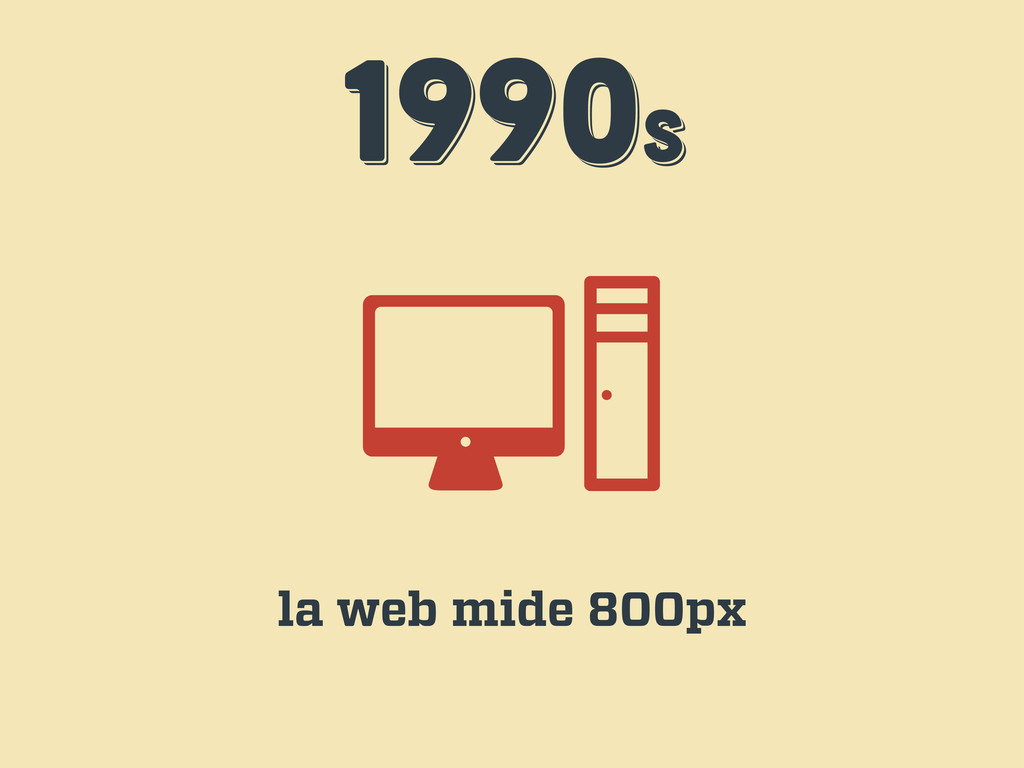
1990s 1990s 1990s la web mide 800px
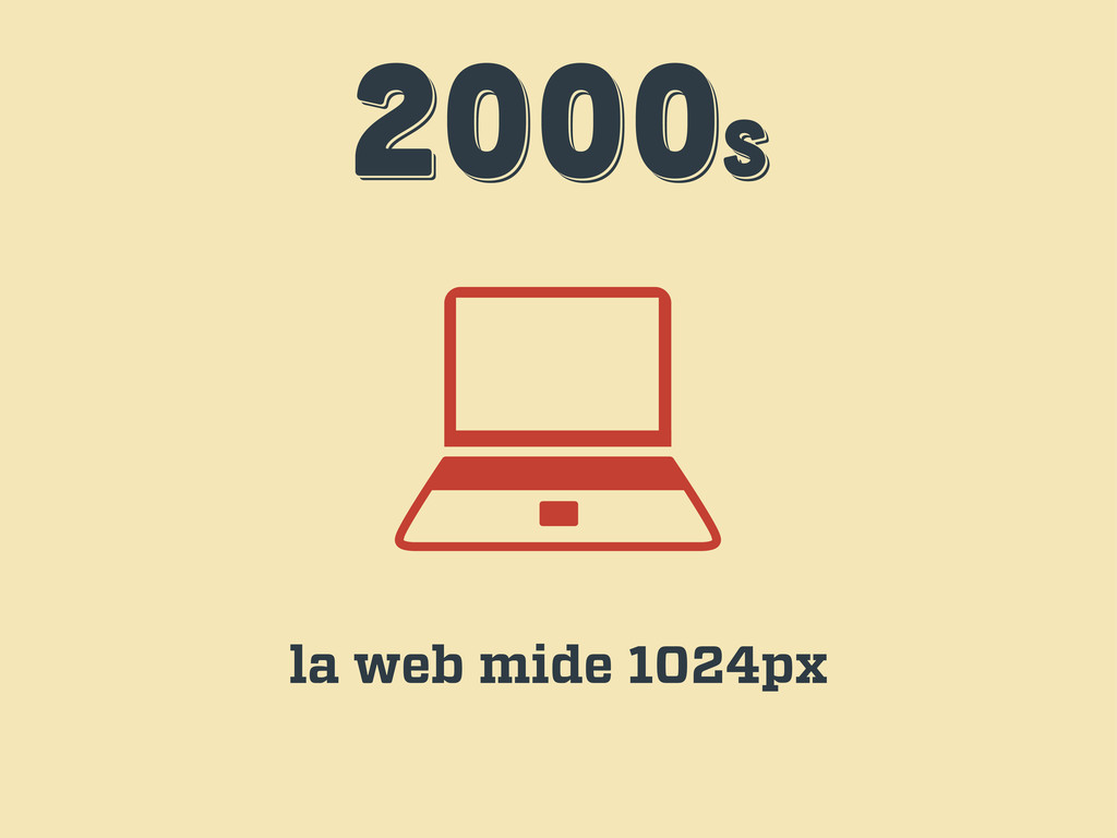
2000s 2000s 2000s la web mide 1024px
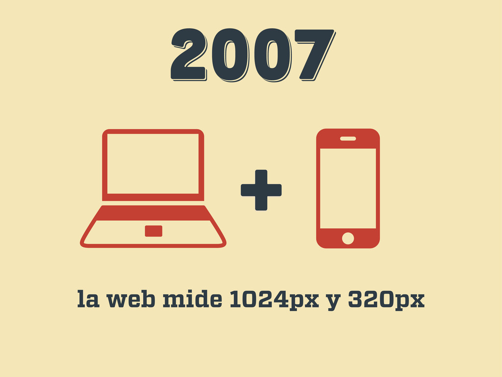
2007 2007 2007 + la web mide 1024px y 320px
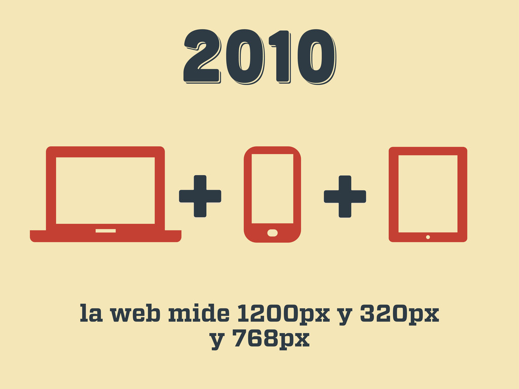
2010 2010 2010 + + la web mide 1200px y
320px y 768px
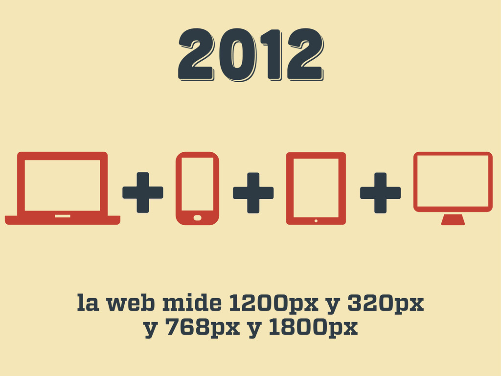
2012 2012 2012 + + la web mide 1200px y
320px y 768px y 1800px +
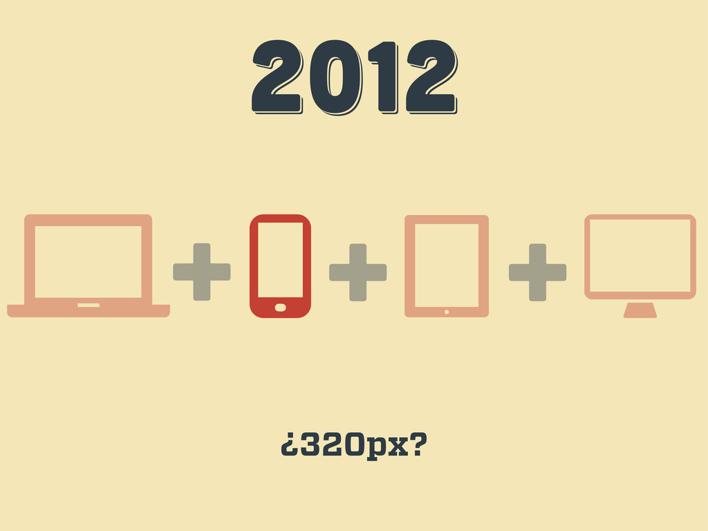
2012 2012 2012 + + ¿320px? +
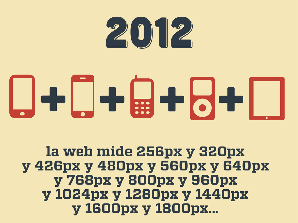
2012 2012 2012 la web mide 256px y 320px y
426px y 480px y 560px y 640px y 768px y 800px y 960px y 1024px y 1280px y 1440px y 1600px y 1800px… + + + +
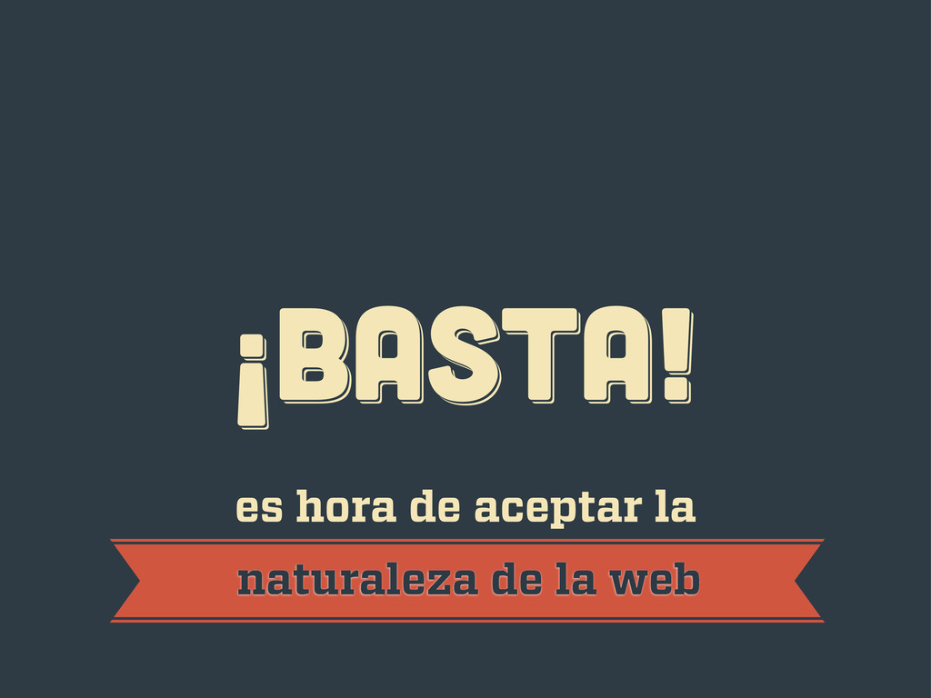
¡BASTA! ¡BASTA! ¡BASTA! es hora de aceptar la naturaleza de
la web
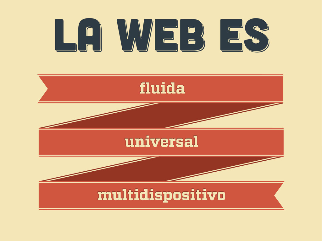
LA WEB ES LA WEB ES LA WEB ES fluida
universal multidispositivo
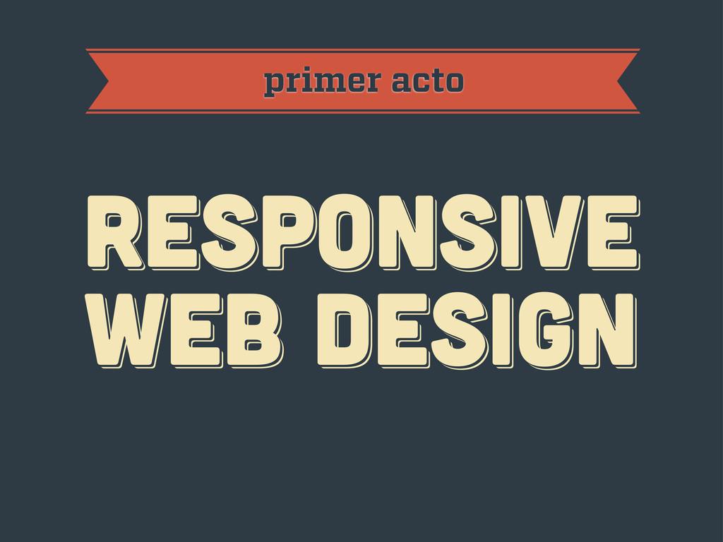
primer acto RESPoNSIVE WEB DESIGN RESPoNSIVE WEB DESIGN RESPoNSIVE WEB
DESIGN
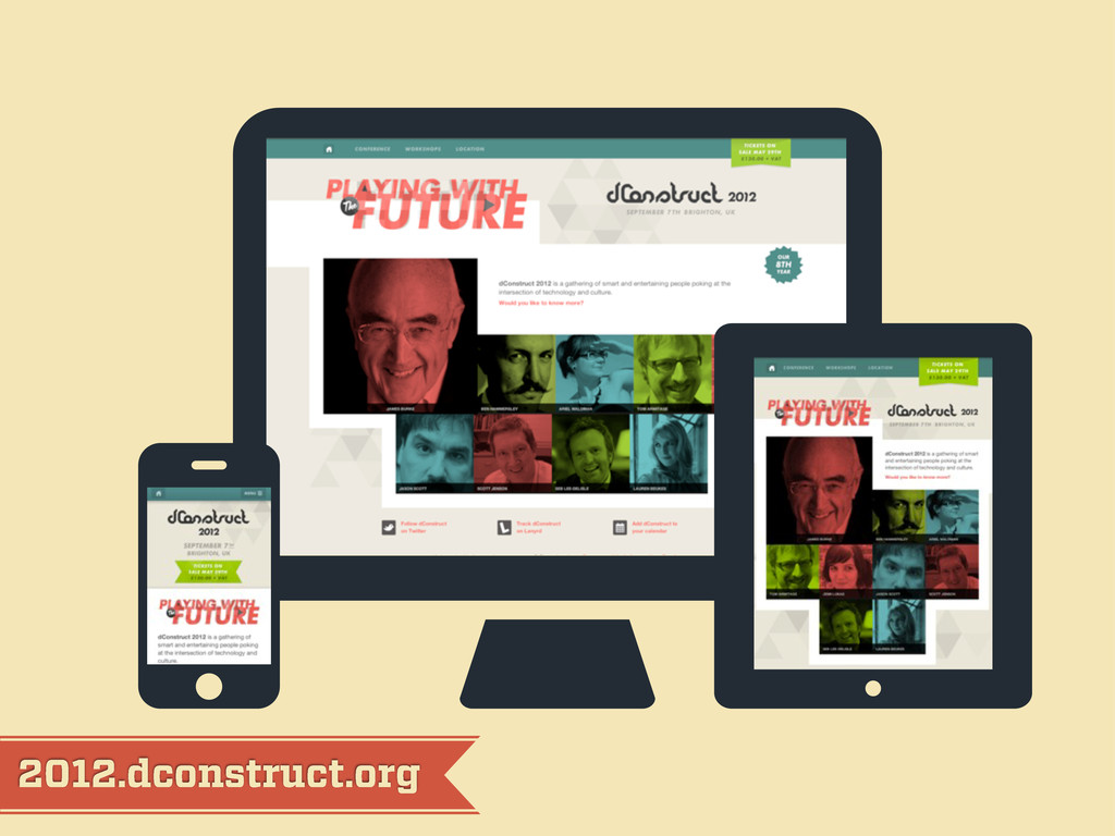
2012.dconstruct.org
mediaqueri.es
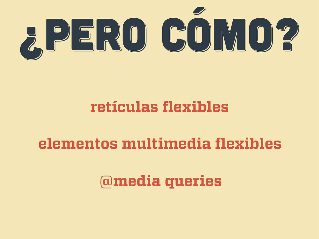
¿PERO CÓMO? ¿PERO CÓMO? ¿PERO CÓMO? retículas flexibles elementos multimedia
flexibles @media queries
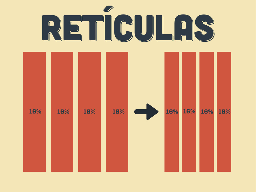
RETÍCULAS RETÍCULAS RETÍCULAS 16% 16% 16% 16% 16% 16% 16%
16%
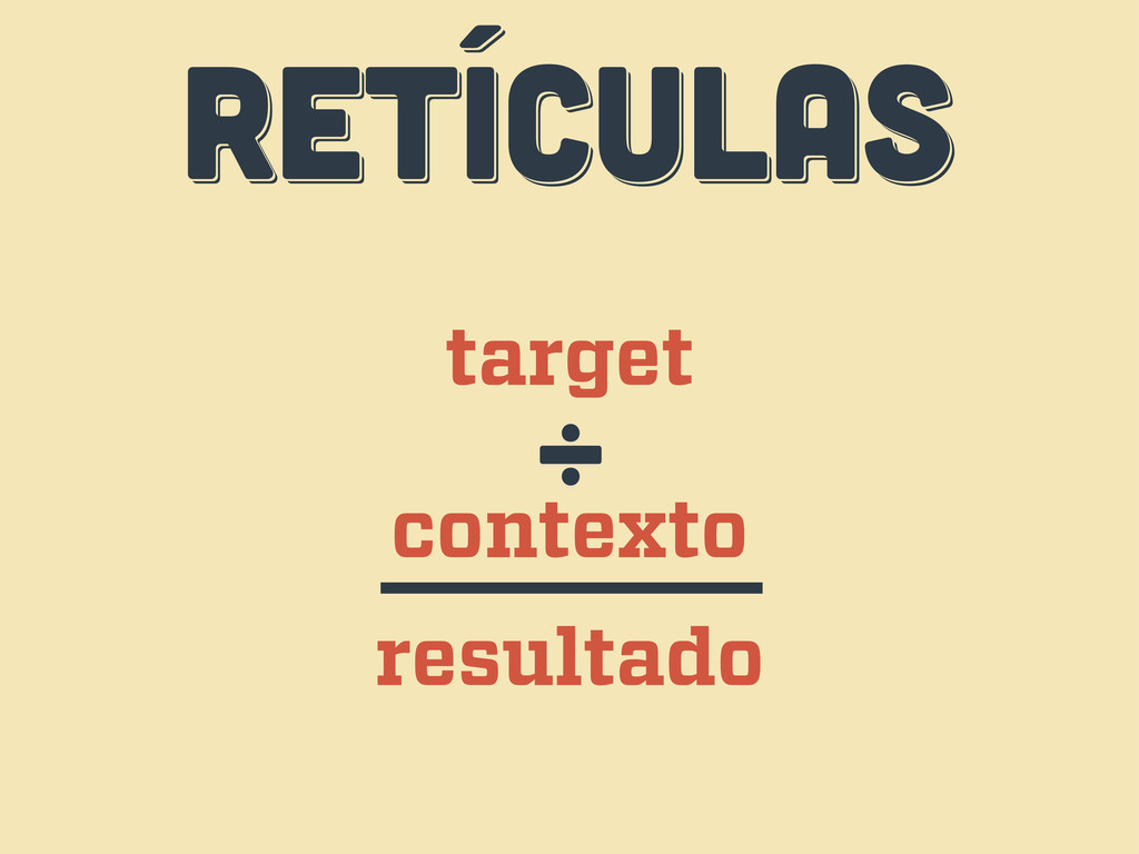
RETÍCULAS RETÍCULAS RETÍCULAS target contexto ÷ resultado
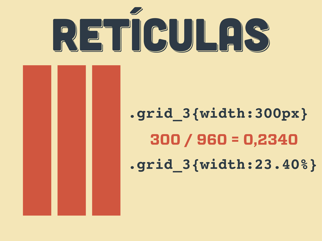
RETÍCULAS RETÍCULAS RETÍCULAS .grid_3{width:300px} 300 / 960 = 0,2340 .grid_3{width:23.40%}
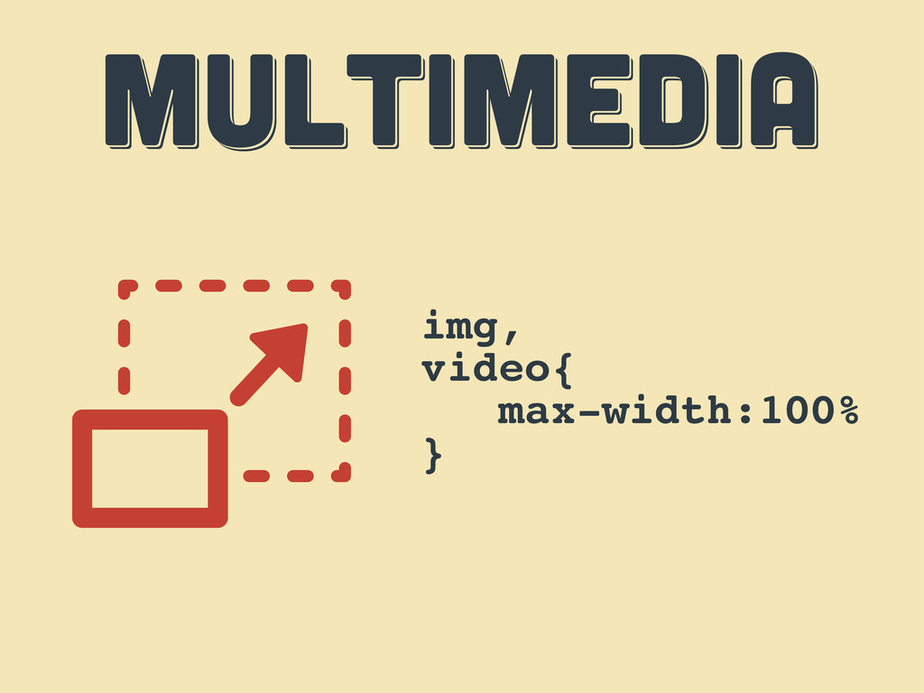
MULTIMEDIA MULTIMEDIA MULTIMEDIA img, video{ max-width:100% }
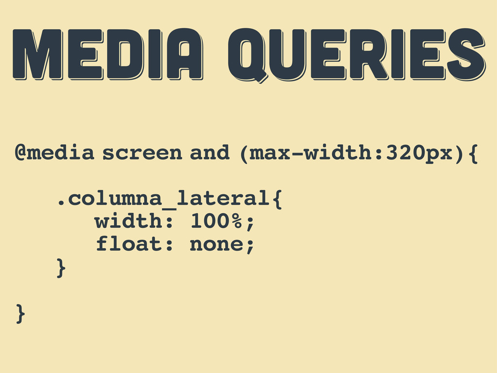
MEDIA QUERIES MEDIA QUERIES MEDIA QUERIES @media screen and (max-width:320px){
.columna_lateral{ width: 100%; float: none; } }
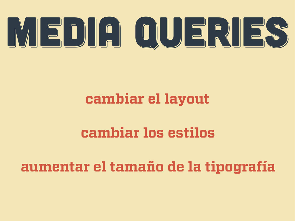
MEDIA QUERIES MEDIA QUERIES MEDIA QUERIES cambiar el layout cambiar
los estilos aumentar el tamaño de la tipografía
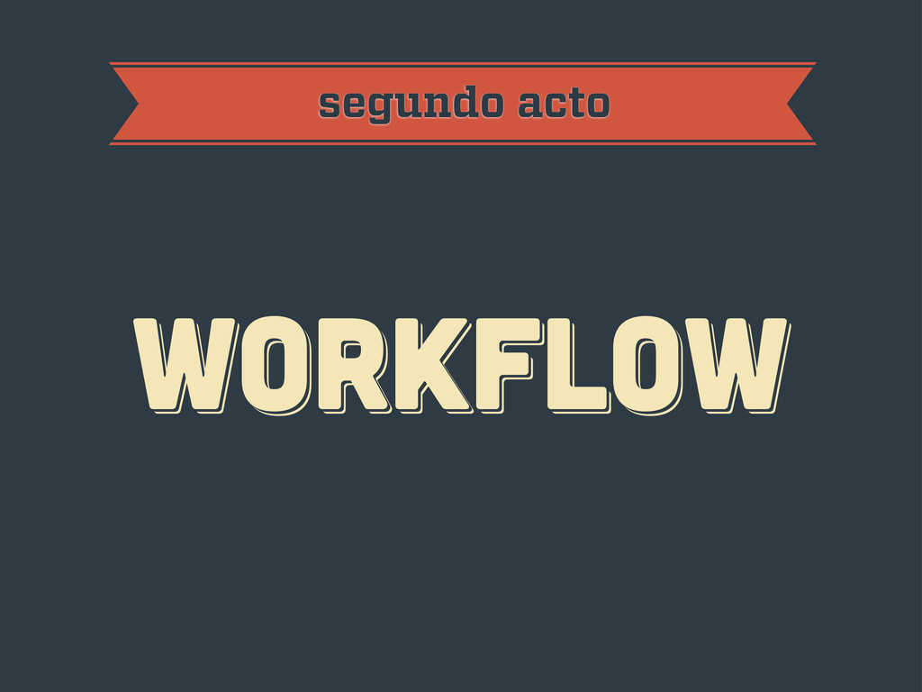
workflow workflow workflow segundo acto
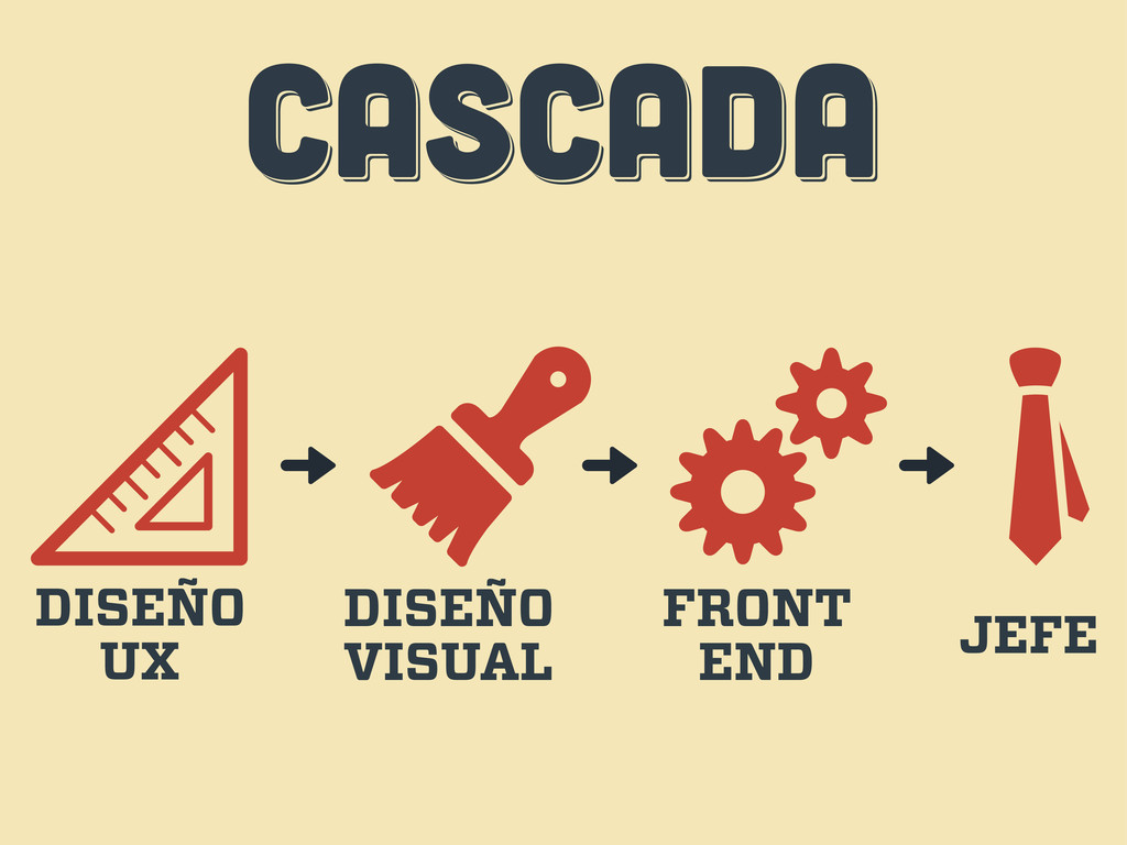
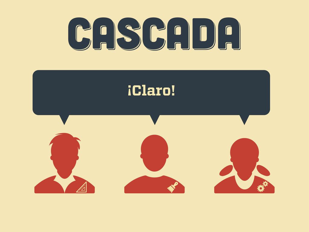
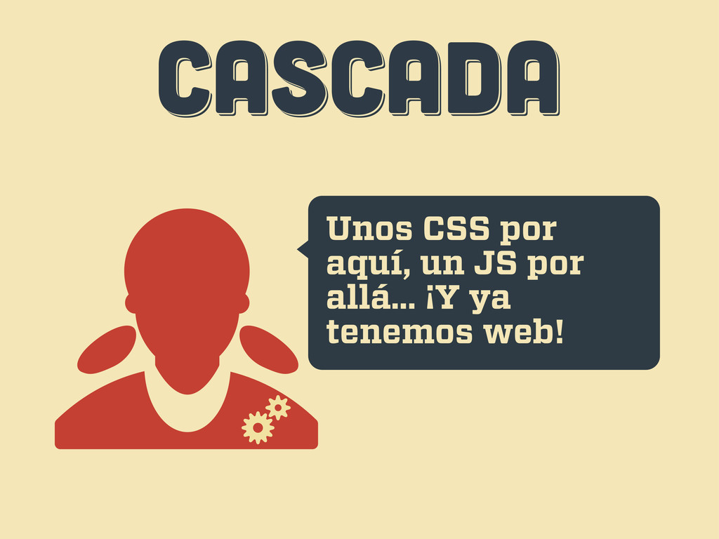
CASCADA CASCADA CASCADA DISEÑO UX DISEÑO VISUAL FRONT END JEFE
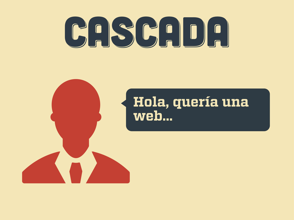
CASCADA CASCADA CASCADA Hola, quería una web...
CASCADA CASCADA CASCADA ¡Claro!
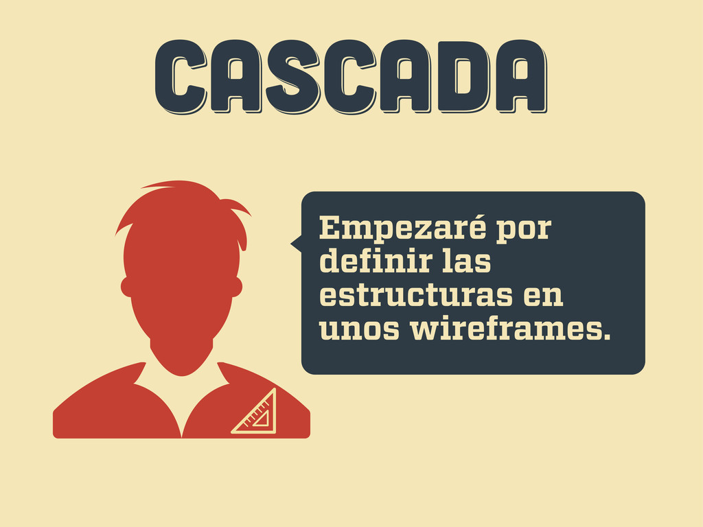
CASCADA CASCADA CASCADA Empezaré por definir las estructuras en unos
wireframes.
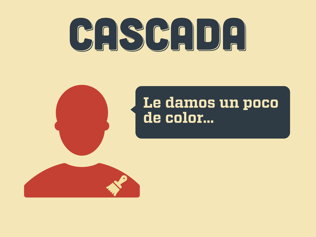
CASCADA CASCADA CASCADA Le damos un poco de color...
CASCADA CASCADA CASCADA Unos CSS por aquí, un JS por
allá... ¡Y ya tenemos web!
CASCADA CASCADA CASCADA Uh... esto...
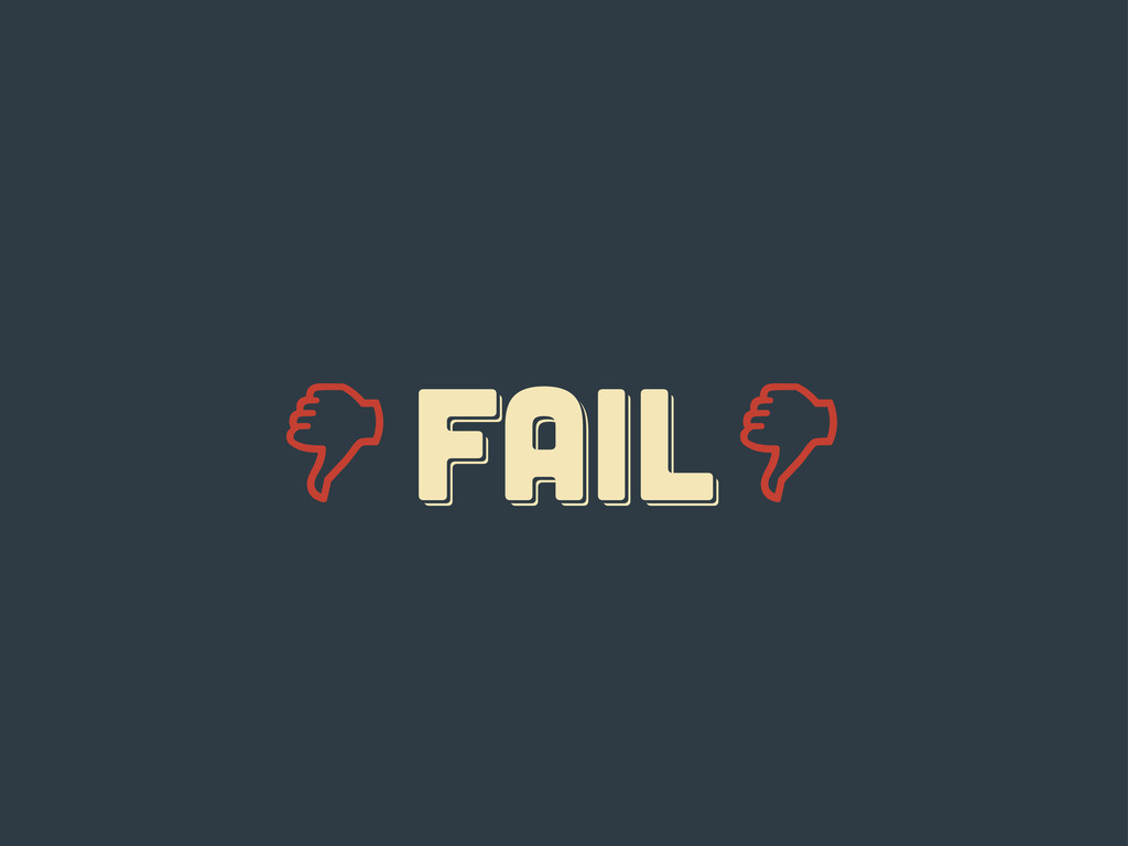
FAIL fail Fail
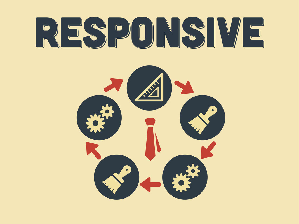
responsive responsive Responsive
diez consejos diez consejos diez consejos tercer acto
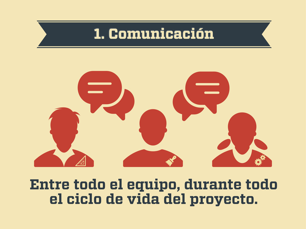
1. Comunicación Entre todo el equipo, durante todo el ciclo
de vida del proyecto.
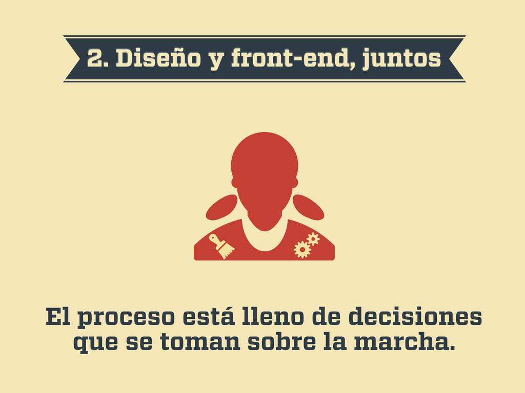
2. Diseño y front-end, juntos El proceso está lleno de
decisiones que se toman sobre la marcha.
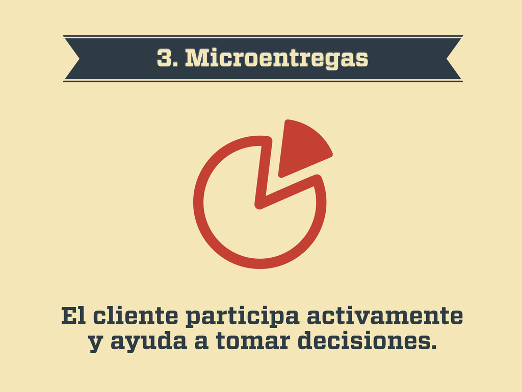
3. Microentregas El cliente participa activamente y ayuda a tomar
decisiones.
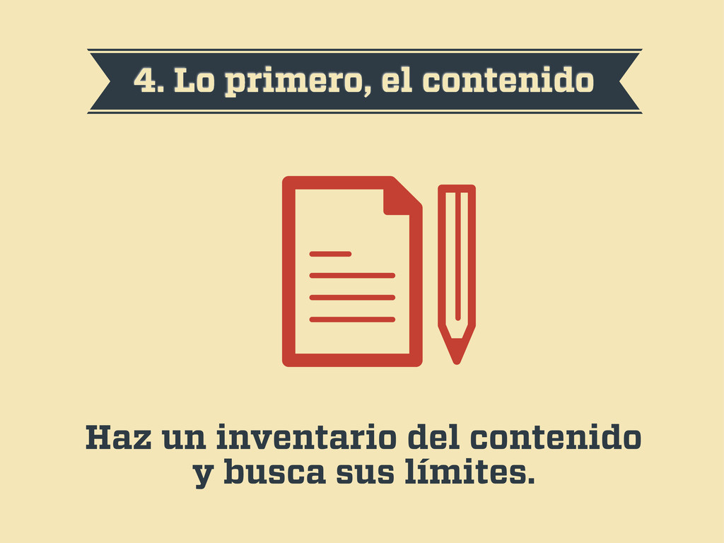
4. Lo primero, el contenido Haz un inventario del contenido
y busca sus límites.
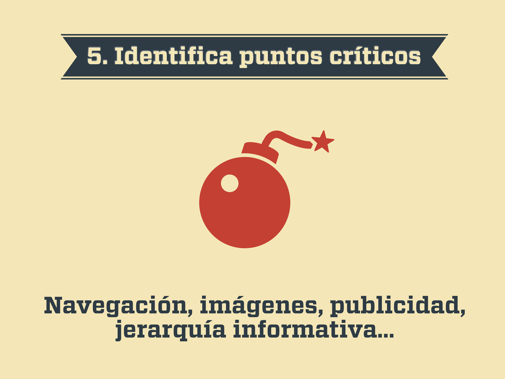
5. Identifica puntos críticos Navegación, imágenes, publicidad, jerarquía informativa…
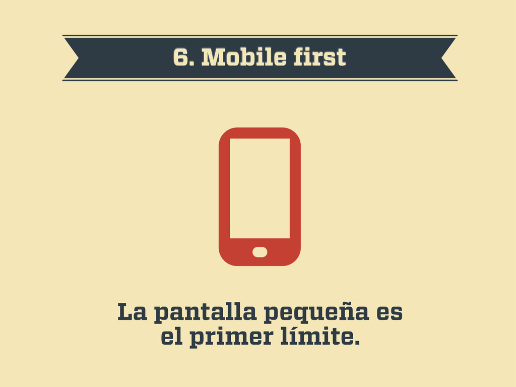
6. Mobile first La pantalla pequeña es el primer límite.
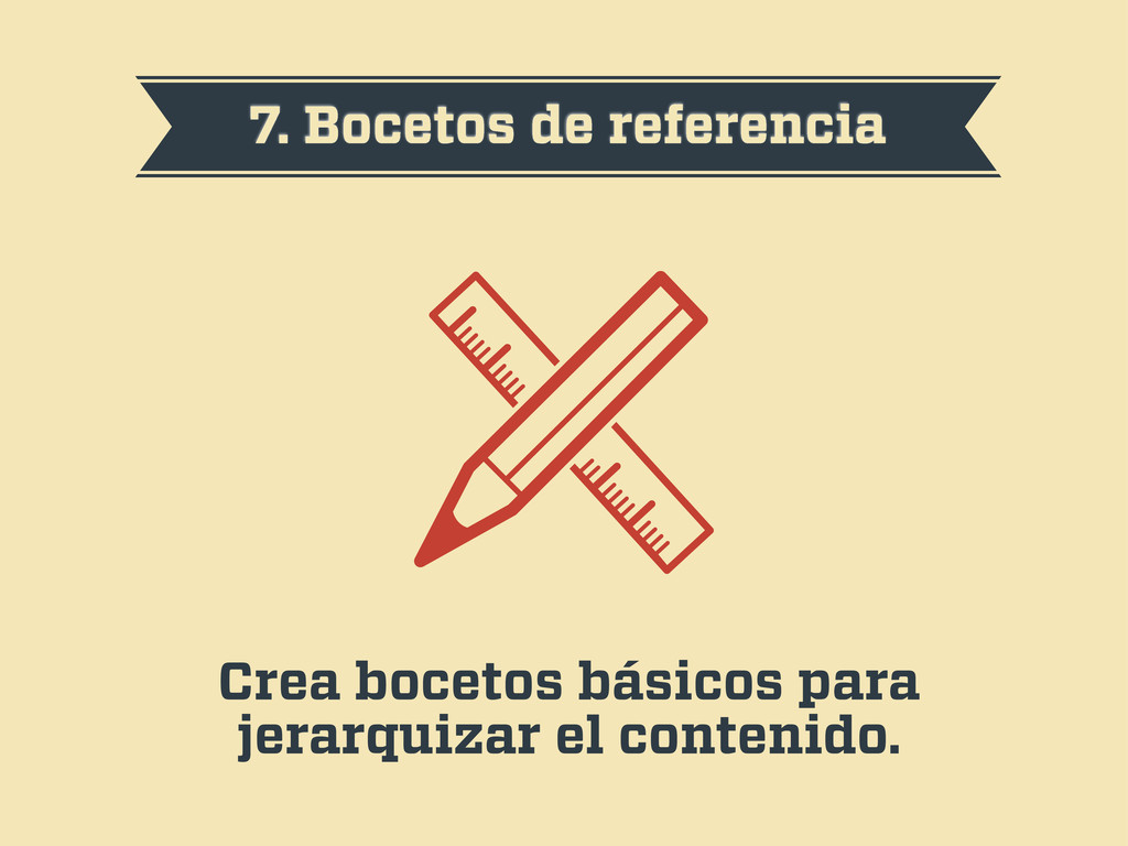
7. Bocetos de referencia Crea bocetos básicos para jerarquizar el
contenido.
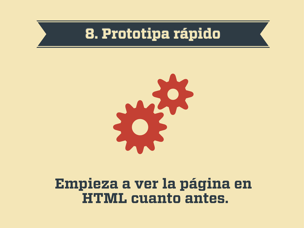
8. Prototipa rápido Empieza a ver la página en HTML
cuanto antes.
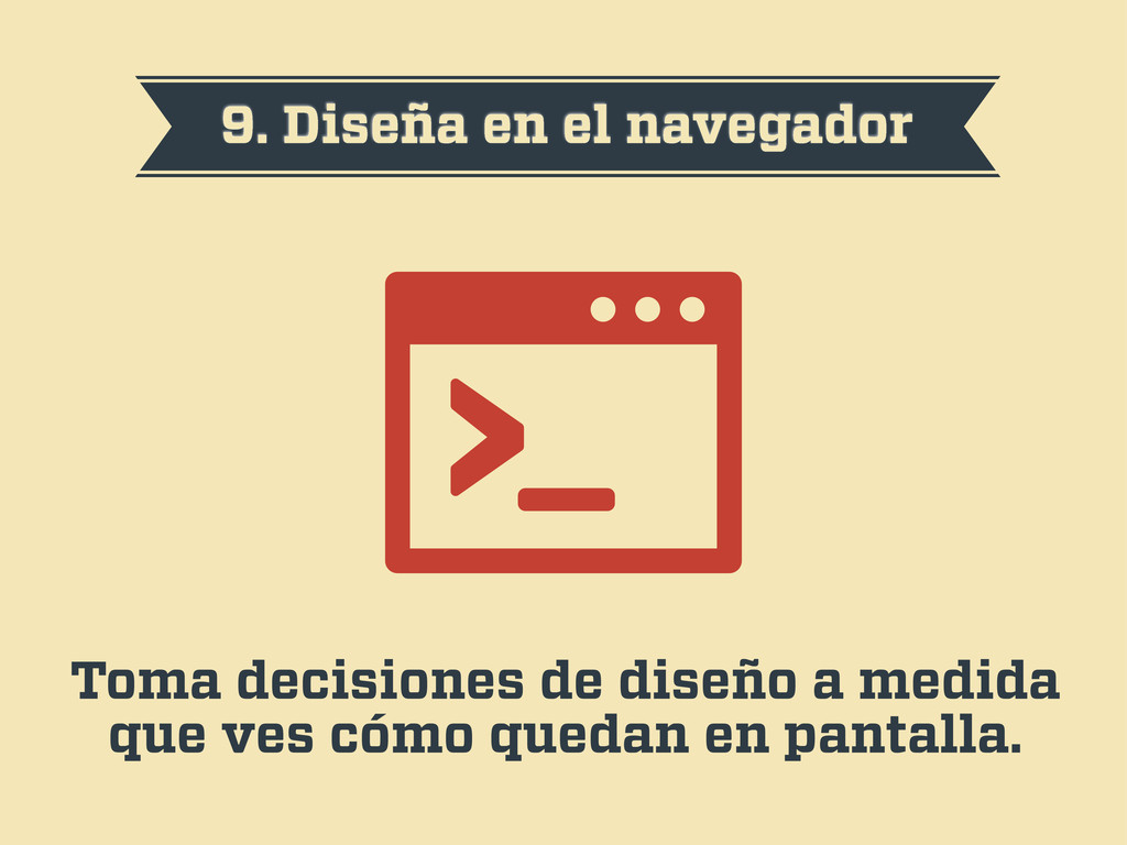
9. Diseña en el navegador Toma decisiones de diseño a
medida que ves cómo quedan en pantalla.
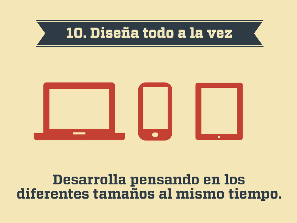
10. Diseña todo a la vez Desarrolla pensando en los
diferentes tamaños al mismo tiempo.
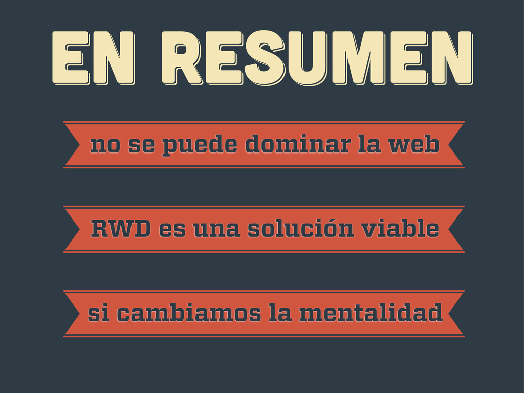
EN RESUMEN EN RESUMEN EN RESUMEN no se puede dominar
la web RWD es una solución viable si cambiamos la mentalidad
¡gracias! ¡gracias! ¡gracias! Javier Usobiaga · http://Swwweet.com · @htmlboy
 swwweet
 rukiadia
 pfn
pfn
 autifyhq
 ichimichi
 hikarut
 lycorptech_jp
 gorou_178
 cyberagentdevelopers
 undefined_name
 comucal
 cmusudakeisuke
 tammielis
 yeseniaperezcruz
 denniskardys
 shlominoach
 lauravandoore
 zakiyama
 thoeni
 tammyeverts
 colly
colly
 panda_program
 destraynor
 garrettdimon