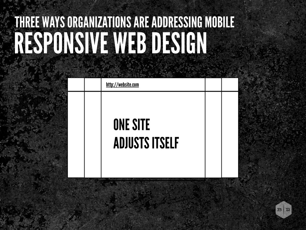
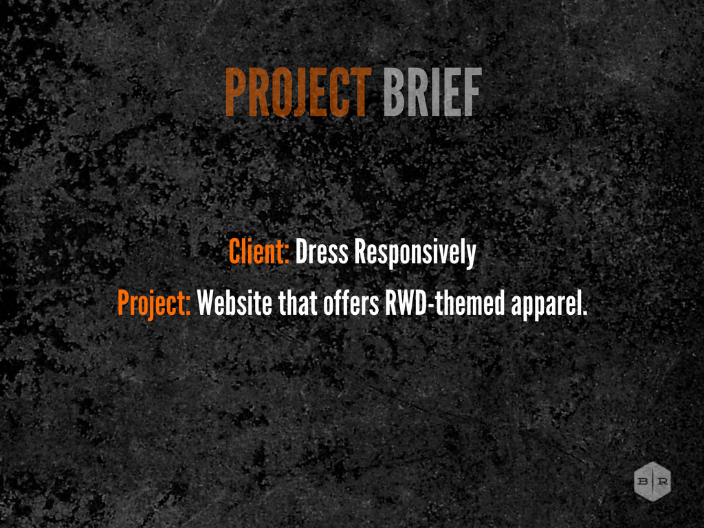
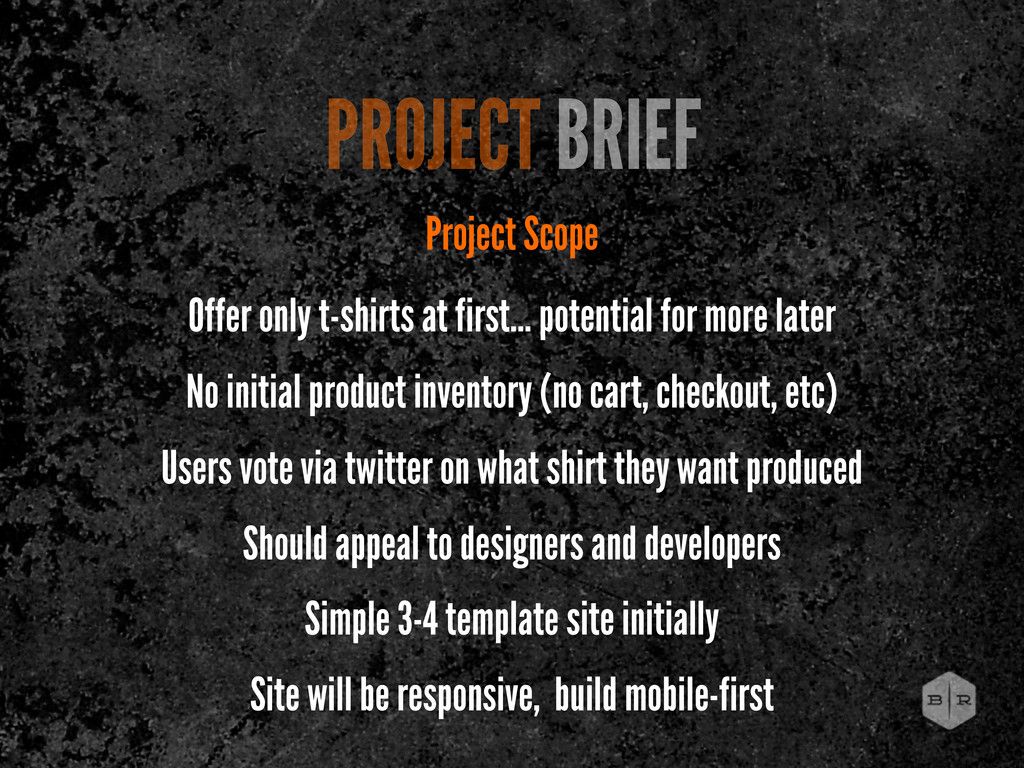
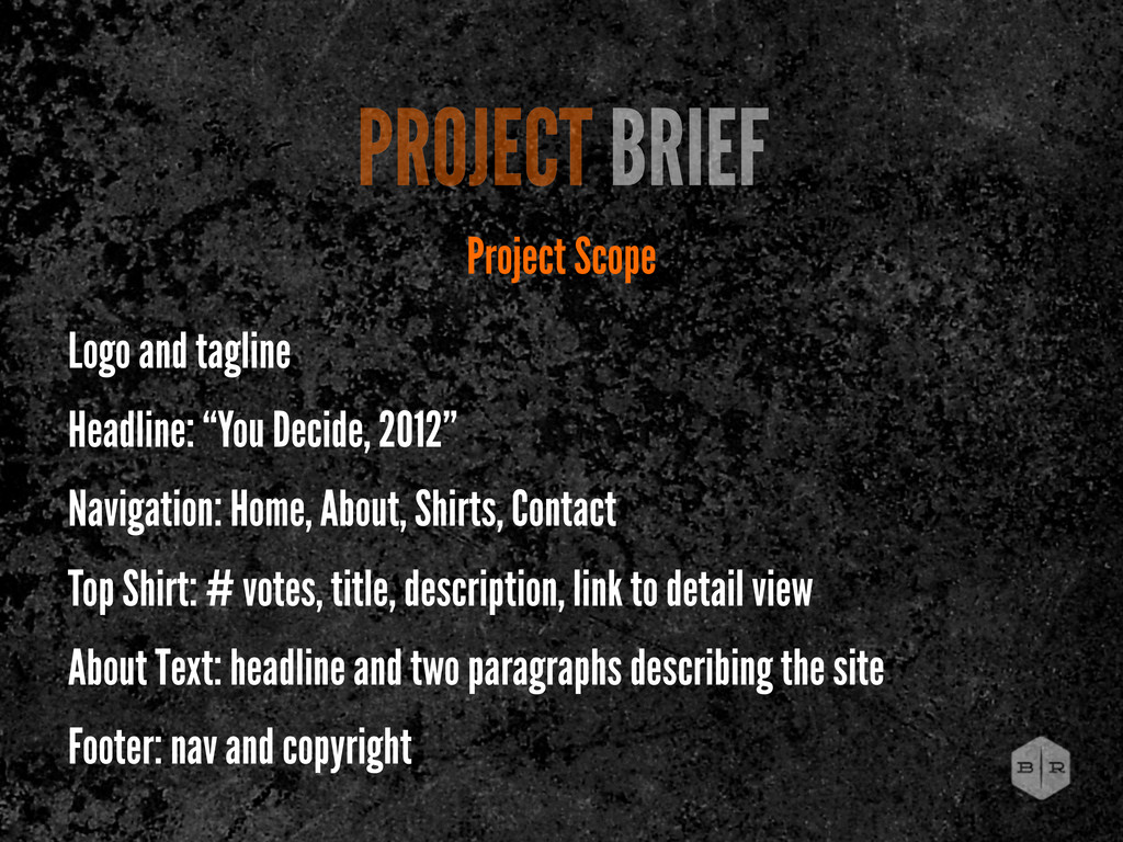
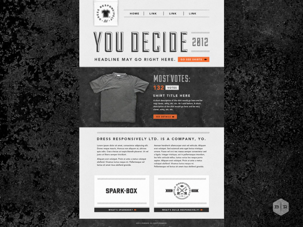
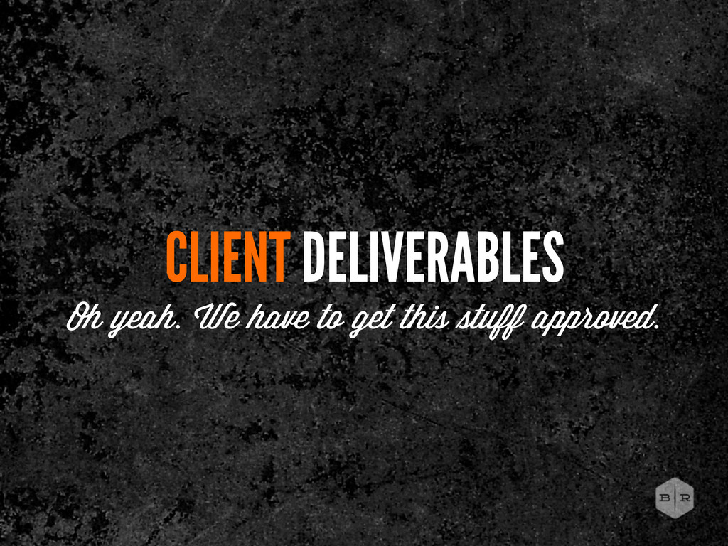
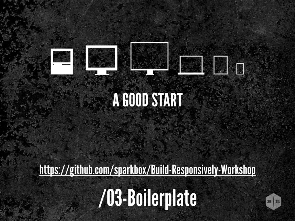
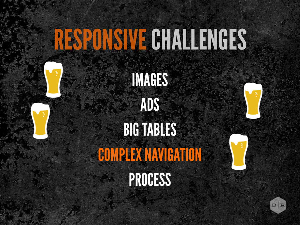
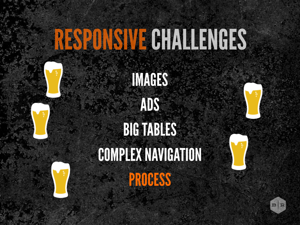
for more later No initial product inventory (no cart, checkout, etc) Users vote via twitter on what shirt they want produced Should appeal to designers and developers Simple 3-4 template site initially Site will be responsive, build mobile-first
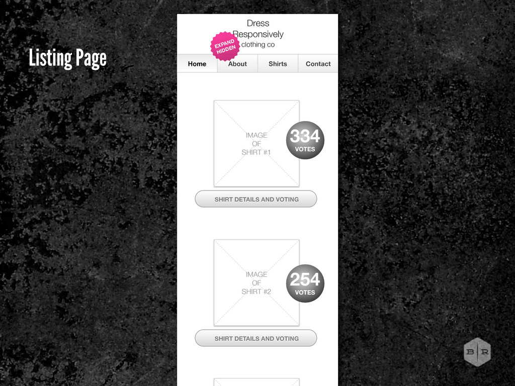
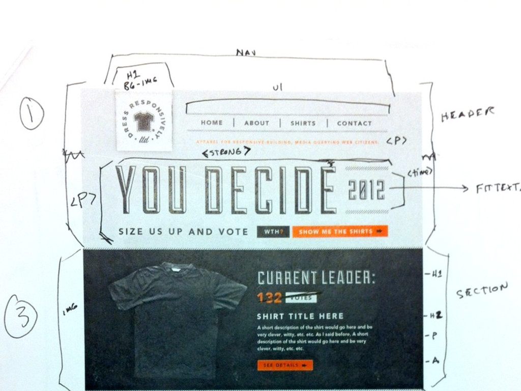
Shirts, Contact Top Shirt: # votes, title, description, link to detail view About Text: headline and two paragraphs describing the site Footer: nav and copyright PROJECT BRIEF Project Scope
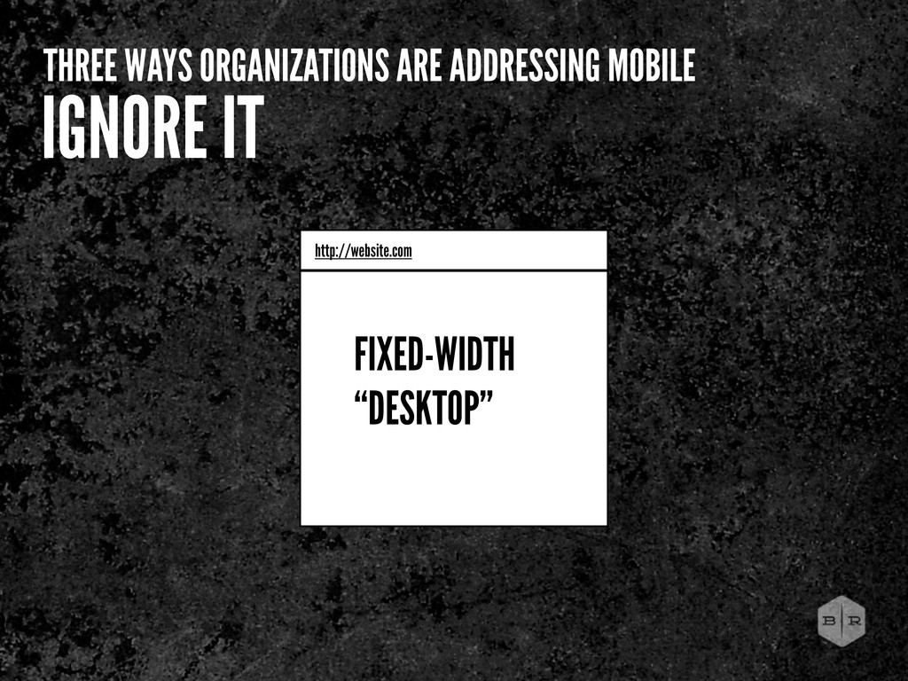
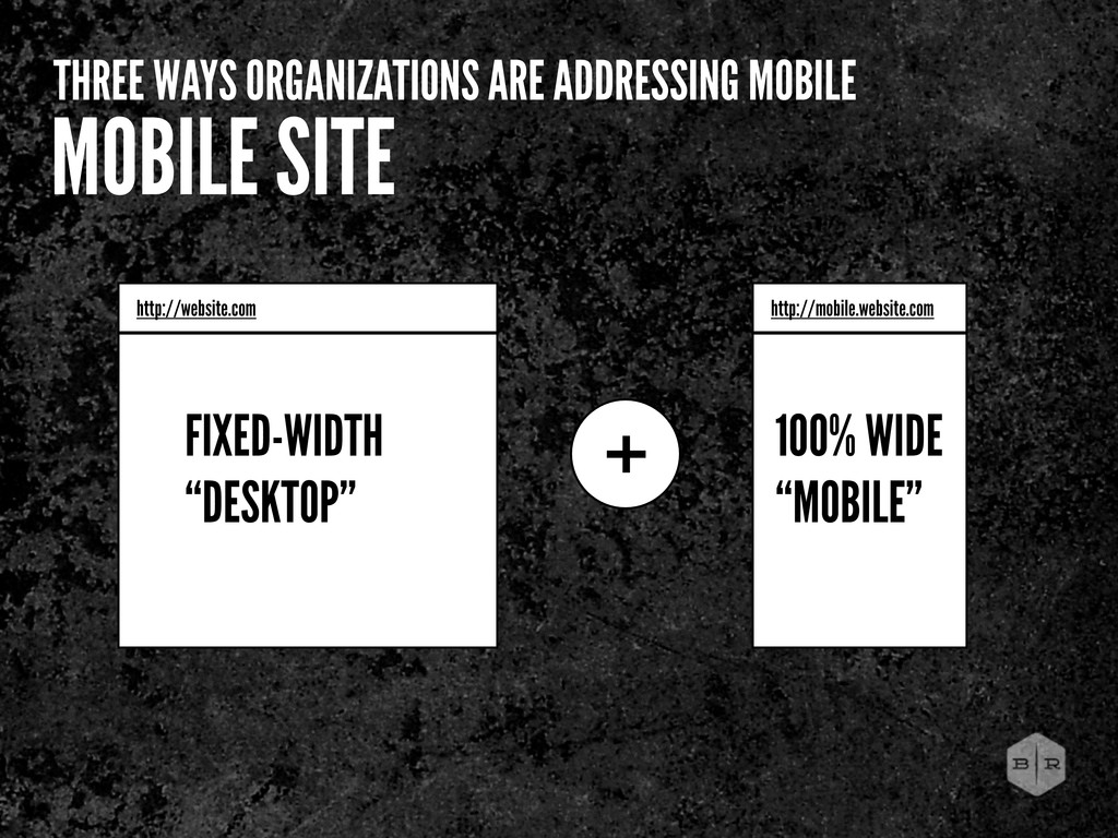
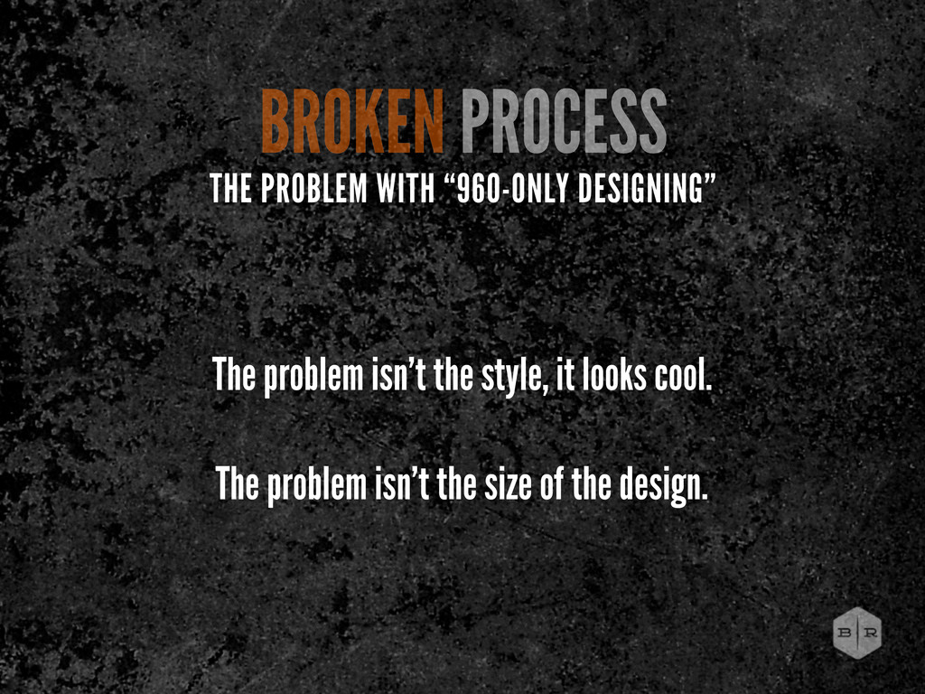
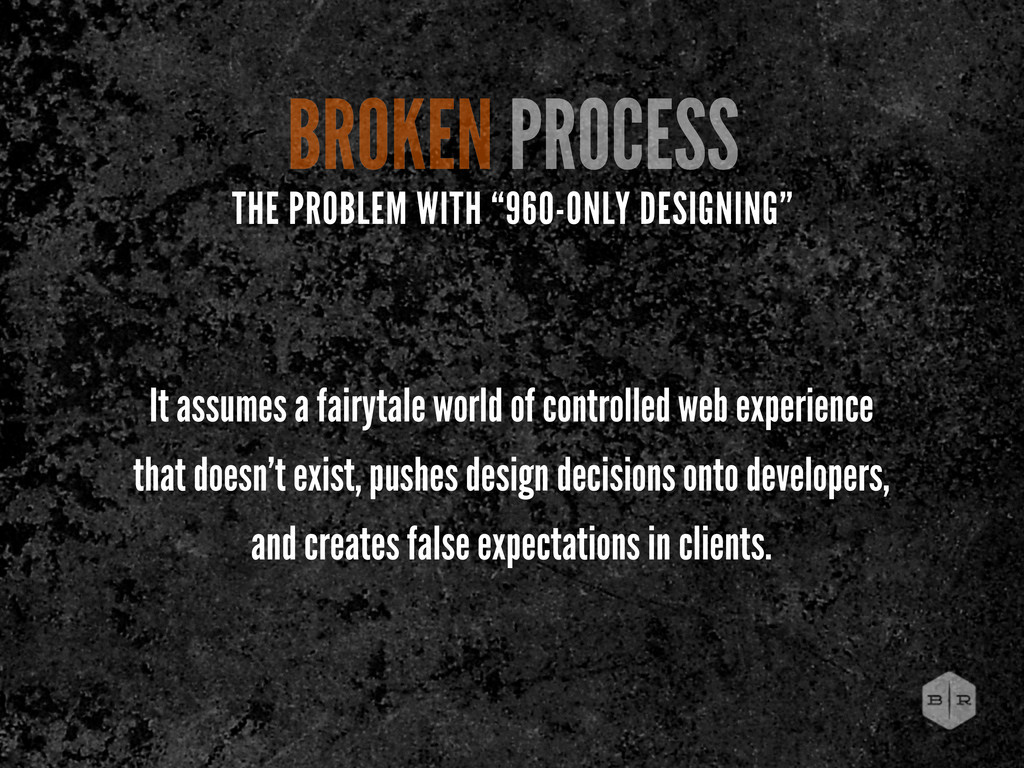
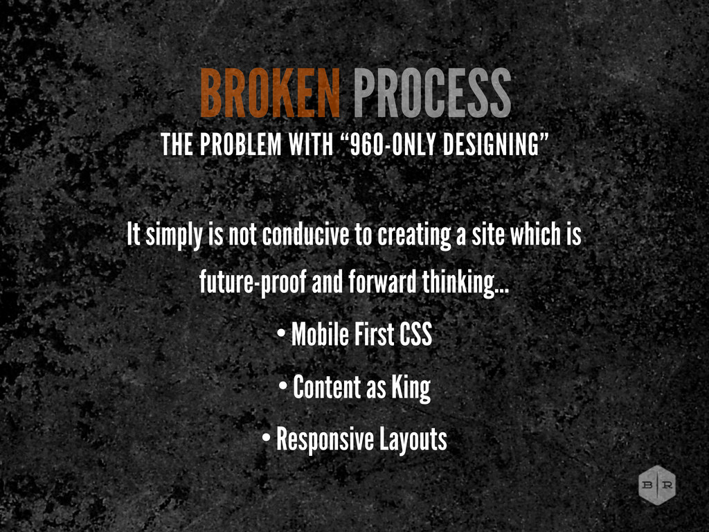
experience that doesn’t exist, pushes design decisions onto developers, and creates false expectations in clients. THE PROBLEM WITH “960-ONLY DESIGNING”
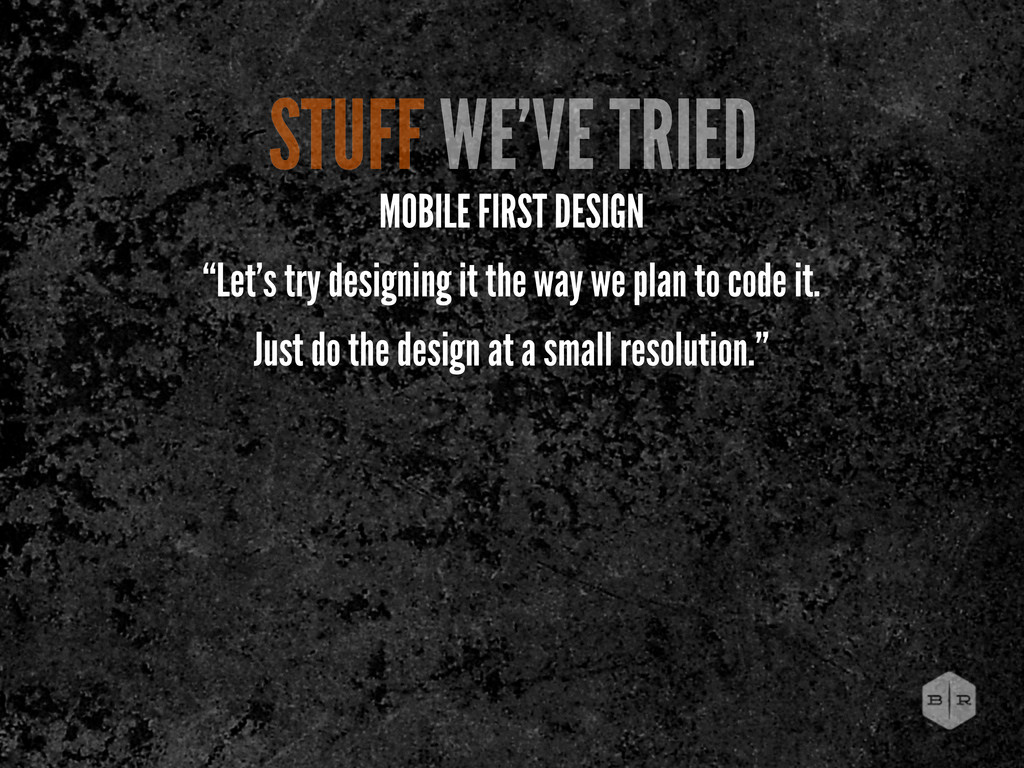
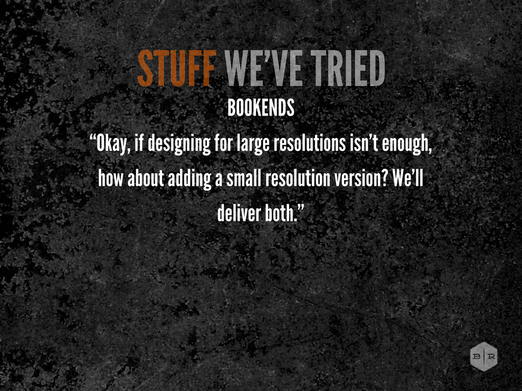
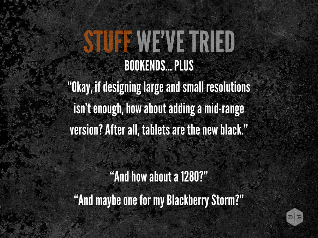
small resolutions isn’t enough, how about adding a mid-range version? After all, tablets are the new black.” “And how about a 1280?” “And maybe one for my Blackberry Storm?”
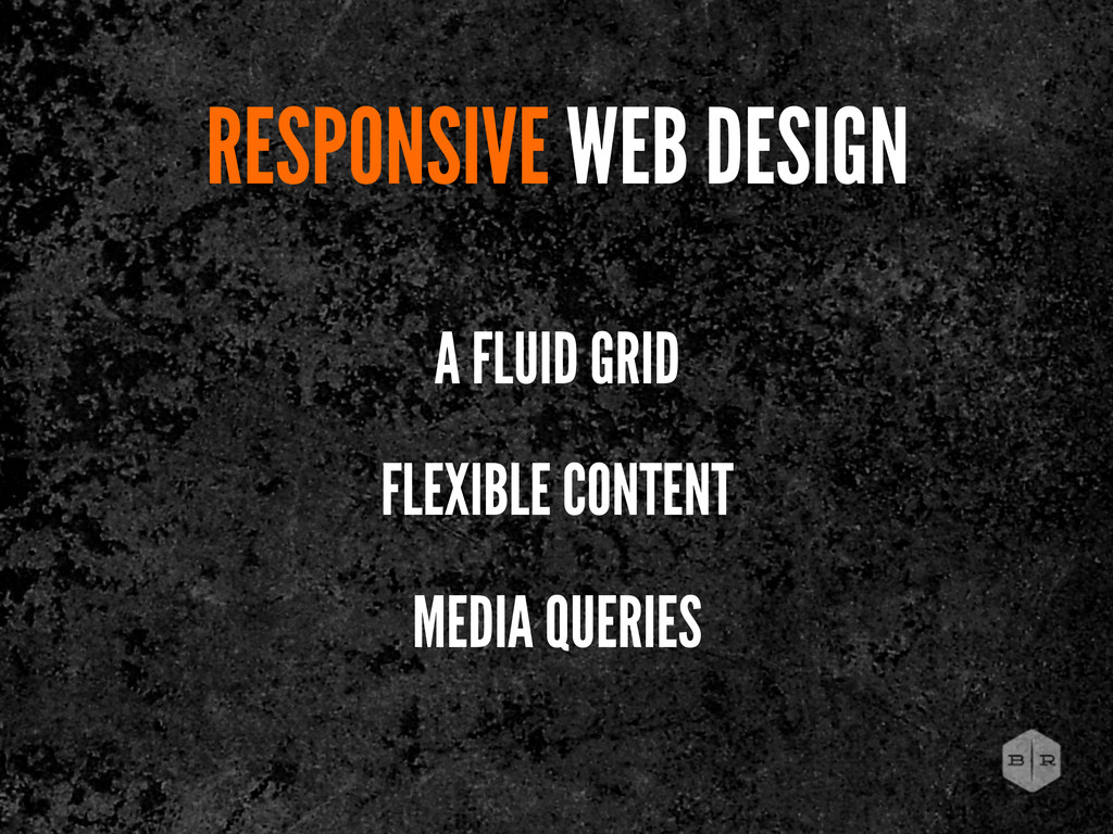
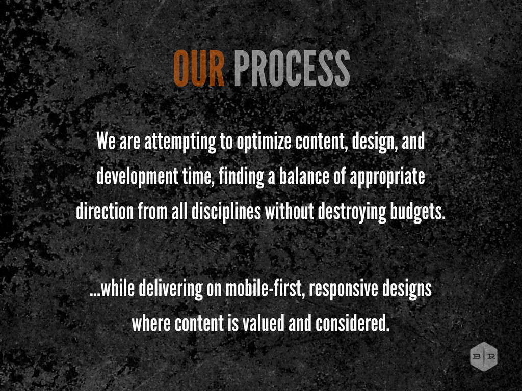
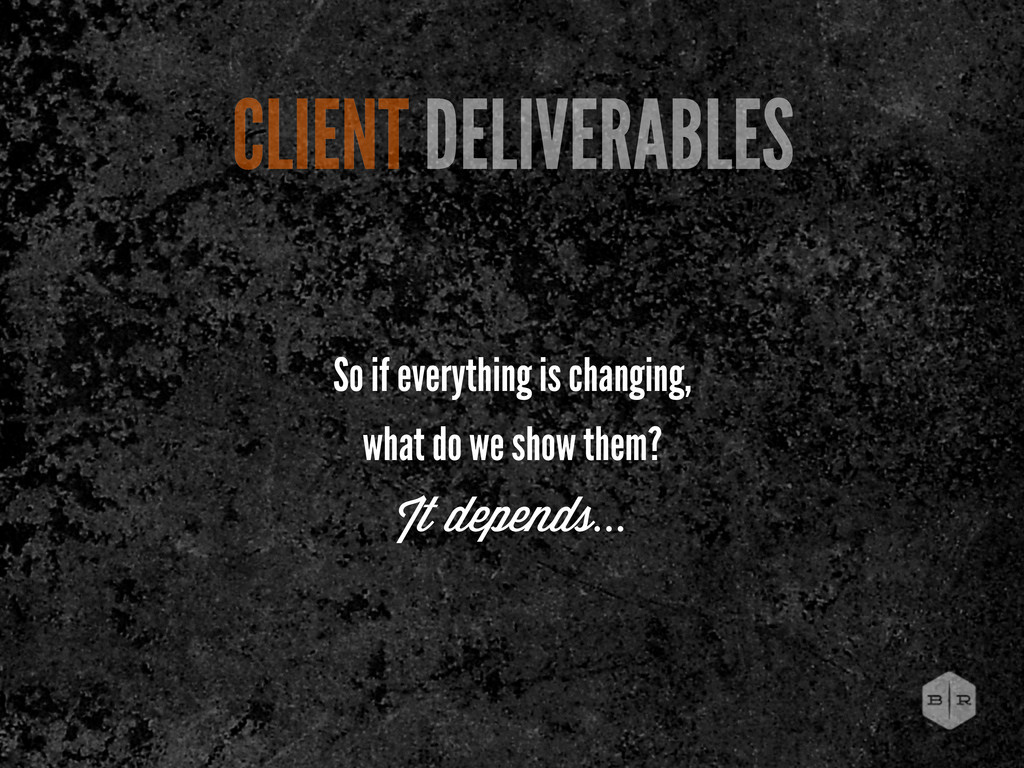
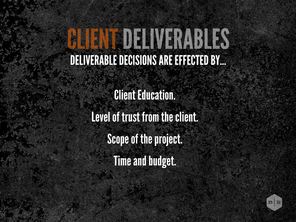
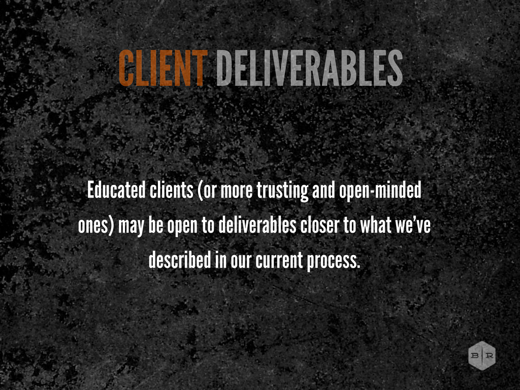
finding a balance of appropriate direction from all disciplines without destroying budgets. ...while delivering on mobile-first, responsive designs where content is valued and considered. OUR PROCESS
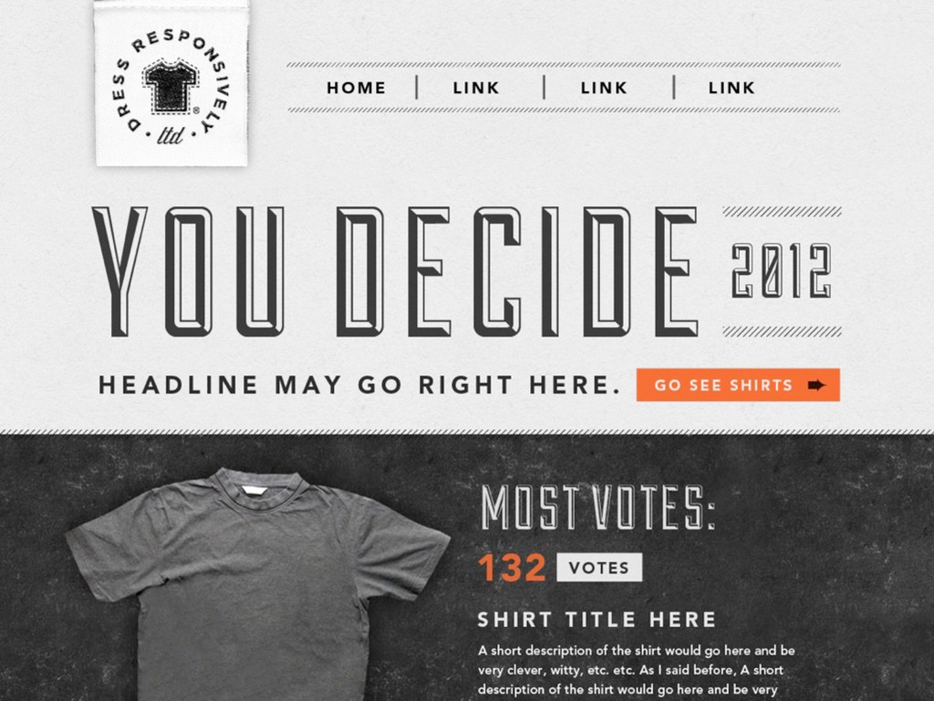
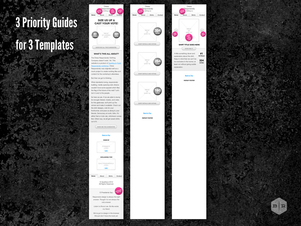
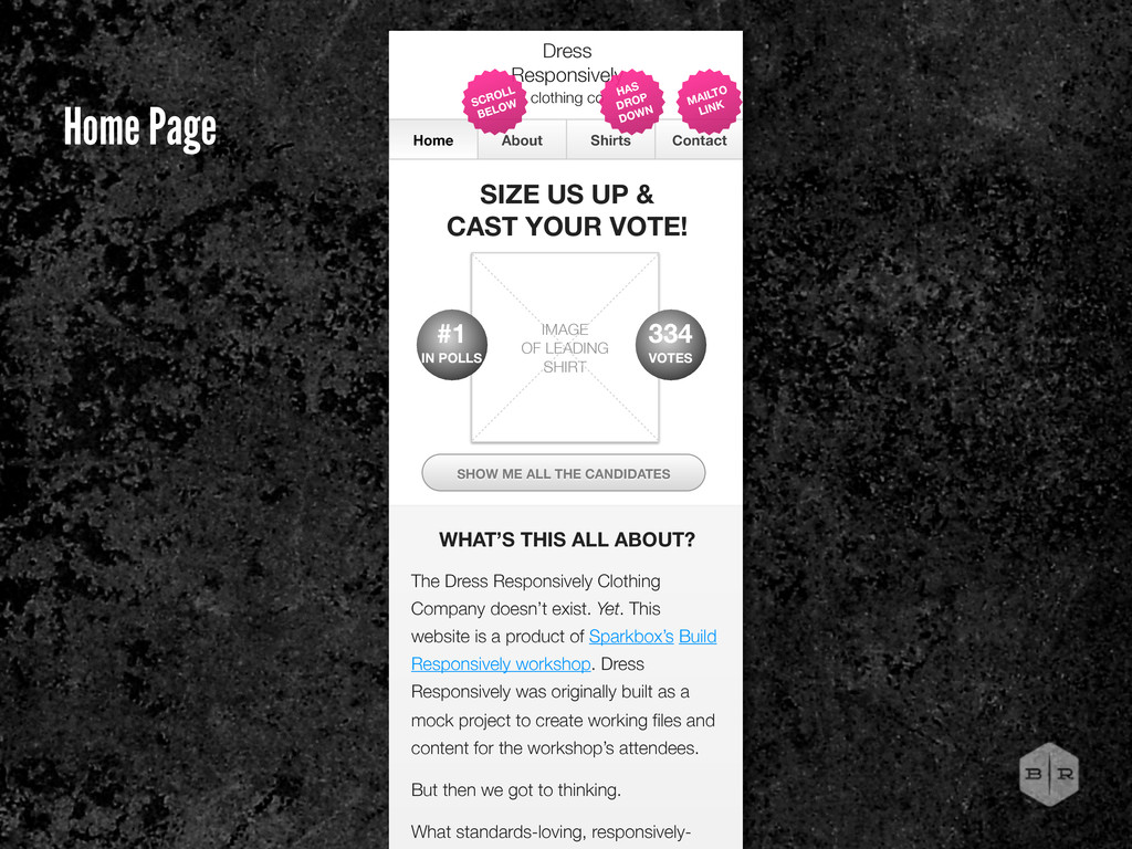
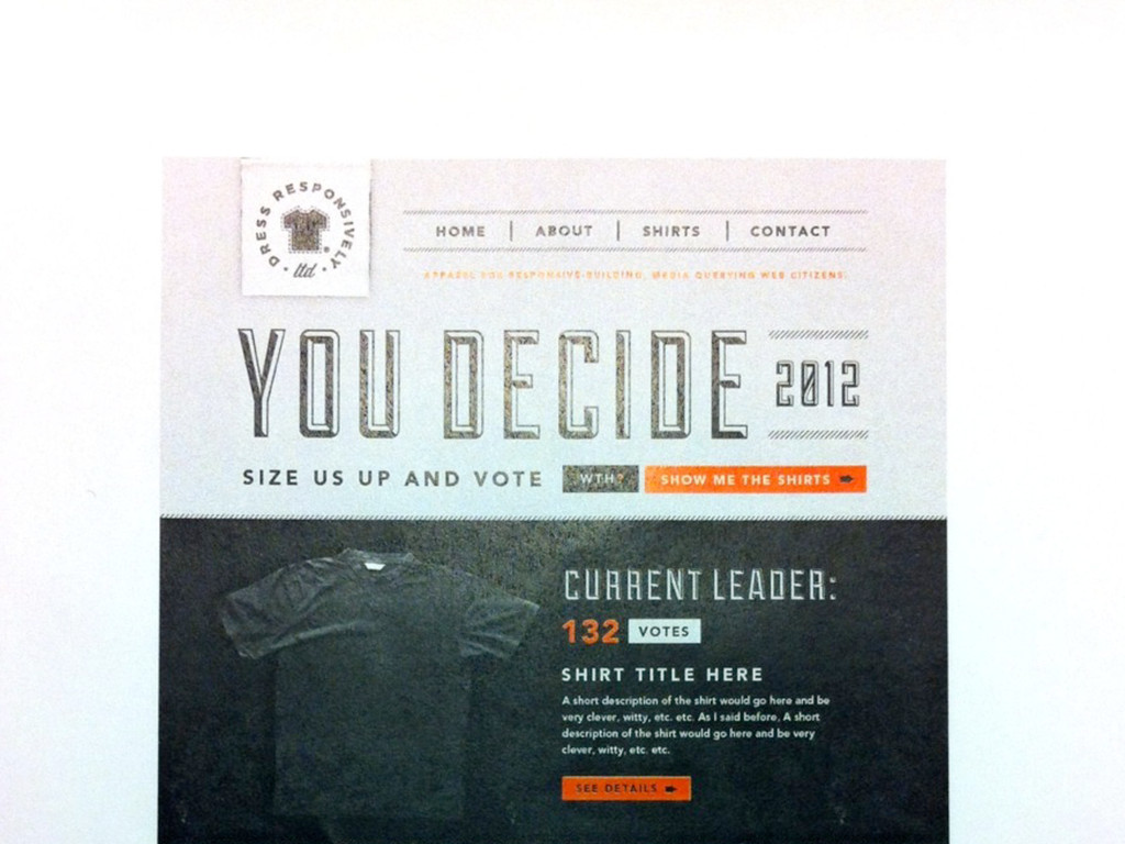
UP & CAST YOUR VOTE! IMAGE OF LEADING SHIRT WHAT’S THIS ALL ABOUT? SHOW ME ALL THE CANDIDATES The Dress Responsively Clothing Company doesn’t exist. Yet. This website is a product of Sparkbox’s Build Responsively workshop. Dress Responsively was originally built as a mock project to create working files and content for the workshop’s attendees. But then we got to thinking. What standards-loving, responsively- HAS DROP DOWN MAILTO LINK SCROLL BELOW 334 VOTES #1 IN POLLS Home Page
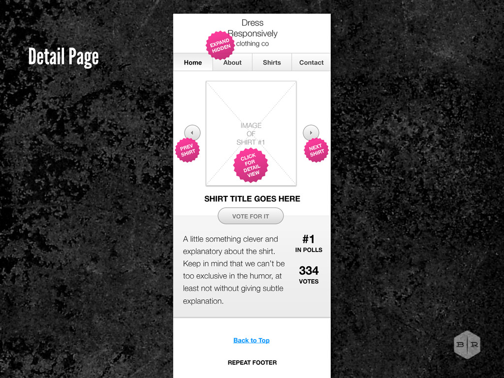
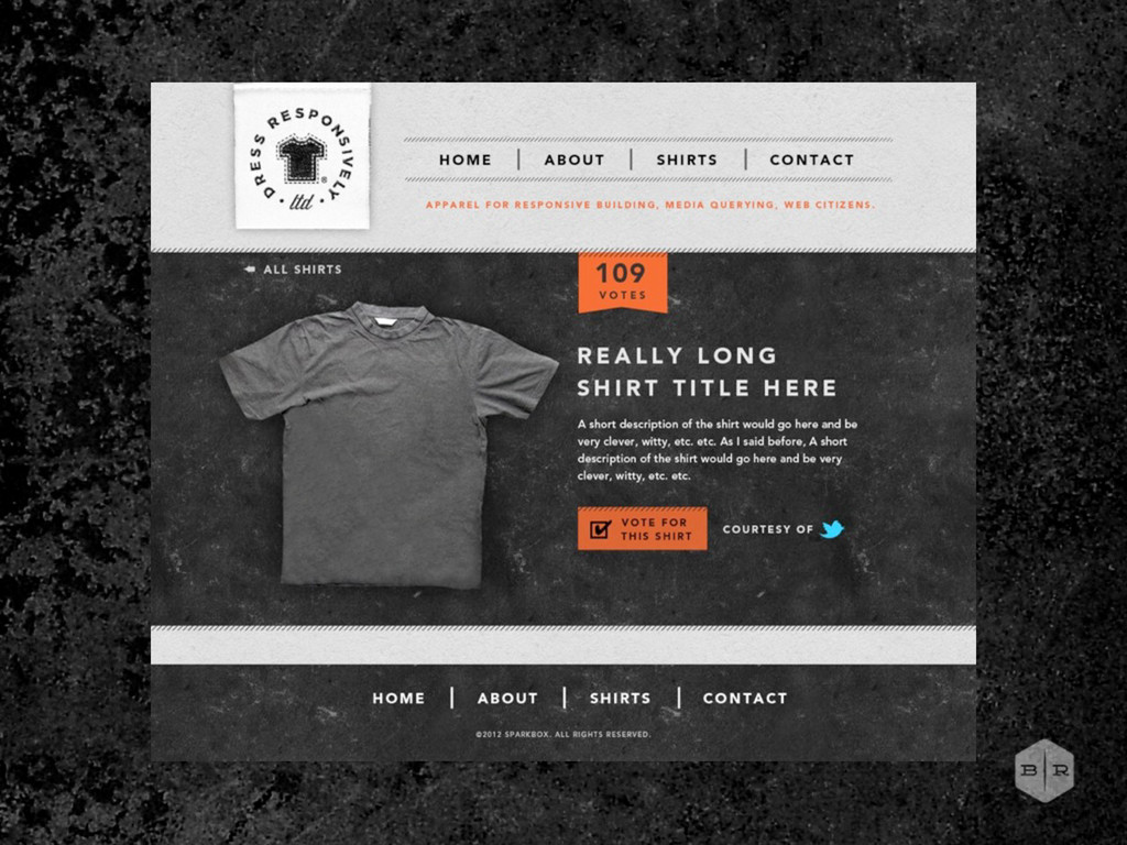
in mind that we can’t be too exclusive in the humor, at least not without giving subtle explanation. Home About Shirts Contact Dress Responsively clothing co IMAGE OF SHIRT #1 VOTE FOR IT EXPAND HIDDEN 334 VOTES CLICK FOR DETAIL VIEW #1 IN POLLS SHIRT TITLE GOES HERE NEXT SHIRT PREV SHIRT Back to Top REPEAT FOOTER Detail Page
 bencallahan
 kenichiota0711
 hideakitakechi
 seto
seto
 kspace
 lw
lw
 garyuten
 usagimaru
 calpin
 klemens
 a2k
a2k
 tajima_kaho
 ajstarks
 gurzu
gurzu
 kimpetersen
 chriscoyier
 reverentgeek
 irinanazarova
 lauravandoore
 scottboms
 orderedlist
 addyosmani
 geoffreycrofte
 mlcsv
mlcsv
 quramy