A slightly modified version of the talk I first presented at Smashing Conference, now presented at Fronteers 2012. (http://fronteers.nl/congres/2012)
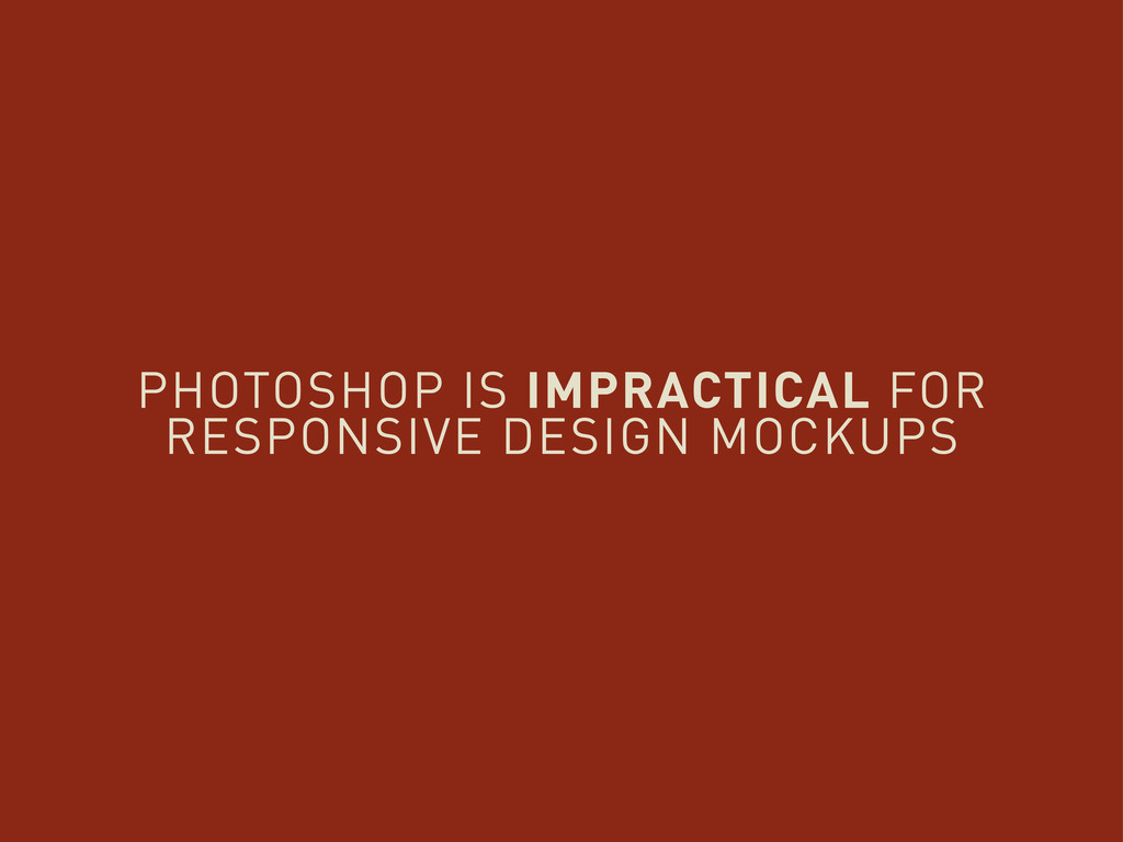
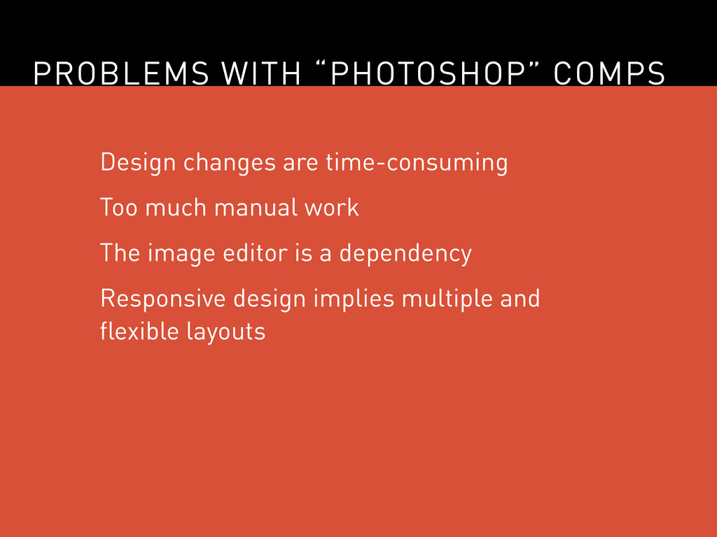
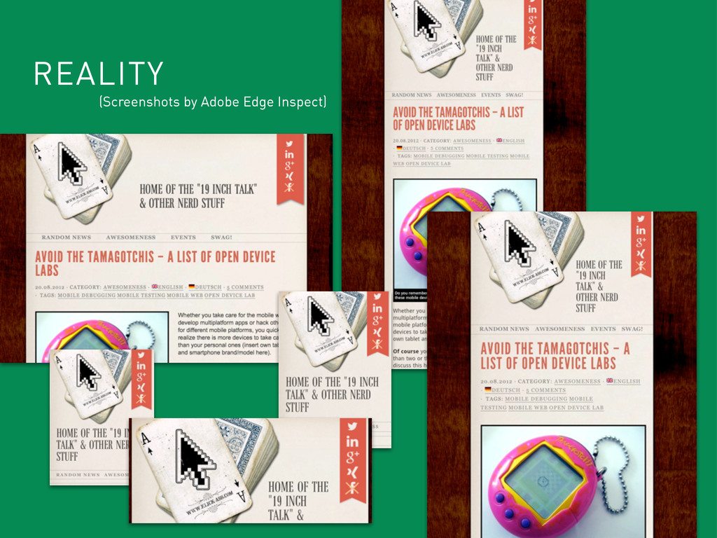
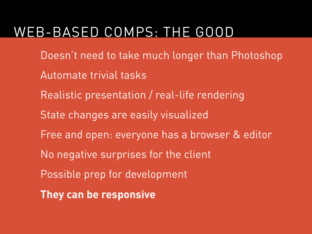
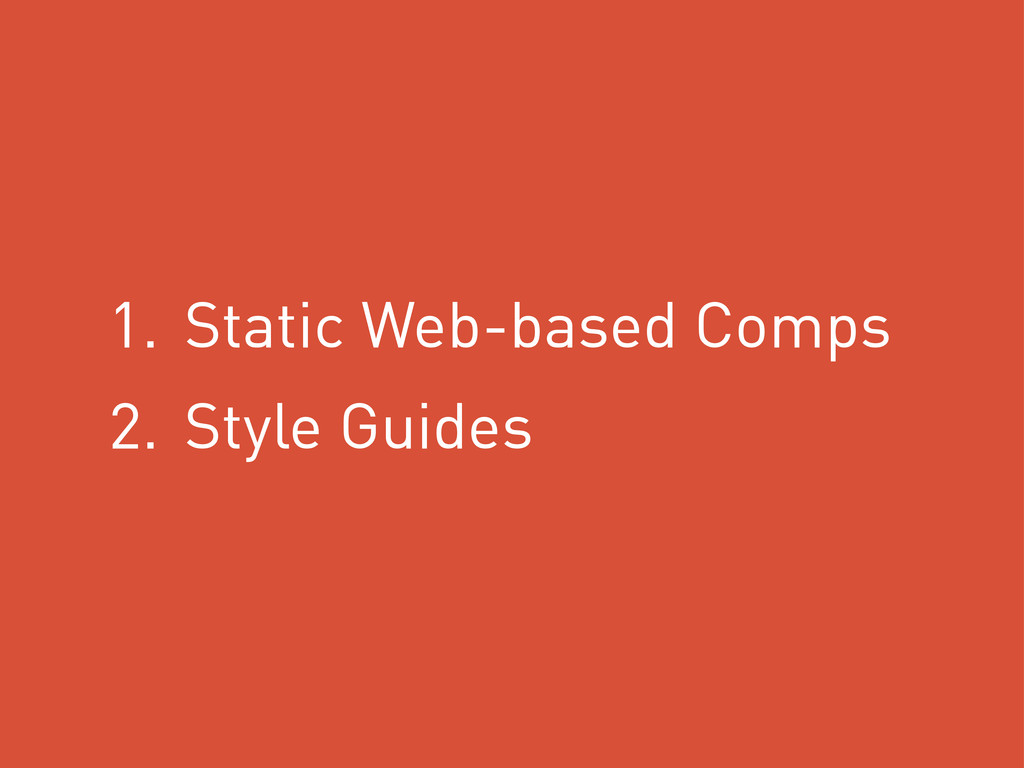
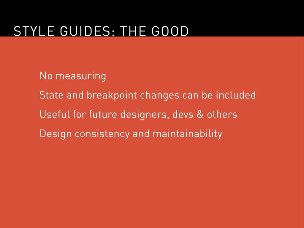
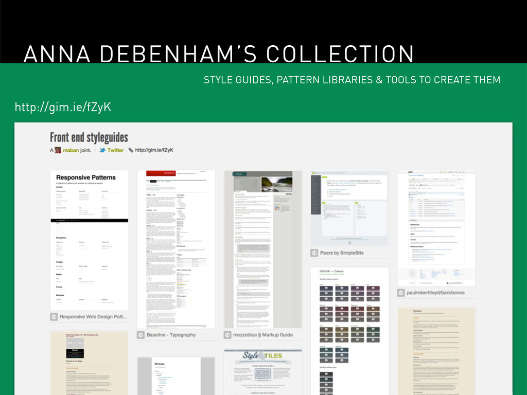
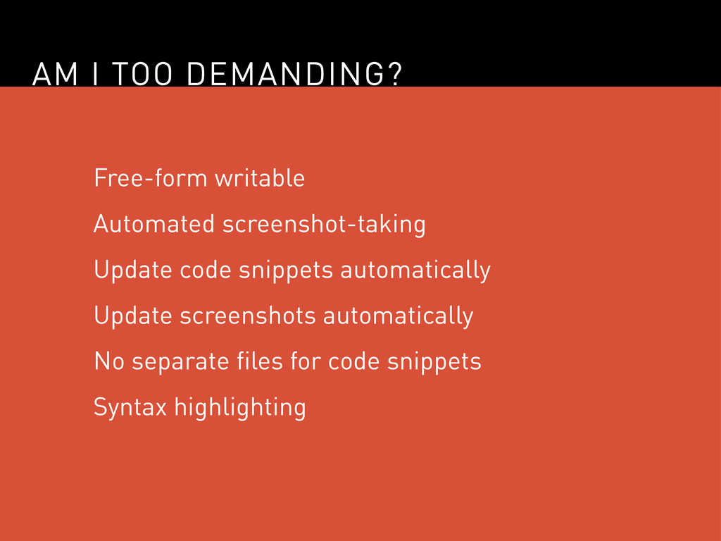
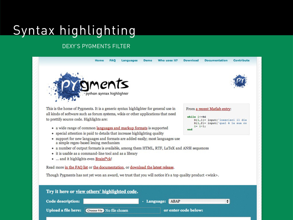
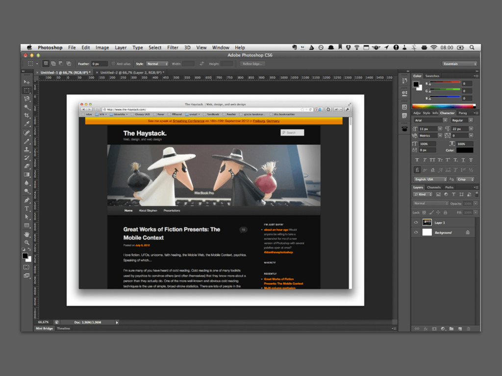
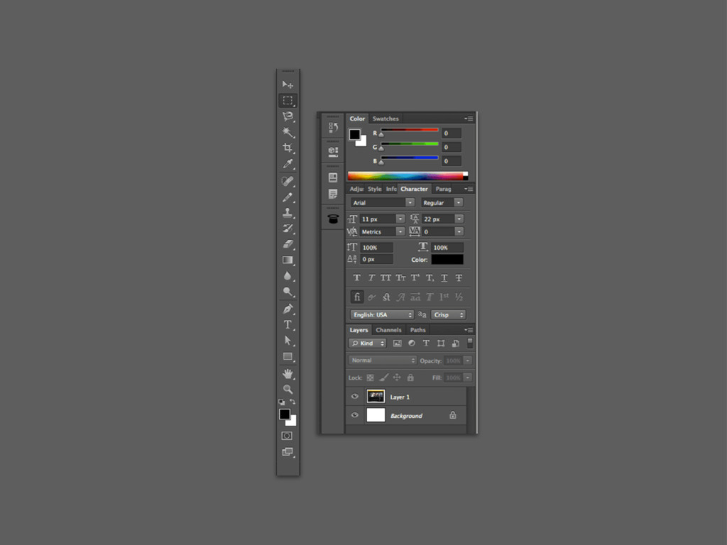
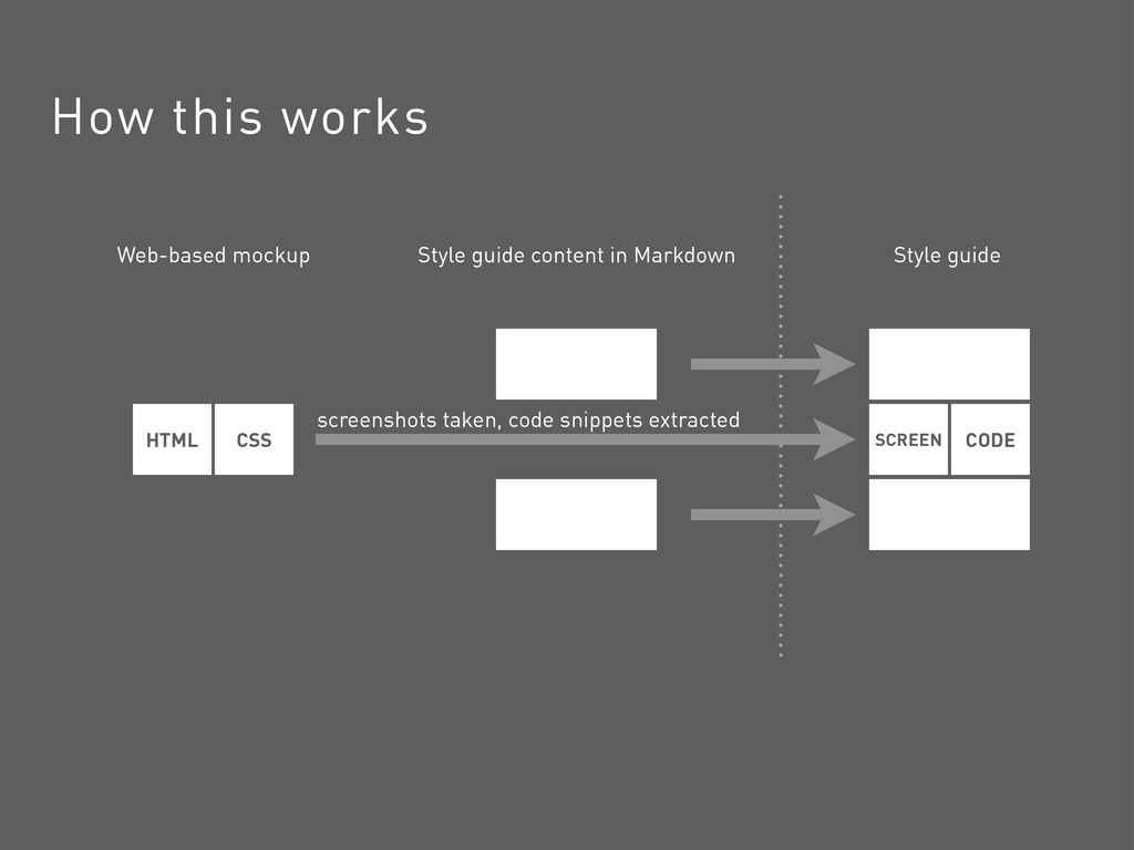
Use of image editors for creating web design mockups has worked until now, but responsive design is forcing us to find alternatives, as we can't simply create more mockups as we design for more screens. Have no fear, there is at least one method of replacing Photoshop for web design. Let's take a look at one of the most important aspects of this method: the creation of clear, semi-automated, self-updating style guides.
 stephenhay
 godlingkogami
 a2k
a2k
 designer_no_pon
 payatsusan213
 nbkouhou
 videlvequio
 hjmkth
 kaminashi
 atsushihomma
 hypebeans
 mhand01
 csswizardry
 jonoalderson
 rabernat
 tmiket
 lara
lara
 baasie
 keithpitt
 pwiseman
 rasmusluckow
 vanstee
 dougneiner
 lynnandtonic
 coloredviolet