Upgrade to Pro
— share decks privately, control downloads, hide ads and more …
Speaker Deck
Features
Speaker Deck
PRO
Sign in
Sign up for free
Search
Search
Responsive Web Design - Reinventando la web
Search
Swwweet
April 27, 2012
Technology
15
4.7k
Responsive Web Design - Reinventando la web
Presentación de Javier Usobiaga en el Ideateca HTML5 DevUp 2012.
Swwweet
April 27, 2012
Tweet
Share
More Decks by Swwweet
See All by Swwweet
Wonders from the Full Stack Fest website
swwweet
1
360
How to be the best web designer in the world.
swwweet
6
1.3k
Design for loading
swwweet
5
550
Mobile First: as difficult as doing things right
swwweet
225
10k
One Size Fits None
swwweet
12
890
One Size Fits None - From the Front 2013
swwweet
2
740
Responsively Responsive
swwweet
23
1.6k
La letra con píxel entra
swwweet
0
1.2k
The future of code
swwweet
4
620
Other Decks in Technology
See All in Technology
データの整合性を保ちたいだけなんだ
shoheimitani
8
3.2k
All About Sansan – for New Global Engineers
sansan33
PRO
1
1.4k
Why Organizations Fail: ノーベル経済学賞「国家はなぜ衰退するのか」から考えるアジャイル組織論
kawaguti
PRO
1
100
OWASP Top 10:2025 リリースと 少しの日本語化にまつわる裏話
okdt
PRO
3
820
Red Hat OpenStack Services on OpenShift
tamemiya
0
120
22nd ACRi Webinar - NTT Kawahara-san's slide
nao_sumikawa
0
100
学生・新卒・ジュニアから目指すSRE
hiroyaonoe
2
650
予期せぬコストの急増を障害のように扱う――「コスト版ポストモーテム」の導入とその後の改善
muziyoshiz
1
2k
仕様書駆動AI開発の実践: Issue→Skill→PRテンプレで 再現性を作る
knishioka
2
680
Bill One急成長の舞台裏 開発組織が直面した失敗と教訓
sansantech
PRO
2
380
Bedrock PolicyでAmazon Bedrock Guardrails利用を強制してみた
yuu551
0
250
コスト削減から「セキュリティと利便性」を担うプラットフォームへ
sansantech
PRO
3
1.5k
Featured
See All Featured
4 Signs Your Business is Dying
shpigford
187
22k
No one is an island. Learnings from fostering a developers community.
thoeni
21
3.6k
Let's Do A Bunch of Simple Stuff to Make Websites Faster
chriscoyier
508
140k
Introduction to Domain-Driven Design and Collaborative software design
baasie
1
590
Chasing Engaging Ingredients in Design
codingconduct
0
110
Leveraging Curiosity to Care for An Aging Population
cassininazir
1
160
Creating an realtime collaboration tool: Agile Flush - .NET Oxford
marcduiker
35
2.4k
The innovator’s Mindset - Leading Through an Era of Exponential Change - McGill University 2025
jdejongh
PRO
1
93
Exploring the Power of Turbo Streams & Action Cable | RailsConf2023
kevinliebholz
37
6.3k
Fireside Chat
paigeccino
41
3.8k
Product Roadmaps are Hard
iamctodd
PRO
55
12k
The agentic SEO stack - context over prompts
schlessera
0
640
Transcript
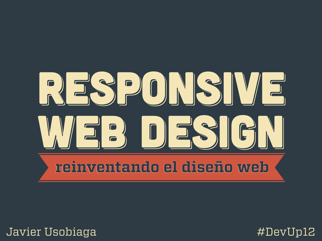
RESPoNSIVE WEB DESIGN RESPoNSIVE WEB DESIGN RESPoNSIVE WEB DESIGN reinventando
el diseño web Javier Usobiaga #DevUp12
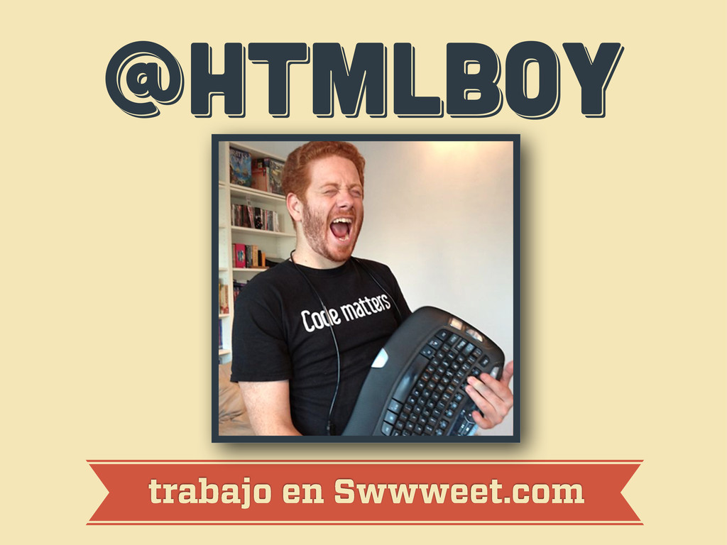
@htmlboy @htmlboy @htmlboy trabajo en Swwweet.com
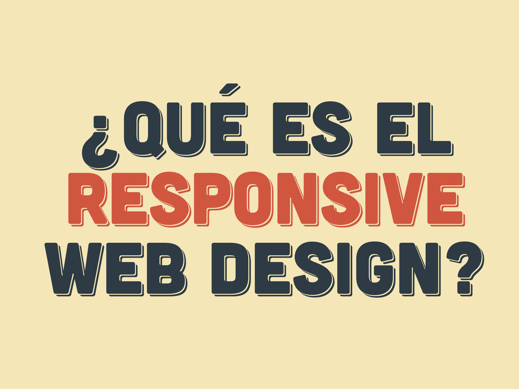
¿Qué es el responsive web design? ¿Qué es el responsive
web design? ¿Qué es el respoNsive web design?
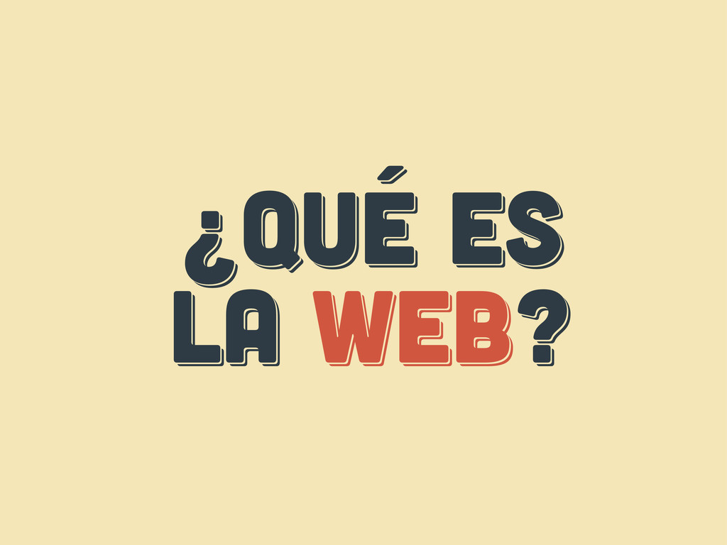
¿Qué es LA web? ¿Qué es LA web? ¿Qué es
LA web?
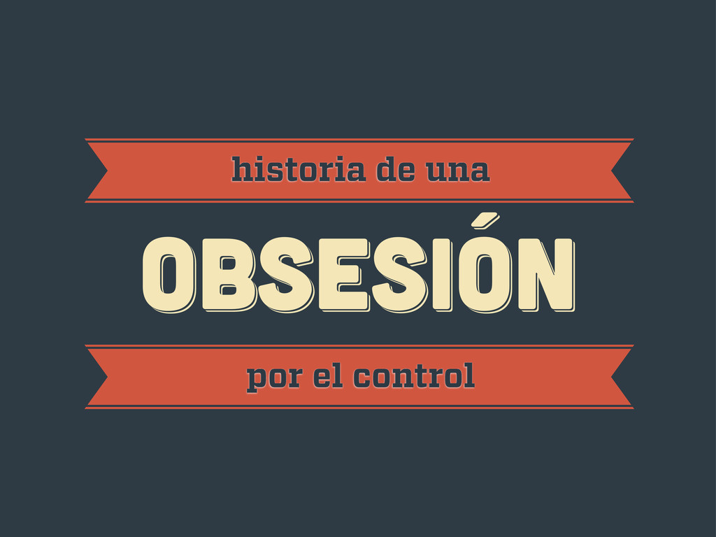
obsesión obsesión historia de una obsesión por el control
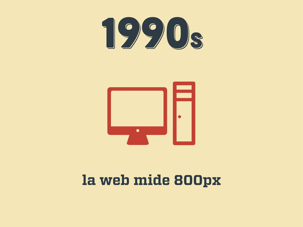
1990s 1990s 1990s la web mide 800px
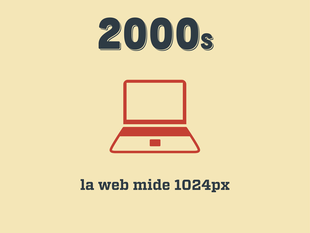
2000s 2000s 2000s la web mide 1024px
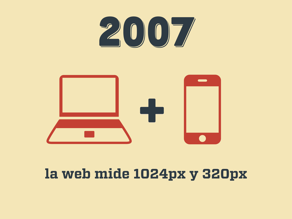
2007 2007 2007 + la web mide 1024px y 320px
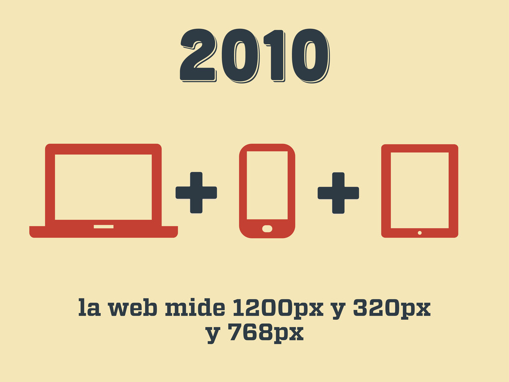
2010 2010 2010 + + la web mide 1200px y
320px y 768px
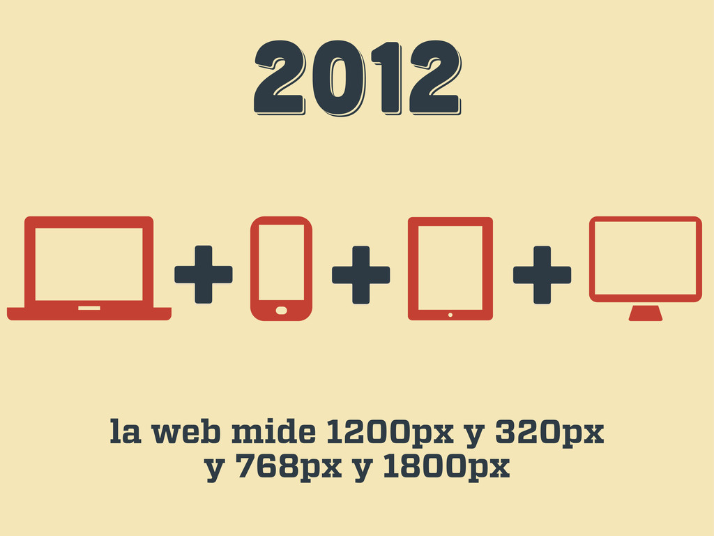
2012 2012 2012 + + la web mide 1200px y
320px y 768px y 1800px +
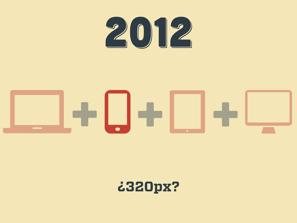
2012 2012 2012 + + ¿320px? +
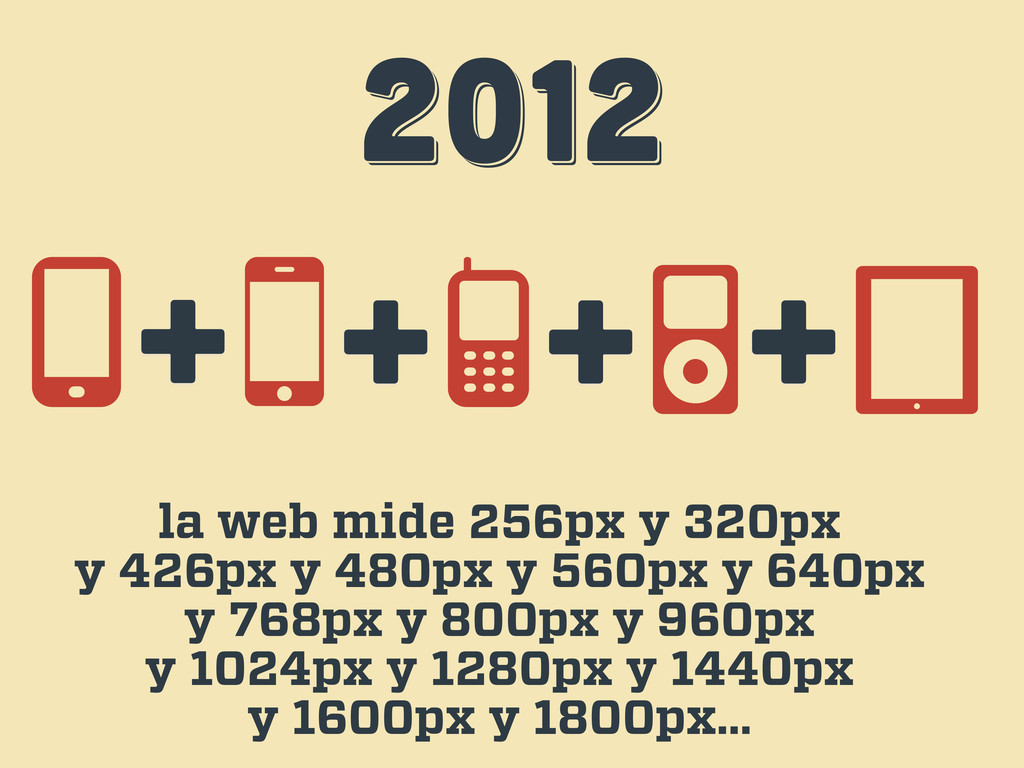
2012 2012 2012 la web mide 256px y 320px y
426px y 480px y 560px y 640px y 768px y 800px y 960px y 1024px y 1280px y 1440px y 1600px y 1800px… + + + +
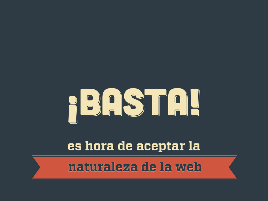
¡BASTA! ¡BASTA! ¡BASTA! es hora de aceptar la naturaleza de
la web
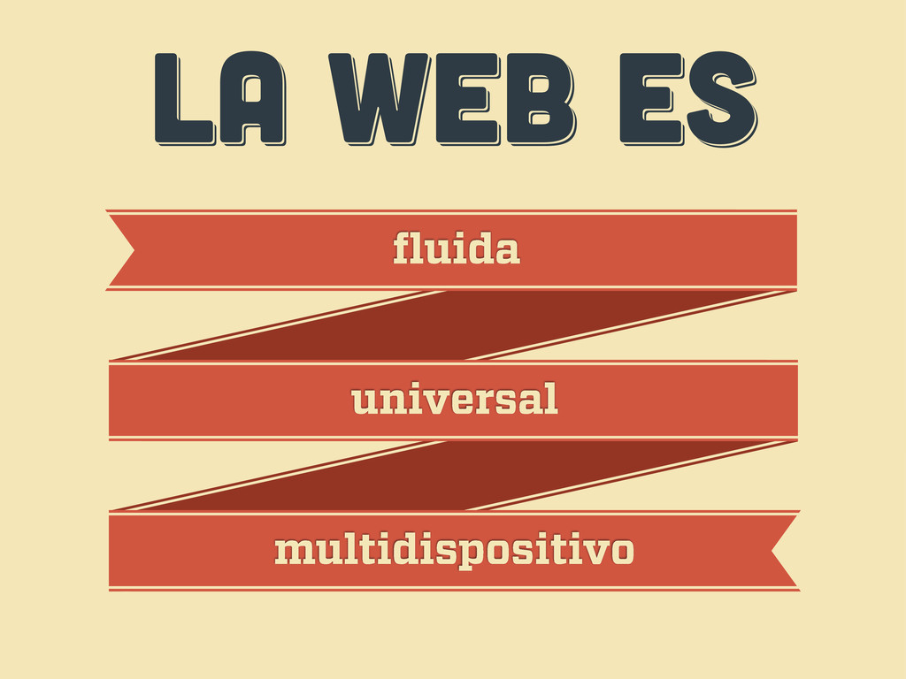
LA WEB ES LA WEB ES LA WEB ES fluida
universal multidispositivo
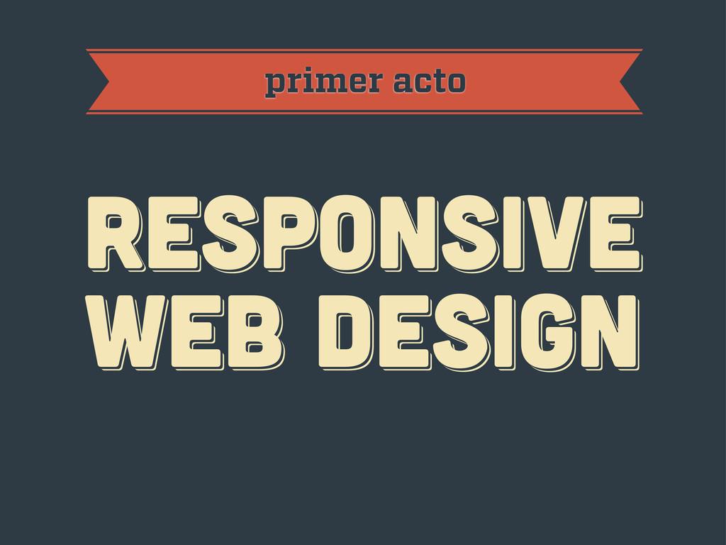
primer acto RESPoNSIVE WEB DESIGN RESPoNSIVE WEB DESIGN RESPoNSIVE WEB
DESIGN
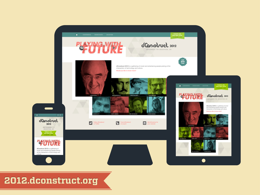
2012.dconstruct.org
mediaqueri.es
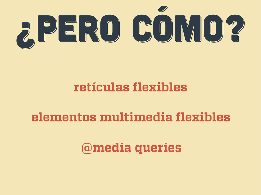
¿PERO CÓMO? ¿PERO CÓMO? ¿PERO CÓMO? retículas flexibles elementos multimedia
flexibles @media queries
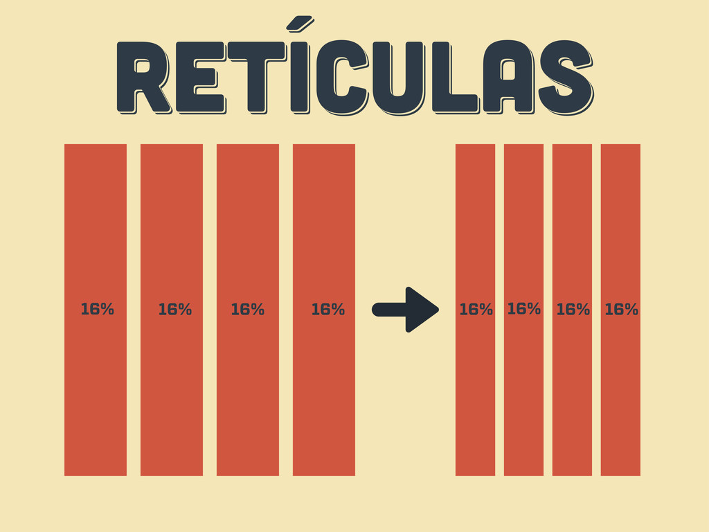
RETÍCULAS RETÍCULAS RETÍCULAS 16% 16% 16% 16% 16% 16% 16%
16%
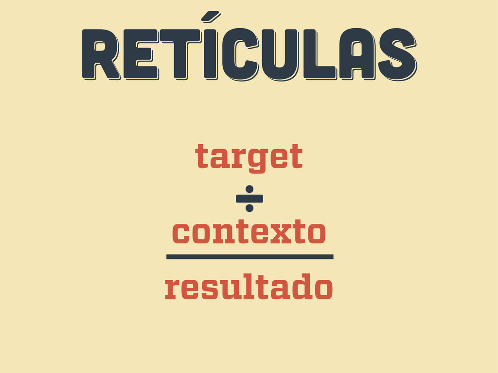
RETÍCULAS RETÍCULAS RETÍCULAS target contexto ÷ resultado
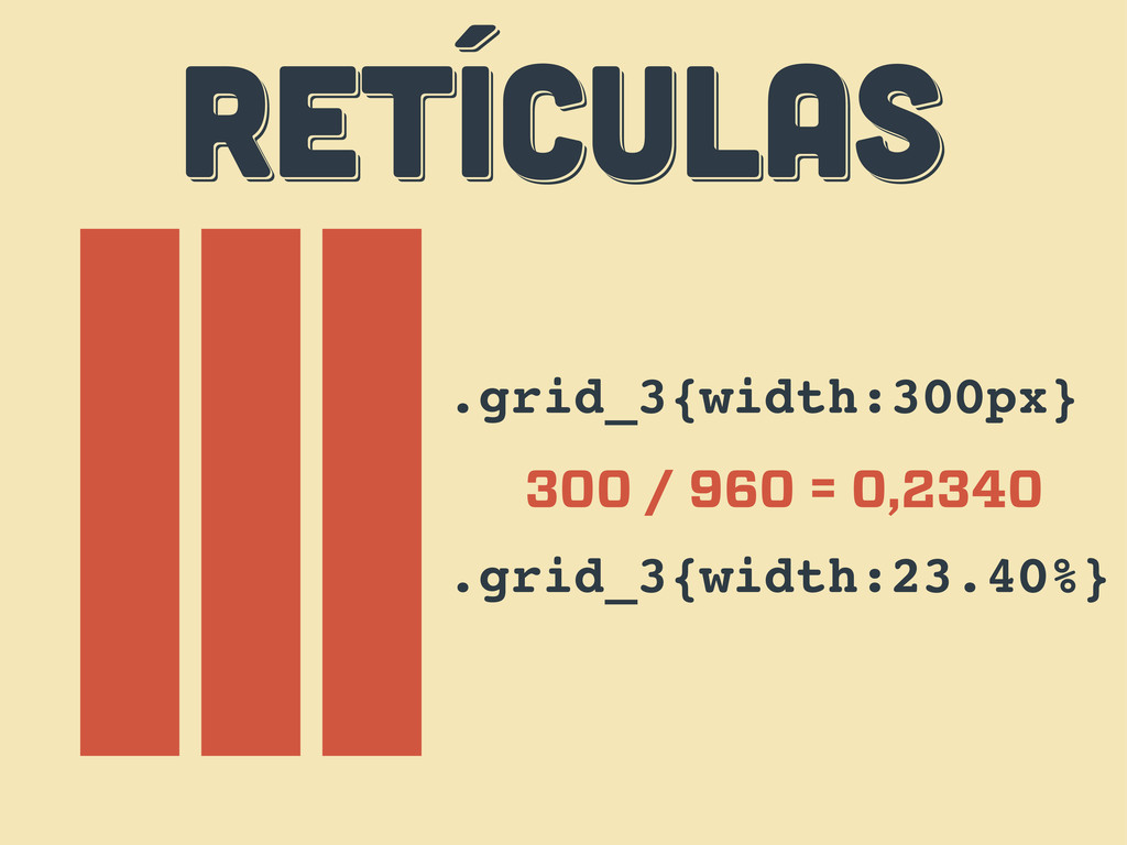
RETÍCULAS RETÍCULAS RETÍCULAS .grid_3{width:300px} 300 / 960 = 0,2340 .grid_3{width:23.40%}
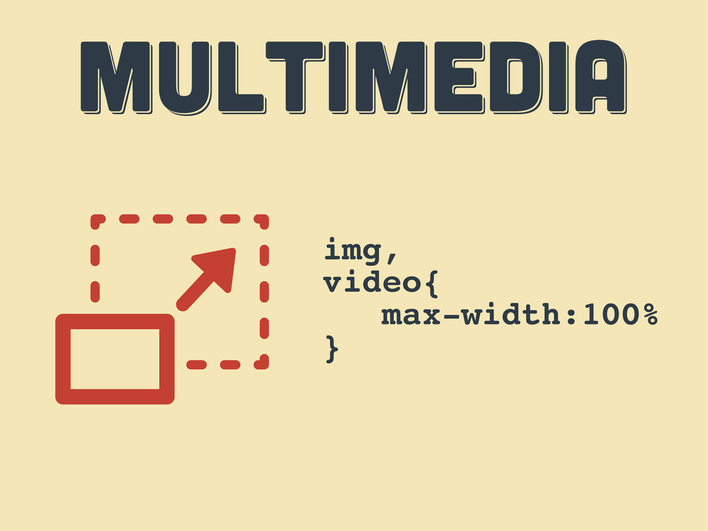
MULTIMEDIA MULTIMEDIA MULTIMEDIA img, video{ max-width:100% }
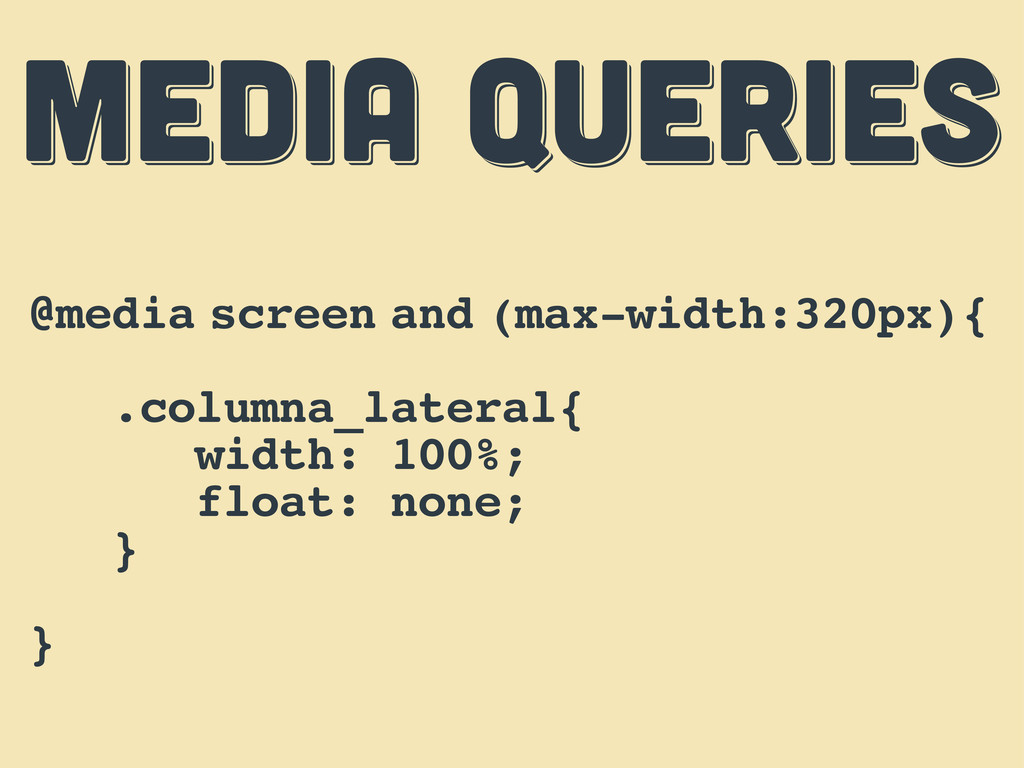
MEDIA QUERIES MEDIA QUERIES MEDIA QUERIES @media screen and (max-width:320px){
.columna_lateral{ width: 100%; float: none; } }
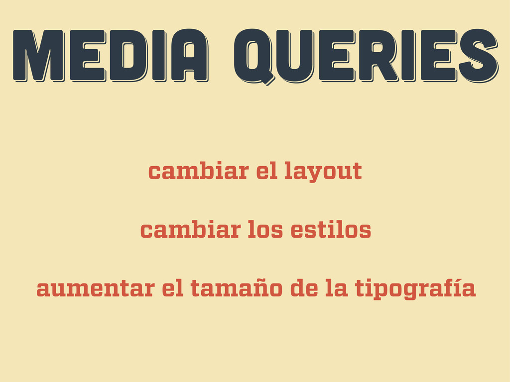
MEDIA QUERIES MEDIA QUERIES MEDIA QUERIES cambiar el layout cambiar
los estilos aumentar el tamaño de la tipografía
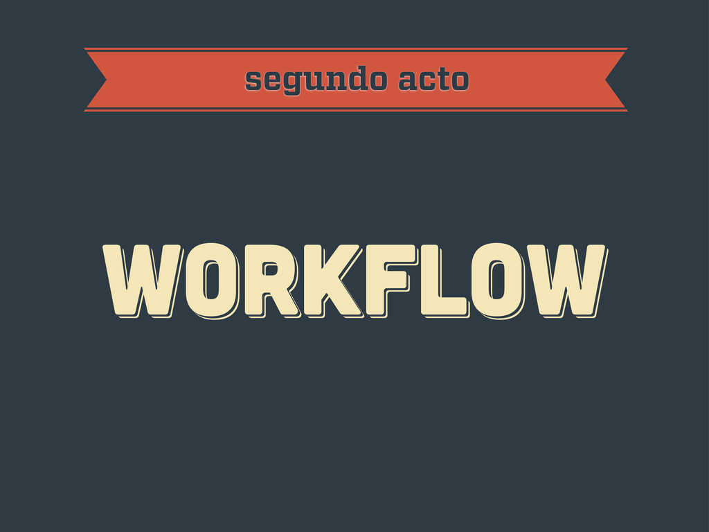
workflow workflow workflow segundo acto
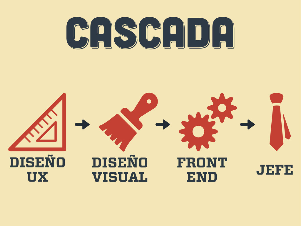
CASCADA CASCADA CASCADA DISEÑO UX DISEÑO VISUAL FRONT END JEFE
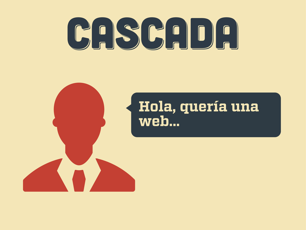
CASCADA CASCADA CASCADA Hola, quería una web...
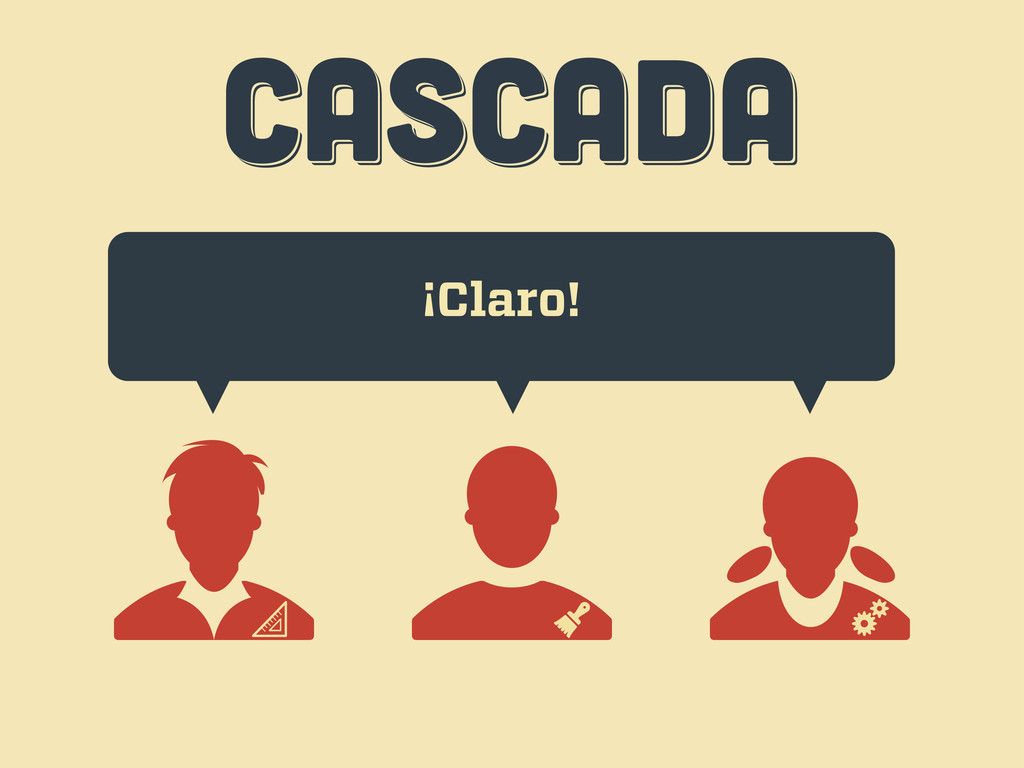
CASCADA CASCADA CASCADA ¡Claro!
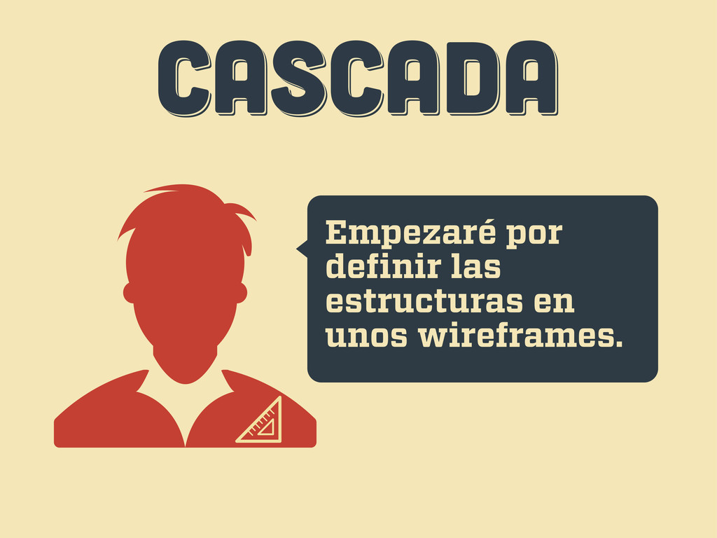
CASCADA CASCADA CASCADA Empezaré por definir las estructuras en unos
wireframes.
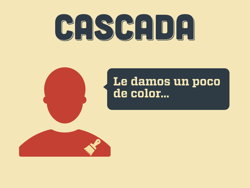
CASCADA CASCADA CASCADA Le damos un poco de color...
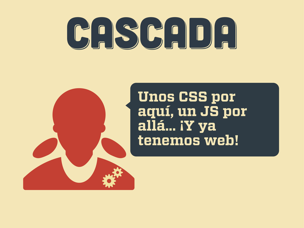
CASCADA CASCADA CASCADA Unos CSS por aquí, un JS por
allá... ¡Y ya tenemos web!
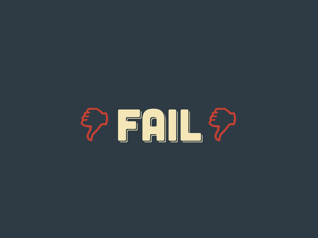
CASCADA CASCADA CASCADA Uh... esto...
FAIL fail Fail
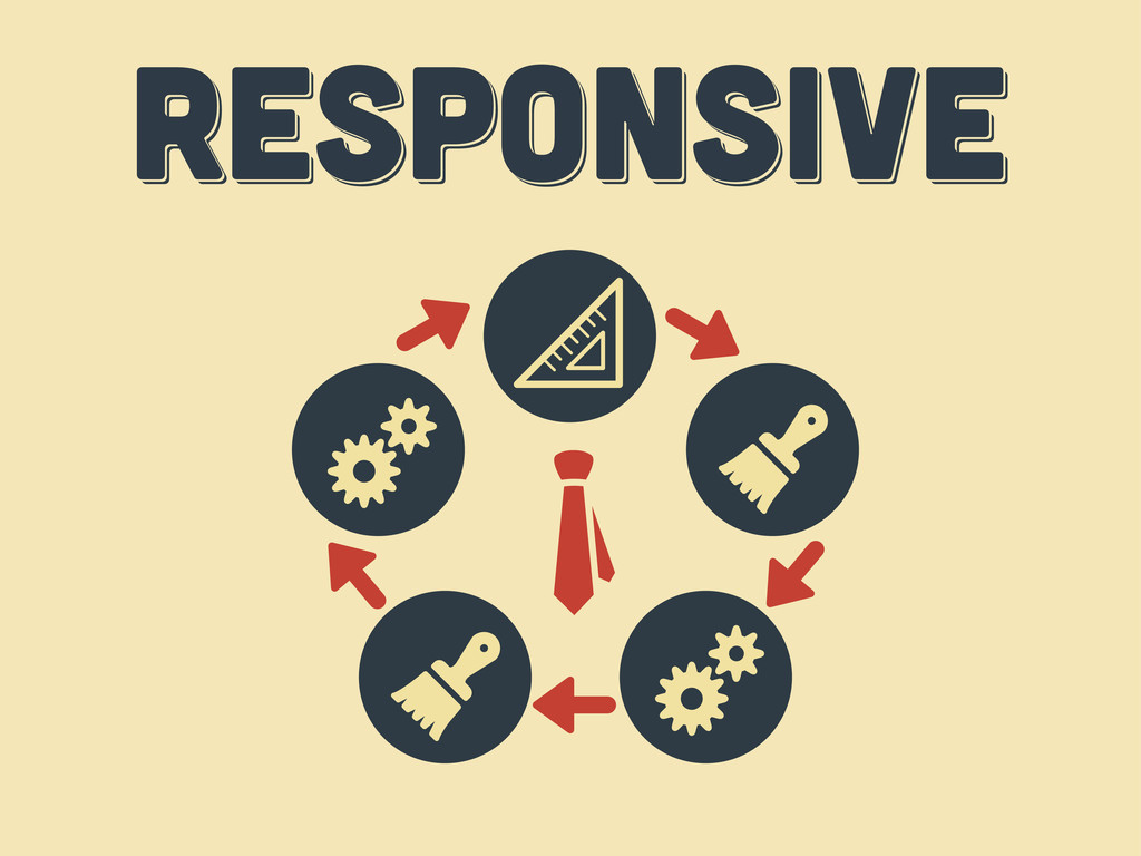
responsive responsive Responsive
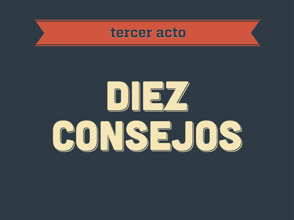
diez consejos diez consejos diez consejos tercer acto
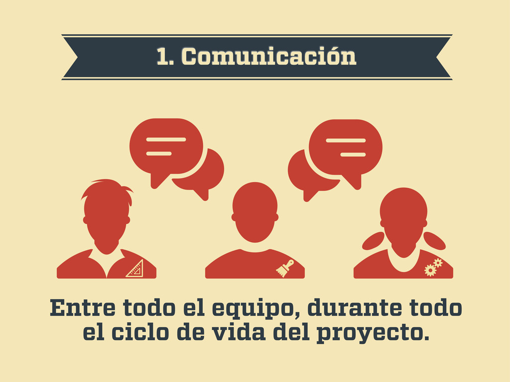
1. Comunicación Entre todo el equipo, durante todo el ciclo
de vida del proyecto.
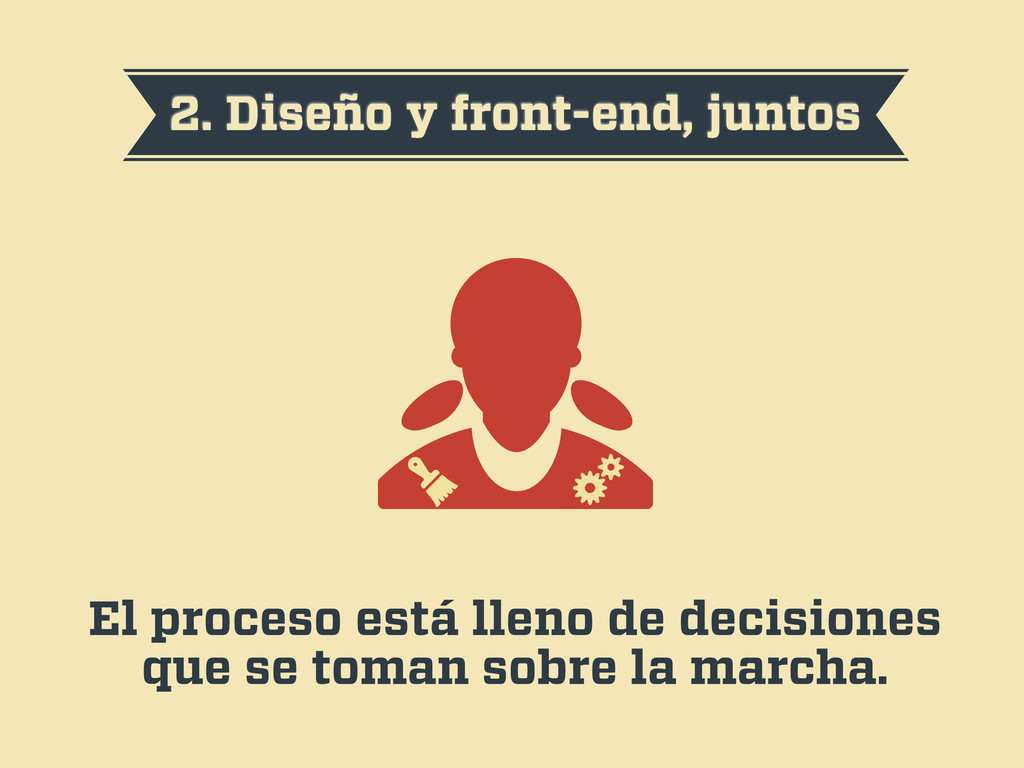
2. Diseño y front-end, juntos El proceso está lleno de
decisiones que se toman sobre la marcha.
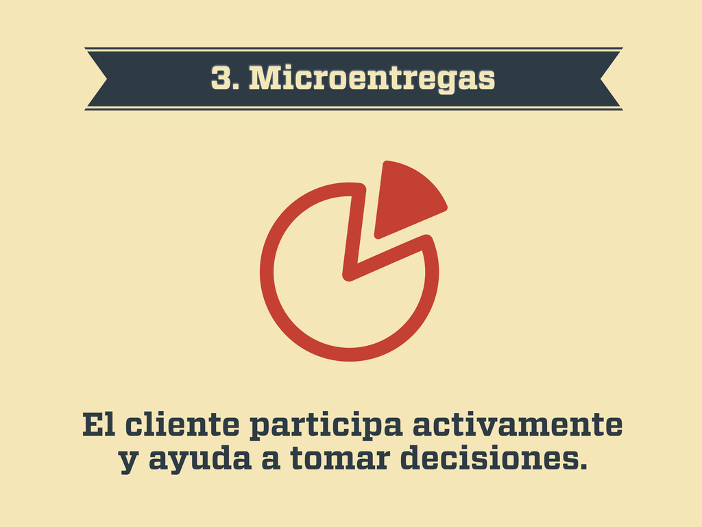
3. Microentregas El cliente participa activamente y ayuda a tomar
decisiones.
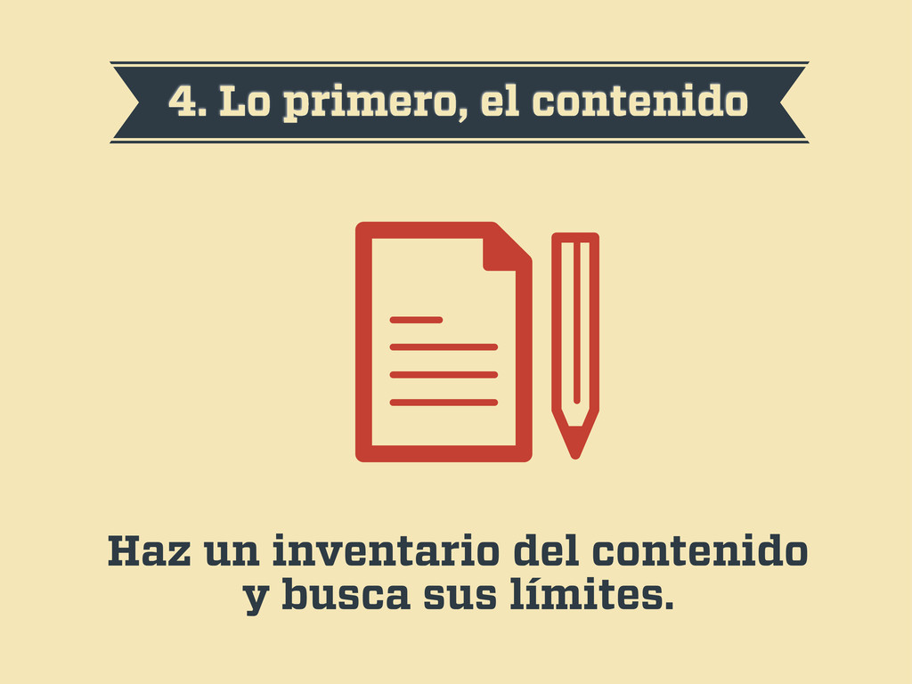
4. Lo primero, el contenido Haz un inventario del contenido
y busca sus límites.
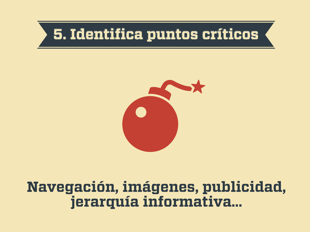
5. Identifica puntos críticos Navegación, imágenes, publicidad, jerarquía informativa…
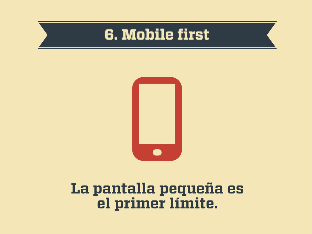
6. Mobile first La pantalla pequeña es el primer límite.
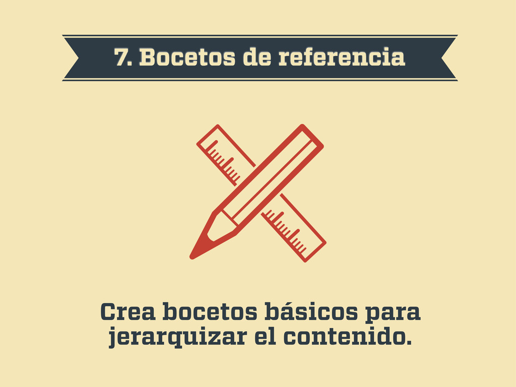
7. Bocetos de referencia Crea bocetos básicos para jerarquizar el
contenido.
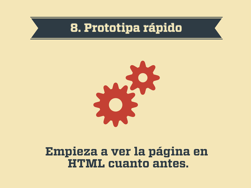
8. Prototipa rápido Empieza a ver la página en HTML
cuanto antes.
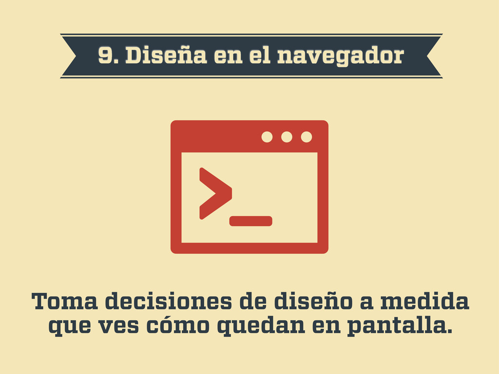
9. Diseña en el navegador Toma decisiones de diseño a
medida que ves cómo quedan en pantalla.
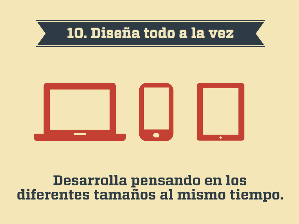
10. Diseña todo a la vez Desarrolla pensando en los
diferentes tamaños al mismo tiempo.
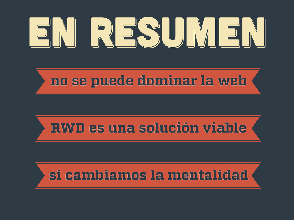
EN RESUMEN EN RESUMEN EN RESUMEN no se puede dominar
la web RWD es una solución viable si cambiamos la mentalidad
¡gracias! ¡gracias! ¡gracias! Javier Usobiaga · http://Swwweet.com · @htmlboy
 swwweet
 shoheimitani
 sansan33
 kawaguti
 okdt
okdt
 tamemiya
 nao_sumikawa
 hiroyaonoe
 muziyoshiz
 knishioka
 sansantech
 yuu551
 shpigford
 thoeni
 chriscoyier
 baasie
 codingconduct
 cassininazir
 marcduiker
 jdejongh
 kevinliebholz
 paigeccino
 iamctodd
 schlessera