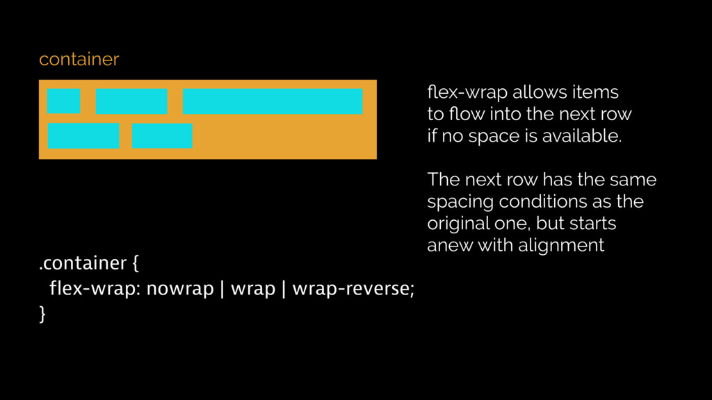
flex-wrap allows items to flow into the next row if no space is available. The next row has the same spacing conditions as the original one, but starts anew with alignment
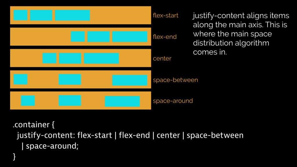
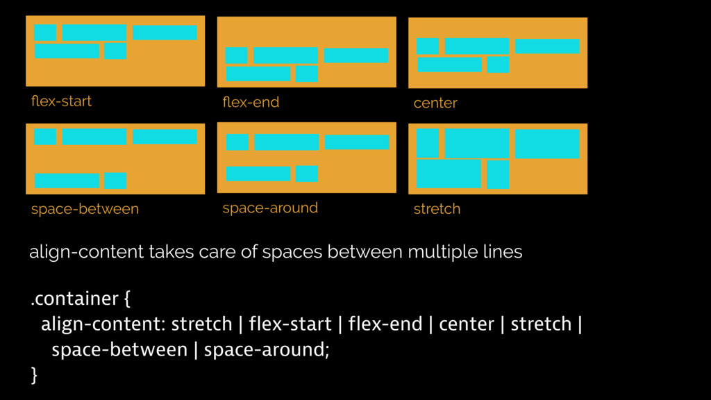
| space-around; } justify-content aligns items along the main axis. This is where the main space distribution algorithm comes in. flex-start flex-end center space-between space-around
greedy operator. It tries to take as much space as is available. If the number is higher, the growth is n-times higher with each iteration cycle. 1 1 1 1 2 flex-shrink is humble. The higher the number, the more space it gives to greedy elements flex-basis is a width value where elements start to grow
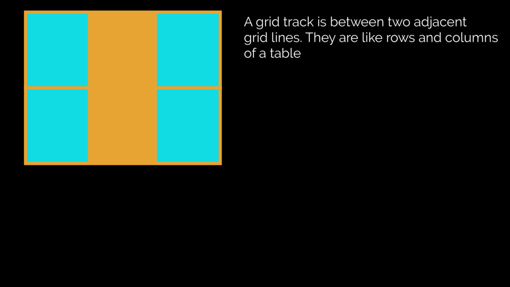
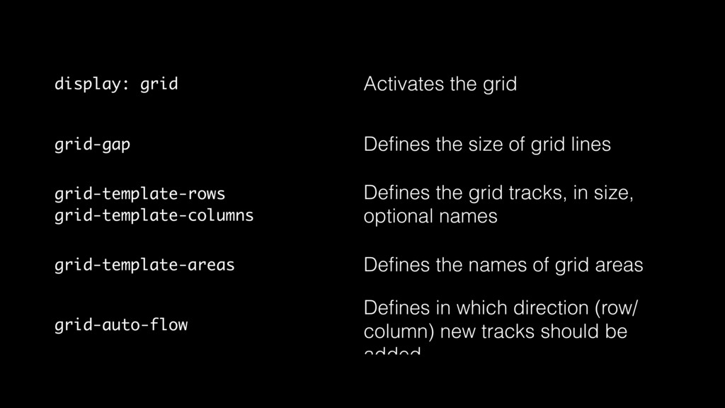
grid lines grid-template-rows grid-template-columns Defines the grid tracks, in size, optional names grid-template-areas Defines the names of grid areas grid-auto-flow Defines in which direction (row/ column) new tracks should be added
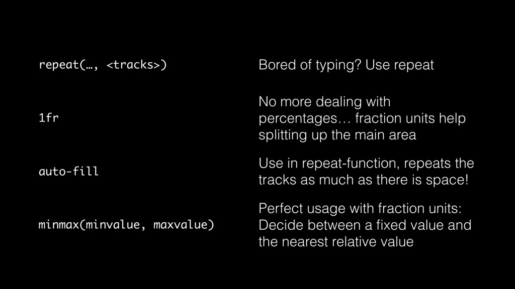
dealing with percentages… fraction units help splitting up the main area auto-fill Use in repeat-function, repeats the tracks as much as there is space! minmax(minvalue, maxvalue) Perfect usage with fraction units: Decide between a fixed value and the nearest relative value
 ddprrt
 kekke_n
 torounit
 rvirus0817
 nihonbuson
 yuu26
yuu26
 minorun365
 yamanoku
 oracle4engineer
 okdt
okdt
 glaforge
 knishioka
 abemii
 michielstock
 dugsong
 retrage
 stephenakadiri
 tammyeverts
 lara
lara
 ipullrank
 mfonobong
 nikkihalliwell
 notwaldorf
 jonyablonski
 aleyda