Upgrade to Pro — share decks privately, control downloads, hide ads and more …

The Super Mario Bros. Principle - Extended Edition

The Super Mario Bros. Principle - Extended Edition

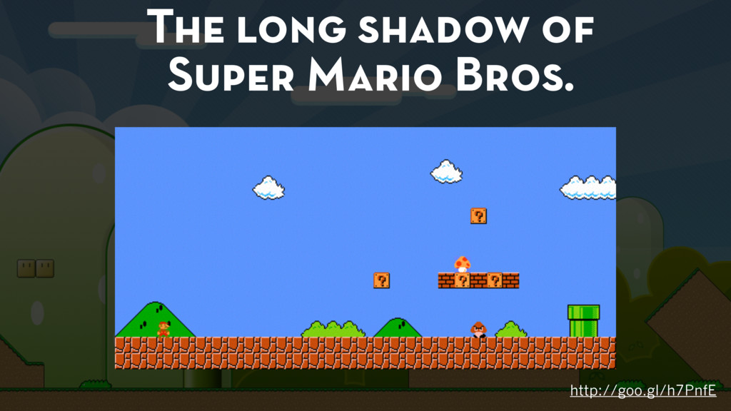
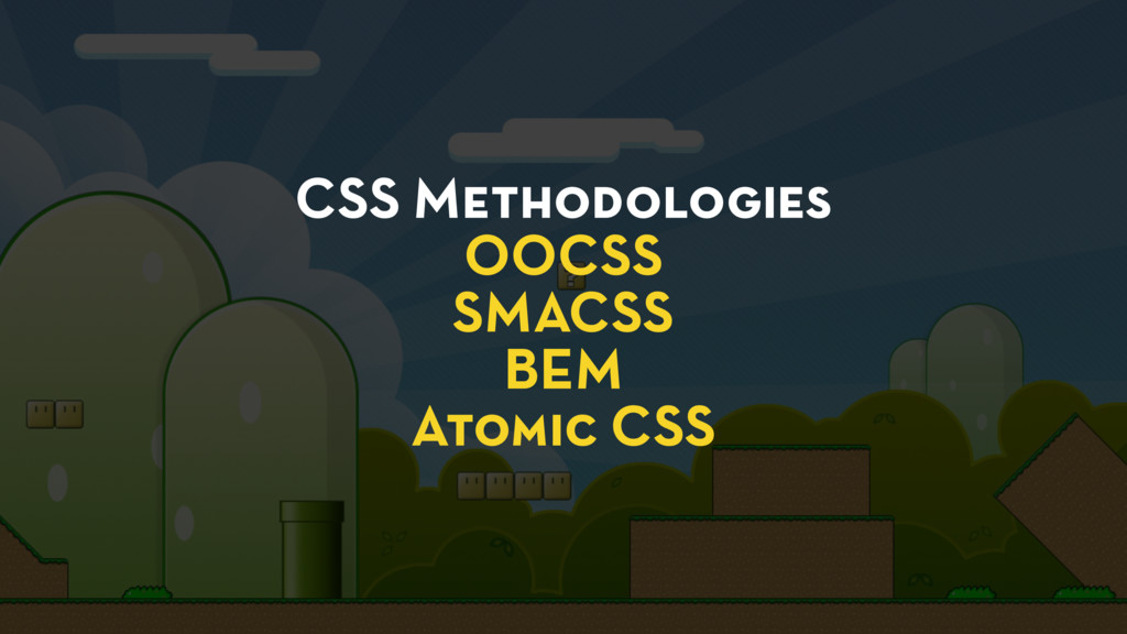
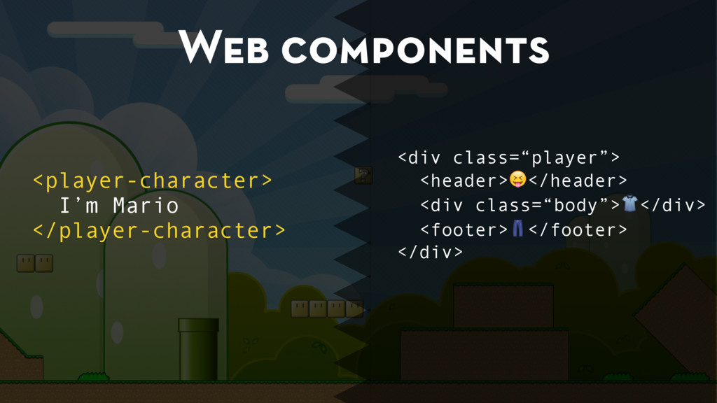
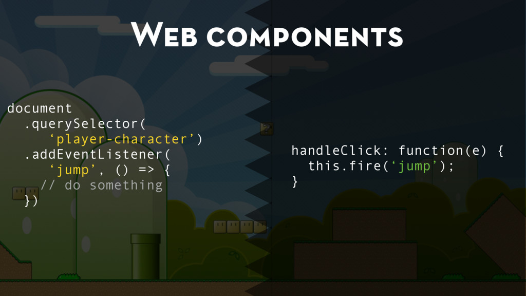
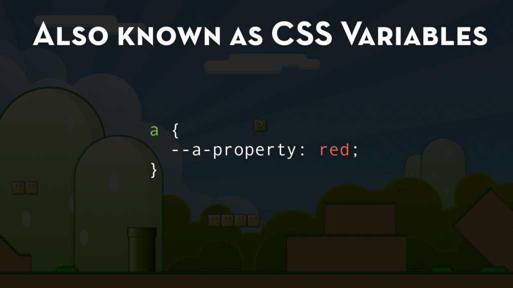
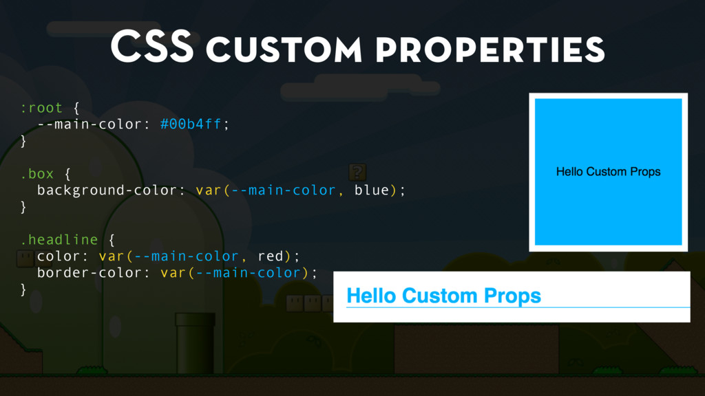
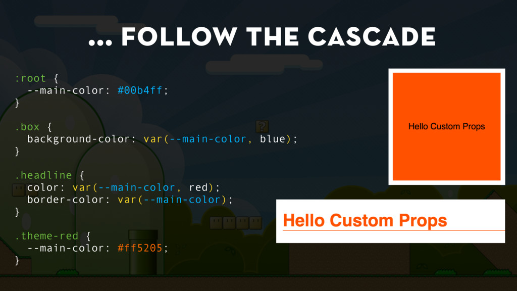
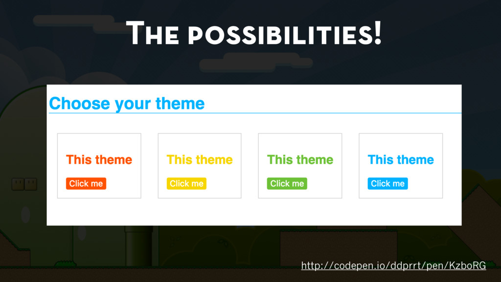
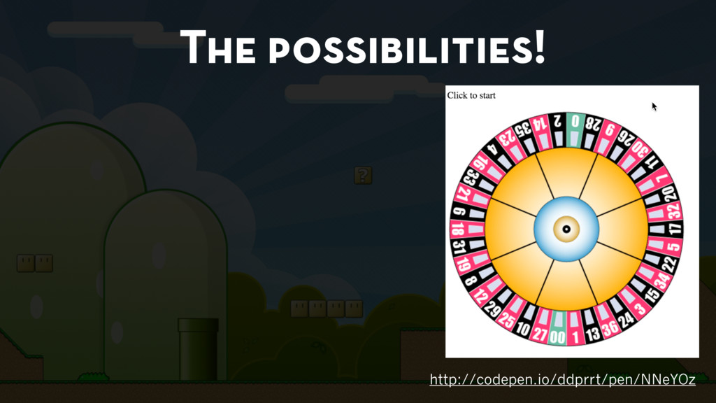
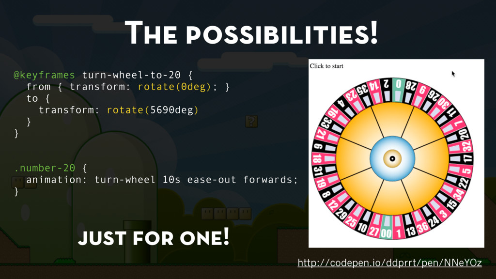
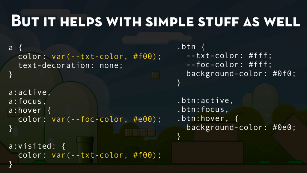
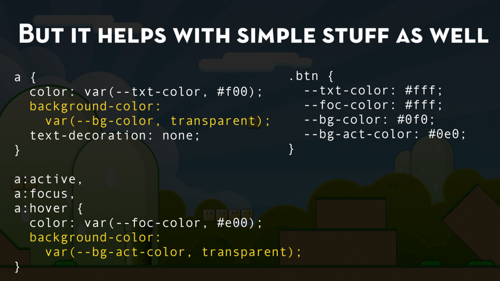
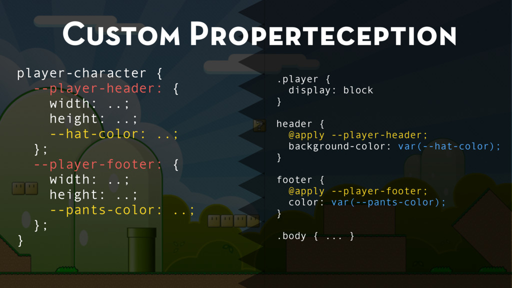
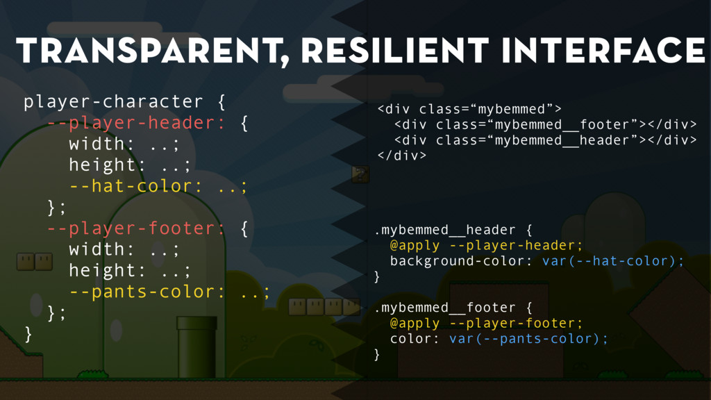
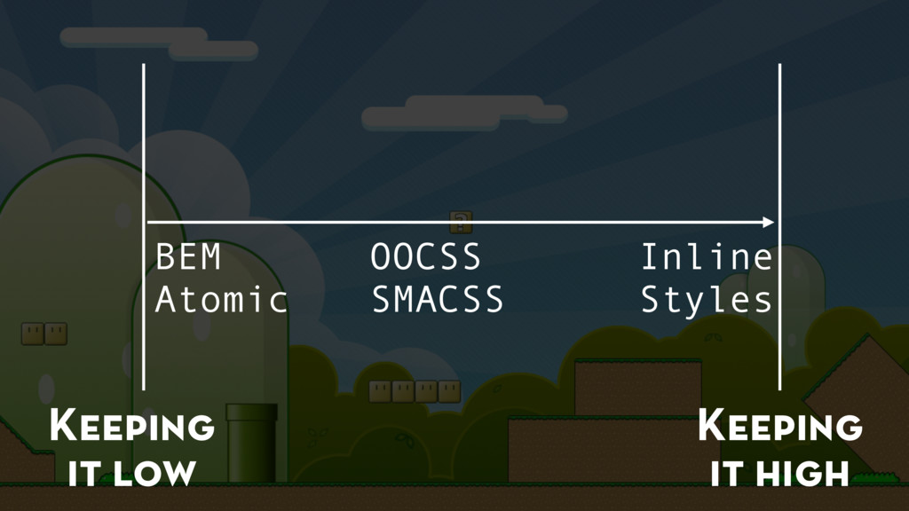
The release of Super Mario Bros. brought us gameplay like we have never seen before. An experience that still holds up to this day. One of the reasons is the architecture of the game: It allows designers absolute freedom in creating levels without spending any thought on the implementation. Not caring about the technical details, but still design without limitations? Isn't that something we'd love for web development? See how we use CSS custom properties, web components and the power of the Cascade to transcend into creative Nirvana. Just like Miyamoto did 30 years ago.

Stefan Baumgartner

September 23, 2016
Tweet

More Decks by Stefan Baumgartner

Other Decks in Technology

Transcript

  1. Super Mario Bros. was about 40 KB in Size That’s

    the same size as today’s Minified Bootstrap JavaScript* * Bootstrap 4, non-gzipped
  2. CSS is easy from-that-thing { make-this: look-like-this; and-this: look-something-like-this; }

    This rarely gets complex This is always centre of debates and problems
  3. Web components document .querySelector( ‘player-character’) .addEventListener( ‘jump’, () => {

    // do something }) handleClick: function(e) { this.fire(‘jump’); }
  4. Web components .player { ... } header { ... }

    footer { ... } .body { ... }
  5. CSS custom properties :root { --main-color: #00b4ff; } .box {

    background-color: var(--main-color, blue); } .headline { color: var(--main-color, red); border-color: var(--main-color); }
  6. … follow the cascade :root { --main-color: #00b4ff; } .box

    { background-color: var(--main-color, blue); } .headline { color: var(--main-color, red); border-color: var(--main-color); } .theme-red { --main-color: #ff5205; }
  7. … are inheritable <body class=“theme-red”> <div class=“box”>…</div> </body> The whole

    page Just one element <body> <div class=“box theme-red”>…</div> </body>
  8. … are inheritable <body class=“theme-red”> <div class=“box”>…</div> </body> The whole

    page Just one element A special area of the site <body> <div class=“theme-red”> <div class=“box”>…</div> <div class=“box”>…</div> </div> <div class=“box”>…</div> </body> <body> <div class=“box theme-red”>…</div> </body>
  9. The possibilities! http://codepen.io/ddprrt/pen/NNeYOz @keyframes turn-wheel-to-20 { from { transform: rotate(0deg);

    } to { transform: rotate(5690deg) } } .number-20 { animation: turn-wheel 10s ease-out forwards; }
  10. The possibilities! http://codepen.io/ddprrt/pen/NNeYOz @keyframes turn-wheel-to-20 { from { transform: rotate(0deg);

    } to { transform: rotate(5690deg) } } .number-20 { animation: turn-wheel 10s ease-out forwards; } just for one!
  11. The possibilities! http://codepen.io/ddprrt/pen/NNeYOz @keyframes turn-wheel { from { transform: rotate(0deg);

    } to { transform: rotate( calc(15 * 360deg + var(--wheel-deg)) ) } } [class*=number-] { animation: turn-wheel 10s ease-out forwards; } .number-20 { --wheel-deg: 290deg; }
  12. The possibilities! http://codepen.io/ddprrt/pen/NNeYOz @keyframes turn-wheel { from { transform: rotate(0deg);

    } to { transform: rotate( calc(15 * 360deg + var(--wheel-deg)) ) } } [class*=number-] { animation: turn-wheel 10s ease-out forwards; } .number-20 { --wheel-deg: 290deg; } turns 1 turn the actual position
  13. But it helps with simple stuff as well a {

    color: #f00; text-decoration: none; } a:active, a:focus, a:hover { color: #e00; } a:visited: { color: #f00; }
  14. But it helps with simple stuff as well a {

    color: #f00; text-decoration: none; } a:active, a:focus, a:hover { color: #e00; } a:visited: { color: #f00; } .btn { color: #fff; background-color: #0f0; } .btn:active, .btn:focus, .btn:hover { background-color: #0e0; } .btn:visited { background-color: #0f0; }
  15. But it helps with simple stuff as well a {

    color: #f00; text-decoration: none; } a:active, a:focus, a:hover { color: #e00; } a:visited: { color: #f00; } .btn { color: #fff; background-color: #0f0; } .btn:active, .btn:focus, .btn:hover { background-color: #0e0; } .btn:visited { background-color: #0f0; }
  16. But it helps with simple stuff as well a {

    color: var(--txt-color, #f00); text-decoration: none; } a:active, a:focus, a:hover { color: var(--foc-color, #e00); } a:visited: { color: var(--txt-color, #f00); } .btn { --txt-color: #fff; --foc-color: #fff; background-color: #0f0; } .btn:active, .btn:focus, .btn:hover, { background-color: #0e0; }
  17. But it helps with simple stuff as well a {

    color: var(--txt-color, #f00); background-color: var(--bg-color, transparent); text-decoration: none; } a:active, a:focus, a:hover { color: var(--foc-color, #e00); background-color: var(--bg-act-color, transparent); } .btn { --txt-color: #fff; --foc-color: #fff; --bg-color: #0f0; --bg-act-color: #0e0; }
  18. But it can be tough .player { display: block }

    header { color: var(--player-header-color); width: var(--player-header-width); height: var(--player-header-height); ... } footer { color: var(--player-footer-color); width: var(--player-footer-width); height: var(--player-footer-height); ... } .body { ... } player-character { --player-header-color: …; --player-header-width: …; --player-header-height: …; --player-footer-color: …; --player-footer-width: …; --player-footer-height: …; … }
  19. Custom property sets player-character { --player-head: { color: …; width:

    …; height: …; } } header { @apply(--player-head); }
  20. Without @apply .player { display: block } header { color:

    var(--player-header-color); width: var(--player-header-width); height: var(--player-header-height); ... } footer { color: var(--player-footer-color); width: var(--player-footer-width); height: var(--player-footer-height); ... } .body { ... } player-character { --player-header-color: …; --player-header-width: …; --player-header-height: …; --player-footer-color: …; --player-footer-width: …; --player-footer-height: …; … }
  21. With @apply .player { display: block } header { @apply

    --player-header; } footer { @apply --player-footer; } .body { ... } player-character { --player-header: { width: ..; height: ..; color: ..; }; --player-footer: { width: ..; height: ..; color: ..; }; }
  22. Custom Properteception .player { display: block } header { @apply

    --player-header; background-color: var(--hat-color); } footer { @apply --player-footer; color: var(--pants-color); } .body { ... } player-character { --player-header: { width: ..; height: ..; --hat-color: ..; }; --player-footer: { width: ..; height: ..; --pants-color: ..; }; }
  23. transparent, resilient interface .mybemmed__header { @apply --player-header; background-color: var(--hat-color); }

    .mybemmed__footer { @apply --player-footer; color: var(--pants-color); } player-character { --player-header: { width: ..; height: ..; --hat-color: ..; }; --player-footer: { width: ..; height: ..; --pants-color: ..; }; } <div class=“mybemmed”> <div class=“mybemmed__footer”></div> <div class=“mybemmed__header”></div> </div>
  24. transparent, resilient interface div:nth-of-type(1) { @apply --player-header; background-color: var(--hat-color); }

    div:not(:nth-of-type(1)) { @apply --player-footer; color: var(--pants-color); } player-character { --player-header: { width: ..; height: ..; --hat-color: ..; }; --player-footer: { width: ..; height: ..; --pants-color: ..; }; } <div></div> <div></div>
  25. transparent, resilient interface //Access the properties via JavaScript! var styles

    = window.getComputedStyle(this); styles.getPropertyValue(‘--hat-color'); player-character { --player-header: { width: ..; height: ..; --hat-color: ..; }; --player-footer: { width: ..; height: ..; --pants-color: ..; }; } <canvas></canvas>
  26. The apply rule needs some time to land (but it’s

    pretty good polyfilled in Polymer)