Upgrade to Pro — share decks privately, control downloads, hide ads and more …

How to Evaluate & Improve Your Blog Design

Jeff Archibald
March 10, 2012

How to Evaluate & Improve Your Blog Design

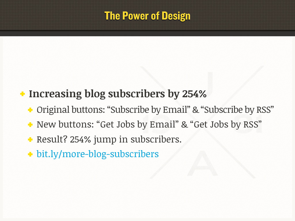
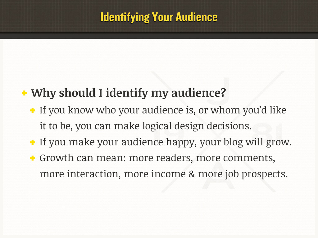
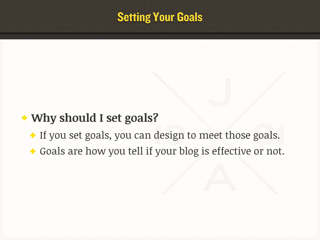
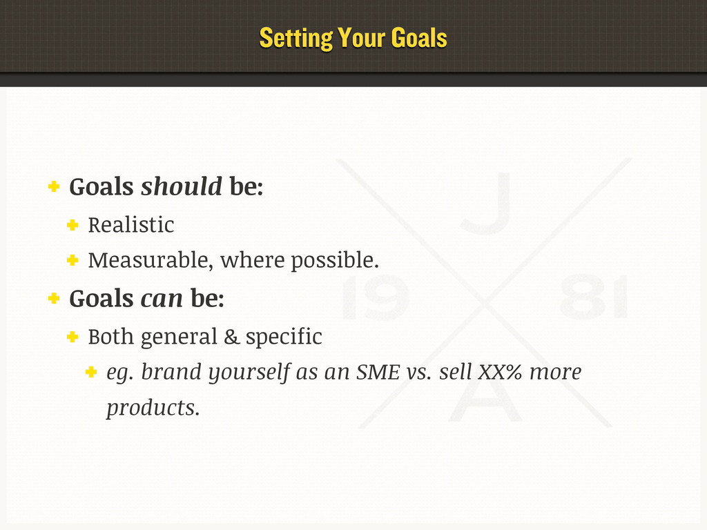
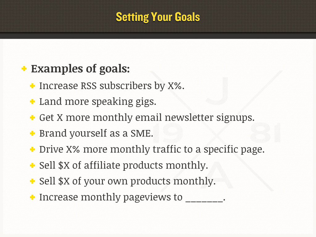
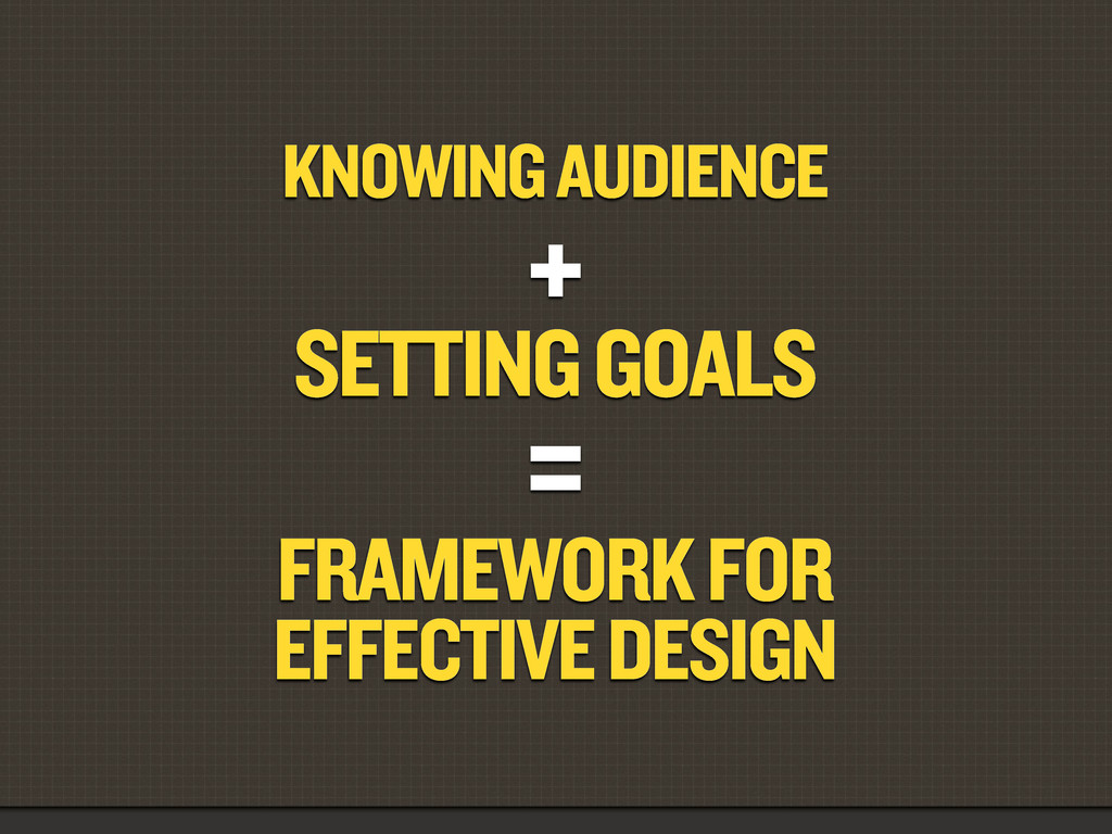
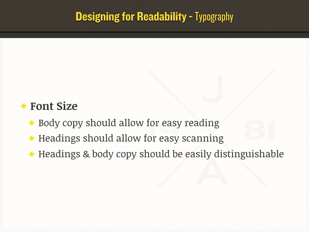
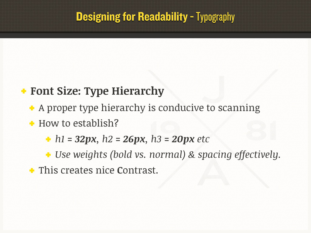
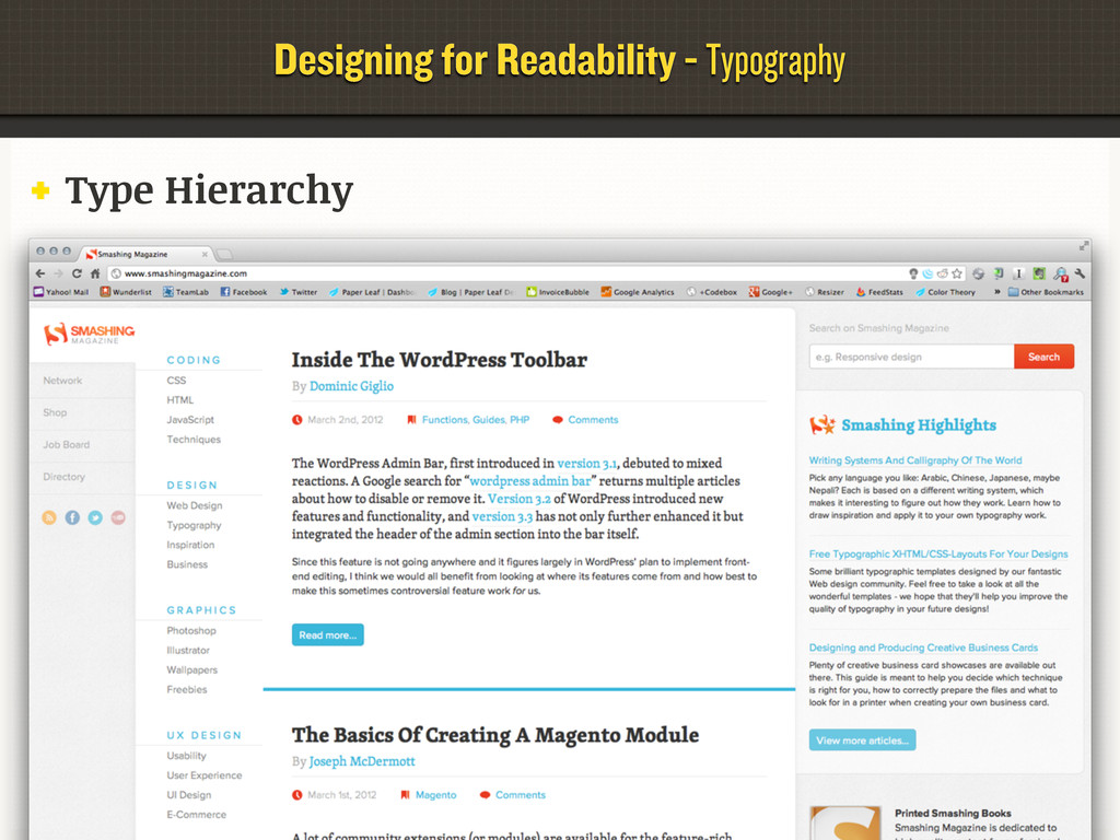
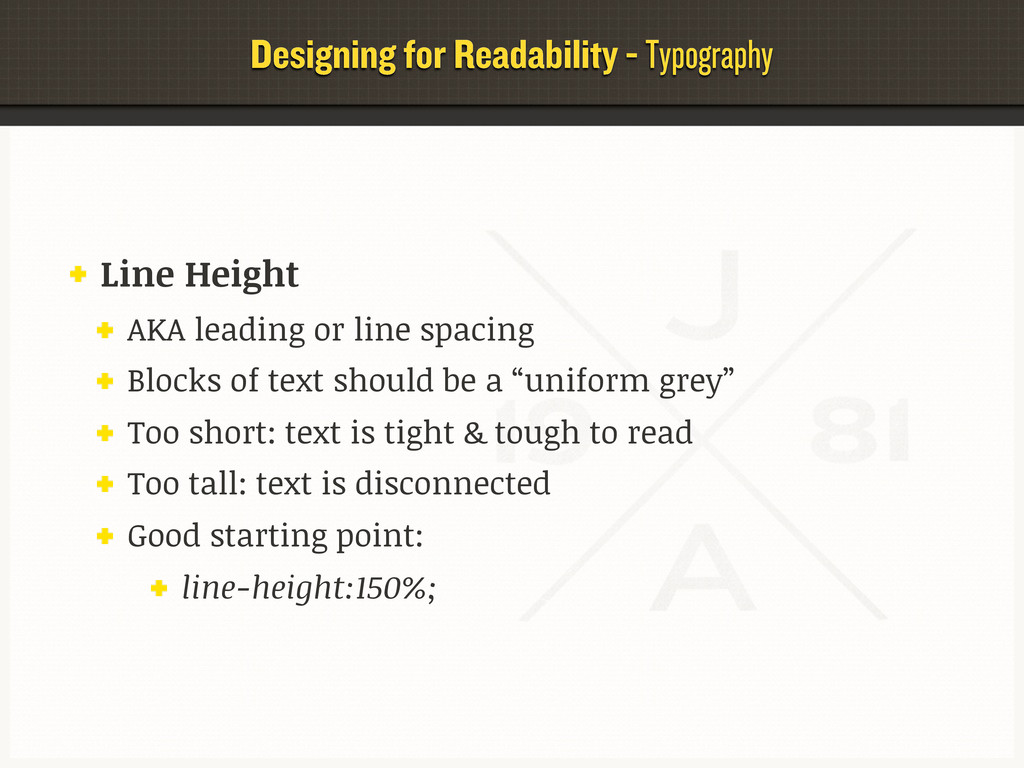
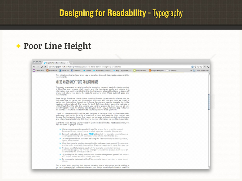
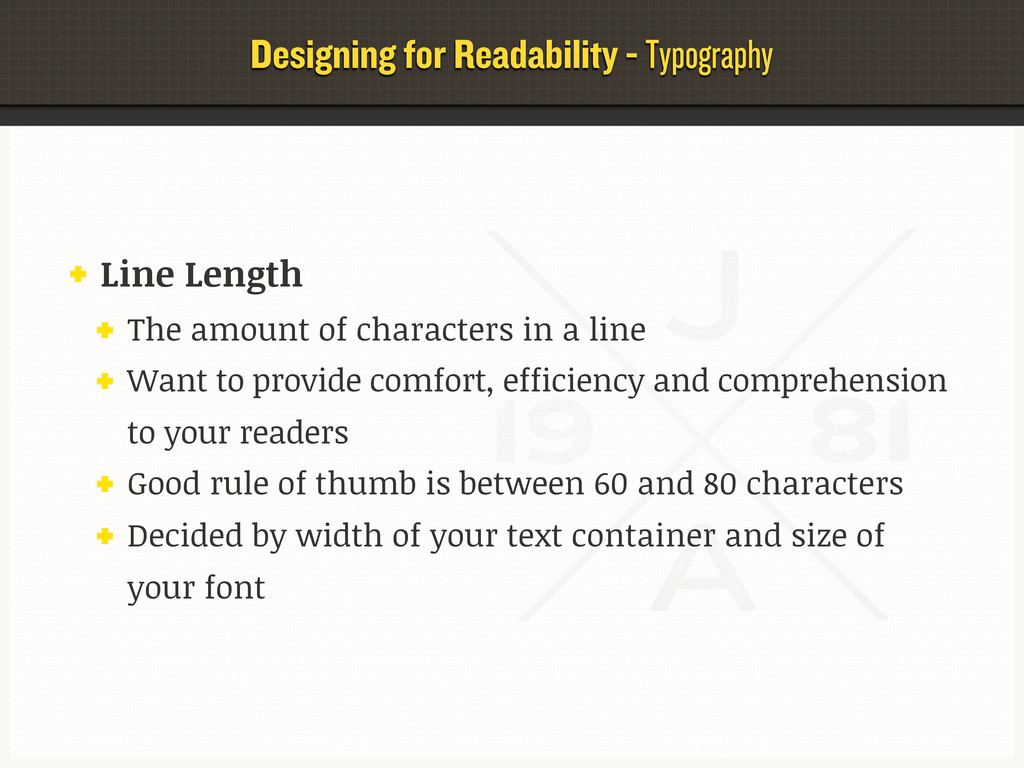
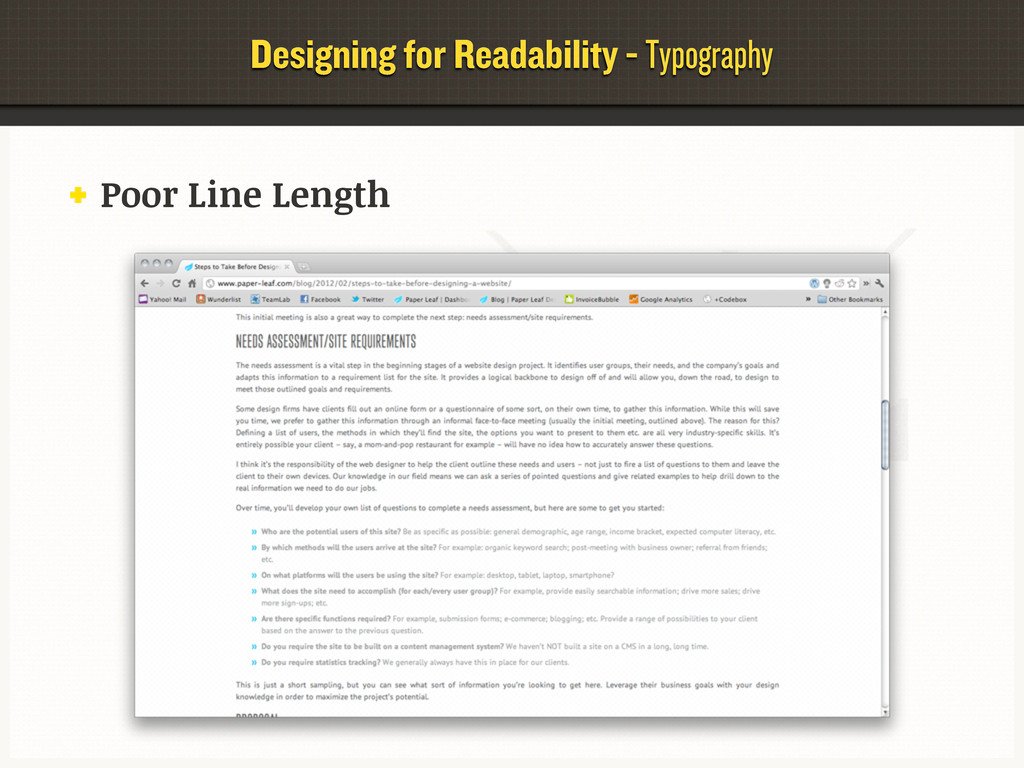
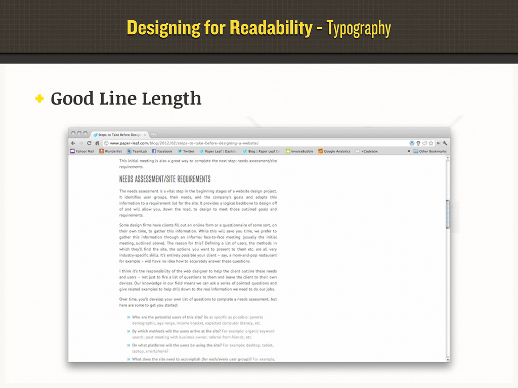
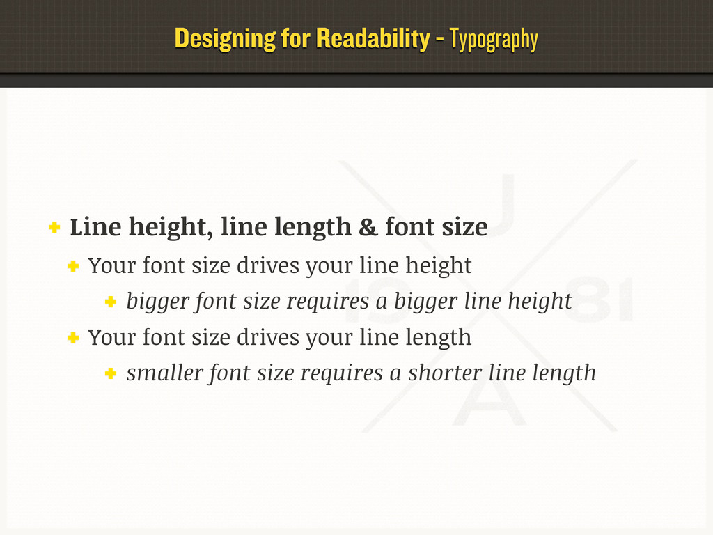
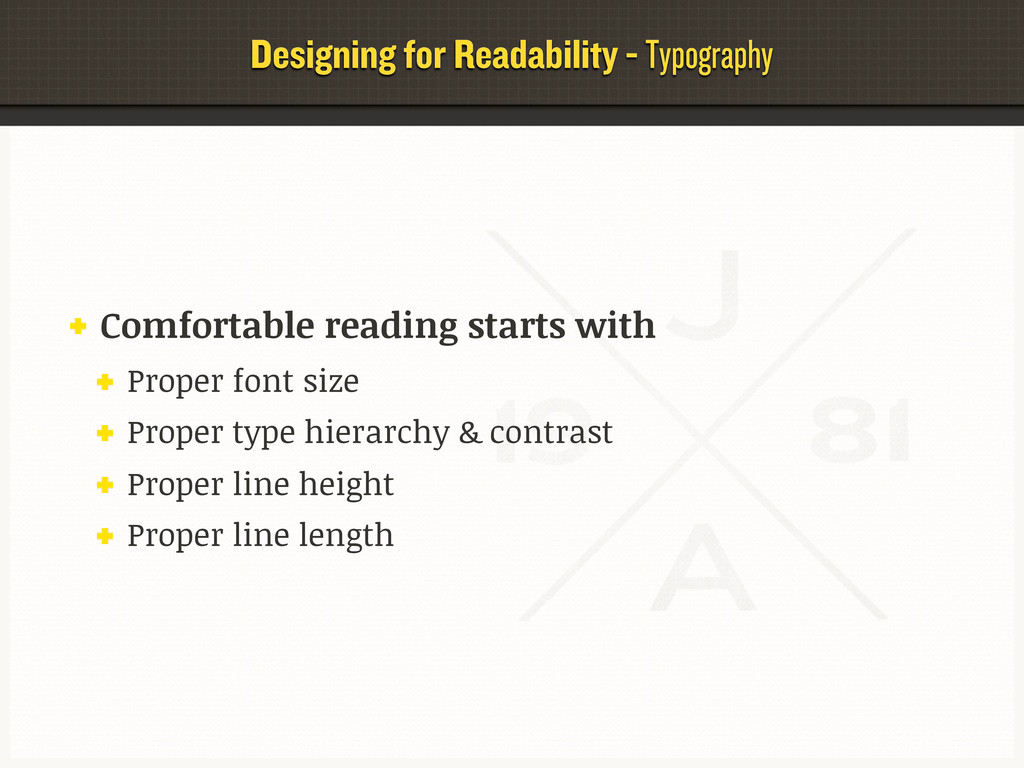
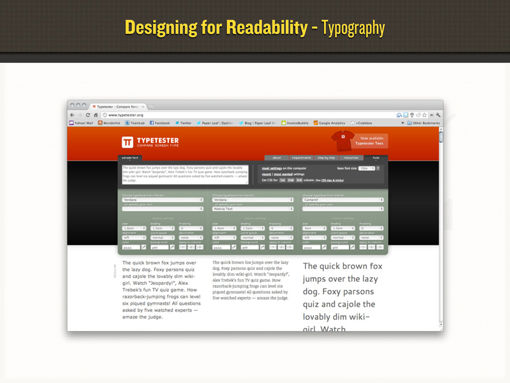
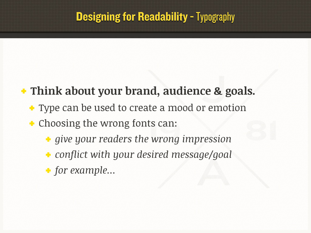
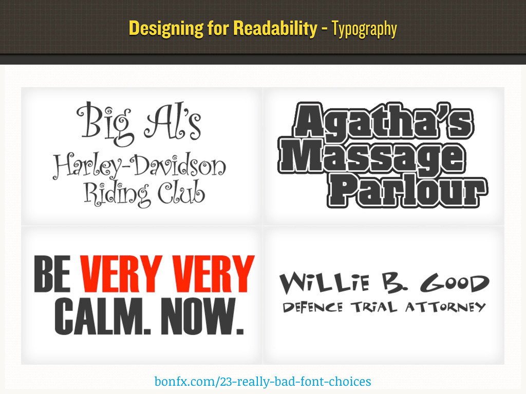
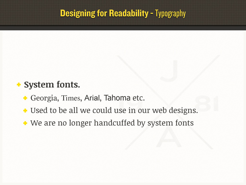
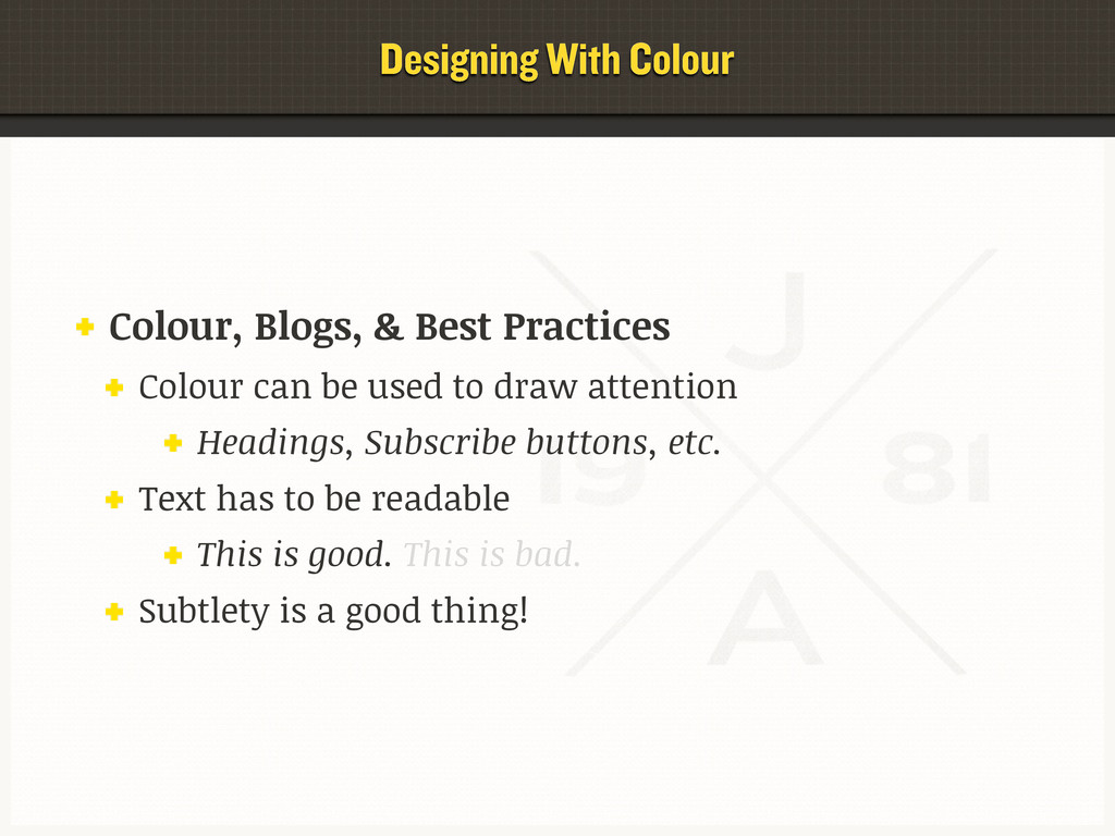
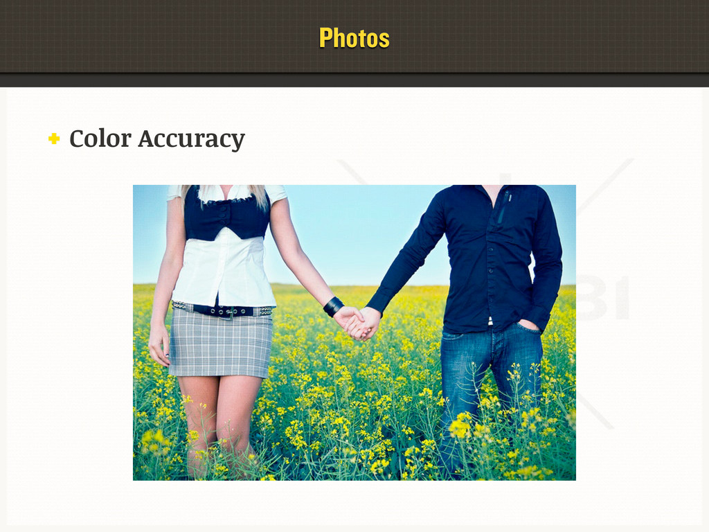
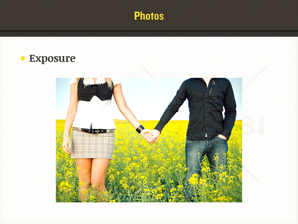
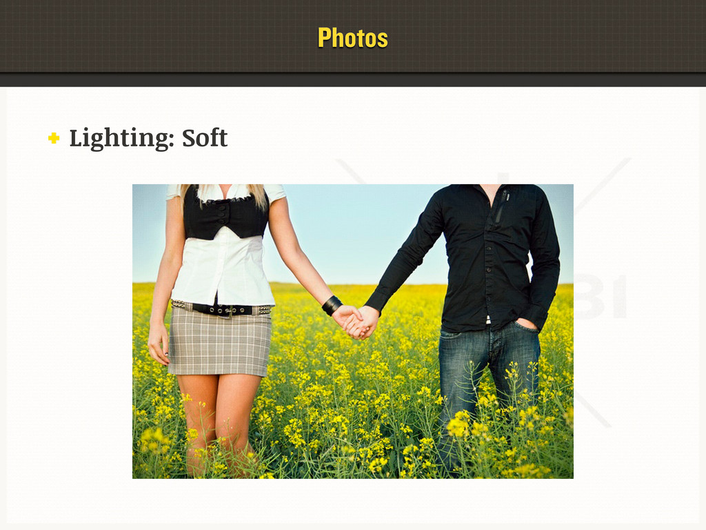
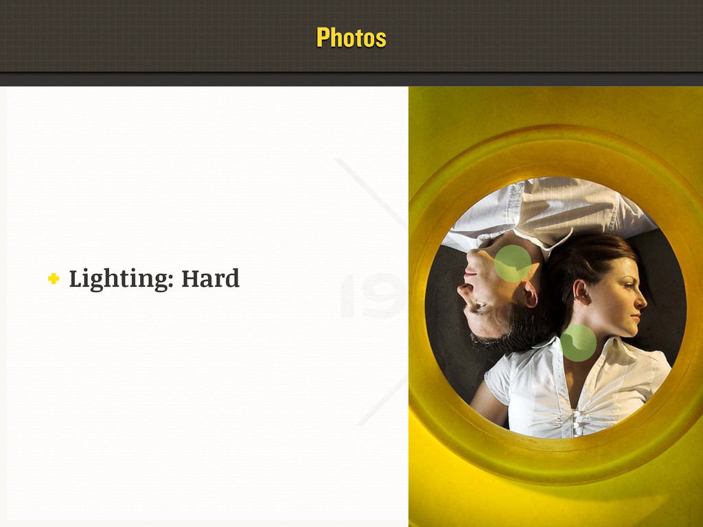
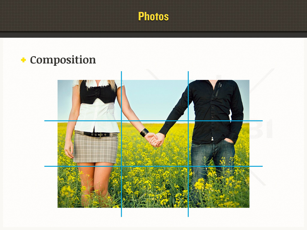
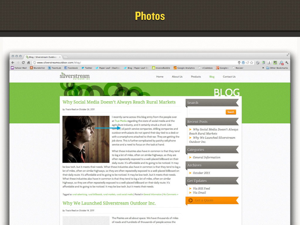
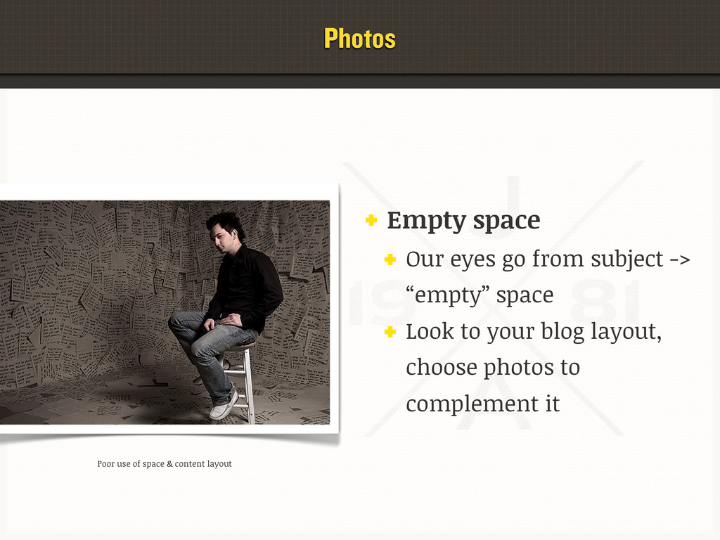
An effective blog design meets your goals & keeps your happy readers engaged and returning for more. Learn how to evaluate and improve your blog’s design based on tried-and-true best practices in web design, including: layout/alignment; colour; typography; spacing and more. You’ll leave this session with a variety of tangible skills and resources to start immediately improving your blog design.

Jeff Archibald

March 10, 2012
Tweet

More Decks by Jeff Archibald

Other Decks in Design

Transcript

  1. Hello. Topics What is “blog design”? Identifying Audience Setting Goals

    The C.R.A.P. Principle Designing for Readability Designing with Colour Evaluating & Using Photos Resources for you
  2. Hello. My Goals for You To care & think about

    typography, layout, & designing with goals/audience in mind. To be able to evaluate & communicate on design elements & principles To leave with one metric ton of new resources and applicable tips & tricks for your blog/site.
  3. The What What is “blog design”? Yes. It’s the design

    of your blog. Thanks, Captain Obvious. The combined result of layout, words, images & colour. Everything works together. The mood, brand, and actions you create.
  4. The What Why should I care? Stop asking mean questions.

    Design can make or break your blog. It can change the perception of you/your business The littlest design decisions can have huge impact. For example...
  5. The Power of Design The $300M Button UX study: Major

    online retailer. Changed their button from “Register” to “Continue” Why? “Registering” made some people uncomfortable and drove them away. Result? 45% uptick in sales, AKA $300M bit.ly/300M-button
  6. The Power of Design Increasing blog subscribers by 254% Original

    buttons: “Subscribe by Email” & “Subscribe by RSS” New buttons: “Get Jobs by Email” & “Get Jobs by RSS” Result? 254% jump in subscribers. bit.ly/more-blog-subscribers
  7. Identifying Your Audience Why should I identify my audience? If

    you know who your audience is, or whom you’d like it to be, you can make logical design decisions. If you make your audience happy, your blog will grow. Growth can mean: more readers, more comments, more interaction, more income & more job prospects.
  8. Identifying Your Audience Who is my audience? Age? Gender? Interests?

    Income range? Level of education? Design to appeal to them. images from Wikipedia
  9. Setting Your Goals Why should I set goals? If you

    set goals, you can design to meet those goals. Goals are how you tell if your blog is effective or not.
  10. Setting Your Goals Goals should be: Realistic Measurable, where possible.

    Goals can be: Both general & specific eg. brand yourself as an SME vs. sell XX% more products.
  11. Setting Your Goals Examples of goals: Increase RSS subscribers by

    X%. Land more speaking gigs. Get X more monthly email newsletter signups. Brand yourself as a SME. Drive X% more monthly traffic to a specific page. Sell $X of affiliate products monthly. Sell $X of your own products monthly. Increase monthly pageviews to _______.
  12. C.R.A.P. Contrast When items are visually different from one another

    Separating unique content visually Allows users’ eyes to flow through the site Contrast via size Contrast via color
  13. C.R.A.P. Repetition Repeat styles throughout the page for cohesion Style

    related elements the same Headings Photos Links Text Alignment
  14. C.R.A.P. Alignment Everything on a page should be connected visually

    to something else. Keeping things in line keeps them coherent and aesthetically pleasing If you know the rules, you can break them.
  15. C.R.A.P. Proximity By grouping related content together, we can create

    meaning Unrelated content should be separated visually
  16. C.R.A.P. Make your design C.R.A.P. Contrast Repetition Alignment Proximity Look

    at every element of your site - photos, colours, layout, typography - and make it CRAP. Concept thanks to ThinkVitamin!
  17. Designing for Readability Let’s chat about: How users read on

    the web Typography essentials: evaluating & improving tips & tricks tools & resources
  18. Designing for Readability Why should I care about readability? Most

    blogs are primarily writing-focused. Better typography = more professional Better typography = better experience for readers
  19. Designing for Readability How Users Read on the Web. Studies

    show users scan - they don’t read everything. Your blog needs to be conducive to scanning content. The “F Pattern” is widely considered the pattern to follow when designing for large bodies of text.
  20. Designing for Readability - Typography Typography the art & technique

    of arranging type in order to make language visible. it communicates: a message an emotion a mood.
  21. Designing for Readability - Typography Ask yourself: Is my blog’s

    typography conducive to scanning and long-form reading? Does my blog meet the basic best practices of typographic design? Does the style of my blog’s typography reflect my desired brand, my audience and my goals?
  22. Designing for Readability - Typography Evaluating & Improving Typography Font

    size Line height Line length Type hierarchy/contrast Font selection
  23. Designing for Readability - Typography Font Size Body copy should

    allow for easy reading Headings should allow for easy scanning Headings & body copy should be easily distinguishable
  24. Designing for Readability - Typography Font Size: Type Hierarchy A

    proper type hierarchy is conducive to scanning How to establish? h1 = 32px, h2 = 26px, h3 = 20px etc Use weights (bold vs. normal) & spacing effectively. This creates nice Contrast.
  25. Designing for Readability - Typography Line Height AKA leading or

    line spacing Blocks of text should be a “uniform grey” Too short: text is tight & tough to read Too tall: text is disconnected Good starting point: line-height:150%;
  26. Designing for Readability - Typography Line Length The amount of

    characters in a line Want to provide comfort, efficiency and comprehension to your readers Good rule of thumb is between 60 and 80 characters Decided by width of your text container and size of your font
  27. Designing for Readability - Typography Line height, line length &

    font size Your font size drives your line height bigger font size requires a bigger line height Your font size drives your line length smaller font size requires a shorter line length
  28. Designing for Readability - Typography Comfortable reading starts with Proper

    font size Proper type hierarchy & contrast Proper line height Proper line length
  29. Designing for Readability - Typography Think about your brand, audience

    & goals. Type can be used to create a mood or emotion Choosing the wrong fonts can: give your readers the wrong impression conflict with your desired message/goal for example...
  30. Designing for Readability - Typography System fonts. Georgia, Times, Arial,

    Tahoma etc. Used to be all we could use in our web designs. We are no longer handcuffed by system fonts
  31. Designing for Readability - Typography @font-face Fonts can be embedded

    for the web using @font-face If you want to know the code side: bit.ly/how-to-font-face
  32. Designing for Readability - Typography Some guidelines. Apply CRAP to

    your typography Max 3 fonts per design. One for body; one for headings; one for date/author etc. Using only one font with different sizes/styles for hierarchy is totally fine too! Use fonts as they were intended to be used. Eg. Don’t use heading/“display” fonts for body copy.
  33. Colour & Your Blog. Colours & their meanings Using colour

    to tailor the design to your audience & goals Effective use of colour Dos and Don’ts Designing With Colour
  34. Colour Meanings Red: intense, aggressive, energy, danger, love. Orange: warm,

    stimulating, success, creative, autumn. Yellow: sunshine, joy, intellect, cheerfulness. Purple: royalty, power, nobility, wealth, dignified. Blue: sky, sea, depth, confidence, trust, masculine. Green: nature, growth, money, fresh, safety. Designing With Colour
  35. Designing With Colour Colour and the Brand Should the Art

    of Manliness website’s colour palette be pink & purple? Should the Frugal Bride website’s colour palette be red, black and silver? Who is their audience? What are their goals?
  36. Retiring & Advancing Colours “Retiring” colours appear to recede: violet,

    blue, green “Advancing” colours appear to “come forward”: yellow, orange, red Designing With Colour
  37. Retiring & Advancing Colours Misuse of these colours can be

    irritating to your readers, and can negatively impact your goals. Eg.: retiring colours creating tough-to-read text Advancing colour for background that makes long- form reading tiring Designing With Colour
  38. Using Colour in Your Blog Design Evaluate/figure out your colour

    palette based on your brand, goals, and audience. Define where & how colours in your palette will be used eg. background, headings, buttons, text CRAP! Look to established blogs you enjoy and see how they do it. Designing With Colour
  39. Colour, Blogs, & Best Practices Colour can be used to

    draw attention Headings, Subscribe buttons, etc. Text has to be readable This is good. This is bad. Subtlety is a good thing! Designing With Colour
  40. Photos Photos can help or hinder. Evaluating photo quality Using

    photos in your design (CRAP!) Where to get free stock photos
  41. Photos Why use photos? Grab reader’s attention Walls of text

    are scary, like the cast of Jersey Shore Increase comprehension of subject material Improve overall layout & aesthetics terrible photos are worse than no photos.
  42. Photos How to evaluate photos for quality. Proper size (too

    big is okay; too small is not) Focus Colour accuracy Exposure & Lighting Composition
  43. Photos Checklist In focus? Colour accurate? Proper exposure & lighting?

    Pleasing composition? Has the “feeling” you’re looking for?
  44. Photos Using Photos in Your Design CRAP Contrasts with the

    text (size & colour) Repeat styles and sizes for consistency Align the photo with the rest of the grid equal margins around photo Proximity: placed related photos near that content
  45. Photos Empty space Our eyes go from subject -> “empty”

    space Look to your blog layout, choose photos to complement it Poor use of space & content layout
  46. Photos Tools & Resources Image Editing Photoshop GIMP (gimp.org) Pixlr

    (pixlr.com) resize your photos for better website performance!
  47. Photos Tools & Resources Free Stock Photos Compfight (compfight.com) StockXCHNG

    (sxc.hu) Wikipedia Public Domain (bit.ly/wiki-images)
  48. Wrap-Up & Resources Look at your blog. Now back at

    me. Now back at your blog. Who is your audience? What are your goals? Be specific & measurable!
  49. Wrap-Up & Resources Look at your blog. Evaluate for CRAP.

    Contrast Repetition Alignment Proximity
  50. Wrap-Up & Resources Look at your blog. How is my

    typography? Evaluate the: font size line height line length type hierarchy mood
  51. Wrap-Up & Resources Look at your blog. How is my

    use of colour? Evaluate: the meanings & theory behind your colour choices how your colours reflect your brand how effective your colour use is: drawing attention creating mood creating an enjoyable reading environment
  52. Wrap-Up & Resources Look at your blog. How am I

    using photos? Evaluate: the quality of the photos in your blog focus, colour accuracy, exposure & composition placement of photos in your blog’s design Use tools like GIMP & Pixlr to improve photos Use free stock photo resources to complement your content attribute properly!