Share
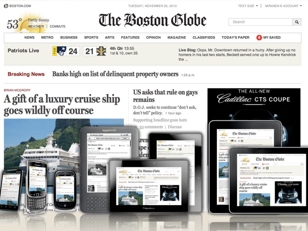
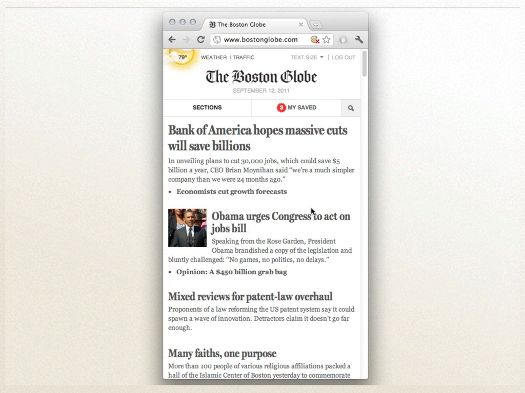
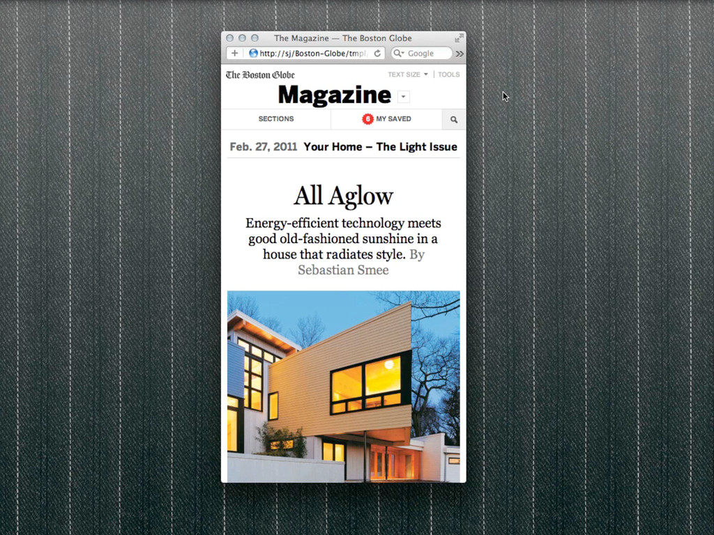
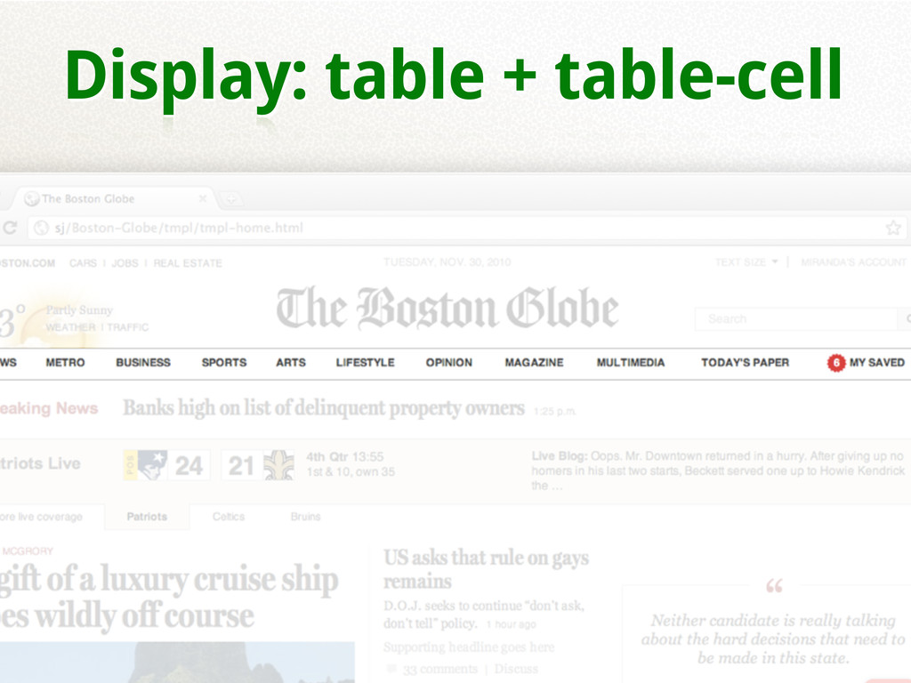
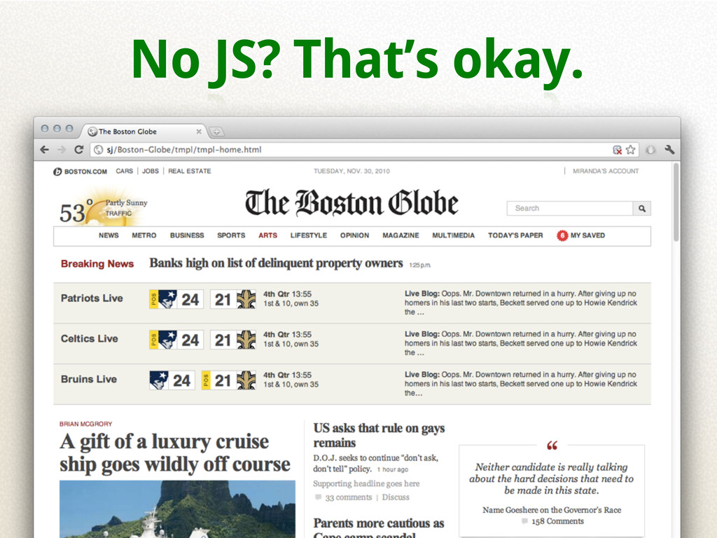
Behind the scenes overview of building a large scale responsive design (with the new BostonGlobe.com as a case study).
 Your Podcast. Everywhere. Effortlessly.
 scottjehl
 mhand01
 pkshadeck
 usagimaru
 nagata03
 littlebusters
 nishame
 seto
seto
 a2k
a2k
 hiro0218
 kumanoayumi
 garyuten
 mottox2
 addyosmani
 eitanlees
 bcantrill
 ryanjones
 axbom
axbom
 retrage
 caitiem20
 tmiket
 katiecoart
 apolaine
 jonoalderson
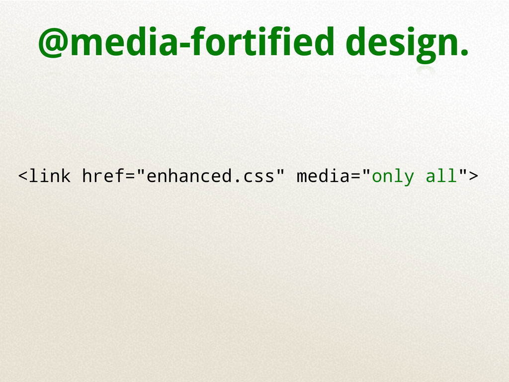
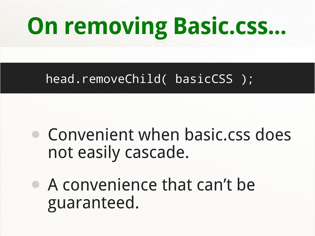
![<link rel=...” href=”basic.css” id=”basic”> <!--[if gte IE 6]><link href="enhanced.css" rel="stylesheet"><![endif]-->](https://files.speakerdeck.com/presentations/4e80d6b4750822006000044c/slide_32.jpg)
![Internet Explorer Flags <!--[if lt IE 7 ]> <html lang="en"](https://files.speakerdeck.com/presentations/4e80d6b4750822006000044c/slide_52.jpg)