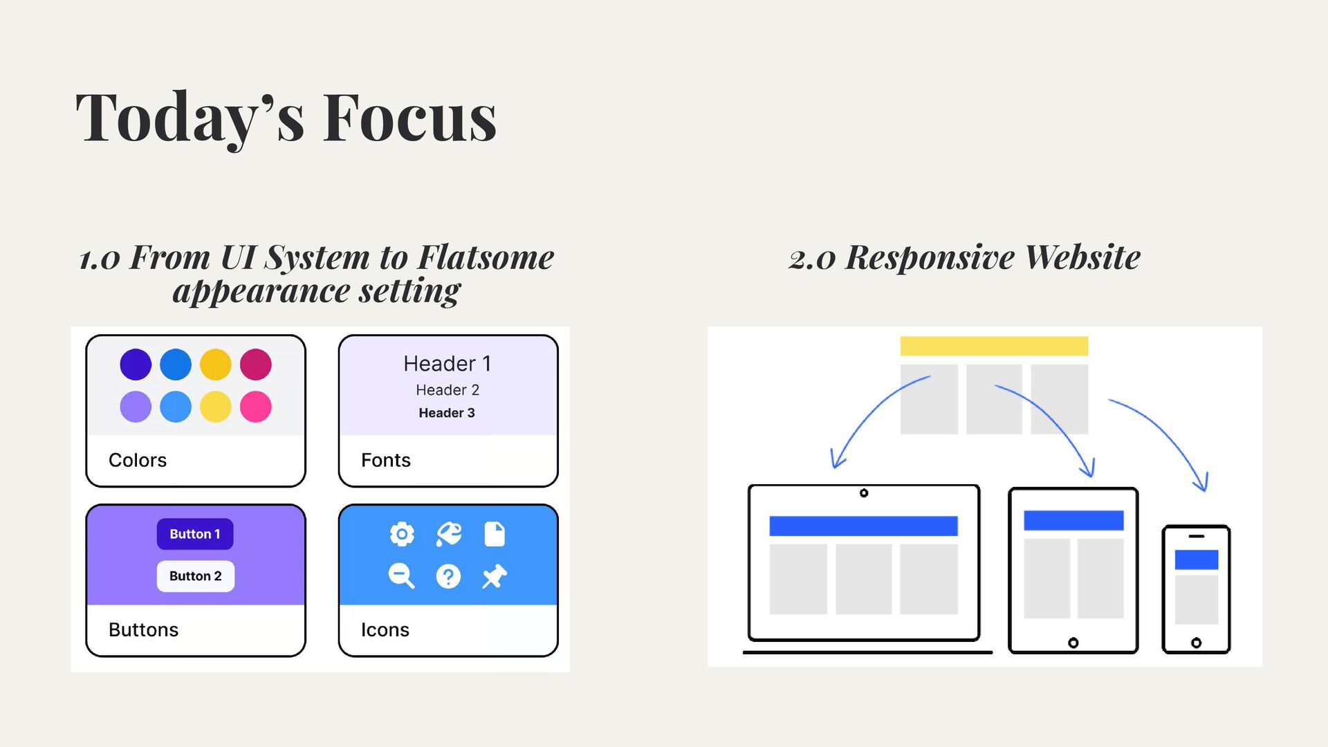
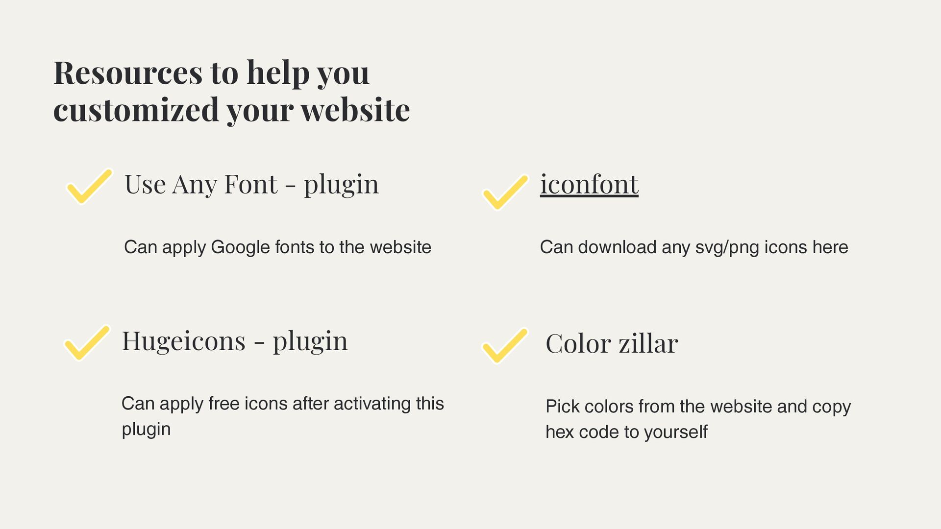
to help you customized your website Can apply Google fonts to the website Can apply free icons after activating this plugin Color zillar Pick colors from the website and copy hex code to yourself Can download any svg/png icons here
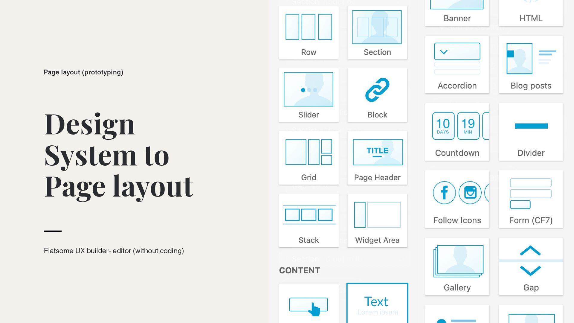
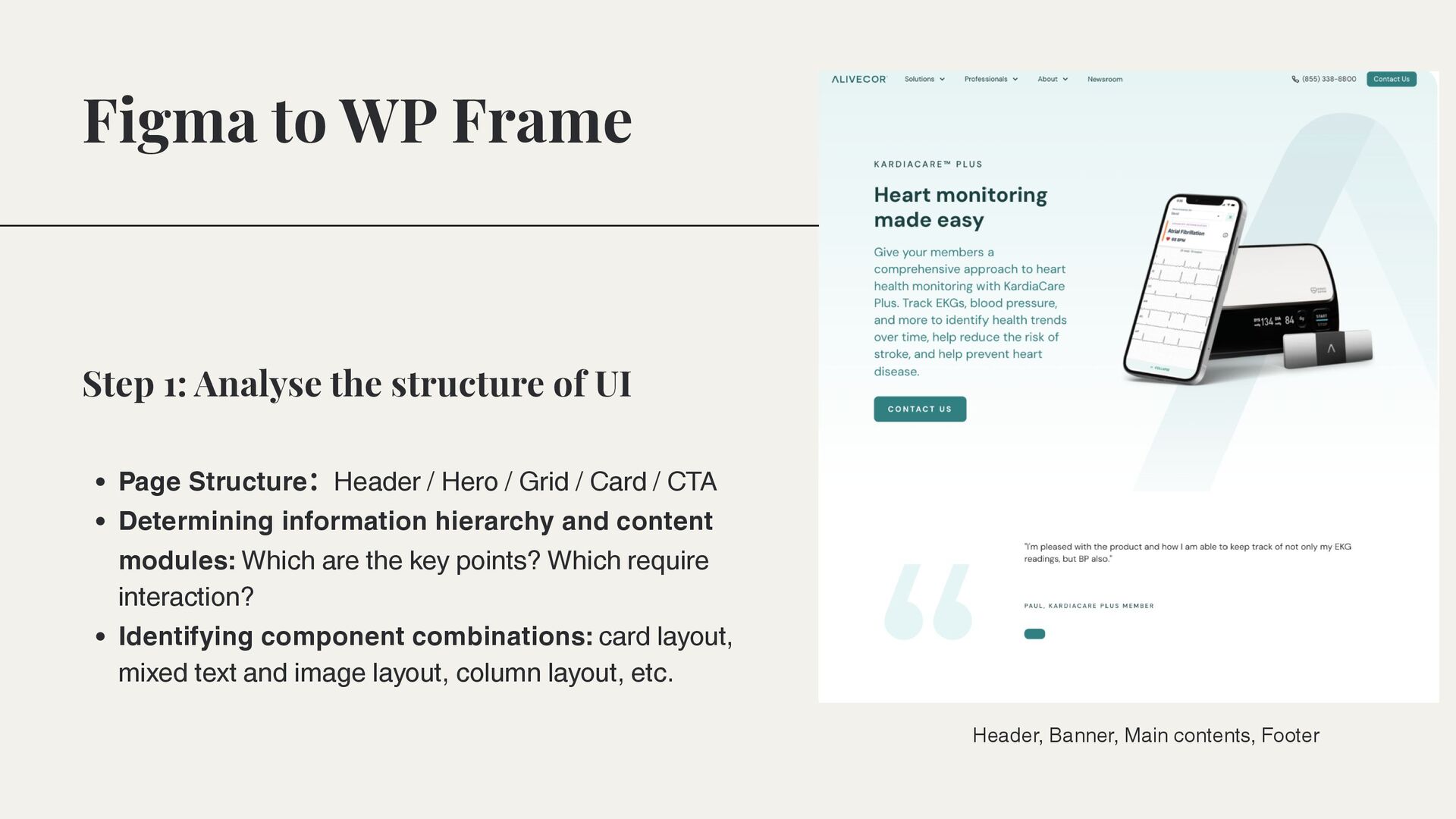
Grid / Card / CTA Determining information hierarchy and content modules: Which are the key points? Which require interaction? Identifying component combinations: card layout, mixed text and image layout, column layout, etc. Step 1: Analyse the structure of UI Header, Banner, Main contents, Footer
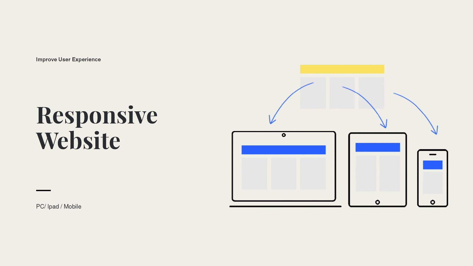
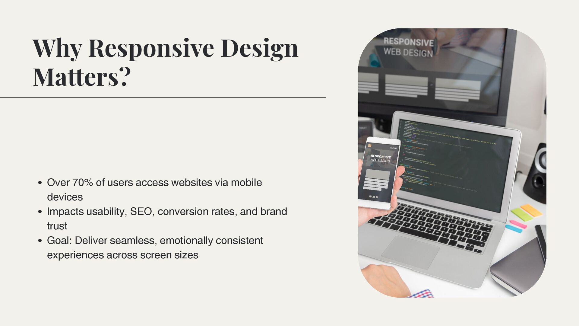
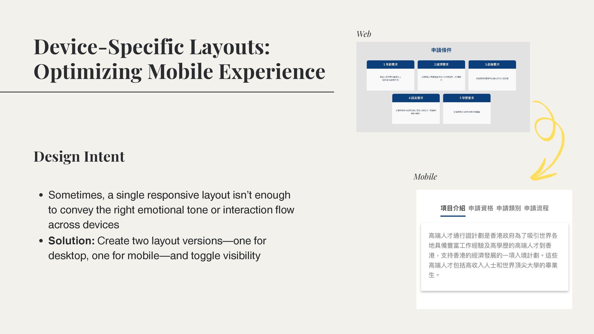
via mobile devices Impacts usability, SEO, conversion rates, and brand trust Goal: Deliver seamless, emotionally consistent experiences across screen sizes
isn’t enough to convey the right emotional tone or interaction flow across devices Solution: Create two layout versions—one for desktop, one for mobile—and toggle visibility Design Intent Web Mobile
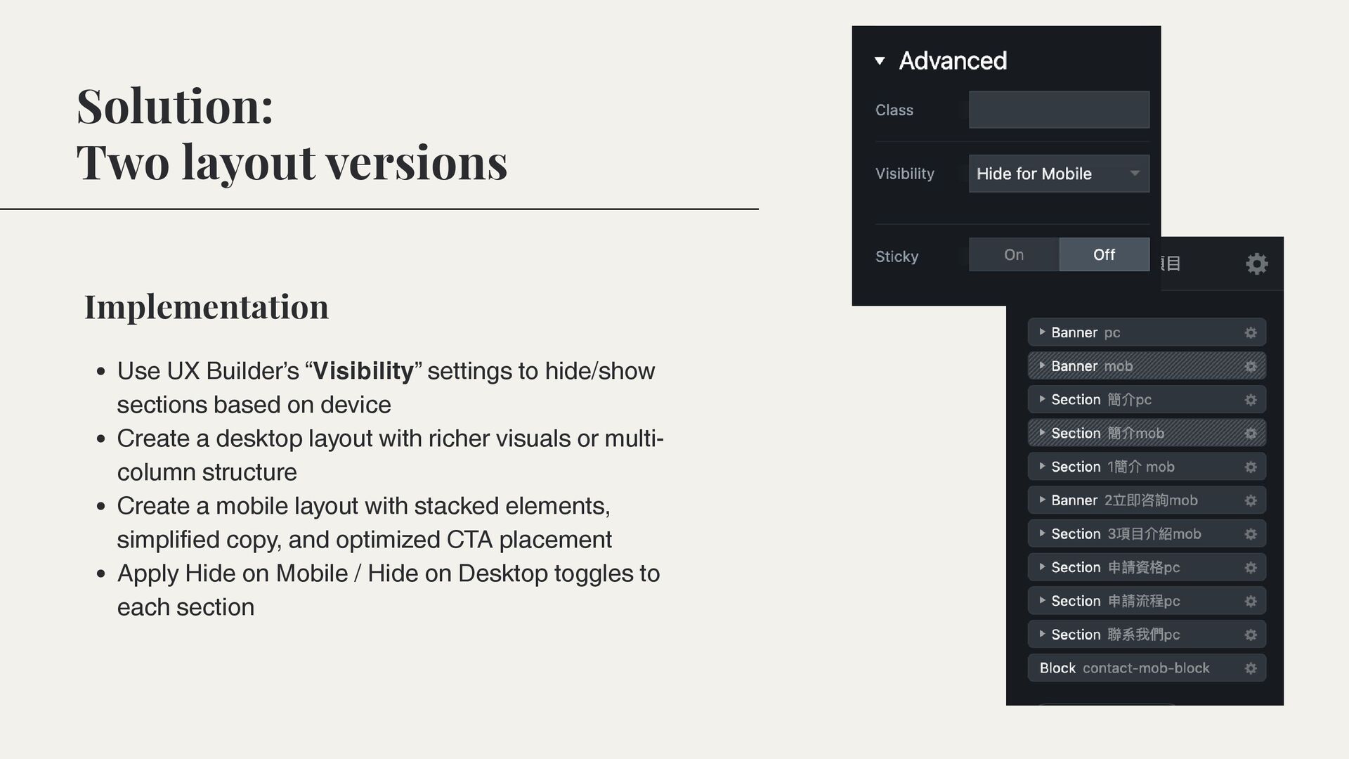
to hide/show sections based on device Create a desktop layout with richer visuals or multi- column structure Create a mobile layout with stacked elements, simplified copy, and optimized CTA placement Apply Hide on Mobile / Hide on Desktop toggles to each section
 hkwp
hkwp
 aleyda
 michielstock
 honzajavorek
 jdejongh
 codingconduct
 kevinliebholz
 tamaranovitovic
 katiecoart
 minecr
 frankvandijk
.jpg) cargoodrich
cargoodrich
 vanstee
![THANK YOU FOR GIVING YOUR TIME! saralin1191.wixsite.com/ portfolio saralinhappy [email protected]](https://files.speakerdeck.com/presentations/8099955abe6f4c30aa5d5f3301290bc5/slide_19.jpg)