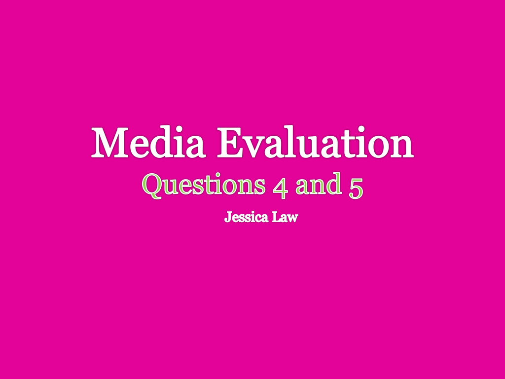
I have catered my magazine. I obtained the photograph from home, (my Father in his Punk days, aged about sixteen) this represents both my secondary and primary audience. I have targeted people who used to be Punks as well as people of the same age that he is in the photograph. Punks typically customised their own clothing, or pieced together outfits that other people wouldn’t have done - a sort of social anarchy by refusing to go by what everyone-else is doing. Punks also tend to colour their hair, as displayed here with the orange and blue/green combination. I think this also represents the attitude of my audience, they dress to shock and to get in people’s faces but the preconception that Punks cause trouble is not a correct one, in fact the relaxed, messing-about feel the photograph gives is exactly that of my target audience.
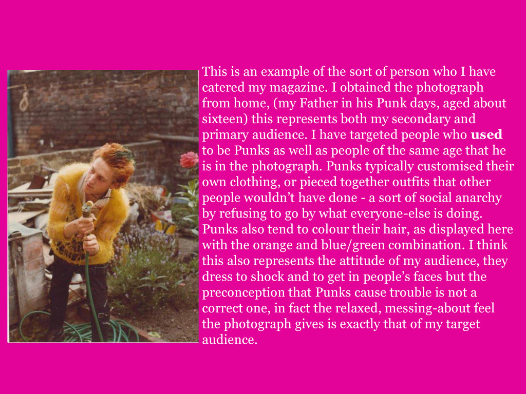
as Camden Lock in London and the Brighton Lanes. This is because both locations are famed for their alternative shops and attractions, this brings many different kinds of people and creates a real diversity: no-one looks the same, an ideal place for a true Punk. Also, as well as their “not following the crowd” clothing interests, such places have a wide variety of items and wares to look at, which range from art to food. Immersing oneself in society and culture is a key component of Punk life.
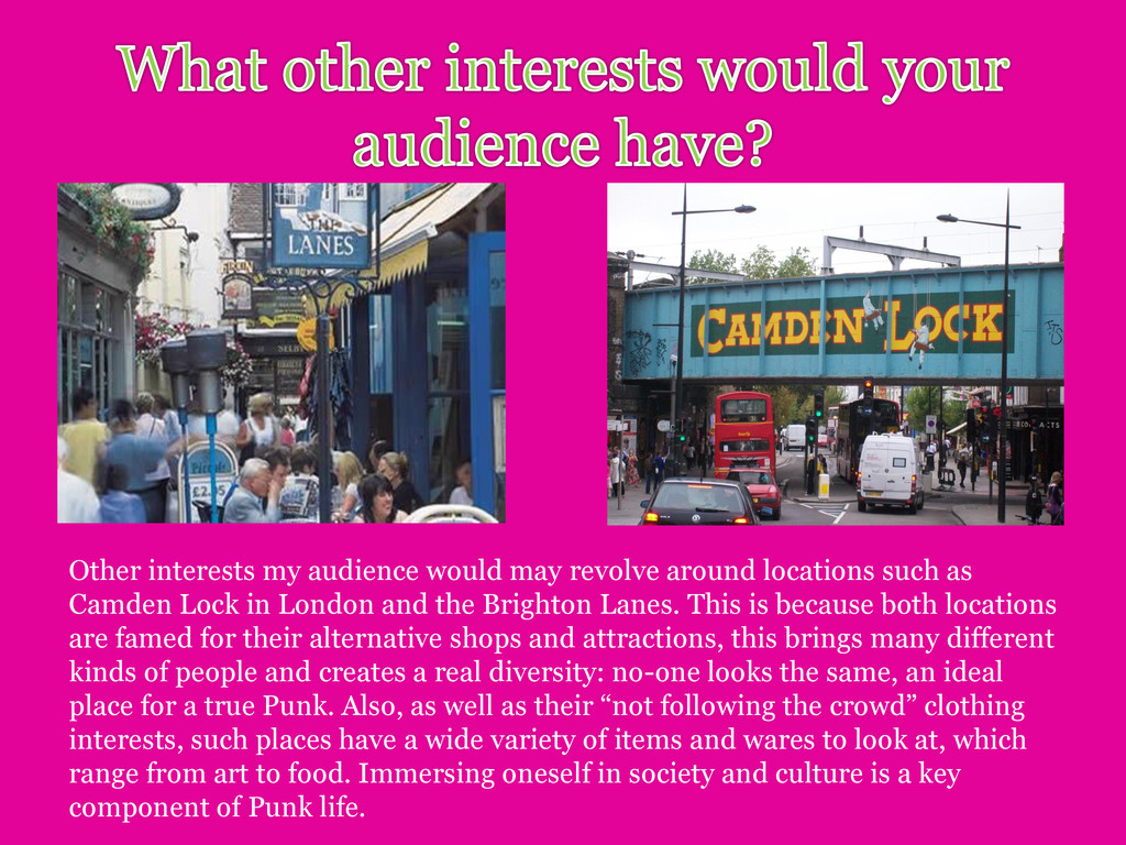
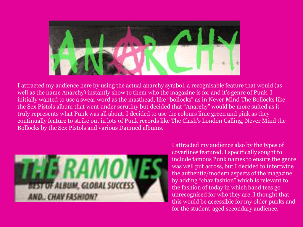
symbol, a recognisable feature that would (as well as the name Anarchy) instantly show to them who the magazine is for and it’s genre of Punk. I initially wanted to use a swear word as the masthead, like “bollocks” as in Never Mind The Bollocks like the Sex Pistols album that went under scrutiny but decided that “Anarchy” would be more suited as it truly represents what Punk was all about. I decided to use the colours lime green and pink as they continually feature to strike out in lots of Punk records like The Clash’s London Calling, Never Mind the Bollocks by the Sex Pistols and various Damned albums. I attracted my audience also by the types of coverlines featured. I specifically sought to include famous Punk names to ensure the genre was well put across, but I decided to intertwine the authentic/modern aspects of the magazine by adding “chav fashion” which is relevant to the fashion of today in which band tees go unrecognised for who they are. I thought that this would be accessible for my older punks and for the student-aged secondary audience.
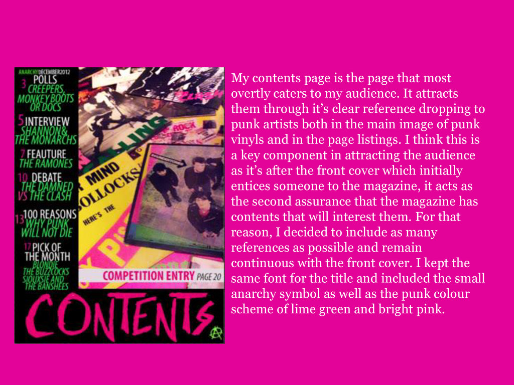
to my audience. It attracts them through it’s clear reference dropping to punk artists both in the main image of punk vinyls and in the page listings. I think this is a key component in attracting the audience as it’s after the front cover which initially entices someone to the magazine, it acts as the second assurance that the magazine has contents that will interest them. For that reason, I decided to include as many references as possible and remain continuous with the front cover. I kept the same font for the title and included the small anarchy symbol as well as the punk colour scheme of lime green and bright pink.


 leimatthew05
 asonas
 schlessera
 skipperchong
 tenderlove
 marcoroth
 akashhashmi
 marketingsoph
 lauravandoore
 davidcarrasco
 cassininazir