Upgrade to Pro — share decks privately, control downloads, hide ads and more …

HTML5+移动开发便携手册.pdf

MarkYun
September 09, 2015
120

 HTML5+移动开发便携手册.pdf

HTML5+移动开发便携手册.pdf

MarkYun

September 09, 2015
Tweet

Transcript

  1. DZone, Inc. | www.dzone.com By Mike Keith Getting Started with

    JPA 2.0 Get More Refcardz! Visit refcardz.com #127 CONTENTS INCLUDE: n Whats New in JPA 2.0 n JDBC Properties n Access Mode n Mappings n Shared Cache n Additional API and more... Getting Started with JPA 2.0 An all-day hackathon with awesome prizes for the top 3 teams 4 Parties! Including welcome reception, beer crawl, SenchaCon party & hackathon beer bash Breakfast, lunch, snacks and discounts to Disney theme parks /////////////////////////////////////////////////////////////////////////////////////////////////////////////////////////////////////////////////////////////////////////////////////////////////////////////// SenchaCon: The Ultimate HTML5 Dev Event SenchaCon is the go-to developer conference for the HTML5 and Sencha communities, including 3 days of technical sessions, an all-day hackathon and a rockin’ party each night. You’ll find deep technical content on Sencha technologies, including Sencha Touch, Ext JS and Sencha Architect as well as JavaScript, HTML5, Server-Side and Cloud technologies. Join us in Orlando from July 16–19, 2013 WHaT’S InCLuded 65+ conference sessions presented by top speakers from around the world Opening keynote with major announcements and product previews Access to the Sencha team and product engineers Register now at SenchaCon.com ///////////////////////////////////////////////////////////////////////////////////////////////////////////////////////////////////////////////////////////////////////////////////////////////////////////////
  2. DZone, Inc. | www.dzone.com Get More Refcardz! Visit refcardz.com #186

    HTML5 Mobile Development By: Max Firtman The HTML5 umbrella covers a vast range of specifications, APIs, techniques, and design approaches to web development. Several of these technologies are intended to help developers build web applications optimized for mobile devices. Not all platforms support the same features in the same way, however. Moreover, specific hardware differences often require special treatment beyond the W3C spec, no matter how the platform implements the spec. This Refcard is intended to bring you up to speed, and help you jump head-first into mobile HTML5 development. The card first covers the most important HTML5 mobile technologies, including key variations by platform and device, then offers a cream-of-the-crop selection from the vast ecosystem of tools, frameworks, and communities that have sprung up to support mobile HTML5 development. The card assumes basic knowledge of core web development technologies (JavaScript, HTML, CSS). BASICS: WHAT IS A VIEWPORT? A viewport allows us to normalize different devices to get the best sizes for a mobile website or webapp and to avoid initial zooming. All platforms support viewport definitions through <meta> tags: <meta name=”viewport” content=”{comma-separated options}”> The most useful version is: <meta name=”viewport” content=”width=device-width”> Viewport options Option Values width Width of the virtual viewport that the browser will expose to our website in CSS pixels or the constant device-width height Height of the virtual viewport that the browser will expose to our website in CSS pixels or the constant device-width user-scalable no/yes initial-scale Float value (1=no zoom) minimum-scale Float value maximum-scale Float value target-densitydpi Integer value (70 to 400) in DPI or one of the following constants: device-dpi, high-dpi, medium-dpi, low-dpi. Not available on Safari for iOS Viewport Through CSS Internet Explorer since v10 also supports @viewport on CSS: @-ms-viewport { width: device-width; } On Windows 8, including tablets, IE can work in snap state. We can define the viewport only when in this mode: @media screen and (max-width: 400px) { @-ms-viewport { width: 320px; } } Device-Width Values When using width=device-width as the viewport’s width, the final width that we’ll have available may be (measured in CSS pixels): Option Values 320 The most common value on smartphones including iPhone, Windows Phone, Android (medium screen sizes < 4") 360 Large screen Android smartphones (< 5"), such as Galaxy SIII & SIV 400 Phablets (>5"), such as Galaxy Note 600 Small tablets 768 Large tables Even on high-resolution screens, such as Retina displays, you will always get a width in CSS pixels with a value of 320. Therefore, the available width for the canvas is the same for all devices. Landscape viewport Safari for iPhone will not use the available space on the viewport on landscape and it will zoom in the content. To avoid this behavior we can use the code on https://gist.github.com/901295 MOBILE URLS Using standard hyperlinks we can communicate with the operating system. Remember to encode in URL format any parameter that you might pass through. Calls and messaging To initiate a call, tel:{phone-number} <a href=”tel:+14152110022”>Call us</a> CONTENTS INCLUDE: ❱ Basics: What is a Viewport ❱ Mobile URLs ❱ High Resolutions Support ❱ Mobile Icons ❱ Touch Events ❱ Offline Support... and more! HTML5 Mobile Development Thinking Mobile? Think Sencha. Sencha Touch Bundle is everything you need to design and develop cross-platform, mobile apps. Try Sencha Touch Bundle free for 30 days! sencha.com/touch-bundle Sponsored By:
  3. 2 HTML5 Mobile Development DZone, Inc. | www.dzone.com To initiate

    an SMS, sms:{destination}?body={message}. The body might be ignored by some platforms. <a href=”sms:1111?body=Hello”>Send us SMS</a> To initiate a mail compose, mailto:{to}?subject={subject}&body={message} iOS supports HTML on the body. <a href=”mailto:[email protected]?subject=Hello?”>Send us SMS</a> To initiate a Facetime call on iOS, facetime:{number/user} <a href=”facetime:myuser”>Call us with Facetime</a> To initiate a Skype call, skype:{user}?call <a href=”skype:myuser?call”>Call us with Skype</a> To tweet through the native Twitter app, twitter://post?message={message} <a href=”twitter://post?Hello”>Tweet</a> Maps and Navigation To open the Maps app on Android and iOS < 6, http://maps.google. com?q={query} <a href=”http://maps.google.com?q=golden+gate+bridge”>Open Map</ a> To initiate a navigation on Android and iOS < 6, http://maps.google.com?sa ddr={point1}&daddr={point2} <a href=”http://maps.google.com?saddr=golden+gate+bridge &daddr=Pier+39”>Navigate to Pier 39</a> To open the Maps app on iOS >=6, http://maps.apple.com?q={query} <a href=”http://maps.apple.com?q=golden+gate+bridge”>Open Map</a> To initiate a navigation on iOS >= 6, http://maps.apple.com?saddr={point1} &daddr={point2} <a href=”http://maps.apple.com?saddr=golden+gate+bridge &daddr=Pier+39”>Navigate to Pier 39</a> Apple Stores To open iTunes, AppStore or iBookStore on iOS, generate the link from https://itunes.apple.com/linkmaker To remove automatic linking <meta name=”format-detection” content=”telephone=no”> <meta name=”x-rim-auto-match” content=”none” forua=”true”> HIGH RESOLUTION SUPPORT Devices with a high-resolution display (as in Retina iOS devices) will use a multiplier for all your dimensions, known as the device pixel ratio. Therefore, if you draw a 100 pixels element it will measure 100 device pixels on a device with an average screen density, it will be rendered as 200 device pixels on a high resolution device such as iPhone 5, and a 300 device pixels on a ultra high resolution device, such as Samsung Galaxy SIV. Thanks to the device pixel ratio, our design will look the same in inches on every device, regardless of the screen density. Using scalar solutions Using these techniques, our content will render properly on all kinds of screen densities without image quality loss: SVG: Scalable Vector Graphics We can use SVG as an external document or as inline using the new <svg> element Font face We can use font files for iconography in conjunction with CSS3 Font face. Look at fontello.com and icomoon.io CSS3 Use CSS3 for effects, gradients, rounded corners and backgrounds Providing alternate bitmap files When working with bitmap files (JPEG, GIF, PNG), we can provide different versions of the same file for different resolution. Be careful about the final size for high-resolution devices. Using background images and media queries If bitmap images are defined using background images on CSS, we can provide alternate versions using the extension (prefixed) device-pixel-ratio. For devices with a pixel ratio of 2 or more: /* Low resolution version */ #picture { background-image: url(picture_low.png); } /* High resolution version with different prefixes */ @media screen and (min--moz-device-pixel-ratio: 2), only screen and (-webkit-min-device-pixel-ratio: 2) { #picture { background-image: url(picture_hi.png); background-size: 100%; } } Using image-set On Safari for iOS from version 6 we can use the -webkit-image-set function to provide different images from CSS: background-image: -webkit-image-set( url(picture_low.png) 1x, url(picture_hi.png) 2x ); Using JavaScript We can query the window.devicePixelRatio property. If it’s undefined, we can guess a low-resolution device; if it’s a numeric value we can use it to change the image being loaded. var pixelRatio = window.devicePixelRatio || 1; if (pixelRatio >= 2) { document.querySelector(“#image1”).src = “picture_hi.png”; } MOBILE ICONS We need to provide different icons for the tab or title area and for the home screen when the user adds an icon to it. Different platforms and devices support different icon sizes. Window and tab icons <link rel=”icon” href=”icon_32.png”> <!-- For IE, we need an icon in ICO format --> <link rel=”shortcut icon” href=”icon.ico”>
  4. 3 HTML5 Mobile Development DZone, Inc. | www.dzone.com Home screen

    icons <-- iPad icons --> <link rel=”apple-touch-icon” href=”icons/72.png” sizes=”72x72”> <link rel=”apple-touch-icon” href=”icons/144.png” sizes=”144x144”> <!-- iPhone and iPod touch icons --> <link rel=”apple-touch-icon” href=”icons/57.png” sizes=”57x57”> <link rel=”apple-touch-icon” href=”icons/114.png” sizes=”114x114”> Other platforms—such as Android, BlackBerry and Symbian—support the apple-touch-icon link with non-standard sizes. Nokia Symbian also supports: <link rel=”nokia-touch-icon” href=”icons/54.png”> Precomposed icons By default, Apple will add shadow, rounded corners and 3D shine effects to the icons, as in the following image: To avoid some of these effects we can use the alternate version <link rel=”apple-touch-icon-precomposed” href=”icons/72.png” sizes=”72x72”> Windows 8 Start Screen Tile Internet Explorer 10 on Windows 8 supports a "Pin to the Start Screen" feature. We can define the background color and the icon to be used in the Start Screen using: <meta name=”msapplication-TileImage” content=”icons/tile144.png”> <meta name=”msapplication-TileColor” content=”#FFFF00”> Updating a badge notification The Start Screen Tile may be updated frequently defining an XML URL through: <meta name=”msapplication-badge” content=”frequency=1440;polling-uri={xml-url}”> The XML will look like: <?xml version=”1.0 ?> <badge value=”30”></badge> UPGRADE TO WEBAPP A webapp is a hosted website that can be installed with a home screen icon and once installed it works full-screen outside of the browser and it might have some kind of super powers in terms of permissions and support. iOS Home Screen webapps On iPhone and iPad we can create webapps using a meta tag and usually adding the apple-touch-icon link: <meta name=”apple-mobile-web-app-capable” content=”yes”> Once added to the Home Screen, a page with the meta tag will open in full screen mode. We can customize the status bar appearance through one of the possible options on this meta tag: <meta name=apple-mobile-web-app-status-bar-style” content=”{black/default/black-translucent}”> Startup images When the webapp is opened from the Home Screen, we can define a startup image that acts as the image while the webapp is being loaded: <link rel=”apple-touch-startup-image” href=”startup.png”> The image has to be full screen size and because there are several resolutions (iPhone 3GS, iPhone 4S, iPhone 5, iPad Mini, iPad 2) we can use media queries to provide different versions. For iPhone 5 and latest iPods touch we can use: <link rel=”apple-touch-startup-image” href=”startup.png” media=”only screen and (device-height: 568px) and (-webkit-device-pixel-ratio: 2)”> We can also provide portrait and landscape versions for iPads using orientation: landscape and orientation: portrait in the media attribute. Opening links While in a webapp, all the links are opened in Safari (new window). To open a link and replace the current HTML in our app context, we can use JavaScript as in: <a href=’#’ onclick=’location.href=”newfile.html”’>Go</a> Mozilla open webapps On Firefox for desktop and mobile, including Firefox OS, we can install a webapp using a manifest JSON file and a JavaScript API. The manifest file looks like: { “name”: “My HTML5 App”, “description”: “This is the description of the app”, “launch_path”: “/index.html”, “icons”: { “128”: “/img/icon-128.png” // >=128 is mandatory }, “default_locale”: “en” } To initiate the webapp installation we can use the Apps API: var r = window.navigator.mozApps.install(“/manifest.webapp”); r.onsuccess = function() { alert(“App installed”) } r.onerror = function() { alert(“App installed”) } TOUCH EVENTS Mouse events (such as click) are not always suitable for mobile devices for different reasons, including: a) A delay of 300ms before firing the event handler. b) They don’t support multitouch. c) The clickable area using a finger is not always just one pixel. Apple Touch Events Safari on iOS created the touch events, a series of 4 events that we can detect on any DOM element. Most of the other mobile browsers (excluding IE) support this specification. The events available are: • touchstart • touchend • touchmove • touchcancel
  5. 4 HTML5 Mobile Development DZone, Inc. | www.dzone.com All the

    events can be attached using addEventListener or through HTML DOM properties, such as ontouchstart. Every event receives through the first argument a touches collection. This collection includes each of the current available touches as a Touch object where we can get coordinates (such as pageX): document.addEventListener(“touchstart”, function(event) { var touches = event.touches; var quantity = touches.length; var firstTouch = touches[0]; var coordinates = { x: firstTouch.pageX, y: firstTouch.pageY } }, false); Gesture API Compatible only with Safari on iOS, we can use gesture events to detect two-fingers rotate and pinch gestures: document.addEventListener(“gesturechange”, function(event) { var currentRotation = event.rotation; var currentScale = event.scale; }, false); W3C Touch Events W3C has standardized Apple Touch Events with the additions of touchenter and touchleave for dragging purposes. Firefox and BlackBerry smartphones and tablets are using this spec. The Gesture API is not included. Microsoft Pointer Events Microsoft is using another approach through Pointer events (also to be standardized in the W3C). Pointer events inherit from mouse events; therefore instead of receiving a collection of touches we receive one call per touch only with the information of the current point. Pointer events include support for touch, mouse, and styles; the most useful available events are pointerdown, pointerup, pointercancel, pointermove, pointerover, pointerout. In IE10, these events are prefixed with MS; for example: mspointerup. document.addEventListener(“mspointerdown”, function(event) { var coordinates = { x: event.clientX, y: event.clientY } }, false); Gesture API Microsoft also supports a Gesture API for more complex touch interaction detection, including: • msgesturehold • msgesturetap • msgesturestart • msgestureend • msgesturechange • msinertiastart OFFLINE SUPPORT Most mobile browsers support offline access through the Application Cache API. This API allows us to define a package that the browser will install for future access. Step 1: Define the manifest file <!DOCTYPE html> <html manifest=”offline.manifest”> Step 2: Define the offline.manifest CACHE MANIFEST # This is a comment line # We define first the files that need to be downloaded # The HTML file is always included in the package CACHE: styles/mystyles.css scripts/mycode.js images/myimages.png # If we want the app to access some resources on the web # We can define specific URLs or a pattern, such as * NETWORK * Step 3: Detect events client-side Through the object window.applicationCache we can detect several events over the process, such as downloading, cached, noupdate, and updateready. window.applicationCache.addEventListener(“cached”, function() { alert(“The package was installed”); } , false); How Application Cache works If the webapp was installed (cached event) then the next time the user accesses it, it will always be loaded from the cached version, even if the user has a connection. If there is a connection available, the browser will download the manifest file and it will compare byte-by-byte with the stored version. If it is the same, the noupdate event will be fired; if the manifest has changed, then the whole package will be discarded from the cache and downloaded again from the server firing the updateready event. It's important to understand that when an update is available, the user is still seeing the old version as it was loaded from the cache, so the next reload or access will use the updated resources. CLIENT-SIDE STORAGE Whether we are online or offline we can store information on the user’s device using some of the client-side storage APIs, including localStorage, Web SQL Storage, IndexedDB and FileSystem API. Limits vary per platform, but usually localStorage gives us safely at least 5Mb per origin (protocol+domain+port combination). On some platforms such as iOS, we can overpass the 5Mb limit with the user’s permission usually up to 50Mb. HYBRID/NATIVE WEBAPP With HTML5 we can create native webapps, also known as hybrid apps, and distribute them through Application Stores. These platforms require packaging all the resources, and sometimes compiling and signing processes. The most important platforms to create native webapps are: Distribution Name Platforms Compatible Stores WebWorks BlackBerry 5.x-7.x BlackBerry PlayBook BlackBerry 10 BlackBerry AppWorld Windows 8 Store HTML5 apps Windows 8 Microsoft Windows Store Nokia S40 webapps Nokia Series 40 Nokia Store
  6. 5 HTML5 Mobile Development DZone, Inc. | www.dzone.com Name Platforms

    Compatible Stores Symbian webapps Symbian Nokia Store Mozilla Open Web Apps Firefox OS Android Desktop Mozilla Marketplace Chrome Packaged Apps Desktop Chrome OS Android (future) Chrome Store Apache Cordova / Adobe PhoneGap iOS Android BlackBerry Windows Phone Bada / Tizen Symbian Apple AppStore Google Play Store BlackBerry AppWorld Microsoft Windows Phone Store Nokia Store The native HTML5 webapp should be distributed through an application store for free or for a fee. To do that, we need to register as publishers in the stores and pay the publisher fee as defined in the next table: store publisher fee url Apple AppStore USD 99 per year developer.apple.com/ ios/program Google Play Store USD 25 play.google.com/apps/ publish Amazon AppStore for Android Free developer.amazon. com/apps/apps BlackBerry AppWorld Free appworld.blackberry. com/isvportal Windows 8 Store Varies appdev.microsoft.com/ StorePortals Windows Phone Store USD 99 per year dev.windowsphone. com Nokia Store EUR 1 publish.nokia.com MOBILE BROWSERS These are the available mobile browsers by platform: Platform Default Browser Other Browsers iOS Safari (WebKit) Opera Mini, Google Chrome (Web View) Android Android Browser (WebKit) Google Chrome (4.0+), Firefox, Opera Mini, Opera Mobile, Opera (WebKit), UC Browser, Dolphin BlackBerry BlackBerry Browser (WebKit) Opera Mini (for old smartphones) Windows Phone Internet Explorer Nokia Xpress (experimental) Symbian Nokia Browser (WebKit) Opera Mobile, Opera Mini Firefox OS Firefox Kindle Fire (Android) Amazon Silk Nokia S40 Nokia Xpress Browser Opera Mini Other Jasmine, Dolfin,NetFront, UC Web, webOS Browser (now Iris) EMULATORS These are the available emulators and simulators per platforms (source: http://emulato.rs): Platform Host Platforms Where to get it for free iOS Mac Search for Xcode on Mac App Store Android Windows, Linux, Mac http://developer.android. com/sdk Windows Phone Windows 8 Pro Visual Studio 2012 Express for Windows Phone Windows 8 Tablet Windows 8 Pro Visual Studio 2012 Express for Windows 8 BlackBerry 10 Windows, Linux, Mac http://developer.blackberry. com/devzone/ develop/ simulator/ BlackBerry 6/7 Windows http://us.blackberry.com/ sites/developers/ resources/ simulators.html Firefox OS Windows, Linux, Mac https://addons.mozilla.org/ en-US/firefox/addon/firefox- os-simulator/ Nokia S40 Windows https://www.developer. nokia.com/Develop/ Series_40/ REMOTE DEBUGGING Support for remote debugging for HTML, CSS and JavaScript: Browser Host Browser Connection Method Safari for iOS Safari for Mac USB cable with the device Google Chrome on Android Google Chrome Windows, Mac or Linux USB cable with the device and ADB tools (Android Debug Bridge) Firefox on Android and Firefox OS Firefox Windows, Mac or Linux TCP via IP Address (same Wi-Fi network) BlackBerry 7 and 10 Browser Any Webkit-based desktop browser TCP via IP Address (same Wi-Fi network) Opera Mobile for Android or Symbian Opera for Windows, Mac or Linux TCP via IP Address (same Wi-Fi network) HTML5 APIS These APIs might not be available on all the browsers and platforms. Check http://caniuse.com or http://mobilehtml5.org for compatibility tables. Geolocation navigator.geolocation.getCurrentPosition( function(position) { var lat = position.coords.latitude; var lon = position.coords.longitude; }, function () { alert(‘Error locating your device’); } ); Accelerometer, Magnetometer & Gyroscope We can read current acceleration in 3 axes measured in m/s2 including gravity or excluding it on some devices only: window.addEventListener(“devicemotion”, function(event) { var acceleration = event.accelerationIncludingGravity; // acceleration.x, acceleration.y, acceleration.z }, false);
  7. Browse our collection of over 150 Free Cheat Sheets Upcoming

    Refcardz Free PDF 6 HTML5 Mobile Development DZone, Inc. 150 Preston Executive Dr. Suite 201 Cary, NC 27513 888.678.0399 919.678.0300 Refcardz Feedback Welcome [email protected] Sponsorship Opportunities 
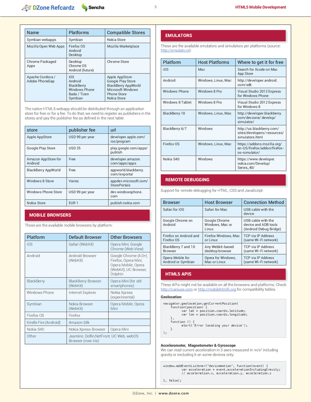
[email protected] Copyright © 2013 DZone, Inc. All rights reserved. No part of this publication may be reproduced, stored in a retrieval system, or transmitted, in any form or by means electronic, mechanical, photocopying, or otherwise, without prior written permission of the publisher. Version 1.0 $7.95 DZone communities deliver over 6 million pages each month to more than 3.3 million software developers, architects and decision makers. DZone offers something for everyone, including news, tutorials, cheat sheets, blogs, feature articles, source code and more. “"DZone is a developer's dream",” says PC Magazine. We can also read current device orientation as alpha (direction according to the compass), beta (angle of the tilt front-to-back) and gamma (angle of the tilt left-to-right). All angles are measured in degrees. window.addEventListener(“devicemotion”, function(event) { var acceleration = event.accelerationIncludingGravity; // acceleration.x, acceleration.y, acceleration.z }, false); Battery var battery = navigator.mozBattery || navigator.webkitBattery; var level = battery.level * 100; var charging = battery.charging; var chargingTimeFully = battery.chargingTime; var dischargingTimeEmpty = battery.dischargingTime; // Events available battery.addEventListener(“levelchange”, handler, false); battery.addEventListener(“chargingchange”, handler, false); battery.addEventListener(“chargingtimechange”, handler, false); battery.addEventListener(“dischargingtimechange”, handler, false); Vibration // One time vibration for 0.5 seconds navigator.vibrate(500); // Vibration pattern (vibration/pause) navigator.vibrate([500, 500, 1000, 600,100]); Media capture Using HTML forms to capture media: <input type=”file” accept=”image/*” capture=”camera”> <input type=”file” accept=”audio/*” capture=”microphone”> <input type=”file” accept=”video/*” capture=”camcorder”> Reading the camera as <video> input: var video = document.querySelector(“video”); var URL = window.URL || window.webkitURL; var getUserMedia = navigator.getUserMedia || navigator.webkitGetUserMedia || navigator.mozGetUserMedia; var video = document.getElementById(“player”); if (getUserMedia) { getUserMedia({audio:true, video:true}, function(stream){ video.src=URL.createObjectURL(stream); video.play(); }); } RESOURCES HTML5 documentation: www.webplatform.org Can I Use Compatibility Tables: www.caniuse.com HTML5 Compatibility Tables: www.mobilehtml5.org HTML5 Rocks for Mobile: www.html5rocks.com/mobile HTML5 demos: www.html5demos.com Emulators and Simulators: www.emulato.rs HTML5 Test: www.html5test.com HTML5 Developer Scorecard: http://www.sencha.com/blog/category/ Author and mobile development expert Maximiliano Firtman shows you how to develop a standard app core that you can extend to work with specific devices. This updated edition covers many recent advances in mobile development, including responsive web design techniques, offline storage, mobile design patterns, and new mobile browsers, platforms, and hardware APIs. Buy Here Max Firtman is a developer, consultant, and speaker, and international expert on mobile and web 2.0. Max has written two books with O’Reilly (“Programming the Mobile Web” and “jQuery Mobile: Up and Running”), is a certified Nokia and BlackBerry trainer, and regularly speaks at conferences around the world. He has founded several companies, taught at several universities, and maintains several major mobile HTML5 resource sites, including mobile HTML5 compatibility tables (http://mobilehtml5. org/) and media queries test sites (http://mediaqueriestest.com/). ABOUT THE AUTHOR RECOMMENDED BOOK C++ CSS3 OpenLayers Regex