Upgrade to Pro — share decks privately, control downloads, hide ads and more …

Optimizing Your Streaming Profile For Mobile No...

Avatar for StreamerSuite StreamerSuite PRO
August 30, 2025
1

Optimizing Your Streaming Profile For Mobile Not Just Desktop

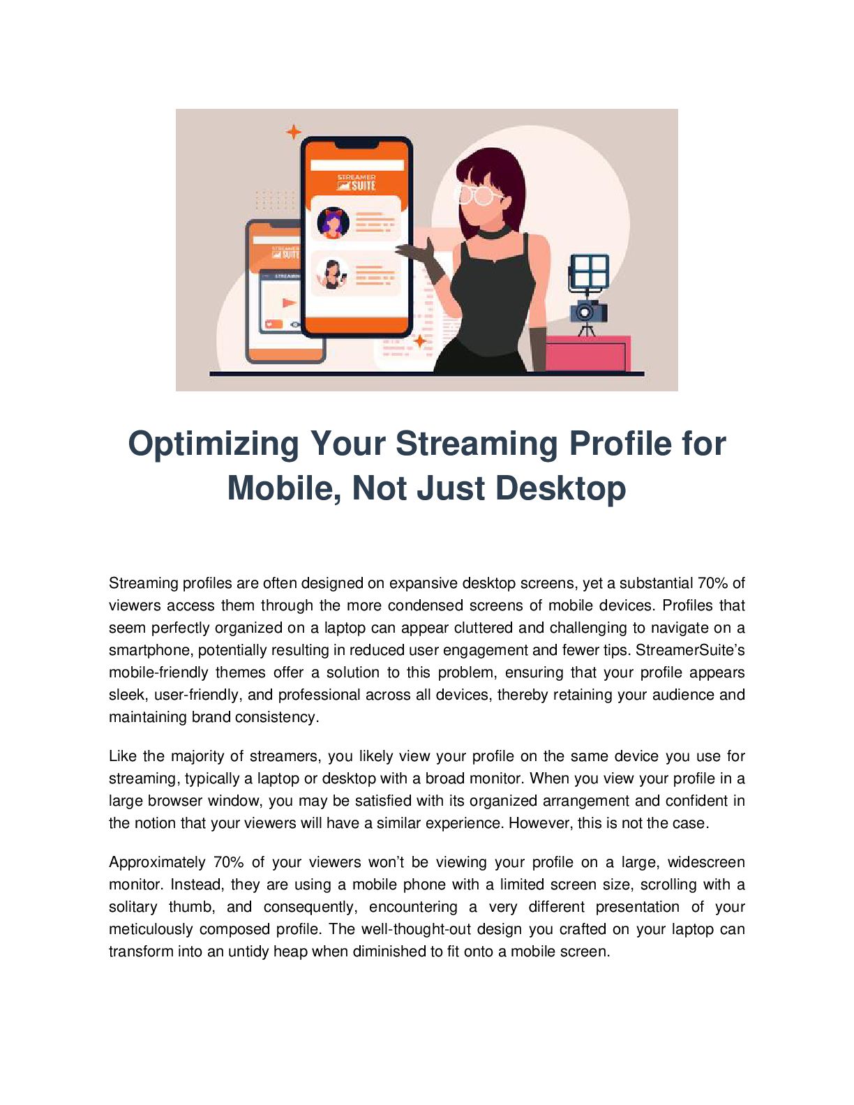
Streaming profiles often appear cluttered and difficult to navigate on mobile devices, despite looking organized on desktop screens. This discrepancy can lead to reduced user engagement and fewer tips, as around 70% of viewers access streaming profiles on mobile devices. StreamerSuite offers mobile-friendly themes to ensure profiles appear sleek, user-friendly, and professional across all devices. Most streamers view their profile on the same device they use for streaming, typically a desktop or laptop. However, this perspective differs greatly from the experience of mobile viewers who navigate the content with a single thumb on a smaller screen. Streamers often overlook the dominance of mobile viewing when establishing their online presence. Therefore, adopting a mobile-first design mentality is crucial. Despite almost 99% of streamers using a desktop or laptop for streaming, about 70% of viewers access the content via a mobile device. Streamers should consider the viewing habits of their audience when designing their profile, ensuring the mobile layout is clear and appealing within seconds. Before making changes, streamers should view their profile from the perspective of their viewers to understand the user experience.

Source: https://streamersuite.com/blog/why-streamers-need-to-design-for-mobile-first---not-their-own-laptop-screens

Avatar for StreamerSuite

StreamerSuite PRO

August 30, 2025
Tweet

More Decks by StreamerSuite

Transcript

  1. Optimizing Your Streaming Profile for Mobile, Not Just Desktop Streaming

    profiles are often designed on expansive desktop screens, yet a substantial 70% of viewers access them through the more condensed screens of mobile devices. Profiles that seem perfectly organized on a laptop can appear cluttered and challenging to navigate on a smartphone, potentially resulting in reduced user engagement and fewer tips. StreamerSuite’s mobile-friendly themes offer a solution to this problem, ensuring that your profile appears sleek, user-friendly, and professional across all devices, thereby retaining your audience and maintaining brand consistency. Like the majority of streamers, you likely view your profile on the same device you use for streaming, typically a laptop or desktop with a broad monitor. When you view your profile in a large browser window, you may be satisfied with its organized arrangement and confident in the notion that your viewers will have a similar experience. However, this is not the case. Approximately 70% of your viewers won’t be viewing your profile on a large, widescreen monitor. Instead, they are using a mobile phone with a limited screen size, scrolling with a solitary thumb, and consequently, encountering a very different presentation of your meticulously composed profile. The well-thought-out design you crafted on your laptop can transform into an untidy heap when diminished to fit onto a mobile screen.
  2. This is a common mistake made by streamers when establishing

    their online presence, and is easily rectifiable once the problem is understood and a mobile-first design mentality adopted from the outset. It’s critical not to underestimate the prevalence of mobile viewing in live streaming. Most analytics platforms, including data from Chaturbate, indicate that approximately 70% of site traffic originates from mobile devices. This suggests that out of 100 viewers, 70 of them are likely accessing your profile via a phone or tablet. A significant disparity exists between streamers' content creation methods and viewers' consumption habits. The vast majority of streamers, almost 99%, stream from a laptop or desktop computer. While this makes sense given the enhanced ease of managing your broadcast on a larger screen and more robust hardware, it can also lead to a significant blind spot. When you view your profile on a widescreen display, you encounter your content very differently from most of your audience. From your perspective, the design may appear clean and balanced. However, your mobile viewers might find it confusing and overwhelming. Even if you don't use your mobile to browse streaming sites, your design choices should consider the habits of your audience. Your mobile layout needs to be clear and appealing within seconds. A visually appealing desktop profile that becomes chaotic on mobile could cost you followers, tips, and long-term fans. Before making any changes, it's important to see what your viewers see. There are ways to check how your profile appears on mobile devices which can be enlightening. It often becomes apparent that attention-grabbing graphics are barely legible, important buttons are buried down the page, and text that seemed compact on a desktop appears as an intimidating wall of words when viewed on a mobile. Designing a profile that functions effectively across both desktop and mobile devices is more difficult than it might seem. Streaming platforms weren't initially developed with advanced responsive design in mind, and the customization tools they offer are often limited, making it challenging to balance aesthetics and usability across various devices. Without adopting a mobile-first design approach from the outset, you run the risk of your profile being visually appealing to you on your desktop, yet frustrating for the majority of your viewers who are accessing it on mobile devices. For more details, see this comprehensive resource. This is where StreamerSuite's profile design service can be invaluable. All our themes are fully responsive and adapt to the size of the viewer's screen. Whether your profile is being viewed on a widescreen desktop monitor, a laptop, a tablet, or a small phone, the layout is
  3. optimized for clarity and impact. When you choose a StreamerSuite

    theme, you're selecting a design that caters not just to your own laptop viewing experience, but also to the 70% of your audience who are accessing your profile from a mobile device. This distinction can have a direct impact on your user engagement, tips, and overall audience growth. A mobile-optimized profile does more than just appear organized. It transforms how people interact with your content. Small improvements in mobile accessibility can lead to measurable increases in engagement and revenue. There are several common mistakes to avoid when ensuring your profile is optimized for mobile. StreamerSuite’s themes are designed to automatically side-step these issues, but for those customizing their profiles, they are important points to keep in mind. A mobile-friendly design isn’t something you set once and forget. As platforms evolve their layouts, as you add new content, and as your audience's device preferences change, it's important to regularly check and update your profile accordingly. If your profile has been designed predominantly with a laptop or desktop in mind, it's time to change your approach. With StreamerSuite's mobile-friendly themes, you can be confident that your profile will not only look great but also function seamlessly, regardless of whether it's viewed on a mobile device or desktop. This allows you to focus on streaming, secure in the knowledge that your brand is leaving a positive impression every time someone visits your profile. Your laptop may be your creation tool, but your mobile viewers represent your growth potential. Ensure that your profile treats them as the priority they deserve. For a comprehensive guide on why streamers need to design for mobile first, not their laptop screens, visit our blog post at StreamerSuite. Copyright StreamerSuite LLC, 2025 Original: https://streamersuite.com/blog/why-streamers-need-to-design-for-mobile-first---not-t heir-own-laptop-screens