Upgrade to Pro — share decks privately, control downloads, hide ads and more …

Responsive Web Design: A Deep-Dive Crash Course

Sponsored · SiteGround - Reliable hosting with speed, security, and support you can count on. →

Responsive Web Design: A Deep-Dive Crash Course

Responsive Web Design is a very hot topic in web development. Using the web via devices will soon exceed using it via a desktop or laptop. As developers, we need to make complete, rich web experiences for all devices. We need to be responsive. This presentation is a deep-dive crash course on just that.

Avatar for Matt Smith

Matt Smith

May 14, 2013

Other Decks in Technology

Transcript

  1. ?

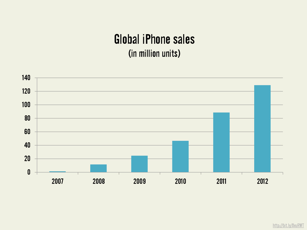
  2. http://bit.ly/XvuRWT 0 20 40 60 80 100 120 140 2007

    2008 2009 2010 2011 2012 Global iPhone sales (in million units)
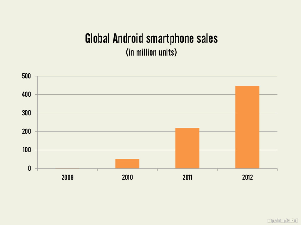
  3. http://bit.ly/XvuRWT 0 100 200 300 400 500 2009 2010 2011

    2012 Global Android smartphone sales (in million units)
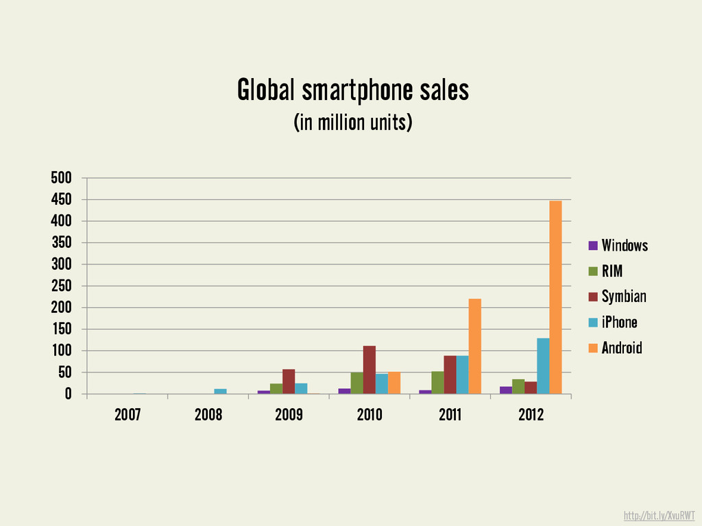
  4. http://bit.ly/XvuRWT 0 50 100 150 200 250 300 350 400

    450 500 2007 2008 2009 2010 2011 2012 Windows RIM Symbian iPhone Android Global smartphone sales (in million units)
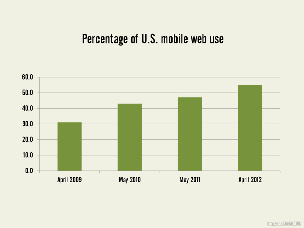
  5. http://read.bi/MvOtBk 0.0 10.0 20.0 30.0 40.0 50.0 60.0 April 2009

    May 2010 May 2011 April 2012 Percentage of U.S. mobile web use
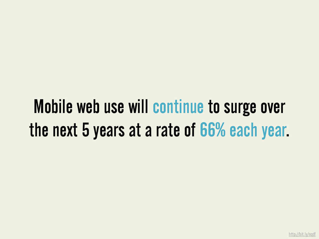
  6. Mobile web use will continue to surge over the next

    5 years at a rate of 66% each year. http://bit.ly/nqdf
  7. ?

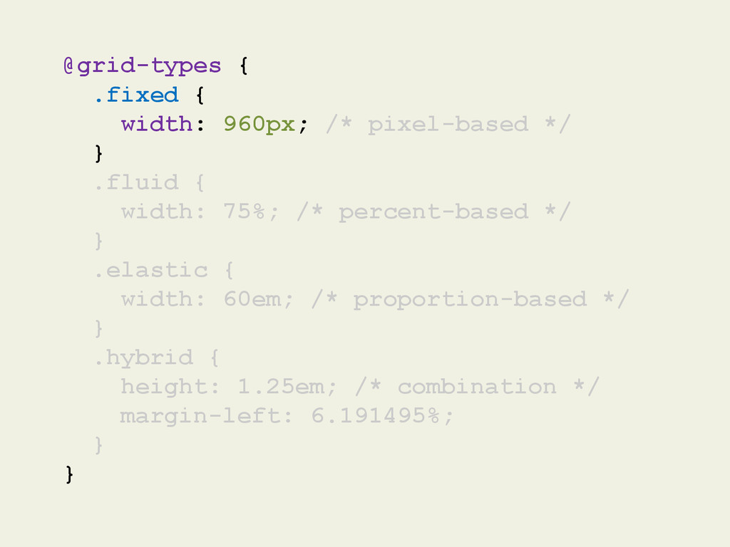
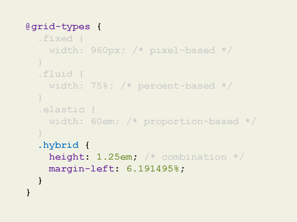
  8. @grid-types { .fixed { width: 960px; /* pixel-based */ }

    .fluid { width: 75%; /* percent-based */ } .elastic { width: 60em; /* proportion-based */ } .hybrid { height: 1.25em; /* combination */ margin-left: 6.191495%; } }
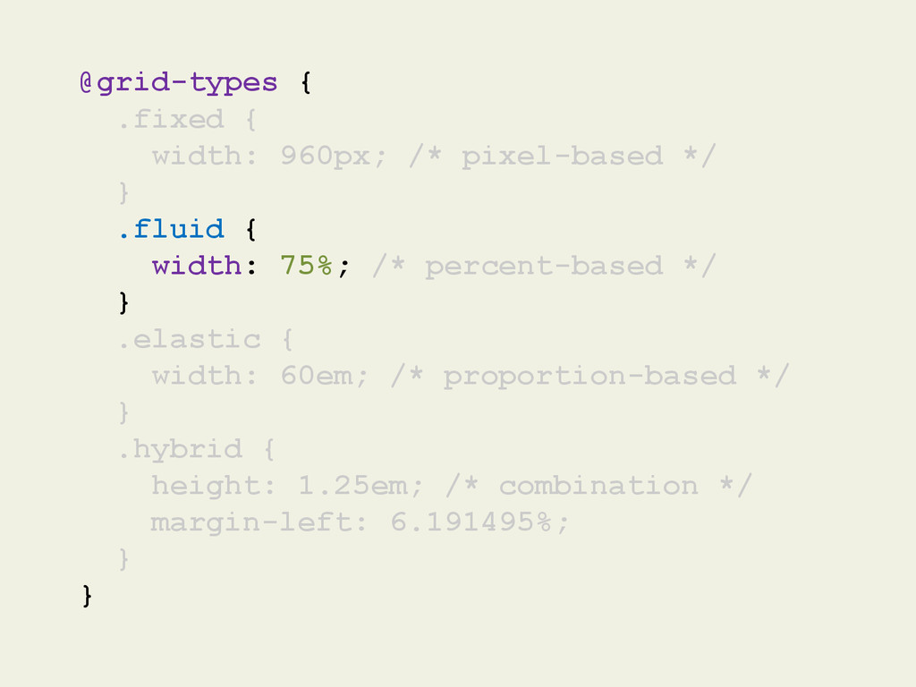
  9. @grid-types { .fixed { width: 960px; /* pixel-based */ }

    .fluid { width: 75%; /* percent-based */ } .elastic { width: 60em; /* proportion-based */ } .hybrid { height: 1.25em; /* combination */ margin-left: 6.191495%; } }
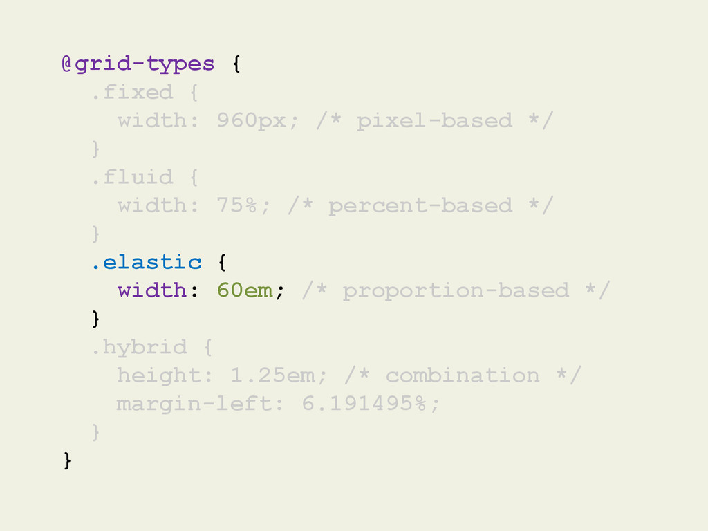
  10. @grid-types { .fixed { width: 960px; /* pixel-based */ }

    .fluid { width: 75%; /* percent-based */ } .elastic { width: 60em; /* proportion-based */ } .hybrid { height: 1.25em; /* combination */ margin-left: 6.191495%; } }
  11. @grid-types { .fixed { width: 960px; /* pixel-based */ }

    .fluid { width: 75%; /* percent-based */ } .elastic { width: 60em; /* proportion-based */ } .hybrid { height: 1.25em; /* combination */ margin-left: 6.191495%; } }
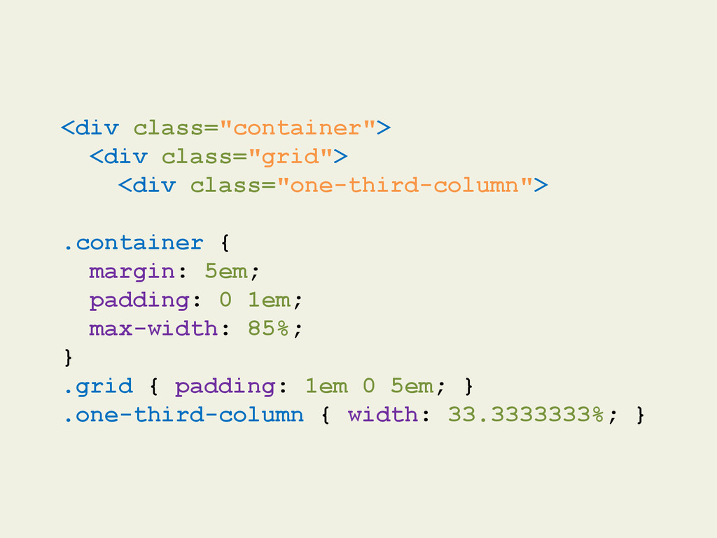
  12. <div class="container"> <div class="grid"> <div class="one-third-column"> .container { margin: 5em;

    padding: 0 1em; max-width: 85%; } .grid { padding: 1em 0 5em; } .one-third-column { width: 33.3333333%; }
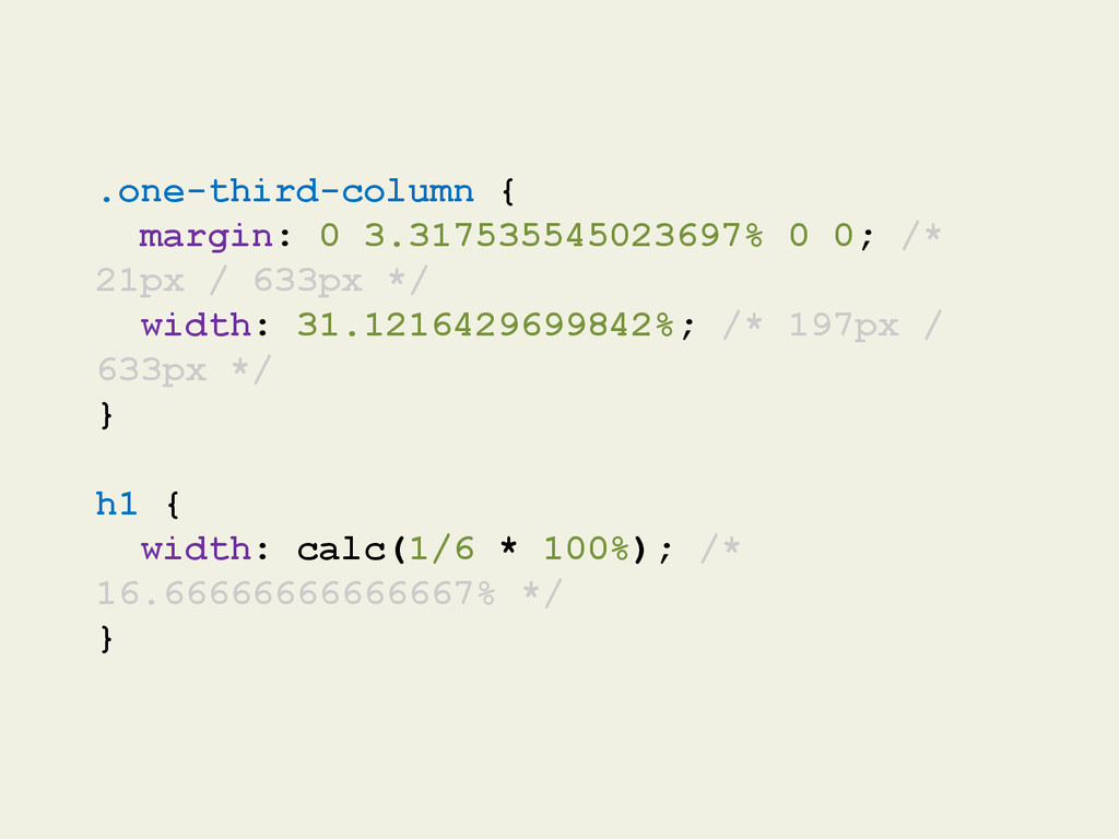
  13. .one-third-column { margin: 0 3.317535545023697% 0 0; /* 21px /

    633px */ width: 31.1216429699842%; /* 197px / 633px */ } h1 { width: calc(1/6 * 100%); /* 16.66666666666667% */ }
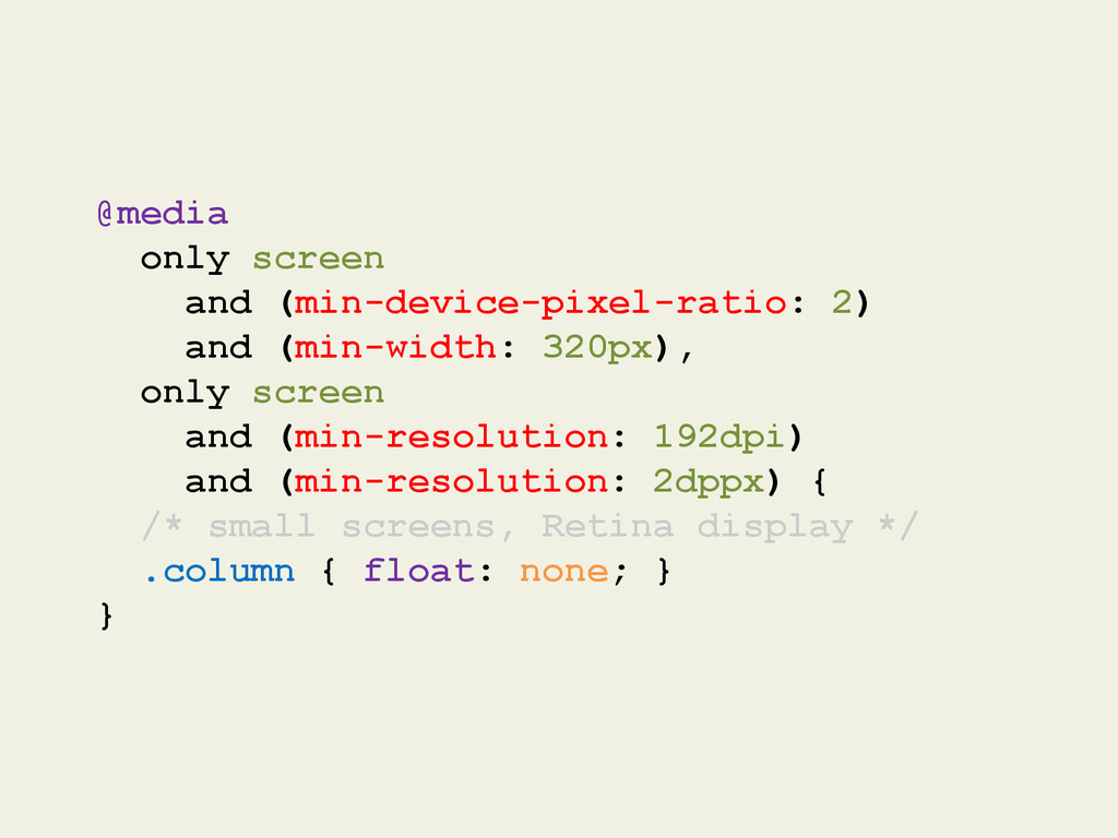
  14. @media only screen and (min-device-pixel-ratio: 2) and (min-width: 320px), only

    screen and (min-resolution: 192dpi) and (min-resolution: 2dppx) { /* small screens, Retina display */ .column { float: none; } }
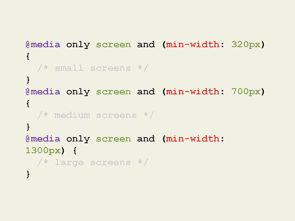
  15. @media only screen and (min-width: 320px) { /* small screens

    */ } @media only screen and (min-width: 700px) { /* medium screens */ } @media only screen and (min-width: 1300px) { /* large screens */ }
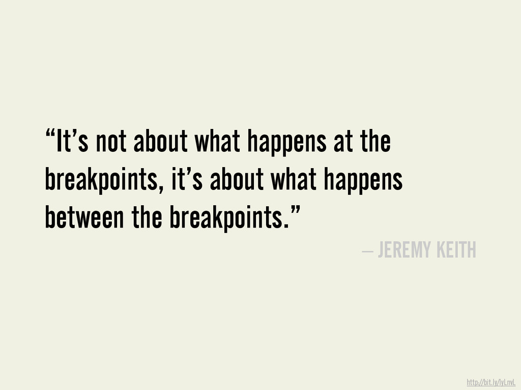
  16. “It’s not about what happens at the breakpoints, it’s about

    what happens between the breakpoints.” – JEREMY KEITH http://bit.ly/IyLnvL
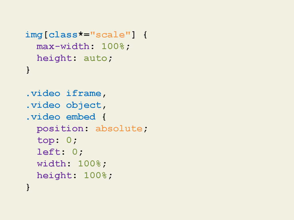
  17. img[class*="scale"] { max-width: 100%; height: auto; } .video iframe, .video

    object, .video embed { position: absolute; top: 0; left: 0; width: 100%; height: 100%; }
  18. “People want to do different things on mobile, so one

    adaptive experience is a bad idea.” http://bit.ly/10KHnOd
  19. By 2015, there will be one mobile phone for every

    person on Earth. Google Internal Data
  20. More than half your customers won’t recommend your business to

    a friend if you have a bad mobile site. http://bit.ly/qCcpl3
  21. http://bit.ly/Yd0Lmj When someone searches and finds your mobile site: •

    61% of them will call you • 59% will visit you • 70% of mobile users compare prices • 65% read product reviews • 50% of mobile searches have lead to purchases
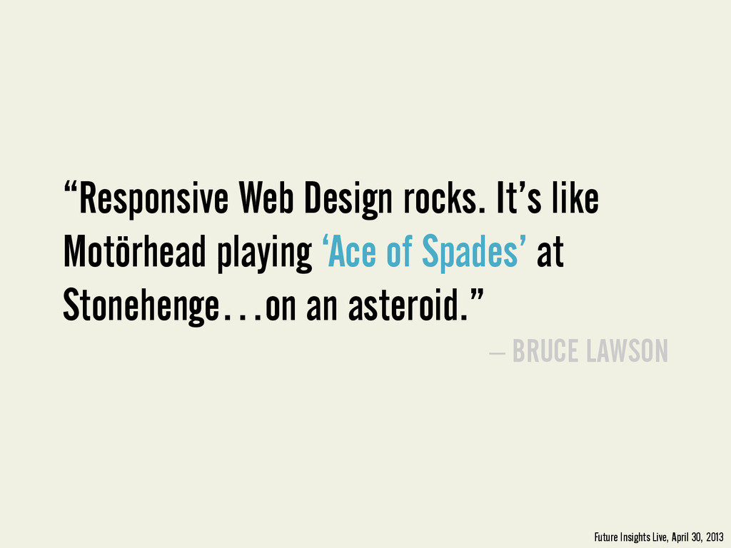
  22. “Responsive Web Design rocks. It’s like Motörhead playing ‘Ace of

    Spades’ at Stonehenge…on an asteroid.” – BRUCE LAWSON Future Insights Live, April 30, 2013
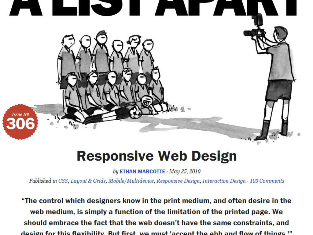
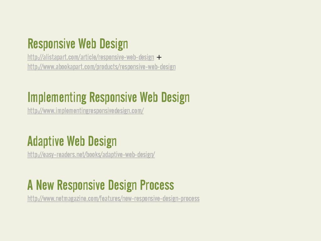
  23. Responsive Web Design http://alistapart.com/article/responsive-web-design + http://www.abookapart.com/products/responsive-web-design Implementing Responsive Web Design

    http://www.implementingresponsivedesign.com/ Adaptive Web Design http://easy-readers.net/books/adaptive-web-design/ A New Responsive Design Process http://www.netmagazine.com/features/new-responsive-design-process