Upgrade to Pro — share decks privately, control downloads, hide ads and more …

websitePortfolio

arie106082
September 19, 2016
130

 websitePortfolio

arie106082

September 19, 2016
Tweet

Transcript

  1. About My Process For every project I strive to follow

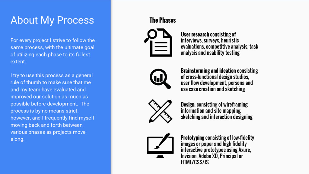
    the same process, with the ultimate goal of utilizing each phase to its fullest extent. I try to use this process as a general rule of thumb to make sure that me and my team have evaluated and improved our solution as much as possible before development. The process is by no means strict, however, and I frequently find myself moving back and forth between various phases as projects move along. User research consisting of interviews, surveys, heuristic evaluations, competitive analysis, task analysis and usability testing Brainstorming and ideation consisting of cross-functional design studios, user flow development, persona and use case creation and sketching Design, consisting of wireframing, information and site mapping, sketching and interaction designing Prototyping consisting of low-fidelity images or paper and high fidelity interactive prototypes using Axure, Invision, Adobe XD, Principal or HTML/CSS/JS The Phases
  2. Move In Flow My project consisted of me doing an

    end to end redesign of a major user flow in AppFolio’s software. I began with creating analytics tags to track user behavior, and then used those data insights to structure my initial user interviews and calls. Following research, my main goal for the project was removing artificial dependencies that were built into the flow in its infancy. These dependencies were now creating a major pain point for users. In addition, the flow’s UI was out of date and needed to be updated to match the current pattern library. Through data analysis, survey responses and customer discovery calls, I was able to determine the major user needs and pain points surrounding the flow. The main finding was that the flow did not mirror the actual process of our users, so using the flow was an inefficient and frustrating process for them. Key findings: • Flow did not match real life user process, i.e. we were forcing them to take steps in an order that did not make sense • Many users use outside software to track additional tasks related to moving new tenants in • Many users make mistakes when moving in more than one tenant at a time due to a complex in-app method of grouping applications My Contributions: • Conducted data analysis and formed interview and test plans • Created and distributed a survey to users regarding their pains • Interviewed multiple users to learn more about use cases and pain points
  3. After the research phase I was able to create user

    personas and a customer journey map, both of which informed the creation of a service blueprint. We then created an information architecture that would fit the multiple use cases and user types. With service blueprint, IA and user personas in hand I was able to facilitate two cross-functional design studios (spread out by a couple weeks). Next Steps... Key findings: • Users seek a one page summary view of their move in vs the tabular current flow to allow for more rapid data entry • Incorporating an in-app task list would greatly improve user satisfaction as well as streamline their workflow My Contributions: • Facilitating and synthesizing two design studios • Creating user personas as well as a journey map and service blueprint (see next slide) A few design studio sketches
  4. Design Iterations Following the design studio(s), I began initial sketching

    initial mockups while receiving constant feedback from devs, PMs and other designers. The design studios were extremely helpful as the design studio trends aligned with initial customer research, essentially double-validating our design decisions. After sketching and testing many iterations with mixed results, I arrived at two different designs to fully prototype and test with users. Key findings: • The design studio sketches identified multiple paths for the flow, which informed my subsequent design decisions • The new one page, modular format eliminated the need for a system status indicator (validated through testing) My Contributions: • Wireframing, sketching and mocking multiple layouts and iterations • Continuously making sure that potential new design patterns matched backend logic through close collaboration with developers
  5. Prototyping After multiple mockups I settled on two designs to

    prototype and A/B test with users. Through usability testing I was able to identify the best structure and architecture for the redesigned flow. After multiple tweaks to both prototypes, a clear winner arose. I then continued to test and iterate on that version to create a flow that users repeatedly ranked as a significant improvement over the current flow. Key findings: • The one page format vastly improved user efficiency • New built in tasks section eliminated many users’ need for vast and complex external lists and spreadsheets • New rental application grouping reduced user mistakes when moving in more than one tenant at a time My Contributions: • Creating multiple interactive prototypes using Axure, Adobe XD and InVision • Testing prototypes to identify key usability issues Prototype Link
  6. Bored in Isla Vista App The Problem: Never knowing what

    or where the best pitcher deal is in IV The Solution: An iOS app that provides a list of ongoing drinking deals in Isla Vista
  7. Features We knew we needed the day of the week,

    time of the deal and the deal itself. We decided to add map data after surveying our target users Task Flow We aimed to keep the task flow as simple as possible to provide the best UX
  8. Pain Point 2: Numbers next to names are confusing Pain

    Point 3: Eliminate save feature. No need to save favorite deals because deals change Pain Point 1: No need for location indicator until app is scaled Pain Point 4: This design would have opened separate screens. InVision prototyping indicated this was undesirable b/c of short avg screen interaction time (~20sec)
  9. Usability Testing Results After soliciting feedback from our friends/ target

    users, we realized our initial feature set was wrong for the target audience. We revised and iterated by eliminating the save feature and deal number indicator and instead integrating the Google Maps API to display each deal’s location.