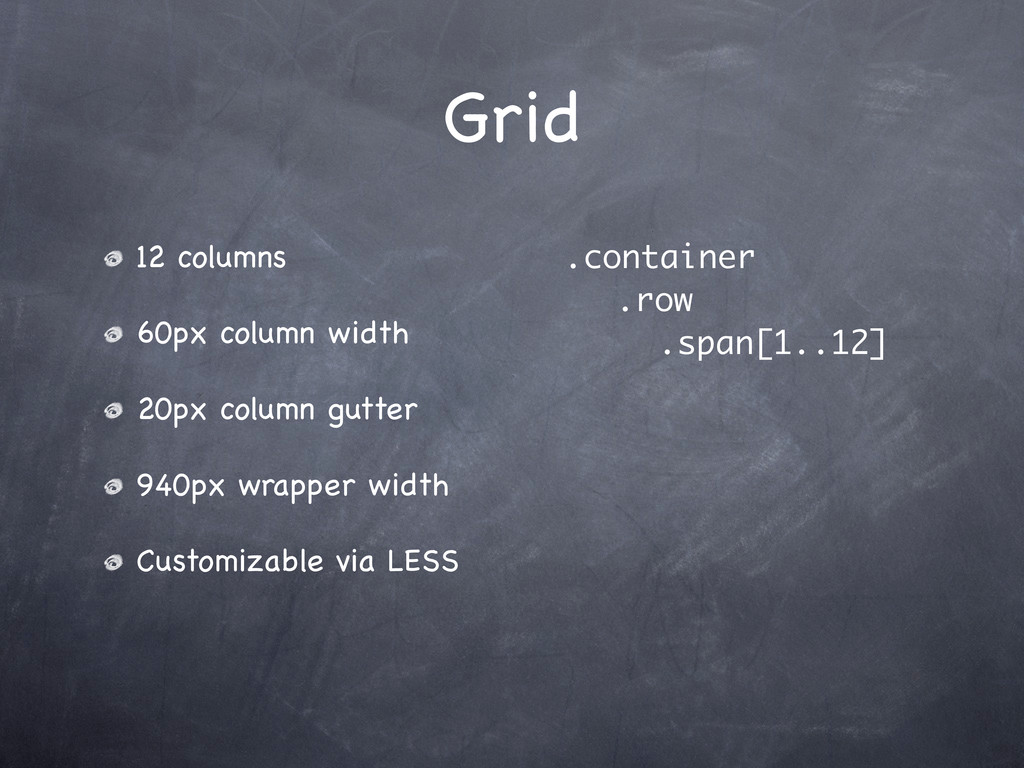
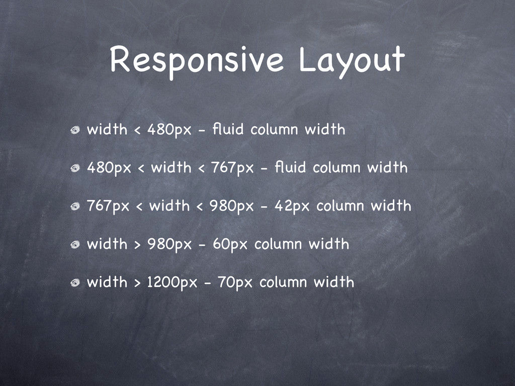
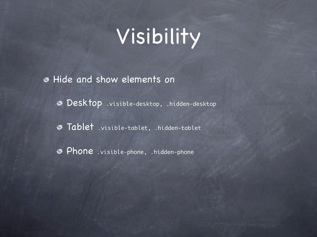
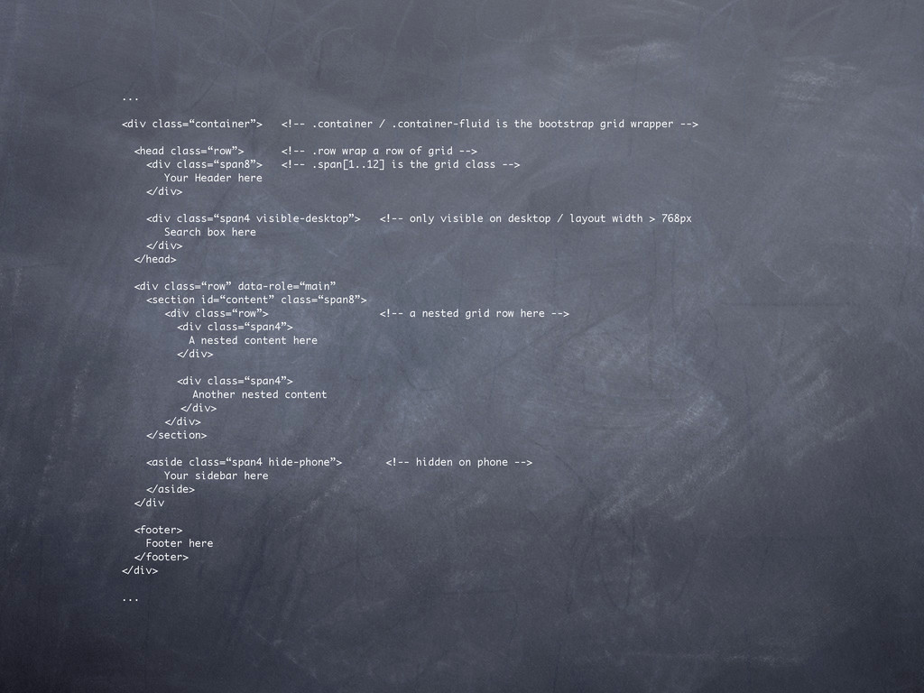
grid wrapper --> <head class=“row”> <!-- .row wrap a row of grid --> <div class=“span8”> <!-- .span[1..12] is the grid class --> Your Header here </div> <div class=“span4 visible-desktop”> <!-- only visible on desktop / layout width > 768px Search box here </div> </head> <div class=“row” data-role=“main” <section id=“content” class=“span8”> <div class=“row”> <!-- a nested grid row here --> <div class=“span4”> A nested content here </div> <div class=“span4”> Another nested content </div> </div> </section> <aside class=“span4 hide-phone”> <!-- hidden on phone --> Your sidebar here </aside> </div <footer> Footer here </footer> </div> ...
 pkshadeck
 signull
 takanorip
 visional_engineering_and_design
 shoko_seven11
 mhand01
 saka2jp
 kenichiota0711
 hiromimaeo
 garyuten
 root_recruit
 sevendex
 soudai
 tamaranovitovic
 ammeep
 twada
twada
 davidcarrasco
 keavy
keavy
 katarinadahlin
 schroneko
 uxyall
 bluesmoon
 paigeccino
 sabderemane