 SiteGround - Reliable hosting with speed, security, and support you can count on.
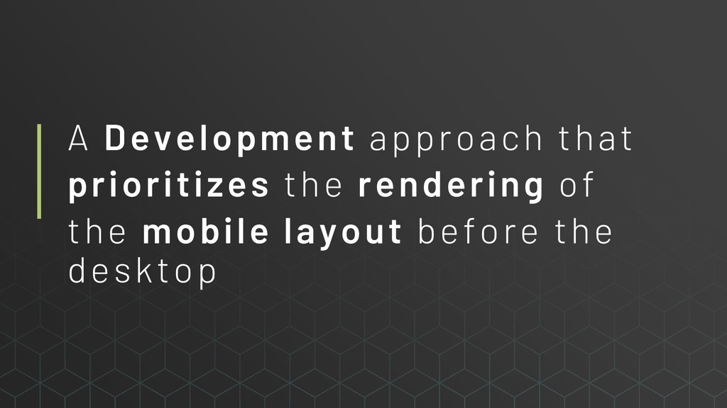
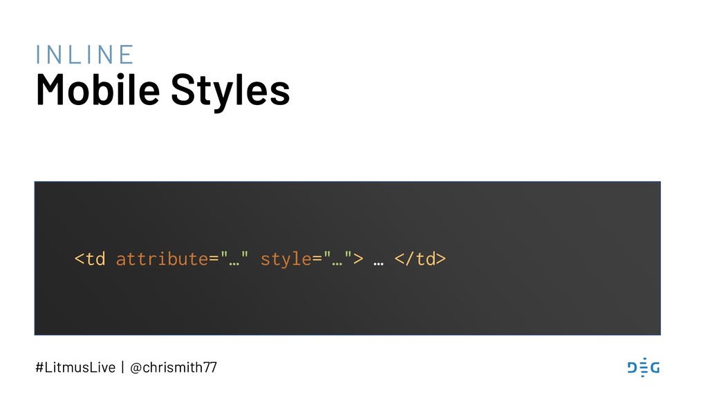
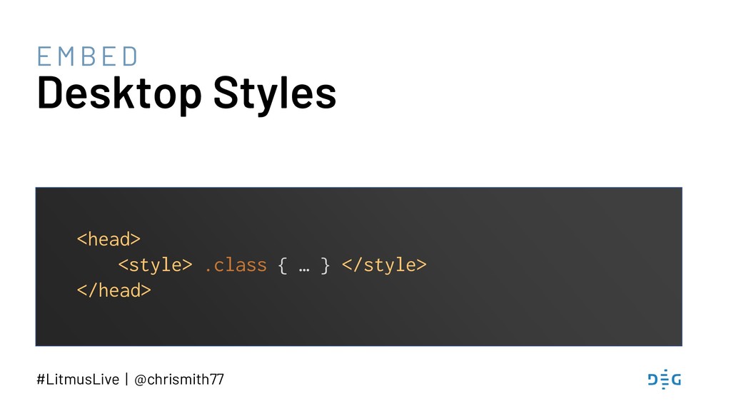
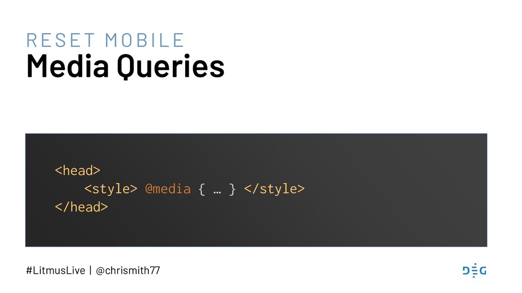
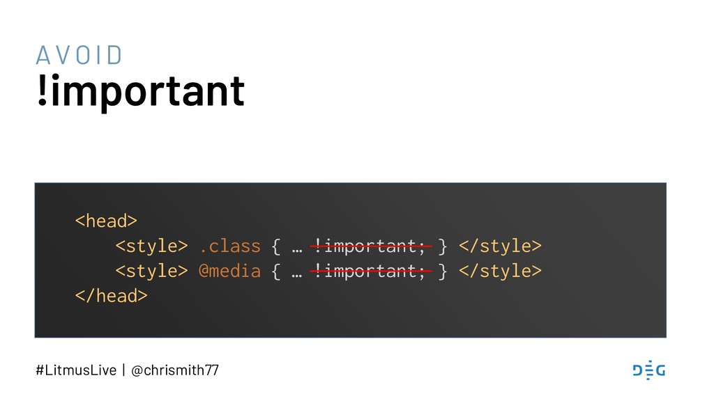
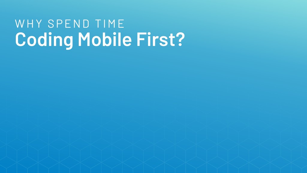
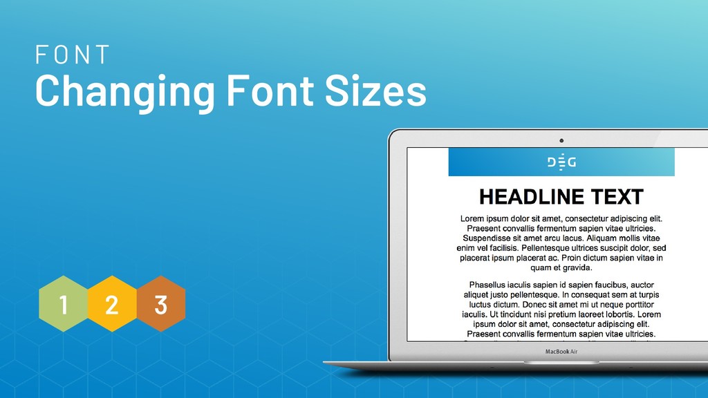
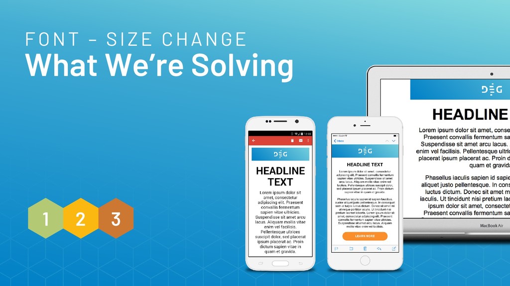
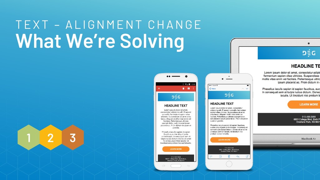
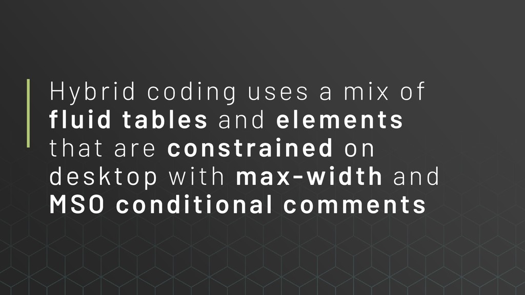
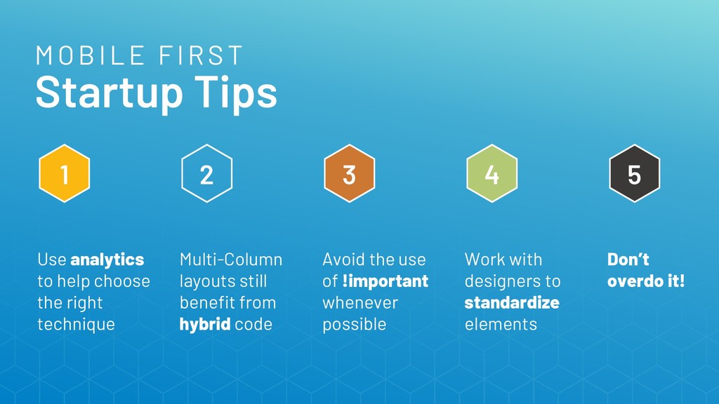
You know that feeling you get when you look at your beautifully coded email on an iPhone? How does it compare to the one you get when looking at the same email in the Gmail App? By coding mobile first, you can handle the challenges that different email clients and devices pose, ensuring your emails look great and function properly in even the trickiest inboxes.
 chrismith
 nao_mk2
 kishikawakatsumi
 pyama86
 kajitack
 yosshi4486
 chobishiba
 ryutaro_yako
 manfredsteyer
 yoshyum
 kntkymt
 seosoft
 seanchas116
 aarron
 destraynor
 michaelherold
 uxyall
 erikaheidi
 addyosmani
 jct
jct
 szymonslowik
 afnizarnur
 tammyeverts
 lynnandtonic
 konakalab
![#LitmusLive | @chrismith77 MSO Margin Reset HYBRID <!--[if true]> <style>](https://files.speakerdeck.com/presentations/437e8d41355d4f6fbbd9d20ff5ee1e29/slide_45.jpg)
![Thank You! [email protected] | @chrismith77 | #LitmusLive Let’s chat at](https://files.speakerdeck.com/presentations/437e8d41355d4f6fbbd9d20ff5ee1e29/slide_49.jpg)