creating mobile templates • Show you how to make tables responsive • Deconstruct some CSS • Probably lose you in the code • Give you enough of the basics to find your way out of all that code • Explore some development tools and resources that will help you build successful templates
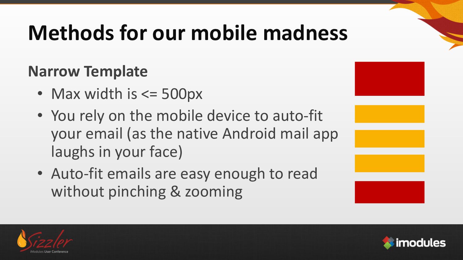
is <= 500px • You rely on the mobile device to auto-fit your email (as the native Android mail app laughs in your face) • Auto-fit emails are easy enough to read without pinching & zooming
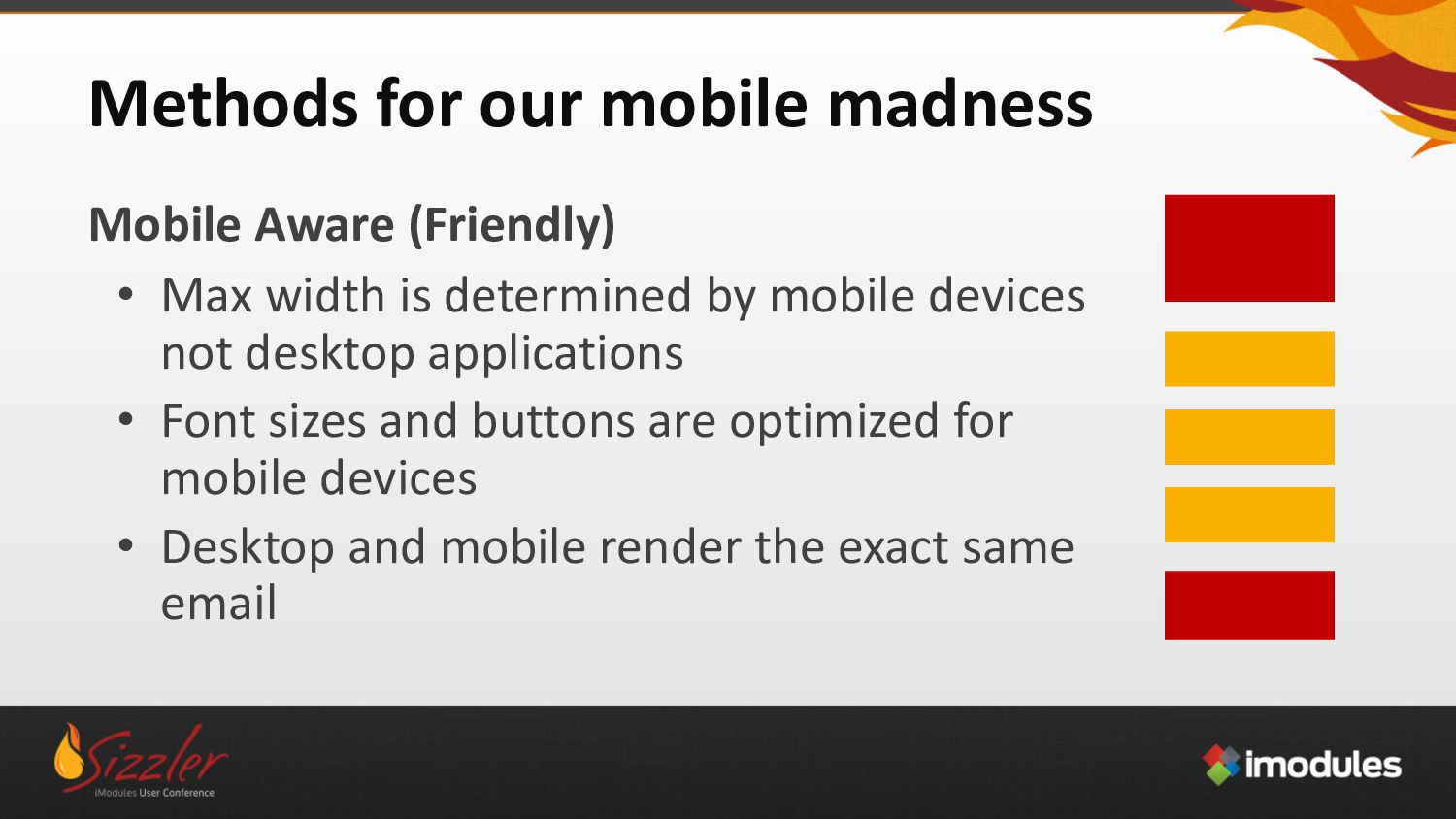
width is determined by mobile devices not desktop applications • Font sizes and buttons are optimized for mobile devices • Desktop and mobile render the exact same email
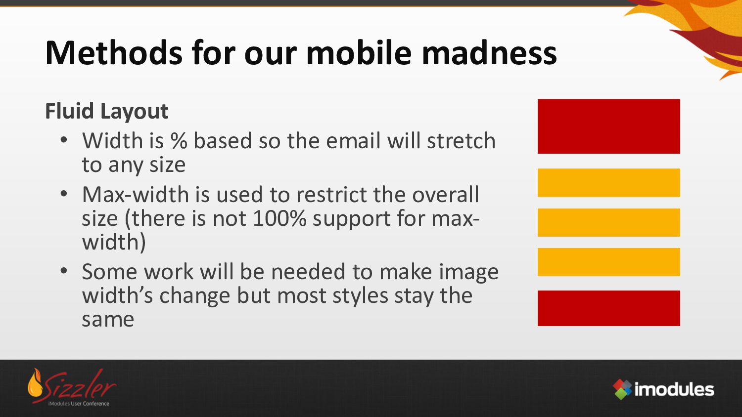
% based so the email will stretch to any size • Max-width is used to restrict the overall size (there is not 100% support for max- width) • Some work will be needed to make image width’s change but most styles stay the same
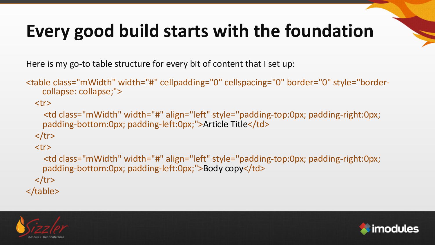
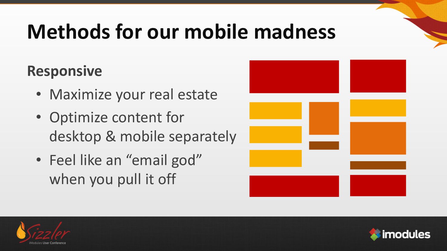
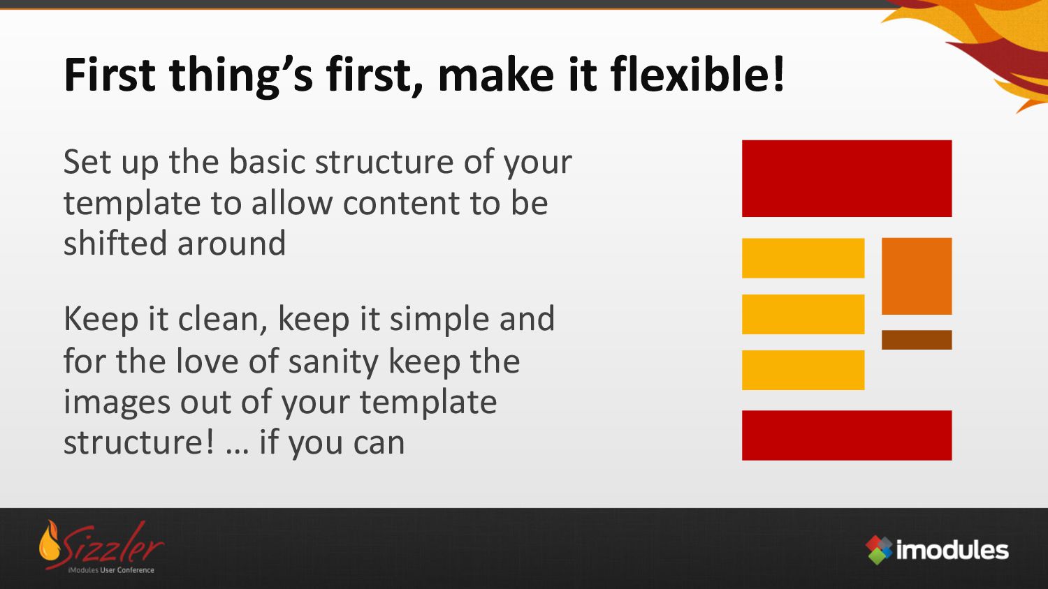
structure of your template to allow content to be shifted around Keep it clean, keep it simple and for the love of sanity keep the images out of your template structure! … if you can
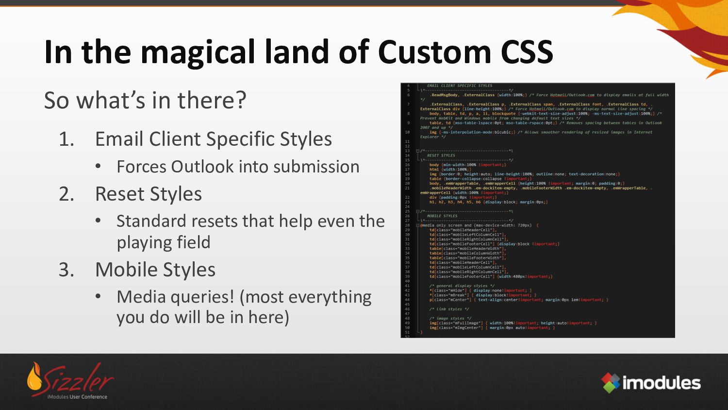
there? 1. Email Client Specific Styles • Forces Outlook into submission 2. Reset Styles • Standard resets that help even the playing field 3. Mobile Styles • Media queries! (most everything you do will be in here)
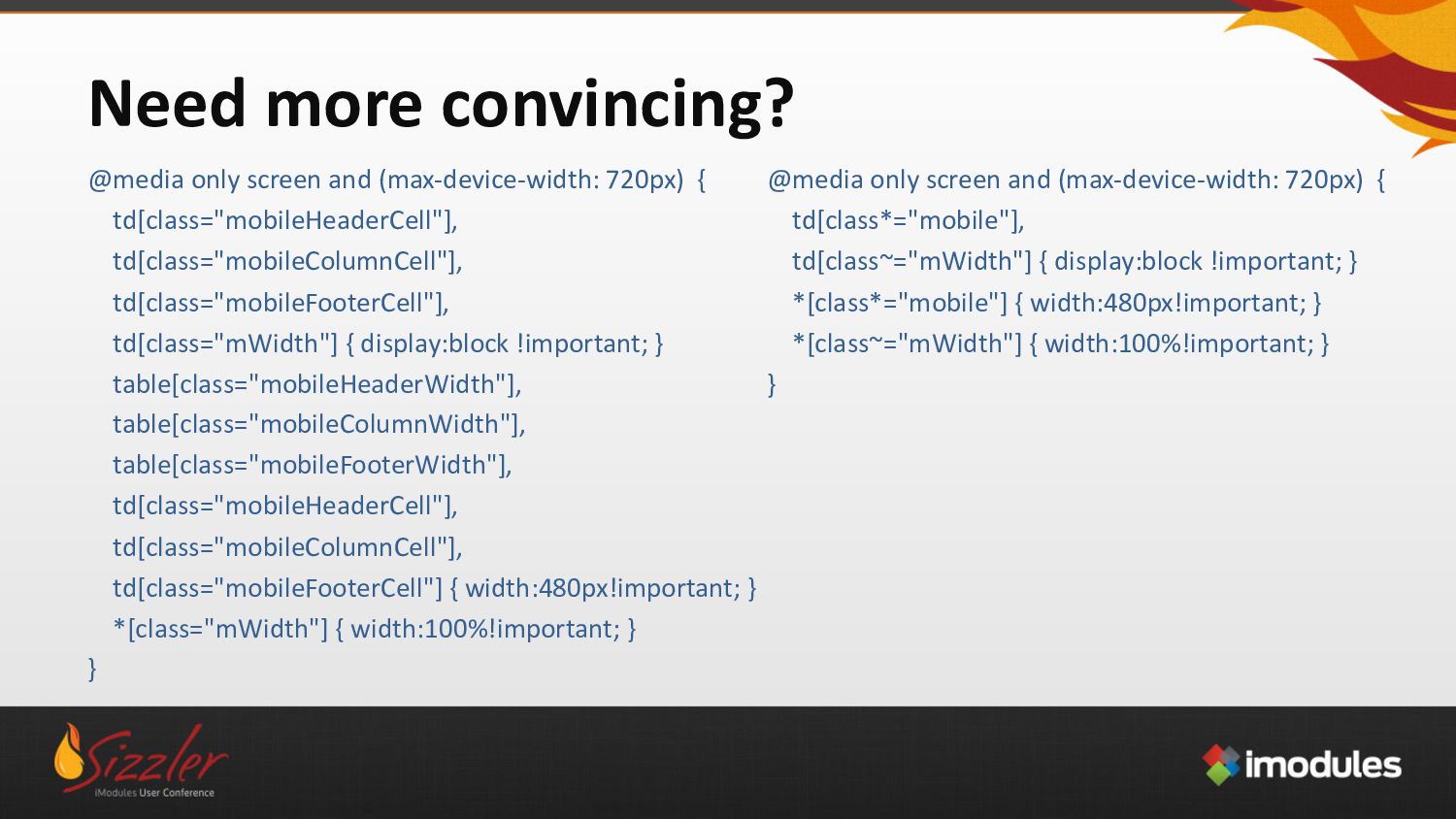
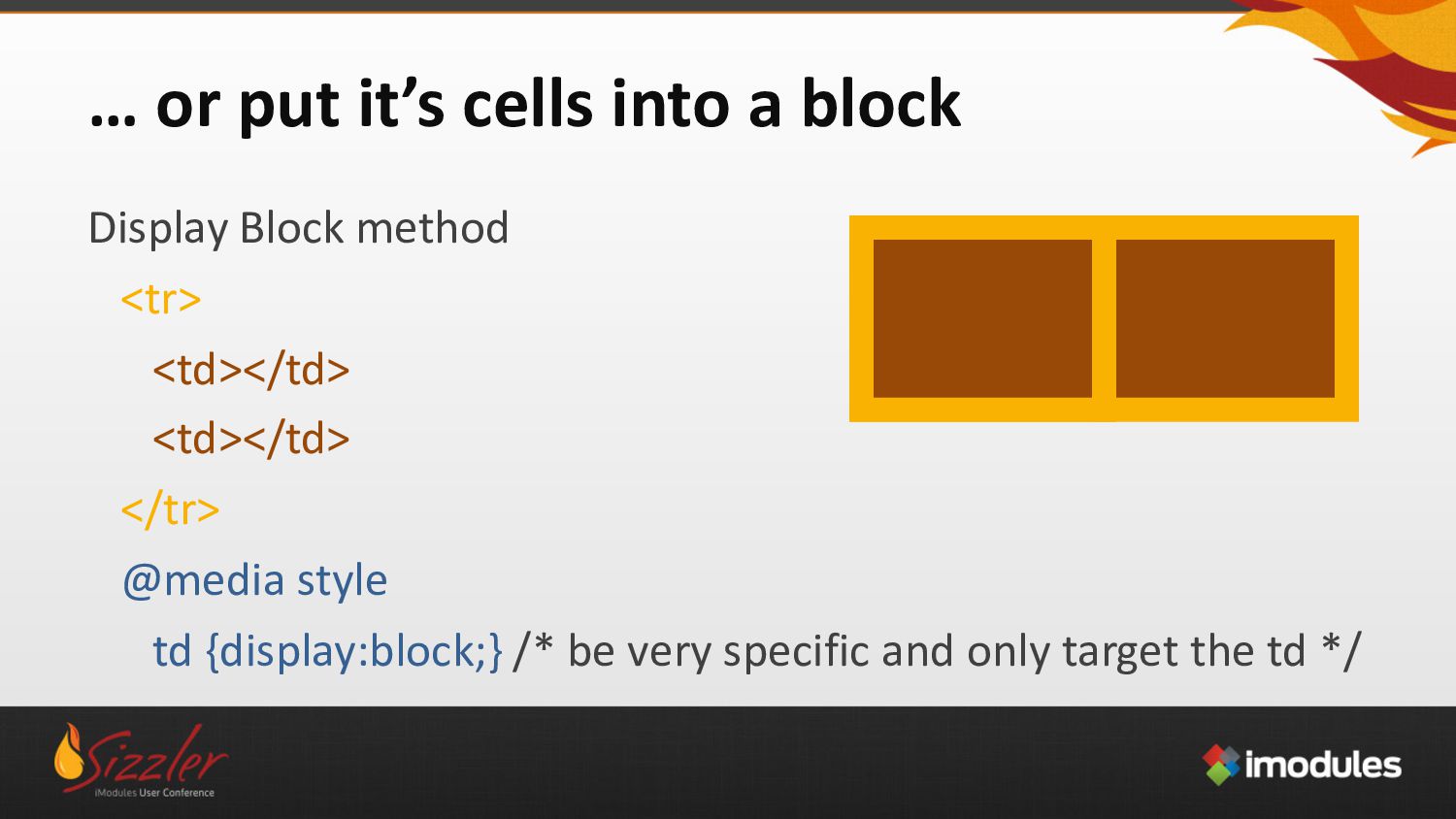
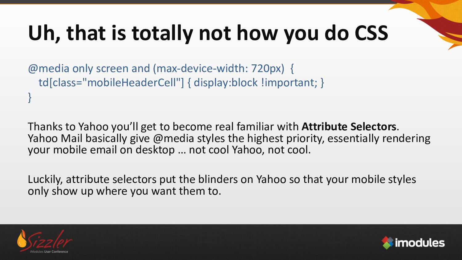
only screen and (max-device-width: 720px) { td[class="mobileHeaderCell"] { display:block !important; } } Thanks to Yahoo you’ll get to become real familiar with Attribute Selectors. Yahoo Mail basically give @media styles the highest priority, essentially rendering your mobile email on desktop … not cool Yahoo, not cool. Luckily, attribute selectors put the blinders on Yahoo so that your mobile styles only show up where you want them to.
by nature. This makes it harder to produce re-useable CSS for your email. Normally to target a <span class=“large”> you would do something like: .large {font-size:18px;} To do the same thing in email you have to do: span[class=“large”] {font-size:18px!important;}
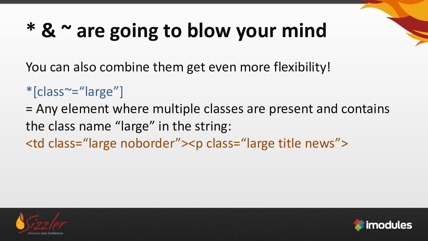
= Any element with only the class “large” on it: <p class=“large”><span class=“large”> td[class*=“large”] = Any <td> where any part of the class name contains the word large: <td class=“largetitle”><td class=“largenews”><td class=“largefeature”> td[class~=“large”] = Any <td> where multiple classes are present and one of the class names is “large”: <td class=“large noborder”><td class=“large article nopadding”>
can also combine them get even more flexibility! *[class~=“large”] = Any element where multiple classes are present and contains the class name “large” in the string: <td class=“large noborder”><p class=“large title news”>
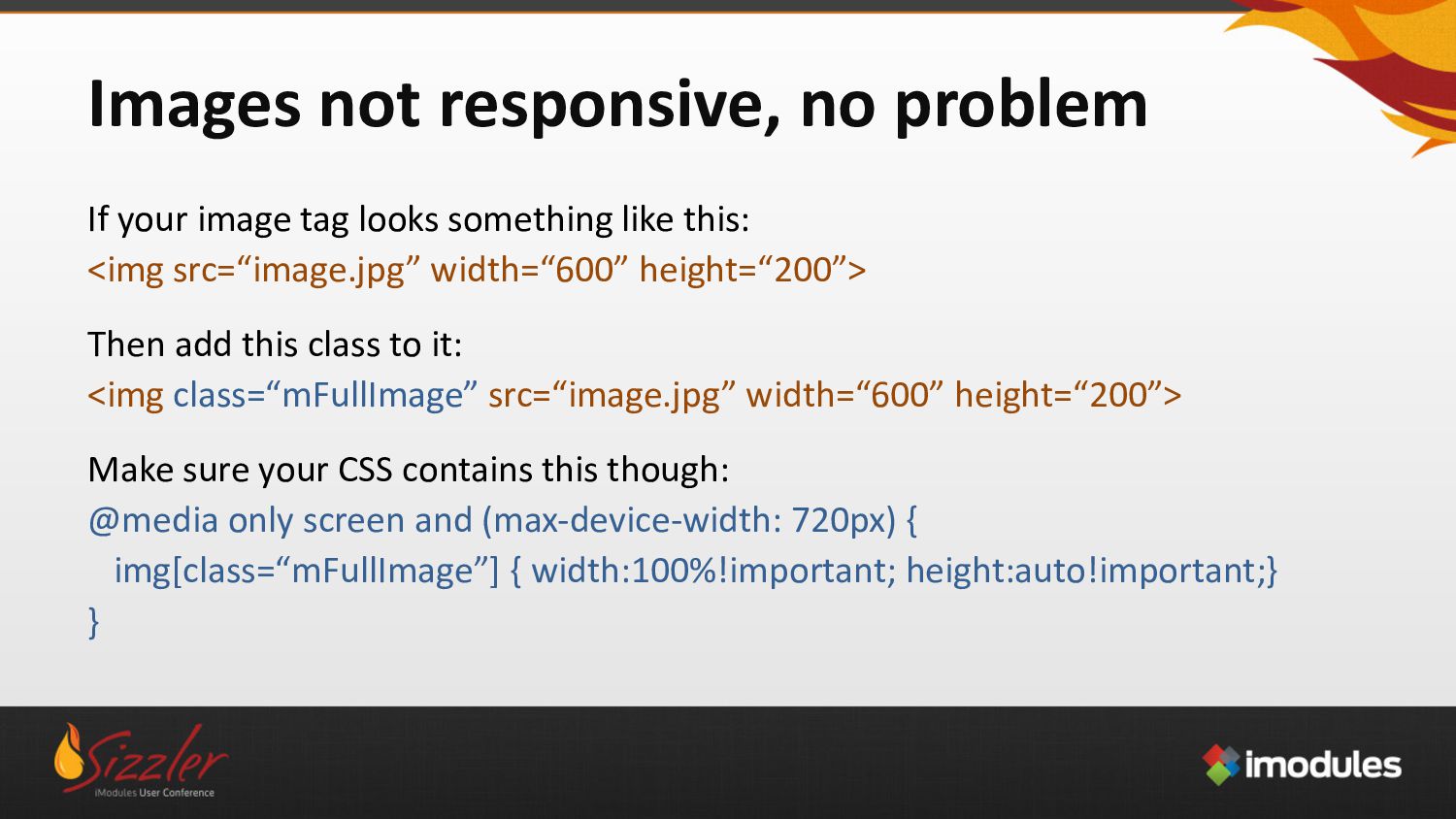
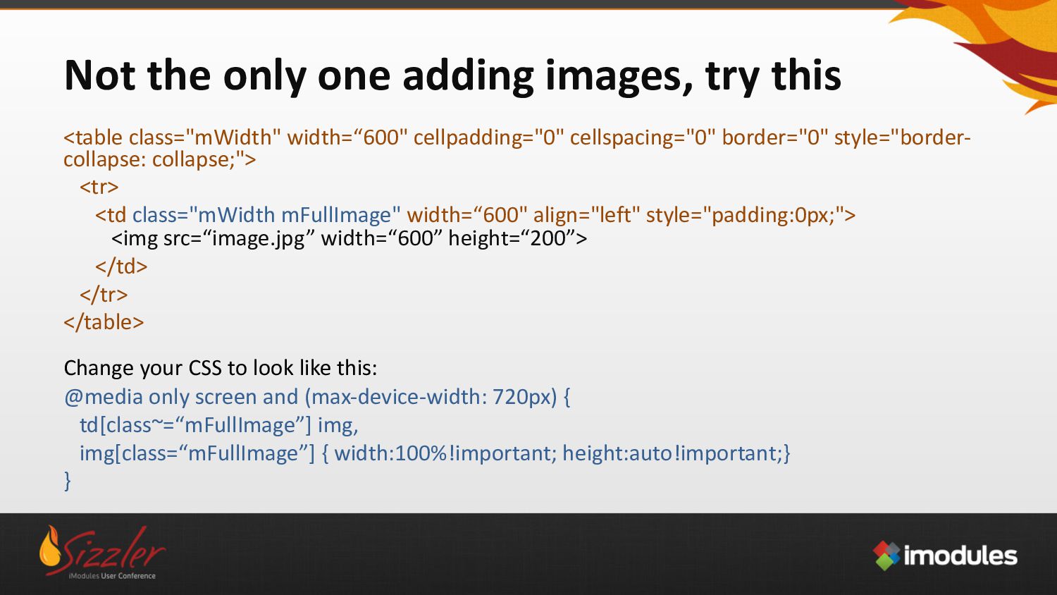
something like this: <img src=“image.jpg” width=“600” height=“200”> Then add this class to it: <img class=“mFullImage” src=“image.jpg” width=“600” height=“200”> Make sure your CSS contains this though: @media only screen and (max-device-width: 720px) { img[class=“mFullImage”] { width:100%!important; height:auto!important;} }
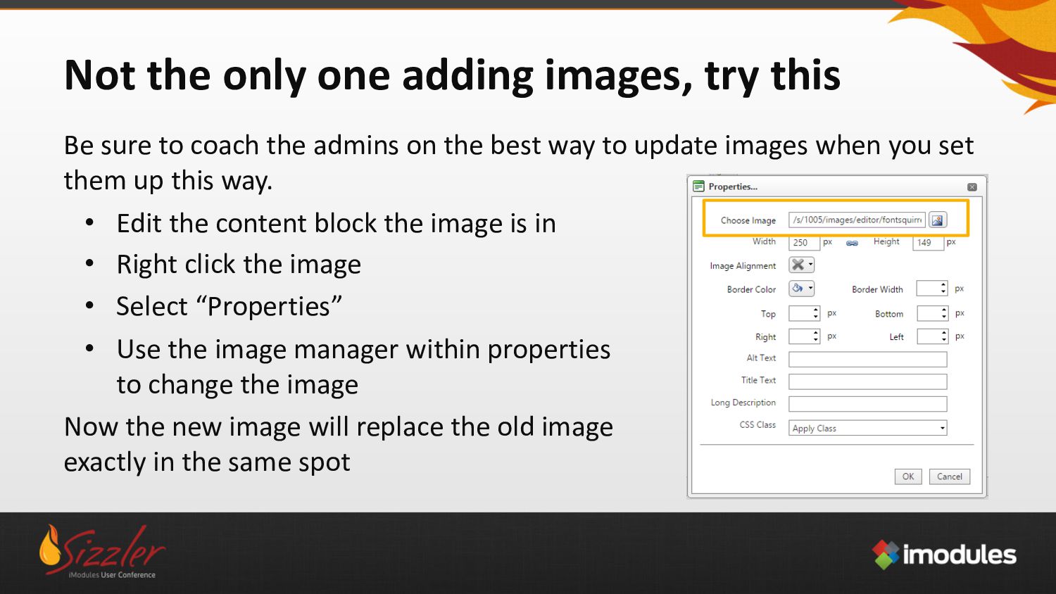
to coach the admins on the best way to update images when you set them up this way. • Edit the content block the image is in • Right click the image • Select “Properties” • Use the image manager within properties to change the image Now the new image will replace the old image exactly in the same spot
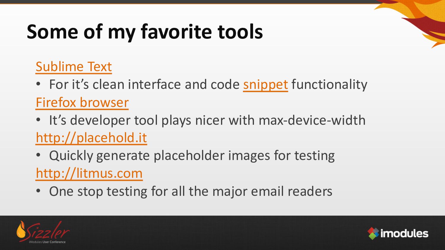
clean interface and code snippet functionality Firefox browser • It’s developer tool plays nicer with max-device-width http://placehold.it • Quickly generate placeholder images for testing http://litmus.com • One stop testing for all the major email readers
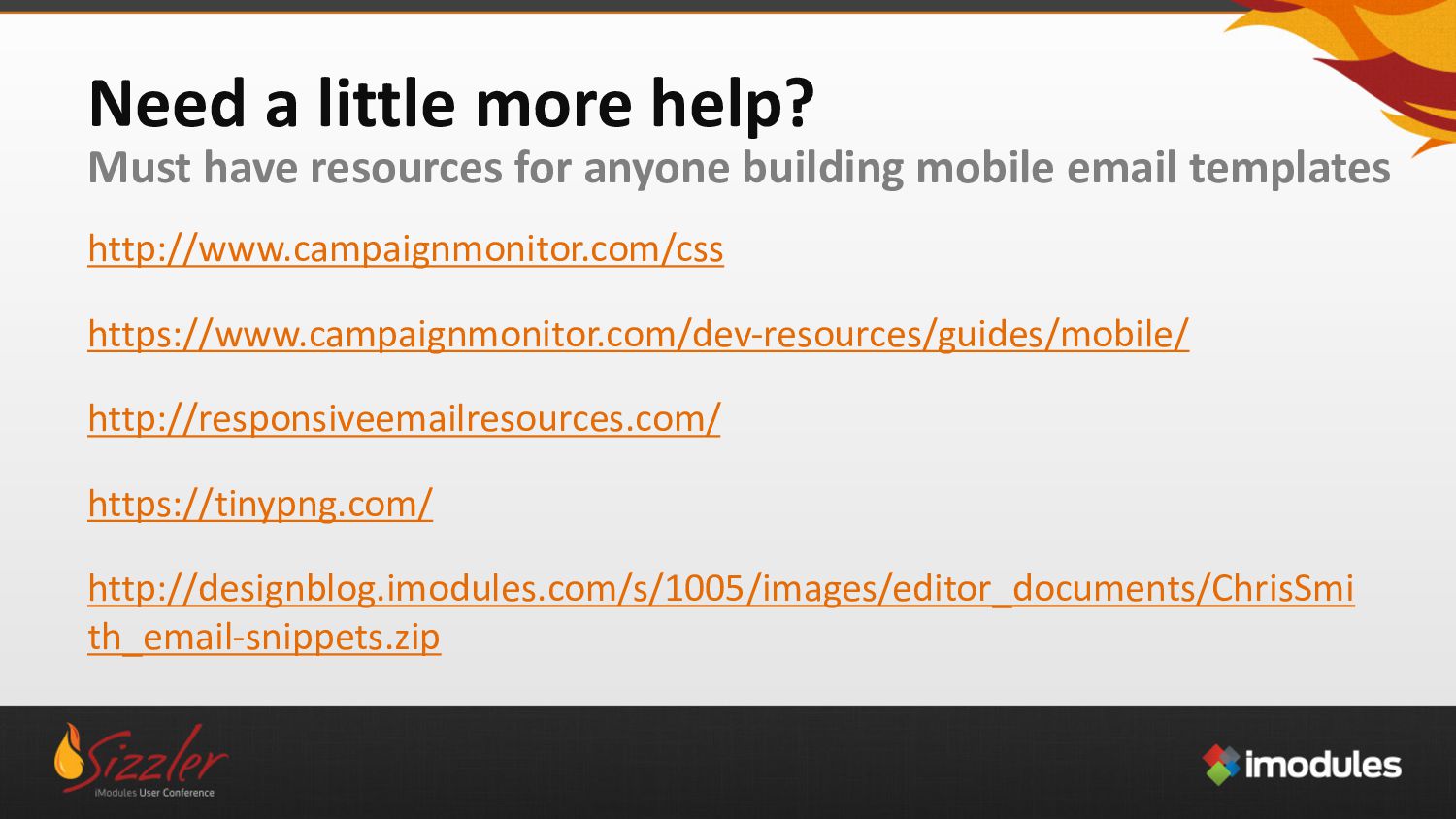
building mobile email templates http://www.campaignmonitor.com/css https://www.campaignmonitor.com/dev-resources/guides/mobile/ http://responsiveemailresources.com/ https://tinypng.com/ http://designblog.imodules.com/s/1005/images/editor_documents/ChrisSmi th_email-snippets.zip


 chrismith
 schroneko
 nonsquared
 akashhashmi
 destraynor
 marktimemedia
 bryan
bryan
 szymonslowik
 csswizardry
 sstephenson
 rkaga
rkaga
 varn
varn
 chriscoyier
![The pitfalls of [Attribute Selectors] Attribute selectors are very specific](https://files.speakerdeck.com/presentations/1d52c1c12c69445d8435c78516d7a59a/slide_17.jpg)
![* & ~ are going to blow your mind *[class=“large”]](https://files.speakerdeck.com/presentations/1d52c1c12c69445d8435c78516d7a59a/slide_18.jpg)