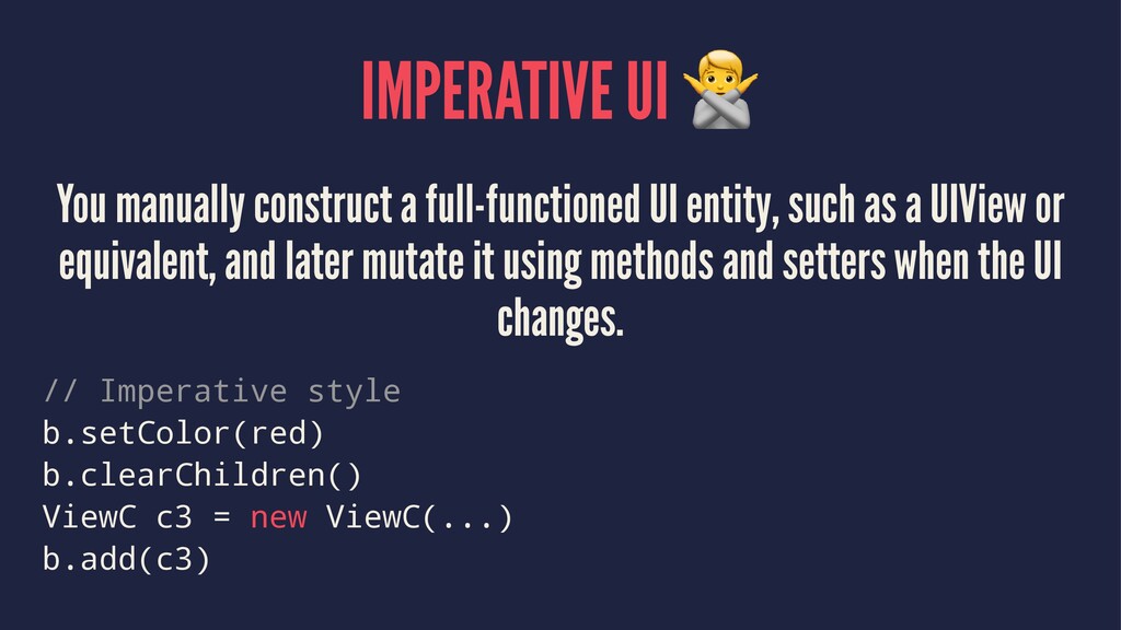
as a UIView or equivalent, and later mutate it using methods and setters when the UI changes. // Imperative style b.setColor(red) b.clearChildren() ViewC c3 = new ViewC(...) b.add(c3)
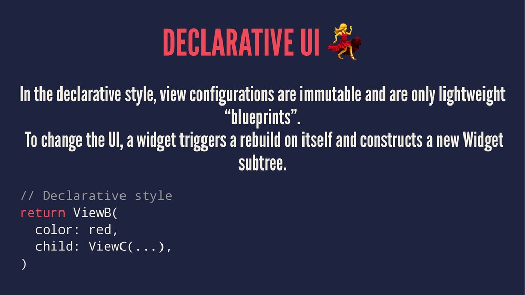
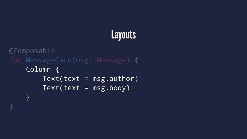
and are only lightweight “blueprints”. To change the UI, a widget triggers a rebuild on itself and constructs a new Widget subtree. // Declarative style return ViewB( color: red, child: ViewC(...), )
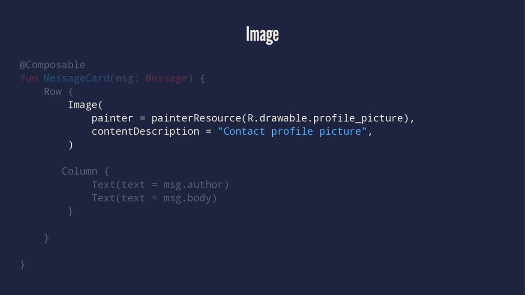
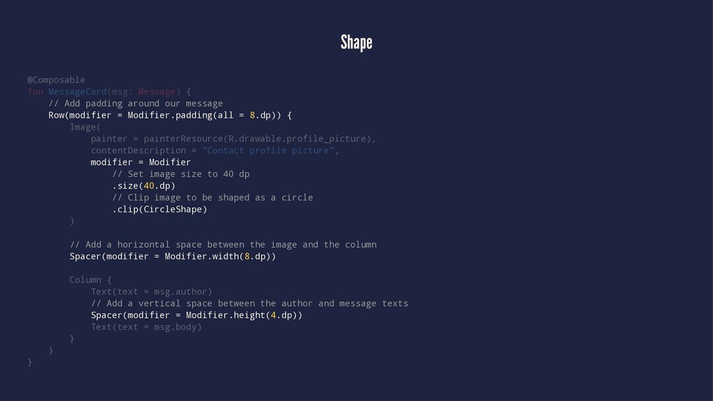
our message Row(modifier = Modifier.padding(all = 8.dp)) { Image( painter = painterResource(R.drawable.profile_picture), contentDescription = "Contact profile picture", modifier = Modifier // Set image size to 40 dp .size(40.dp) // Clip image to be shaped as a circle .clip(CircleShape) ) // Add a horizontal space between the image and the column Spacer(modifier = Modifier.width(8.dp)) Column { Text(text = msg.author) // Add a vertical space between the author and message texts Spacer(modifier = Modifier.height(4.dp)) Text(text = msg.body) } } }
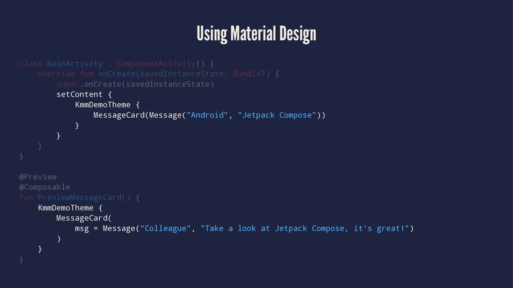
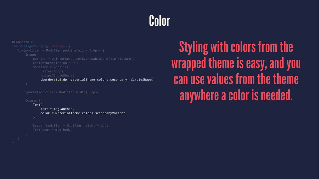
8.dp)) { Image( painter = painterResource(R.drawable.profile_picture), contentDescription = null, modifier = Modifier .size(40.dp) .clip(CircleShape) .border(1.5.dp, MaterialTheme.colors.secondary, CircleShape) ) Spacer(modifier = Modifier.width(8.dp)) Column { Text( text = msg.author, color = MaterialTheme.colors.secondaryVariant ) Spacer(modifier = Modifier.height(4.dp)) Text(text = msg.body) } } } Styling with colors from the wrapped theme is easy, and you can use values from the theme anywhere a color is needed.
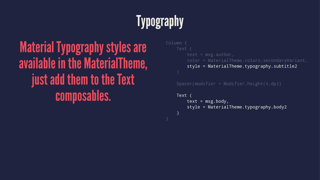
add them to the Text composables. Column { Text ( text = msg.author, color = MaterialTheme.colors.secondaryVariant, style = MaterialTheme.typography.subtitle2 ) Spacer(modifier = Modifier.height(4.dp)) Text ( text = msg.body, style = MaterialTheme.typography.body2 ) }
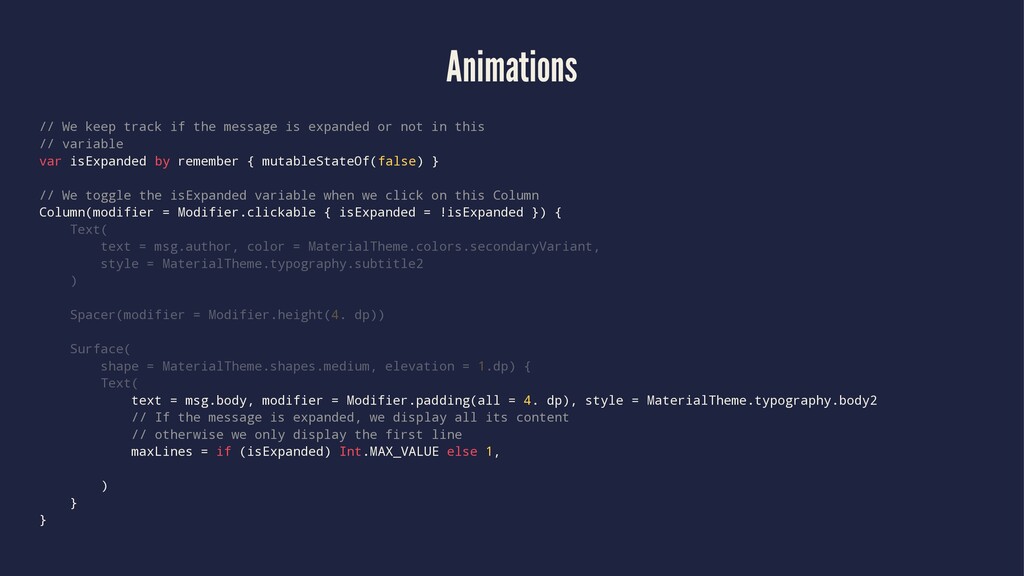
or not in this // variable var isExpanded by remember { mutableStateOf(false) } // We toggle the isExpanded variable when we click on this Column Column(modifier = Modifier.clickable { isExpanded = !isExpanded }) { Text( text = msg.author, color = MaterialTheme.colors.secondaryVariant, style = MaterialTheme.typography.subtitle2 ) Spacer(modifier = Modifier.height(4. dp)) Surface( shape = MaterialTheme.shapes.medium, elevation = 1.dp) { Text( text = msg.body, modifier = Modifier.padding(all = 4. dp), style = MaterialTheme.typography.body2 // If the message is expanded, we display all its content // otherwise we only display the first line maxLines = if (isExpanded) Int.MAX_VALUE else 1, ) } }
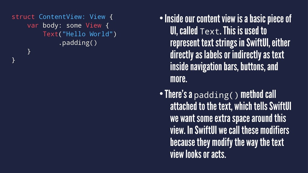
strongly encouraged. •All views must conform to the View protocol. •That protocol requires a computed property called body that contains the actual layout for the view. •It returns some View, which is a Swift feature called opaque return types – it means “one specific sort of view, but we don’t really care which one.”
World") .padding() } } •Inside our content view is a basic piece of UI, called Text. This is used to represent text strings in SwiftUI, either directly as labels or indirectly as text inside navigation bars, buttons, and more. •There’s a padding() method call attached to the text, which tells SwiftUI we want some extra space around this view. In SwiftUI we call these modifiers because they modify the way the text view looks or acts.
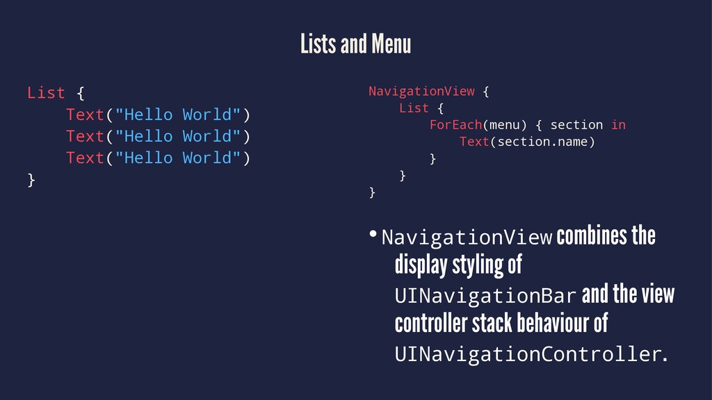
World") } NavigationView { List { ForEach(menu) { section in Text(section.name) } } } •NavigationView combines the display styling of UINavigationBar and the view controller stack behaviour of UINavigationController.
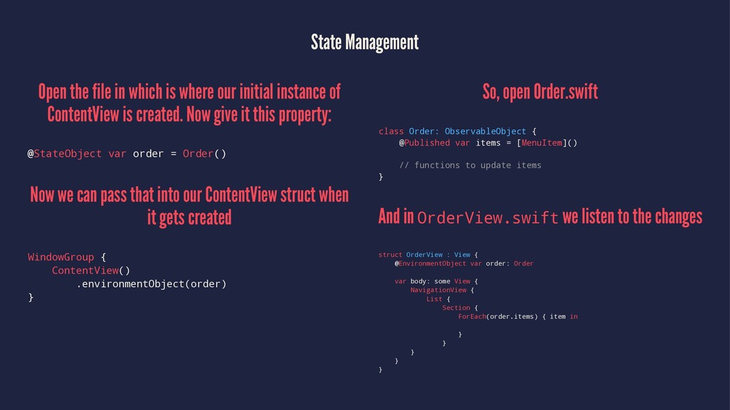
initial instance of ContentView is created. Now give it this property: @StateObject var order = Order() Now we can pass that into our ContentView struct when it gets created WindowGroup { ContentView() .environmentObject(order) } So, open Order.swift class Order: ObservableObject { @Published var items = [MenuItem]() // functions to update items } And in OrderView.swift we listen to the changes struct OrderView : View { @EnvironmentObject var order: Order var body: some View { NavigationView { List { Section { ForEach(order.items) { item in } } } } }
 inc2734
 tosuri13
 fruitriin
 mickyp100
 dip_tech
 konifar
 masahiro_nishimi
 codelynx
 ajstarks
 javiergs
 gessy0129
 koukimiura
 mraible
 portentint
 greggifford
 tanoku
 sarafernandez
 malarkey
 inesmontani
 skipperchong
 akademiya2063
 ryanjones
 aemeredith
 marcelosomers