Upgrade to Pro — share decks privately, control downloads, hide ads and more …

brand book

Avatar for trident brand trident brand
February 08, 2025
3

brand book

Lets create a Highly Minimalist Logo and a complete branding package tailored to your brand. Message me today to get started!

Avatar for trident brand

trident brand

February 08, 2025
Tweet

Transcript

  1. Logo usage guidelines p. 03 p. 01 p. 01 p.

    01 1.0 p. 01 p. 01 p. 01 Color palette Typography guidelines Do's and don'ts TechEstate Version 1.1 January 2025 02 Identity guidelines
  2. 1.2 Logo Usage Guidelines 1.2 About Logo 05 The TechEstate

    logo combines the concepts of technology and real estate through a mini- malistic house shape, symbolizing the real estate aspect, with a sleek curve or cutout within the house, representing technological precision and innovation. This design effectively com- municates the integration of modern technology with traditional real estate, creating a pro- fessional and memorable visual identity. This design was chosen for its ability to seamlessly reflect TechEstate’s identity by balancing the modern, innovative aspect of technology with the grounded nature of real estate. The clean, minimalistic design ensures clarity and versatility, making it suitable for various appli- cations, while the purple color evokes creativity and sophistication, appealing to a tech-sav- vy audience. Its simplicity enhances recognition and professionalism, effectively aligning with the brand’s purpose and values. The minimalistic design ensures clarity and versatility, focusing on essential elements for a clean, modern look. It enhances recognition, works across platforms, and reflects profession- alism, aligning with TechEstate’s innovative identity.
  3. 1.3 Logo Usage Guidelines 1.3 Logo construction 06 To enhance

    clarity and visual impact, the logo is given ample breathing space. The logo icon is positioned with intentional empty space around it, particularly at all corners, to allow it to stand out and maintain a sense of openness. This ensures the logo remains clean, versatile, and easily recognizable in different contexts. The structure of the logo is minimal to maintain consistency and scalability, making it adaptable for various applications across all brand materials. W value : 137 px H value : 130px Whole Lockup Size (W Value) : 403px
  4. 1.3 Logo Usage Guidelines 1.3 Logo construction 07 To enhance

    clarity and visual impact, the logo is given ample breathing space. The logo icon is positioned with intentional empty space around it, particularly at all corners, to allow it to stand out and maintain a sense of openness. This ensures the logo remains clean, versatile, and easily recognizable in different contexts. The structure of the logo is minimal to maintain consistency and scalability, making it adaptable for various applications across all brand materials. W value : 137 px H value : 130px Whole Lockup Size (W Value) : 137 px
  5. 1.3 Logo Usage Guidelines 1.3 Logo construction 08 To enhance

    clarity and visual impact, the logo is given ample breathing space. The logo icon is positioned with intentional empty space around it, particularly at all corners, to allow it to stand out and maintain a sense of openness. This ensures the logo remains clean, versatile, and easily recognizable in different contexts. The structure of the logo is minimal to maintain consistency and scalability, making it adaptable for various applications across all brand materials. W value : 137 px H value : 130px Whole Lockup Size (W Value) : 403px
  6. 2.2 Color Palette 2.2 Color Palette 11 We chose a

    bold purple as our primary color to represent creativity, innovation, and sophisti- cation, perfectly aligning with TechEstate’s vision of merging cutting-edge technology with the real estate industry. Purple stands out, evoking a sense of luxury and modernity, while also being versatile enough to appeal to a wide audience. It exudes trust and quality, two key values in both tech and real estate. Complementing this, white was selected for its clean, fresh, and neutral tone, providing bal- ance and contrast that enhances readability and visual clarity. The combination of purple and white gives the logo a contemporary, professional feel while ensuring it remains ap- proachable and memorable. This color palette was carefully chosen to reflect TechEstate’s dynamic and innovative nature, creating a strong and consistent brand identity across all touchpoints.
  7. 2.3 Color Palette 2.3 Color Palette 12 The color palette

    for TechEstate was carefully selected to embody both innovation and professionalism. Purple, our dominant color, was chosen for its association with creativity, luxury, and moderni- ty, making it the perfect fit for a brand that merges technology with real estate. It captures attention and conveys a sense of high-quality service, while still feeling approachable. To complement the boldness of purple, white was chosen for its simplicity and freshness, offering contrast that ensures the logo remains clear and impactful in vari- ous settings. Together, these colors reflect TechEstate’s forward-thinking nature, striking a balance between innovation and trustworthi- ness, and creating a strong, cohesive brand identity.
  8. 2.3 Color Palette 13 Hex #FFFFFF Rgb 255, 255, 255

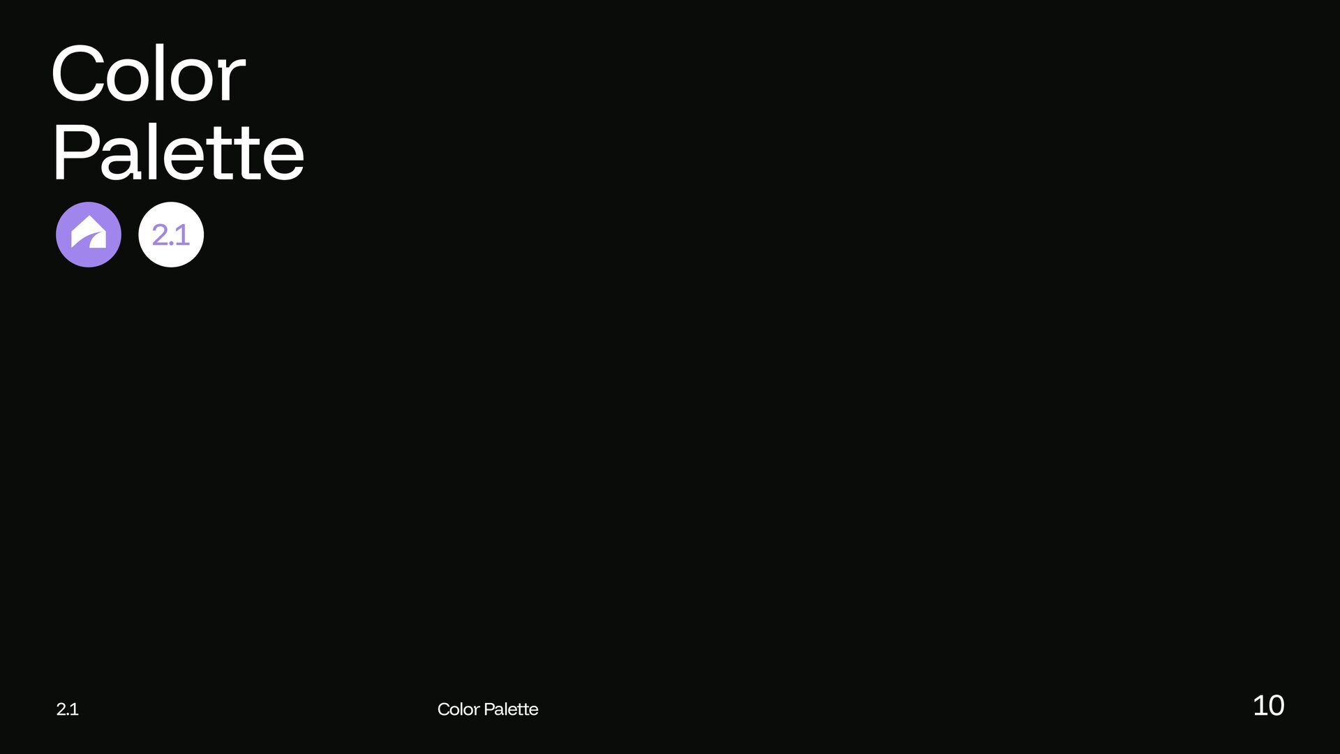
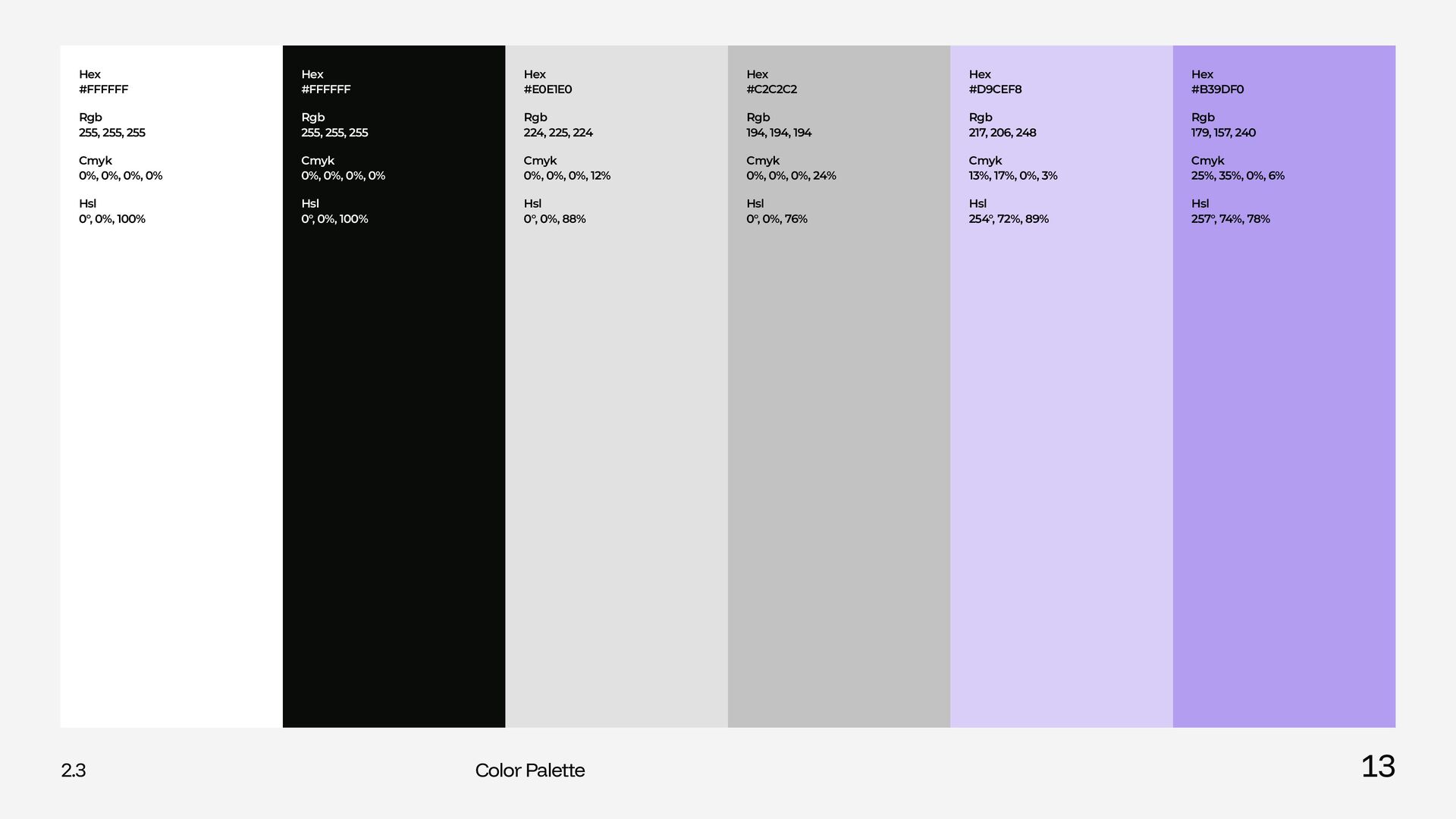
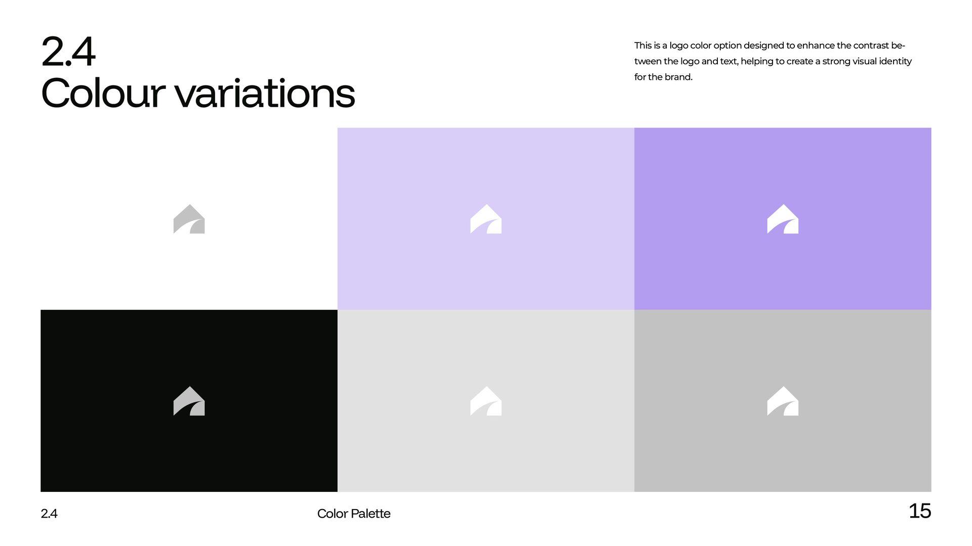
    Cmyk 0%, 0%, 0%, 0% Hsl 0°, 0%, 100% Hex #FFFFFF Rgb 255, 255, 255 Cmyk 0%, 0%, 0%, 0% Hsl 0°, 0%, 100% Hex #E0E1E0 Rgb 224, 225, 224 Cmyk 0%, 0%, 0%, 12% Hsl 0°, 0%, 88% Hex #C2C2C2 Rgb 194, 194, 194 Cmyk 0%, 0%, 0%, 24% Hsl 0°, 0%, 76% Hex #D9CEF8 Rgb 217, 206, 248 Cmyk 13%, 17%, 0%, 3% Hsl 254°, 72%, 89% Hex #B39DF0 Rgb 179, 157, 240 Cmyk 25%, 35%, 0%, 6% Hsl 257°, 74%, 78%
  9. 2.4 Color Palette 14 2.4 Contrast The color palette for

    TechEstate was carefully selected to embody both innovation and professionalism. Purple, our dominant color, was chosen for its association with creativity, luxury, and moderni- ty, making it the perfect fit for a brand that merges technology with real estate. It captures attention and conveys a sense of high-quality service, while still feeling approachable. To complement the boldness of purple, white was chosen for its simplicity and freshness, offering contrast that ensures the logo remains clear and impactful in vari- ous settings. Together, these colors reflect TechEstate’s forward-thinking nature, striking a balance between innovation and trustworthi- ness, and creating a strong, cohesive brand identity.
  10. 2.4 Color Palette 15 2.4 Colour variations This is a

    logo color option designed to enhance the contrast be- tween the logo and text, helping to create a strong visual identity for the brand.
  11. 3.2 3.2 Typography Funnel Sans and Funnel Display are modern

    sans-serif typefaces with both clarity and character, originally developed by NORD ID and Kristian Möller for Funnel. The typefaces are inspired by the movement and shapes of data points. In Funnel Display, certain parts of the stems are shifted to further enhance the sense of movement. To contribute, see github.com/Dicotype/Funnel.
  12. 3.3 Typography ABCDEFGHIJKLMNOPQRSTUVWXYZ Funnel Display Regular Designers: Main Font: abcdefghijklmnopqrstuvwxyz

    1234567890&*)(_+{}:”<>?[];’,./ ABCDEFGHIJKLMNOPQRSTUVWXYZ Funnel Display Medium abcdefghijklmnopqrstuvwxyz 1234567890&*)(_+{}:”<>?[];’,./ NORD ID Kristian Möller
  13. 3.4 Hierarchy 19 3.4 Hierarchy Our typography hierarchy uses Funnel

    Display Regular to ensure clarity and consistency. Main headlines are set at 60px to grab attention, while sub-headlines are at 30px for clear distinction. Body text is sized at 15px for optimal readability. This structure supports our brand’s visual identity and enhances communi- cation. Big Headline - 60px Big Headline (Funnel Display Medium) Sub-Headline - 30px Sub-Headline (Montserrat Medium) (Montserrat Regular) Body-text - 15px Body-text
  14. 4.2 our logo 22 4.2 our logo Our logo is

    the sum of our brandmark and word mark. This word mark was set and modified to specific proportions in the typeface Funnel Display. Logotype Logo Brand mark
  15. 4.3 Profile icon For optimal use on social channels a

    profile icon version of the logo is provided. The logo houses more clearspace all around in order to be represented more clearly. 4.3 Profile icon 23 Square Round
  16. 4.4 our logo 24 4.4 Don'ts Please share our logo

    thoughtfully. Always use the master artwork files. Make sure the logo is clearly visible against the background and isn’t edited or distorted in any way Never lock up our wordmark and app icon together. Don’t rotate any of our logos. Don’t outline any of our logos. Don’t warp or distort our logo in any way. Don’t add gradients to our logo. Don’t apply any visual effects (shadow, glow, etc.) to any of our logo. Don’t crop the logo. Don’t place our logo on busy backgrounds or on low contrast backgrounds.