Upgrade to Pro — share decks privately, control downloads, hide ads and more …

Styles, Themes, Material Theming, Oh My!

Anita
March 27, 2019

Styles, Themes, Material Theming, Oh My!

Link to the talk:
https://youtu.be/oSSi50Qv9DE

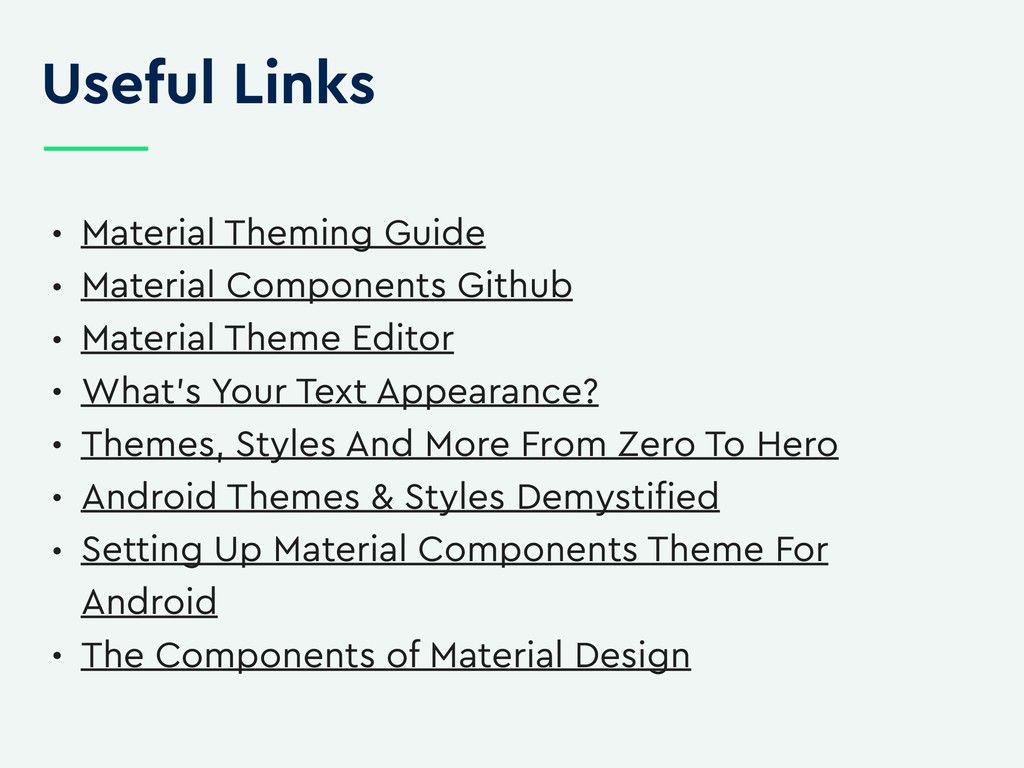
Here are the links mentioned in the slides :

https://issuetracker.google.com/issues?q=componentid:439535 status:open
https://www.material.io/develop/android/docs/theming-guide/
https://github.com/material-components
https://material.io/tools/theme-editor/
https://medium.com/androiddevhttps://speakerdeck.com/cyrilmottier/themes-styles-and-more-from-zero-to-hero?slide=103elopers/whats-your-text-s-appearance-f3a1729192d
https://www.youtube.com/watch?v=TIHXGwRTMWI
https://medium.com/over-engineering/setting-up-a-material-components-theme-for-android-fbf7774da739
https://www.youtube.com/watch?v=DPH3F0v1jB0
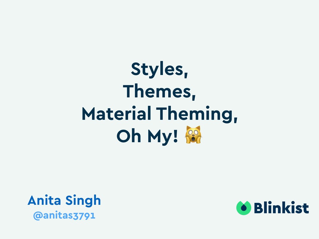
Abstract:

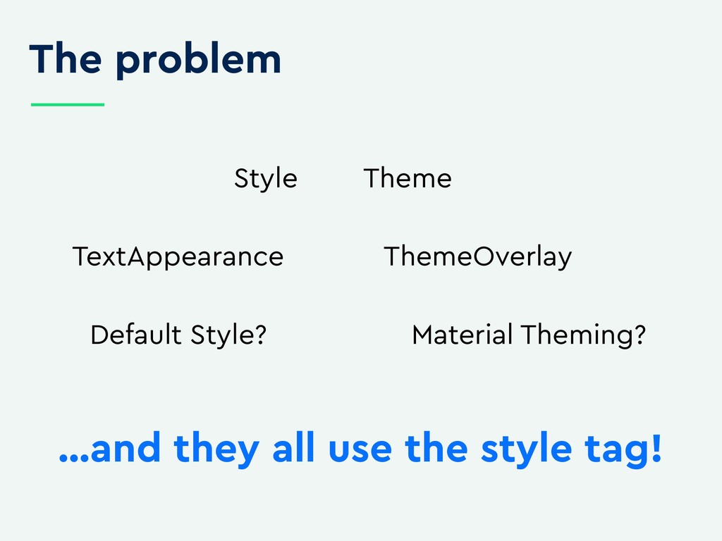
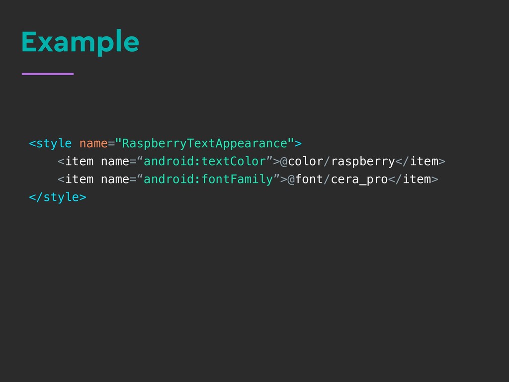
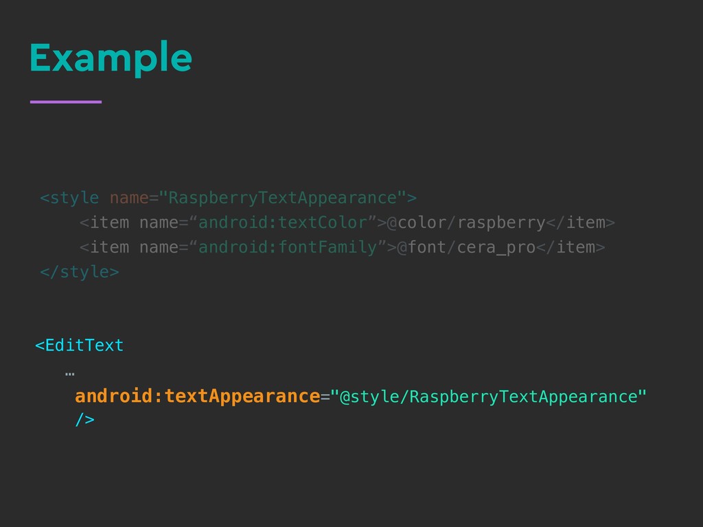
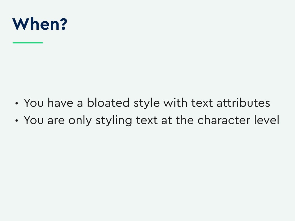
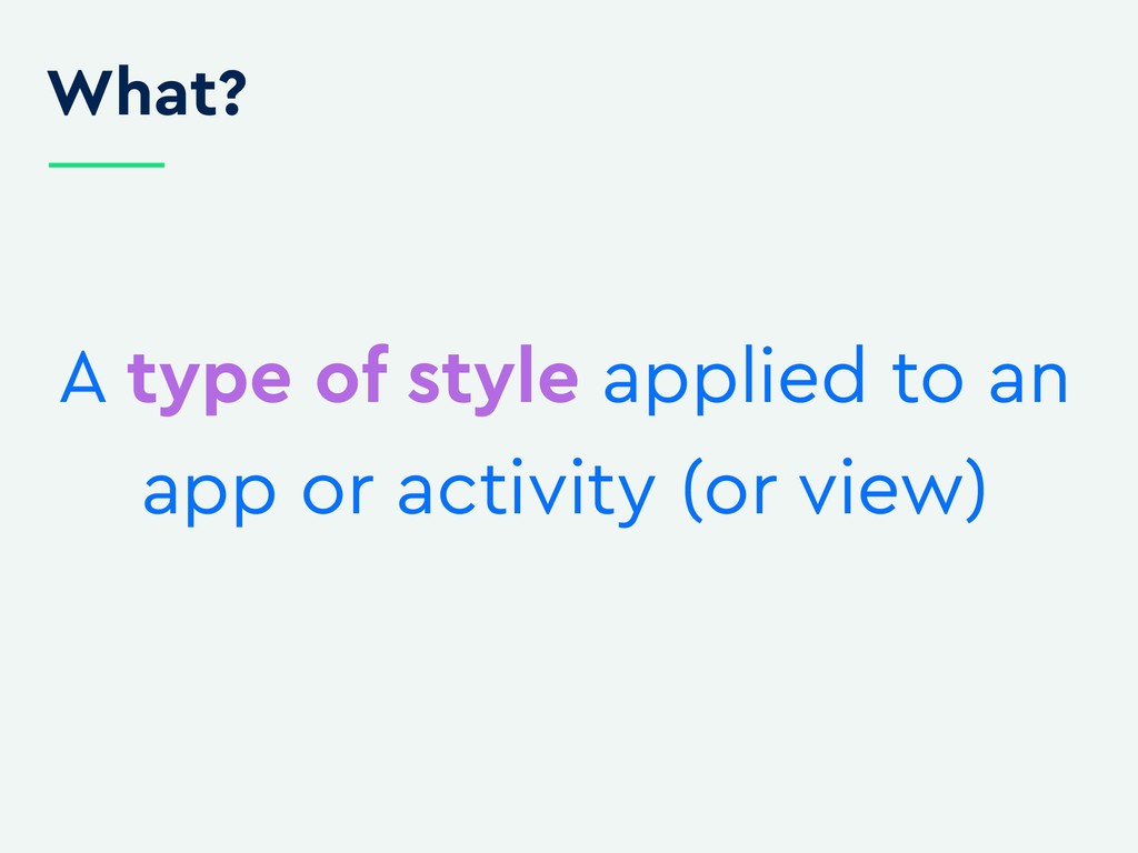
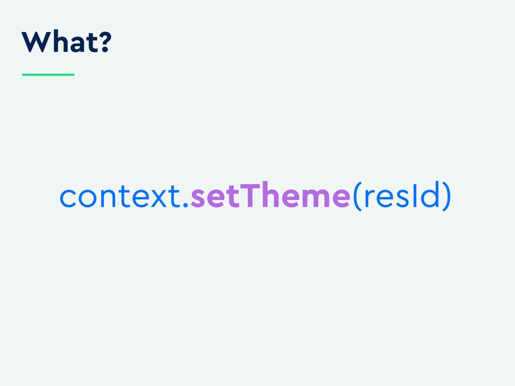
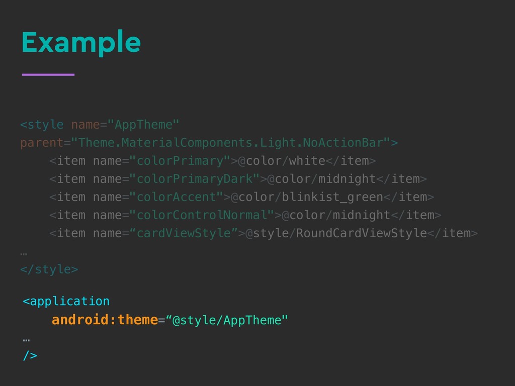
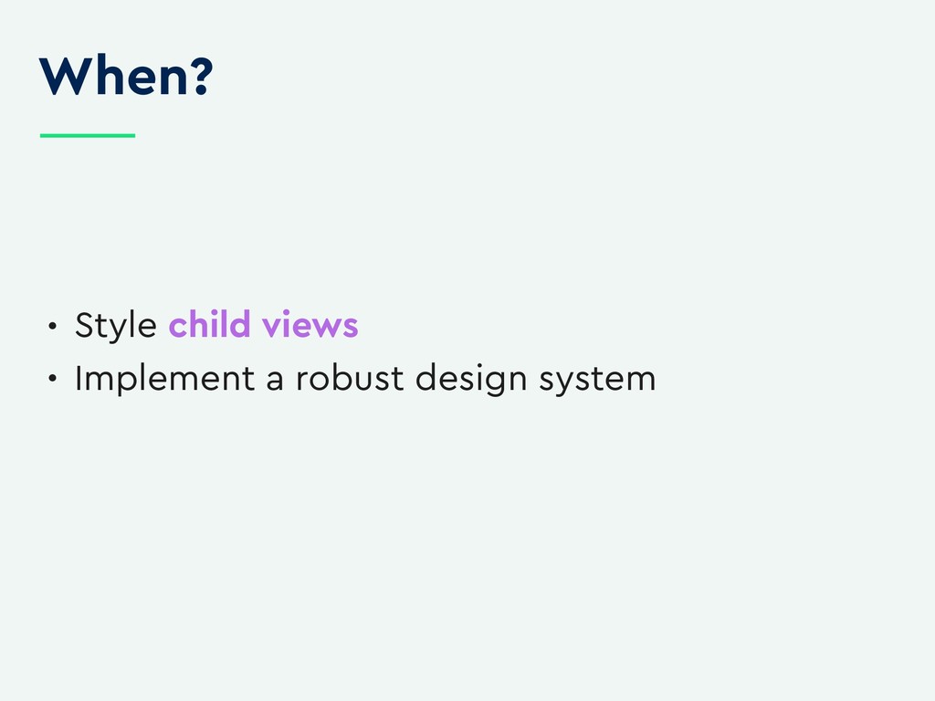
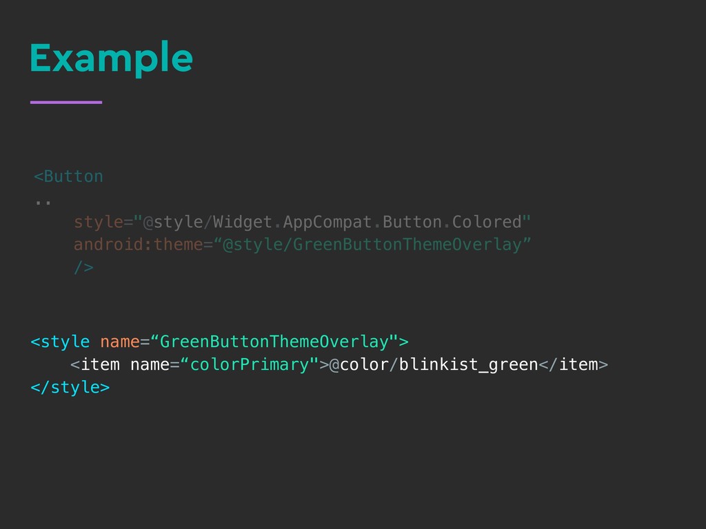
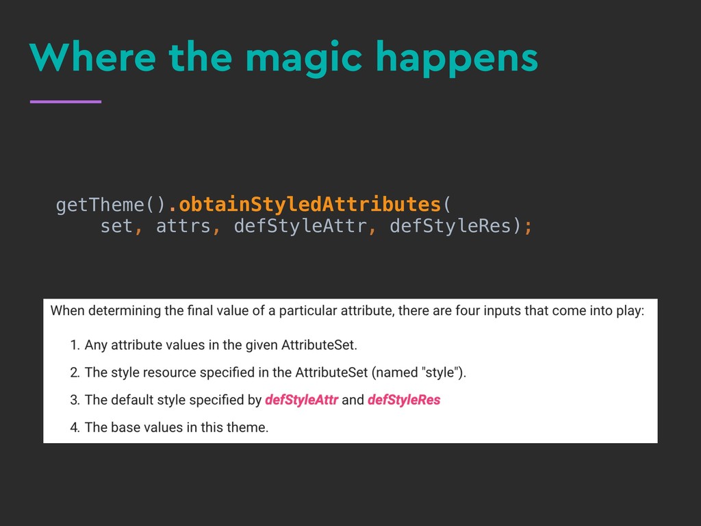
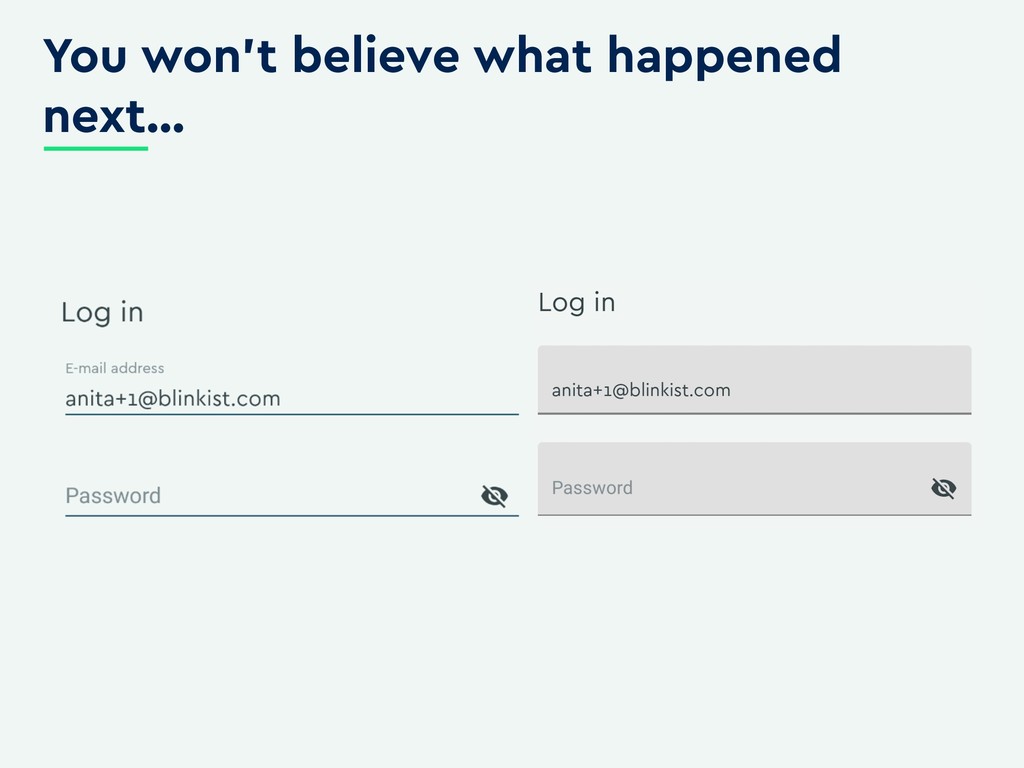
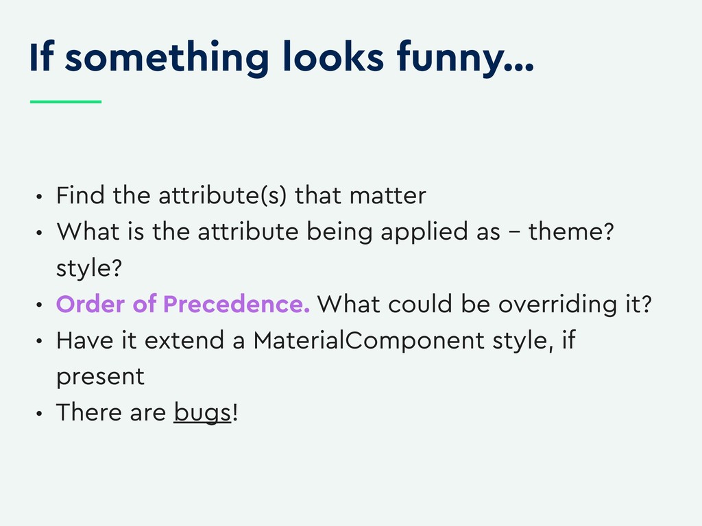
You want to style the title of dialogs throughout your app and you think it should be simple enough. However, once you dive into it, you might start asking questions - should I use alertDialogTheme or alertDialogStyle? Should I use dialogTitle, windowTitle or textAppearanceLarge? It is no secret that the styling and theming system in Android is complex, but I promise there is some method to the madness! We can avoid writing custom components just to achieve pixel perfection if we know how tame to the beast.

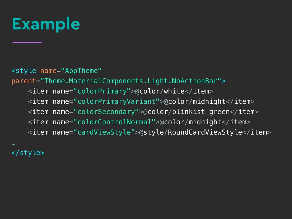
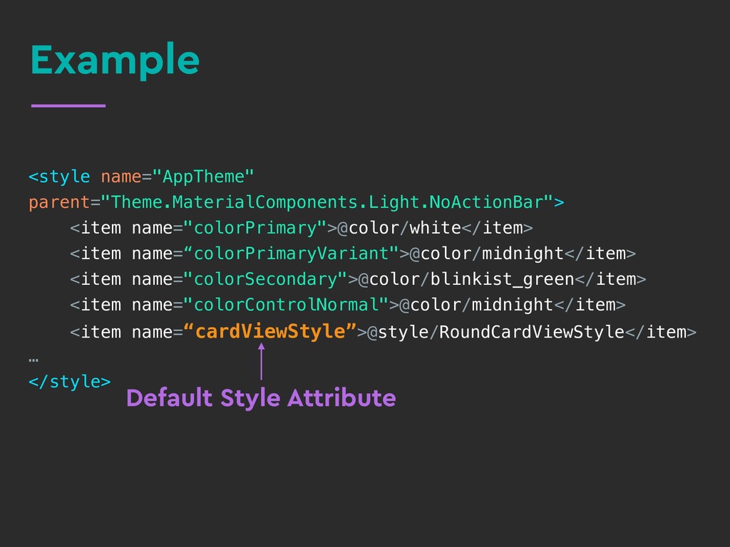
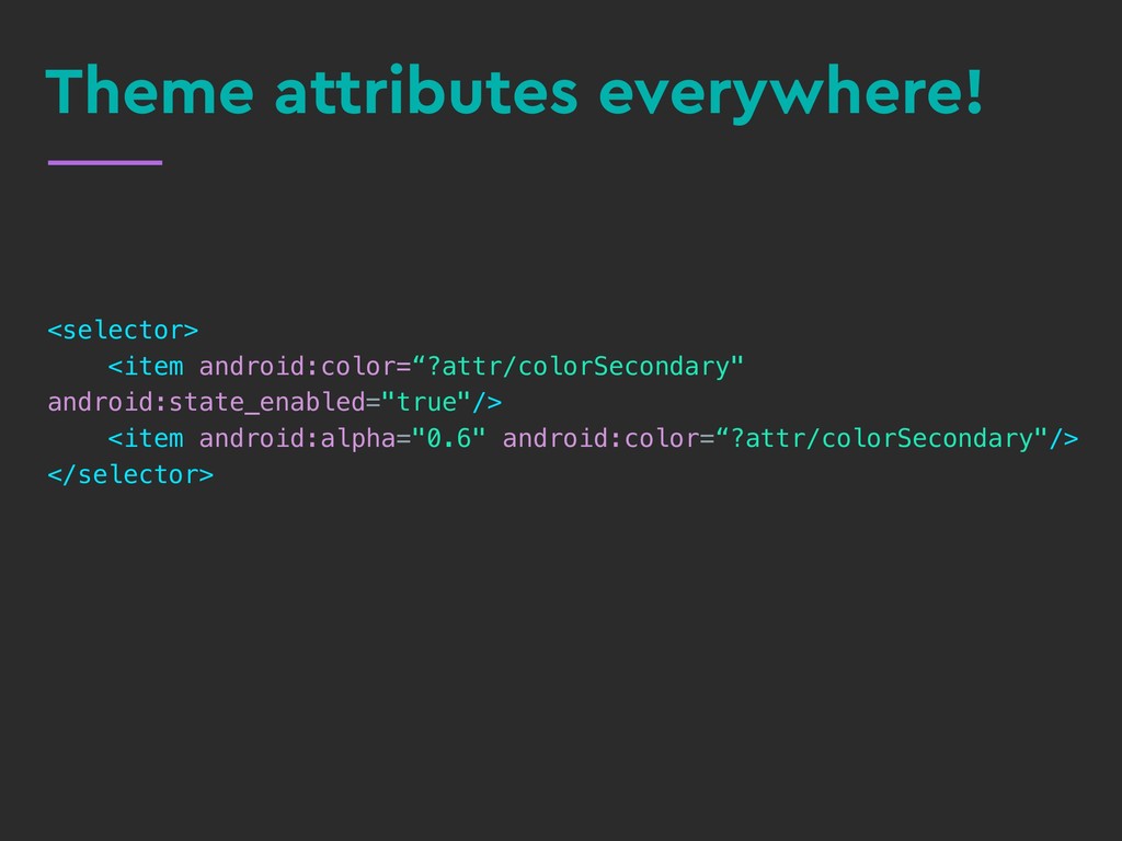
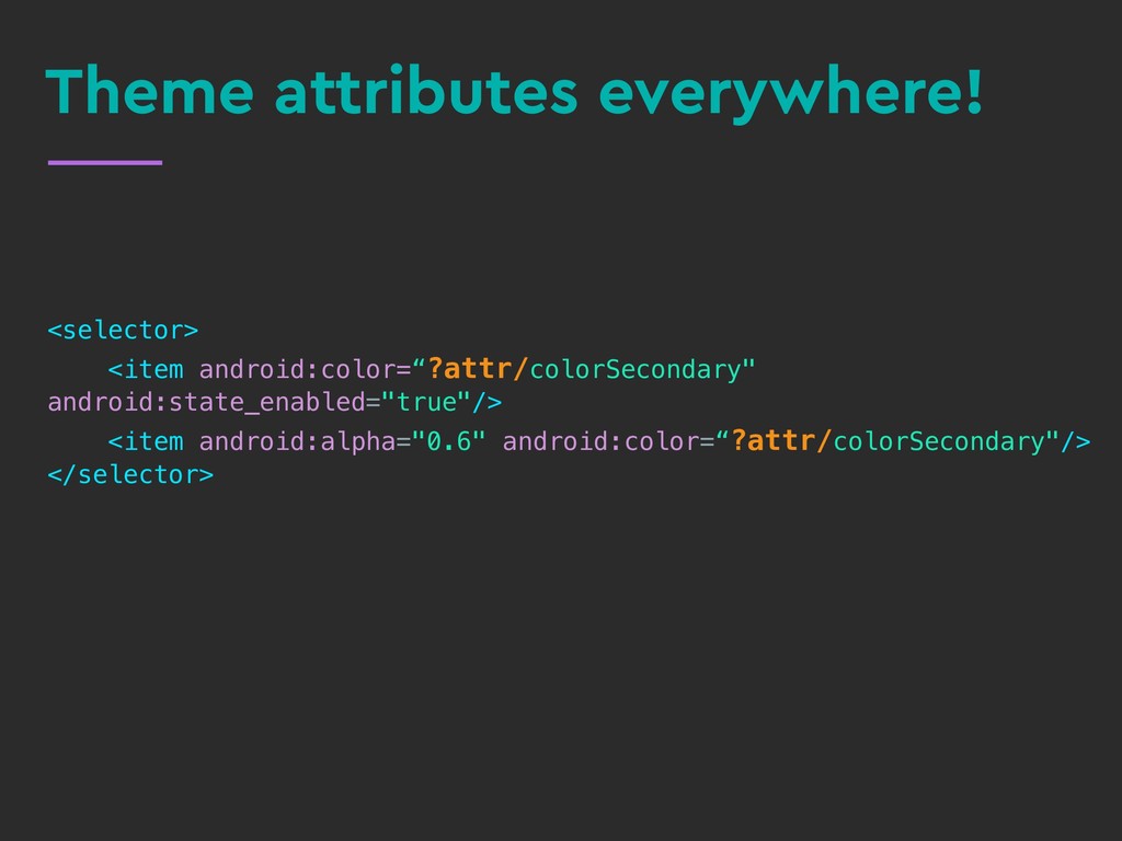
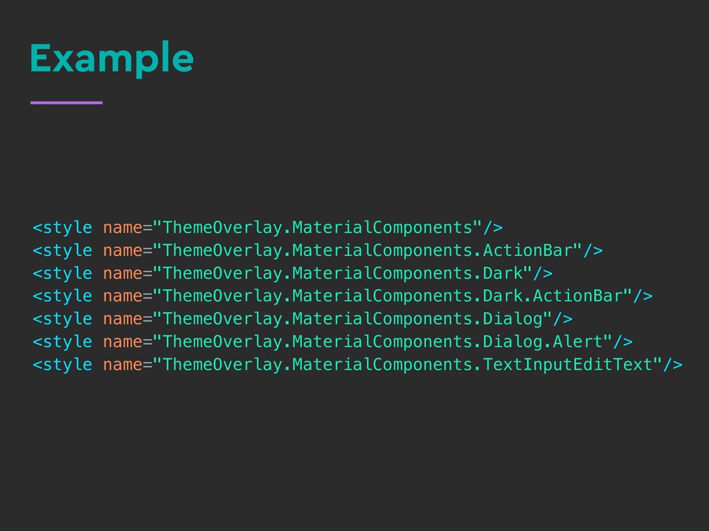
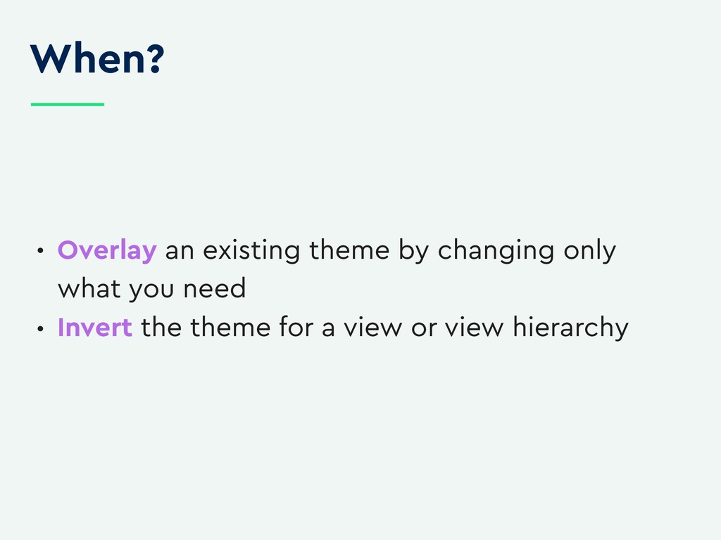
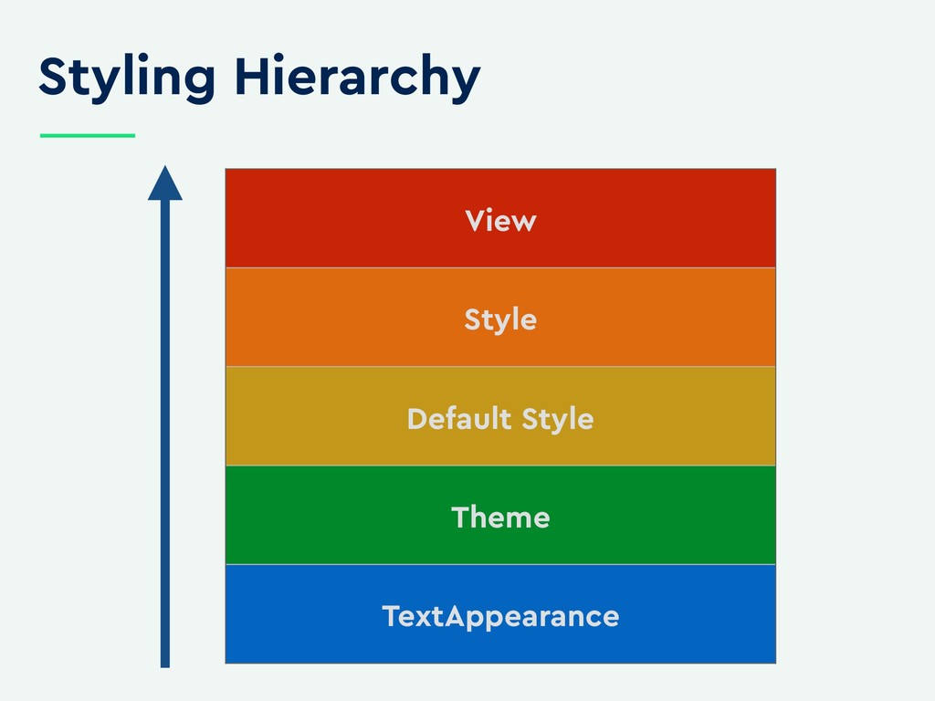
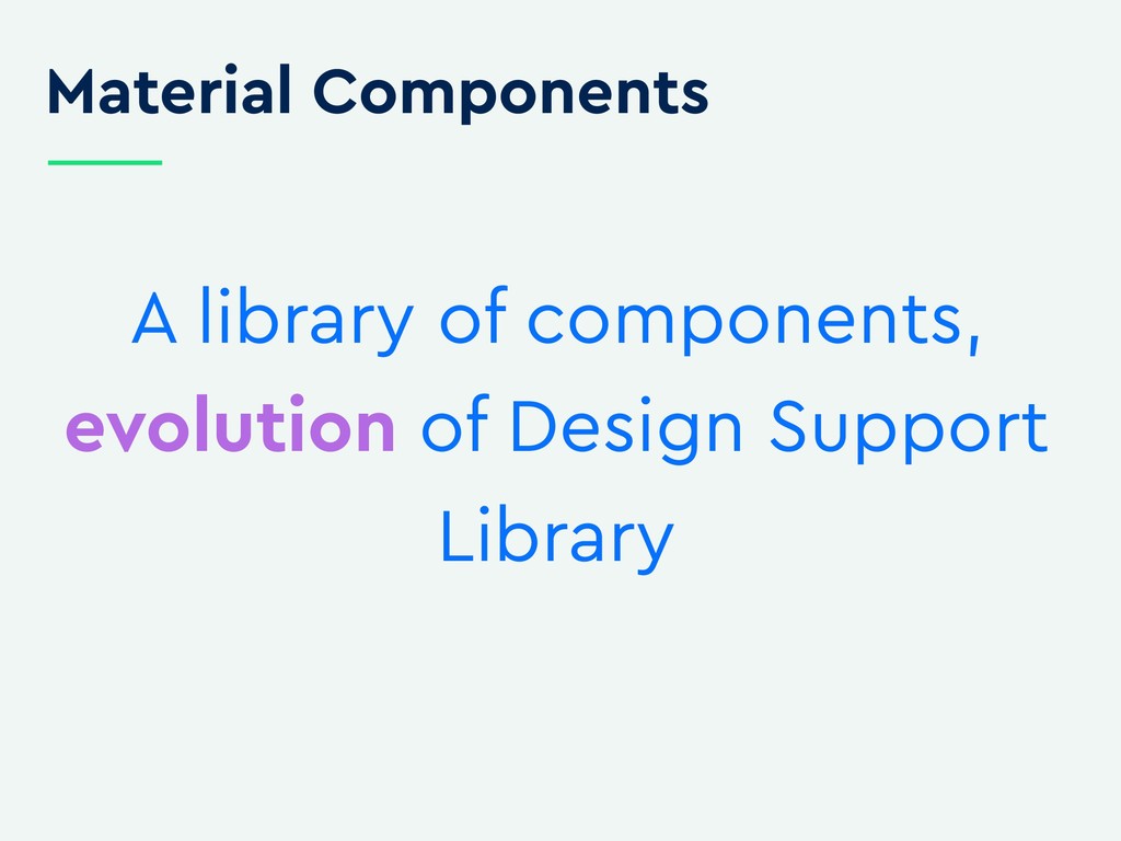
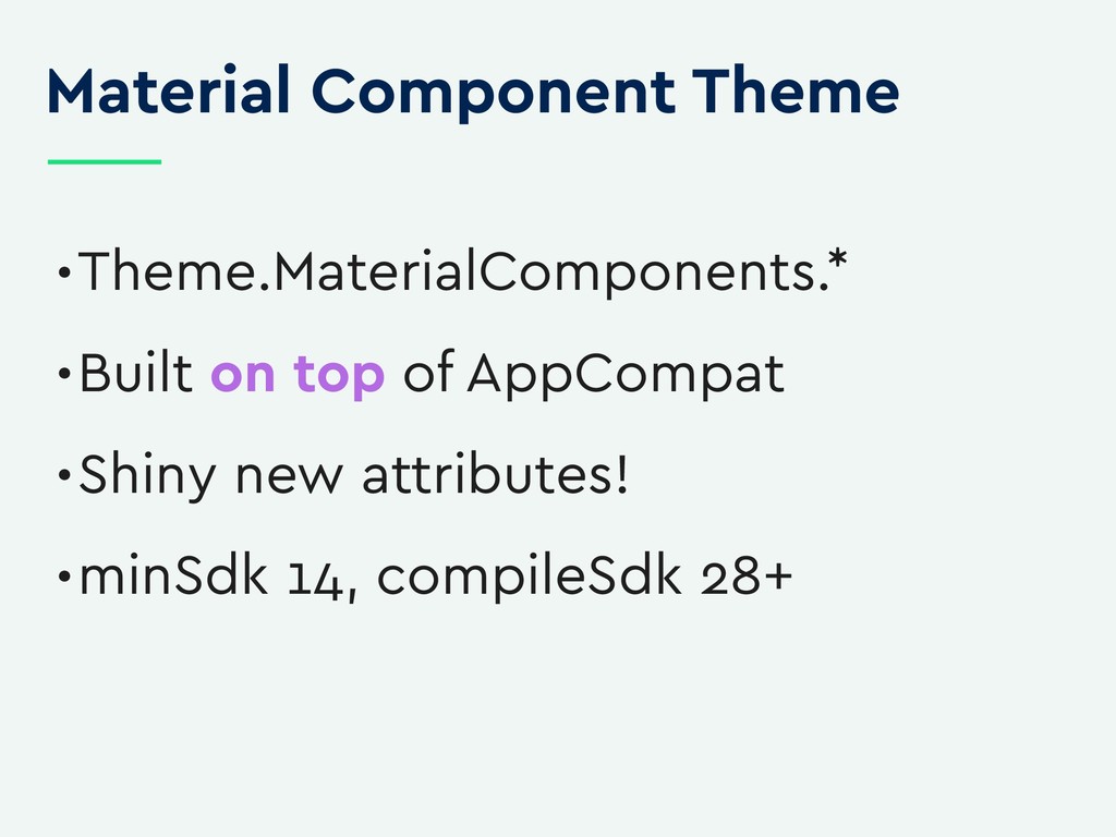
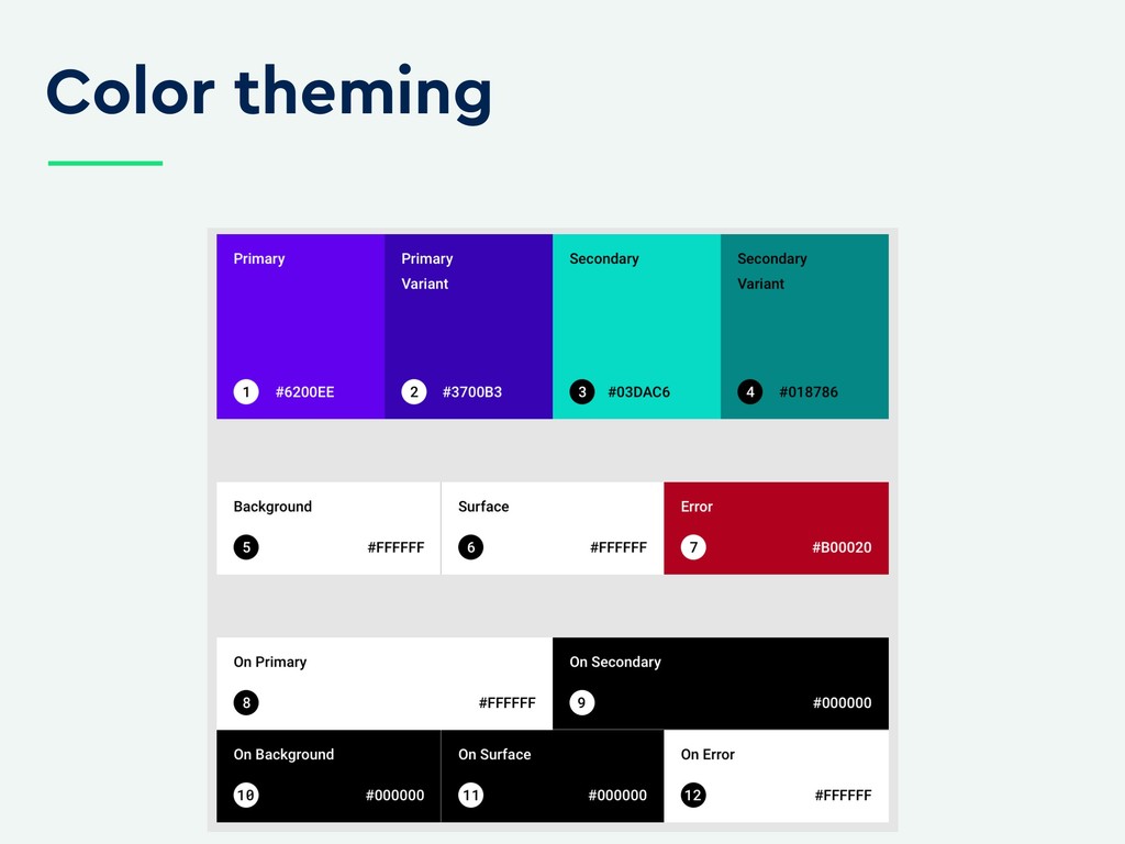
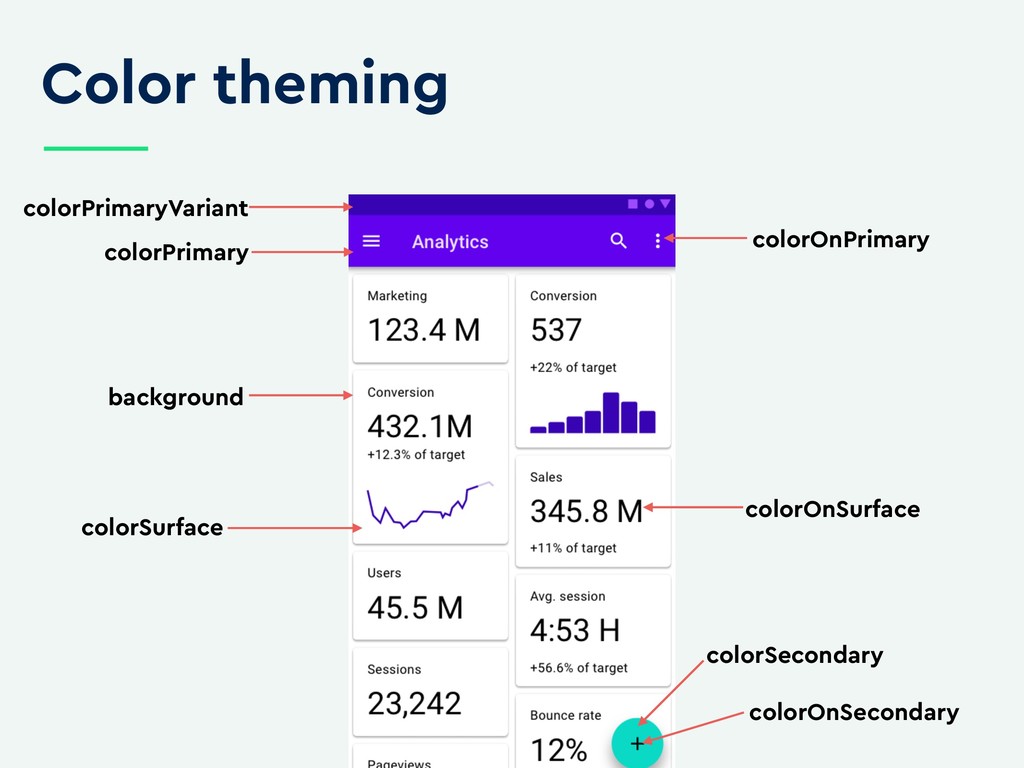
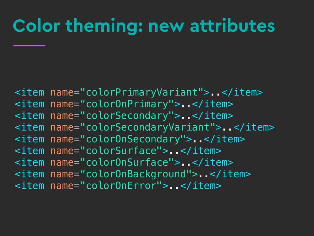
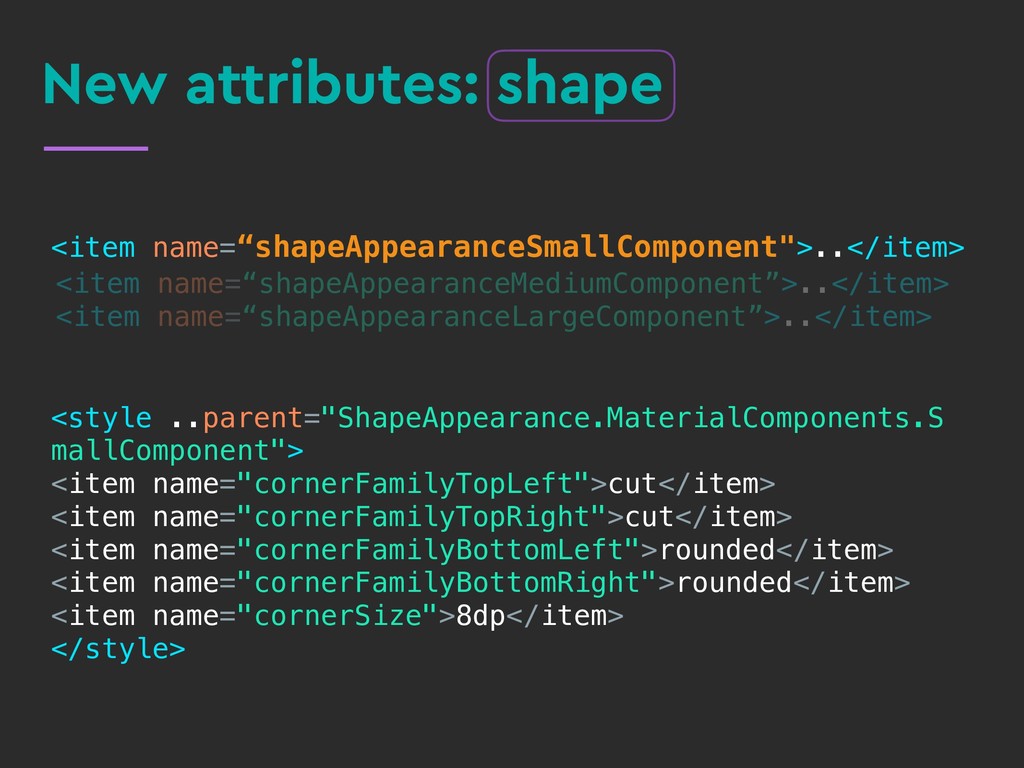
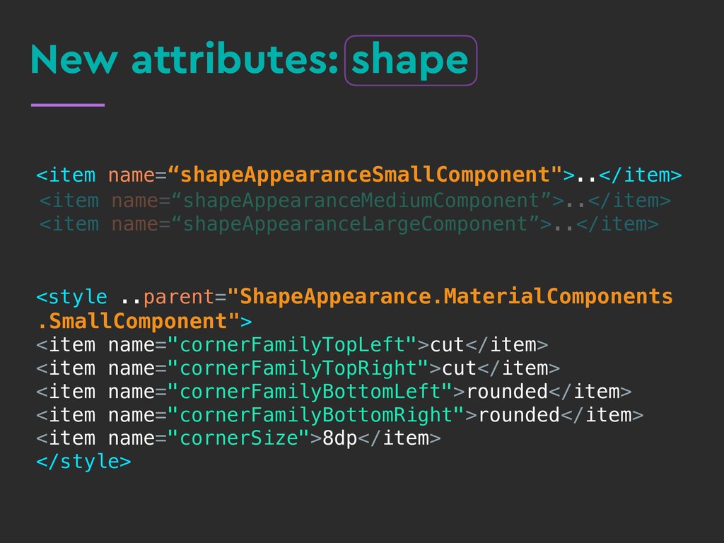
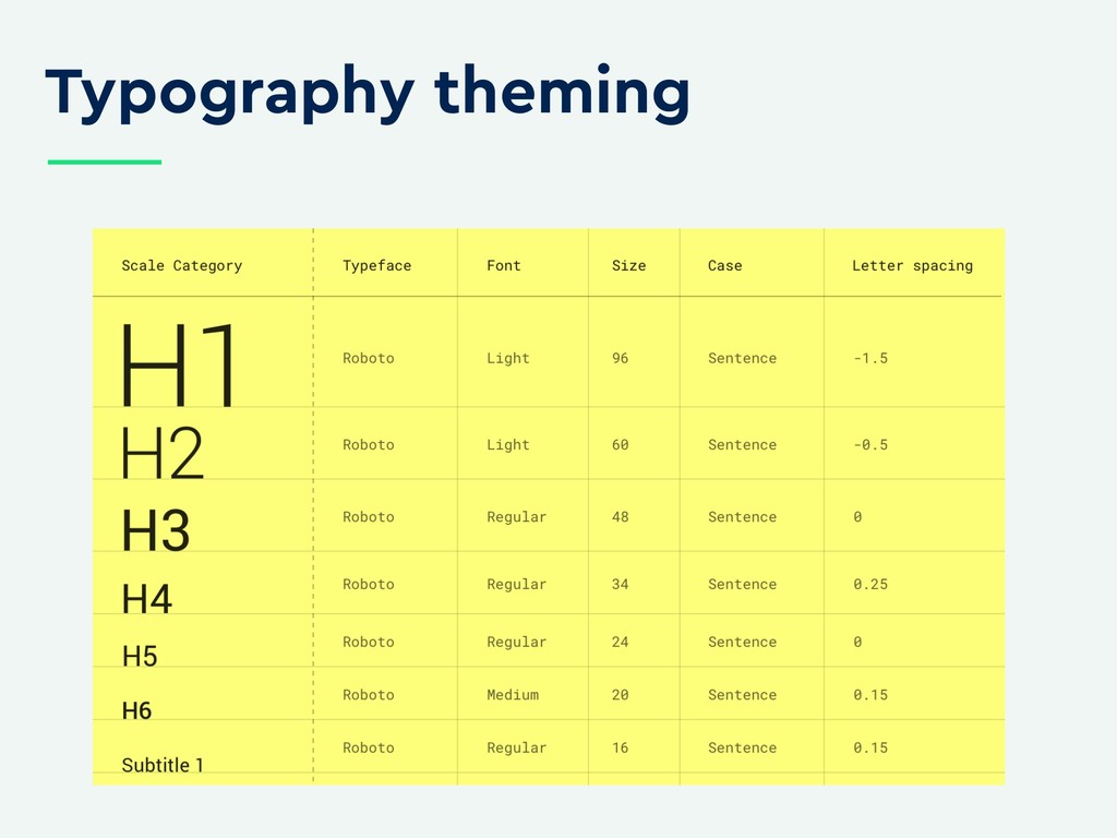
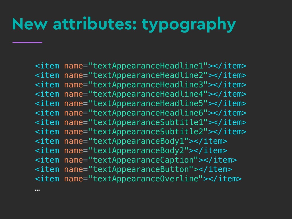
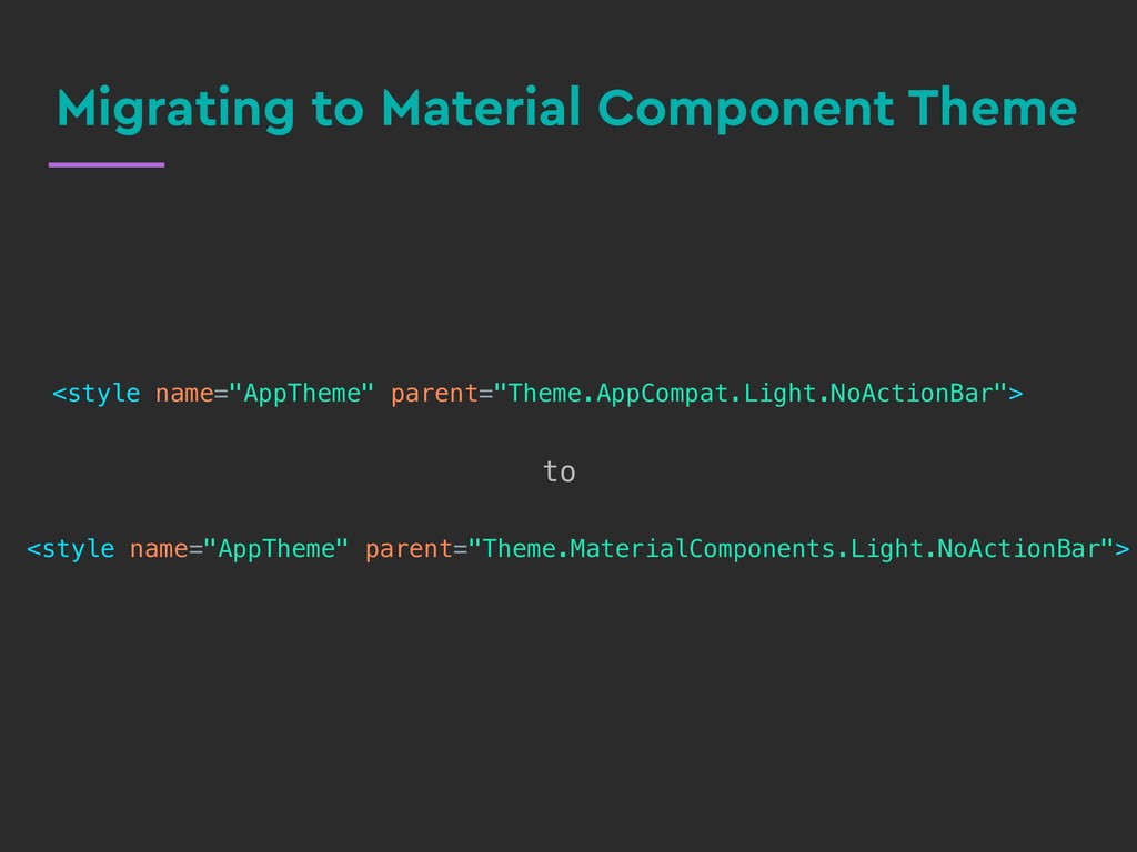
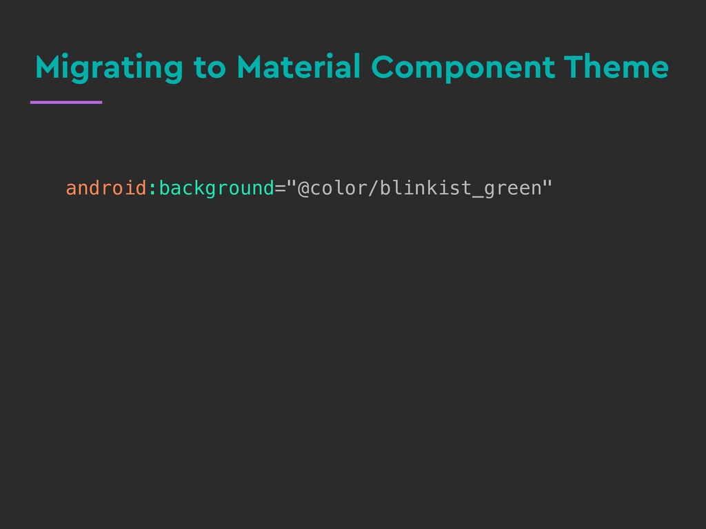
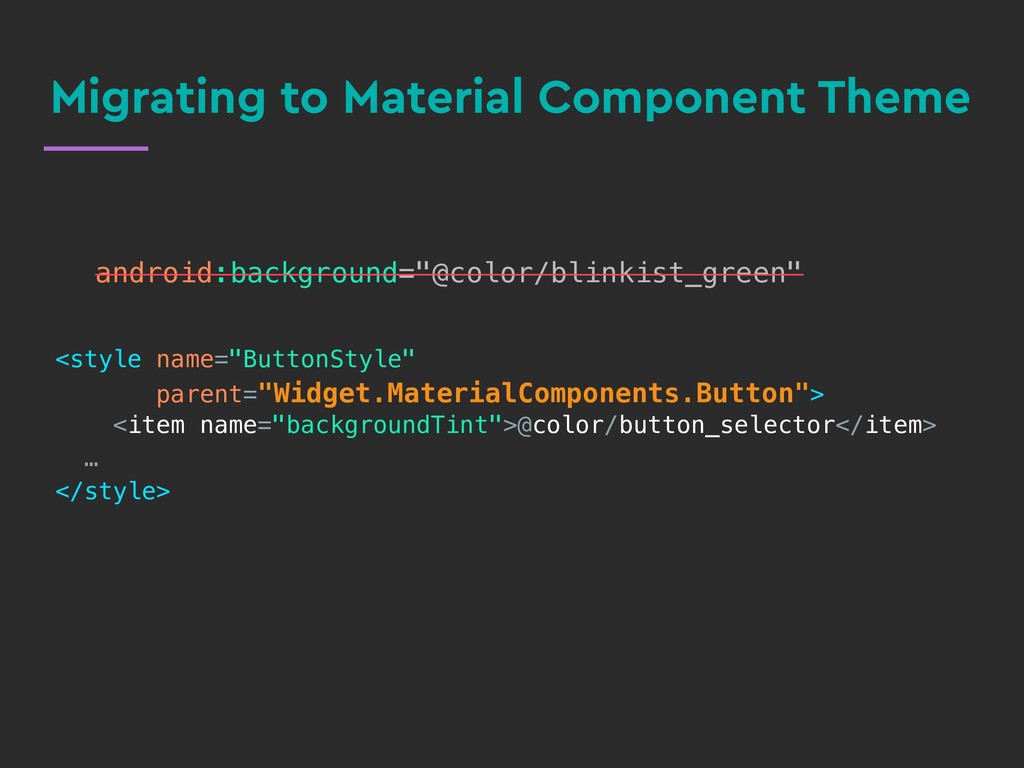
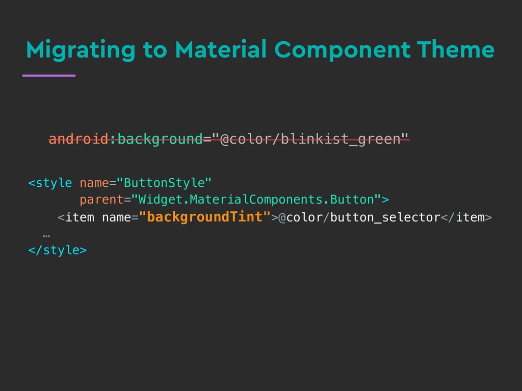
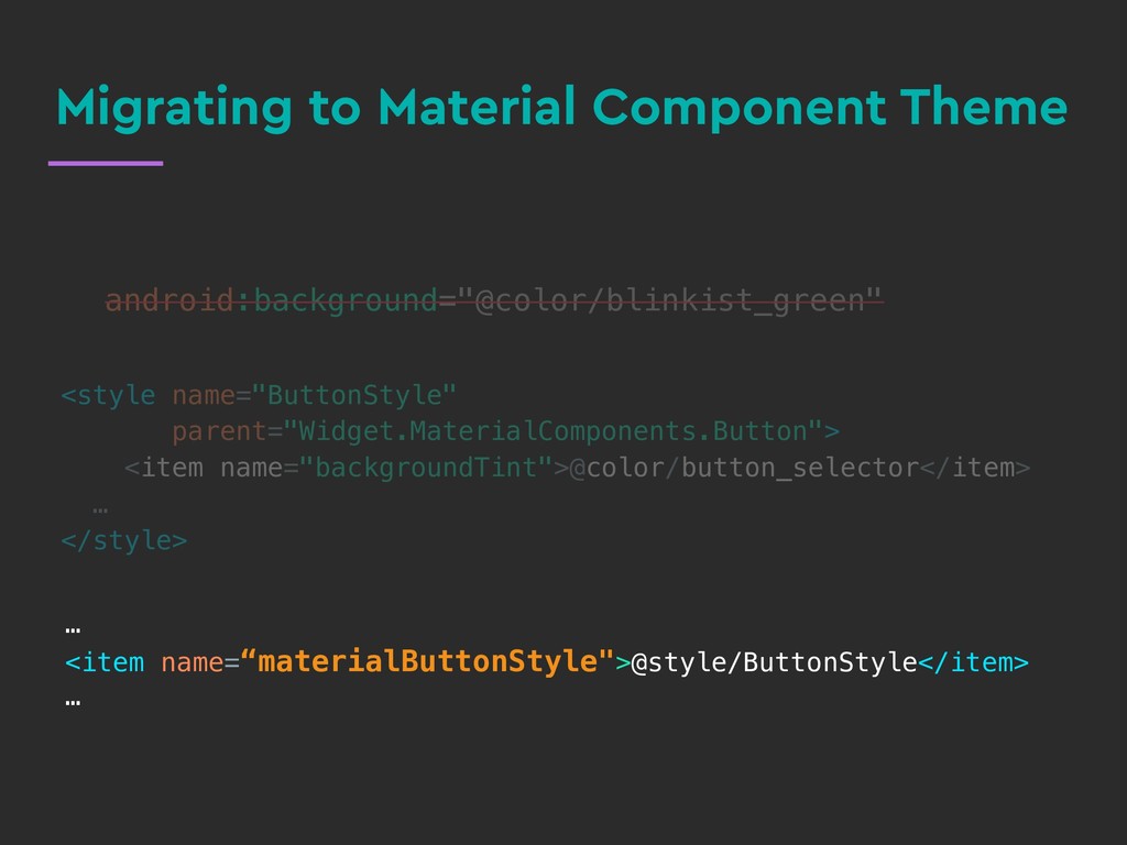
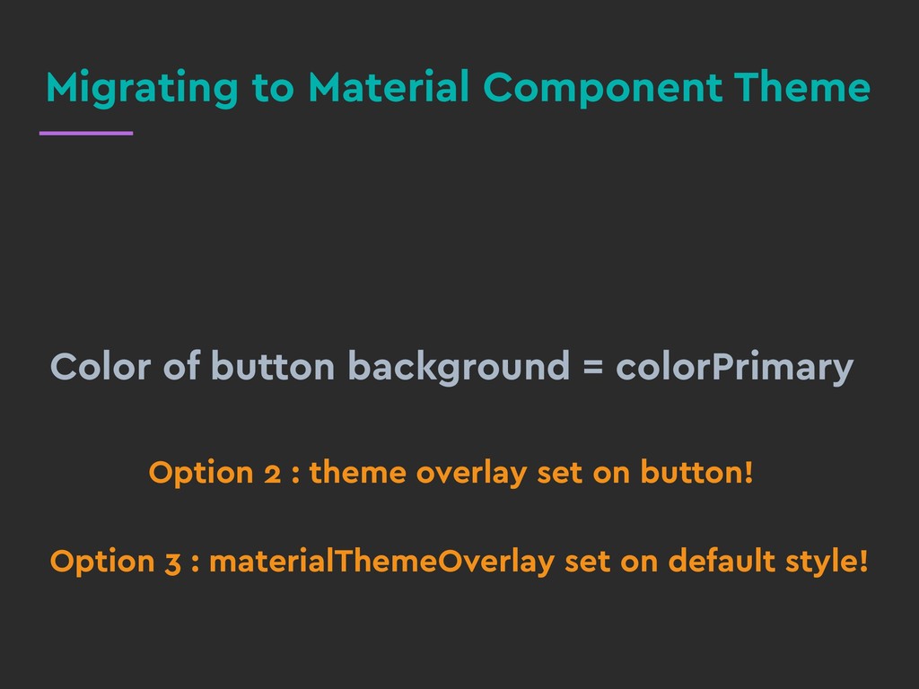
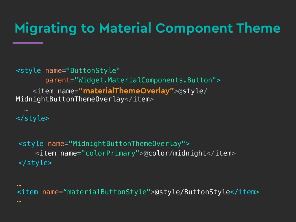
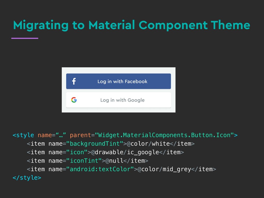
In this talk, we will learn about the difference between themes and styles, the hierarchy of different styling techniques and how to use them effectively. We will also discuss migrating to the newest app theme in town - the Material Components Theme and using the new attributes that come with it, like “colorOnSurface”.

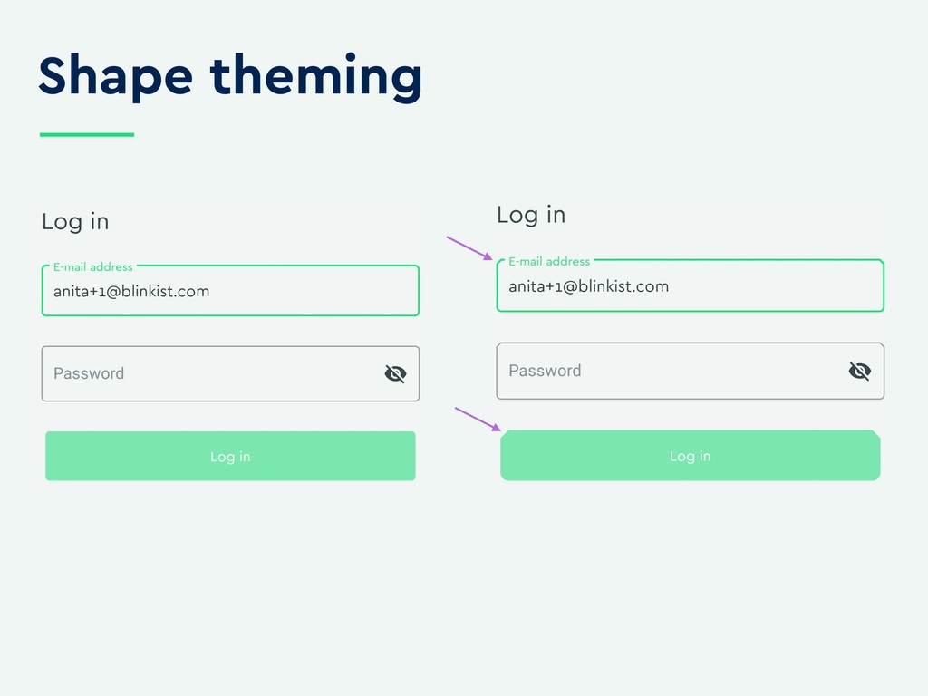
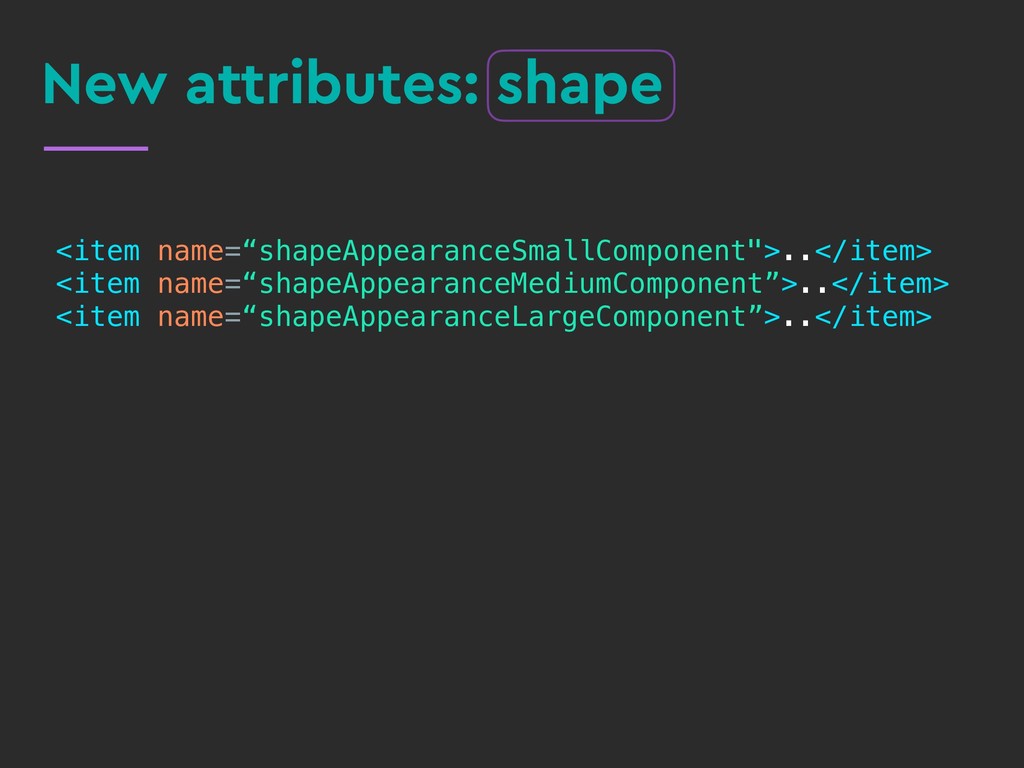
At the end of this talk, you will know how to style your app like a pro with the correct use of Styles, Themes, TextAppearance and sensible defaults while specifying color, shape and typography through Material Theming.

Talk given at Berlindroid March 26th, 2019, Droidcon Italy April 5th, 2019.

Anita

March 27, 2019
Tweet

More Decks by Anita

Other Decks in Technology

Transcript

  1. Styles,

    Themes,

    Material Theming, 

    Oh My!
    Anita Singh
    @anitas3791

    View Slide

  2. Styles,

    Themes,

    Material Theming, 

    Oh My!
    Anita Singh
    @anitas3791

    View Slide

  3. The problem
    Style Theme
    TextAppearance ThemeOverlay
    Material Theming?
    Default Style?
    …and they all use the style tag!

    View Slide

  4. Style

    View Slide

  5. Key-value store, where the
    key is an attribute
    What?

    View Slide

  6. Specifies the look of a single
    view
    What?

    View Slide

  7. Example
    parent=“Widget.MaterialComponents.Button"><br/><item name="android:textColor">@color/white</item><br/><item name="android:fontFamily">@font/cera_pro_bold</item><br/>

    View Slide

  8. Example
    parent=“Widget.MaterialComponents.Button"><br/><item name="android:textColor">@color/white</item><br/><item name="android:fontFamily">@font/cera_pro_bold</item><br/>

    View Slide

  9. Example
    parent=“Widget.MaterialComponents.Button"><br/><item name="android:textColor">@color/white</item><br/><item name="android:fontFamily">@font/cera_pro_bold</item><br/>

    View Slide

  10. Example
    ..
    style=“@style/WhiteTextButtonWidget"
    ..
    />
    parent=“Widget.MaterialComponents.Button"><br/><item name="android:textColor">@color/white</item><br/><item name="android:fontFamily">@font/cera_pro_bold</item><br/>

    View Slide

  11. When?
    Applies to >1 logically related
    components

    View Slide

  12. TextAppearance

    View Slide

  13. Text specific styling, works
    at the character level
    What?

    View Slide

  14. Example
    <br/><item name=“android:textColor”>@color/raspberry</item><br/><item name=“android:fontFamily”>@font/cera_pro</item><br/>

    View Slide

  15. Example
    <br/><item name=“android:textColor”>@color/raspberry</item><br/><item name=“android:fontFamily”>@font/cera_pro</item><br/>

    android:textAppearance="@style/RaspberryTextAppearance"
    />

    View Slide

  16. When?
    • You have a bloated style with text attributes
    • You are only styling text at the character level

    View Slide

  17. Theme

    View Slide

  18. A type of style applied to an
    app or activity (or view)
    What?

    View Slide

  19. context.setTheme(resId)
    What?

    View Slide

  20. Example
    parent="Theme.MaterialComponents.Light.NoActionBar">
    @color/white
    @color/midnight
    @color/blinkist_green
    @color/midnight
    @style/RoundCardViewStyle


    View Slide

  21. Example
    Default Style Attribute
    parent="Theme.MaterialComponents.Light.NoActionBar">
    @color/white
    @color/midnight
    @color/blinkist_green
    @color/midnight
    @style/RoundCardViewStyle


    View Slide

  22. Example
    android:theme=“@style/AppTheme"

    />
    parent="Theme.MaterialComponents.Light.NoActionBar">
    @color/white
    @color/midnight
    @color/blinkist_green
    @color/midnight
    @style/RoundCardViewStyle


    View Slide

  23. Theme attributes everywhere!

    android:state_enabled="true"/>


    View Slide

  24. Theme attributes everywhere!

    android:state_enabled="true"/>


    View Slide

  25. When?
    • Style child views
    • Implement a robust design system


    View Slide

  26. ThemeOverlay

    View Slide

  27. View-level theming

    minSdk 14+
    What?

    View Slide

  28. ContextThemeWrapper
    What?

    View Slide

  29. Example
    ..
    style="@style/Widget.AppCompat.Button.Colored"
    android:theme=“@style/GreenButtonThemeOverlay”
    />

    View Slide

  30. Example
    <br/><item name=“colorPrimary">@color/blinkist_green</item><br/>
    ..
    style="@style/Widget.AppCompat.Button.Colored"
    android:theme=“@style/GreenButtonThemeOverlay”
    />

    View Slide

  31. Example


    View Slide

  32. When?
    • Overlay an existing theme by changing only
    what you need
    • Invert the theme for a view or view hierarchy

    View Slide

  33. Order of Precedence

    View Slide

  34. Example
    Default Style Attribute
    parent="Theme.MaterialComponents.Light.NoActionBar">
    @color/white
    @color/midnight
    @color/blinkist_green
    @color/midnight
    @style/RoundCardViewStyle


    View Slide

  35. How?
    public CardView(@NonNull Context context, @Nullable AttributeSet attrs) {
    this(context, attrs, R.attr.cardViewStyle);
    }
    public CardView(@NonNull Context context, @Nullable AttributeSet attrs, 

    int defStyleAttr) {
    super(context, attrs, defStyleAttr);
    TypedArray a = context.obtainStyledAttributes(attrs,
    R.styleable.CardView, defStyleAttr, R.style.CardView);


    View Slide

  36. How?
    public CardView(@NonNull Context context, @Nullable AttributeSet attrs) {
    this(context, attrs, R.attr.cardViewStyle);
    }
    public CardView(@NonNull Context context, @Nullable AttributeSet attrs, 

    int defStyleAttr) {
    super(context, attrs, defStyleAttr);
    TypedArray a = context.obtainStyledAttributes(attrs,
    R.styleable.CardView, defStyleAttr, R.style.CardView);


    View Slide

  37. How?
    TypedArray a = context.obtainStyledAttributes(attrs,
    R.styleable.CardView, defStyleAttr, R.style.CardView);
    public CardView(@NonNull Context context, @Nullable AttributeSet attrs) {
    this(context, attrs, R.attr.cardViewStyle);
    }
    public CardView(@NonNull Context context, @Nullable AttributeSet attrs, 

    int defStyleAttr) {
    super(context, attrs, defStyleAttr);

    View Slide

  38. How?
    TypedArray a = context.obtainStyledAttributes(attrs,
    R.styleable.CardView, defStyleAttr, R.style.CardView)
    public CardView(@NonNull Context context, @Nullable AttributeSet attrs) {
    this(context, attrs, R.attr.cardViewStyle);
    }
    public CardView(@NonNull Context context, @Nullable AttributeSet attrs, 

    int defStyleAttr) {
    super(context, attrs, defStyleAttr);

    View Slide

  39. Where the magic happens
    getTheme().obtainStyledAttributes(
    set, attrs, defStyleAttr, defStyleRes);

    View Slide

  40. Styling Hierarchy
    View
    Style
    Default Style
    Theme
    TextAppearance

    View Slide

  41. Material Theming

    View Slide

  42. What?

    View Slide

  43. A library of components,
    evolution of Design Support
    Library
    Material Components

    View Slide

  44. Material Component Theme
    •Theme.MaterialComponents.*
    •Built on top of AppCompat
    •Shiny new attributes!
    •minSdk 14, compileSdk 28+

    View Slide

  45. Color theming

    View Slide

  46. Color theming
    colorPrimaryVariant
    colorPrimary
    background
    colorSurface
    colorOnPrimary
    colorOnSurface
    colorSecondary
    colorOnSecondary

    View Slide

  47. Color theming: new attributes
    ..
    ..
    ..
    ..
    ..
    ..
    ..
    ..
    ..

    View Slide

  48. Shape theming
    MaterialShapeDrawable

    View Slide

  49. Shape theming

    View Slide

  50. New attributes: shape
    ..
    ..
    ..

    View Slide

  51. New attributes: shape
    ..
    ..
    ..

    View Slide

  52. New attributes: shape
    <br/><item name="cornerFamilyTopLeft">cut</item><br/><item name="cornerFamilyTopRight">cut</item><br/><item name="cornerFamilyBottomLeft">rounded</item><br/><item name="cornerFamilyBottomRight">rounded</item><br/><item name="cornerSize">8dp</item><br/>
    ..
    ..
    ..

    View Slide

  53. New attributes: shape
    ..
    ..
    ..
    <br/><item name="cornerFamilyTopLeft">cut</item><br/><item name="cornerFamilyTopRight">cut</item><br/><item name="cornerFamilyBottomLeft">rounded</item><br/><item name="cornerFamilyBottomRight">rounded</item><br/><item name="cornerSize">8dp</item><br/>

    View Slide

  54. Typography theming

    View Slide

  55. New attributes: typography


    View Slide

  56. <br/><style name="AppTheme" parent="Theme.MaterialComponents.Light.NoActionBar"><br/>to<br/>Migrating to Material Component Theme<br/>

    View Slide

  57. <br/><style name="AppTheme" parent="Theme.MaterialComponents.Light.NoActionBar"><br/>to<br/>Migrating to Material Component Theme<br/>

    View Slide

  58. You won’t believe what happened
    next…

    View Slide

  59. You won’t believe what happened
    next…

    View Slide

  60. You won’t believe what happened
    next…

    View Slide

  61. Migrating to Material Component Theme
    android:background="@color/blinkist_green"

    View Slide

  62. parent="Widget.MaterialComponents.Button">
    @color/button_selector


    android:background="@color/blinkist_green"
    Migrating to Material Component Theme

    View Slide

  63. android:background="@color/blinkist_green"
    Migrating to Material Component Theme
    parent="Widget.MaterialComponents.Button">
    @color/button_selector


    android:background="@color/blinkist_green"

    View Slide

  64. Migrating to Material Component Theme
    parent="Widget.MaterialComponents.Button">
    @color/button_selector


    @style/ButtonStyle

    android:background="@color/blinkist_green"

    View Slide

  65. Color of button background = colorPrimary
    Option 2 : theme overlay set on button!
    Option 3 : materialThemeOverlay set on default style!
    Migrating to Material Component Theme

    View Slide

  66. parent="Widget.MaterialComponents.Button">
    @style/
    MidnightButtonThemeOverlay


    …

    @style/ButtonStyle

    Migrating to Material Component Theme
    <br/><item name="colorPrimary">@color/midnight</item><br/>

    View Slide

  67. <br/><item name="backgroundTint">@color/white</item><br/><item name="icon">@drawable/ic_google</item><br/><item name="iconTint">@null</item><br/><item name="android:textColor">@color/mid_grey</item><br/>
    Migrating to Material Component Theme

    View Slide

  68. Migrating to Material Component Theme
    <br/><item name="backgroundTint">@color/white</item><br/><item name="icon">@drawable/ic_google</item><br/><item name="iconTint">@null</item><br/><item name="android:textColor">@color/mid_grey</item><br/>

    View Slide

  69. Migrating to Material Component Theme
    <br/><item name="backgroundTint">@color/white</item><br/><item name="icon">@drawable/ic_google</item><br/><item name="iconTint">@null</item><br/><item name="android:textColor">@color/mid_grey</item><br/>

    View Slide

  70. Migrating to Material Component Theme

    View Slide

  71. to
    parent=“Theme.MaterialComponent.Light.Dialog.Alert">
    Migrating to Material Component Theme
    parent="Theme.AppCompat.Light.Dialog.Alert">

    View Slide

  72. Color of button text = colorPrimary
    Migrating to Material Component Theme
    to
    parent=“Theme.MaterialComponent.Light.Dialog.Alert">
    parent="Theme.AppCompat.Light.Dialog.Alert">

    View Slide

  73. Migrating to Material Component Theme
    ..
    @style/
    Widget.MaterialComponents.TextInputLayout.OutlinedBox
    ..

    View Slide

  74. Color of selection = colorPrimary
    Migrating to Material Component Theme
    ..
    @style/
    Widget.MaterialComponents.TextInputLayout.OutlinedBox
    ..

    View Slide

  75. Bridge Themes
    Inherits from AppCompat,
    but defines the new theme
    attributes

    View Slide

  76. Migrating to Material Component Theme
    <br/><style name="AppTheme"<br/>parent=“Theme.MaterialComponents.Light.NoActionBar.Bridge”><br/>to<br/>

    View Slide

  77. If something looks funny…
    • Find the attribute(s) that matter
    • What is the attribute being applied as – theme?
    style?
    • Order of Precedence. What could be overriding it?
    • Have it extend a MaterialComponent style, if
    present
    • There are bugs!

    View Slide

  78. Useful Links
    • Material Theming Guide
    • Material Components Github
    • Material Theme Editor
    • What's Your Text Appearance?
    • Themes, Styles And More From Zero To Hero
    • Android Themes & Styles Demystified
    • Setting Up Material Components Theme For
    Android
    • The Components of Material Design

    View Slide

  79. Thanks. [email protected]
    @anitas3791
    https:/
    /tinyurl.com/styles-material-theming

    View Slide